
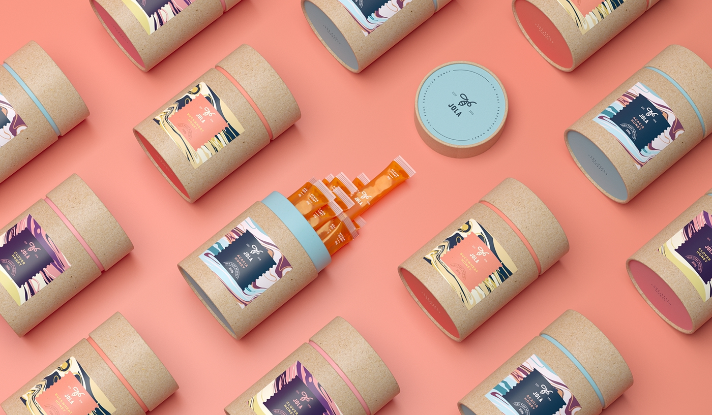
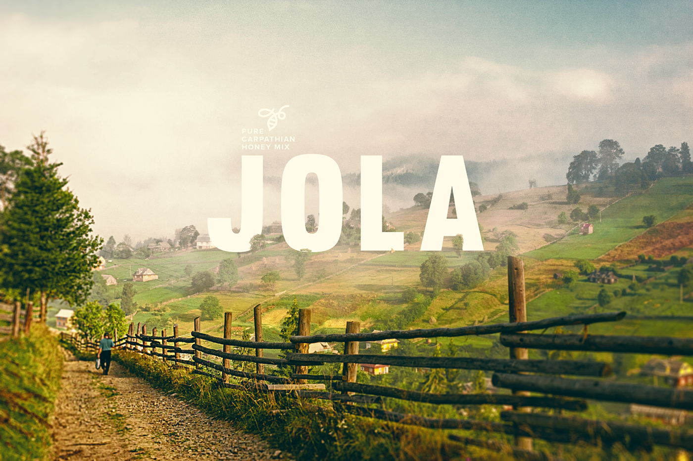
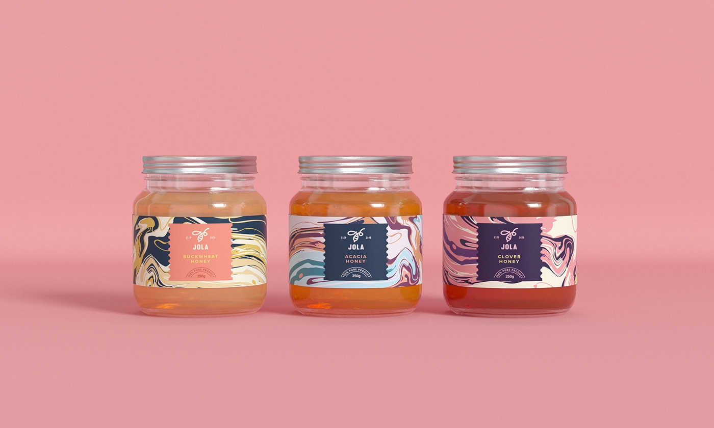

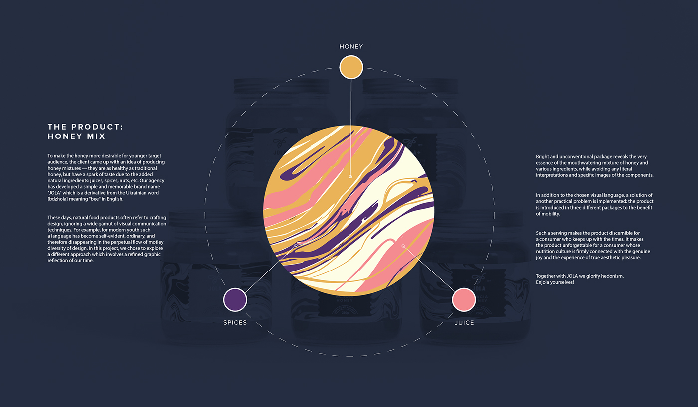
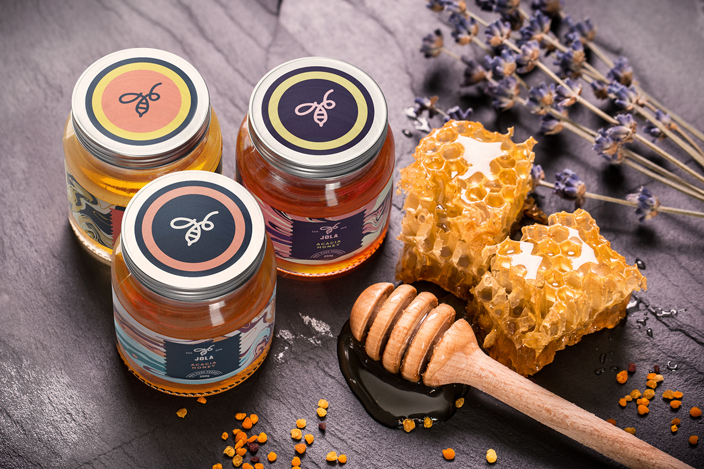

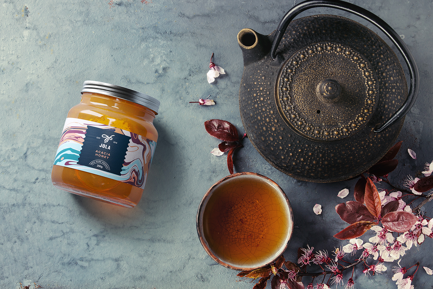

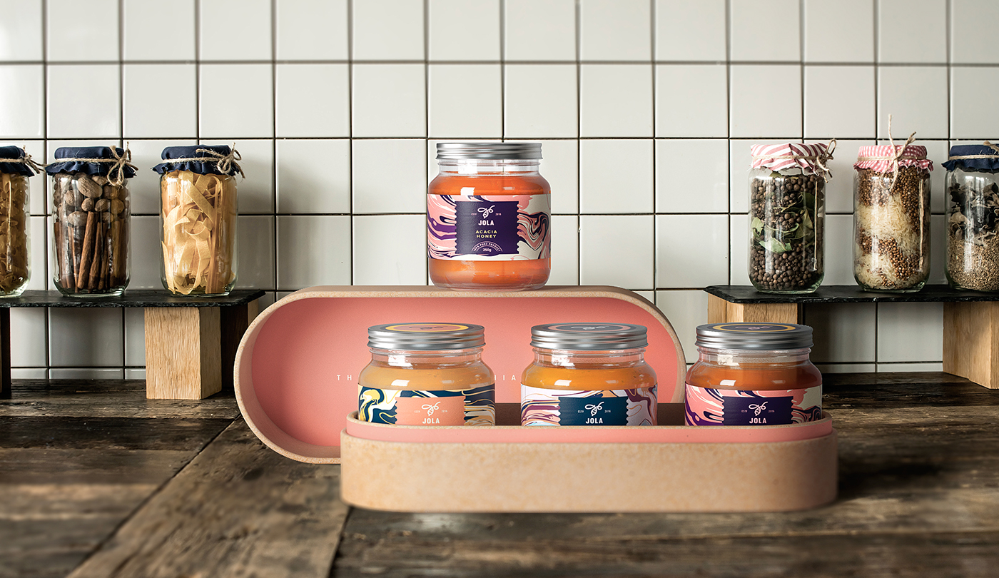
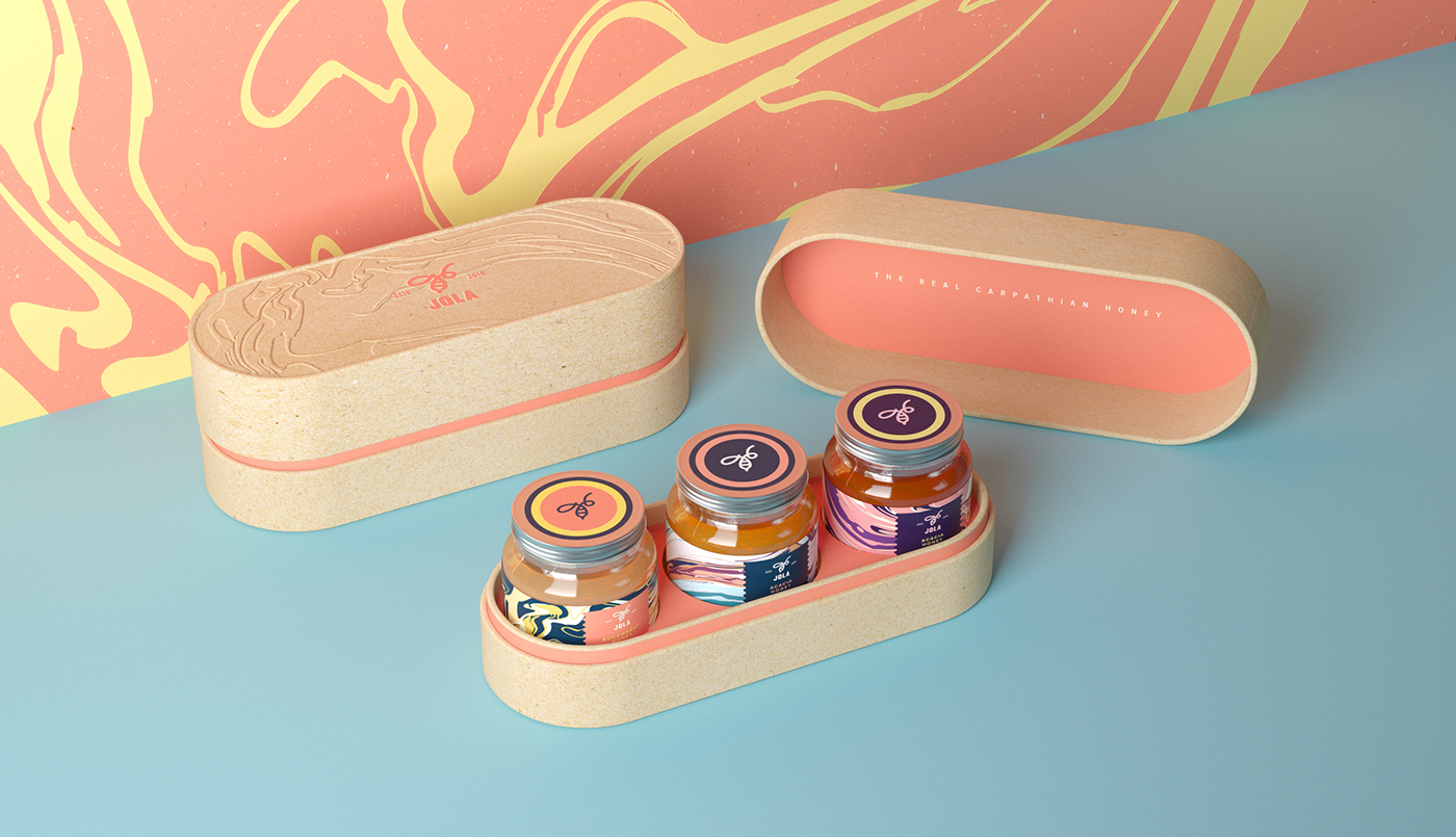
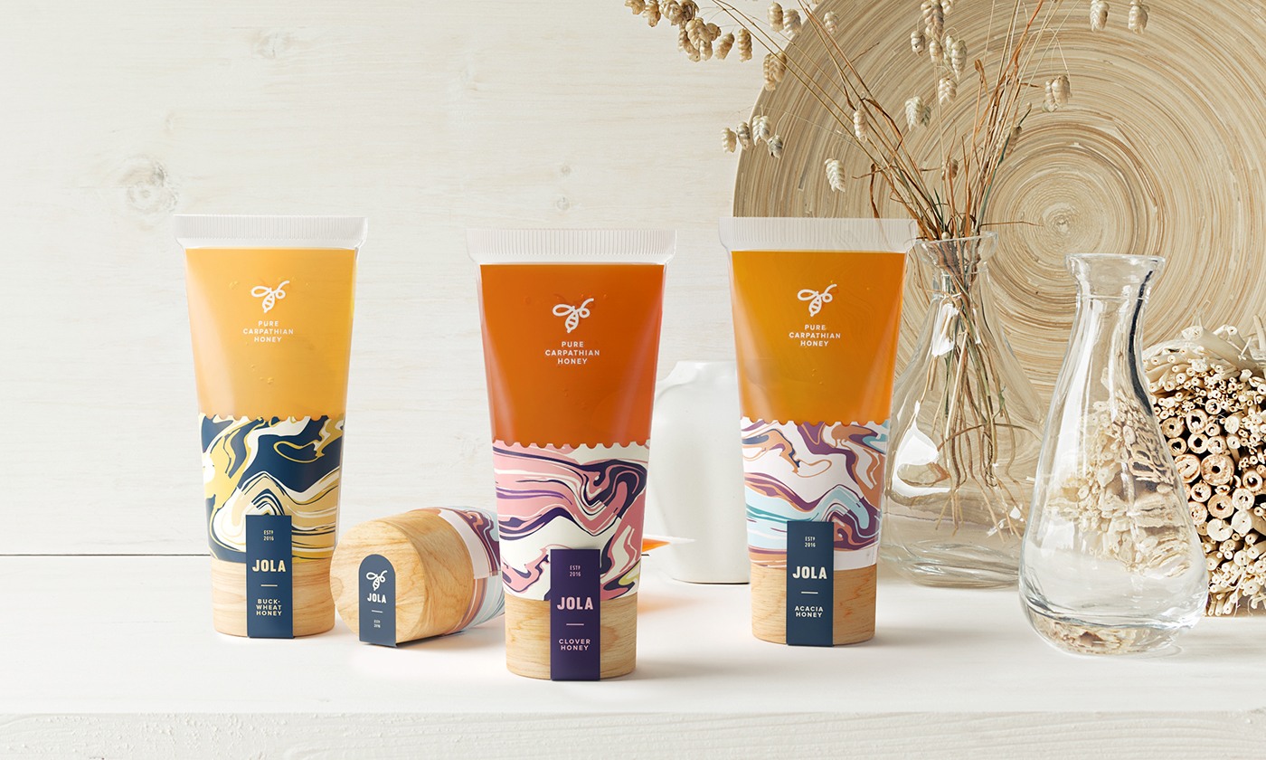
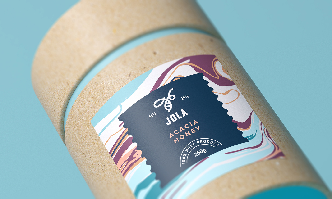
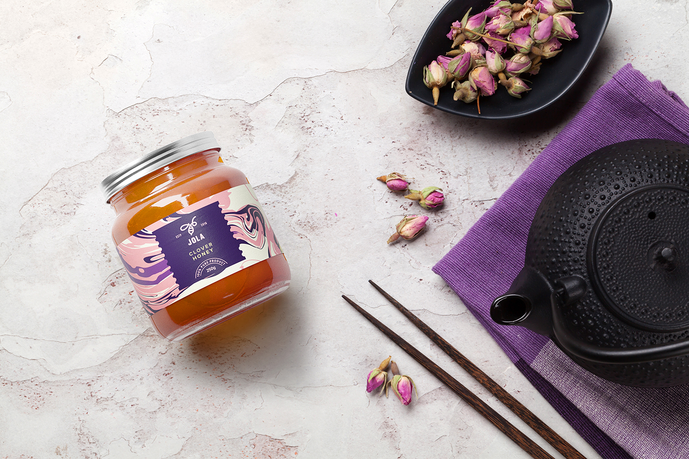


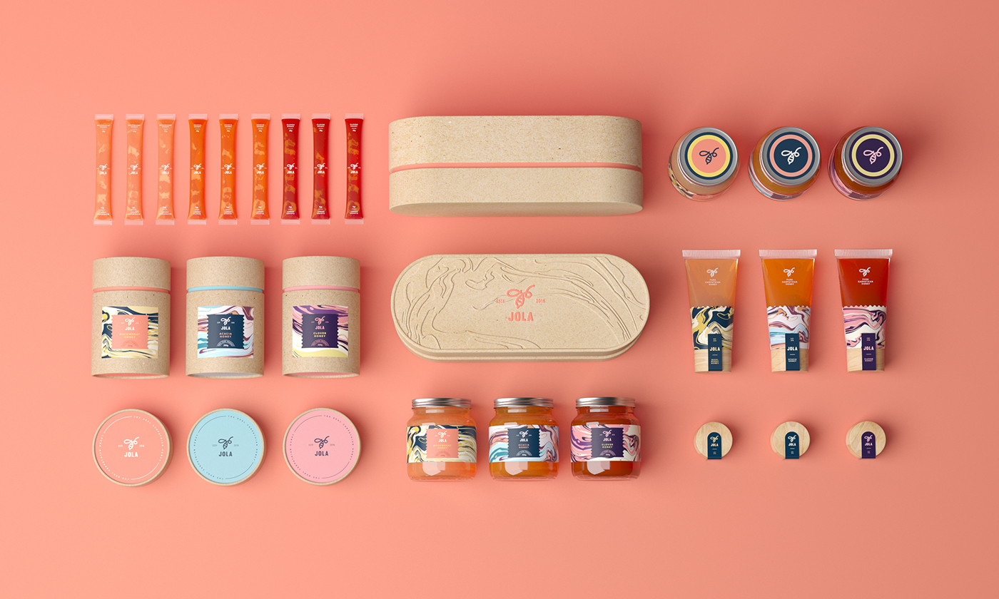
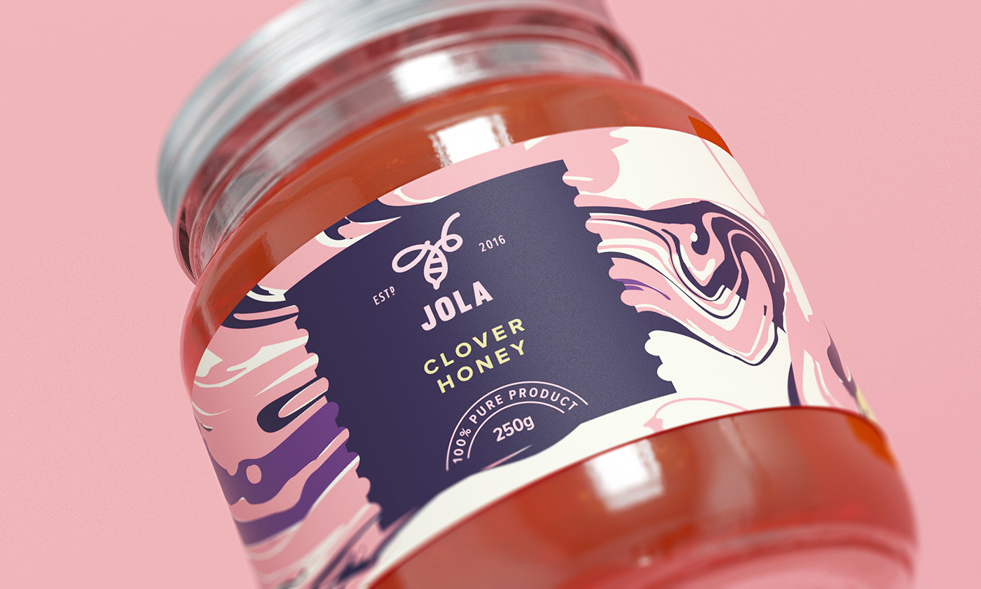


Ukrainian Tough Slate Design, who we’ve featured before, was given the task to create a visual identity for a new local honey brand: JOLA, which is a derivative of the Ukrainian word [bdzhola] meaning “bee” in English. Honey created to specifically attract a younger target audience, the client came up with an idea of producing honey mixtures — they are as healthy as traditional honey, but have a spark of taste due to the added natural ingredients: juices, spices, nuts, etc. Reflecting this idea, Tough Slate Design developed a simple and memorable identity around a key pattern and color palette, making sure the packaging is as distinguishable and desirable as possible.
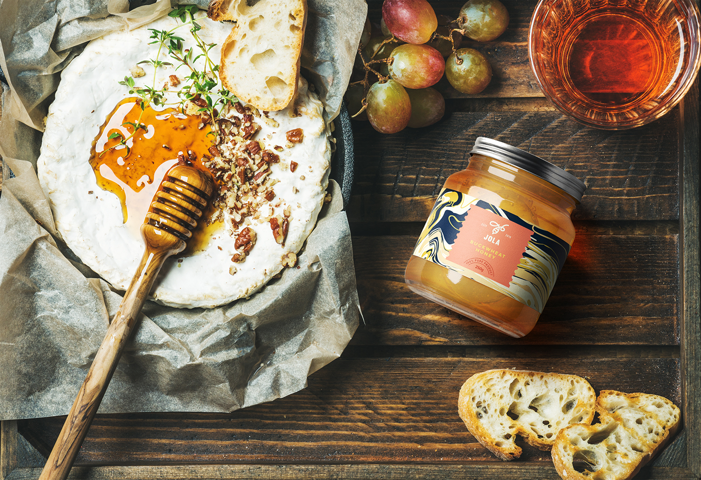
These days, natural food products often refer to crafting design, ignoring a wide gamut of visual communication techniques. For example, for modern youth, such a language has become self-evident, ordinary, and therefore disappearing in the perpetual flow of Motley diversity of design. For this fact, the bright and unconventional packaging of JOLA reveals the very essence of the mouthwatering mixture of honey and various ingredients, while avoiding any literal interpretations and specific images of the components. In addition to the chosen visual language, a solution of another practical problem is implemented: the product is introduced in three different packages to the benefit of mobility. Such a serving makes the product discernible for a consumer who keeps up with the times. It makes the product unforgettable for a consumer whose nutrition culture is firmly connected with the genuine joy and the experience of true aesthetic pleasure.
Images © Tough Slate Design