
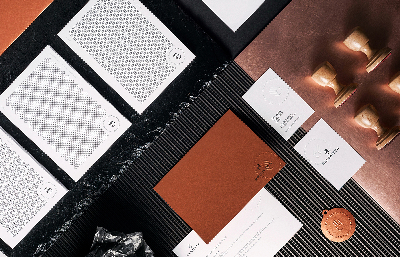
Bulgarian Marka Collective (previously featured here & here) is creating eye-catching branding and packaging designs with quality materials, innovative ideas and cool concepts. Their latest project for Katenitza, a local startup company designing and producing handcrafted ceramic tiles, combines pattern with a minimal color scheme and a clever logo inspired by their most famous tile.

The logo represents one of Katenitza’s most emblematic shapes combined with the hand – symbol of uniqueness and personal touch. It also makes allusion to Hamsa – the well-known symbol of home protection, blessings, power and strength. This is reproduced as embossings as well as stamps, sometimes overlayed in two designs. The shiny copped style paper reminds of metal, and the patterns used in the letterheads come from the various tile designs. The primary goal of the design was to convey Katenitza’s rare attention to detail.


Images © Marka Collective