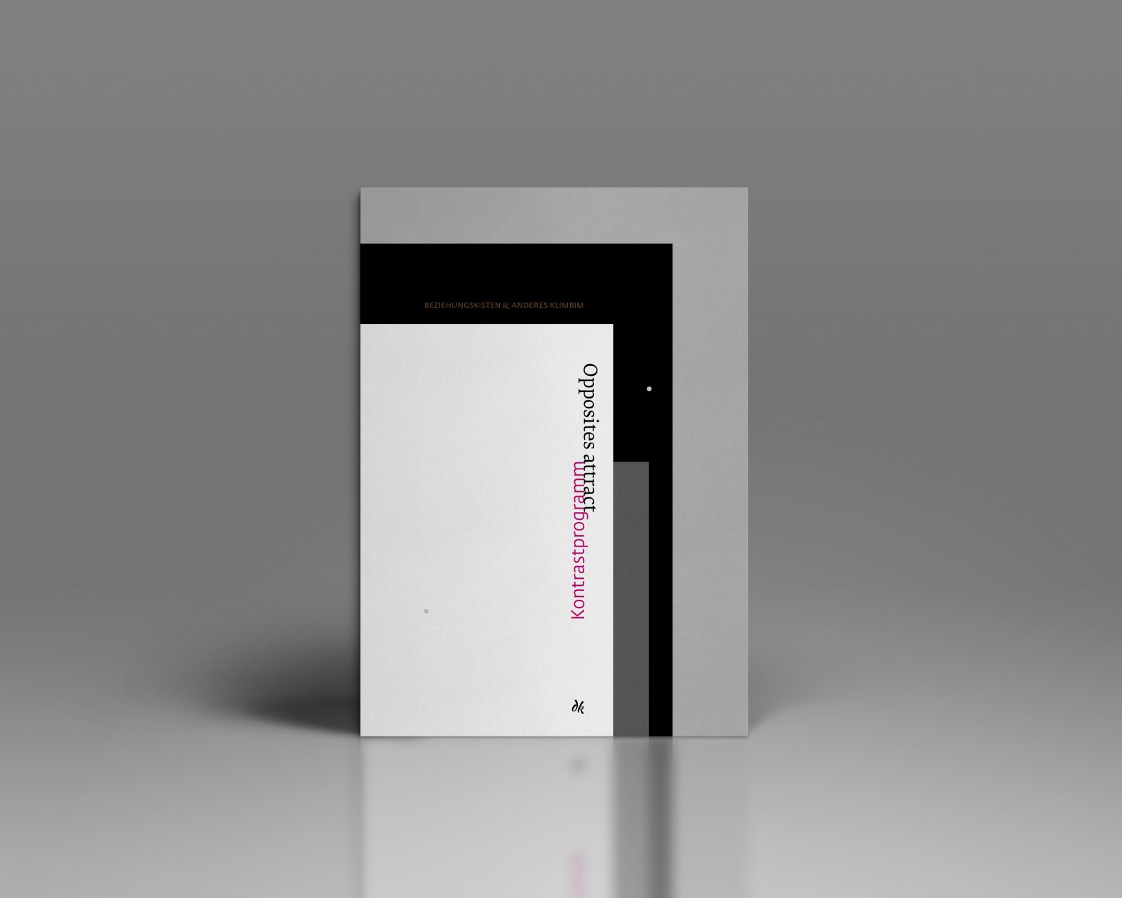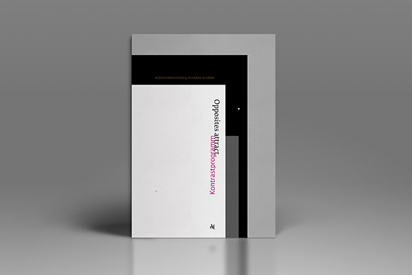
Konstrastprogramm – Opposites Attract is an intriguingly unique book project by Dagmar Krause, a Viennese freelance graphic designer and illustrator. The designer created the book as a non-commercial student project — more precisely, as her thesis for the Book Design course of the New Design University, St. Poelten, Austria.
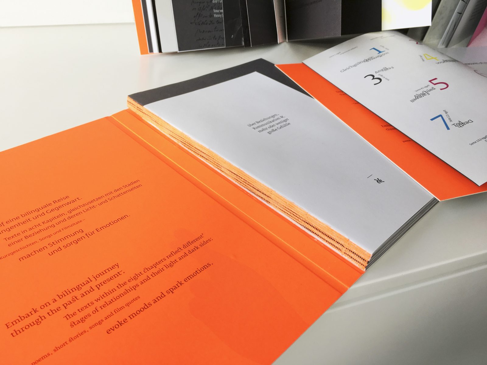
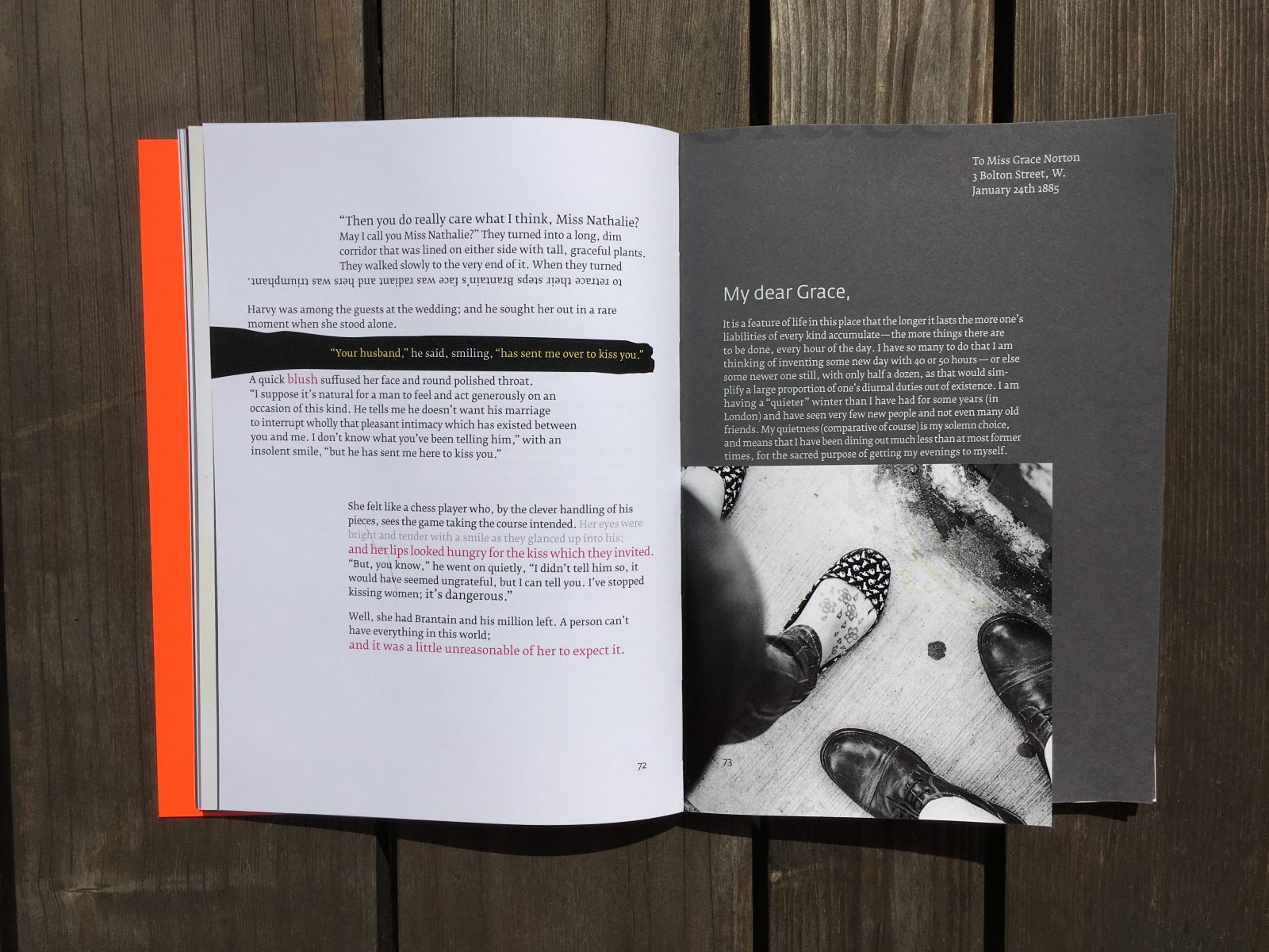
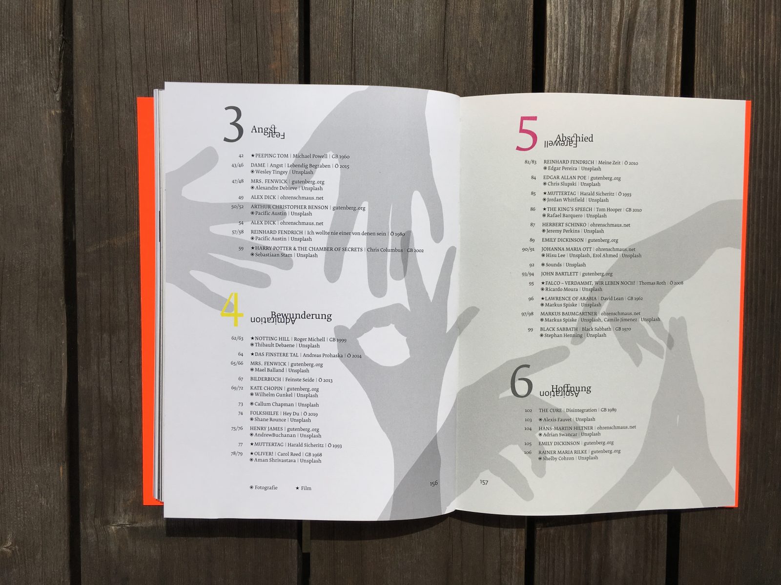
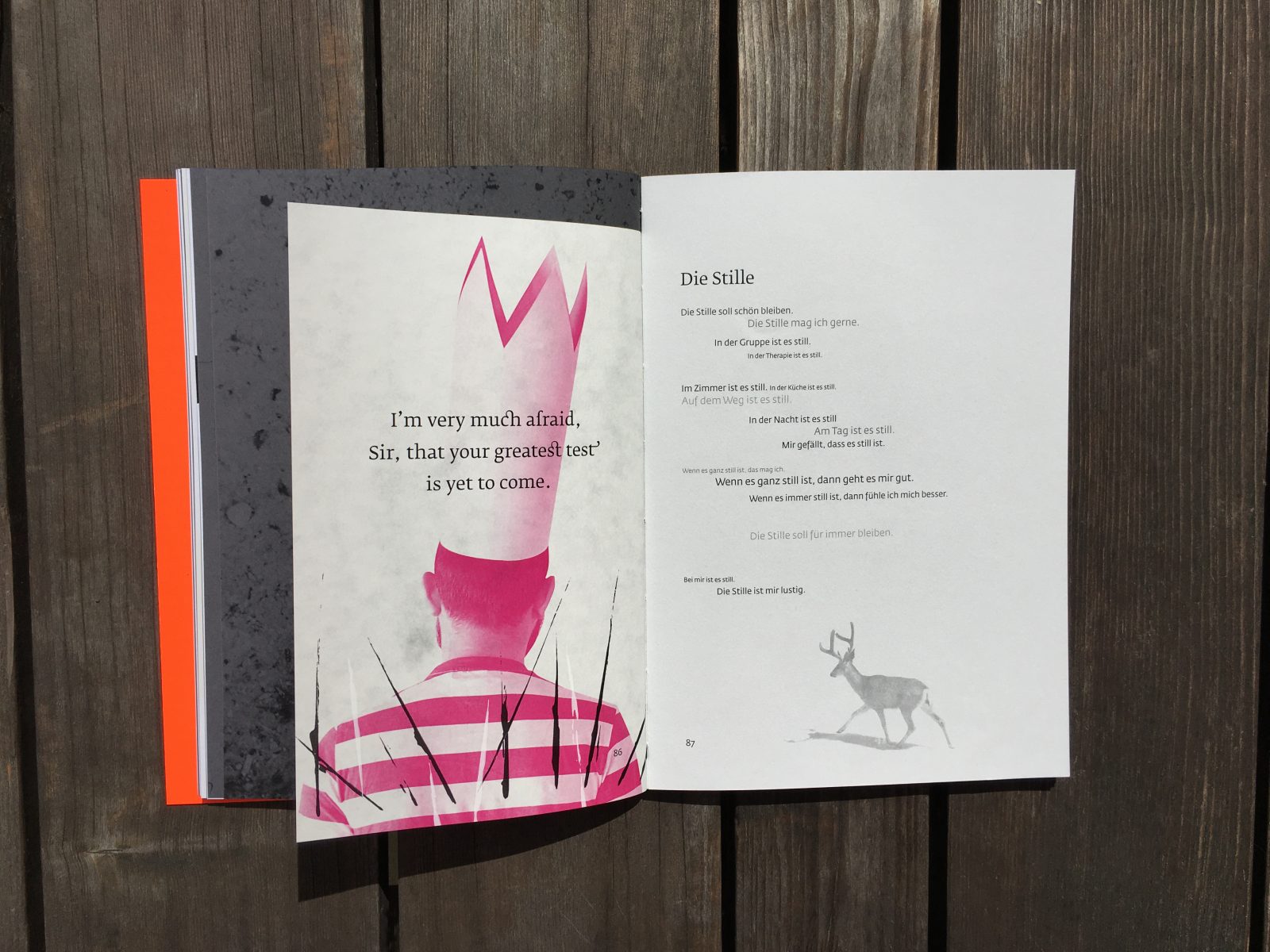
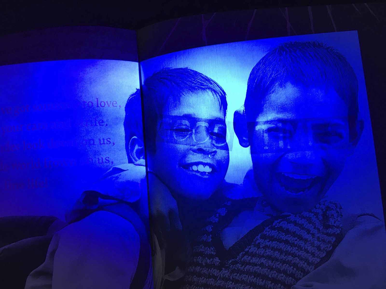
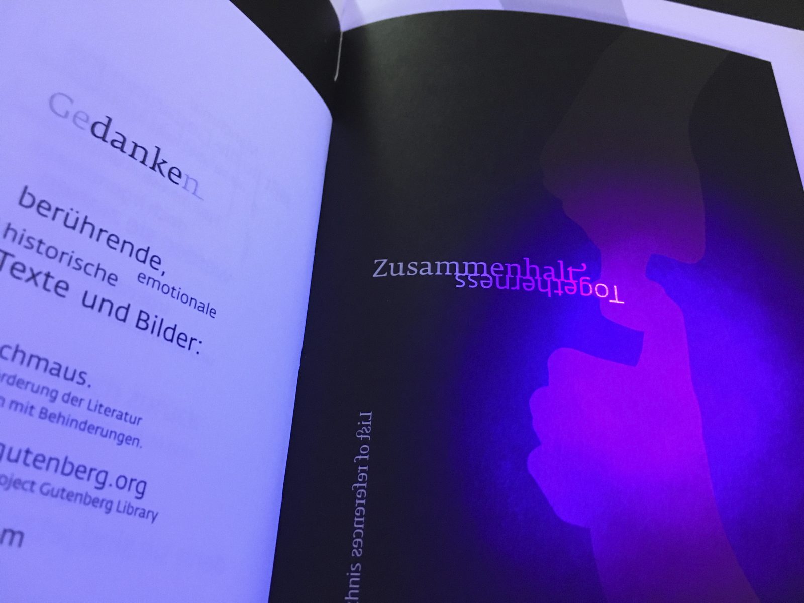
Konstrastprogramm – Opposites Attract is not a linear narrative, but rather an invitation to consider alternatives: a fictional journey told in eight chapters (Indifference, Love, Fear, Admiration, Farewell, Aspiration, Death, Forgiveness), that reflect different stages of relationships, as well as their light and dark sides. Each chapter is introduced by an interpretative hand gesture, which is communication in its most elemental form, and in the book serves as a common thread throughout. Two contrasting stylistic devices, analog illustrations and digital photographic images, are used in the artwork that accompanies the texts. The Konstrastprogramm is a collection of texts that act as an ode to diversity and complexity, as well as individuality, and the potential of contrasts.
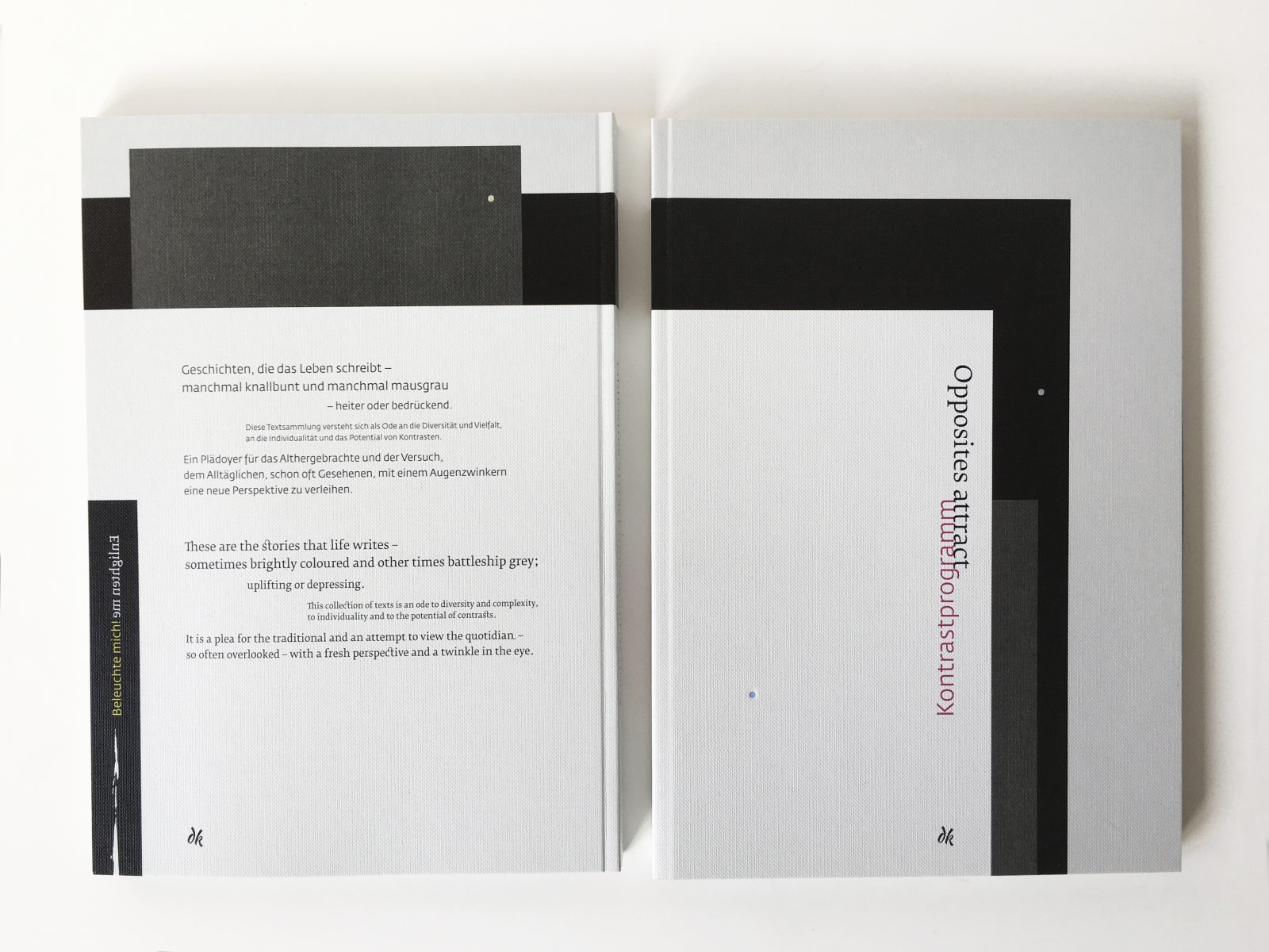
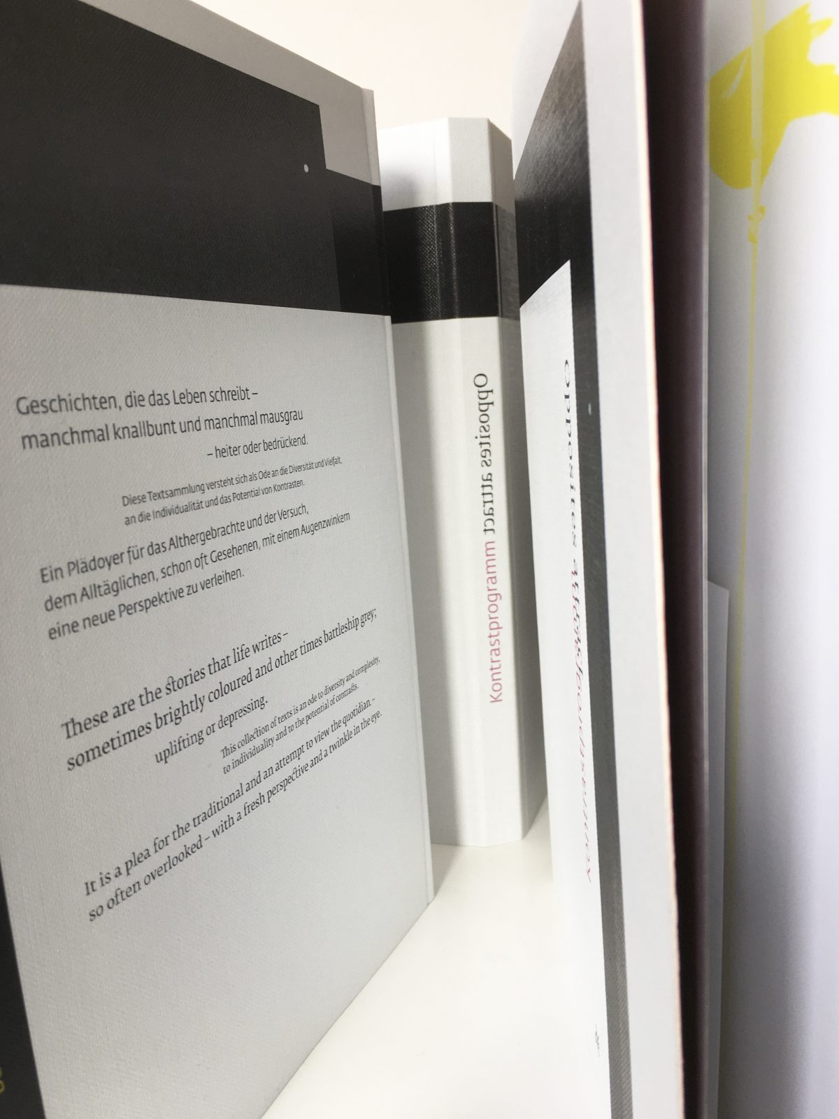
Konstrastprogramm – Opposites attract tells the stories that life writes — sometimes brightly colored and other times battleship grey; uplifting or depressing. This collection of texts is an ode to diversity and complexity, to individuality, and to the potential of contrasts. It is a plea for the traditional and an attempt to view the quotidian — so often overlooked — with a fresh perspective and a twinkle in the eye.
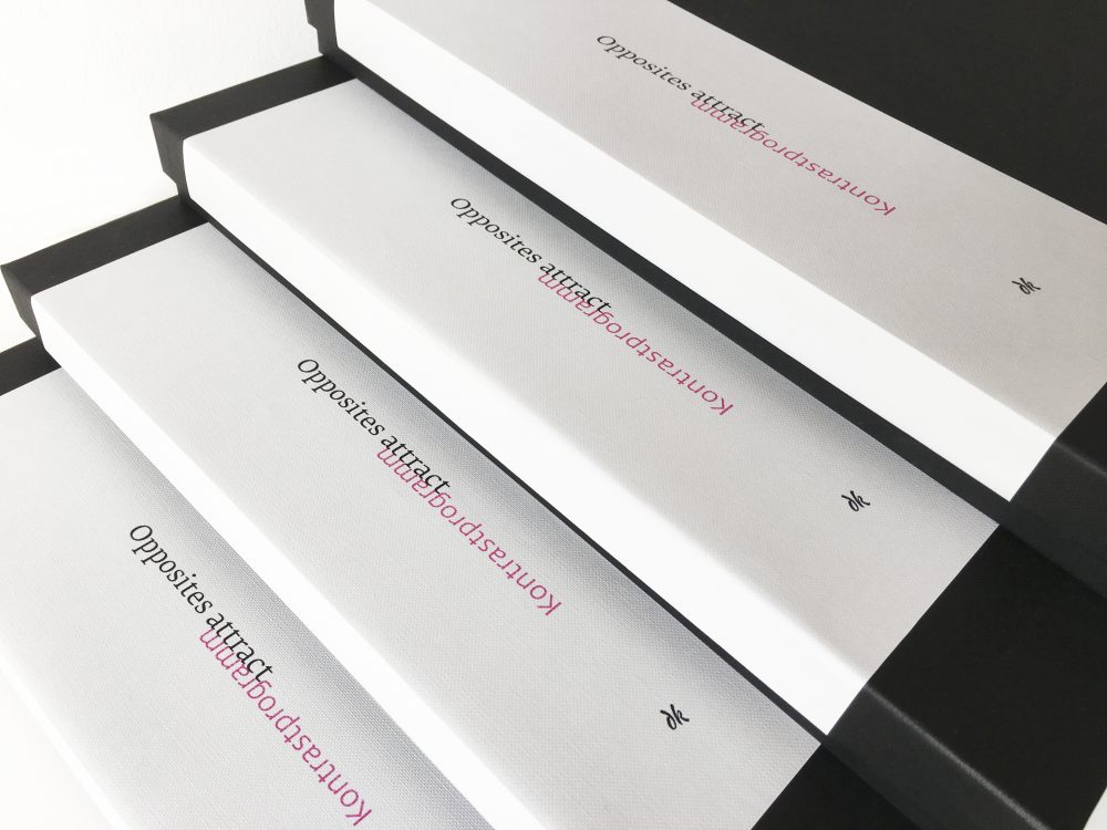
Full of contrast and opposites, Konstrastprogramm sets texts from literally professionals and rap lyrics side by side, printed on papers from opposite ends of the Design Papers collection
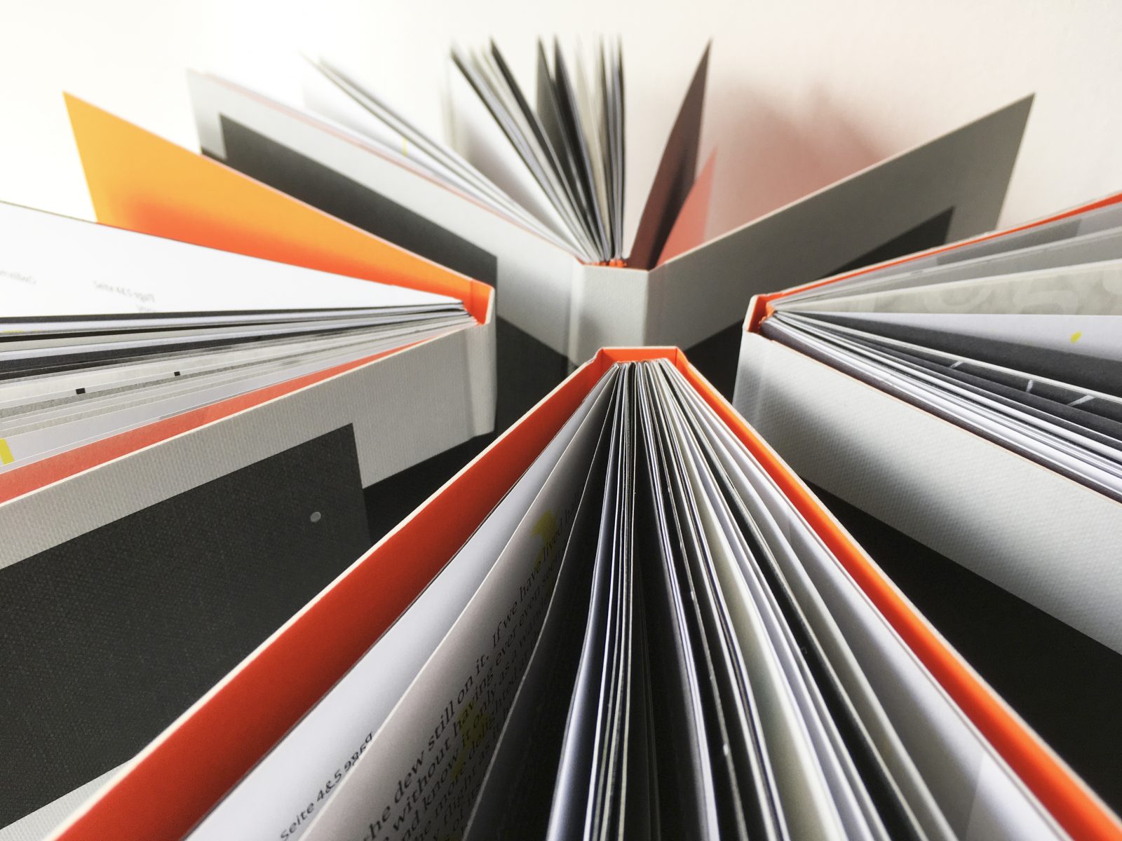
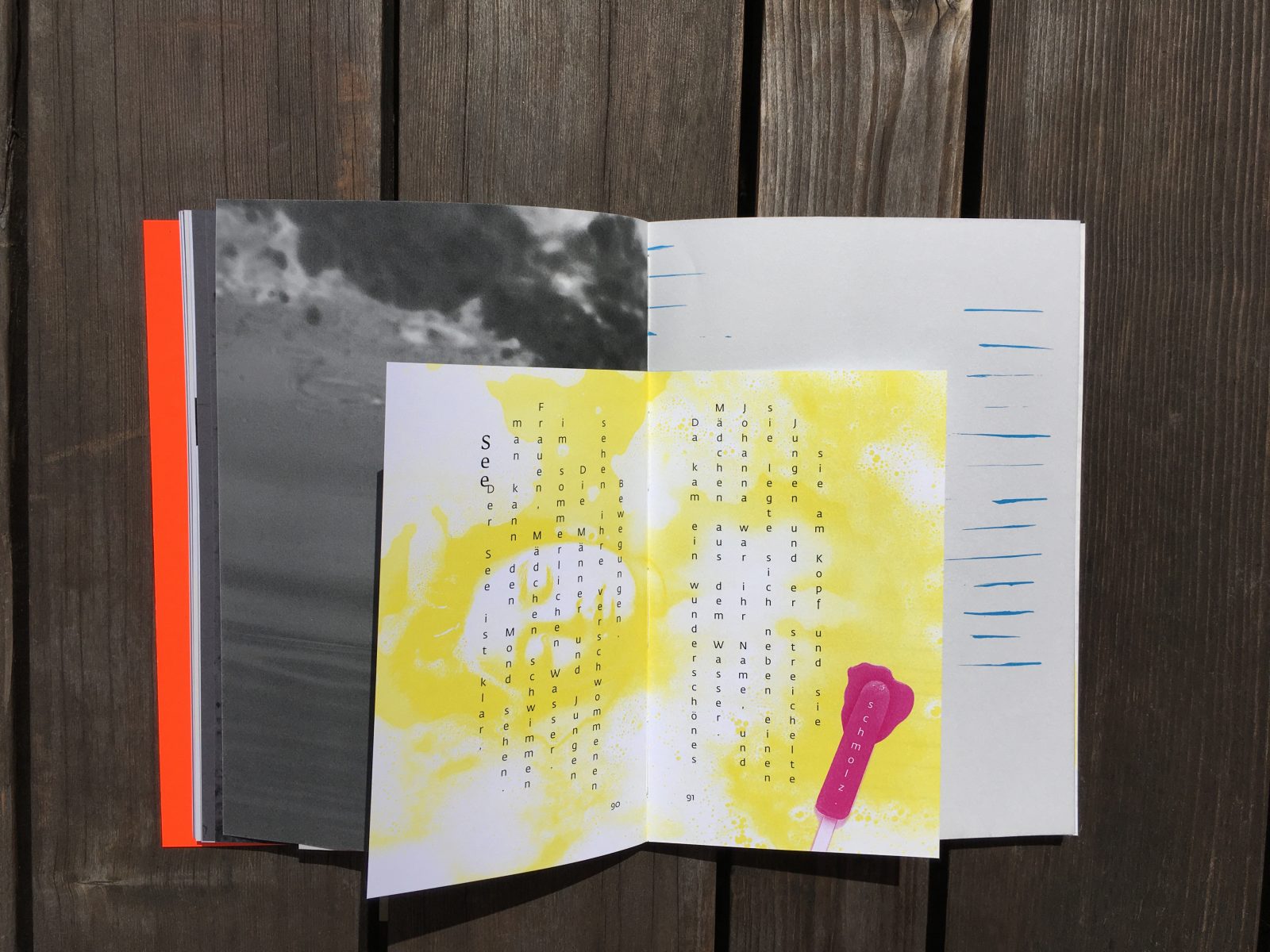
Krause endeavored to embrace a diverse range of papers, colors, and typographic forms: the challenge being to create a visual framework facilitating multiple possibilities. “The paper acts as a mediator, with colors conveying the prevailing mood and providing an optical translation”, the designer explains.
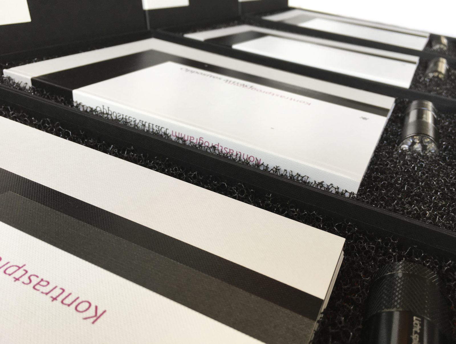
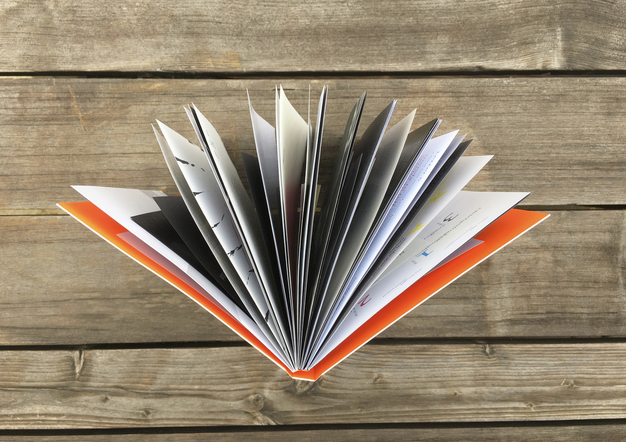
The book’s core is comprised of four physical formats in which the page dimensions typically communicate the text category (short story, poem, song, movie quote). For example, Magno Gloss 135gsm corresponds to the size of a CD booklet, hence the format of the lyrics (120 x 120 mm); and poems can be found on the page format 110 x 180 mm, which corresponds to the size of a typical poetry book.
Yet this seemingly rigid constraint is subverted by the discretionary reassignment of a handful of papers to other formats in order to emphasize the themes’ mutuality: without light, there is no shadow.
 The two contrasting sides are created with papers chosen from opposite ends of the spectrum in Europapier Group’s Design Papers Collection. There is the “bright world”, comprised of Pergraphica® High White Rough 120gsm, Magno Gloss 135gsm, Magno Satin 135gsm, Via Linen pure white 120gsm, and the “gloomy world”, which is made of Pure Coton Smoke 120gsm, Esprit de Nature ombre 110gsm, Color Style Recycling 120gsm, as well as Pergraphica® Infinite black 120gsm – all papers exclusively available at Europapier Group. “I felt, however, that the design process also necessitated a purely optical transition – the marble decor paperwhite 90gsm was added”, Krause further explains.
The theme carries through from design to content, with different wordsmiths contributing to the surprisingly varied text sequence of the book. Literary works by renowned authors are side by side with passages by amateur writers, as are rap lyrics and movie quotes. This potpourri of composition styles — as colorful as life itself — ensures an abundance of entertainment.
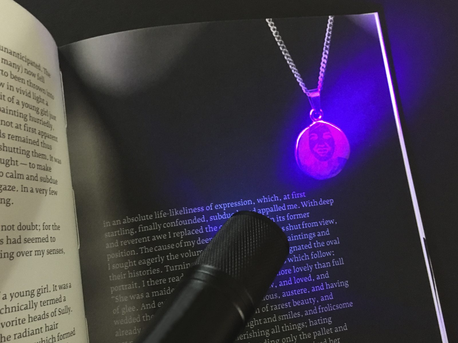
“The use of Invisible Red prints is a way to show that not everything is always obvious and transparent. The reader can illuminate certain areas with a UV lamp or leave them hidden: the book can be experienced individually”, Krause says. Fluo Red and Pergraphica® High White Rough 120gsm, and the UV lamp as a tool demands interactivity. “Image areas in the spot color Invisible Red make the book subjectively tangible, whereby the pace and intensity of the confrontation are left to the reader: which parts to illuminate and which to leave in the dark”, further explaining. As a visual implementation of the spot color Invisible Red, red luminescent paper is used on the inside of the cover — an invitation to immerse oneself in the world of fluorescent colors.