Creative Agency Moloko has offices both in Florida and Vilnius, and has recently been included in the Top-15 Creative Design Agencies in the world. Moloko’s talented team creates high-quality branding and communications work ranging from advertising to corporate identity and packaging design, video, animation, and much more, based on their unique branding methodology – evidence-based design. The technique allows the agency to analyze brands properly and grow them using design instruments.
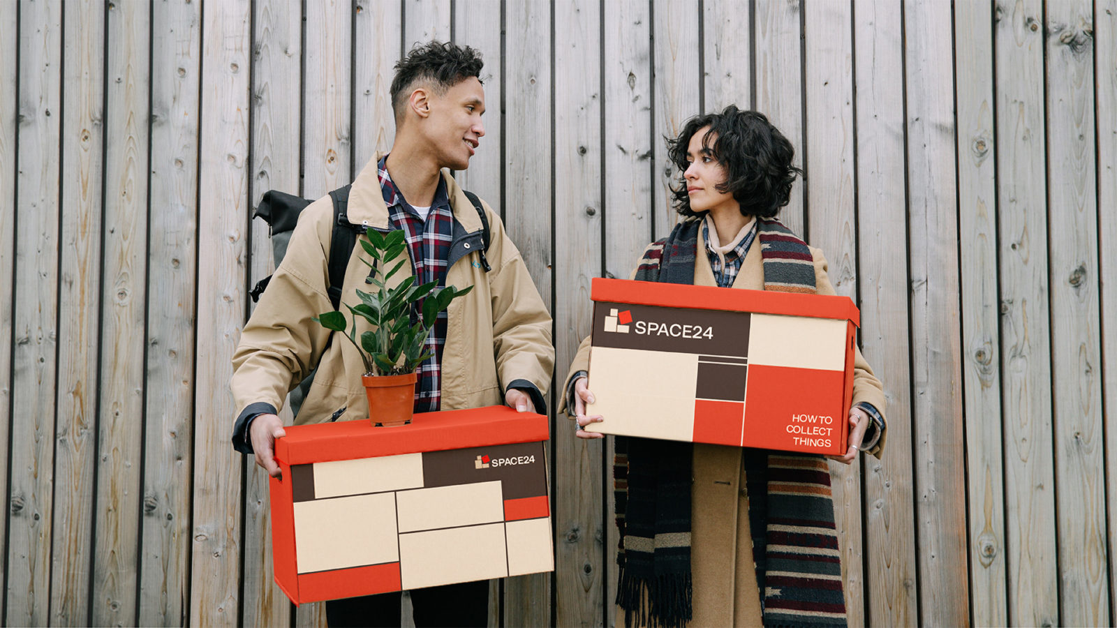
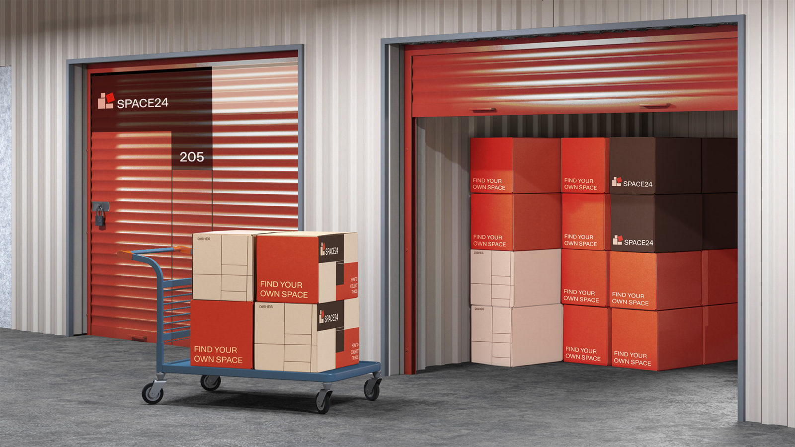
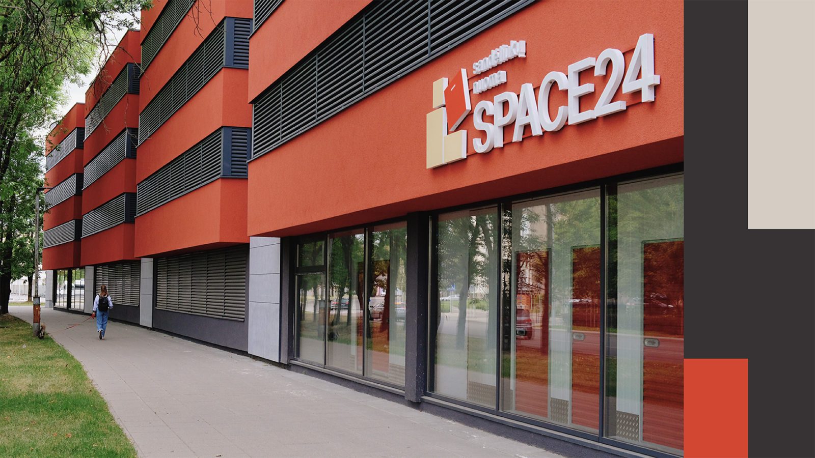
Seeking to understand the philosophy and soul of the brand they work with, and offer something that will definitely please both their client, as well as their client’s client. And in turn for this dedication, brands trust their ideas, experience, and consciousness free from stereotypes. On such brand is Space24, the largest modern and secure self-service storage facility, providing more than 800 storage units to meet a wide range of needs of businesses, households, and students.
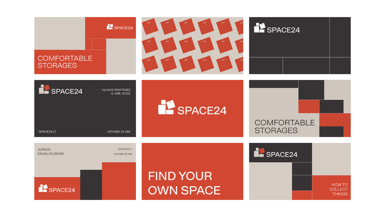
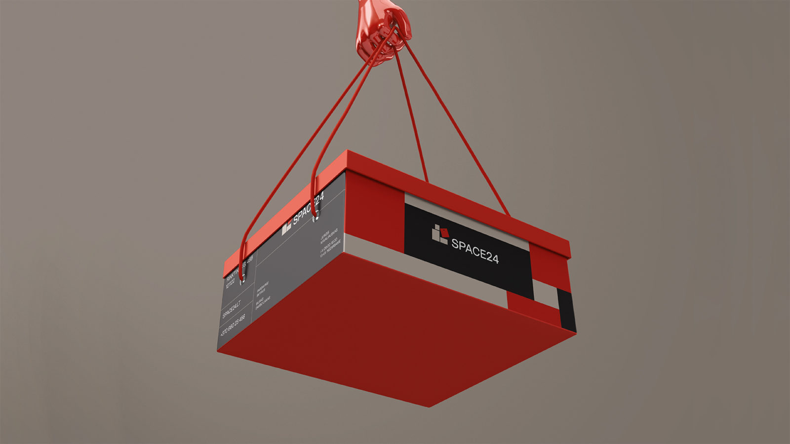
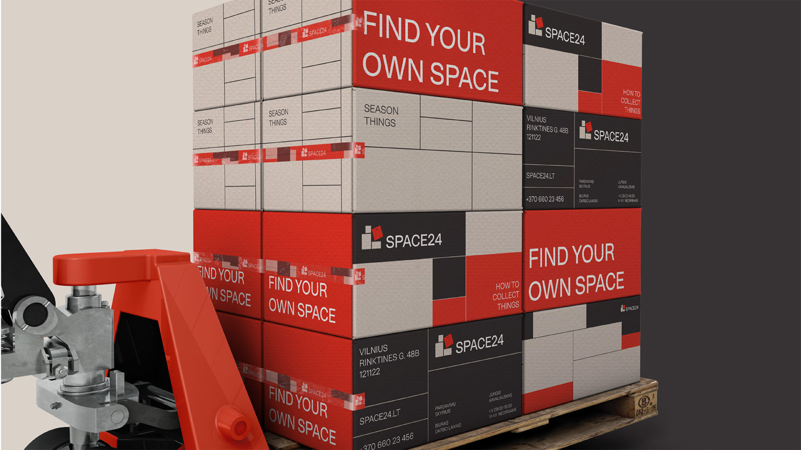
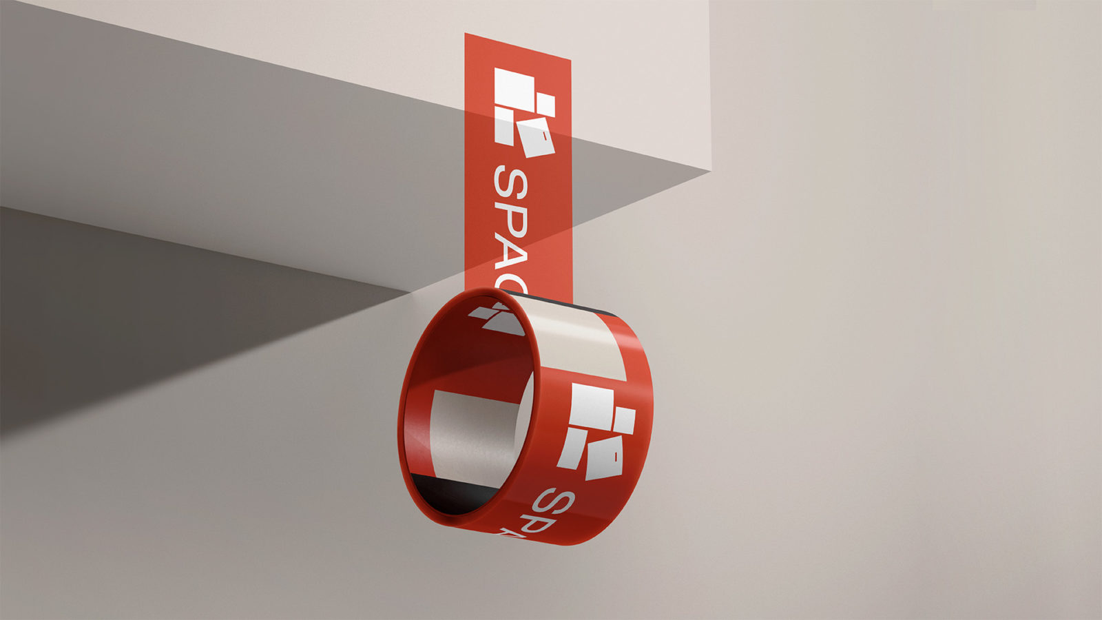
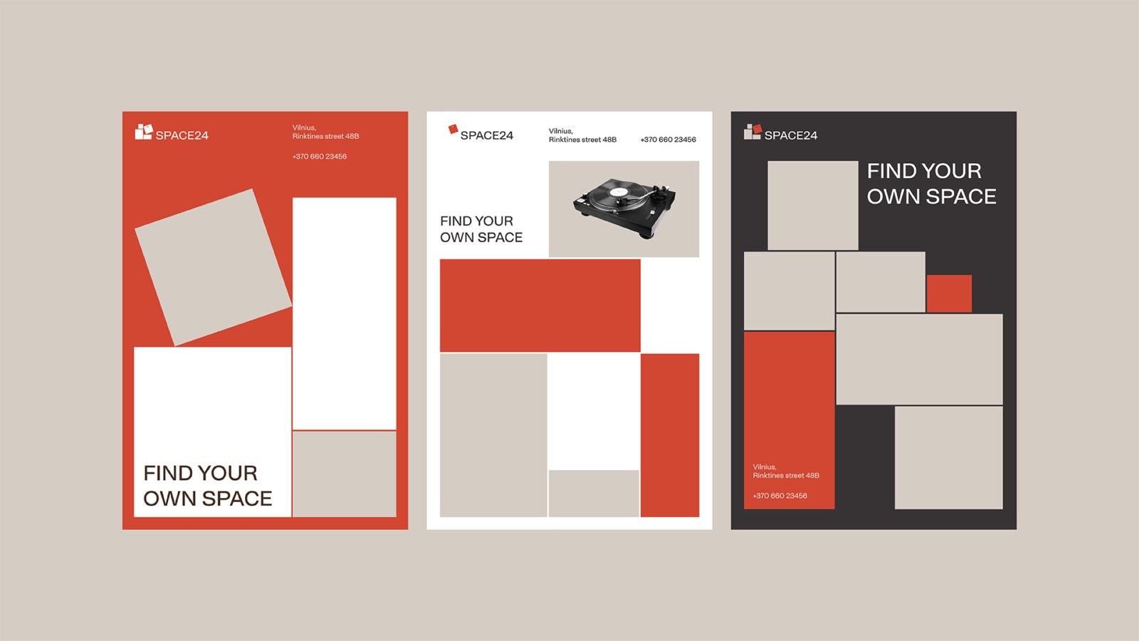
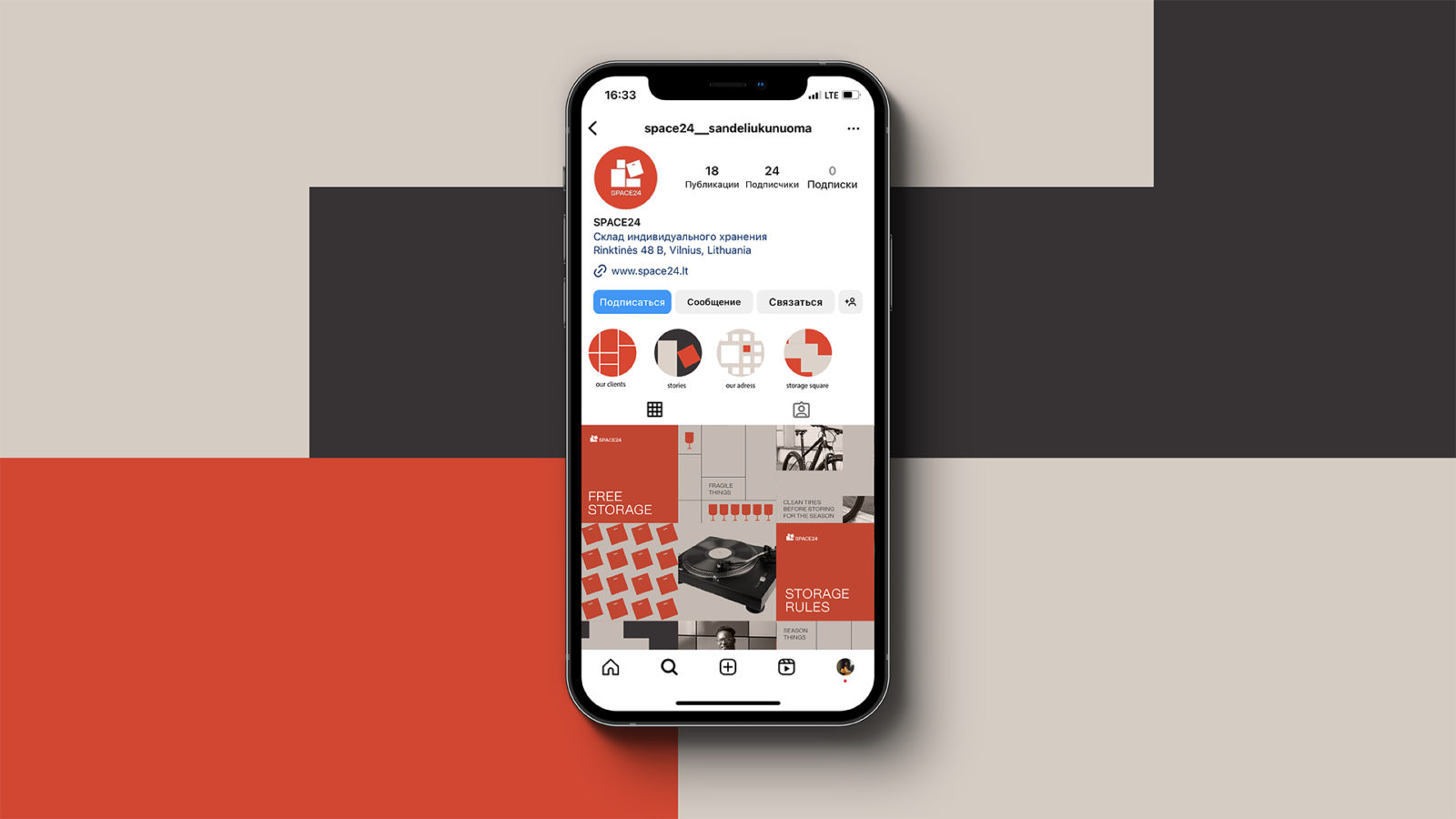
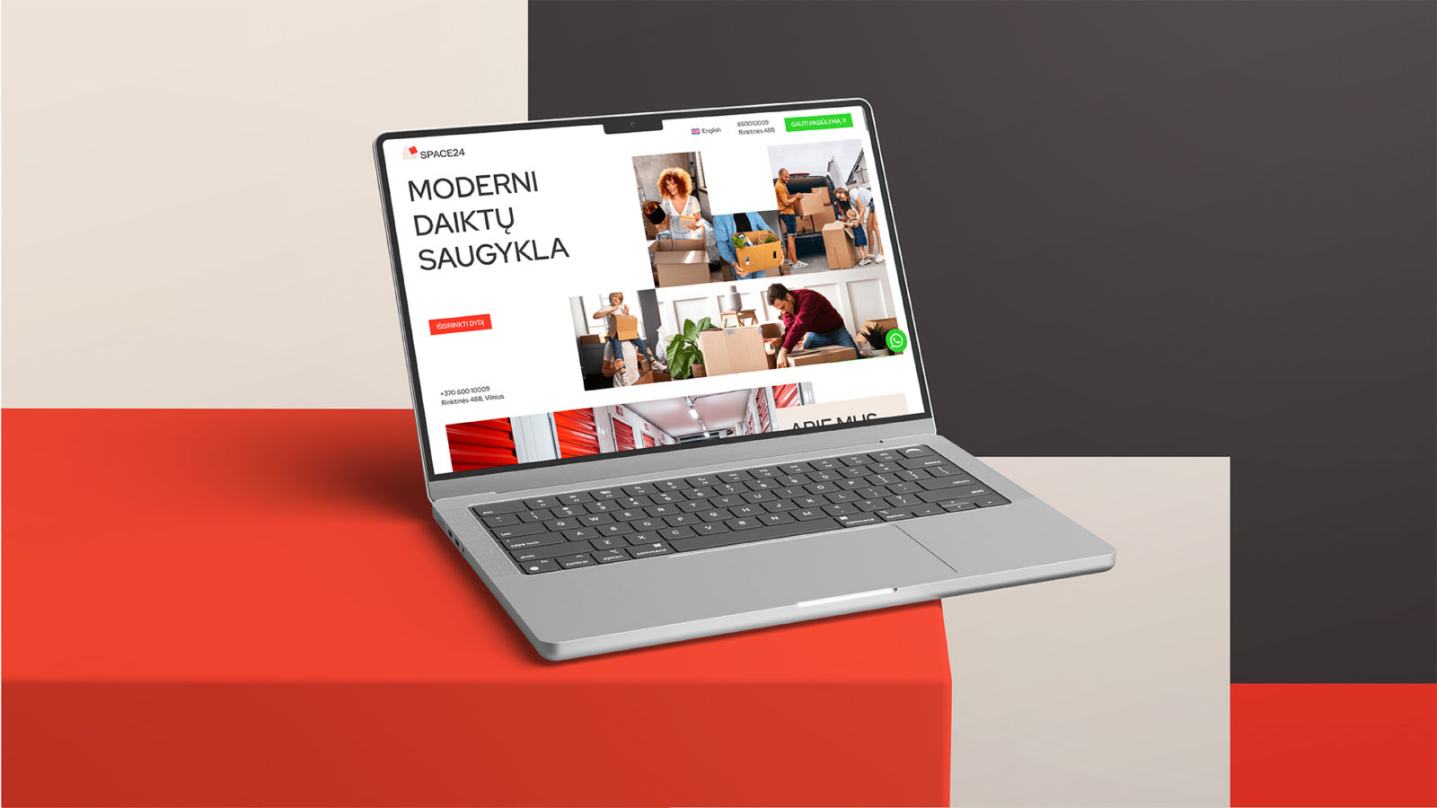
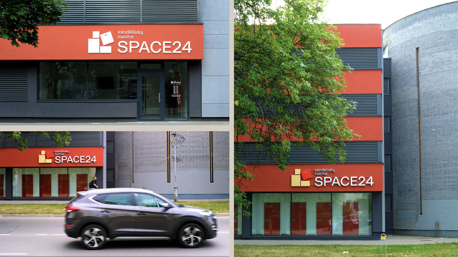
The team behind Space24 asked Moloko to develop a unique corporate identity that would reflect the benefits, style, and functionality of their service. The goal of the task was to create a recognizable and attractive brand “Space24”, which would be associated with reliability, modernity, style, and organization of storage.
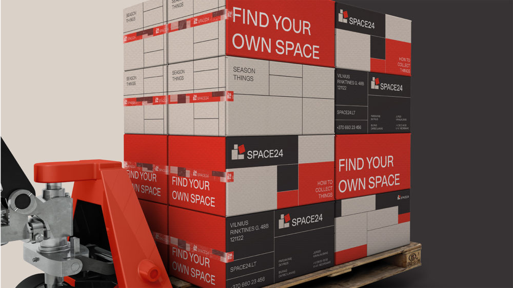
Everyone has dealt with the problem of storing, putting away, or collecting things, at some point in their lives. Some of us have had to deal with moving, packing and unpacking, or managing piles of boxes that grow into unstable mountains if left unsupervised. Or when you are packing the car for a trip and the stuff you had planned to take with you just won’t fit, or packing those groceries you bought in a slightly too small of a bag. Sometimes this process turns into a puzzle or an overwhelming quest you have to defeat.
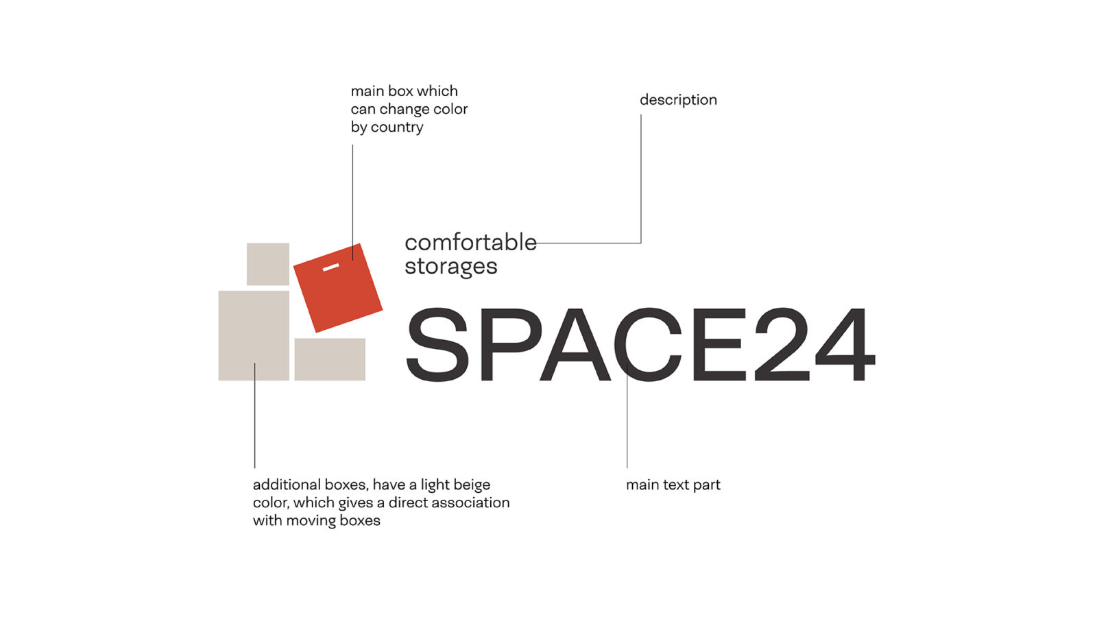
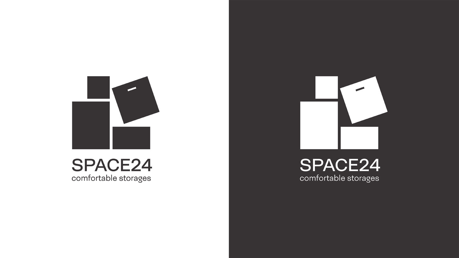
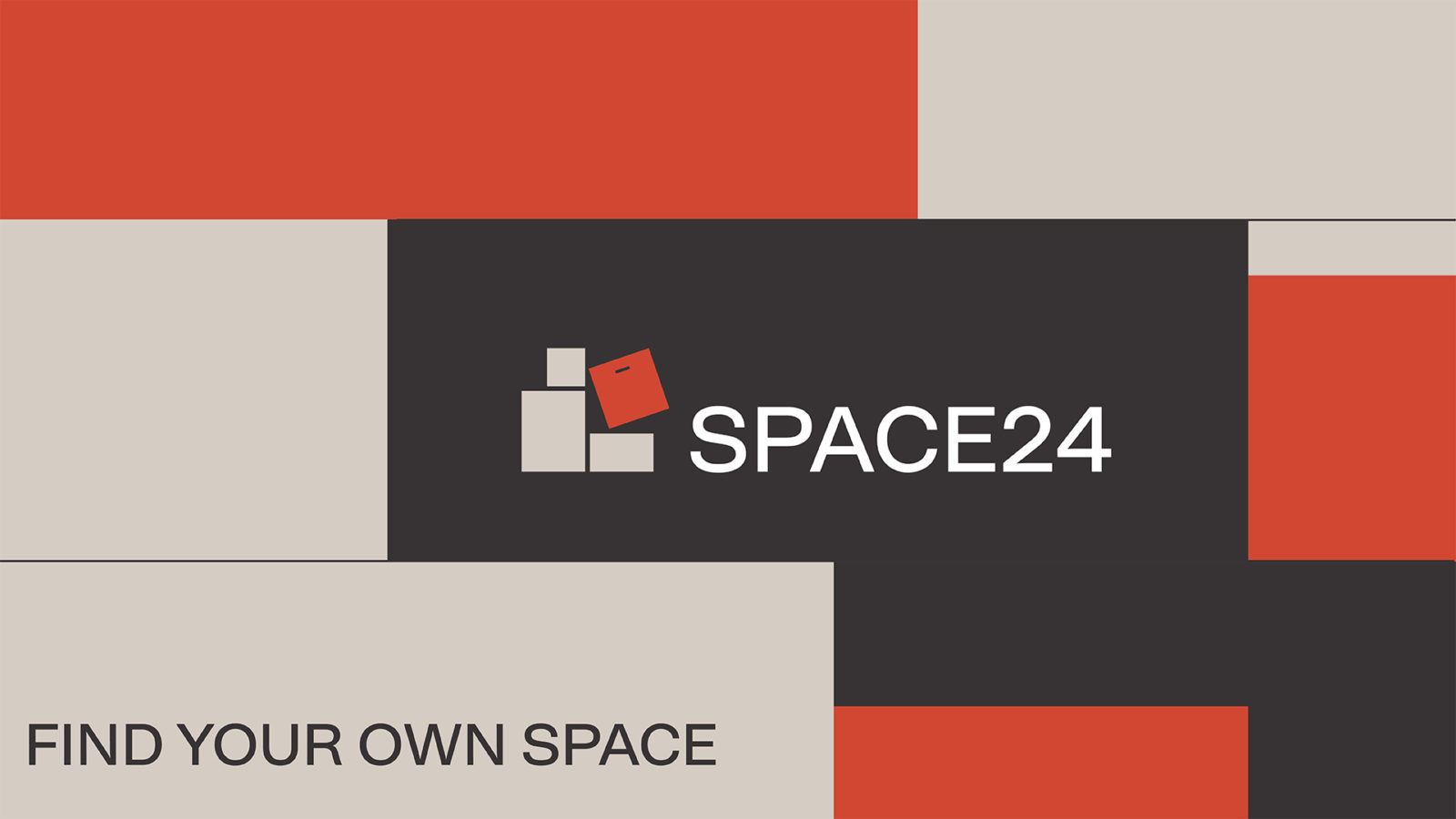
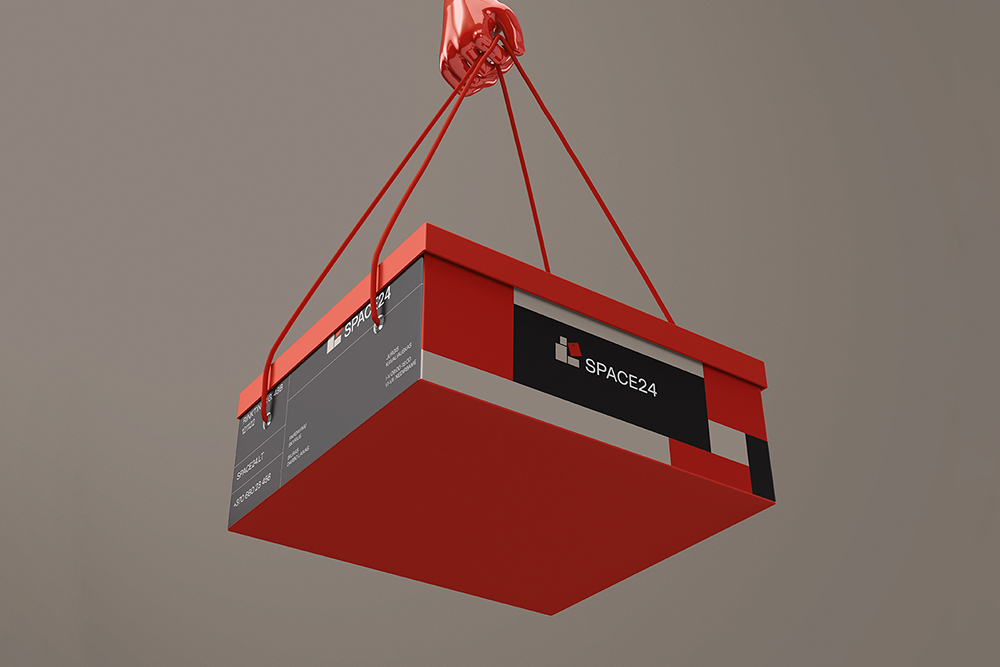
The boxes themselves have geometric shapes consisting of a different number of square blocks, we laid them in horizontal lines without spaces, as we need to do in the Tetris game.
For the Space24 concept, Moloko has taken the idea of the game Tetris, a prime example of a puzzle game – where you have to use your wits and speed to put small squares in orderly lines, as efficiently and correctly as possible and prevent the accumulation of blocks – as their source of inspiration.
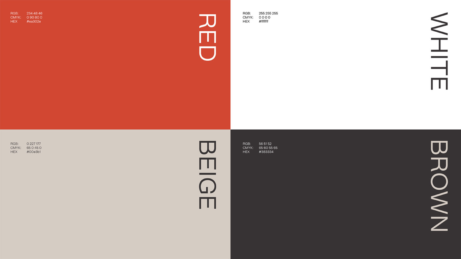
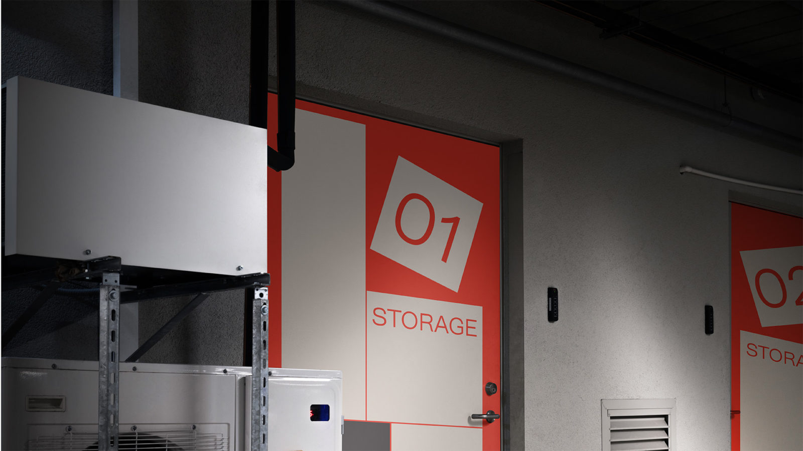
“When developing the logo, we used boxes as a basis, as an attribute that is necessary for storing things. While the main colors of the boxes in logotype were made in light beige, to create an association with moving boxes. However, the main box on the logo is a different color, which may change color depending on the country. The boxes themselves have geometric shapes consisting of a different number of square blocks, we laid them in horizontal lines without spaces, as we need to do in the Tetris game.” Moloko writes. See the whole branding concept below, and follow the agency on Instagram for future inspiration.