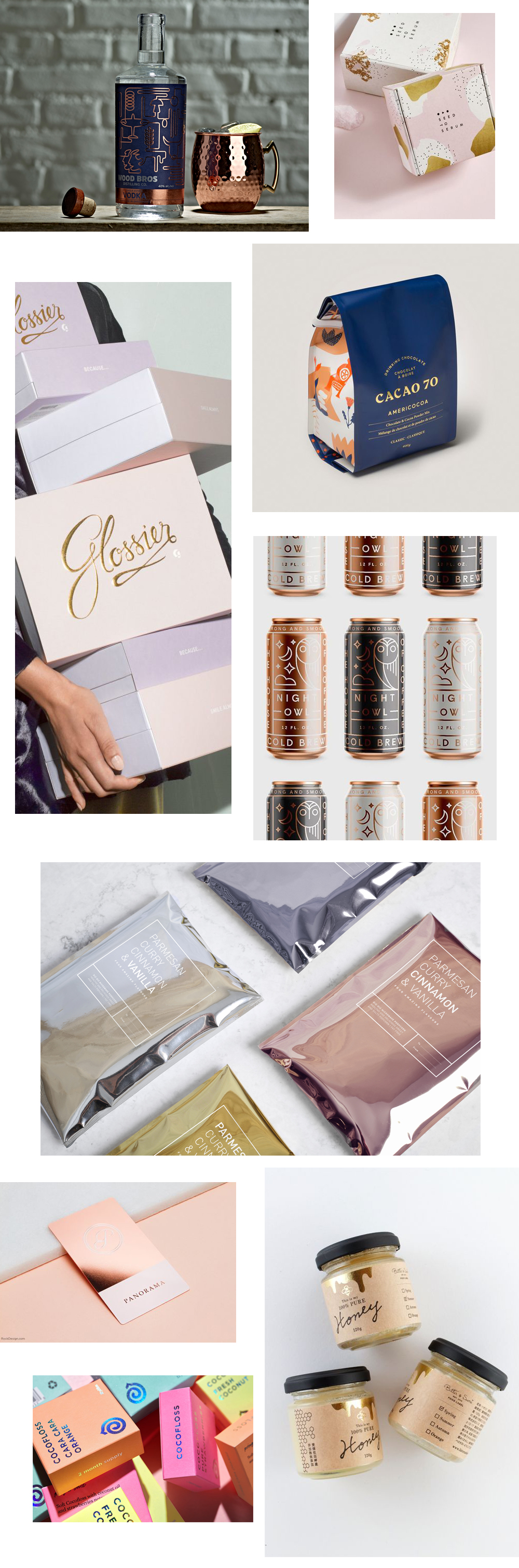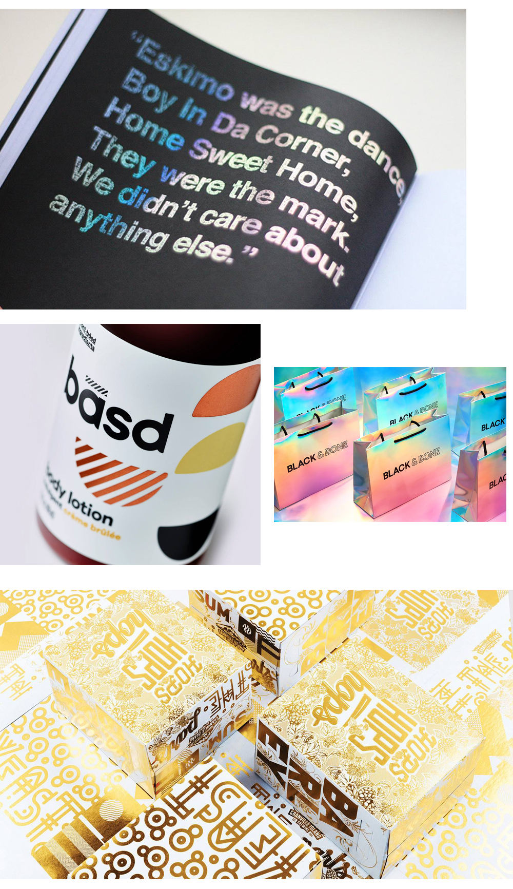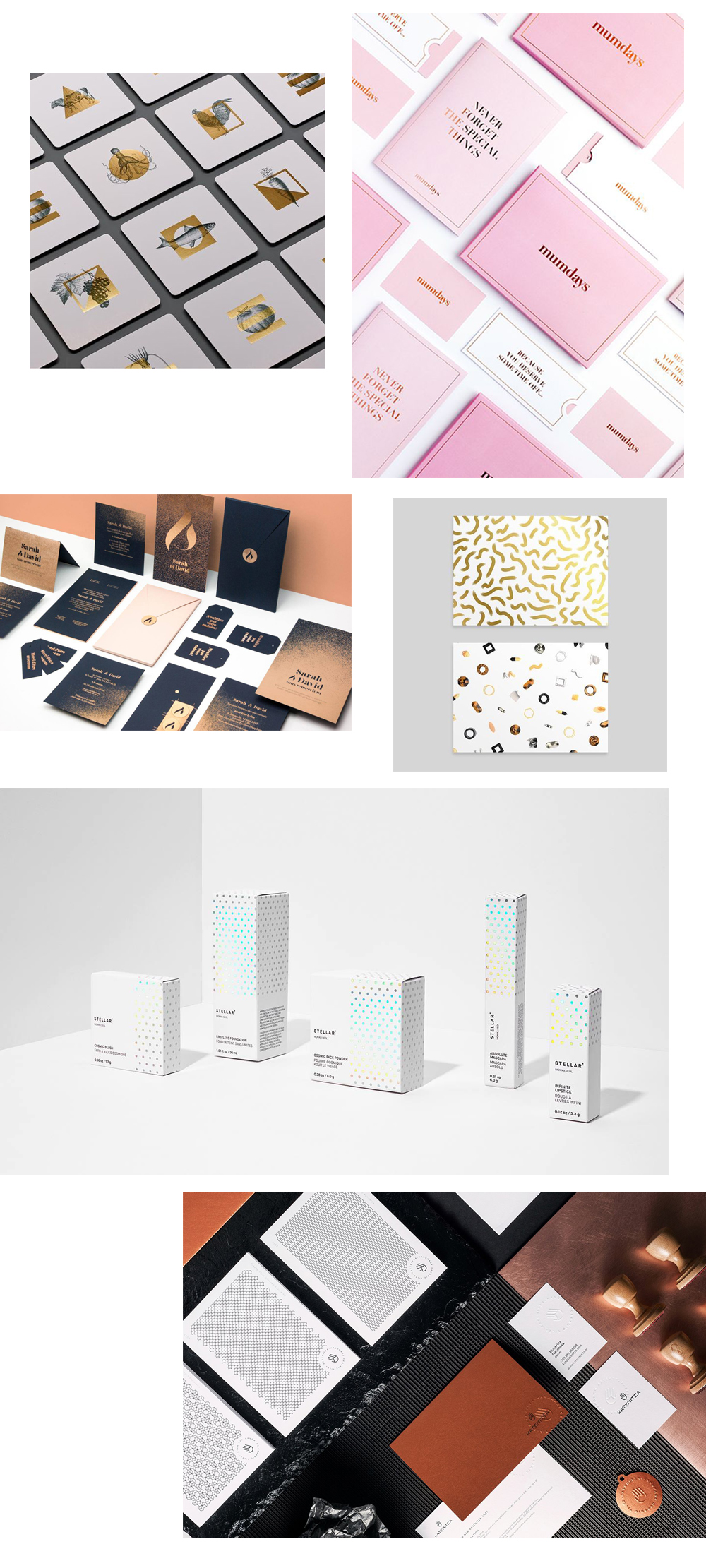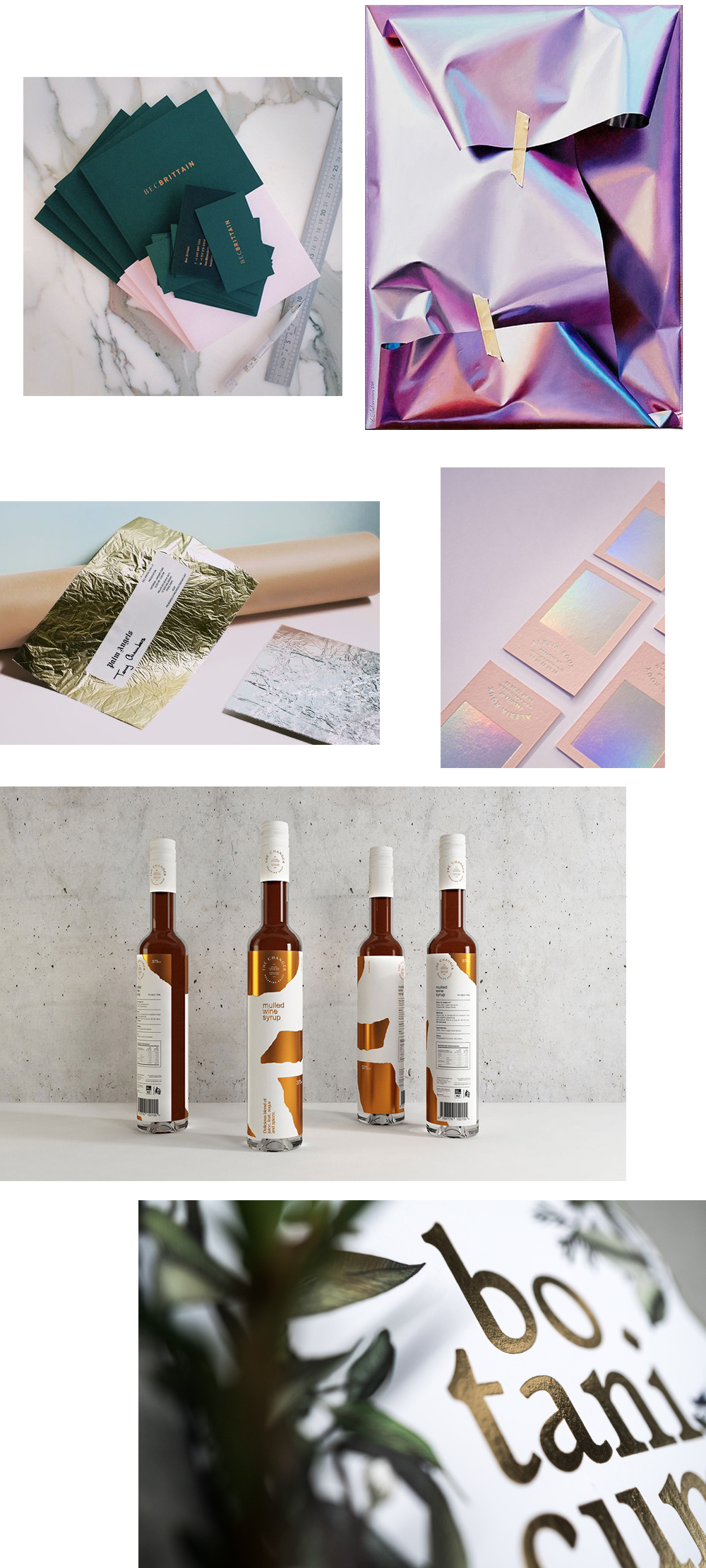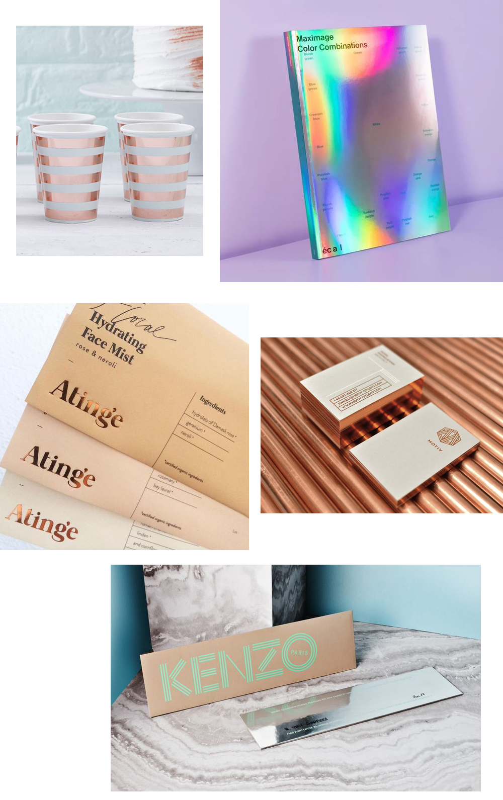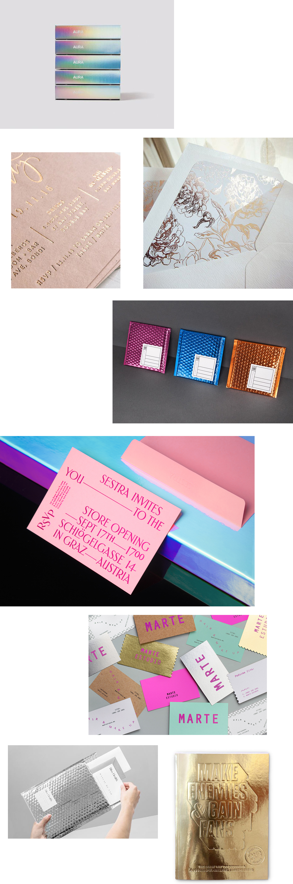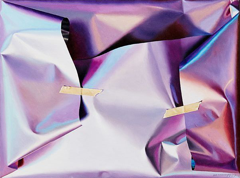
Metallics came into the scene a few years back with a bang and took over everything from interior design to packaging. But while we all might have thought of them as just a nostalgic trend re-surfacing from the futuristic 60’s or the more recently experienced Millenial spice girls-esque era, this time they came to stay. It all started when natural metallics like copper and rustic gold started popping up in details but rapidly escalated into holographic and iridescent foils and ultra-shiny chrome coats. Something that was once thought-of as extravagant, or modern, is now an effect almost as common as Helvetica in the world of typefaces. But something that might have lost its exclusiveness is still creating a unique haptic and visual illusion – that little extra magic which elevates a design to a contemporary taste.
But as the hype has reached its peak momentum, the love for metallics has not died. Rather it’s growing to its full potential, as every season it morphs into a new shape like a chameleon. This year metallics are once again seen in the mix, either as the minimalist accents or more so than ever in its boldest and audacious forms, proving it truly can do it all. I adore all the imaginative and ingenious forms it’s being used in – example in these 37 beautiful branding and packaging concepts below.