Twenty Sparkling Examples of How Gold Foil Can Elevate Any Paper Design

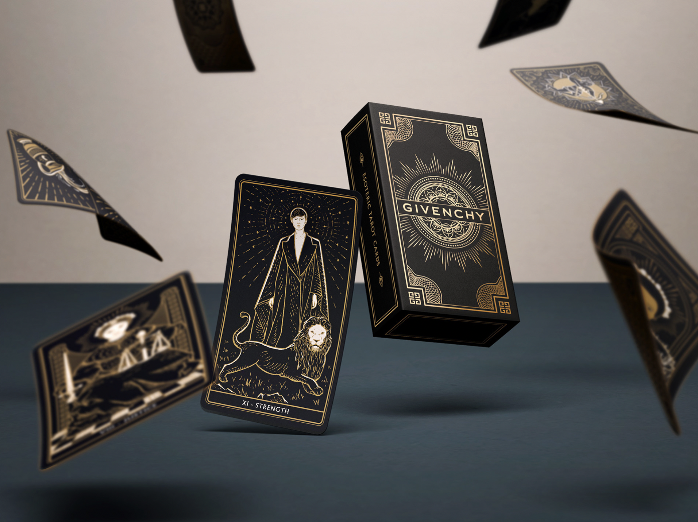
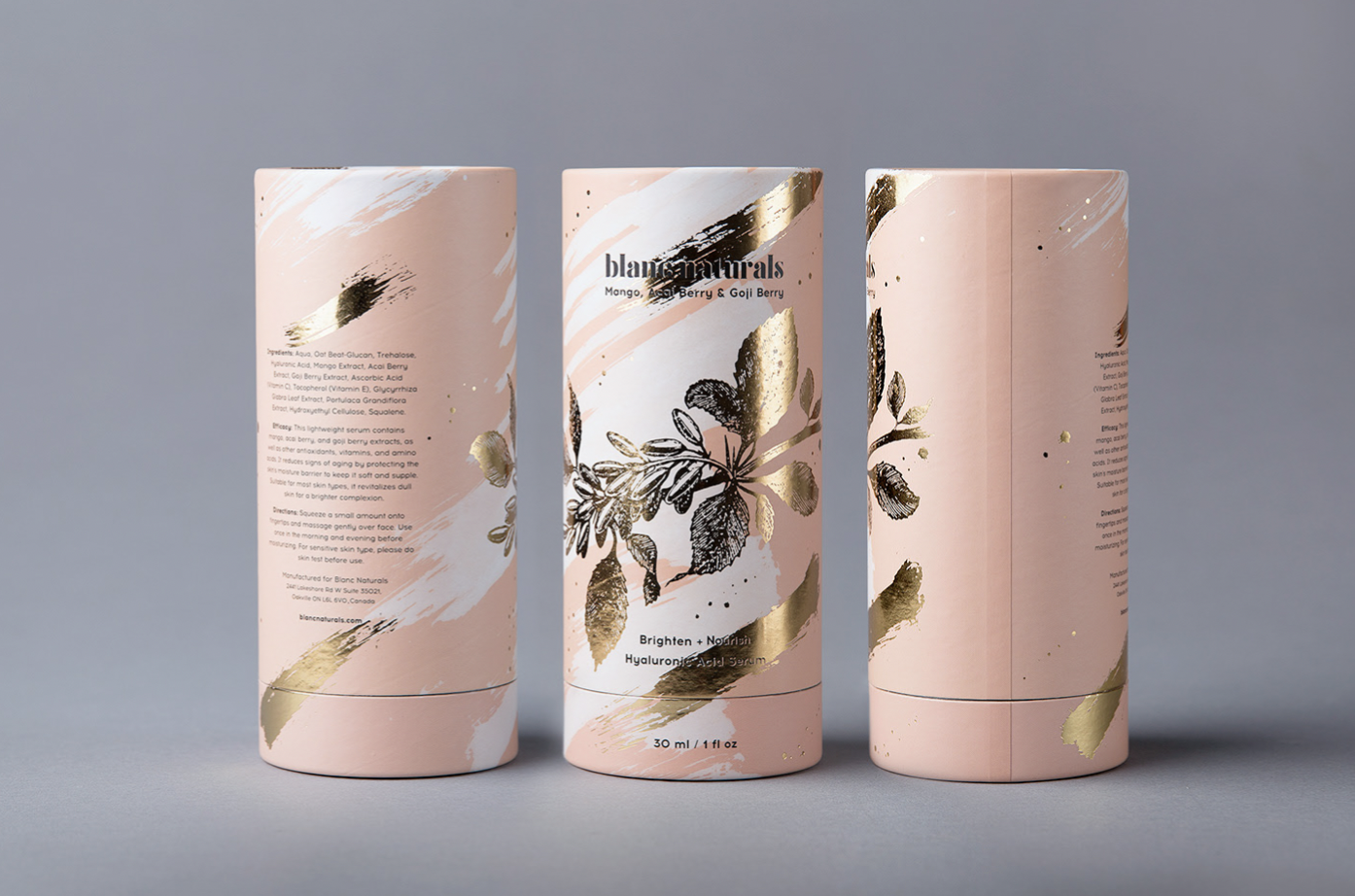
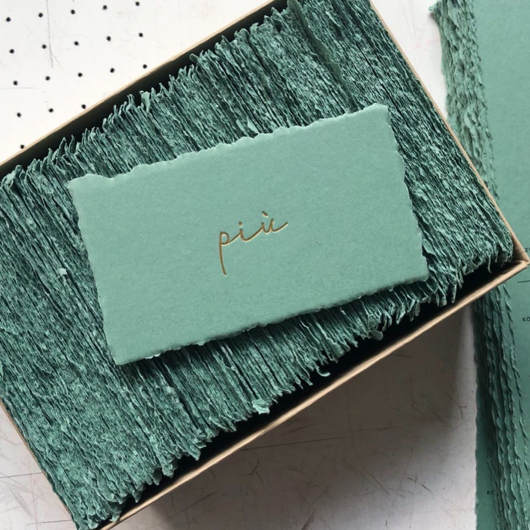
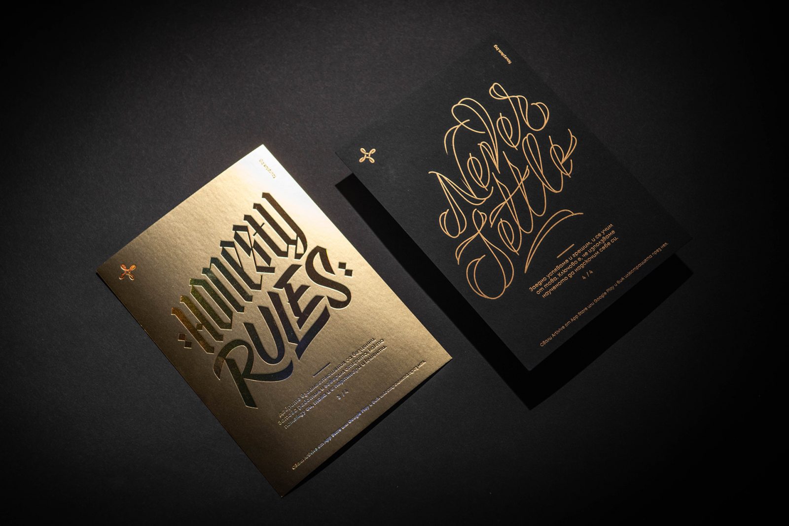
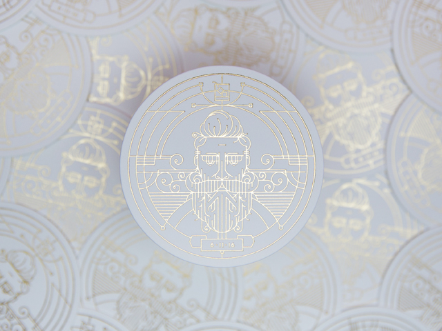
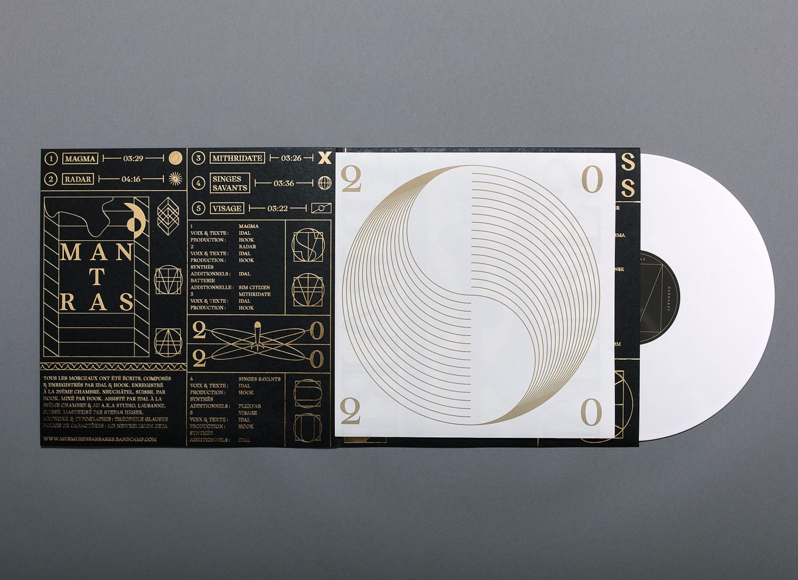
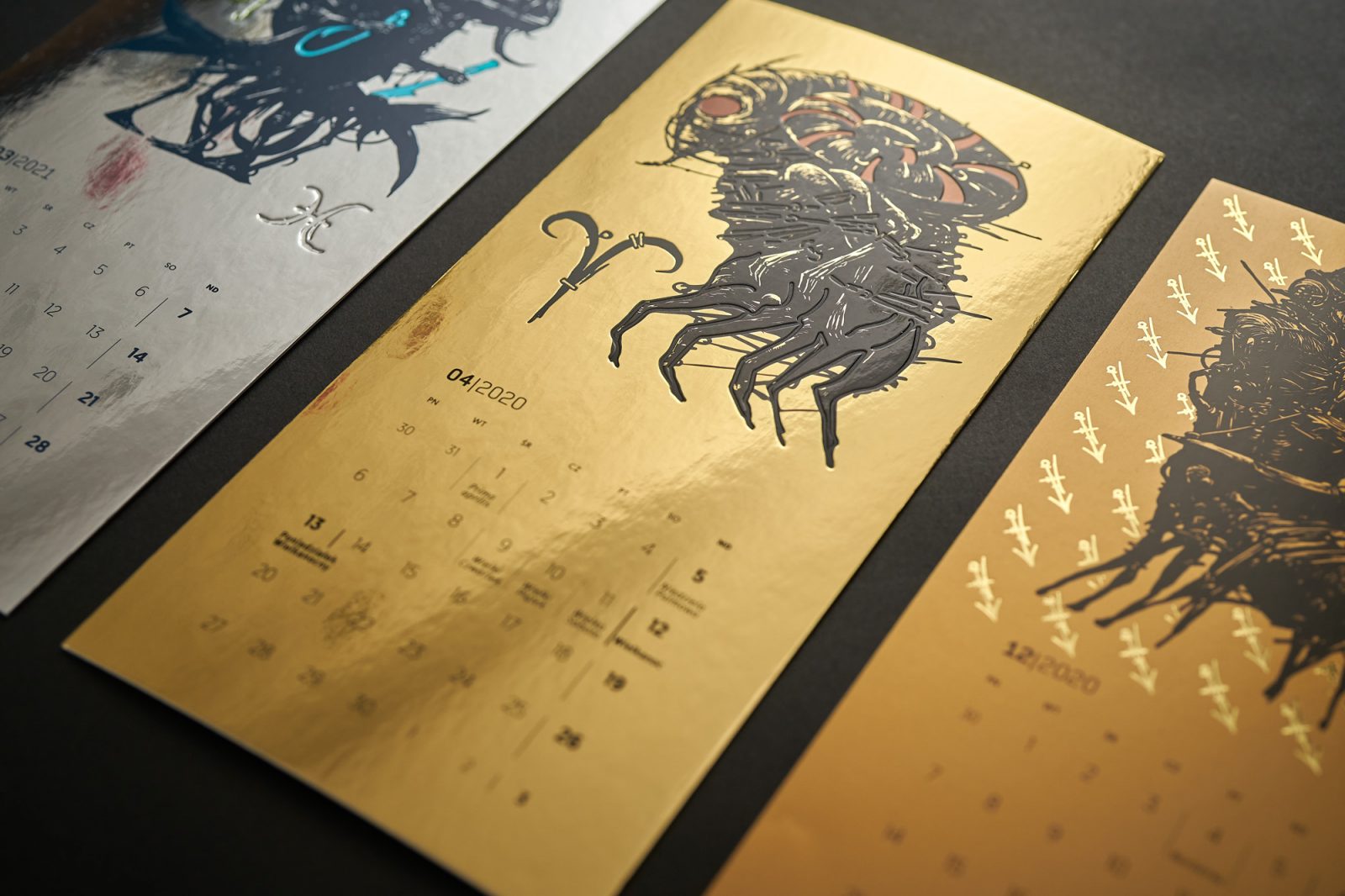
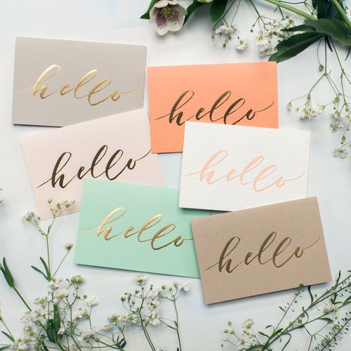
Gold foil, the one printing technique that literally has the Midas touch in elevating a design to a luxurious, elegant branding experience. Even most simple, minimal designs can become the center of the focus with a gilded finish. Whether it’s used in minute detail, or in an extravagant way, the gold foil is the go-to printing option when you want something irresistible and eye-catching.

Beautiful examples of gold foil in use, by Pop & Pac Studio and Nicety Studio

An ancient printing technique that adds a touch of contemporary glamour and charisma

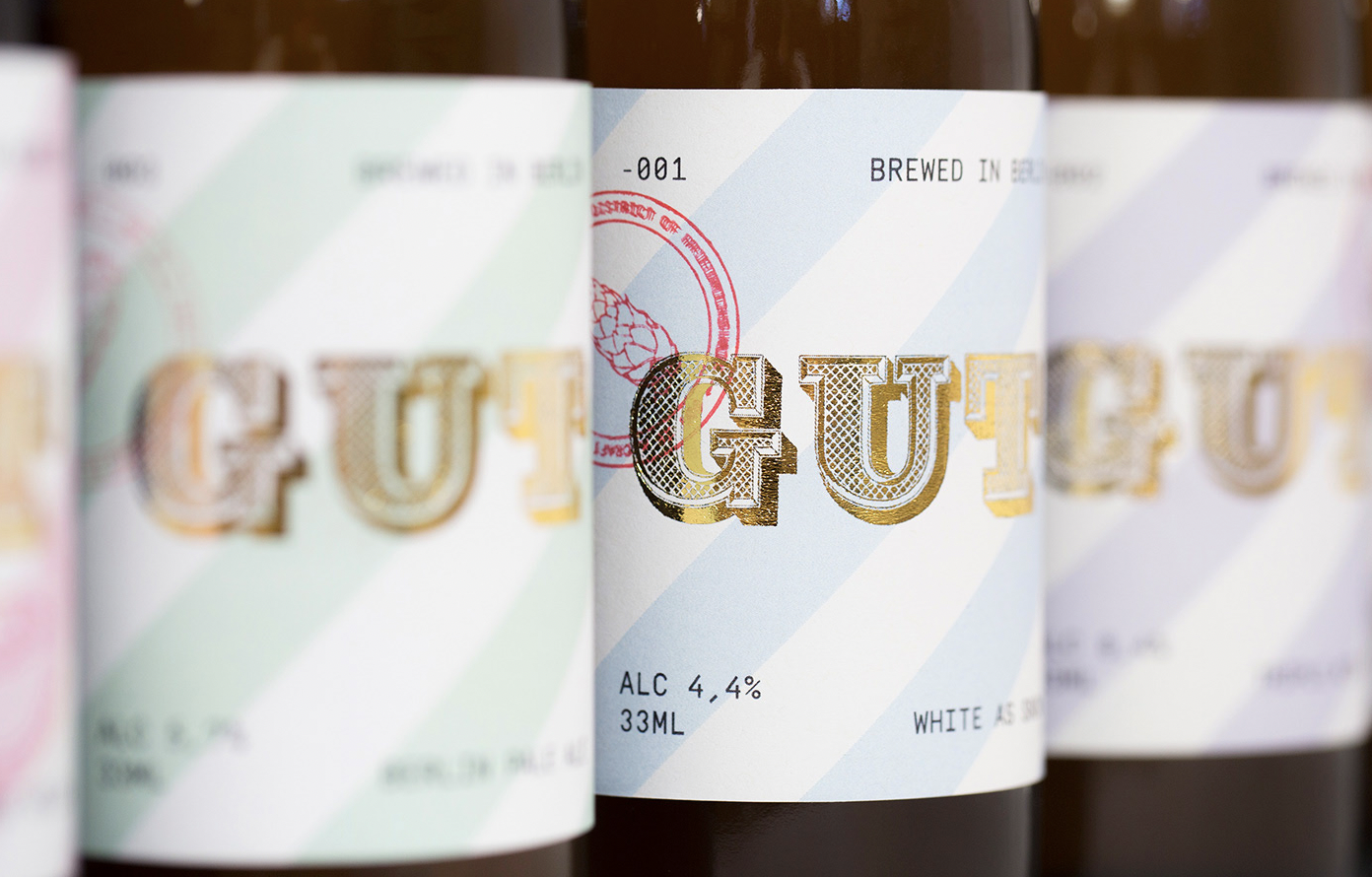
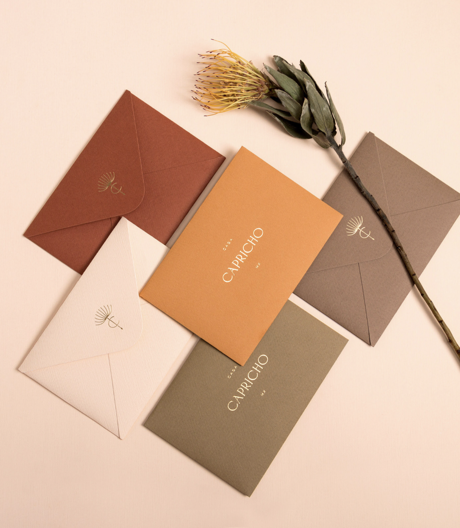
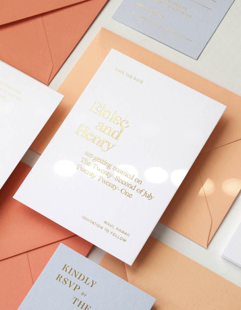
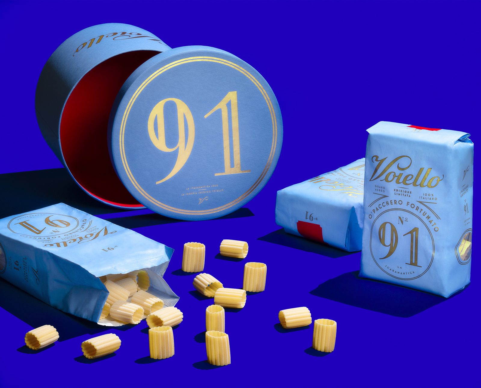
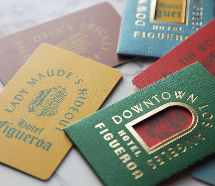
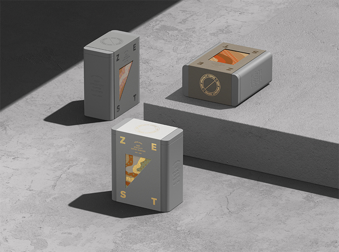
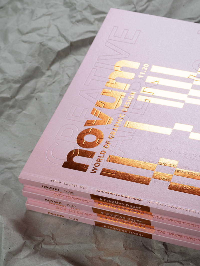
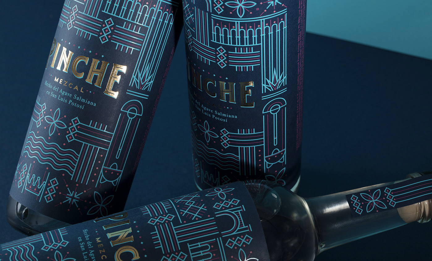
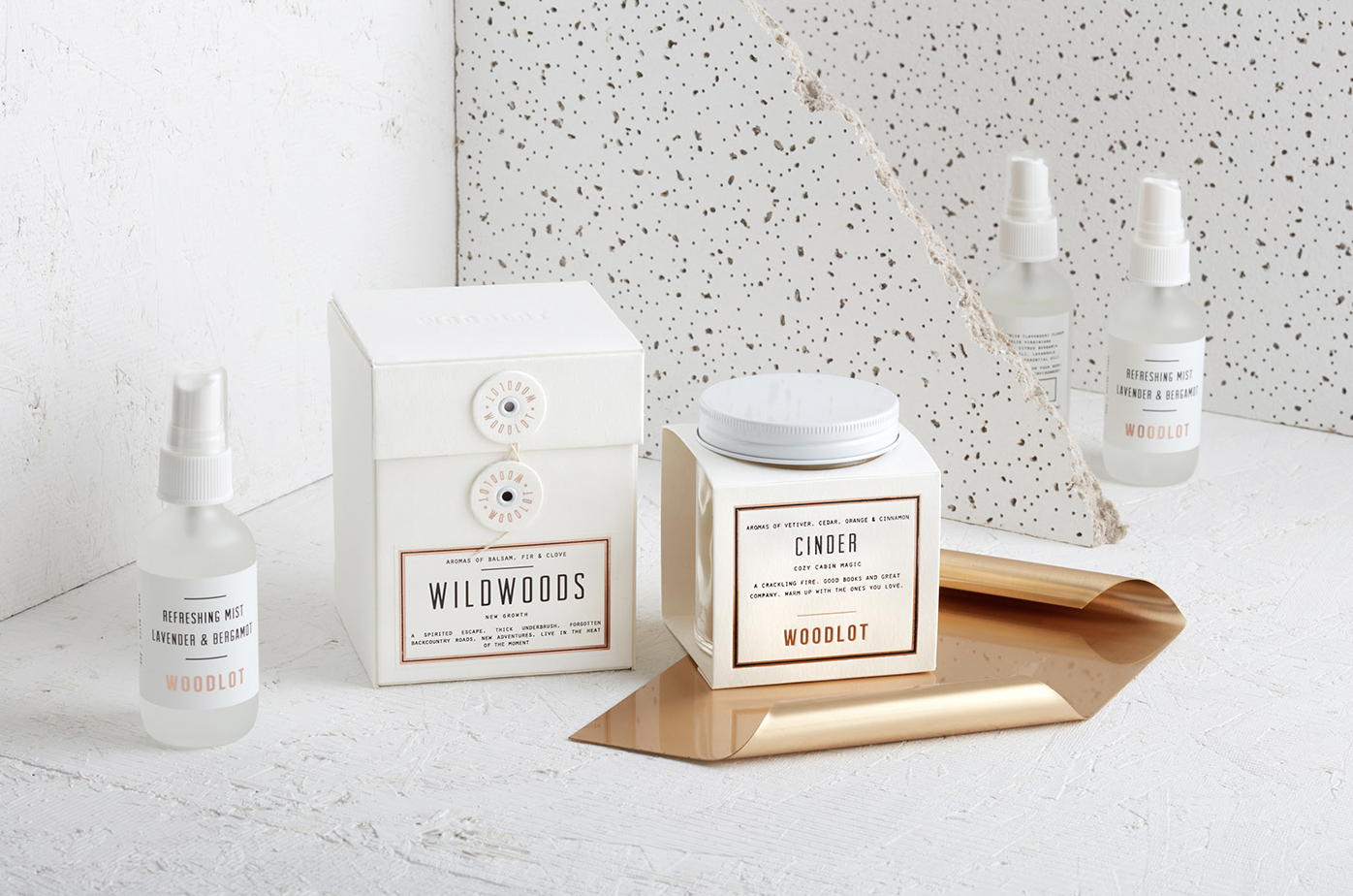
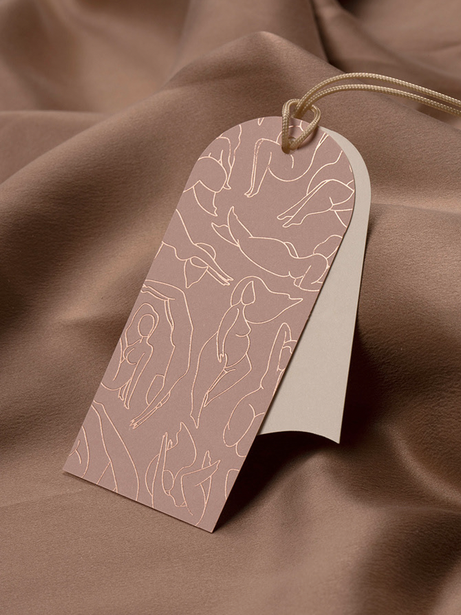
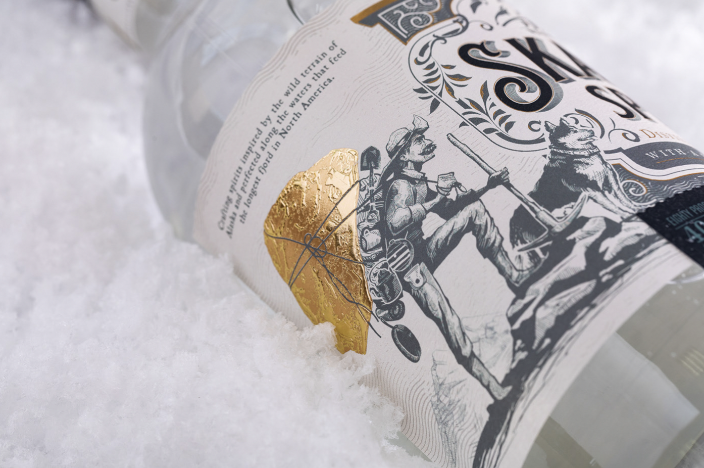
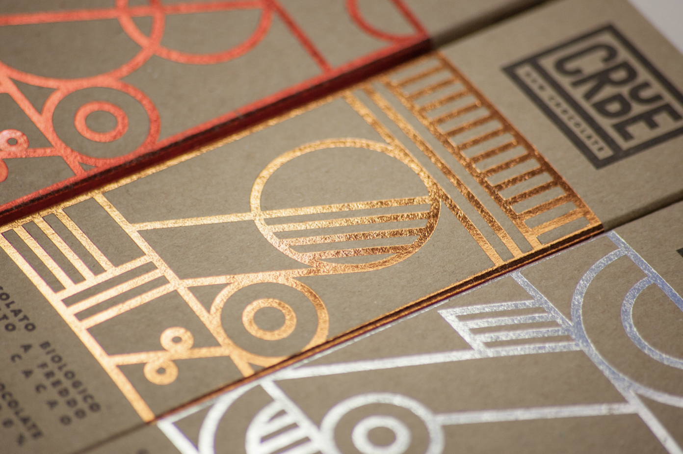
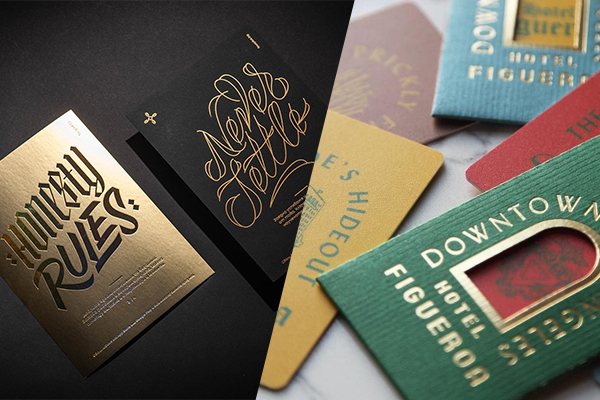
Foil printing is a unique way to add class and sophistication to a design, elevating it to feel more premium or expensive. The special printing technique uses heat, pressure, and metallic foil to print details or graphics on various paper qualities. The range of colors and finishes of foil printing is vast and wide, ranging from silver and bronze to holographic and pearlescent, the most popular being the classic gold – as you can see from the twenty examples below. While golf foil feels modern, the technique is not new, far from it. As the earliest use of real gold leaf to decorate calligraphy dates all the way back to 400 A.D., when gold leaf began to be applied to the letters in illuminated manuscripts in Constantinople, Ireland, and Italy. 

The range of colors and finishes of foil printing is vast and wide, ranging from silver and bronze to holographic and pearlescent, the most popular being the classic gold – as you can see from the twenty examples below.

Make your design shine like a diamond with gold foil printing

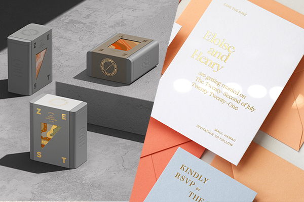
It feels prestigious and definitely helps the design stand out from the competition. Gold foil is a clever way to differentiate and demand attention, as it not only adds a sparkle that catches the consumer’s or viewers’ eye but adds a unique haptic experience – further elevating the design and its appeal. Often seen used by luxury and premium brands, golf foil can be used in as many applications as there are needs. Lately, it’s become a favorite among wedding stationery designers and wine brands, just to name a few. These design examples show the variety of uses for the special printing technique, and how it helps a design shine like a diamond! 

Super fashionable gold foil on black paper GIVENCHY tarot cards by Jérémie Solomon

Blanc Naturals cosmetics packaging by Foxtrot Studio shows how well gold foil works in a botanical illustration.

Gold foil stamped stationery designed by Hugmun Studio for Piu Salon feels elegant and unique.

FourPlus has created a set of powerful cards representing the studio’s own core values, perfected with a strong presence of gold.

This architecture-inspired wedding invitation & stationery designs include delicate gold foil line illustration on white background, designed by Oh So beautiful Paper

Mantras album package design is inspired by duality and modern religion and combines black, white, and gold in a stunning way. Designed by Atelier U-Zehn.

printing house Intercard created a calendar that matches zodiac elements with paper and printing techniques – of course also including golf foil!

A simple and effective example of using gold foil in personal branding, and business cards. Source

Gut beer labels that combine gold foil typography with pastel pattern background feel fresh, young and glamorous at once, designed by Quentin Delègue

CASA CAPRICHO branding by Estudio Albino feels elegant and contemporary with golf foil printed serif typography.

Elegant gold-foil letterpressed wedding invitation design by Nicety Studio shows how to combine the two printing techniques.

Attention-demanding Voiello “La Scaramantica” pasta packaging with gold foil details on a baby-blue paper, designed by Auge Design.

Hotel Figueroa branding including gold foil details, by Love & War, follows the style of the overall branding concept to a tee.

Zest Specialty Coffee packaging with a paper wrap including gold foil print details by Pop & Pac Studio feels contemporary and expensive.


Novum magazines 11.20 »creative paper« edition cover, designed by Tobias Holzmann, feels like a delicious candy.

Pinche Mezcal bottle label design by Human  is a great example of how a gold foil detail within a design can elevate the whole concept to a new level. Also, how great does gold match with the deep royal blue paper?


Woodlot candle packaging design by arithmetic _ combines a minimal aesthetic and strong typography is a way that feels fresh.


WIM – Women In Mind clothing labels by Studio NinetyOne shows how an illustrated line pattern in gold foil feels harmonious and special.

Skagway Vodka label design with unique gold foil detail, designed by Grant Gunderson


CRUDE — Raw Chocolate packaging combines classic craft paper with geometric gold foil patterns, with beautiful results. Designed by Happycentro Design Studio

 
Subscribe
Get the latest articles and news delivered straight to the comfort of your own inbox!
Subscribe
X
Subscribe
Get the latest articles and news delivered straight to the comfort of your own inbox!
Subscribe