Théophile Glauser from Atelier U-Zehn, a graphic designer from Neuchâtel who we’ve written about before here, has collaborated with Idal, a rapper from Murmures Barbares, a group that has established itself as a benchmark in Swiss rap thanks to its unique musical and visual identity, the relevance of its poetry, and the intensity of its live performances. As a result of the collaboration, a unique and exquisite album package, consisting of a lyrics book in an ambiguous resemblance to a Bible, a vinyl in its very own stone case, and a poster, was born.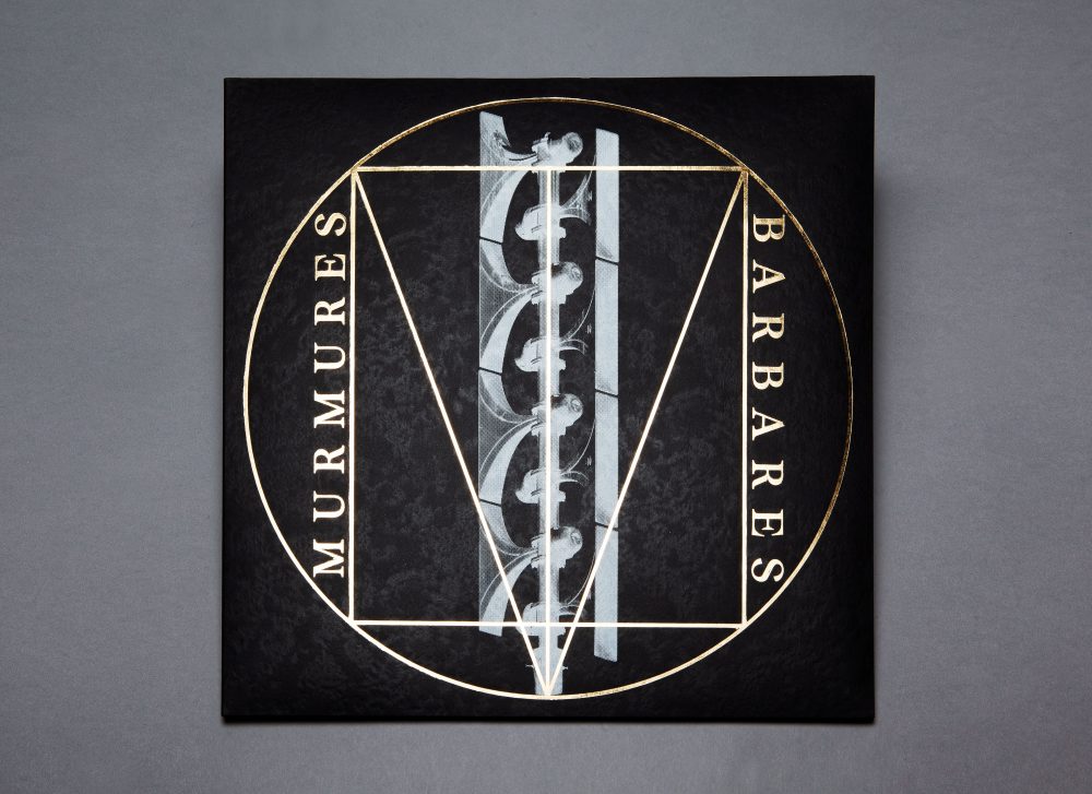
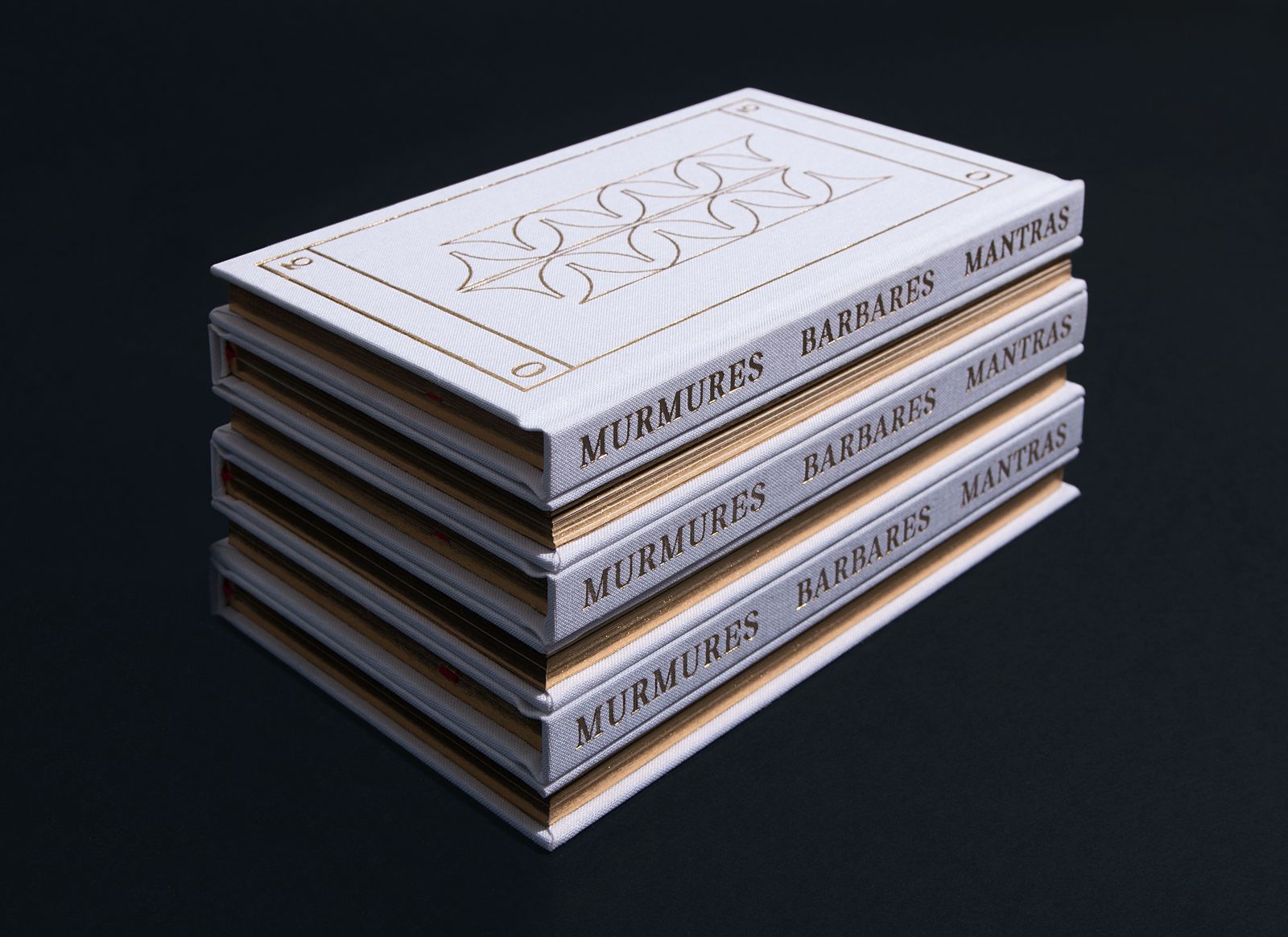
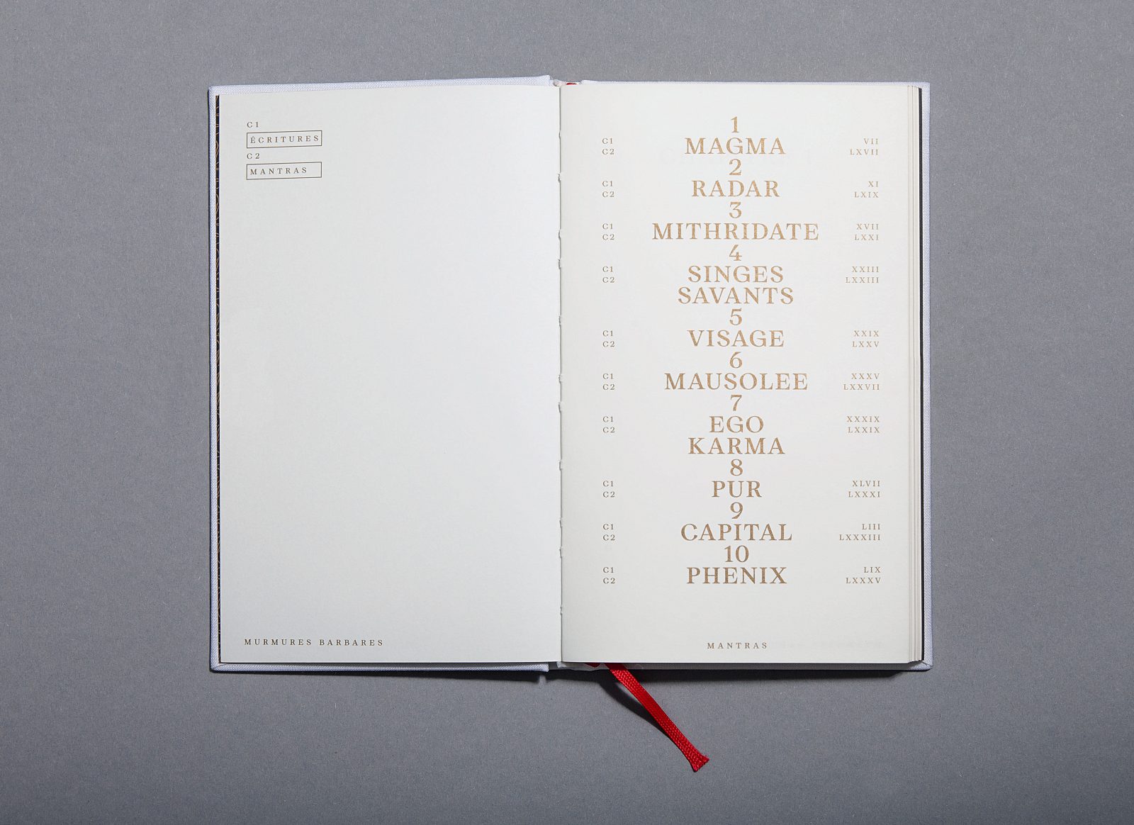
The 300-copy edition of the album package titled Mantras includes the lyrics of each song in a separate prayer book, in a layout that is intended to be both classic and current. As an uncommon detail, in the text-part of the book, there is a timecode matching each sentence to the moment it appears in the song referred to. “The whole book was thought of like a track of a new contemporary religion, mixing the codes of both modern and ancient beliefs and aesthetics”, the creatives explains.
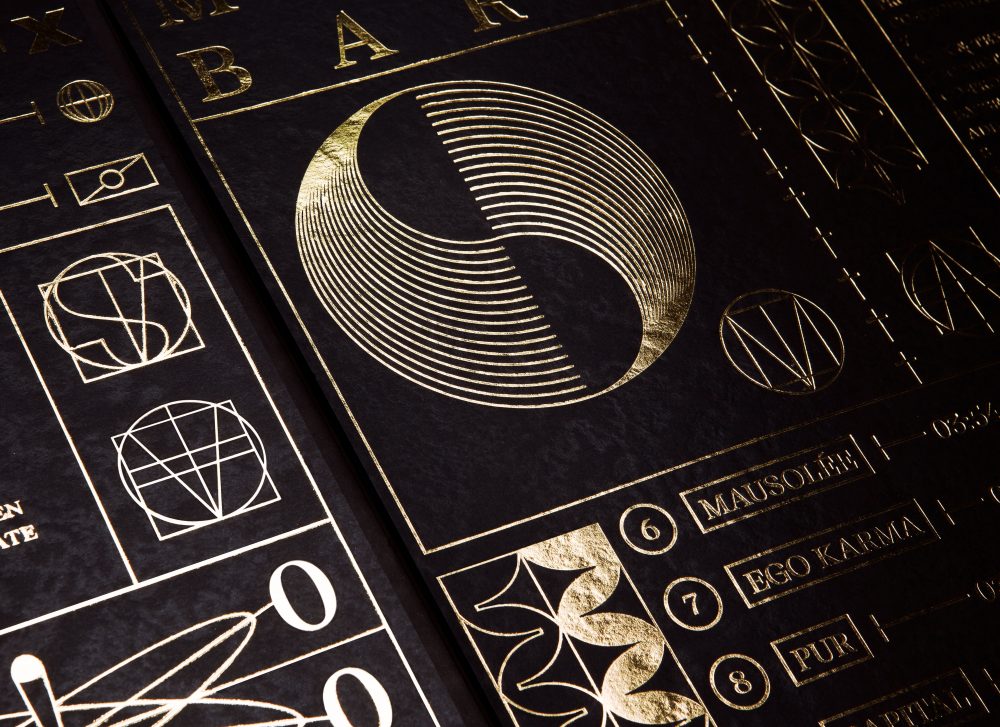
A whole new graphic language, including its very own typeface, was created for the project
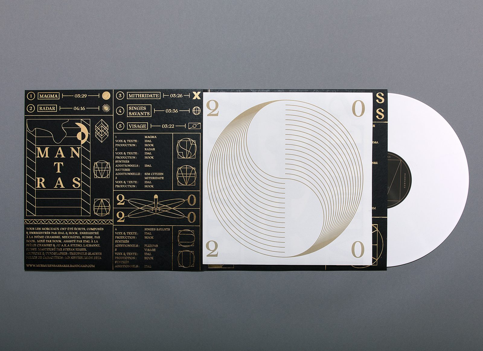
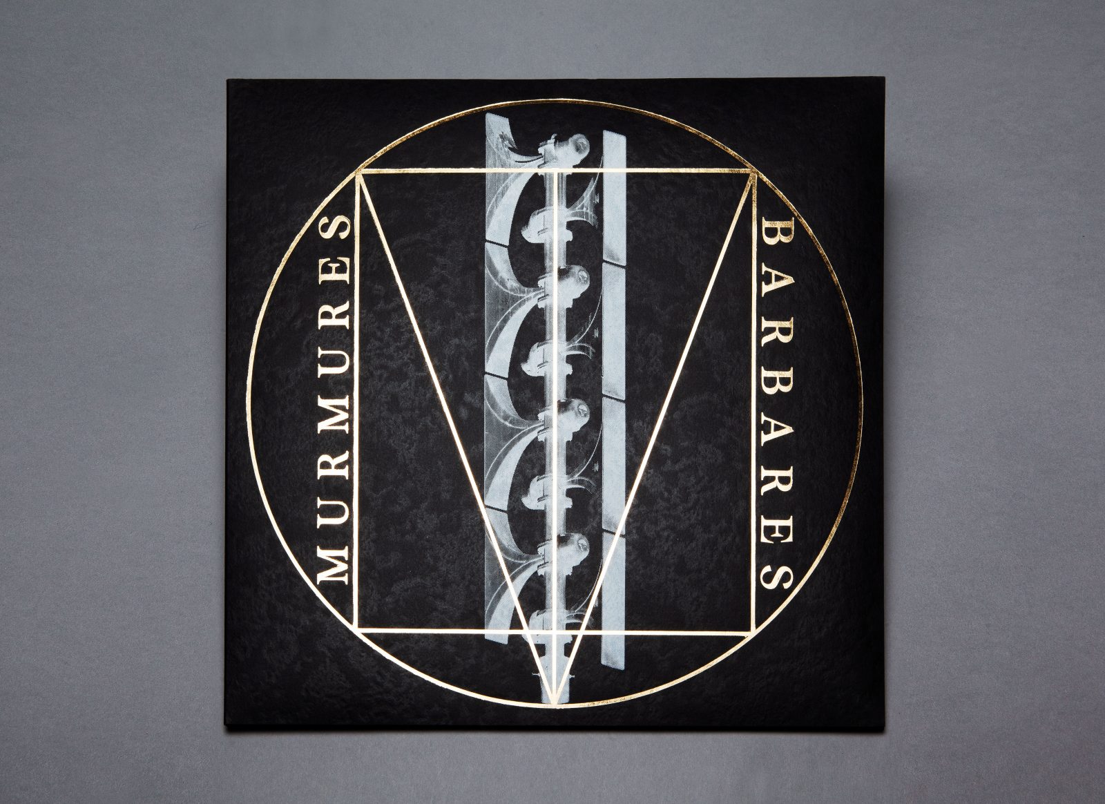
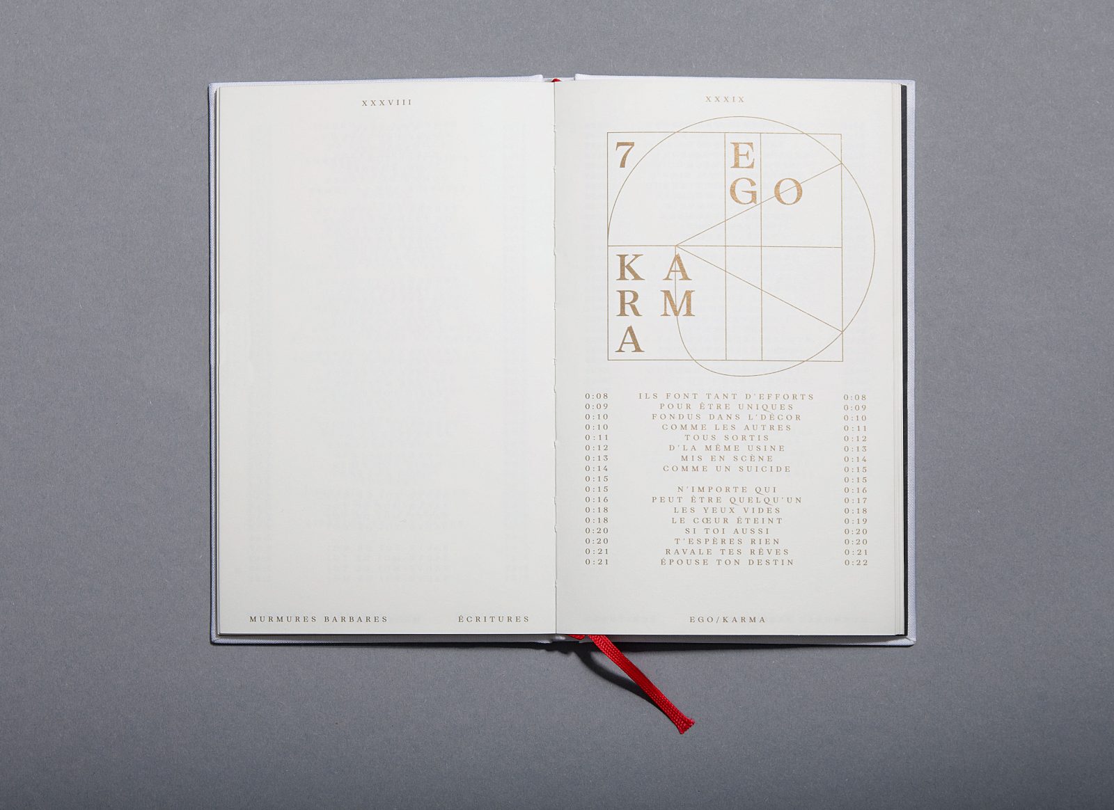
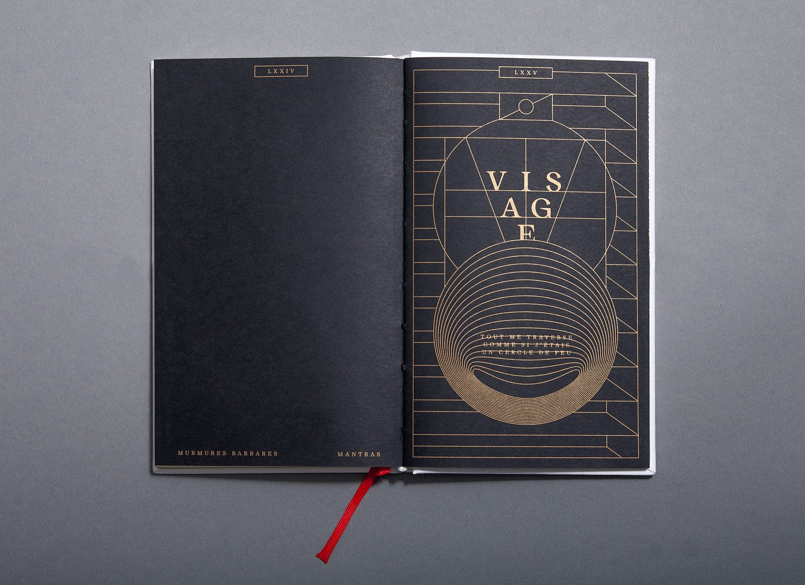
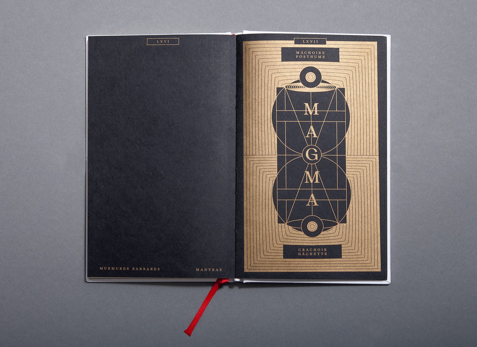
The concept of Mantras was defined by Murmures Barbares’s rapper Idal. The name of the album recalls the repetitive and hypnotic choruses that occur frequently throughout the project. The idea was to create not only a book but a whole kind of new signage and graphic language. Therefore, Théophile Glauser created a whole new typeface specifically for the project, named MB New Religion. This typeface uses a stylistic set that shows the construction grid of each upper case. The letters are inspired by the structure of Roman capitals, and by the geometric studies of Geoffroy Tory. Drawn according to the secret geometry of Renaissance painters, the construction grids appearing as drop caps at the beginning of each title recall Leonardo da Vinci’s, Vitruvian Man.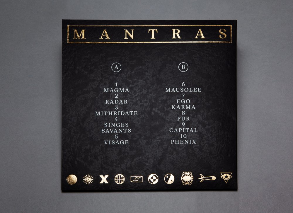
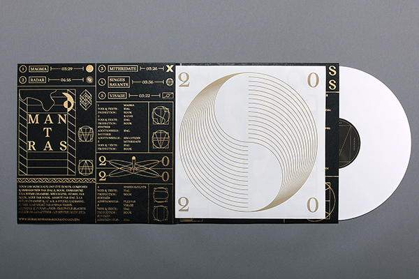
In the representation of Da Vinci, the circle and the square defines the perfect proportions of the human body, and the representation of the world; “Man at the center of everything”, man at the center of the Universe”. This allegorical symbol refers to the individualism that we experience in our time with social networks, which is a theme very present in the texts of Idal. The shape of MB’s logo also evokes the sirens and can become a Radar (which is one of the band’s track titles) when spinning on the label of the vinyl.
Printed on Munken Pure, Pergraphica® Infinite Black and Stone Robust – for high contrast and quality feel
For the booklet that includes all the lyrics, Munken Pure 150 gsm was chosen for its noble aspect in relation to prayerbooks. The PERGRAPHICA® Infinite Black 150 gsm was used to print the Mantra’s illustrations and to contrast the two chapters (Chapter 1 Scriptures, Chapter 2 Mantras). “The frequent concept of duality in the lyrics (Ego/Karma, Yin/Yang), and the black and white scenic ambiances of Murmures Barbares’s shows brought us to make radical design choices and to create a brutal aesthetic”, Glauser says. The combination of black and white papers in the book emphasizes this statement. Stone Robust Carbon 310 gsm was used for the vinyl cover. “We liked the mineral-like structure of this paper, which was chosen to evoke the stone tablets of the Ten Commandments”, Glauser explains further. All papers mentioned above are exclusively available at Europapier.
The frequent concept of duality in the lyrics (Ego/Karma, Yin/Yang), and the black and white scenic ambiances of Murmures Barbares’s shows brought us to make radical design choices and to create a brutal aesthetic. The combination of black and white papers in the book emphasizes this statement.
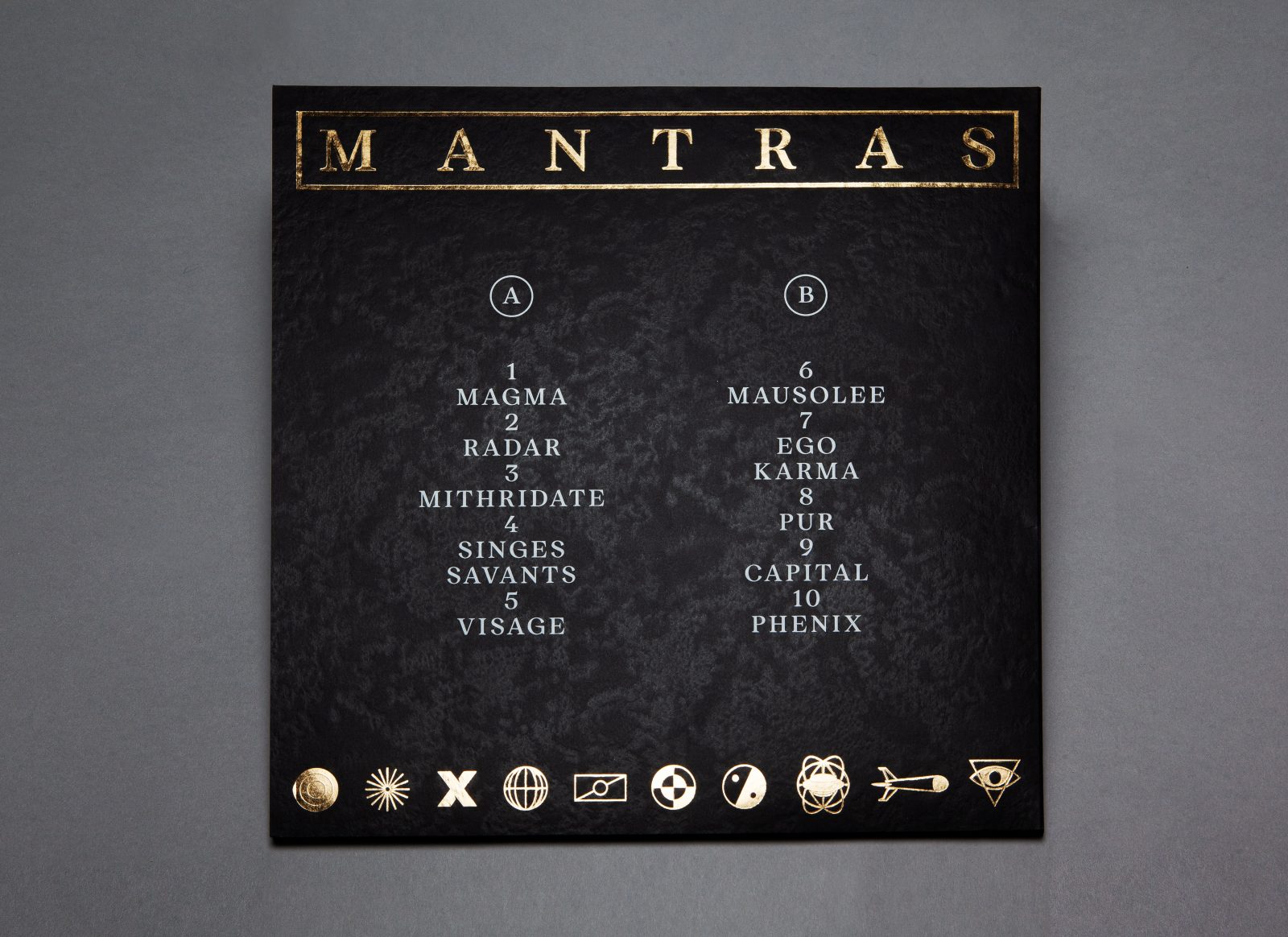
Gold hot foil details inspired by the illuminations of sacral books
The book was printed in offset by Alta Nova Beograd. “We decided to work with gold Pantone and gold hot foil, as for the illuminations of sacral books. The edges of the book have been painted with gold hot foil by Meta Beograd, who occasionally works for the Orthodox Church, which made a lot of sense to us and for the project”, the designer says.
As for the Vinyl cover, it was first printed in silkscreen with the symbol that was defined by the band for the Mantras album (a typically swiss alarm siren made for civil protection). It was then overprinted in gold hot foil with the new logo of Murmures Barbares, a geometrical shape recalling a siren as well as the sacred geometry of Renaissance painters.