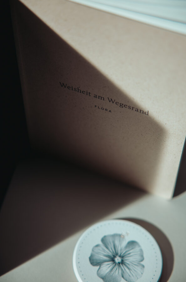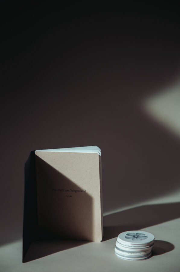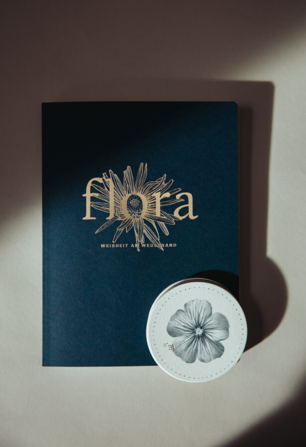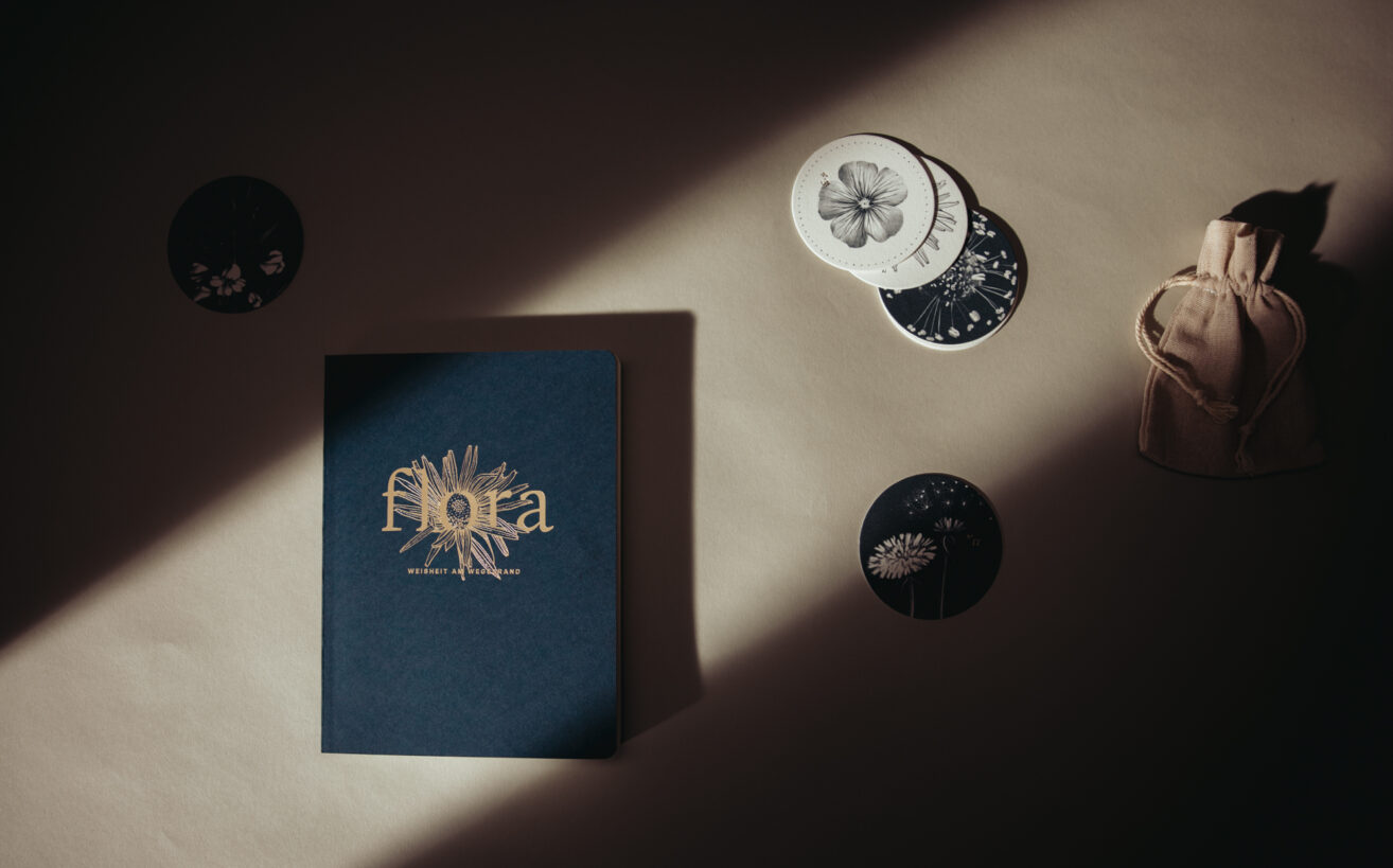
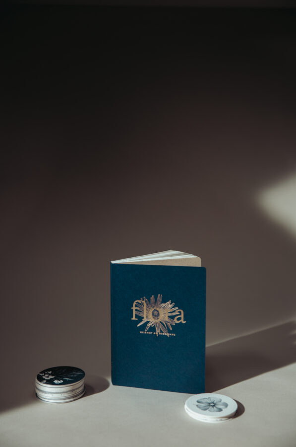
There are books that speak. And then there are books that whisper—with soft edges, velvety, matte texture, and a presence that invites the hand before it invites the eye. FLORA – Wisdom by the Wayside (original German title: Flora – Weisheit am Wegesrand), now in its third edition, is such a book. Wrapped in the deep, mysterious blue, its cover gleams gently under a refined hot‑foil embossing, the rounded corners adding an unexpected tenderness to the object. It is the kind of publication that embodies the quiet elegance we at Design & Paper love: a piece of print that feels both modern and timeless, confident and humble, minimal yet deeply expressive.
 Below, we speak with Magdalena Türtscher, one of the creators behind FLORA and responsible for the design, print production management and photography. She was kind enough to share with us how plants became guides for inner orientation—and how paper, printing, and design transformed that idea into a tactile, contemplative art piece. Other members of the team are Meike Früchtenicht & Helen Ahmad, who took care of the content development, Helen Ahmad with particular attention on the texts. Last but not least, the delicate, nature‑infused illustrations were the work of Paula Roesch.
For readers new to FLORA: What is the book about?
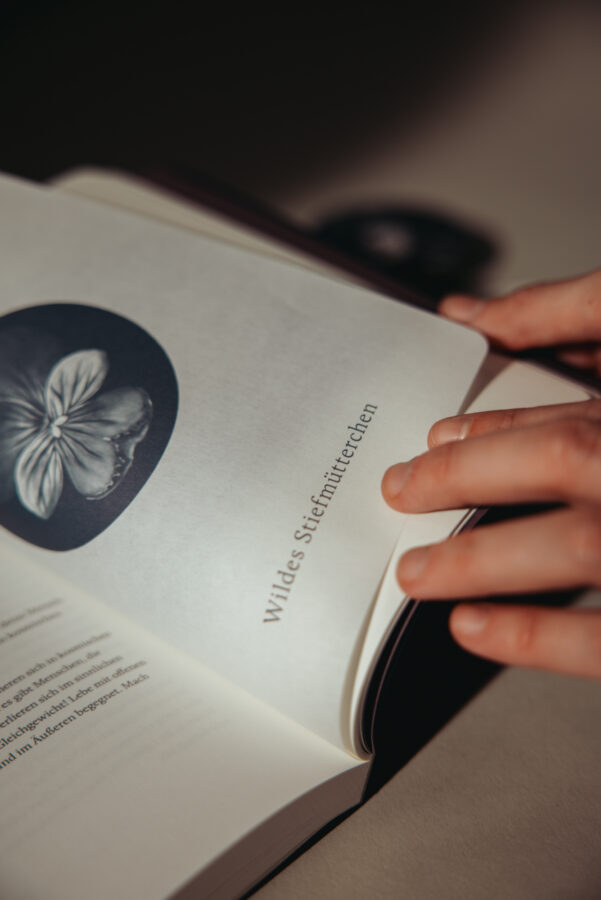
FLORA – Wisdom by the Wayside connects 33 native plants with the question of one’s own path in life.
The book and its accompanying card set encourage readers to pause and ask:
Quo vadis – where is my path leading?
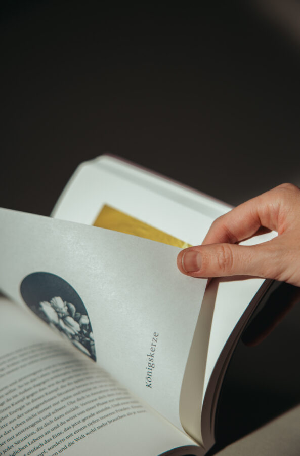
Each plant carries its own quality – an attitude, a memory, a subtle force.
The cards can be drawn or arranged. In the accompanying book, each plant message is explored in depth: Where does one encounter it? What does it stand for? What impulses can it offer in one’s own life?
Flora is not an oracle in the classical sense.
It is a quiet compass – a connection between the outer world of nature and one’s inner orientation.
Paper as part of the story
Materiality plays a central role in shaping FLORA’s contemplative atmosphere.
The third edition was created in collaboration with Europapier, with a focus on sustainable papers produced in Austria:
The book’s cover is crafted from PERGRAPHICA® Mysterious Blue, 330 g/m², a rich, deep-toned premium paper that lends the publication both presence and quiet elegance. Its velvety surface and substantial weight provide a tactile introduction that sets the tone for the entire reading experience.
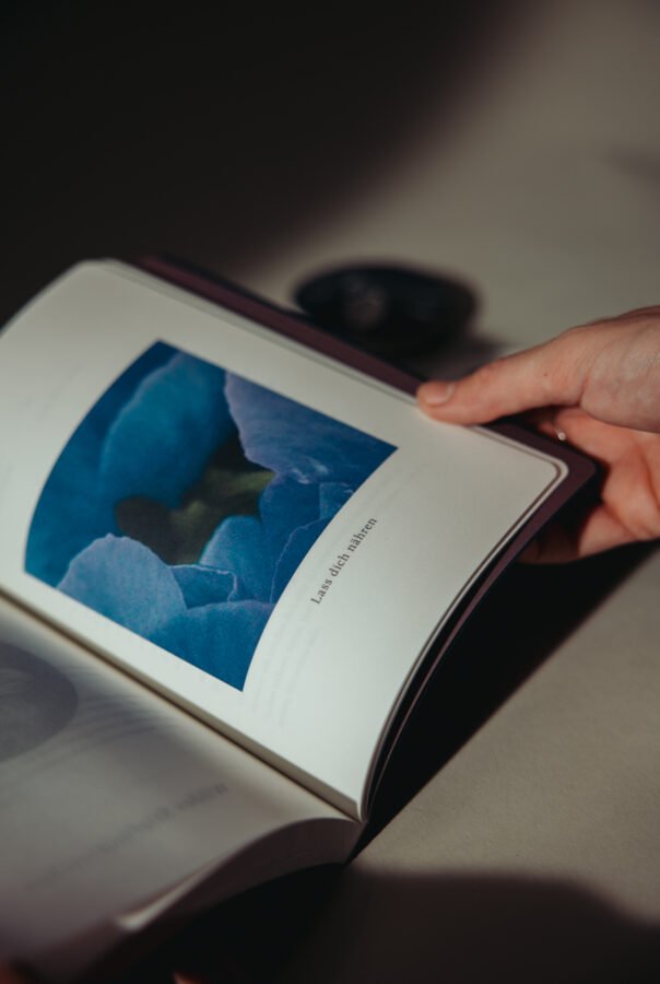
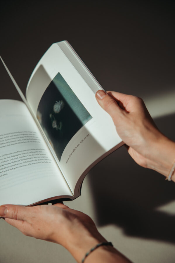
At the heart of the book lies the PERGRAPHICA® Natural Rough, 120 g/m² core—a warm, gently uncoated paper that supports both text and imagery with clarity and softness. Its natural shade and uncoated feel echo the organic themes of the project, inviting readers to engage with each page at a slower, more attentive pace.
Surrounding the core is a core cover made from IQ GRASS + PACKAGING, 120 g/m², a material that incorporates 30% natural grass fibers into its composition. This subtle greenish hue and unique tactile quality deepen the book’s connection to the world of plants, embodying sustainability not just conceptually, but materially.
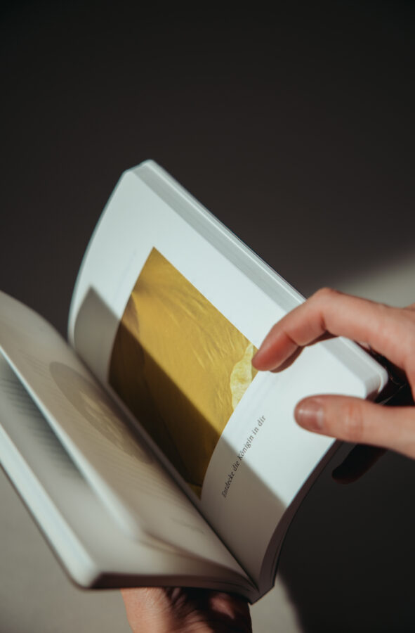
Between the main sections, whenever a new plant is introduced, interleaves printed on delicate 60 g/m² Ibo paper introduce an additional sensory layer. Their fine translucency allows the botanical graphics to shine through softly, like faint memories or impressions carried across time. These lightweight pages create rhythm, depth, and a gentle pause within the reading flow.
The interplay of grammages, beautifully printed in offset print, creates depth and a sensory rhythm—denser pages alternating with delicate, translucent interleaves that allow the plant illustrations to shimmer like faint memories.
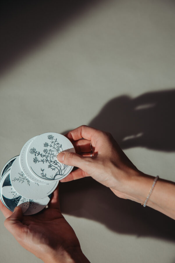
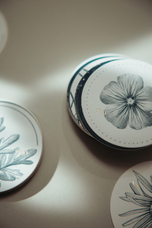
The accompanying card set is crafted with the same attention to materiality and tactile depth and packed in a natural‑toned textile pouch. Each card is produced from PERGRAPHICA® Natural Rough, 400 g/m², then laminated with PERGRAPHICA® Mysterious Blue, 400 g/m², on which the word Flora shimmers. The result is a beautifully balanced, double‑layered board which feels substantial in the hand while maintaining the visual clarity and quiet elegance characteristic of the entire FLORA edition. Their weight, surface quality, and rich color interplay make the cards not only functional, but a sensorial extension of the book itself.