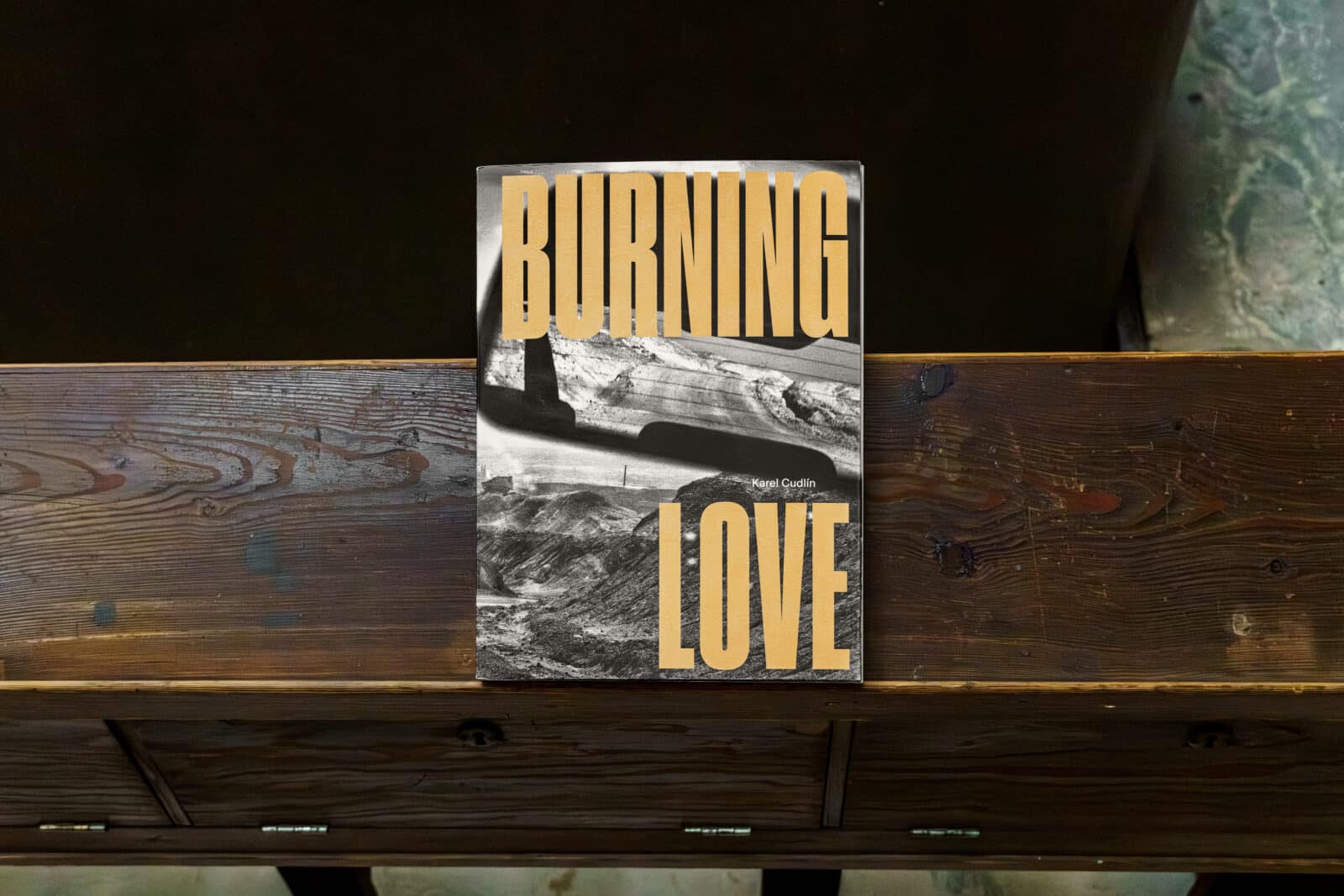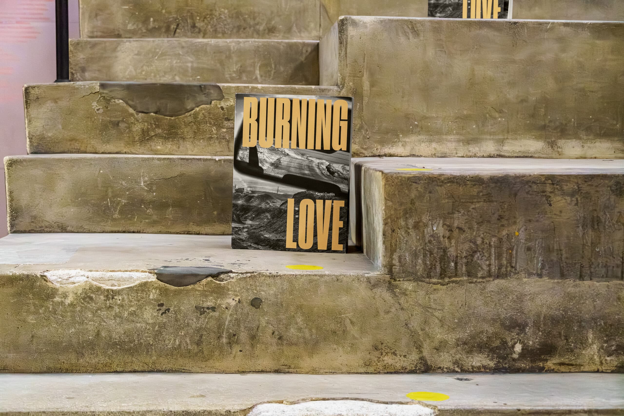
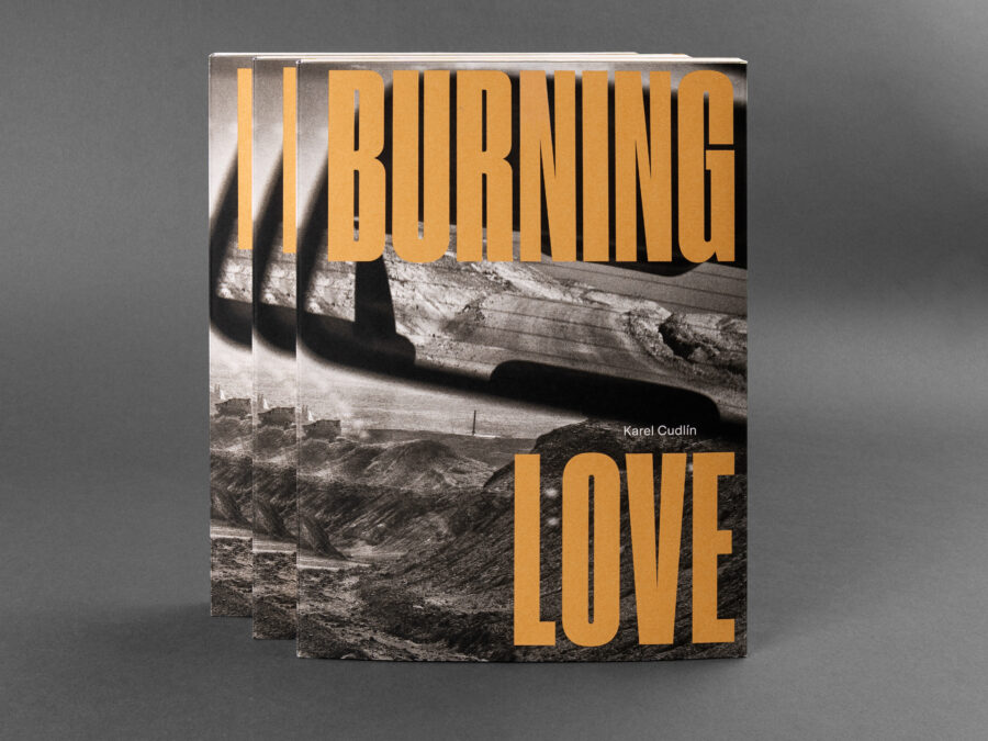
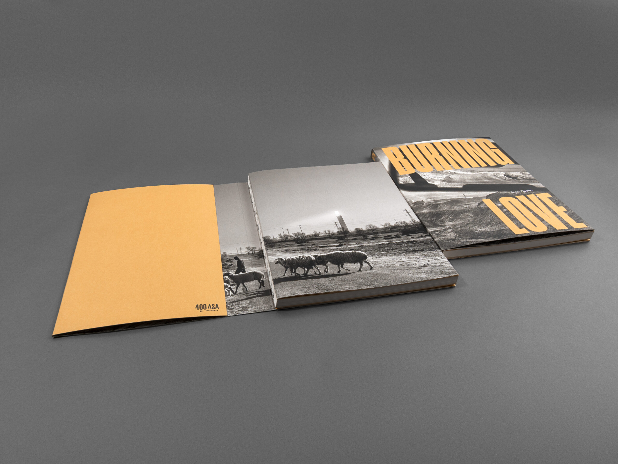
Some books are created to be read, others to be experienced. Burning Love, the new photographic publication by Czech documentary photographer Karel Cudlín, belongs firmly to the latter. Spanning nearly three decades and more than 50 journeys through Israel, the extensive volume captures a deeply personal and visually powerful portrait of a country shaped by constant transformation.
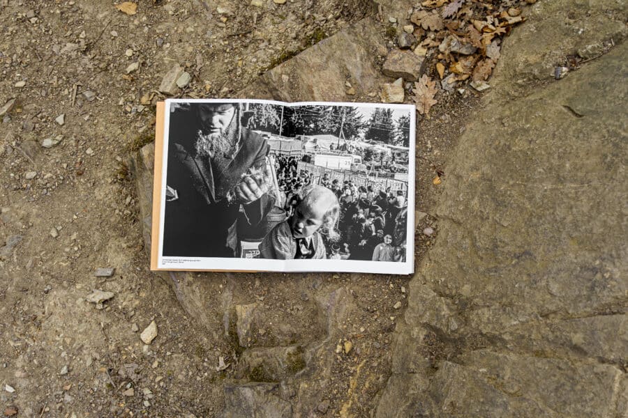
Bringing together 102 black-and-white photographs, Burning Love explores people, landscapes, and the social realities of Israel from the mid-1990s to the present day. The publication combines both analog and digital photography, creating a layered visual narrative that reflects the passing of time while maintaining a strikingly cohesive atmosphere throughout the book.
But the book is much more than a collection of photographs. Alongside the images, the publication features accompanying texts by photographer Karel Cudlín and renowned Israeli writer and journalist Tzur Shezaf, adding context, reflection, and another emotional layer to the visual storytelling.
Behind the project stands an experienced and carefully assembled creative team. In addition to the authors, the book was edited by Misha Sidenberg, Chief Curator of the Jewish Museum in Prague, while the visual concept and graphic design were created by Jiří Karásek from Studio Marvil. The technical production and printing were realised by Daniel Printing House in close collaboration with the publisher 400ASA, continuing a long-standing partnership established through previous titles such as Lost Europe and La Putyka.
A book designed to open without limits
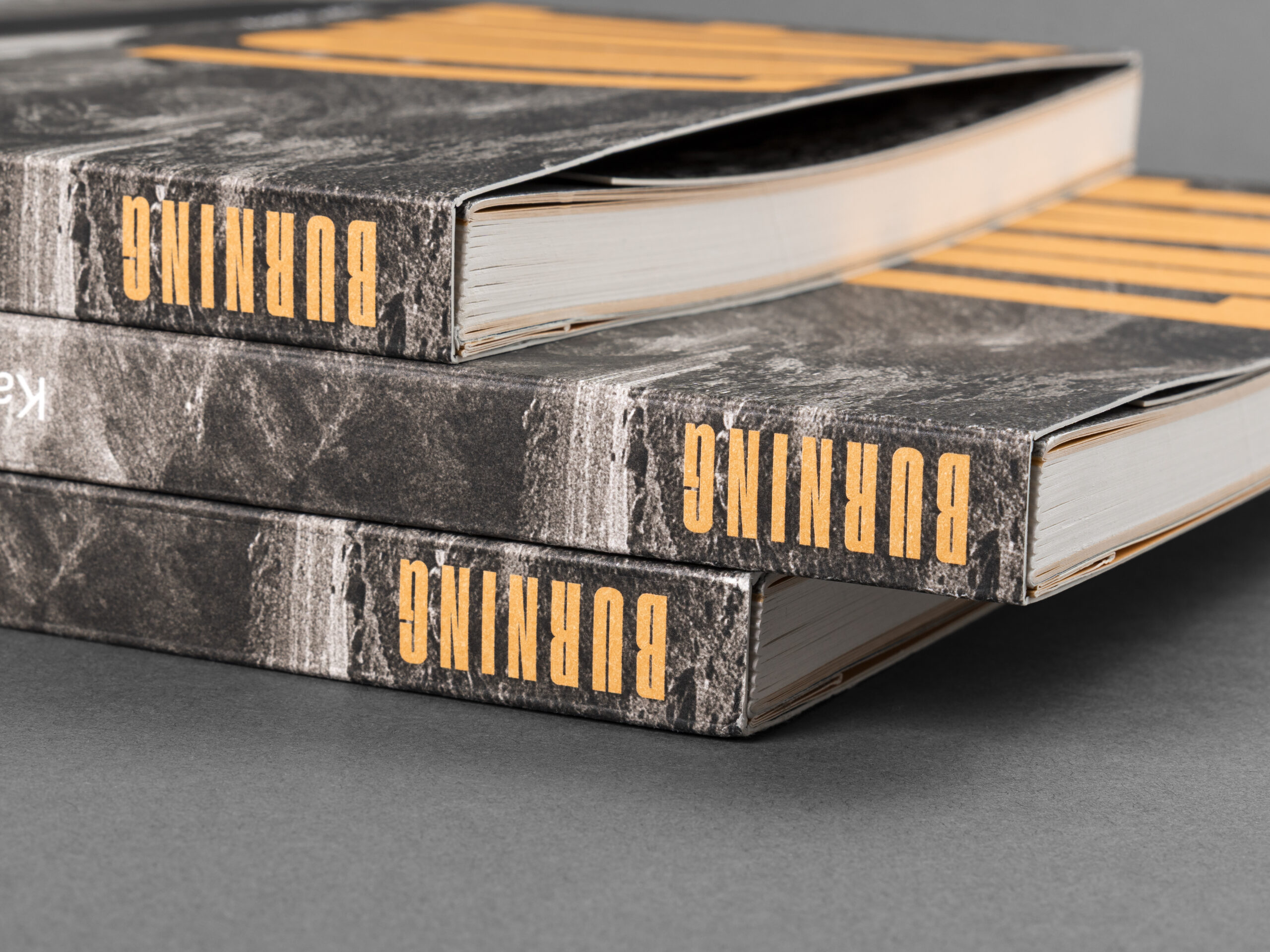
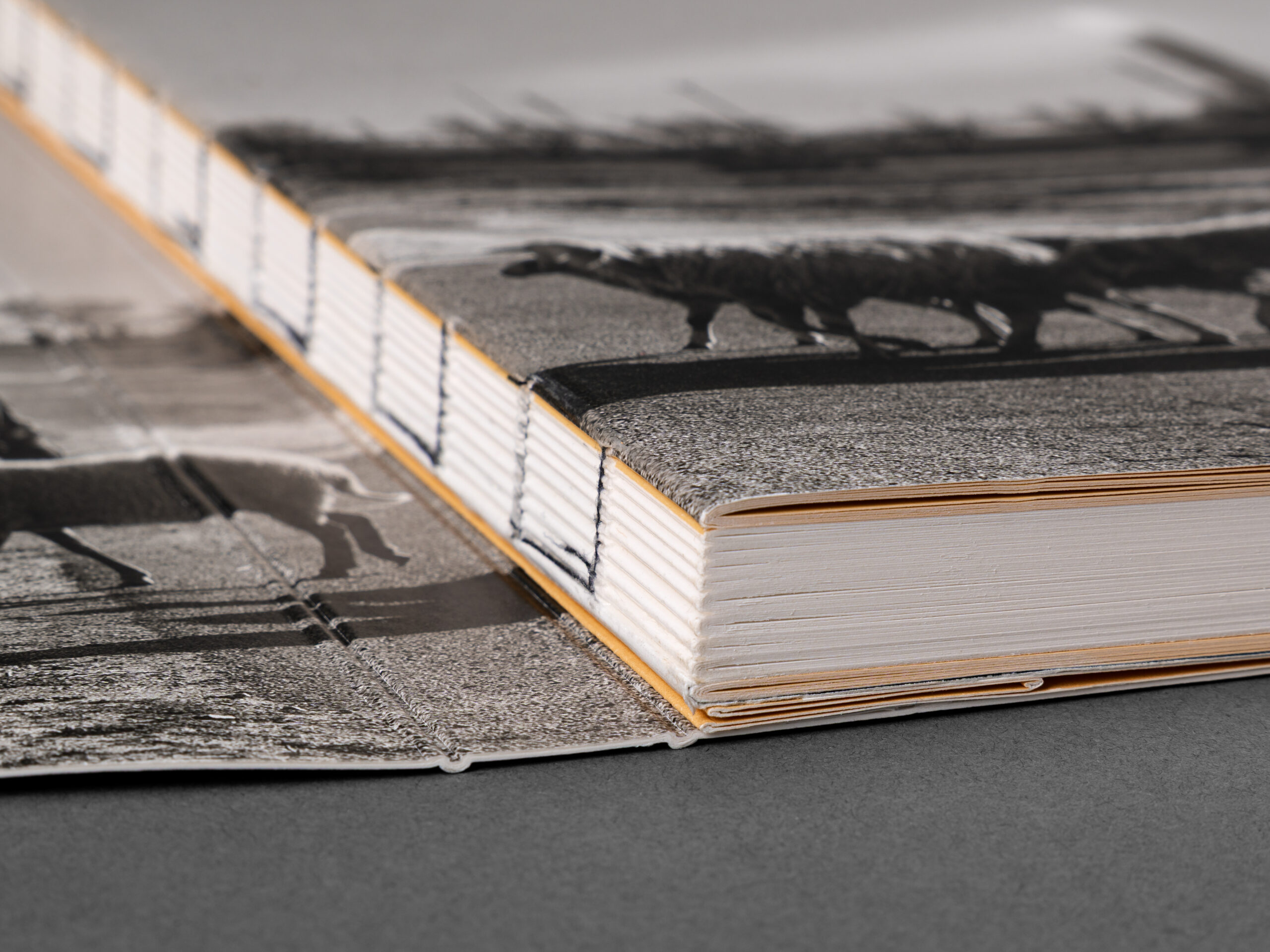
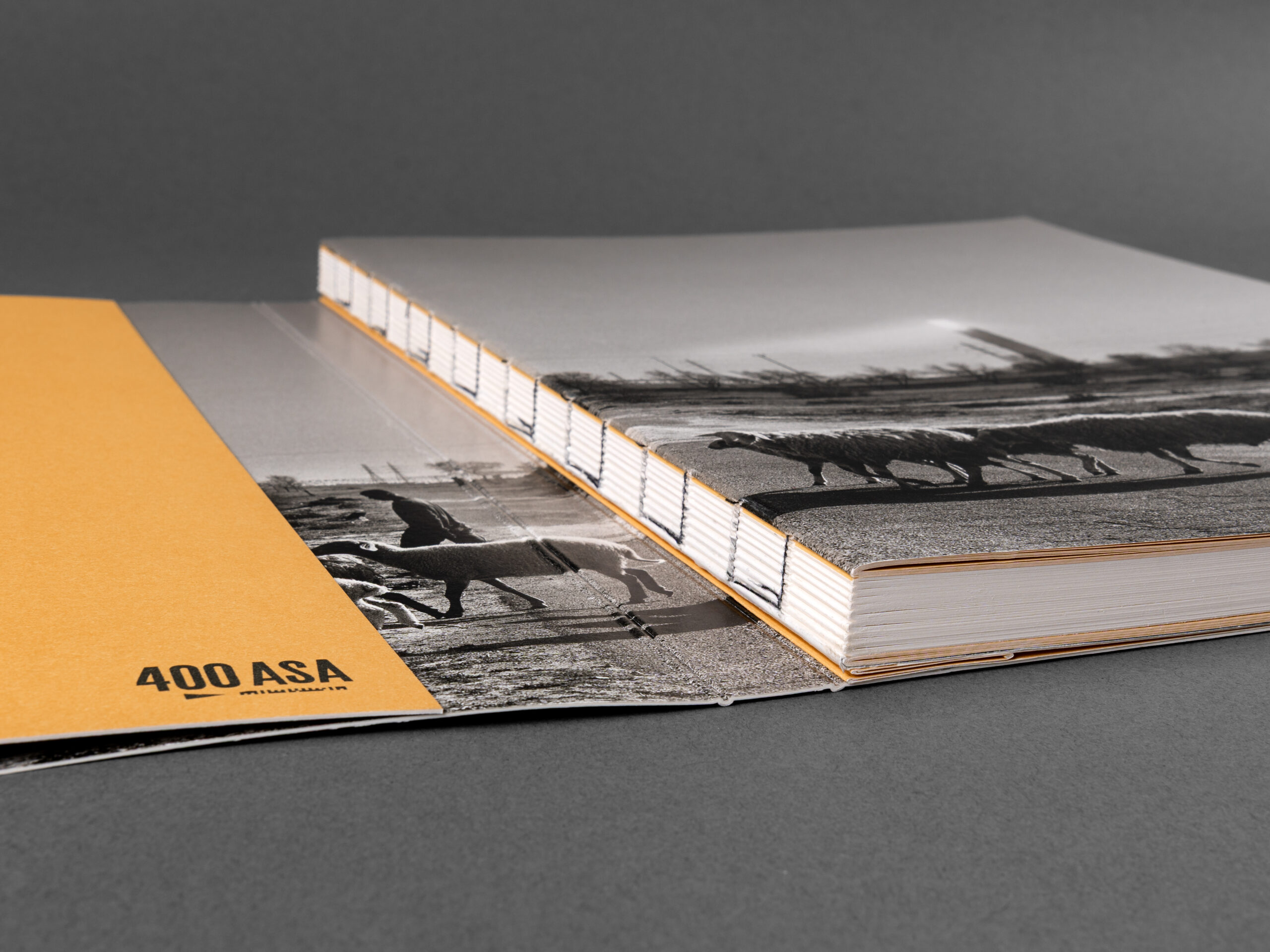
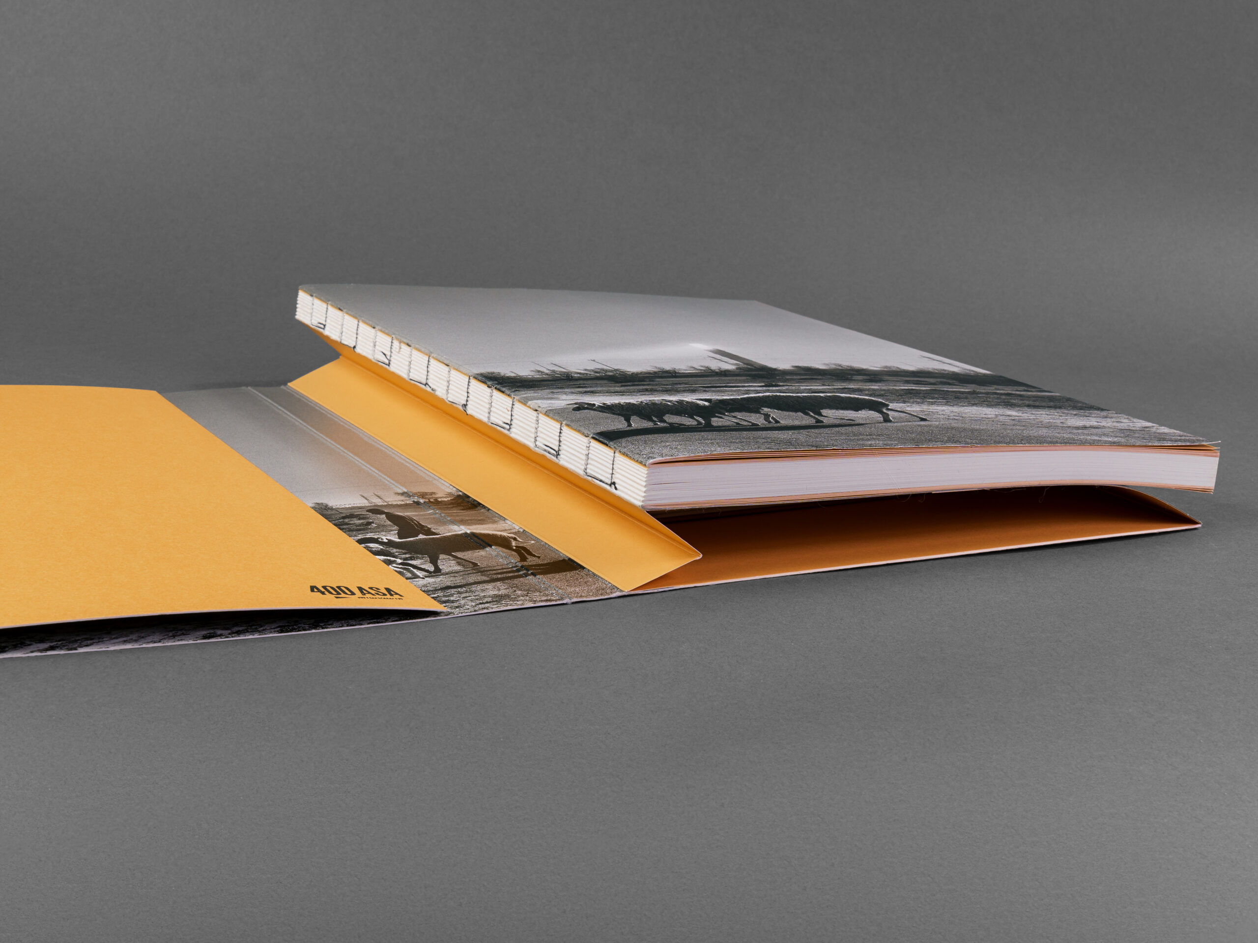
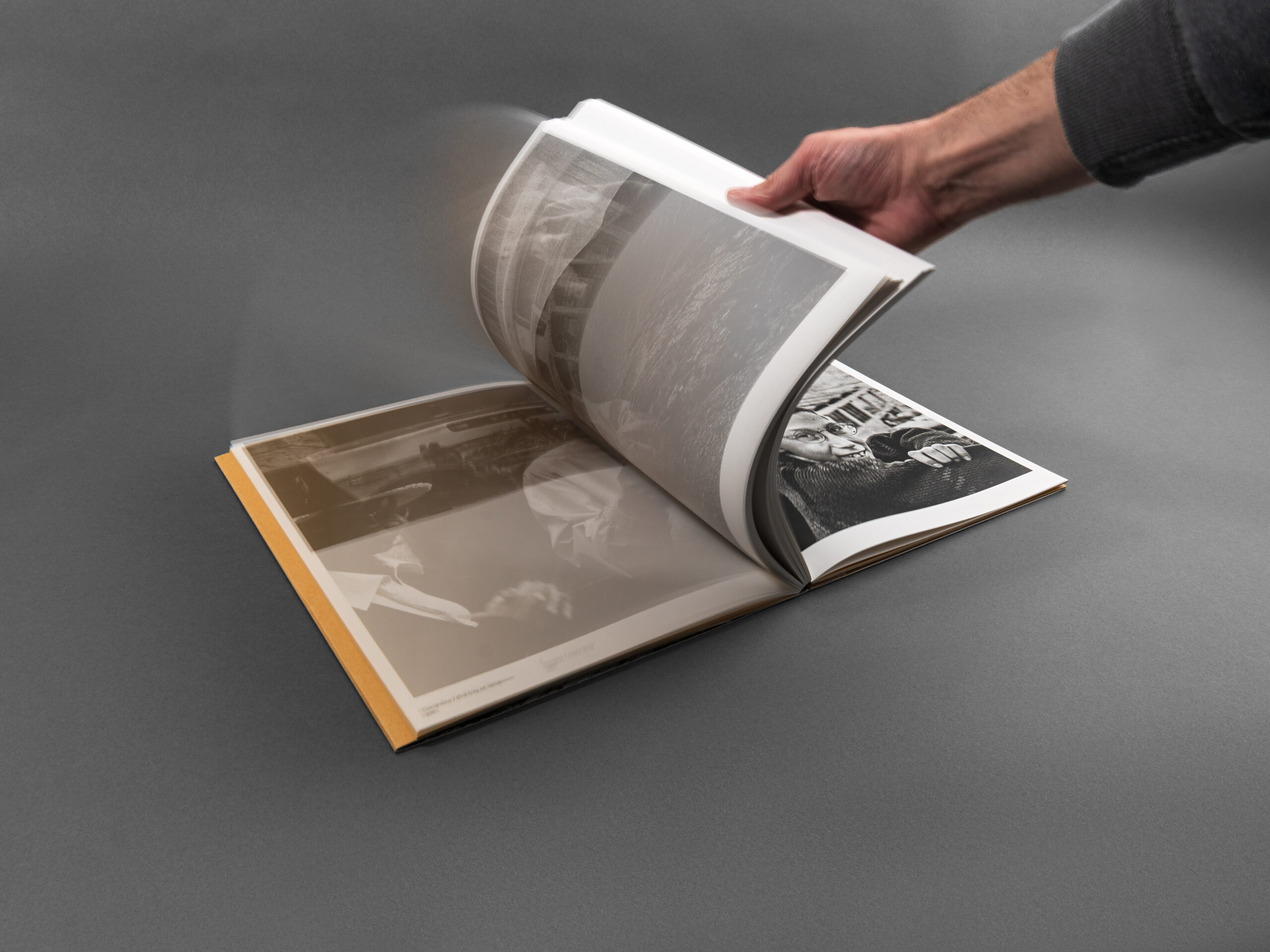
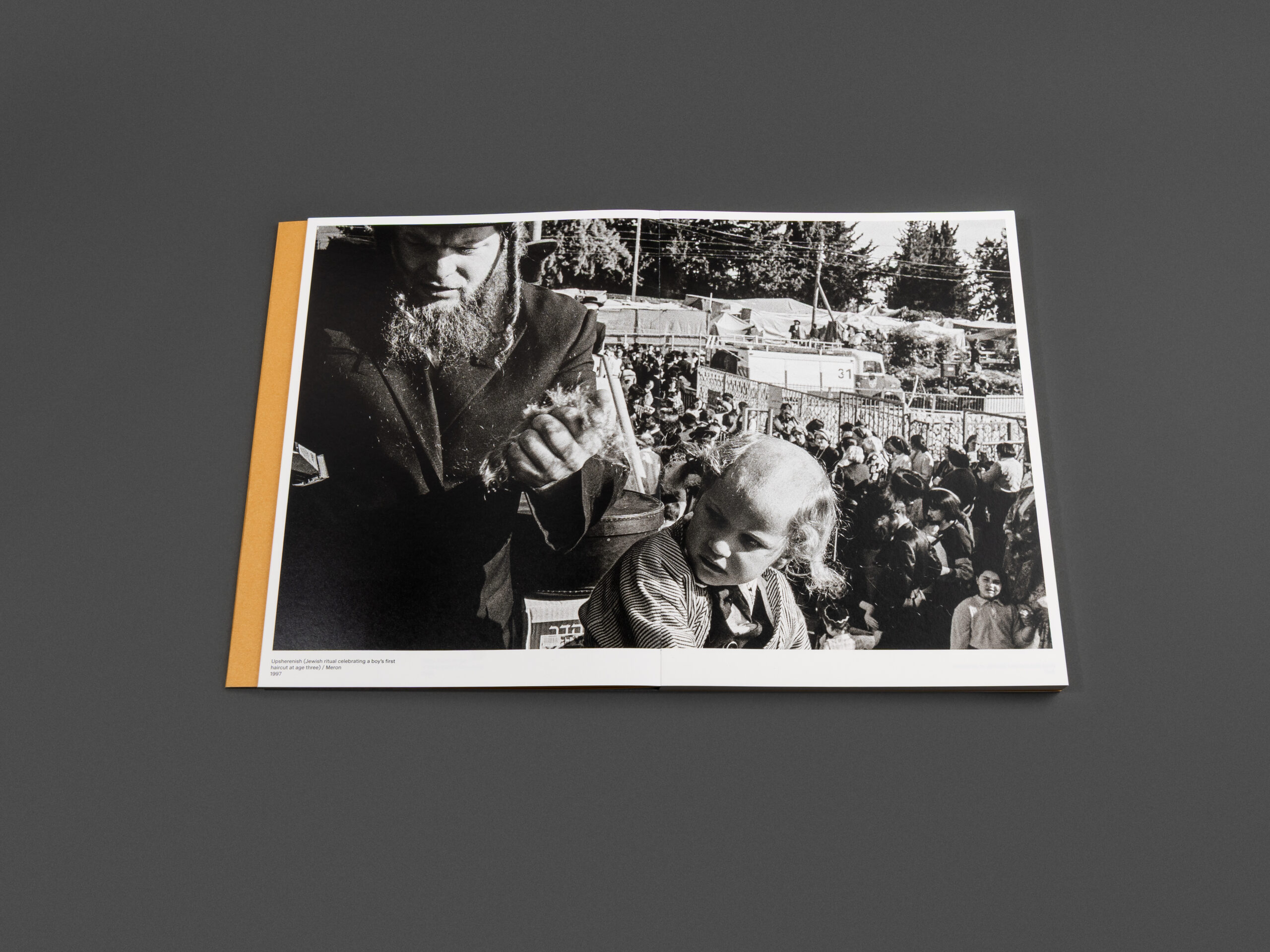
One of the defining elements of Burning Love lies in its physical construction. From the beginning, graphic designer Jiří Karásek specified one key requirement: the binding had to allow the book to open completely flat at any point without resistance from the spine or tension within the pages. This requirement was essential, as many of the photographs extend seamlessly across double-page spreads. Any interruption caused by a traditional binding would compromise the immersive viewing experience and the continuity of the imagery.
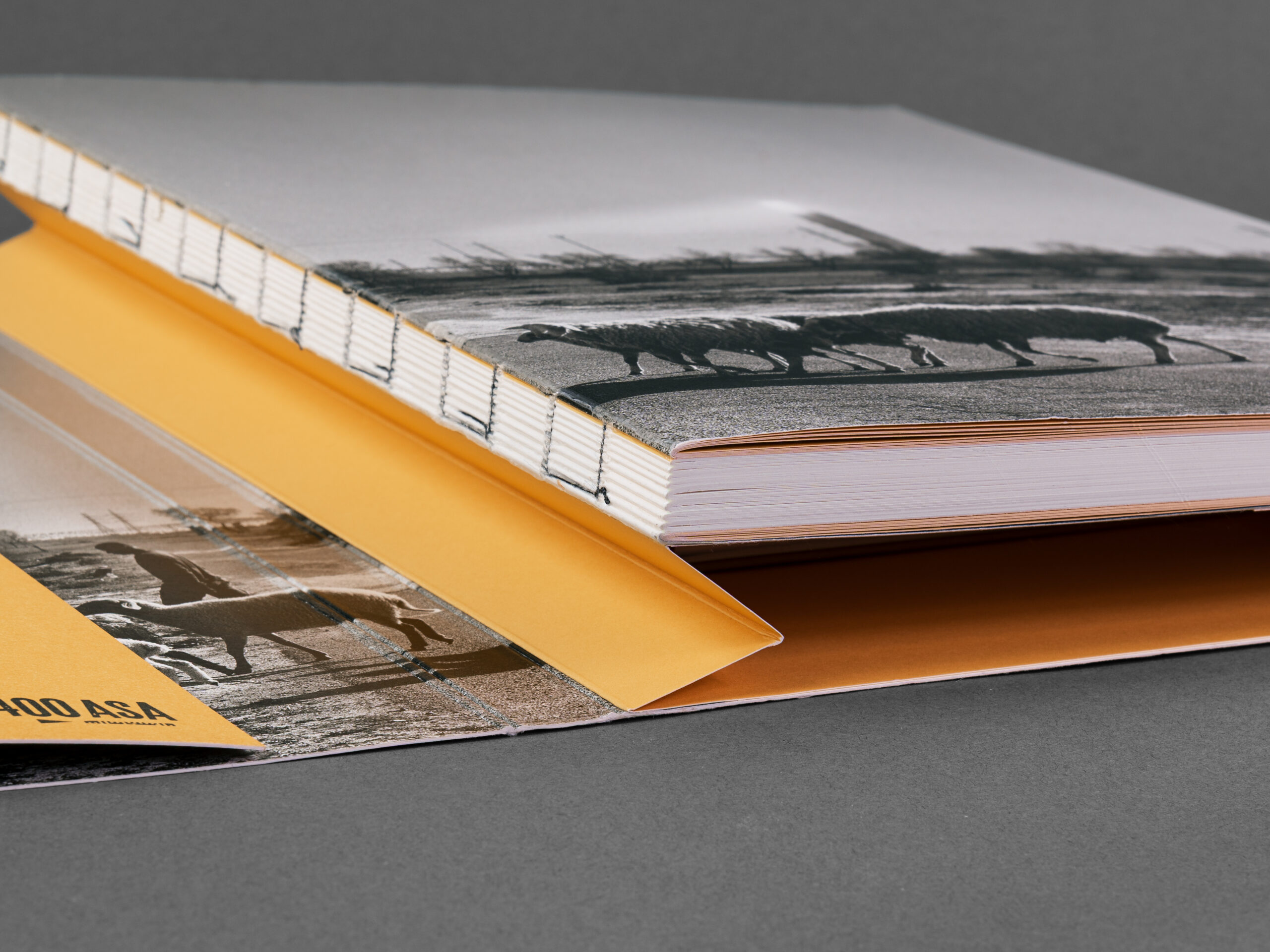
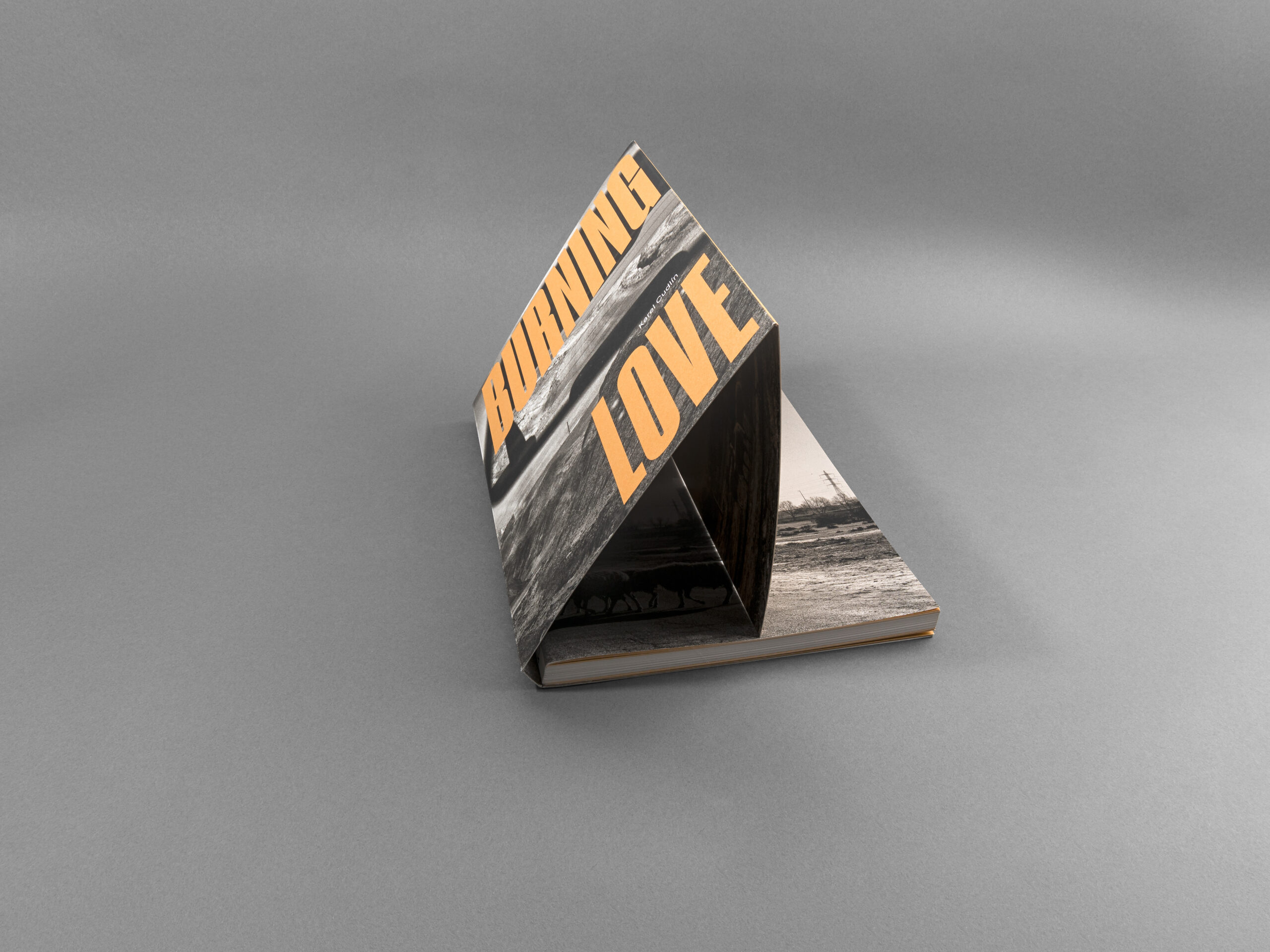
To achieve this, Daniel Printing House implemented a carefully tested binding solution using sewn sections combined with a reinforced book block. After trimming to the final format, the book block was attached to the cardboard cover solely by the last page. Due to the thickness of the volume and the risk of stress or detachment between the inner structure and cover boards, a paper hinge system was additionally applied. This thoughtful technical detail allows the substantial book block to compensate naturally while opening, ensuring flexibility and durability throughout the publication.
The result is an open binding that feels both functional and intimate. The pages lay perfectly flat, inviting the reader to fully engage with each image while enhancing the tactile experience of the book itself. It is a subtle but remarkable example of how technical craftsmanship can elevate visual storytelling.
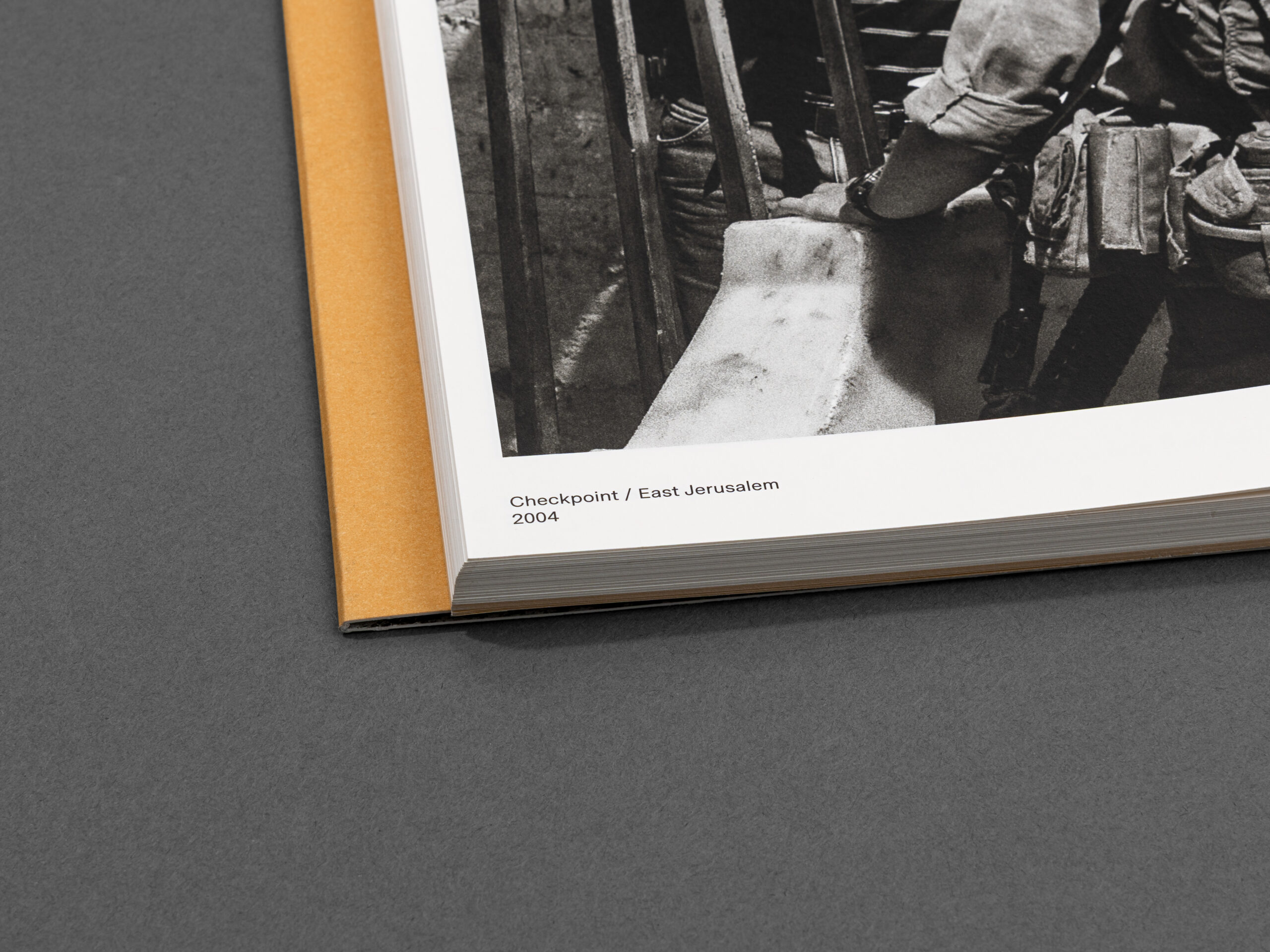
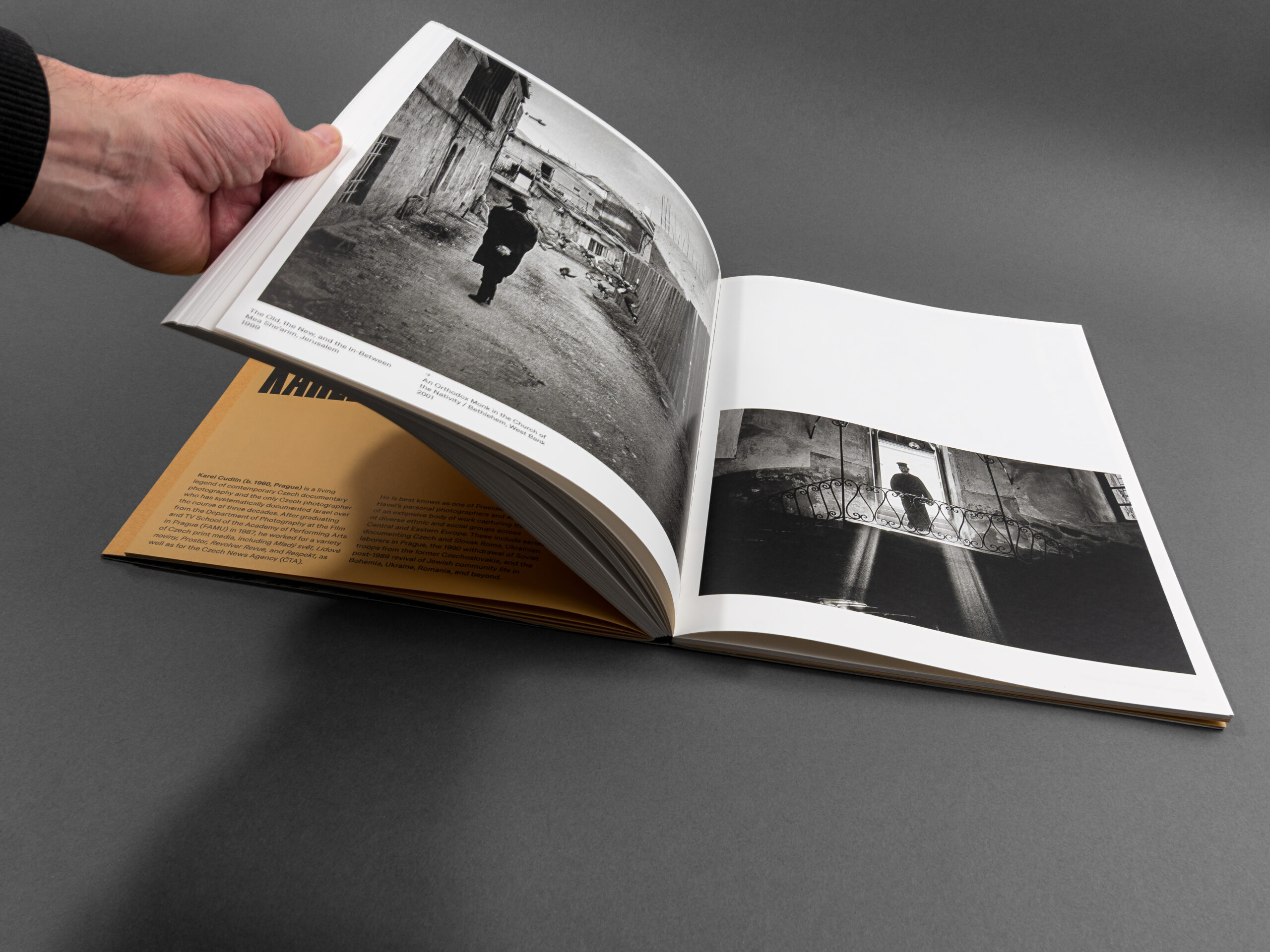
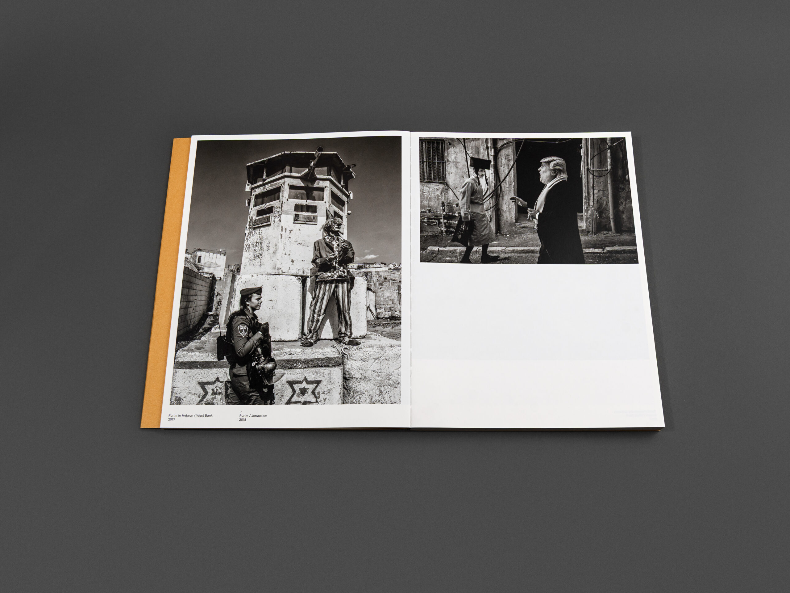
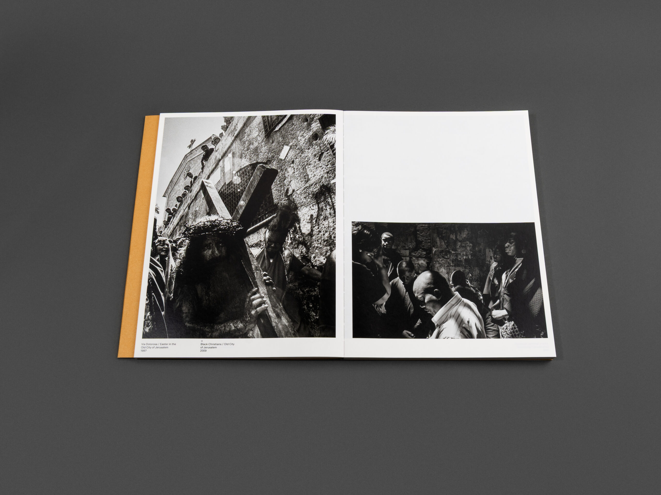
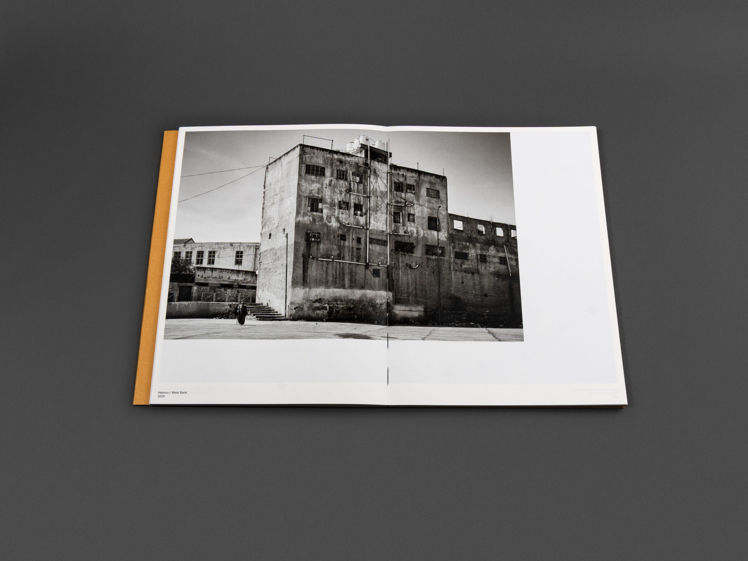
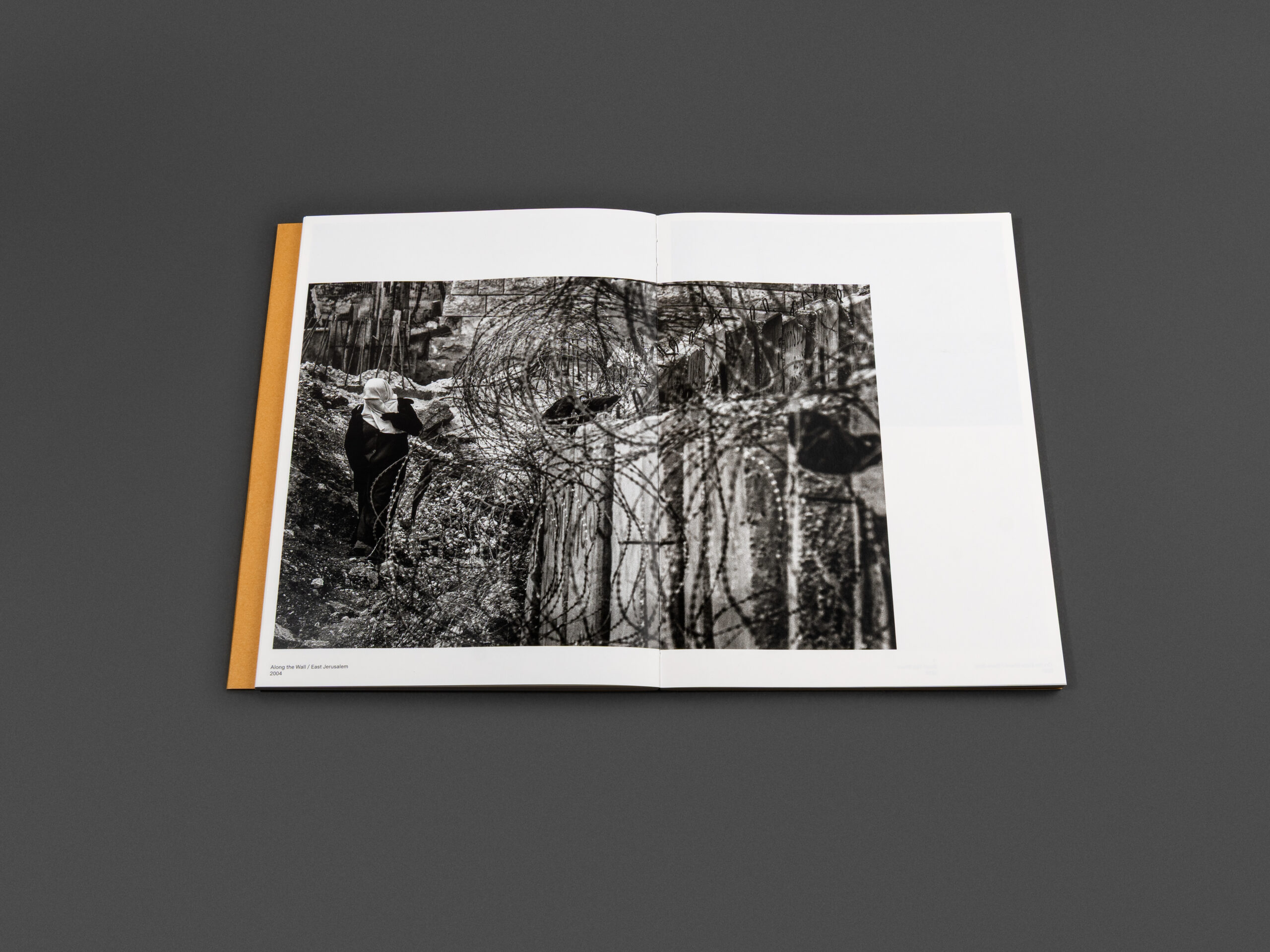
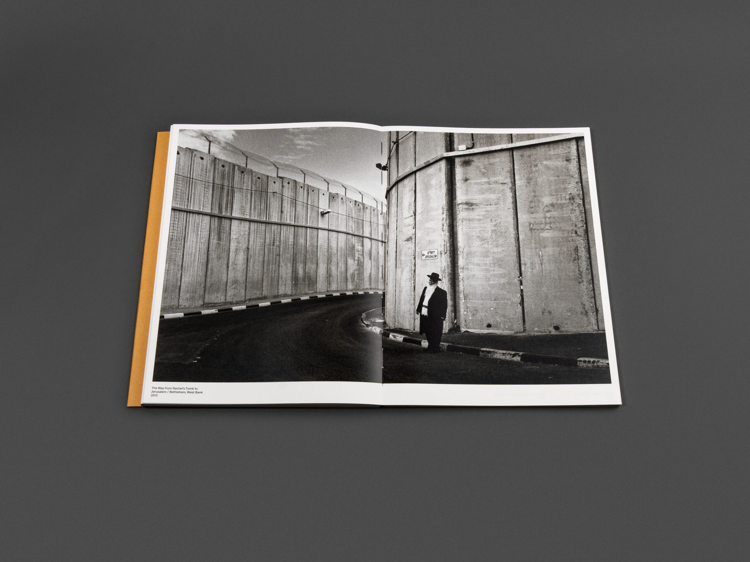
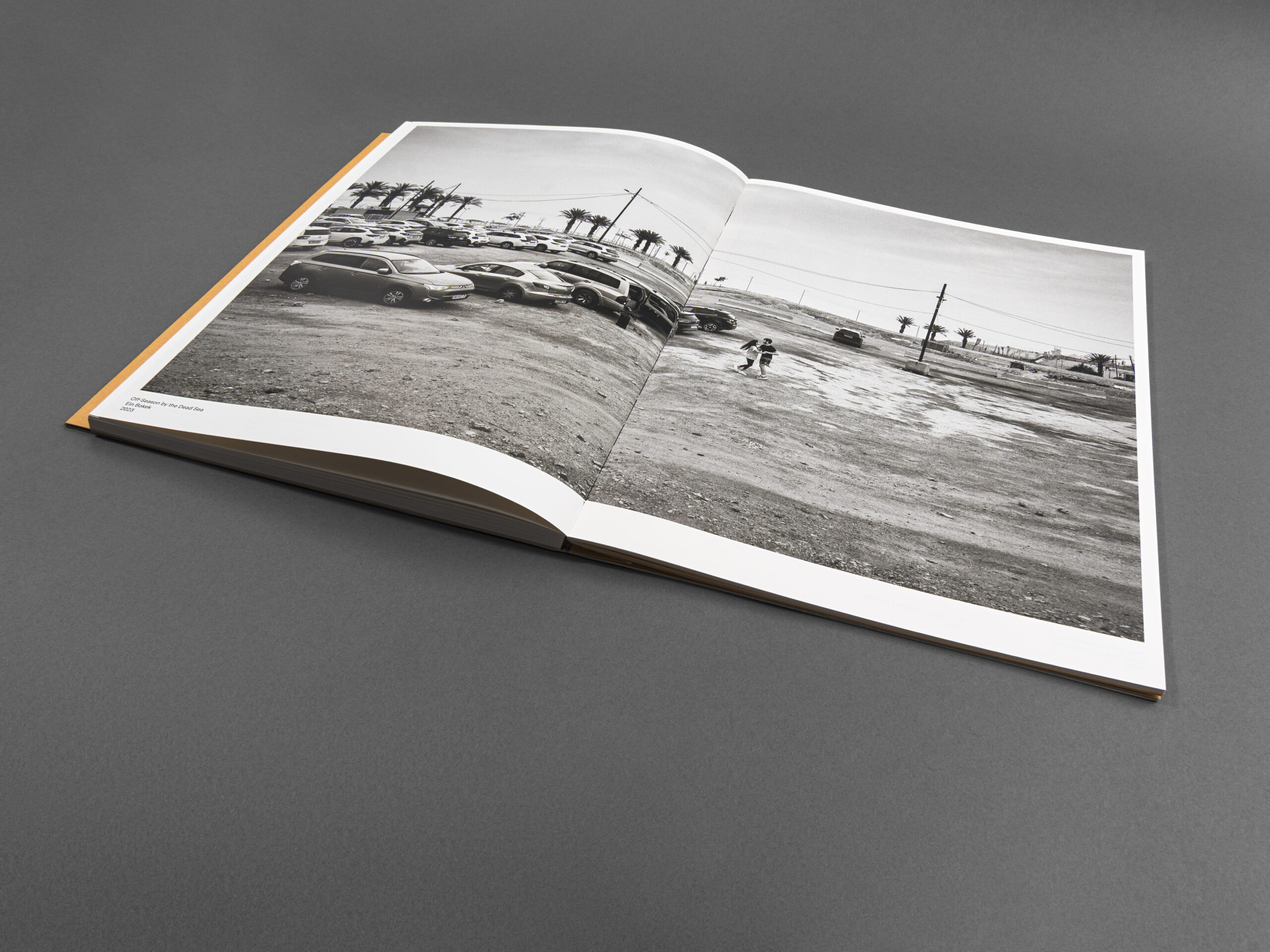
Carefully selected papers add visual depth and cohesion: the book itself is printed on GardaPat 11 Ivory 150 gsm, while the cover features Pergraphica Natural Rough 400 gsm.
GardaPat 11 Ivory by Europapier offers a refined balance between performance and tactile elegance. The matt, wood-free coated paper has a pleasing volume of 1.1, creating reassuring thickness even at lower grammages. Its soft Ivory shade introduces warmth and sophistication to the monochrome imagery, while its opacity supports impressive image clarity and tonal depth, qualities particularly important for black-and-white photography.
At the same time, the paper performs reliably in production. With short drying times and high pulp content, GardaPat 11 Ivory supports efficient printing and smooth finishing processes while maintaining excellent structural integrity. The paper’s tactile softness and subtle visual character make it an ideal choice for a publication where materiality plays such an important role.
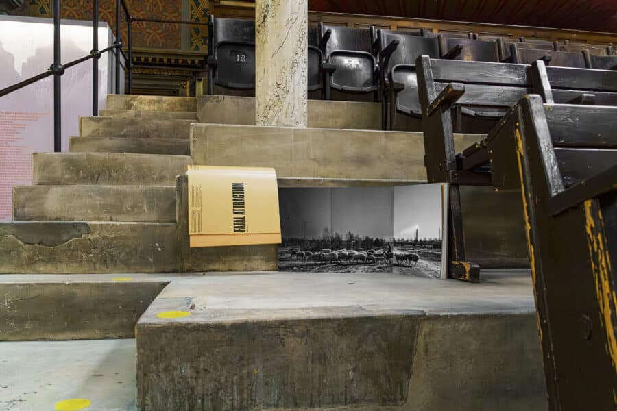
An especially thoughtful detail can also be found inside the cover construction. The interior of the cover was laminated using the same coated stock as the book block itself. This technical decision was made to support a panoramic photograph printed across the gatefold cover flap and continuing seamlessly onto the first page of the book block, spanning three consecutive page widths. Printing directly across uncoated and coated materials would have created visual inconsistencies, so the unified stock ensured a smooth and cohesive image reproduction across the entire spread.
Burning Love is where the art of photography, materiality, and craftsmanship meet.
With Burning Love, every production decision supports the storytelling. From the tactile paper selection to the technically demanding open-flat binding, the publication demonstrates how thoughtful print production can deepen the emotional impact of photography. The result is a book that feels carefully considered in every detail, visually immersive, physically engaging, and quietly sophisticated. It is not only a compelling photographic document of Israel across 30 years, but also a beautiful example of contemporary bookmaking where form and function exist in perfect balance. You can purchase your own copy here.