In design, permanence is often treated as a virtue. We are taught to create timeless identities, enduring packaging systems, and visual languages robust enough to survive years of market shifts. We obsess over consistency, durability, and longevity. Every guideline, every specification, every carefully chosen detail is intended to ensure that a design remains exactly as it was envisioned. But what if not everything needs to last? What if some of the most compelling design experiences are the ones that slowly disappear?
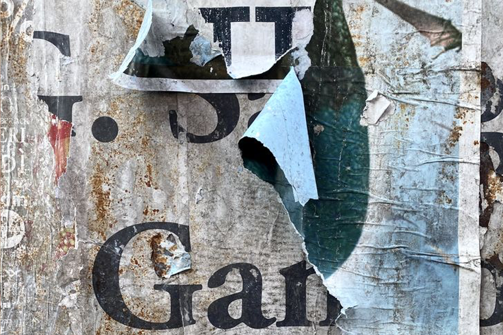
Design has always been more fragile than we like to admit. Paper yellows. Inks fade. Packaging crumples. Adhesives fail. Surfaces scratch. Brands evolve. Even the most carefully crafted identity systems eventually become artefacts of a particular moment in time. Yet much of contemporary design practice is dedicated to resisting these realities.
We laminate, coat, preserve, archive, and standardise. We attempt to freeze a visual expression in place, as though permanence were somehow the natural state of things. But materials tell a different story. Paper is a living material. It reacts to light, moisture, temperature, handling, and age. Printing inks shift over time. Colors soften. Textures wear. Objects accumulate evidence of their existence. Perhaps the question is not how to prevent change, but how to design for it.
Packaging as a temporary object and the aesthetics of fading.
Packaging is uniquely positioned within this conversation. Unlike furniture, architecture, or even books, packaging is rarely intended to remain. Its life cycle is often measured in days, sometimes only minutes. It exists to protect, communicate, and create a moment of interaction before disappearing into recycling bins, drawers, or memory. And yet, packaging design frequently borrows the language of permanence.
Brands seek consistency. Materials are engineered for resilience. Visual systems aim for complete control. But temporary objects can be powerful precisely because they are temporary. A shipping box that shows signs of travel. A label that softens through handling. A paper sleeve that acquires folds and marks. These traces of use are not necessarily defects. They are evidence of interaction. They tell a story.
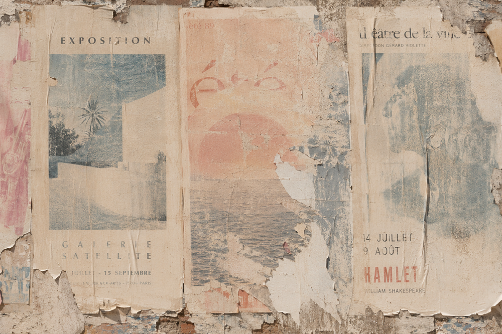
There is something strangely beautiful about a design that changes with exposure. A poster left in a shop window gradually bleaching under sunlight. A printed surface becoming softer after repeated contact. A package whose colors shift subtly as it ages. Historically, these transformations were considered failures. Today, many designers are beginning to see them as opportunities.
Specialty inks such as thermochromic and photochromic inks actively respond to environmental conditions, changing color when exposed to heat or UV light. Once confined largely to novelty applications, these technologies increasingly demonstrate how printed matter can become dynamic rather than static. Rather than resisting change, they make change visible. The result is a different understanding of print, not as a fixed image, but as a performance unfolding over time. In this context, fading becomes a feature rather than a flaw.
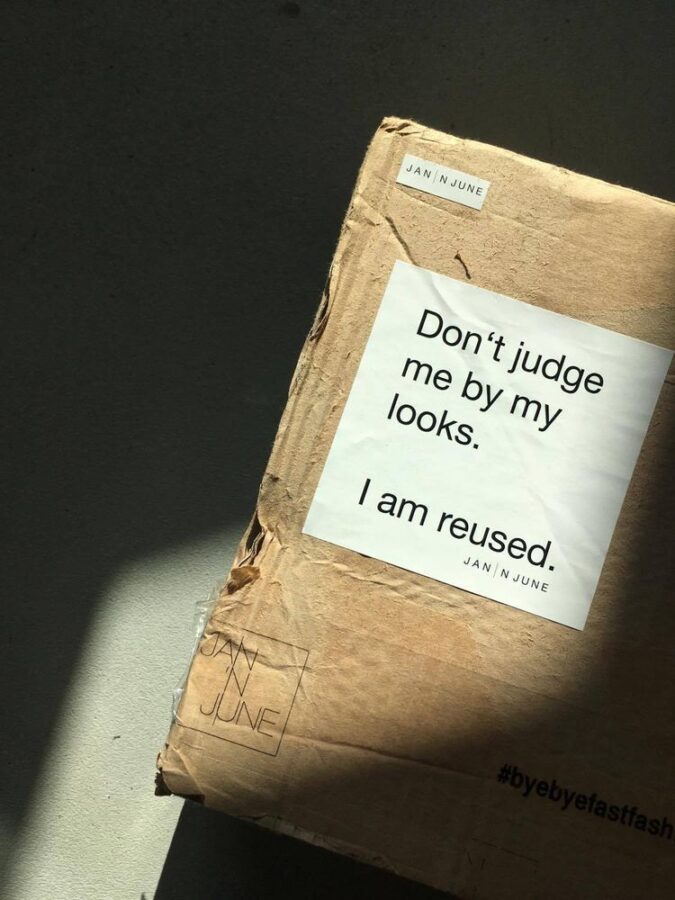
The same idea appears in the growing interest in recycled and reconstructed packaging materials.
Many contemporary sustainable packaging solutions no longer attempt to hide their previous lives. Fibres, fragments, color variations, and visible irregularities are increasingly celebrated rather than concealed. Materials arrive with a history already embedded within them. Recycled paper often contains subtle traces of their origins. Post-consumer materials introduce unpredictability into color, texture, and surface quality. What was once considered inconsistency becomes character. The material itself becomes a narrative.
Projects exploring recycled packaging systems and circular material flows demonstrate that reconstruction can be both a practical and aesthetic strategy. Rather than presenting materials as pristine, they acknowledge their ongoing transformation. In a culture saturated with perfection, visible imperfection can feel surprisingly honest.
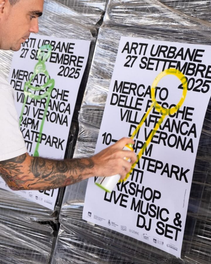
Yet perhaps the most radical extension of this thinking concerns branding itself. For decades, visual identity design has been built around consistency. The same logo. The same colors. The same rules. Repeated indefinitely. Yet brands, like people, are not fixed entities. They evolve through culture, technology, context, and audience. Their meaning shifts regardless of whether their visual systems do.
Increasingly, designers are exploring identities that embrace this fluidity. Systems that allow adaptation, variation, and transformation. Visual languages that behave more like living organisms than monuments. The question is no longer how to create an identity that never changes. It is how to create one that changes meaningfully. A shifting identity can communicate responsiveness, relevance, and humanity. It can acknowledge that certainty is not always the goal. Sometimes resilience comes from flexibility.
Not everything needs to last forever. In fact, some things become more meaningful because they do not.
Perhaps the most interesting design medium is not paper or ink, or the packaging or the branding concept it is part of. Perhaps it is time itself. Every object we create exists within time. Whether it be a book, a card, or anything. With a guarantee, it will age. It will wear. It will eventually disappear. Rather than treating this as a problem to solve, designers might consider it a parameter to work with. What happens after six months? After a year? After exposure to sunlight, handling, weather, or repeated use? How might a package improve through ageing rather than deteriorate? How might a printed surface reveal new qualities through wear? How might a brand acknowledge its own evolution rather than conceal it? These are not questions about durability, but the realities of time.
A faded print reminds us of time passing. A worn package records human interaction. A reconstructed material carries traces of previous lives. A changing identity reflects a changing world. There is honor in permanence, but there is also beauty in disappearance. And perhaps the future of design lies not in resisting change, but in learning how to design with it.