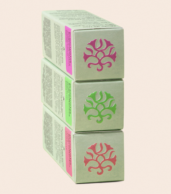
Aware Branding & Packaging by Fibra Is Where Beauty Meets Nature’s Finest Essence

In a world where conscious consumerism is on the rise, the demand for natural and organic cosmetic brands continues to flourish. Beyond the promise of radiant skin or luscious locks, these brands embody a deeper promise – a pledge to harness the power of Mother Nature while advocating for sustainability and purity. So as the market for organic cosmetics is gaining momentum, we’re seeing more and more brands finding unique ways to stand out. 

Central to any brand’s allure is its visual identity. And what we’re used to seeing from organic cosmetics brands is harmonious blends of earthy tones, botanical motifs, and minimalist design principles. But now some are straying from the norm, and pathing their way through the tough competition that commercial markets are.

We could not move away from the category, of natural and organic cosmetics, but above all, we had to represent the exoticism of the natural Peruvian ingredients used in their products.
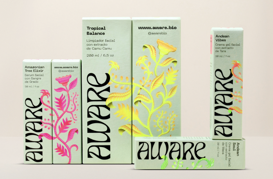
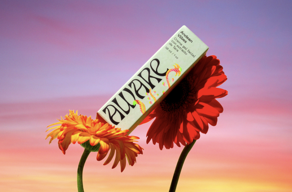
“There is no denying that in recent years natural and organic brands have proliferated, Aware is one of them; but it is also true that many start in a rustic or homemade way and their visual identity, at least initially, does not usually have the necessary work to be competitive internationally” – writes Fibra, a Lima-based branding studio, about their freshly made visual identity concept for organic cosmetics brand Aware.
 
Aware tasked Fibra to create and design a rebranding concept, for an organic cosmetics product that aims to compete in international markets – with the request that the identity represents the product and brand’s quality. “In addition, we could not move away from the category, of natural and organic cosmetics, but above all, we had to represent the exoticism of the natural Peruvian ingredients used in their products.” Fibra continues.
 
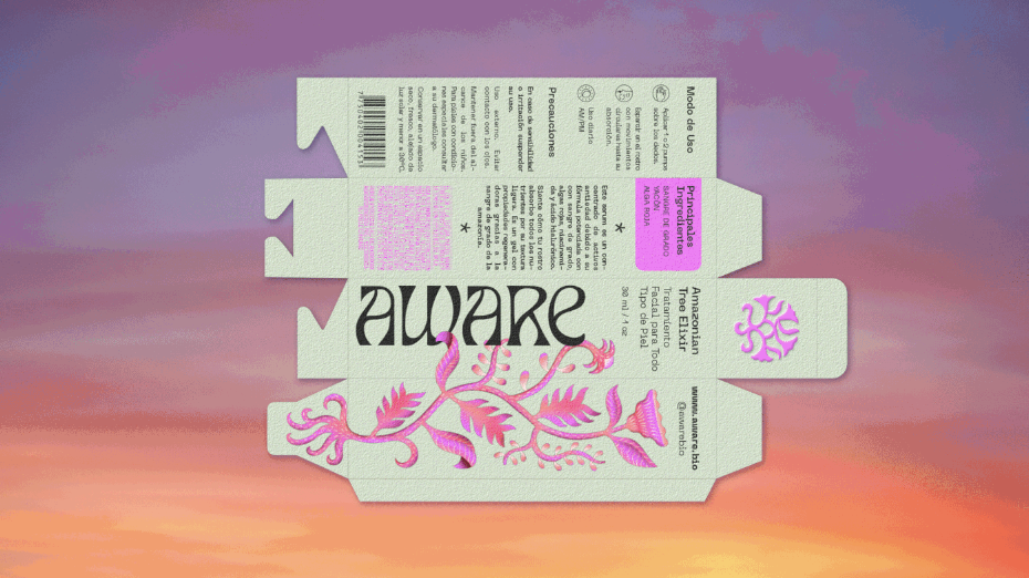
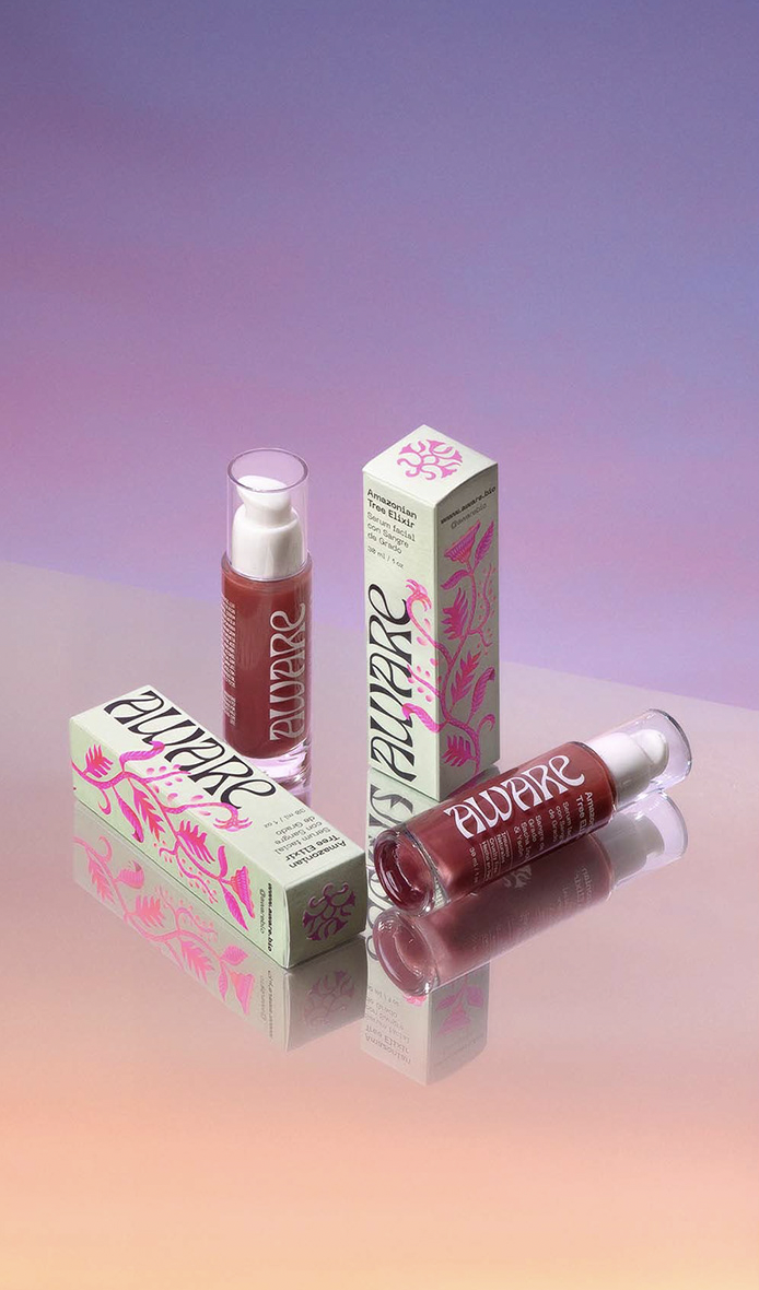
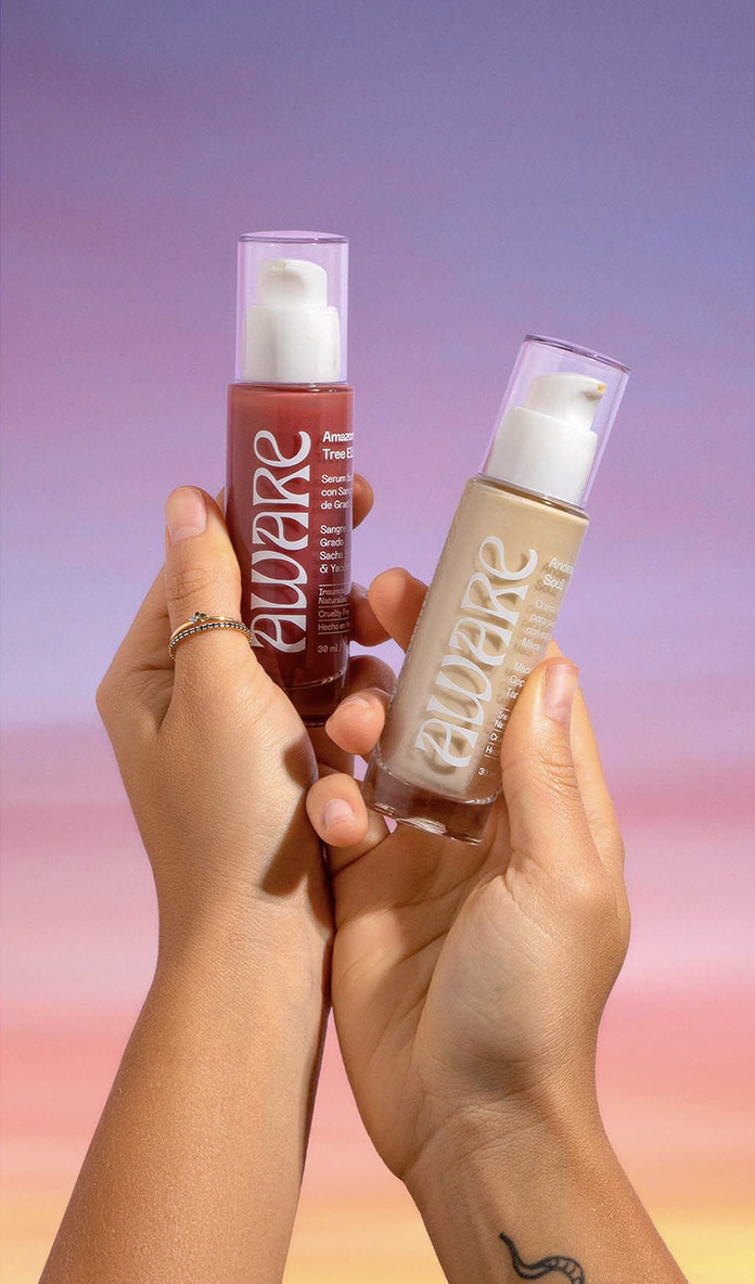
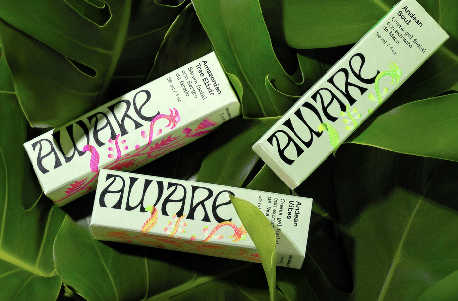
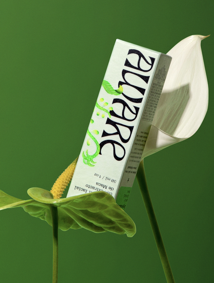
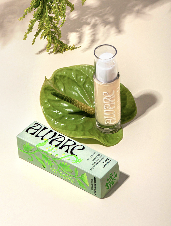
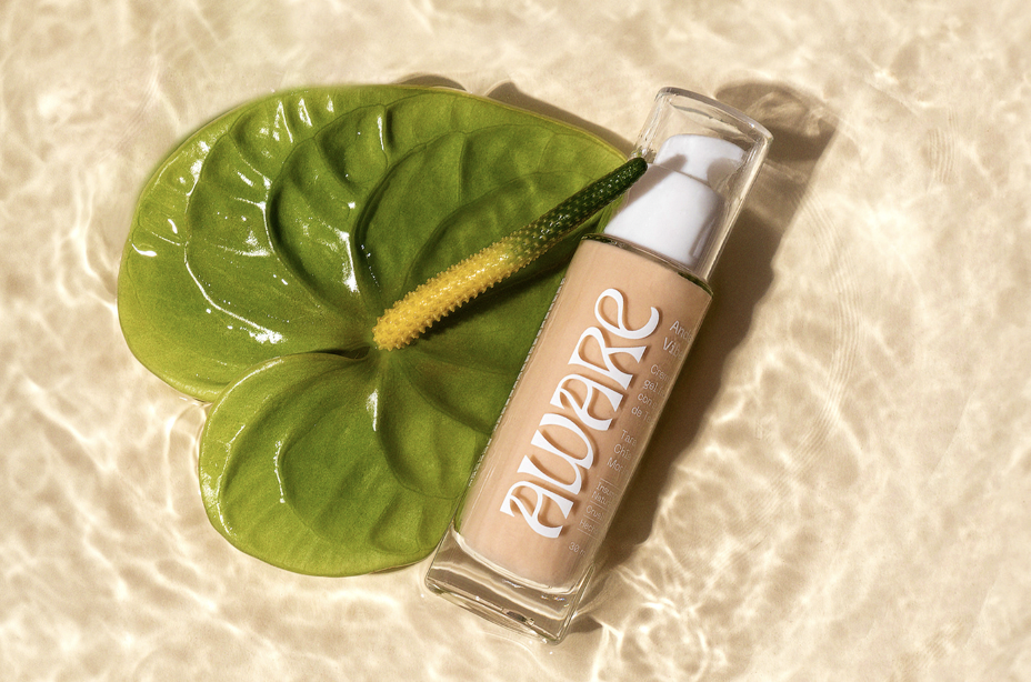
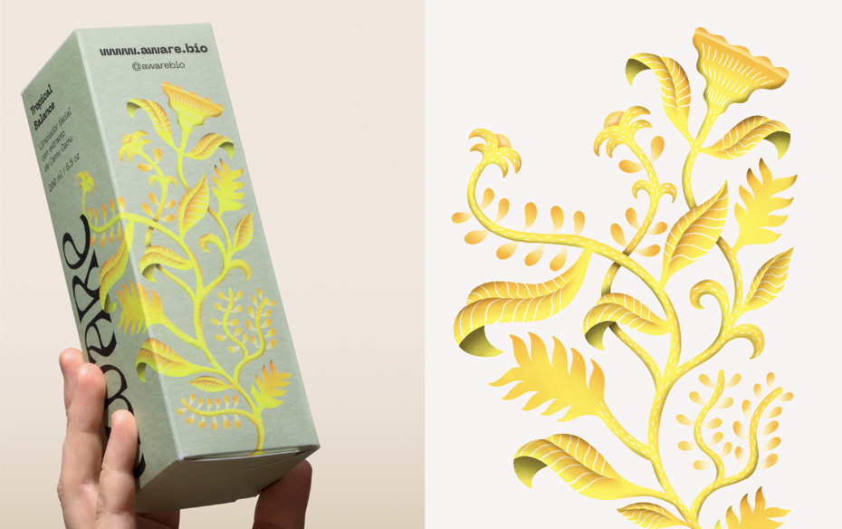
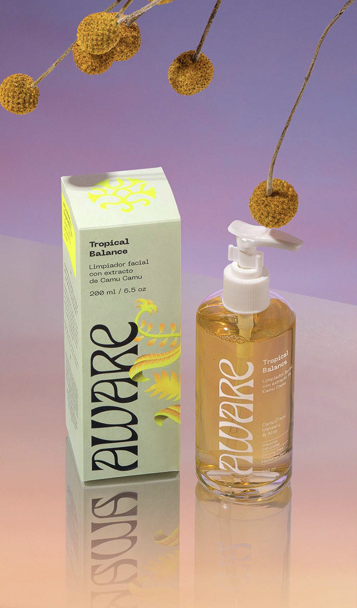
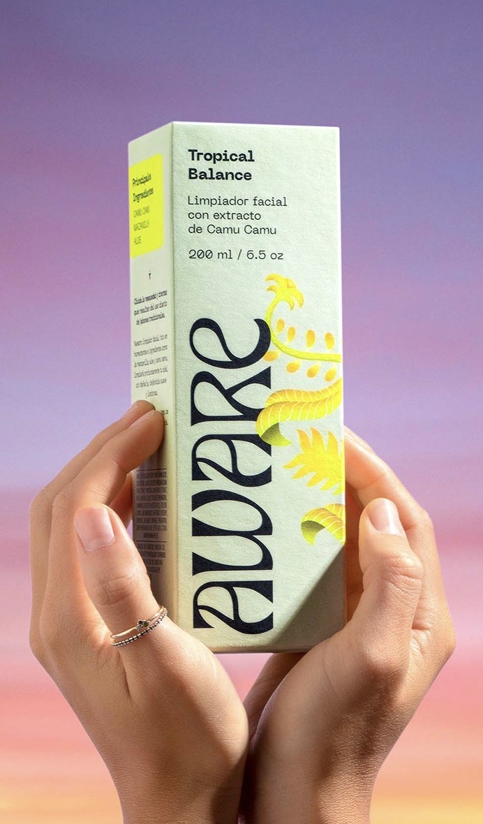
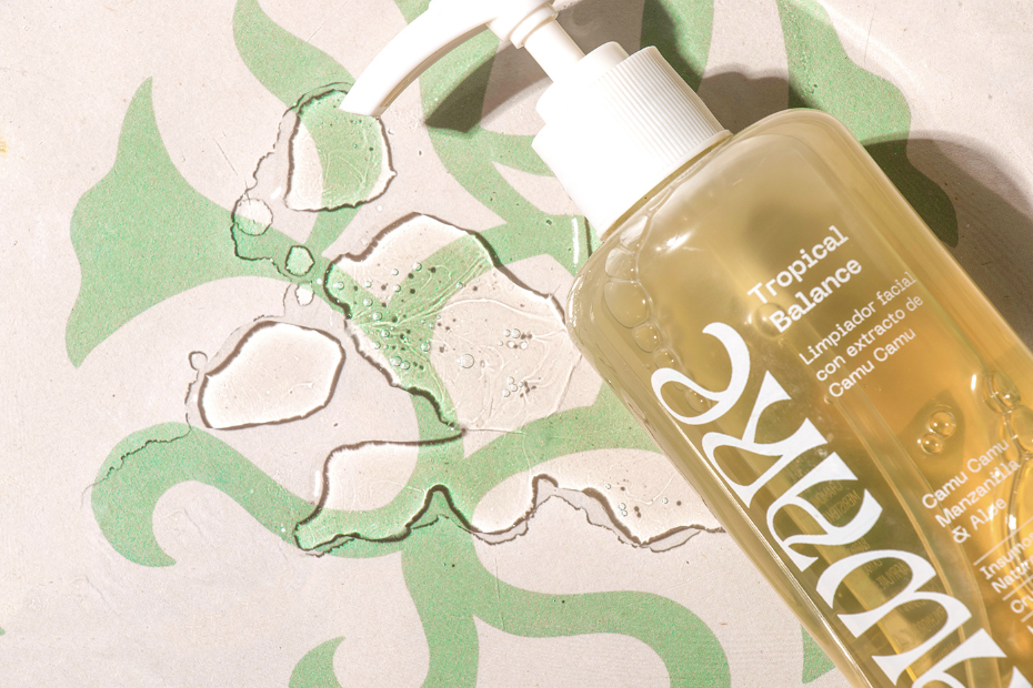
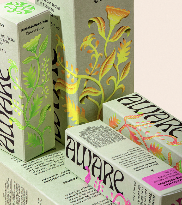
As part of the visual identity concept, which combines contemporary typography with traditional botanical illustration and fresh neon color details. Fibra’s creative team created an illustration that is a type of botanical chimera: a plant that does not exist in reality but is composed of parts and characteristics of several of the ingredients utilized in the products, all as one species; the color palette of intense shades, created with special printing inks are saturated to the maximum, reinforce the rarity of this exotic chimera. The vine-like shape of the illustration is designed to wrap, from bottom to top, around the brand’s packaging.

Enjoy more of the studio’s creative work by following them on Instagram.
 

Images © ??

Subscribe
Get the latest articles and news delivered straight to the comfort of your own inbox!
Subscribe
X
Subscribe
Get the latest articles and news delivered straight to the comfort of your own inbox!
Subscribe