The Polish Theatre in Bydgoszcz is a public institutional theatre, with an ideology of polyphonic openness and accessibility. Theatre should speak with many voices – for a wide audience. Listening carefully to the needs of the inhabitants and trying to address those needs, the theatre writes. One of their plays – WE, EUROPE, BANQUET OF PEOPLES – which premiered on the Avinion Festival last year and is currently on show in the Theatre in Bydgoszcz, is played by actors from different nationalities focusing on the theme of EU and it’s diversity. 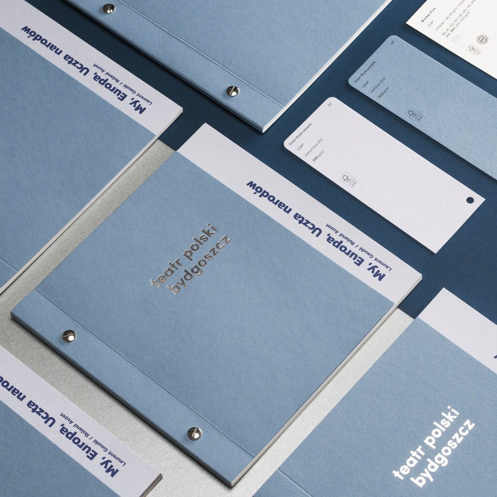
Besides being celebrated for their work, Polish Theatre in Bydgoszcz is known to put special care into their theatre play programmes, which always echo the style and mood of the play in question (see The Vampire Theatre Play Program in Art Deco Style). For WE, EUROPE, BANQUET OF PEOPLES, PERGAMA, a young Polish design studio offering comprehensive service in the field of print and graphic design, was tasked to create a matching programme.
A play programme so unusual and beautiful – everyone would like to own their own!
The design of the programme, both the concept of the publication’s appearance, composition, and graphics are by Wojciech Lewan from PERGAMA. The concept of the design is simple – a really nice, beautiful, elegant folder describing the play. “We always try to make a play program leaflet that will be so unusual and pretty so everyone would like to own one. The program leaflet must be tempting to read so the visual aspect is crucial. During the meetings in the Theatre in Bydgoszcz with the dramatist Daria Sobik we discuss each program leaflet design – the concept and the paper to make decisions about the final solutions and to make sure that it reflects the essence of the play,” Wojciech Lewan explains.
We always try to make a play program leaflet that will be so unusual and pretty so everyone would like to own one. The program leaflet must be tempting to read so the visual aspect is crucial.
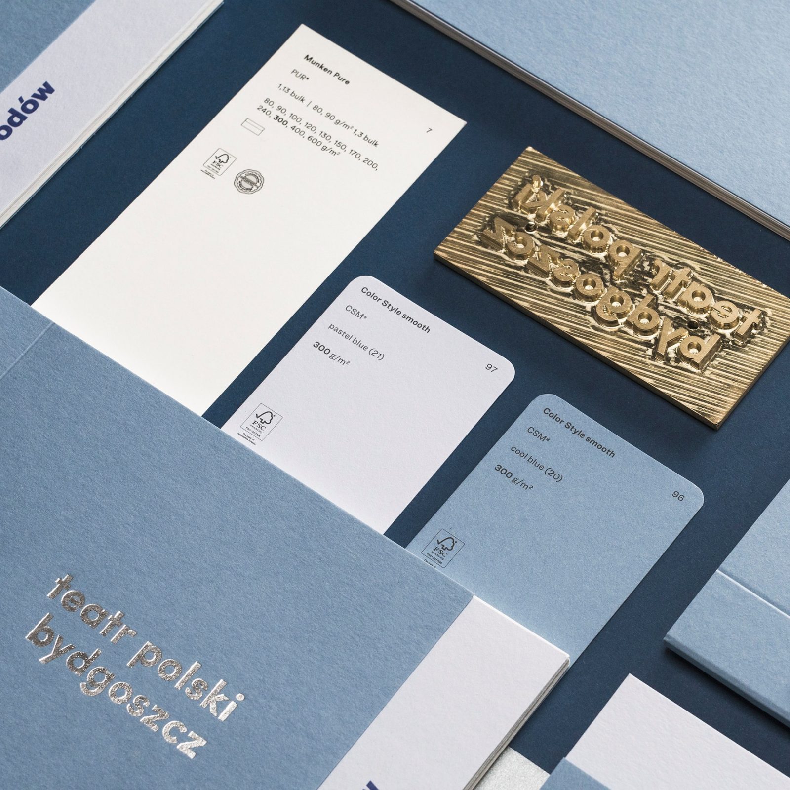
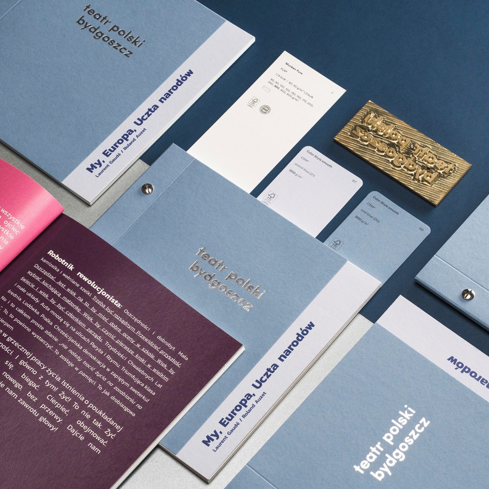
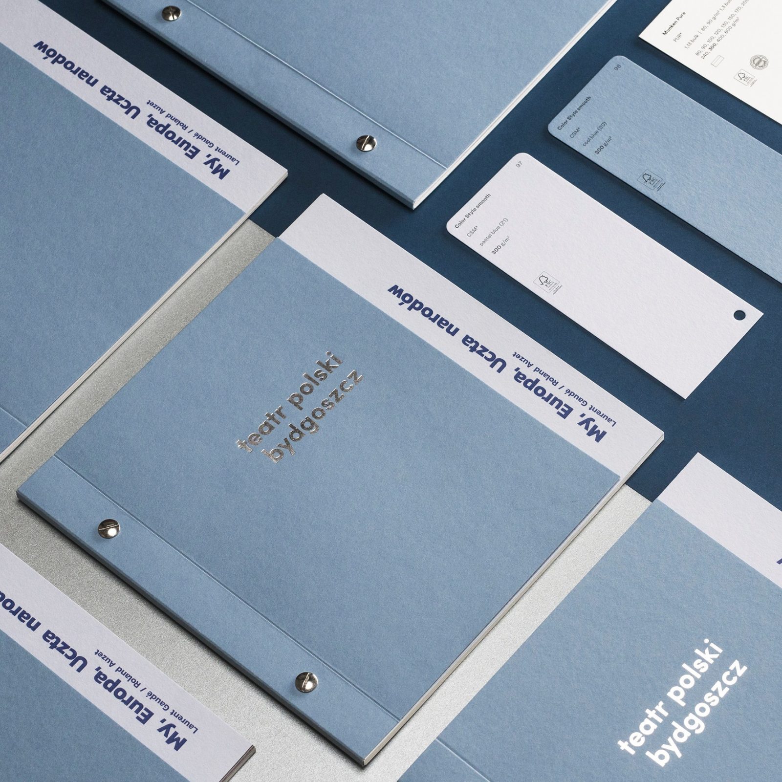
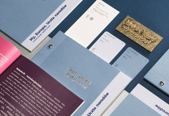
The programme printed on blue tones of Color Style Smooth paper echo the colors of the EU, with a unique and elegant finish
Tones of blue and cream signal harmony and are fitting to the theme of the European Union. The chosen papers; Color Style Smooth Cool Blue and Color Style Smooth Pastel Blue for the cover, and Munken Pure for the inside, create a beautiful, cohesive set, and are all exclusively available at Europapier.
“The composition of two tones of blue and cream fit together perfectly. We try to make every single theatre play program to look different. In this particular case, we decided to make really nice folder in the dimension of 21×21 cm. We also composed paper with silver binding and hot stamping. A little bit shorter cover gives the opportunity to show a piece of the first page with the play title – this is a nice and unusual solution and it invites the viewer to look inside the folder and to start reading”, Wojciech Lewan explains.
The composition of two tones of blue and cream fit together perfectly. We try to make every single theatre play program to look different. In this particular case we decided to make really nice folder in the dimension of 21×21 cm. We also composed paper with silver binding and hot stamping. A little bit shorter cover gives the opportunity to show a piece of the first page with the play title – this is a nice and unusual solution and it invites the viewer to look inside the folder and to start reading.