Podpunkt is an award-winning creative based in Warsaw who finds inspiration in Saul Bass’ famous saying: “Design is thinking made visual”. With a team of experienced designers, managers, and programmers Podpunkt creates comprehensive design concepts for a wide range of clients that stretch from original ideas to strategy and implementation. Their own sister company, software house Superkrypt specializes in digital products, making Podpunkt a powerhouse when it comes to modern design concepts that reach the client across all platforms and mediums. With many impressive projects under their belt, one recent one caught our eye with its simple and down-to-earth yet
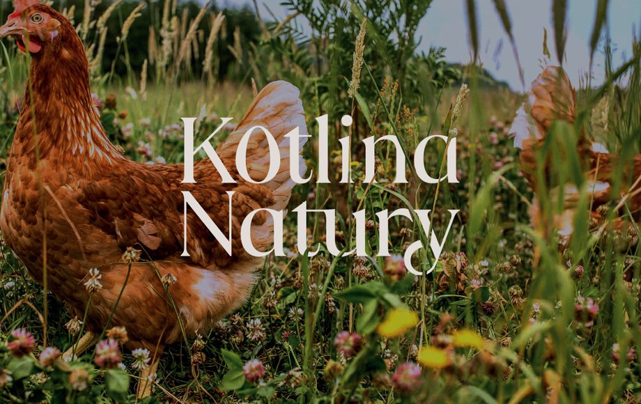
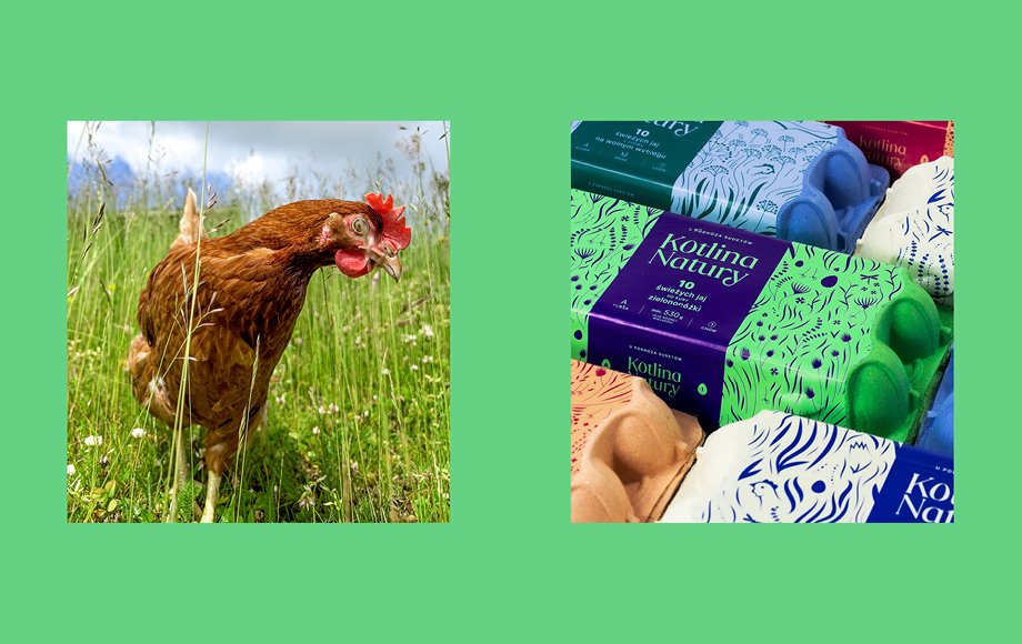
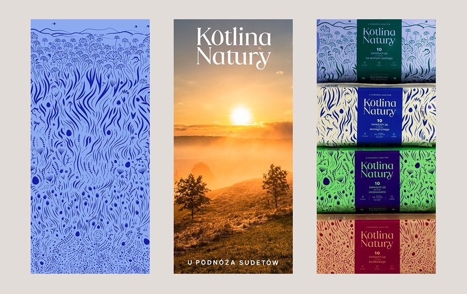
 The identity visualizes the homeland of the brand, the green meadows of the Sudetes mountains – with beautiful, contemporary patterned illustrations in a range of bold colors
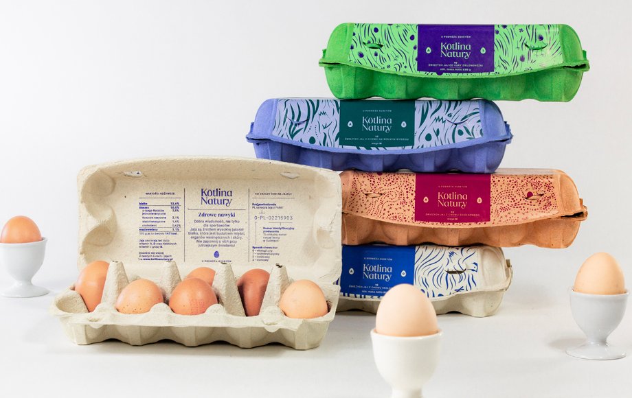
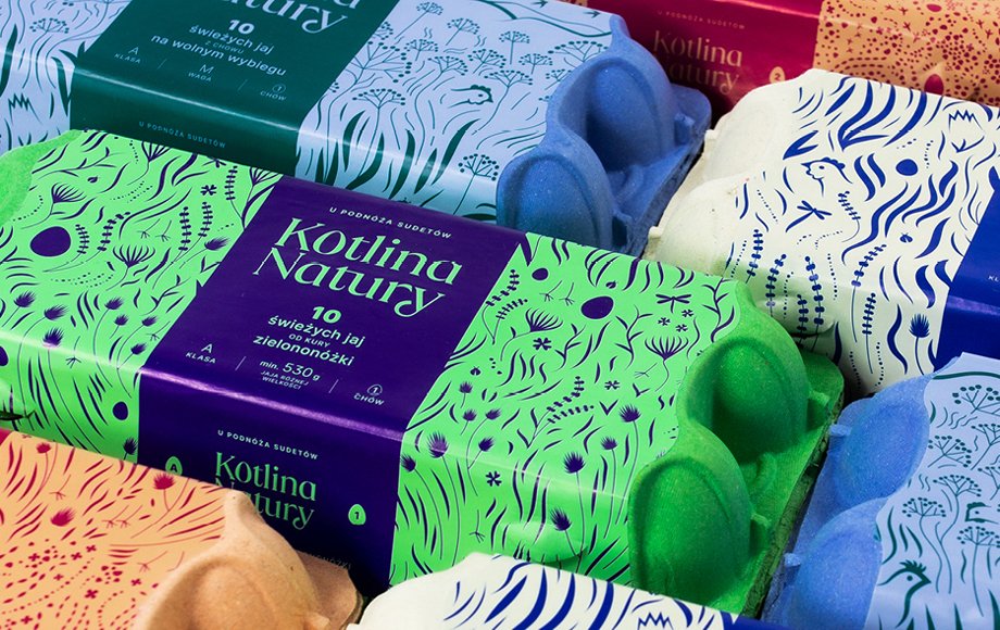
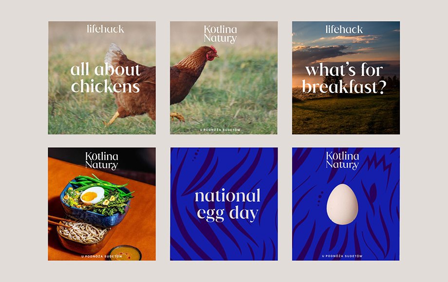
The brand identity invites the consumers to the home of Kotlina Natury. To the meadows in the middle of the Sudetes mountains, introducing the natural habitat of the brand’s heroines — the hens. The custom illustration of the meadow leads us through four geographical levels or areas of the valley. A level of grains and sand, a level of dense grass, a level of taller sprouts and their inhabitants, and finally, a level of tall stems, the tops of which reach the mountain landscapes. Each “level” of the illustration has been assigned to one of the four categories of eggs. The illustrations also feature the protagonists of the story: the hens and their traces, tails, beaks, and full silhouettes, and of course the eggs — as the main logo symbol.
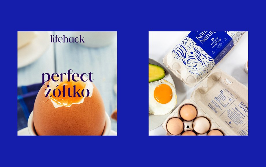
“We chose them because their beautiful, natural pattern and color resembles the structure of an eggshell. They are also good for embossing and stamping, and we wanted a nice 3-D effect.”