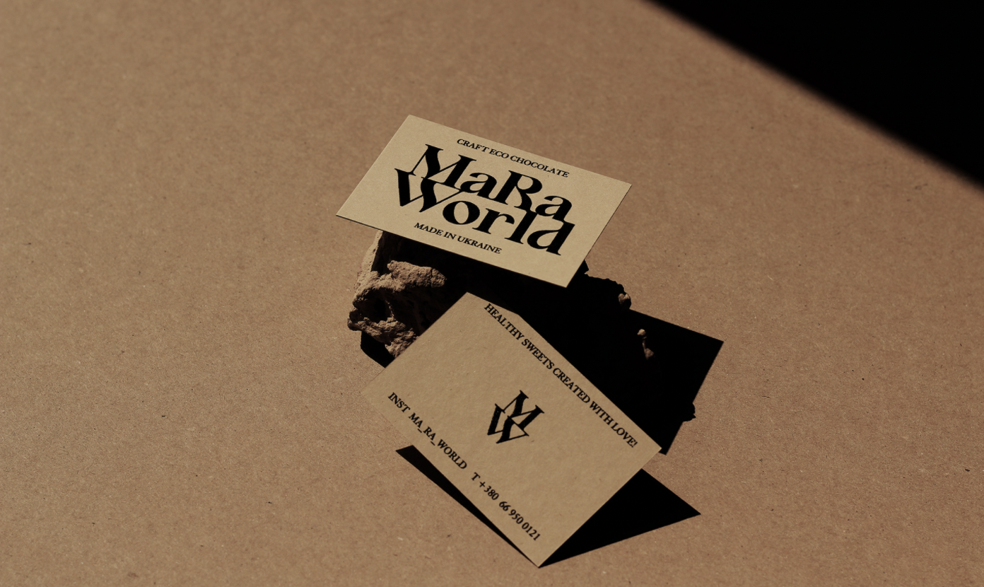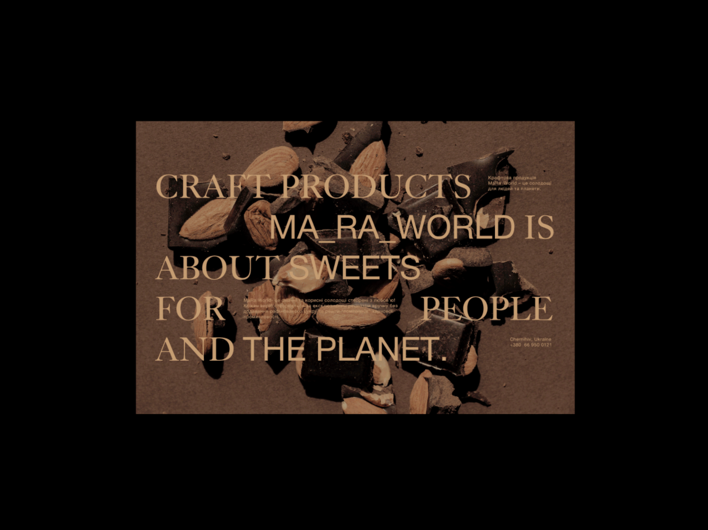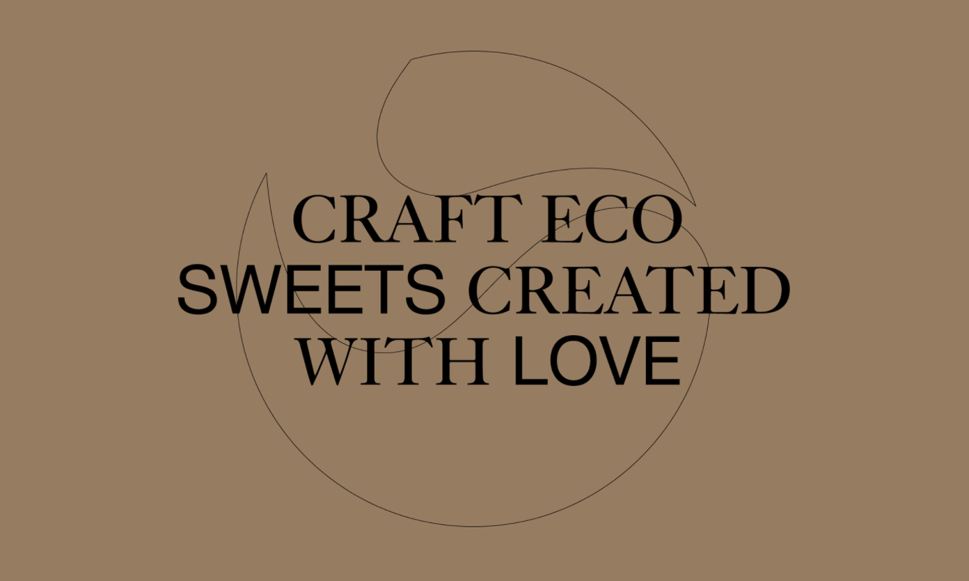
The MaRa World is a craft production of eco-sweets with a mission to create harmless pleasure and inspire for a more conscious and joyful life
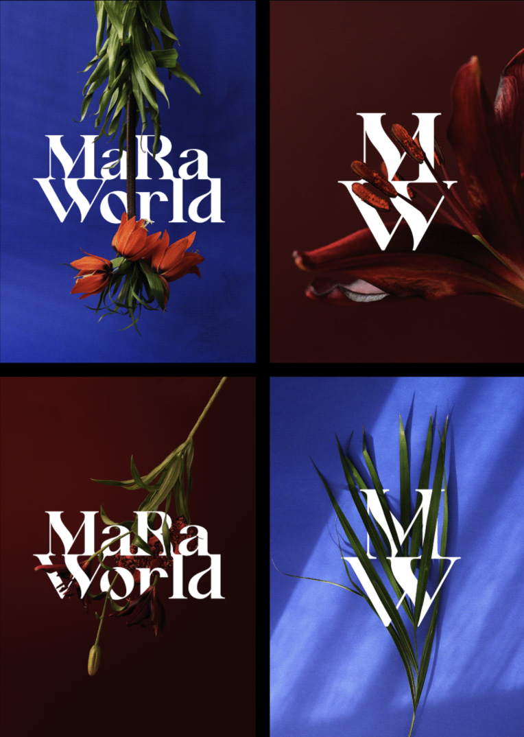
With a name inspired by astrology and a balanced world, the visual identity follows the concept through form, color, and material choices
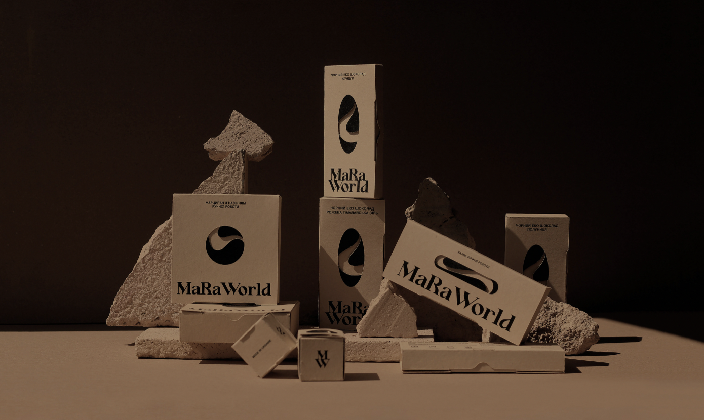
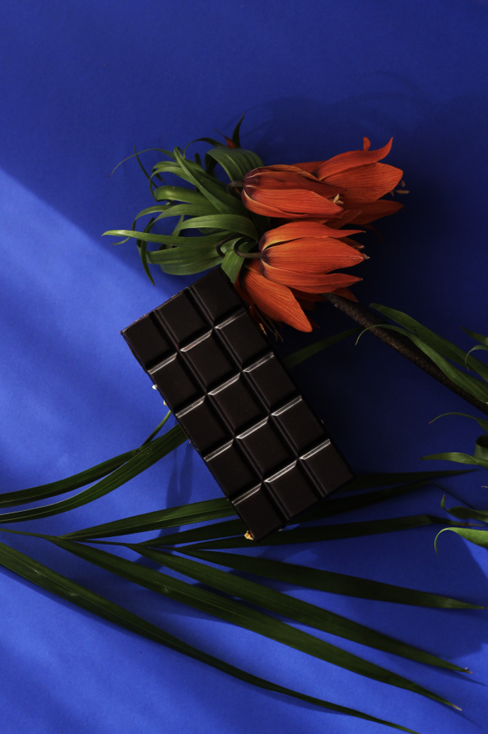
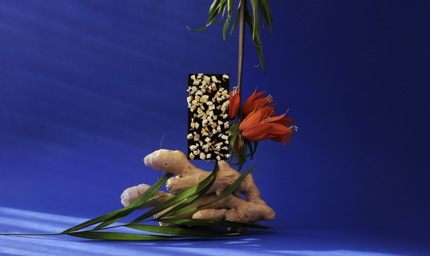
The MaRa name is a combination of terms from the astrology of personality, where Ma (Mars) – a sphere of motivation, willpower, and courage, and Ra (Rahu) – a sphere of instinct, a constant thirst for pleasure. Inspired by the idea of a balanced world, a space of synergy with these opposite human elements. The visual concept consists of three: freedom of nature, the strength of personality, and conscious choice. Which take form as contrast and defined shapes, bright colors and craft eco materials, natural light, and fluent lines.
The visual concept consists of three: freedom of nature, the strength of personality, and conscious choice. Which take form as contrast and defined shapes, bright colors and craft eco materials, natural light, and fluent lines.
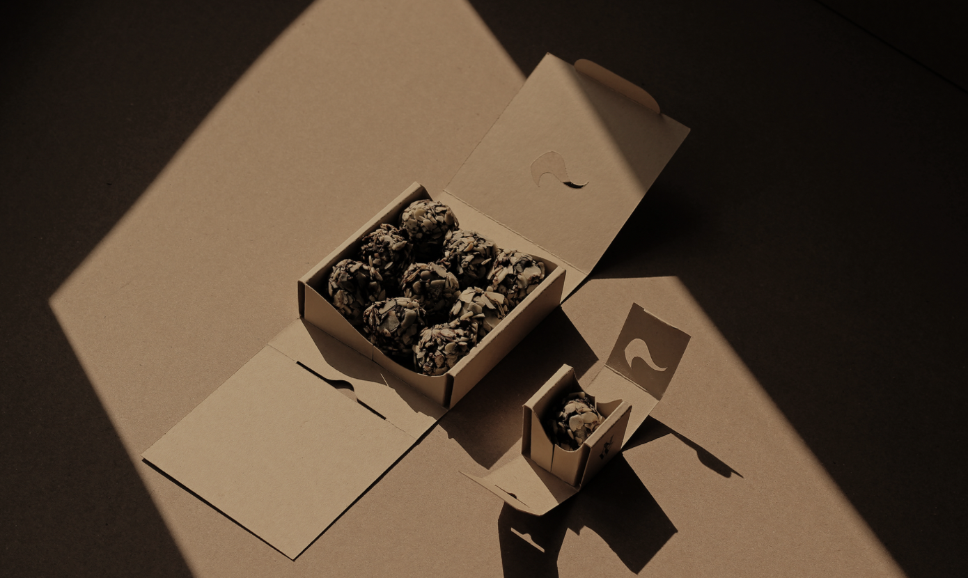
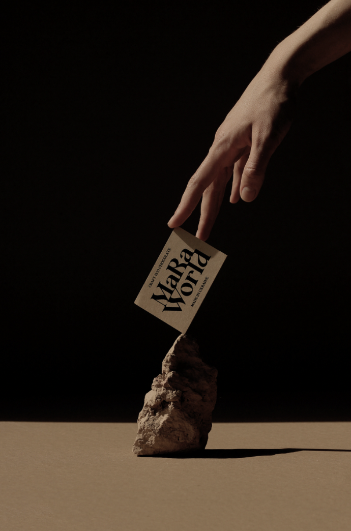
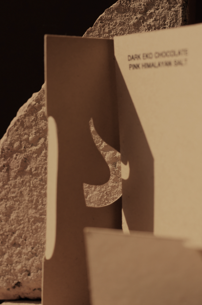
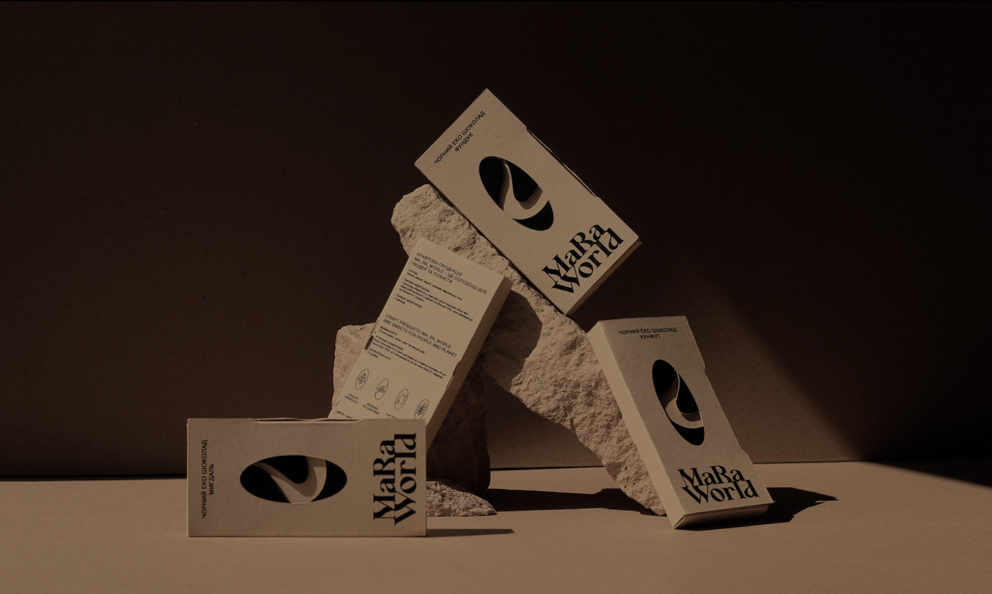
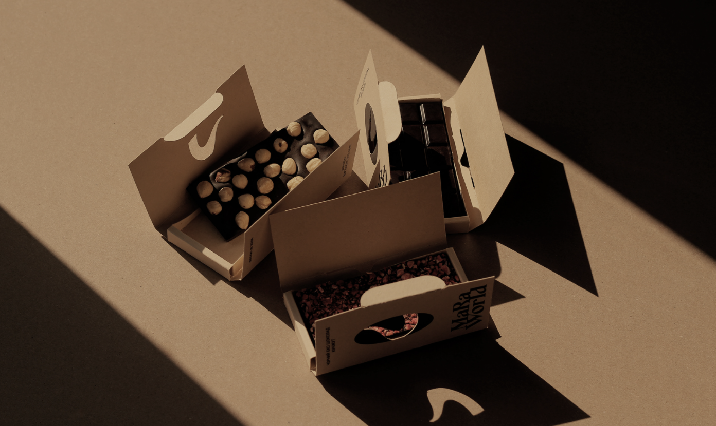
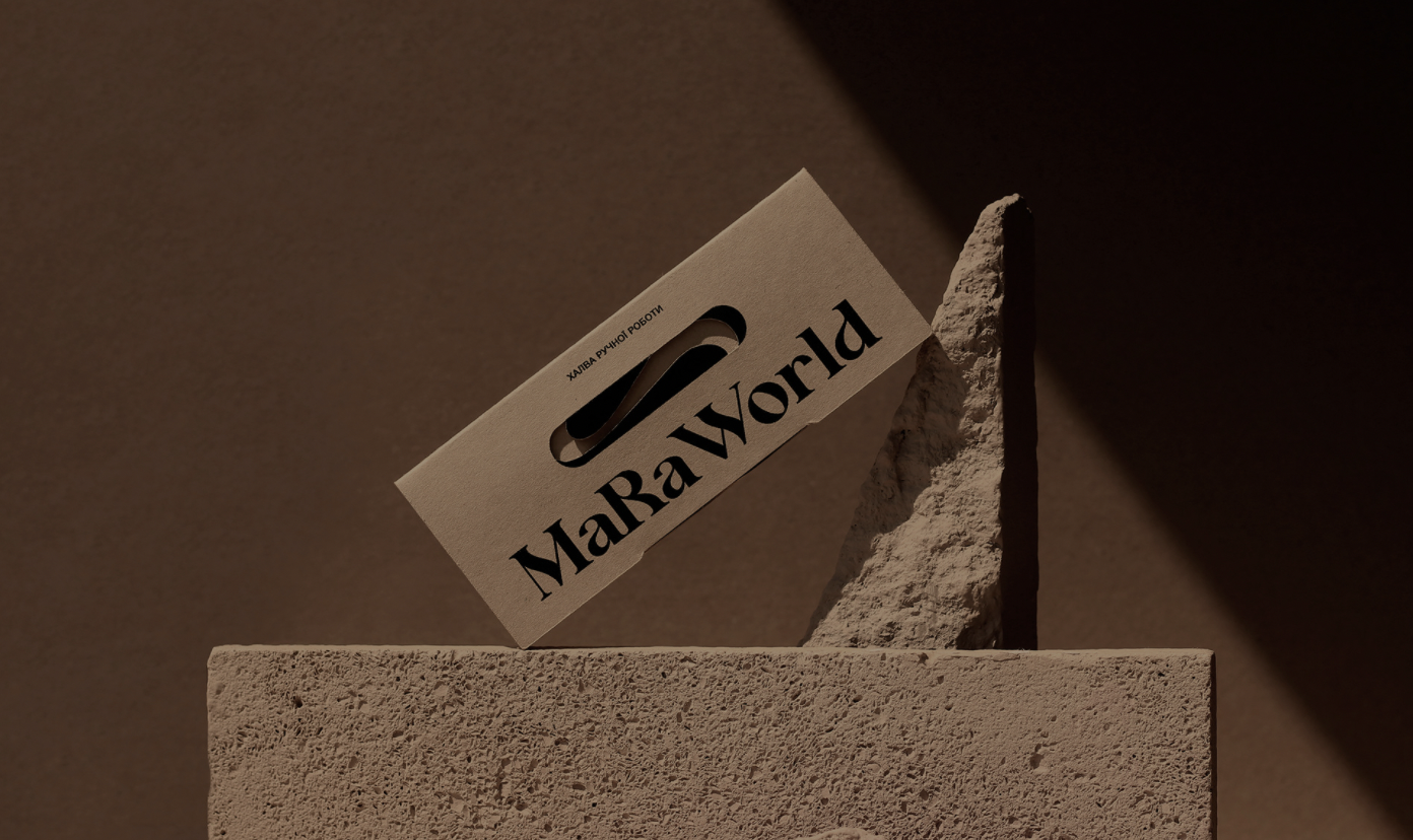
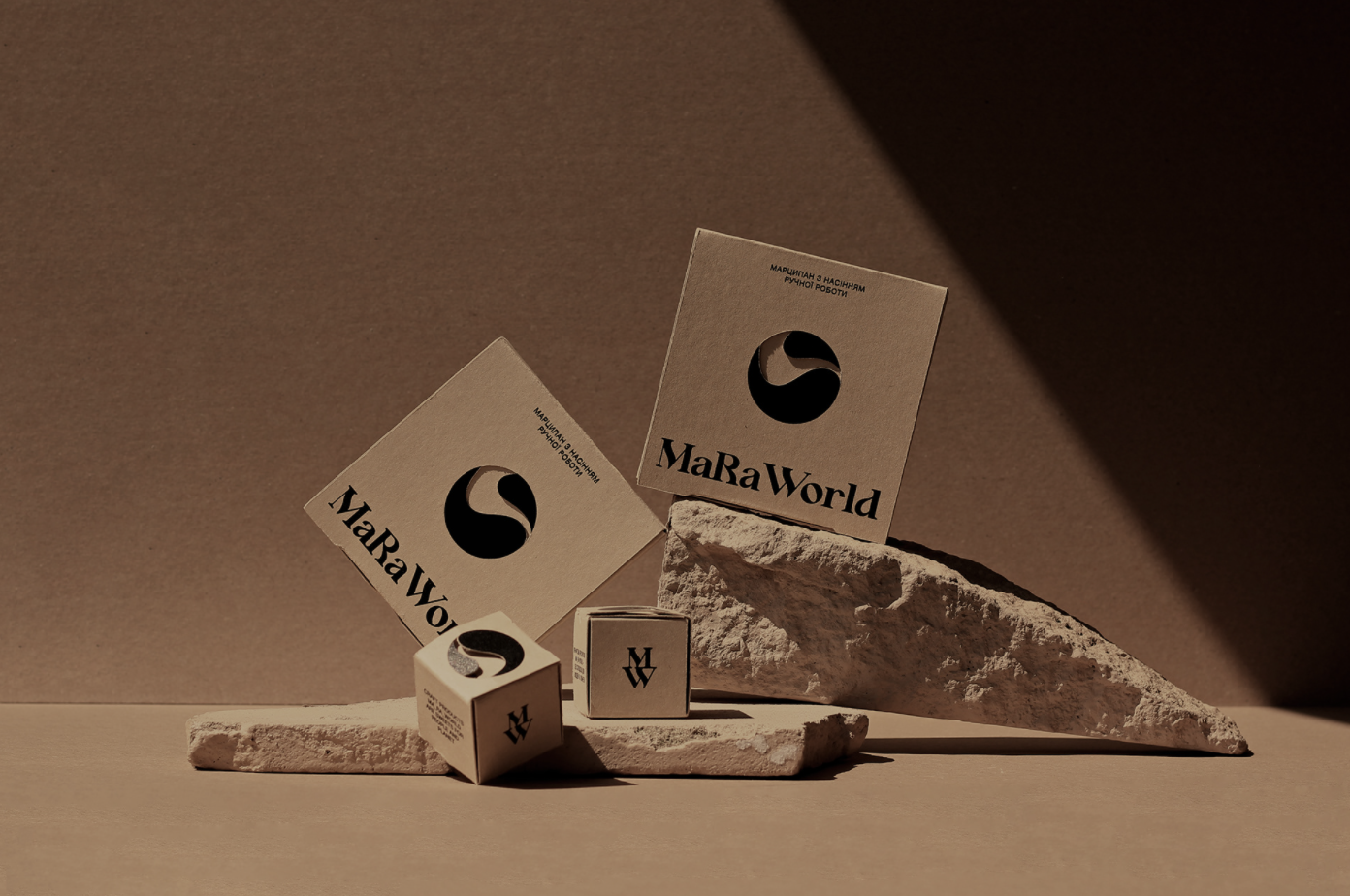
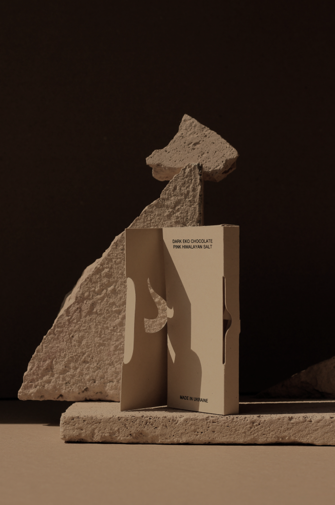
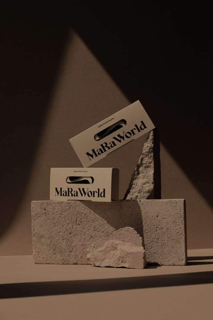
To emphasize the idealogy and strengths of the brand, only black color was used for printing, it being the most environmentally friendly choice, and paper, which consists of 50% recycled material, were used. In addition to the individual forms of packaging, a reusable bag and products with the brand’s social slogans were created. “The visual solutions were aimed at expanding the brand’s audience, making the visual presentation relevant to its high-quality products, and conveying its values”, Davydenko writes.
Photography & Set Design: DAVYD team