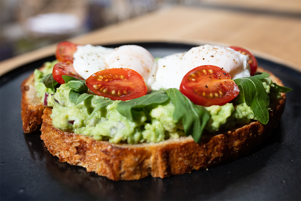
Angi Reisinger is an award-winning corporate design and branding studio, based in the heart of Innsbruck. The studio focuses on encapsulating strong core statements and giving ideas and visions clear form while taking pride in high-quality execution. Recently the studio was tasked with creating an appealing branding design concept for a vegan & vegetarian breakfast and coffee shop Café Momo.
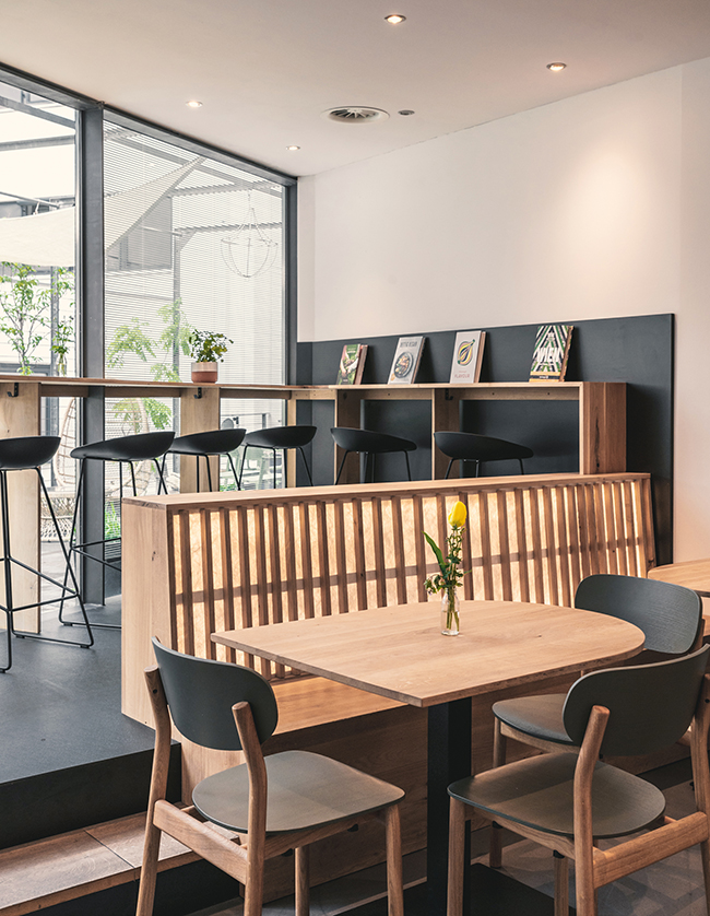
The branding design concept was deeply inspired by the close collaboration with the architect and interior designer of the cafe, which is located on the first floor of the Wagner’sche bookstore in central Innsbruck. “All parties brought together their ideas regarding color, form, and function – so we were able to filter the common grounds and built the whole concept on a strong, and above all, a harmonious basis.”, the studio writes.
All parties brought together their ideas regarding color, form, and function – so we were able to filter the common grounds and built the whole concept on a strong, and above all, a harmonious basis.
“By having the bookstore in the immediate proximity of the cafe, it seemed natural to have elements from the bookstore in the visual identity and furthermore in the interior design. By that, we were able to build a consistent journey for the customers as they have to walk through the bookstore; passing books, magazines, and bookshelves to enter the Café Momo.”
The visual identity and interior design is inspired by the cafe’s unique location within a bookstore, as well as the idea of giving its visitors “some time off from everyday life”
The name of the cafe was drawn from its special location, or more specifically, a certain novel with a beautiful story and message. “Who knows the little girl Momo from Michael Ende’s eponymous novel? In this novel, Momo wants to give people one thing above all: Give people time! Having this wonderful message in the back of our minds Café Momo also wants to create an opportunity to give people time – time to have a freshly brewed coffee, time to eat a vegetarian cake, time to read a great book. In a nutshell, Café Momo wants to create the opportunity where one is able to get a time out from everyday life”.
Who knows the little girl Momo from Michael Ende’s eponymous novel? In this novel, Momo wants to give people one thing above all: Give people time! (…) Café Momo also wants to create an opportunity to give people time – time to have a freshly brewed coffee, time to eat a vegetarian cake, time to read a great book.
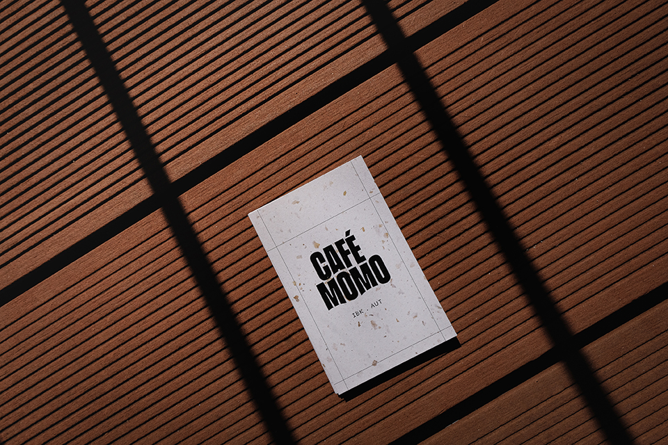
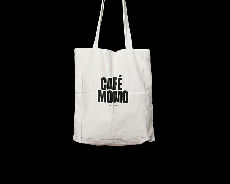
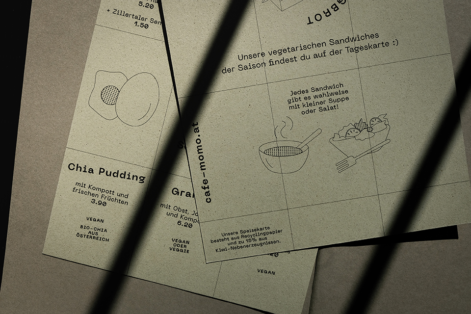
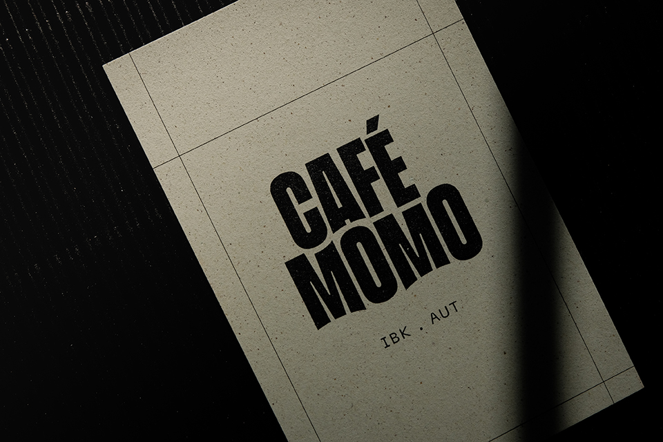
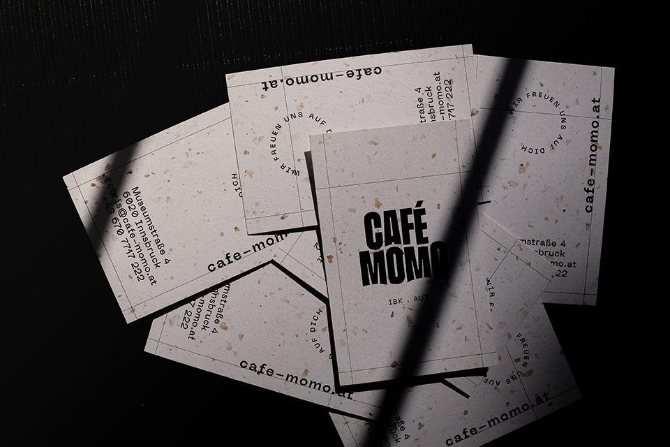
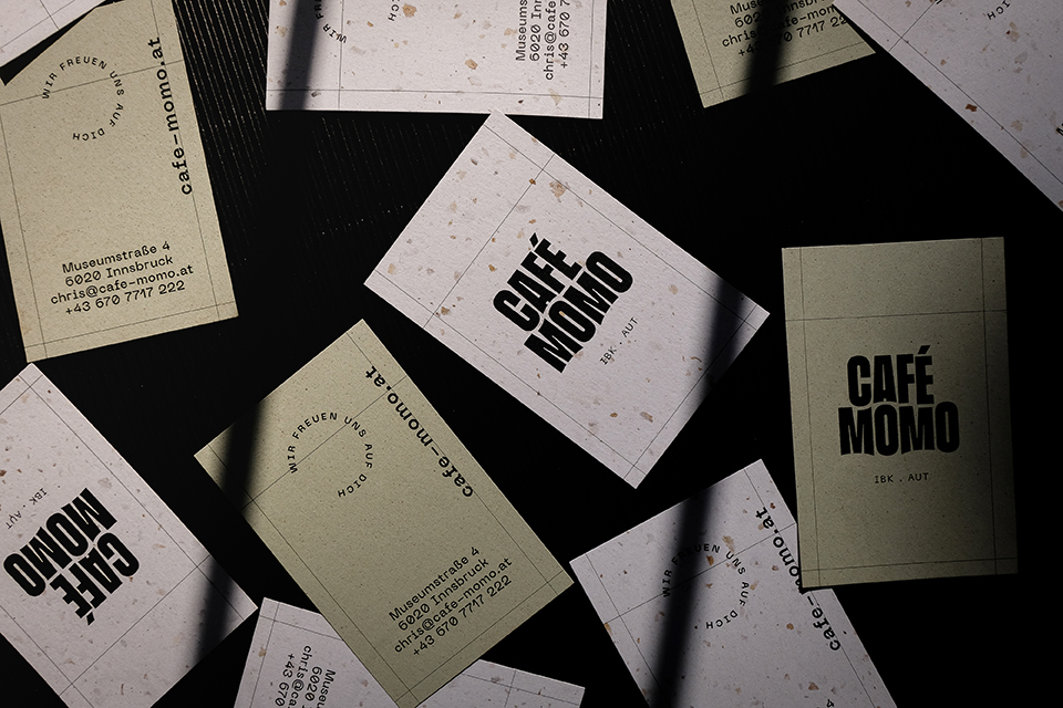
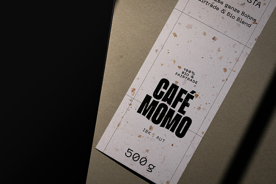
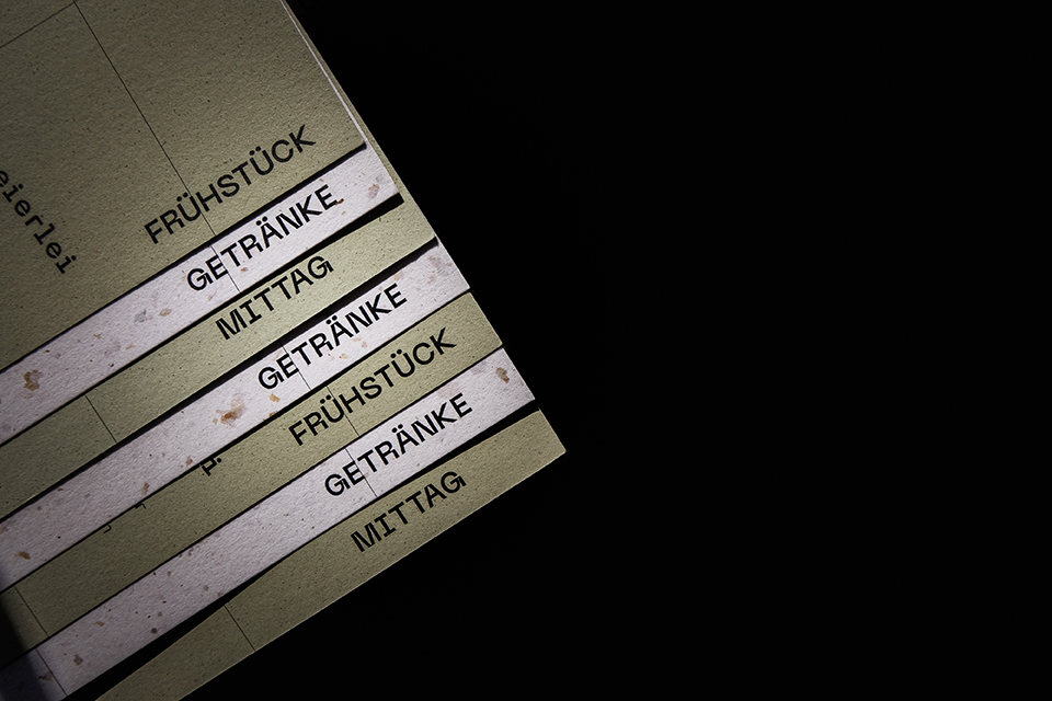
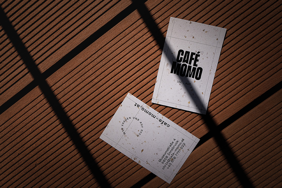
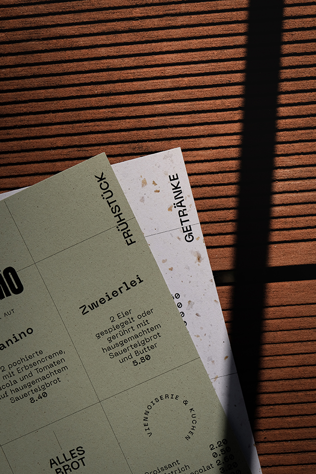
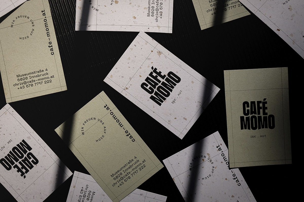
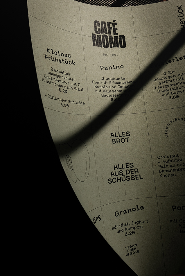
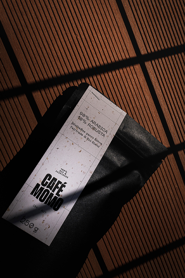
Staying on theme, besides the naming of the cafe, also the logo was inspired by a book. On closer inspection, you can see the arches on the typeface on the logo, as of the pages of an open book, creating a signature look. Additionally, all printed matter repeats an abstract grid pattern referring to the bookshelves of the bookstore.
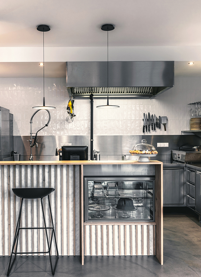
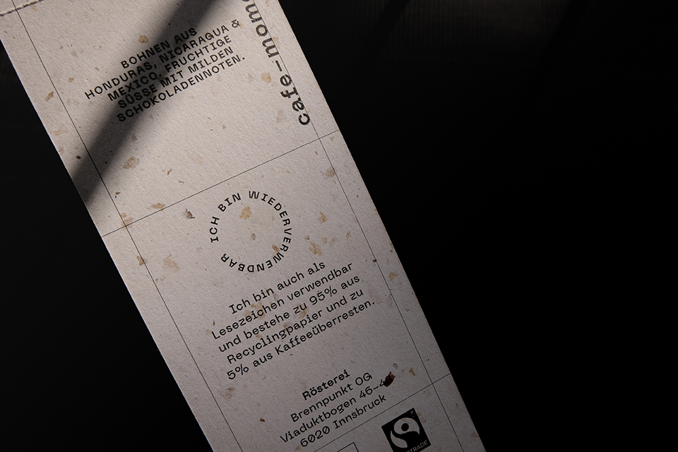
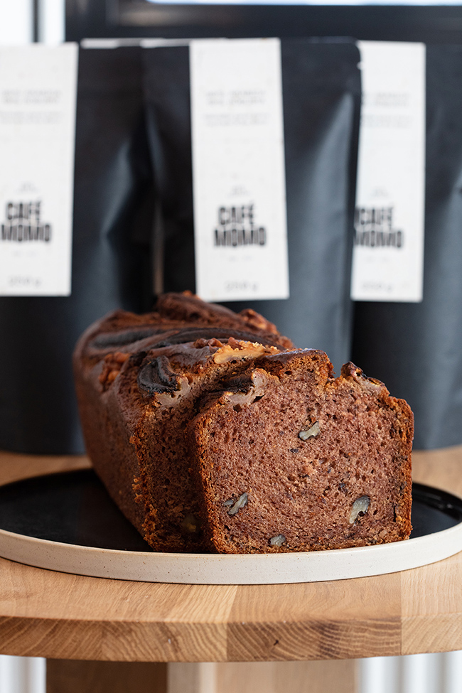
Elements from the concept, including unique line-drawn illustrations, echo throughout the printed materials, from drinks and food menus to shirts and bags, and vouchers and business cards to the cafe’s own coffee packaging, which comes with a stapled bookmark that you can rip off and use further as a bookmark. Besides the visual identity, Angi Reisinger designed a simple but functional website and signage for Café Momo.
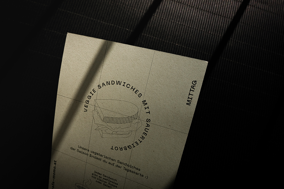
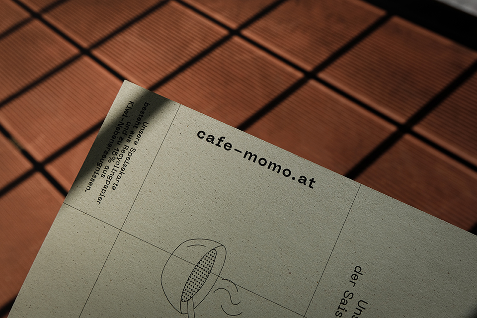
Sustainable and eco-conscious design papers Favini Crush and Kaffee Papier recycelt provide a great match for the vegan and vegetarian-exclusive menu of Café Momo
When it came to creating the printed materials, the studio wanted to highlight the natural and ecological aspects of the Café Momo concept. Considering the served menu is vegan and vegetarian-exclusive, the recycled Favini Crush Kiwi paper became a smart choice for all the printed matters connected to food. The unique design paper is manufactured with residues of the kiwi fruit itself, which is used as an alternative raw material to produce the ecological paper following a circular economy model, which provided the paper with a distinctive flecked texture and appearance. (You can read more about the Favini Crush range here). For the remaining print materials, an equally unique paper was chosen: Coffee Paper recycled from the Europapier Group, which is made out of 100% recycled material and residues from the process of roasting coffee beans. (Read more about the paper’s unique characteristics here). “Having these exciting papers as the base for the print materials, we integrated the “bookshelf-inspired” grids that provide an opportunity to give the stationery a structured look but still create a calm synergy between exciting paper and structure.”
Keep it natural, keep it simple.
The studio’s main idea behind the material choices was to “Keep it natural, keep it simple. As the chosen papers, and also the themes printed on them, are beautiful enough, we concluded that there is no need for further refinements such as embossing, etc., and printed everything with a simple black on the wonderful colored papers”, the studio concludes.