Croatian Design Bureau Izvorka Jurić creates complete product or service identities for major clients, extending from the original market strategy development to a complete, detail-oriented visual identity and packaging. The bureau carries the name of its founder and creative director Izvorka Jurić, whose career expands over 20 years and includes numerous international awards and recognitions for successful projects in both Croatia and across the world. Working with a team of skillful professionals of the design field, Design Bureau Izvorka Jurić is an expert in building memorable visual experiences that stand out in the most competitive markets, being familiar with the latest trends and technologies while caring about brand sustainability and ecological values.

These skills which only come from the practical designing experience the bureau has is well demonstrated in the visual identity and packaging of Plasinia, a premium quality all-natural cosmetics brand from Croatia.
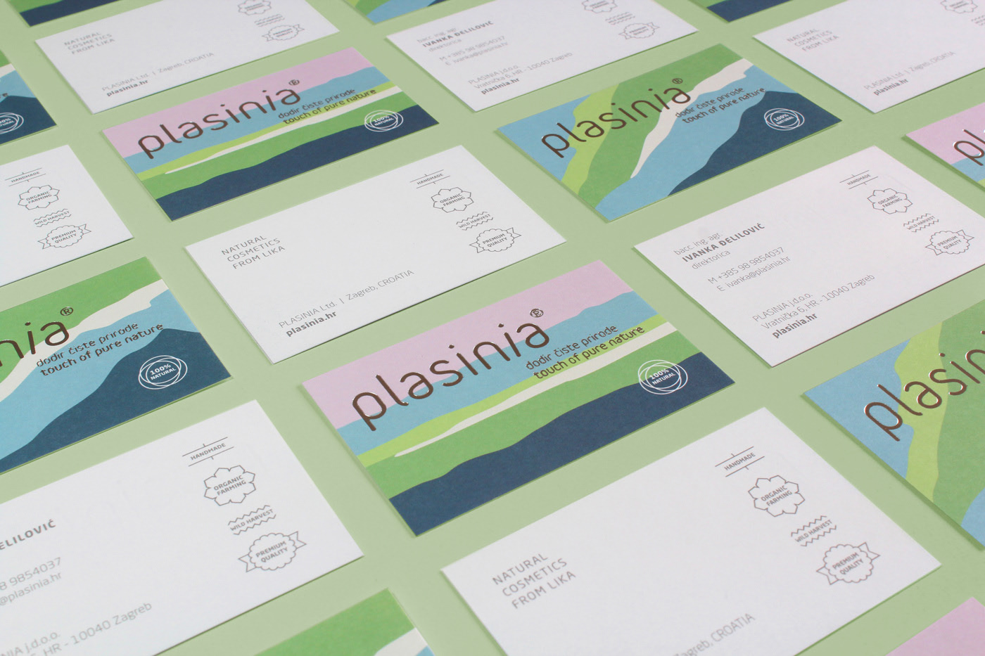
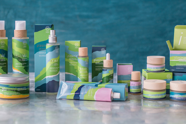
Visual identity inspired by the geographic area and unique nature of the Like region
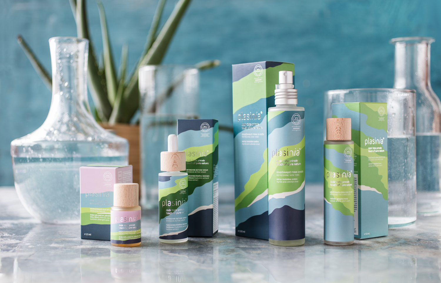
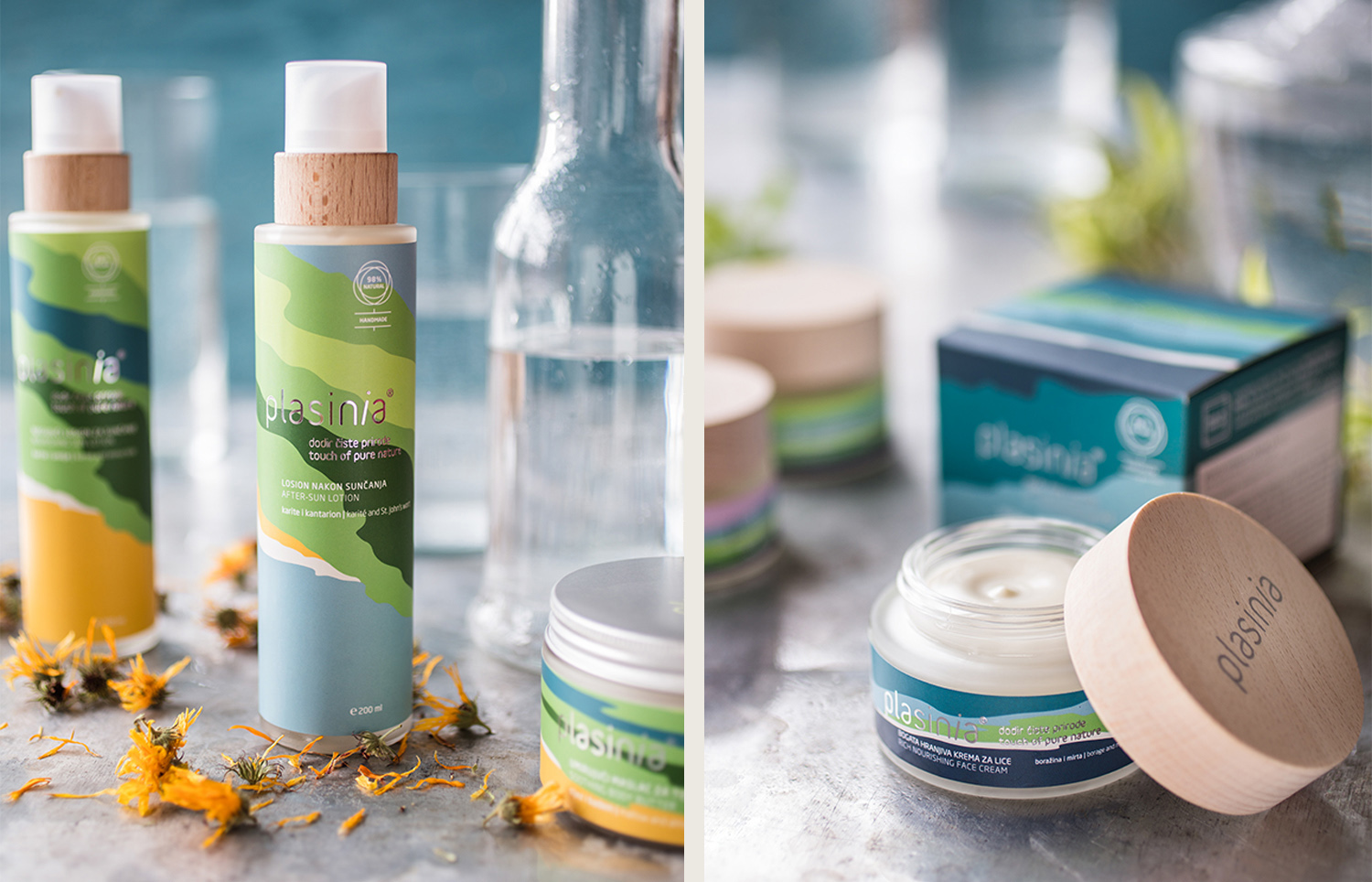
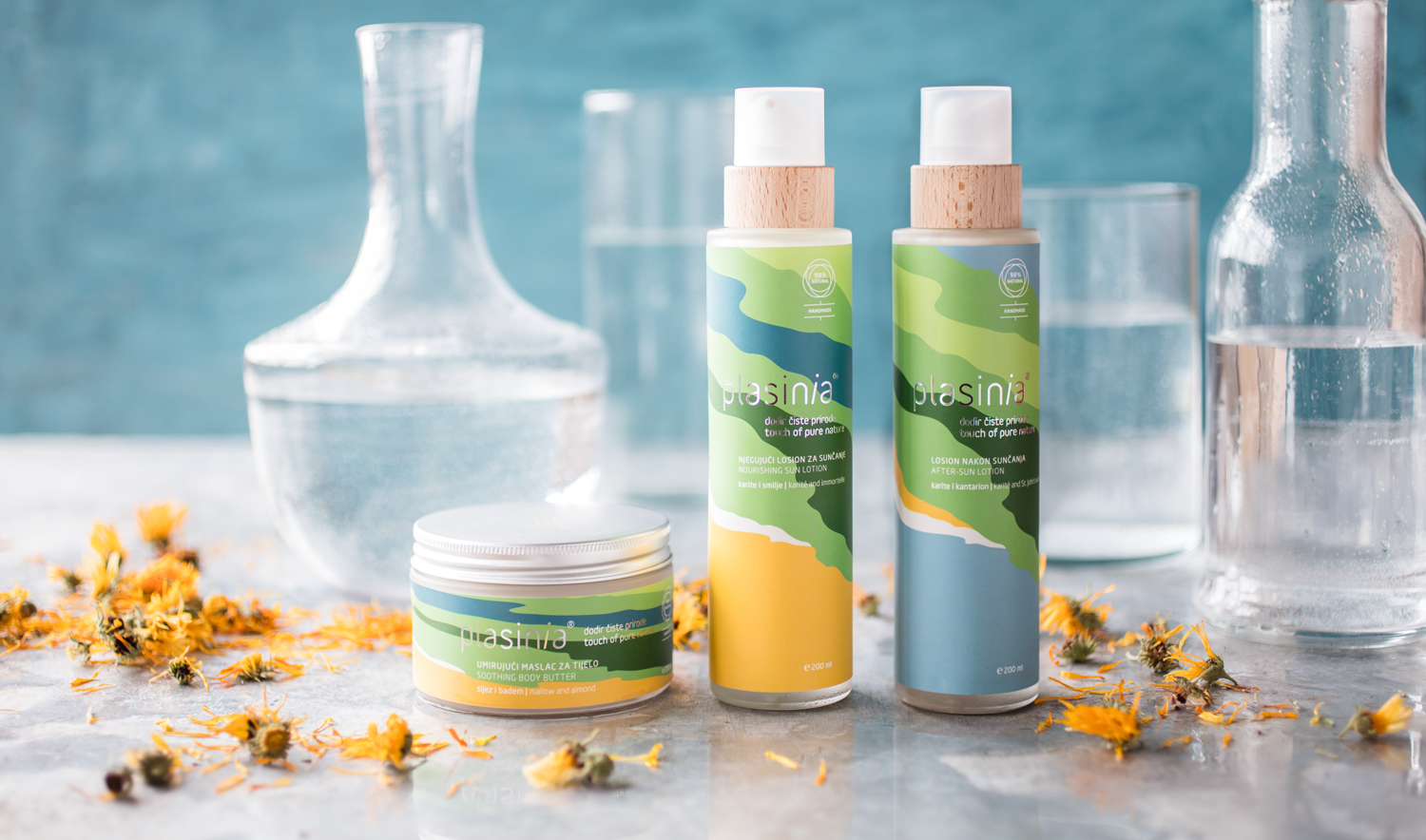
Plasinia is a line of completely natural cosmetics made in the Lika region in Croatia. Inspired by the pristine nature of the area, the Plasinia line of products was born out of love for self-grown herbs, and the healing power of which they possess yet has almost been forgotten. The whole product range is made using herbs and the water of one the world’s purest rivers – River Gacka and contains no preservatives and needless additives, being completely organic and handmade.
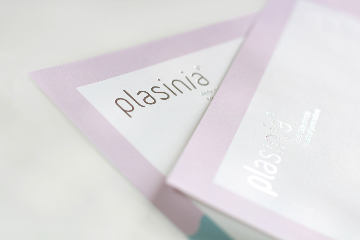
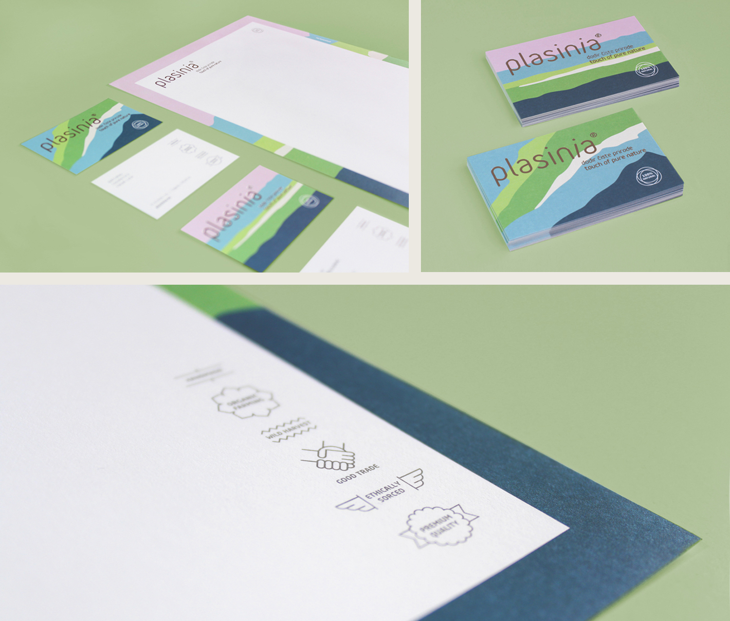
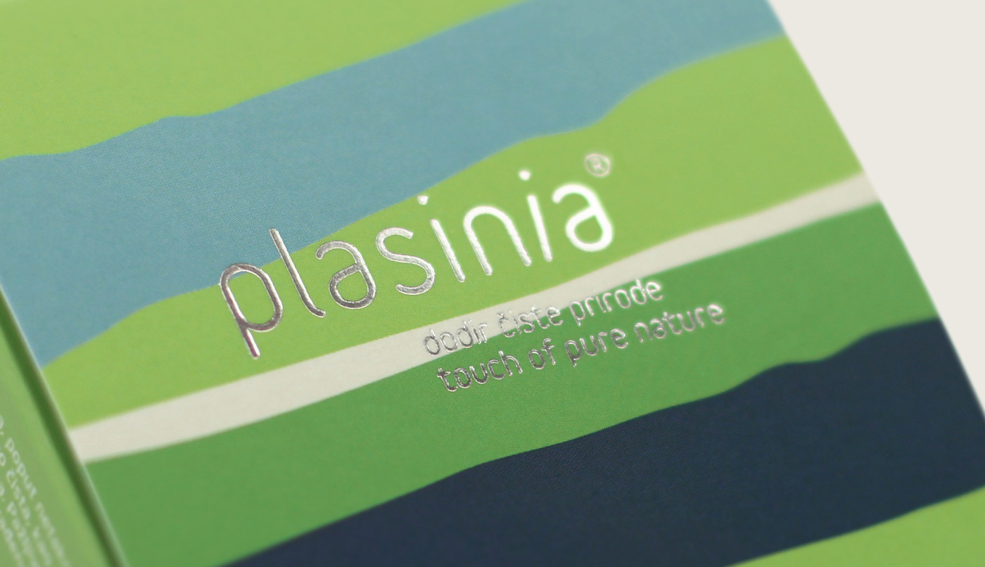
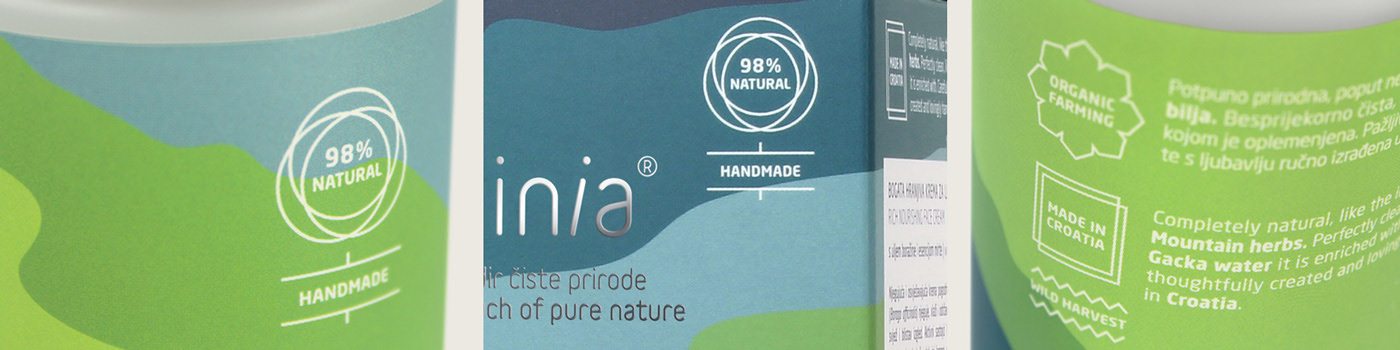
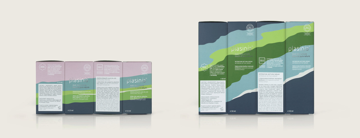
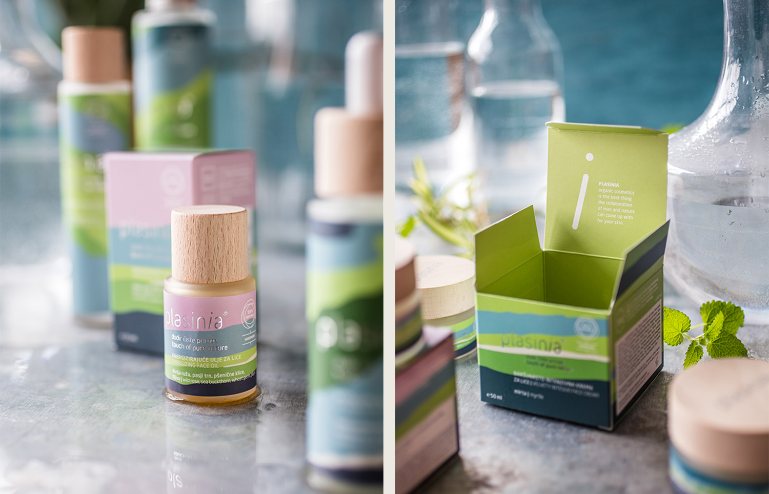
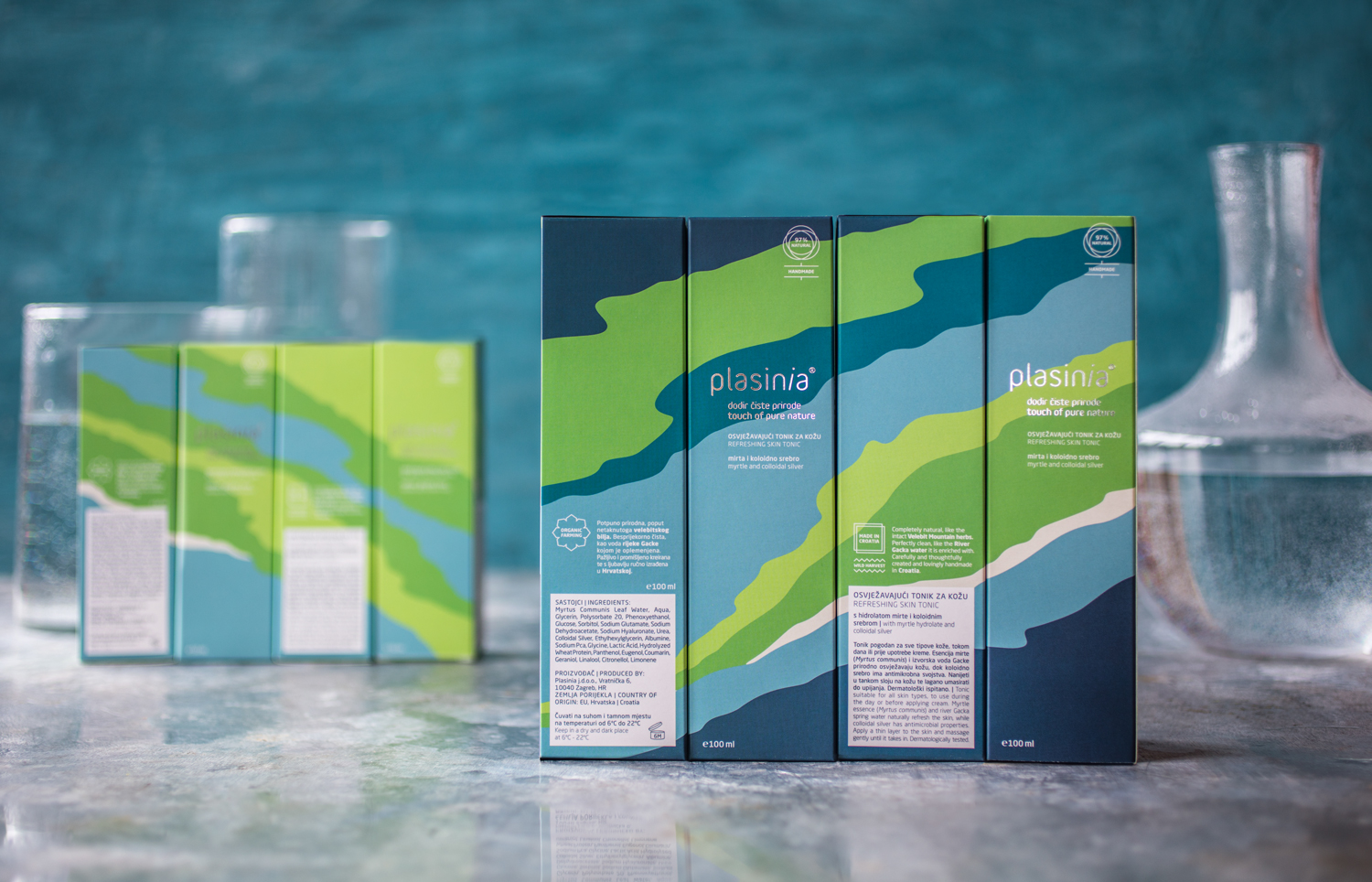
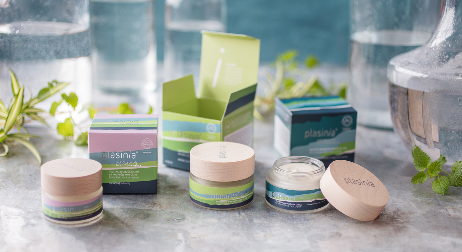
The visual identity of the brand is based on and inspired by Plasinia’s natural geolocation – the illustrations and colors represent the green fields, forests and wild herbs, with a blue river and water-rich fields in the middle. At the same time, the illustrations make one think of skin layers or textures of creams or lotions. – Design Bureau Izvorka Jurić writes.
The inspiration and foundation of the brand’s visual identity design was Plasinia’s natural geolocation, illustrated in a stylish pattern in harmonious colors, with the green representing fields, forests, and wild herbs, and the blue the rivers and water fields in the middle. The illustration utilized in the packaging also references the rejuvenating layers of skin as well as the textures of creams and lotions.
The packaging is made of all-natural materials such as wood, plastered glass, and paper, with details printed in aluminum and silver foil for accent and premium feel. The design communicates the values of the brand to a tee while creating a strong, impactful visual experience, sure to catch the eye of the buyer. The way the packaging creates a flowing pattern when placed beside each other is particularly pleasing to the aesthetic.