Warsaw, Poland based interdisciplinary design studio Foxrabbit designs and produces clear and elegant design solutions across multiple platforms, from publications and signage to web and information visualization, with some of the most prolific Polish and international institutions and companies as their clients. 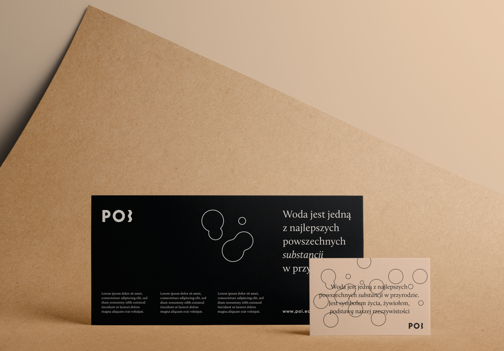
…operating under the principle that fashion fades away, but rules are eternal. Hierarchy, structure, and readability are their definitions of beauty – Foxrabbit
Foxrabbit believes that design is not only aesthetics and emotions, operating under the principle that fashion fades away, but rules are eternal. Hierarchy, structure, and readability are their definitions of beauty.
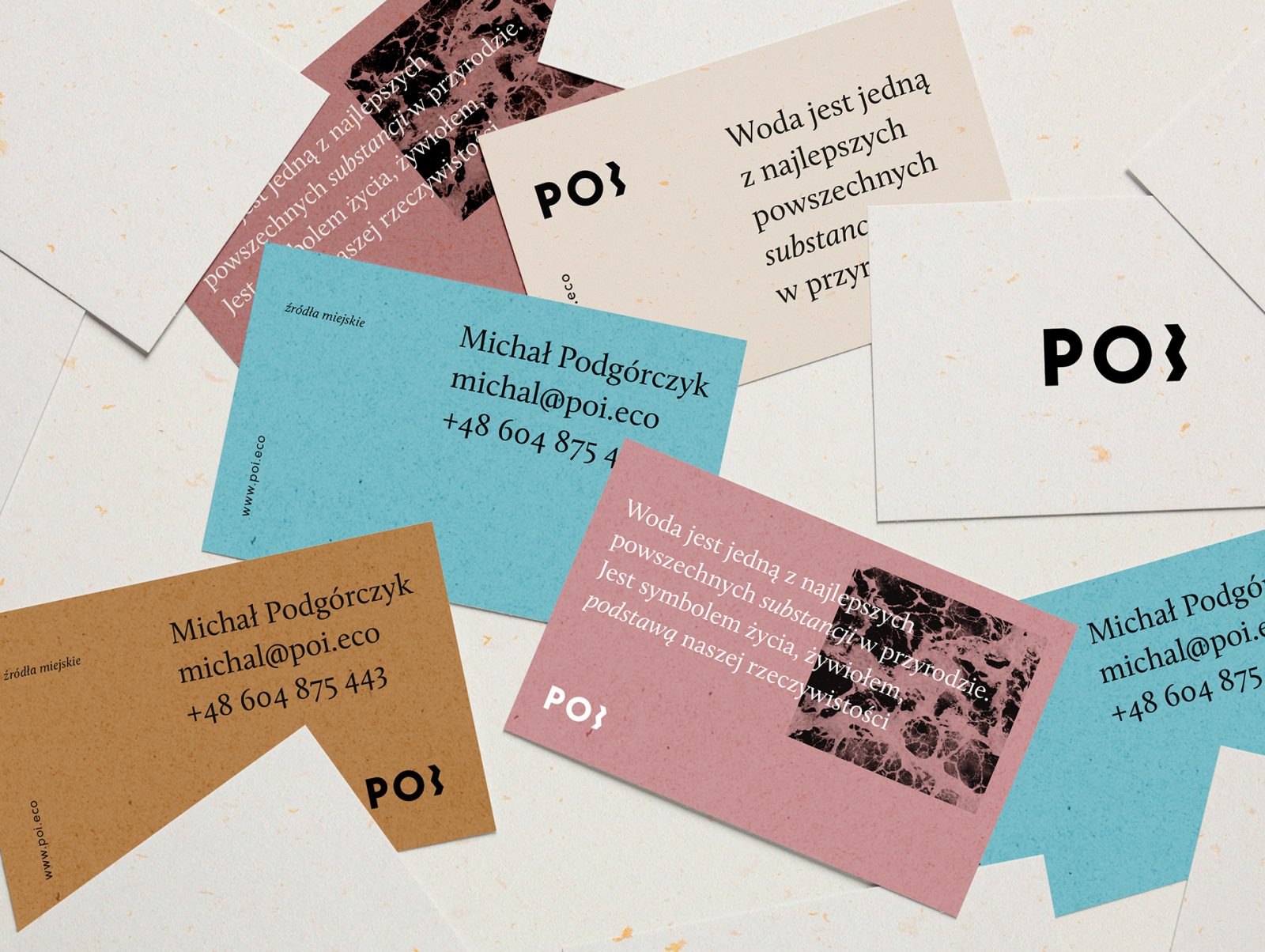
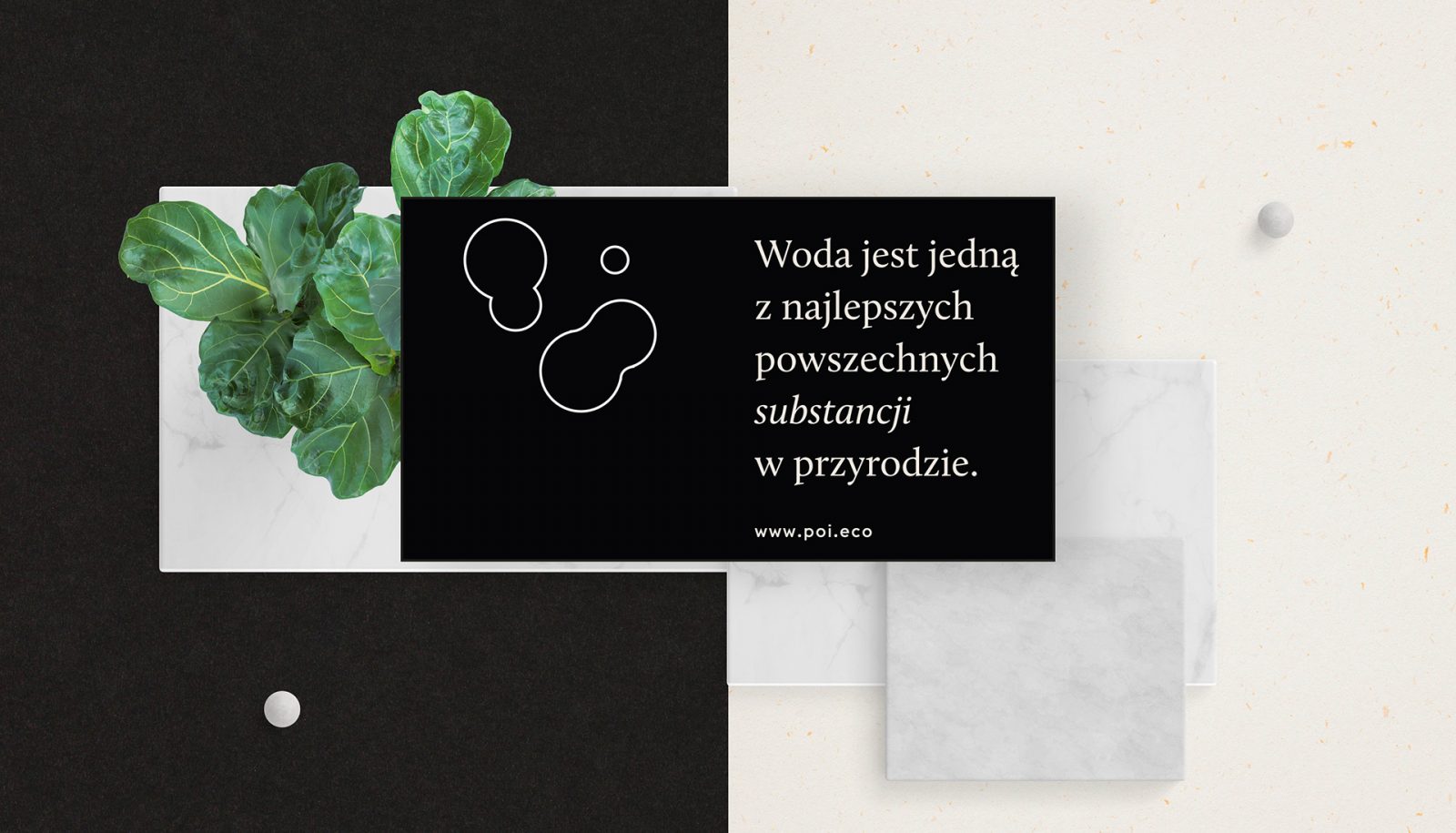
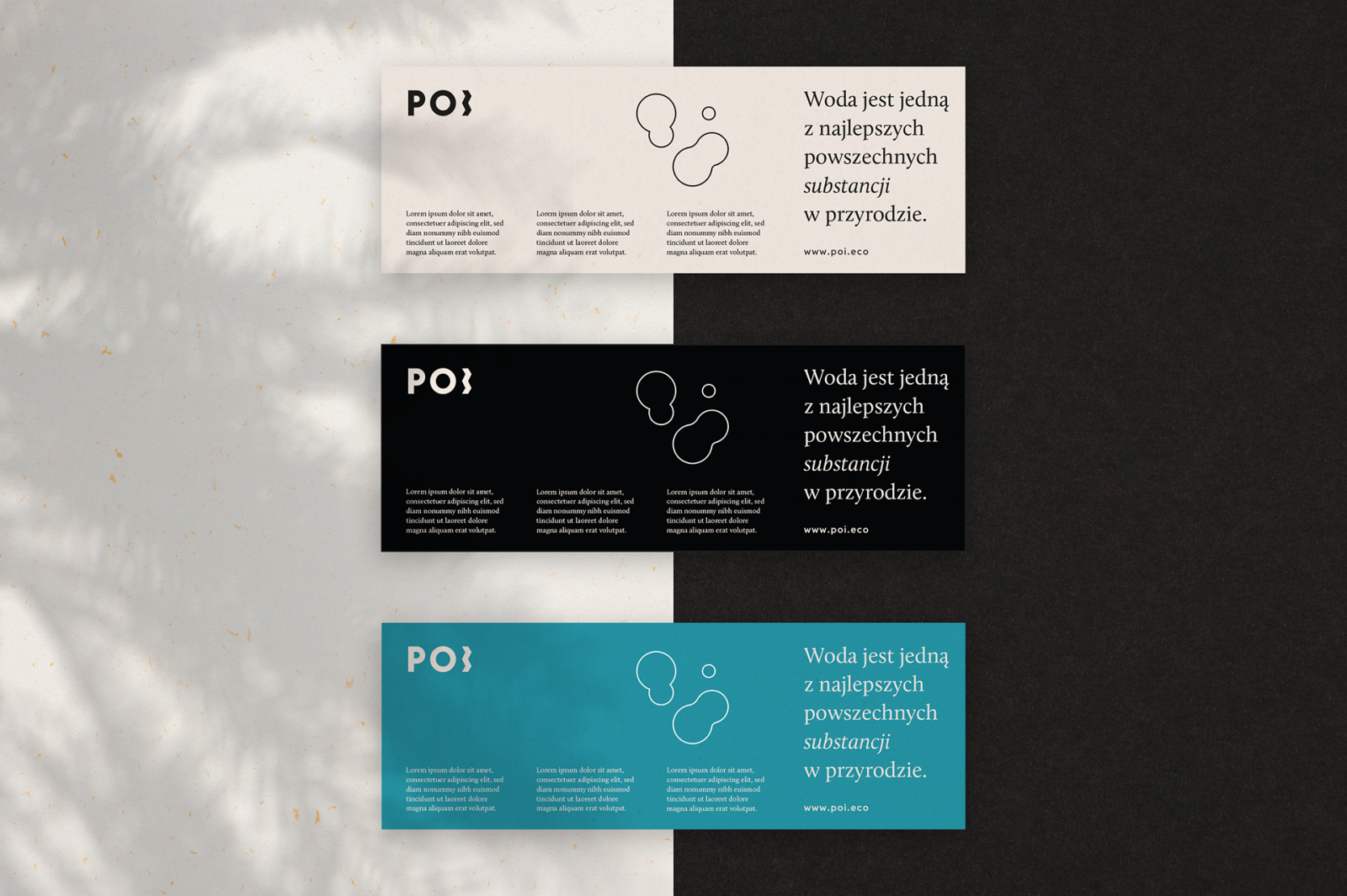
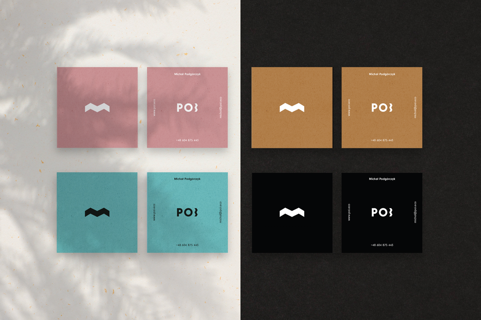
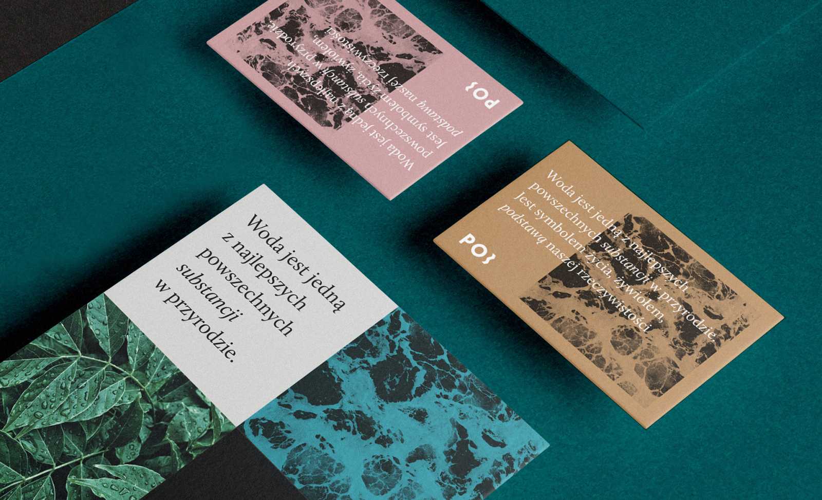
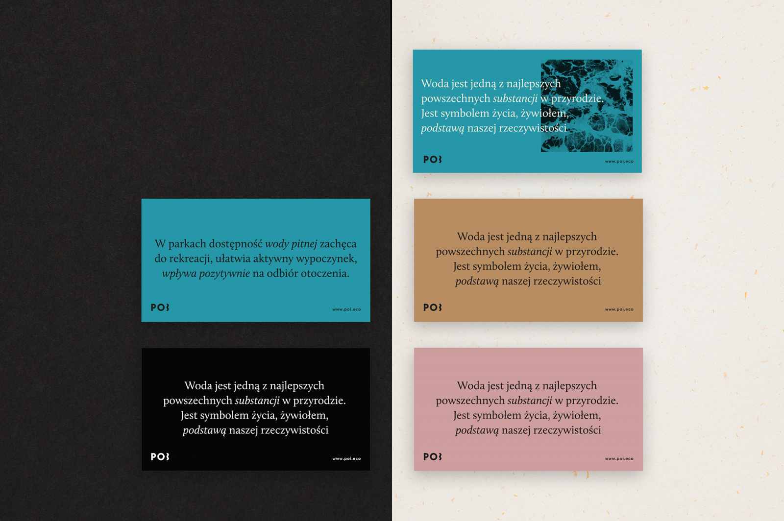
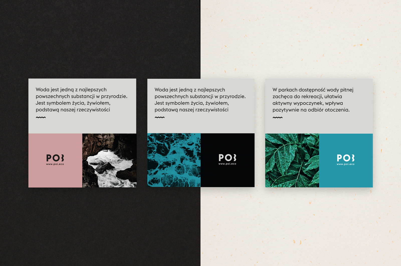
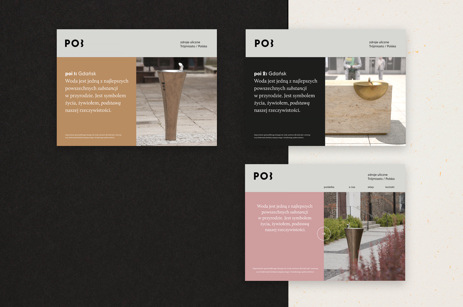
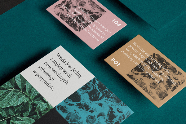
POI’s new identity represents with the eco brand with harmonious tones and earthy textures imitating the water, city, and us, the humans
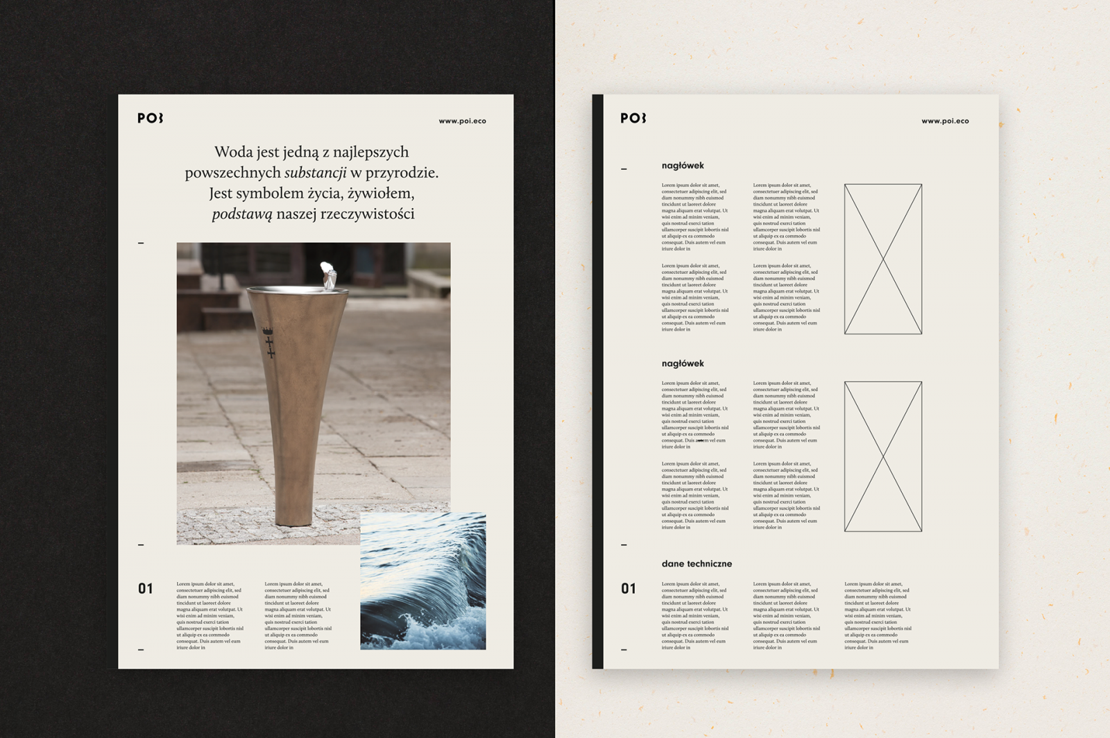
Among many great projects, Foxrabbit and designer Alina Rybacka-Gruszczyńs created a beautiful visual identity design for POI Eco, a drinking fountain device providing the public with free access to drinking water, that caught our eye with its clever use of color, typography, and paper choices, which include Favini’s Remake in shades of Oyster, Sky, Smoke, and Midnight as well as Crush Grape and Almond – papers exclusively available at Europapier.