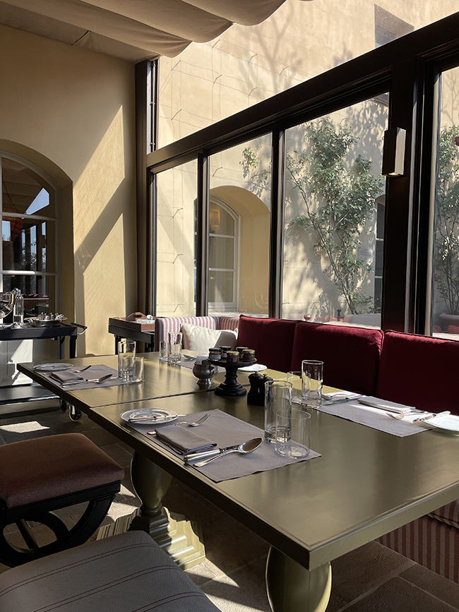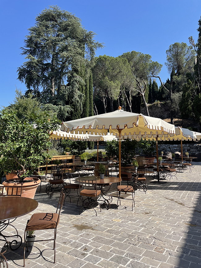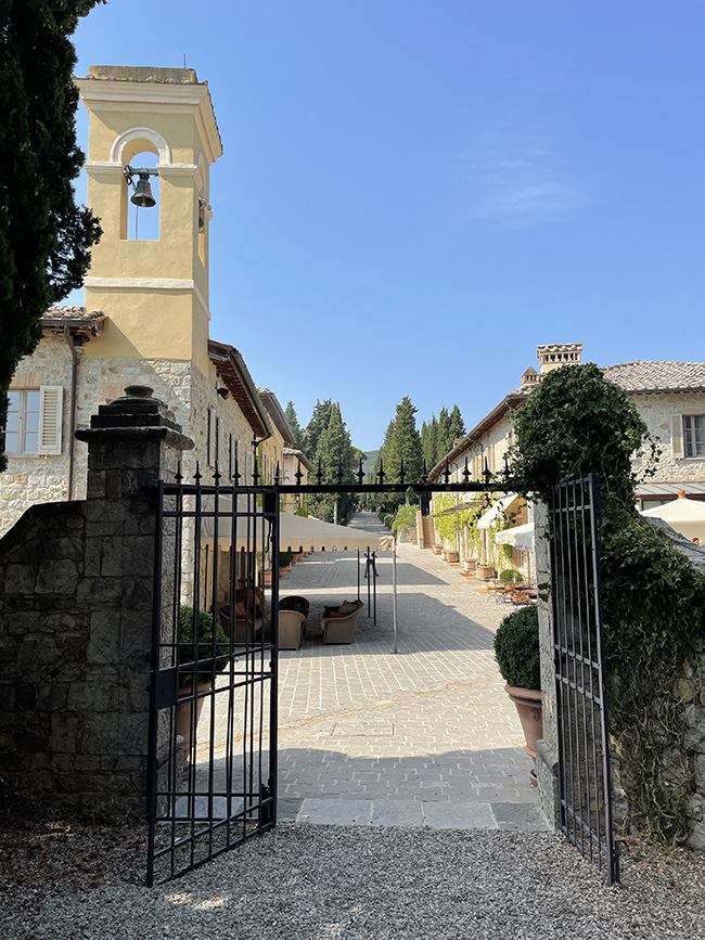
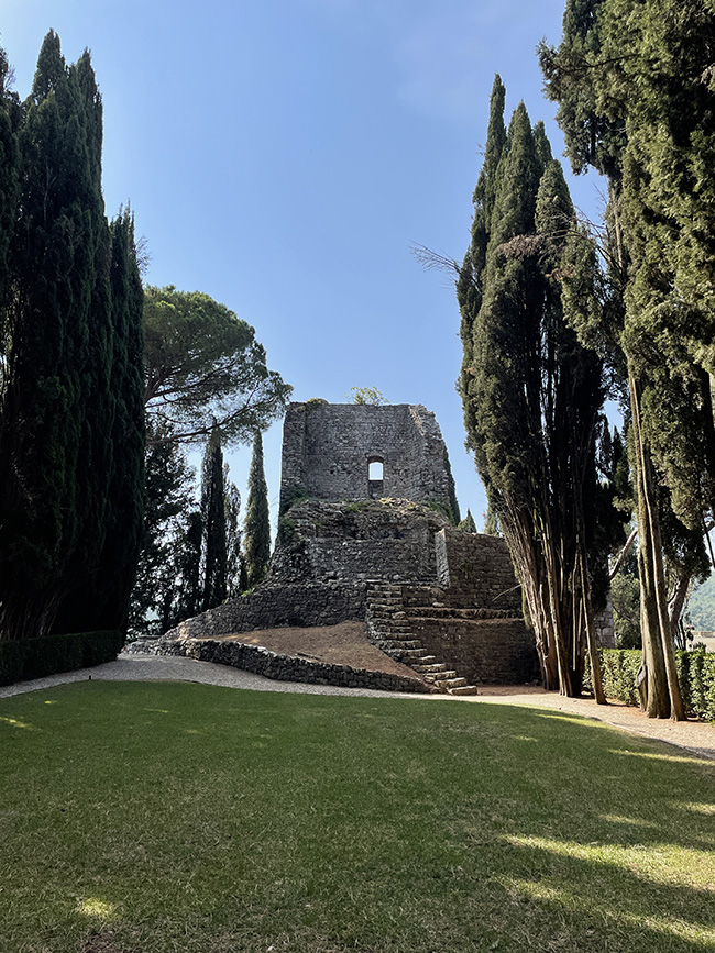
The restaurant “Osteria La Canonica” at the Rosewood Castiglion del Bosco Resort is located in the picturesque Tuscany area in Italy. Serving traditional Italian cuisine including favorites such as pasta and pizza, the restaurant prepares all its dishes with the best ingredients grown either in their own vegetable garden or provided by local suppliers. Meeting Rosewood resorts high standards, the Osteria La Canonica has an easy-going, welcoming atmosphere, with a beautiful outdoor dining area in Borgo’s center square, providing a truly Italian experience for visitors.
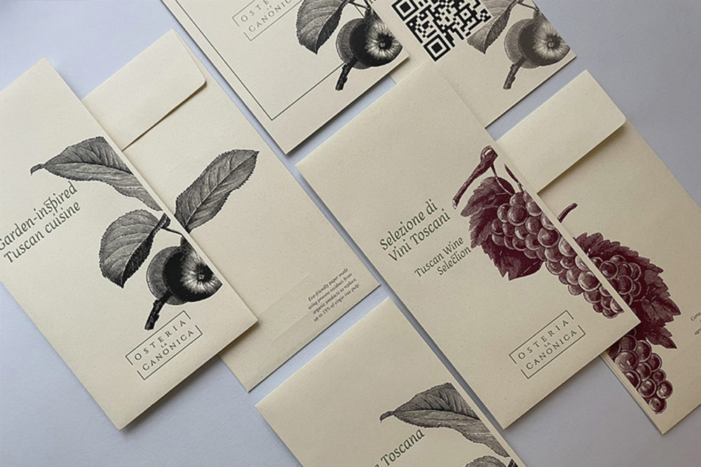
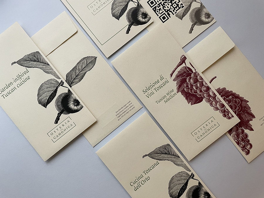
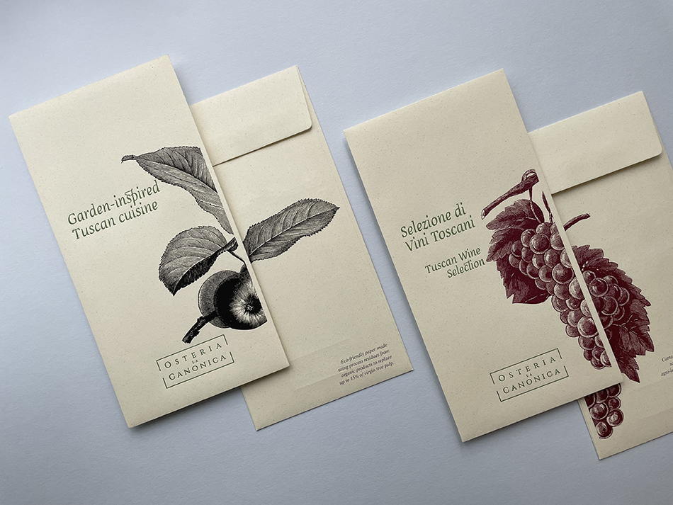
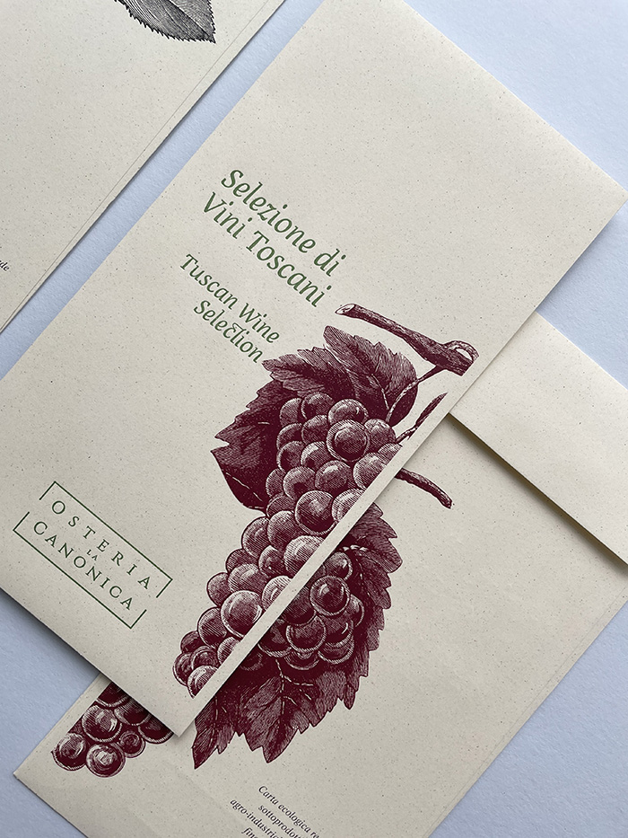
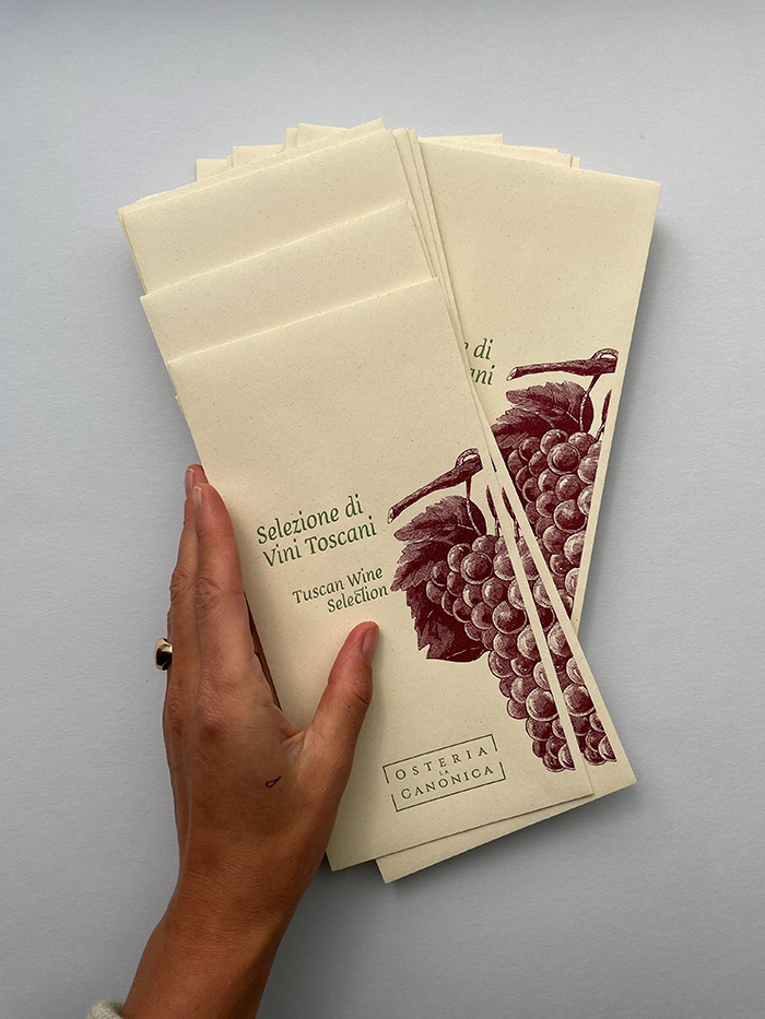
Due to the Covid-restrictions, the restaurant came up with a clever idea of providing single-use menu cards for their restaurant guests, to guarantee the safest dining experience possible. And as in everything else, the quality and high standard of the production of the menus was a must. Viennese design and print studio Carissimo Letterpress was asked to help with this task, and they came up with not only beautiful designs but a clever idea to bring the menus to the guests in closed envelopes, to guarantee the highest hygiene possible.
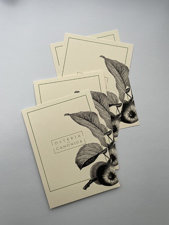
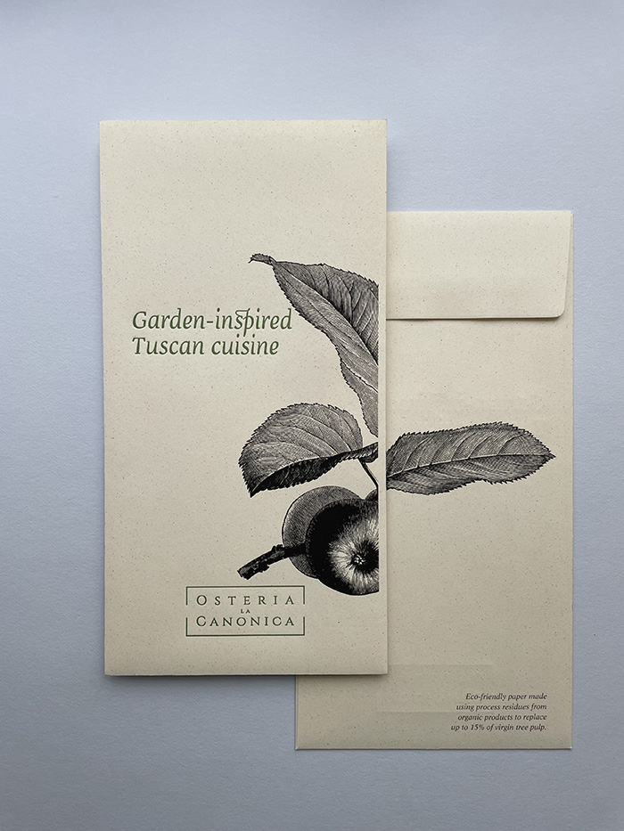
Carissimo Letterpress (previously here) updated all of Osteria La Canonica’s menu cards for their lunch, dining, and kid’s menus, as well as the complete aesthetic design of the sleeves. Choosing an eco-friendly paper with as little impact on the environment as possible was important, so Favini’s Crush paper was the perfect choice for the project – a paper exclusively available at Europapier Group.
We used Favini Crush papers because of its special look and of course, more importantly, because it is eco-friendly. This was very important for our clients because they are strongly connected to the nature surrounding them in beautiful Tuscany.
“For this project, we used Favini Crush papers because of its special look and of course, more importantly, because it is eco-friendly. This was very important for our clients because they are strongly connected to the nature surrounding them in beautiful Tuscany. We opted for the existing envelopes in the color Agrumi (Citrus) for the menu sleeves”, Ana & Alessandro, the creatives behind Carissimo Letterpress explain.
We opted for a mix of two printing techniques because our client definitely wanted to add a luxurious finish and create an experience for their guests touching all senses.
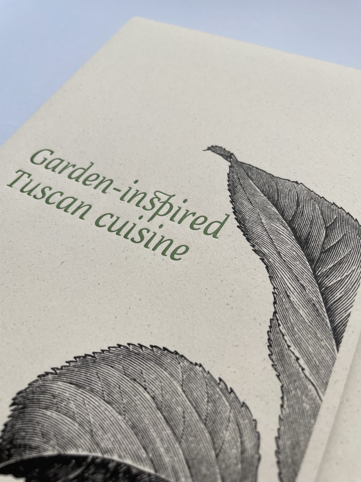
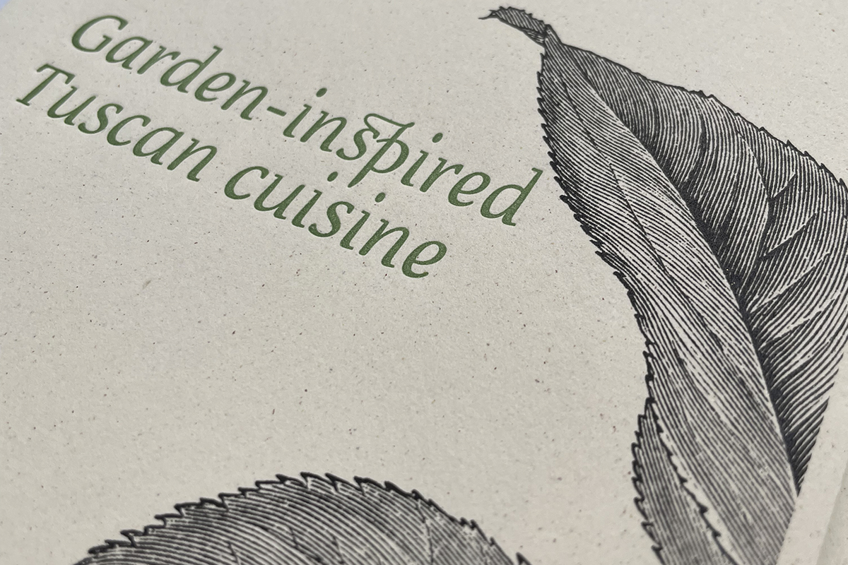
Combining charming, detailed botanical illustrations depicting grapevines and apple tree branches, with a phrase that captures the spirit of Osteria La Canonica (printed in both Italian and English), the menus perfectly match the unique Italian countryside experience the restaurant can offer. The menus and envelopes were printed in two steps, as first the illustrations were digitally printed in black and deep red, and then the logo and slogan were added with letterpress printing in the brand’s corporate green Pantone tone. “We opted for a mix of two printing techniques because our client definitely wanted to add a luxurious finish and create an experience for their guests touching all senses”, Carissimo Letterpress concludes.
Follow and enjoy more of Carissimo’s fine, timeless stationeries with personality on Instagram.