Jordan Jelev, better known as The Labelmaker, is an award-winning wine label designer from Varna, Bulgaria, who is 100% focused on creating incredible and memorable branding concepts for wine, spirit, and beer brands. With an undefeated passion and dedication for elevating a brand into a bestseller, many notorious brands have trusted their products into the knowing hands of The Labelmaker – Downtown Urban Winery being the latest.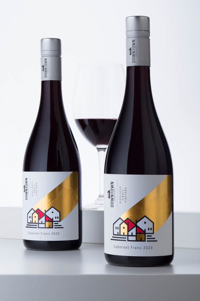
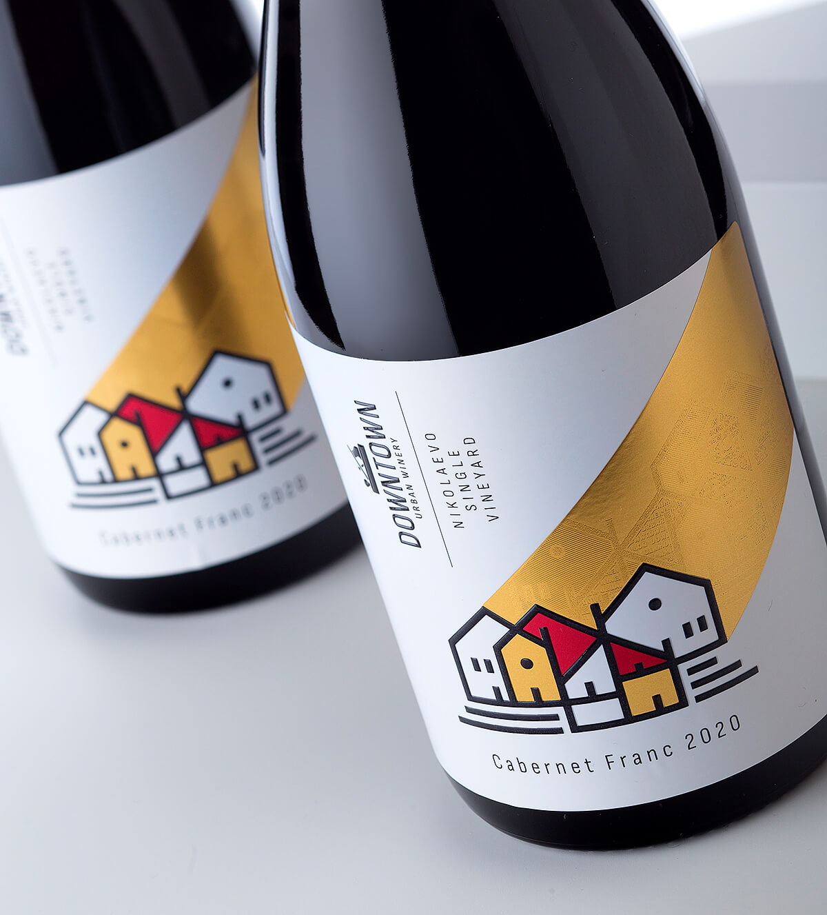
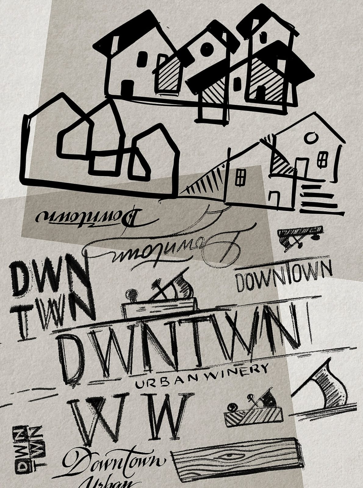
A craft wine project by a team of four winemakers with a unique backstory and history inspired The Labelmaker to create a visual identity full of detail and flair. Focusing on the location of the winery in an old carpentry workshop, in downtown Sliven, the name “Downtown Urban Winery” was born. The particular setting also acted as the starting point for the logo and graphics on the packaging.
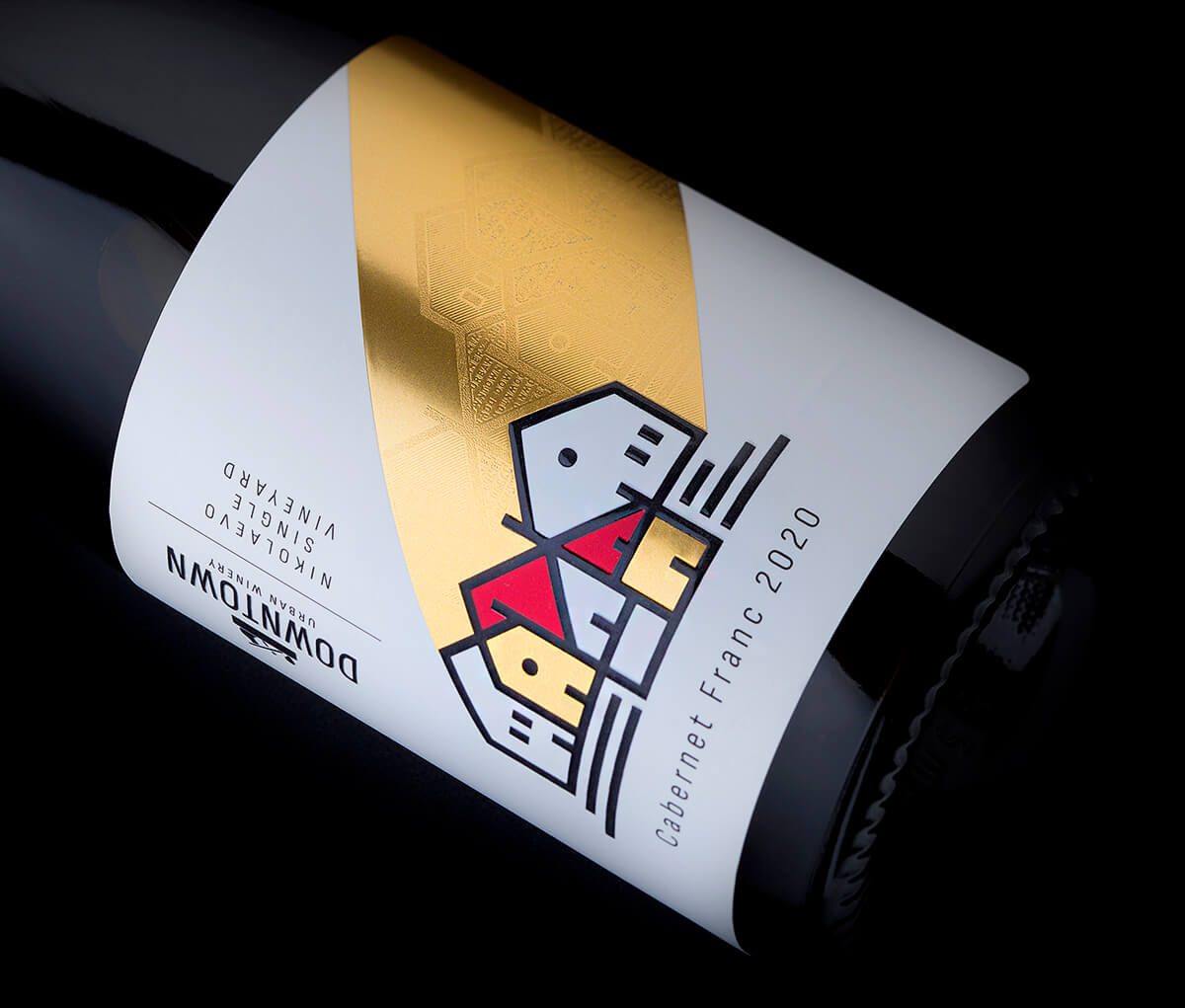
The stylish combination of various printing methods, a restricted color palette, and minimal yet strong illustration by The Labelmaker, elevates a simple design into a rich, harmonious complexity
“I always try to create very memorable labels, ones that carry a special message, one that really stands out. The most unique thing in this project from my point of view was the winery location. Usually, wineries are in the vineyards or somewhere close around them. What we had here was a unique exception and I wanted to use it in my wine label design”, The Labelmaker writes.
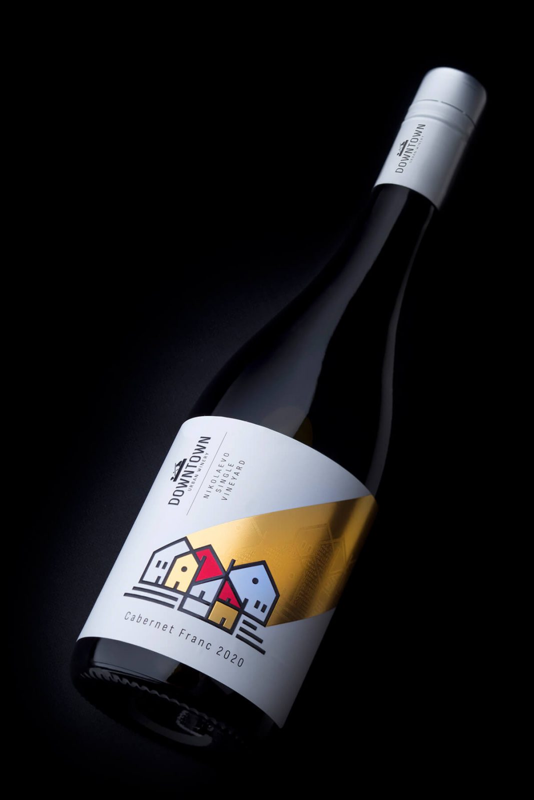
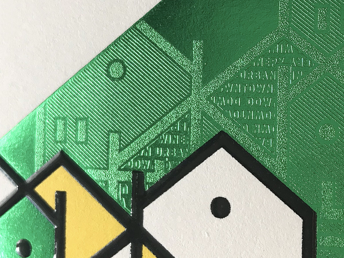
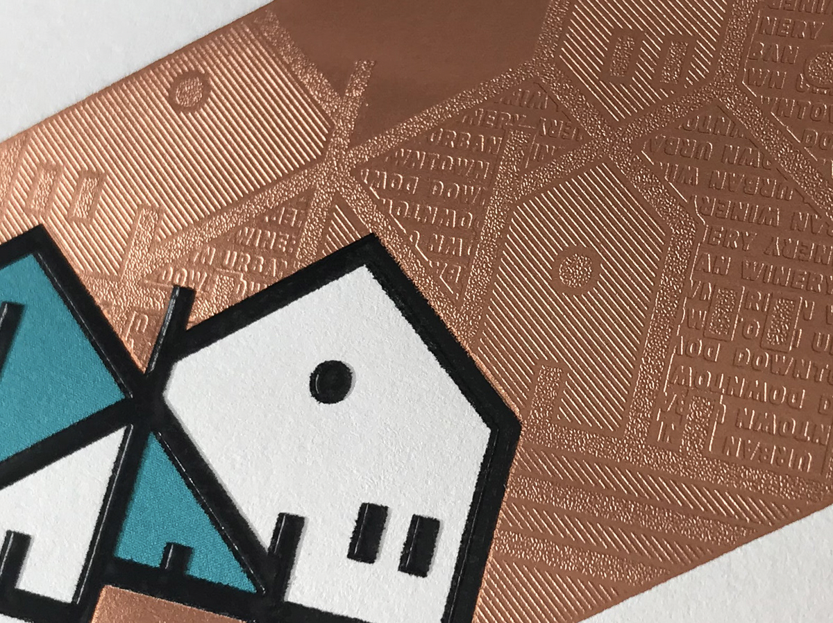
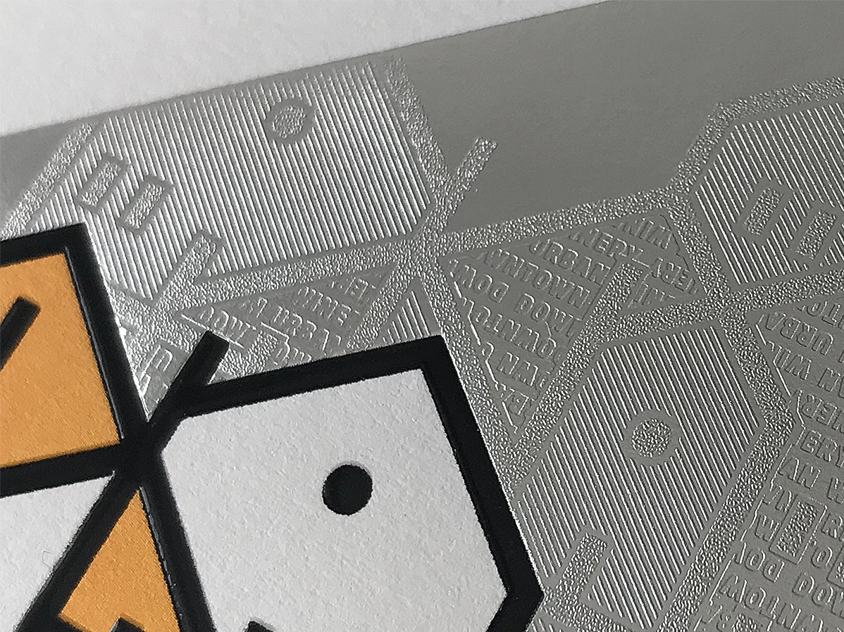
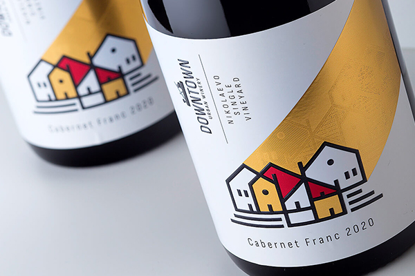
The urban landscape of Sliven is dominated by a view of classic small houses with traditional roofs, build close to one another in combination with narrow streets and small yards. This outlined silhouette printed in black varnish, together with a hot foil element going from the rooftops towards the top right corner of the label, creates a powerful visual that captures the viewer’s attention.
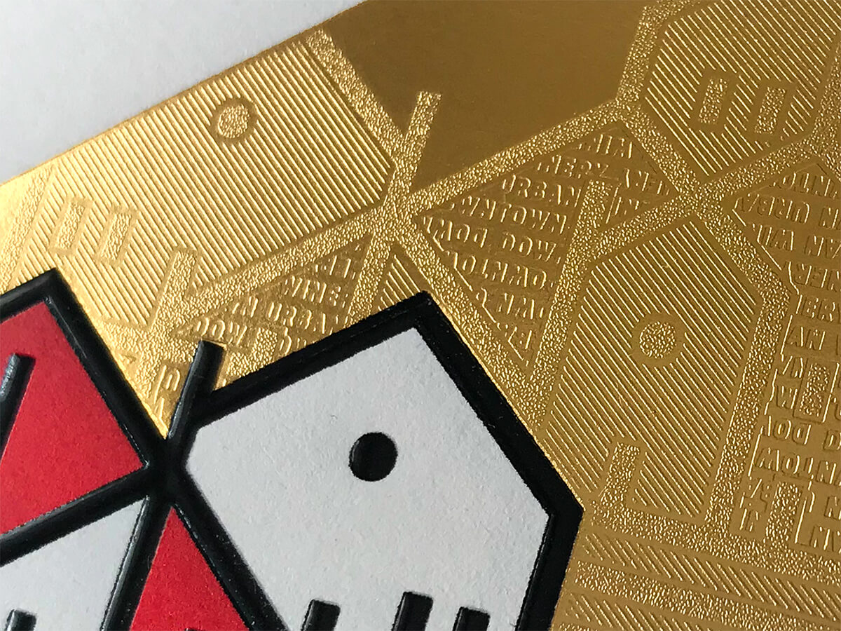
“I decided to modify the composition with the houses and by using a micro-embossing effect to implement it inside the hot foil. Micro-embossing creates unique and delicate engraving effects on the surface of the foil making it reflect the light at different angles. So when you get the bottle in your hands these reflections start to work and you begin to see this hidden cityscape inside the foil”, The Labelmaker further explains.
The stylish combination of various printing methods, a restricted color palette, and minimal yet strong illustration, elevates a simple design into a rich, harmonious complexity. The talented team at Daga Print helped bring every detail of the concept into perfection, resulting in a label that shines out with its own beauty and character – a true reflection of the Downtown Urban Winery story.