

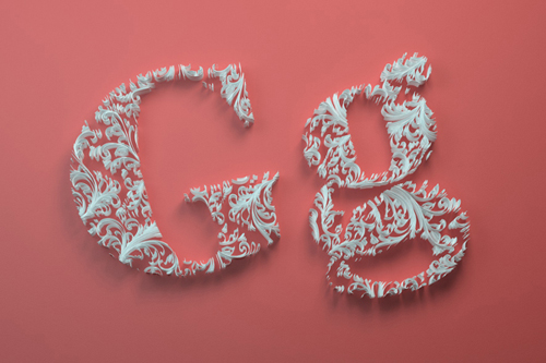
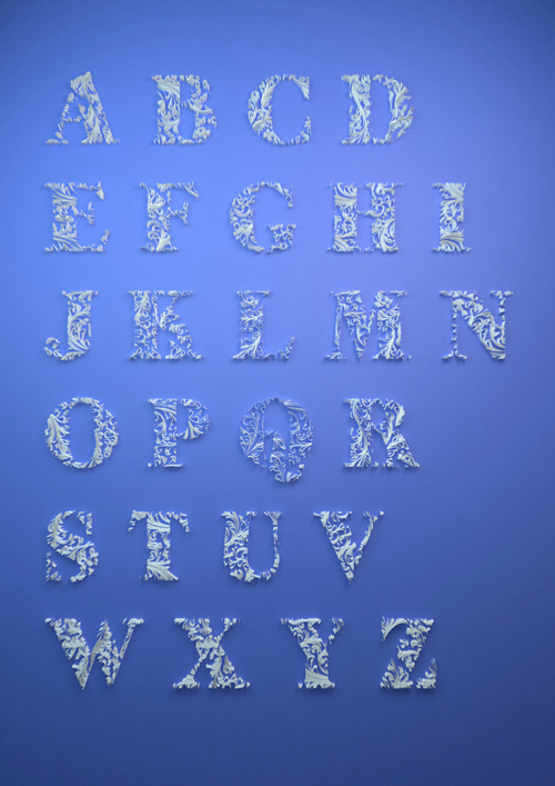
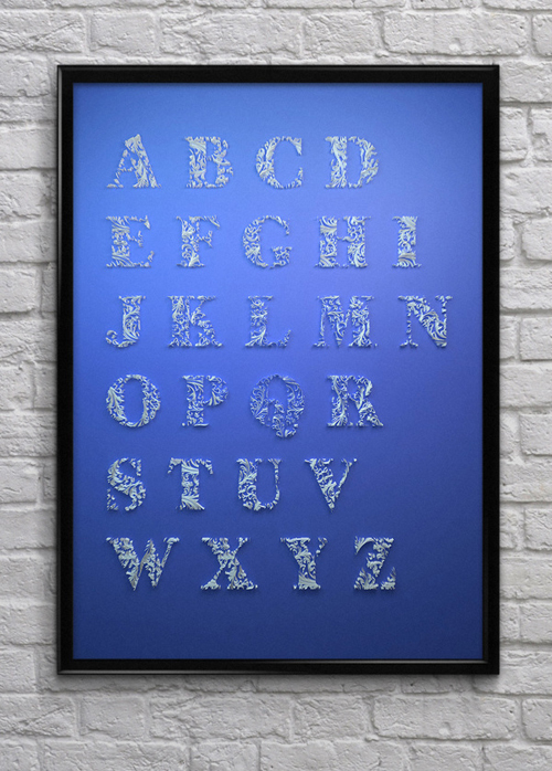
We’ve featured the young designer’s work before, and I couldn’t pass on Dan Hooperts latest Paper Typography experiment without showing it to you. The detailed paper quilling alphabet is an unbelievable tour de force, proving the artist’s knowledge of paper, the craft and skills to manipulate it. Take a closer look into the incredible details of his work.
Quilling is considered to be a technique that requires a lot of skill, patience, and nerves of steel. It uses strips of paper that are rolled, shaped and glued together to create decorative designs. The paper is rolled, looped, curled, twisted and otherwise manipulated to create shapes which make up designs of any form. The most popular and versatile technique is that of rolling, which Hoopert seems to have used in his paper alphabet. The alphabet is not done in the most traditional style of quilling, which actually makes it just more interesting. The gaps between the pieces with the tiny little curved papers create a cool 3D effect when viewed straight ahead, making the design seem to be out of focus. But viewed at an angle, the depth and structure of each letter become visible.
The sheer amount of details that have gone into this typographic experiment is mind-blowing and truly shows the 19-year old designer’s dedication to his craft. Besides awesome typography Hoopert creates cool posters with contemporary themes and images, you can check out his work on his instagram page.


Photos © Dan Hoopert