Minimal, Monochrome Design Of The Organic Elements Brand Draws Inspiration From The Periodic Table

Independent graphic designer and art director Lukas Diemling, and designer and creative lead Christian Taferner (currently working at wolke blau), both based in Graz Austria, have a strong understanding and skillset in creating expressive and ambitious visual concepts for both small and big brands. The two professionals master the fields of branding, packaging, typography, photography, print design, as well as digital environments and copywriting.

“I believe that fearless and distinct design is the most honest and true way for any company, organization, or product to stand out from its competitors”, Diemling writes. 

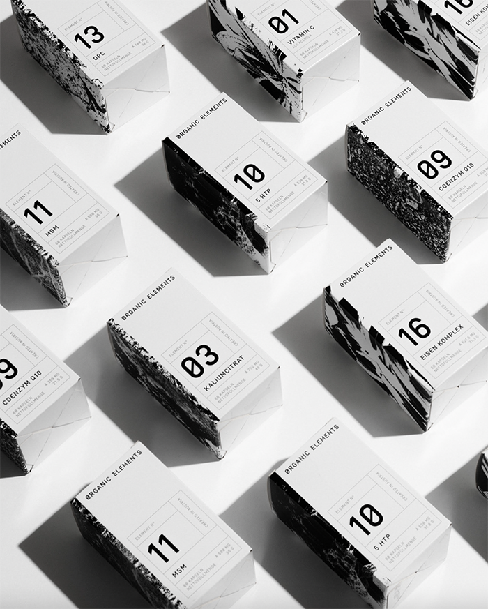
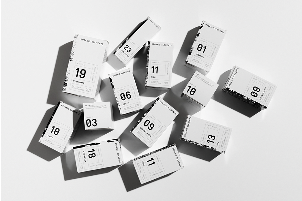
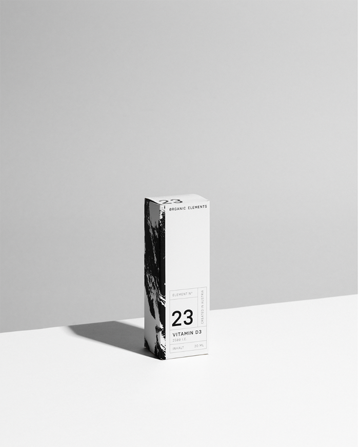
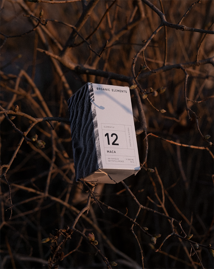
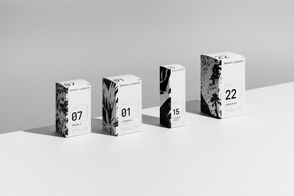
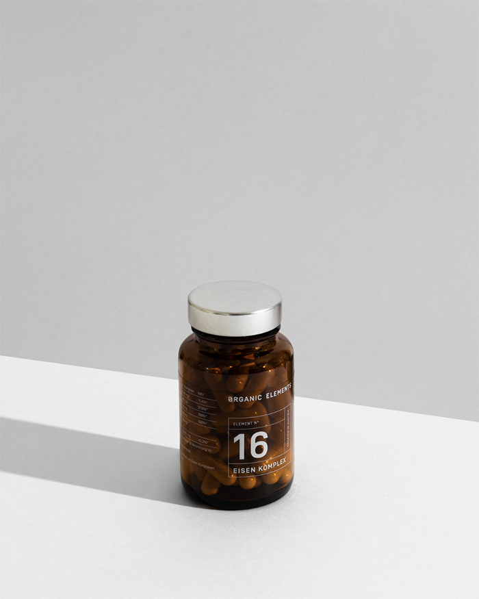
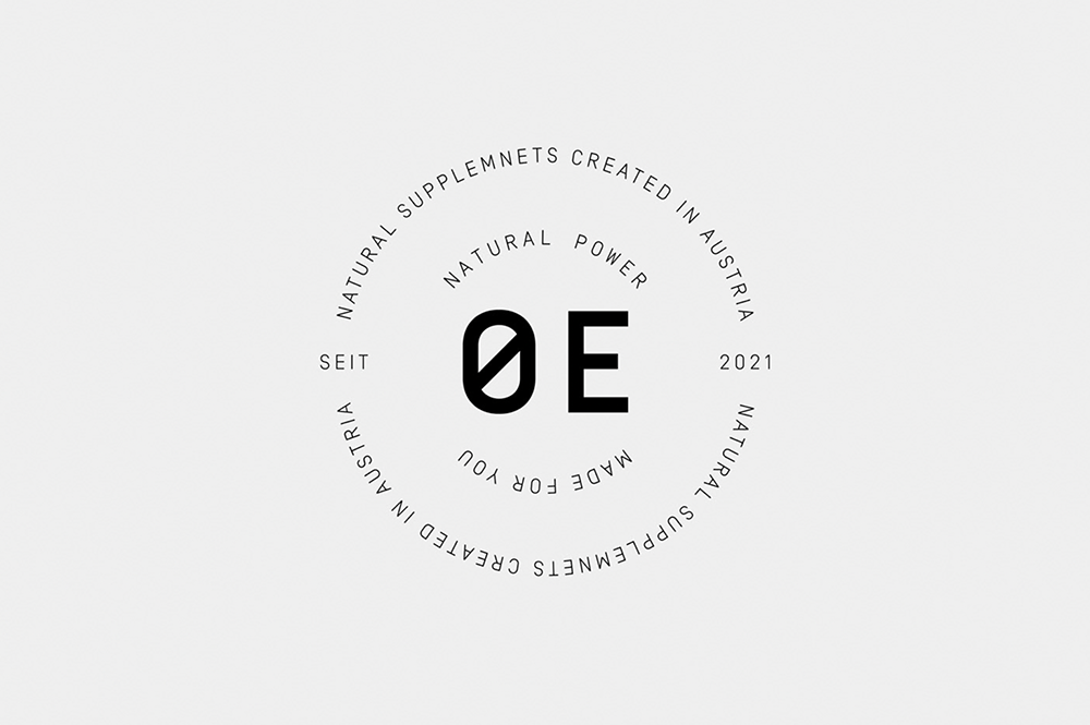
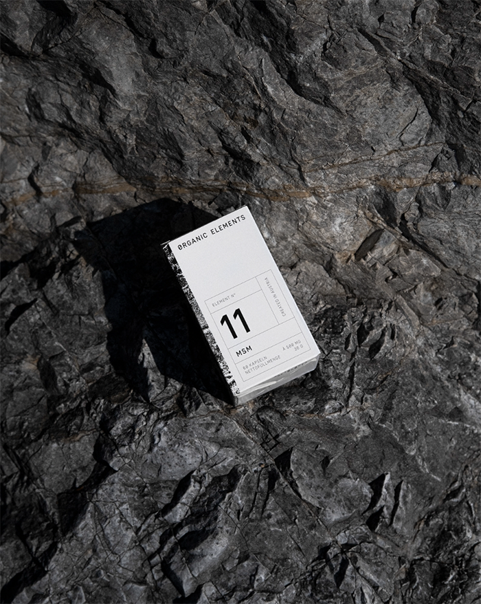
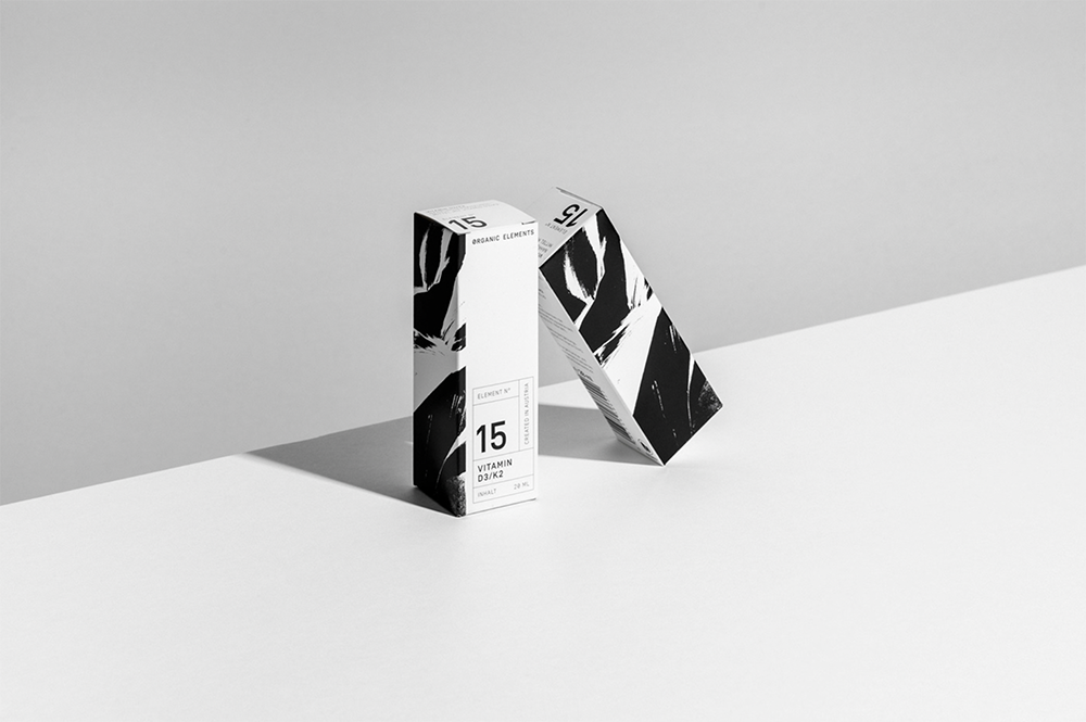
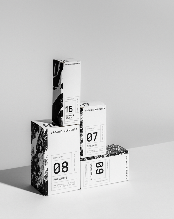
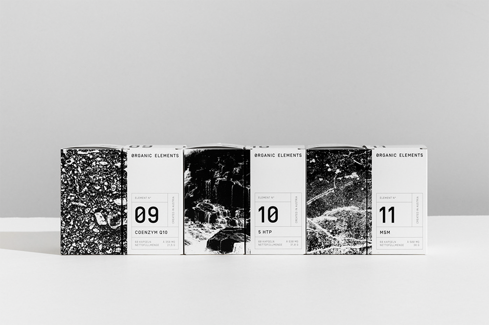
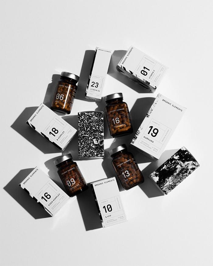
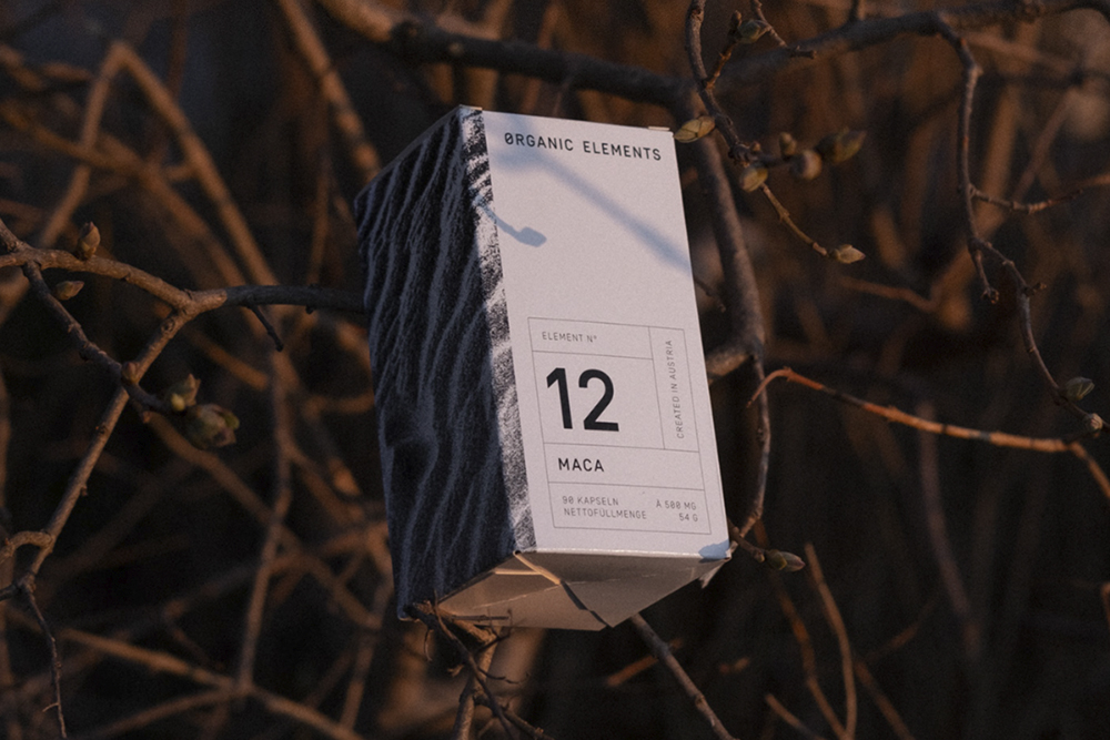
The micronutrient brand Organic Elements’ visual identity balances minimalist coolness and nostalgic familiarity

Diemling and Taferner recently collaborated on bringing alive the Organic Elements brand, a family owned and run company creating nutritional supplements developed by doctors and pharmacists that are both vegan and without artificial ingredients, which included art direction, copy, branding, and packaging design, as well as photography.

The Organic Elements’ visual identity is unlike anything else, while feeling familiar, it achieves to come across thoughtful and genuine while pleasing to the eye of the demanding modern customer. From concept to production, the simple, monochrome design of the packaging as well as the branding feels cohesive and of high quality. At the core of the visual brand is the periodic table of elements, as each product of the line has an individual number and a pattern inspired by nature that matches distinctively the characteristics of the product.
 
To convey the brand’s mission of creating as little waste as possible and as a reference to the numbering system of the products the letter O in the name logo is replaced with a slashed zero. This leads to a subtle twist within the wordmark and to a distinctive OE symbol. While the product packaging range includes paper, glass, and metal, and as little plastic as possible, to meet the standards of contemporary and sustainable packaging. The monochrome packaging combines strong, bold typographic elements, with saturated, minimal patterns of varied elements found in nature – for a solid, contemporary brand experience.
 
For more creative and design inspiration follow Lukas Diemling and Christian Taferner on Instagram or read our late articles 28 Contemporary Cosmetics & Skincare Packaging Designs and TwentyTwo Juice Packaging Design Concepts Full Of Zest.

Images © Lukas Diemling

Subscribe
Get the latest articles and news delivered straight to the comfort of your own inbox!
Subscribe
X
Subscribe
Get the latest articles and news delivered straight to the comfort of your own inbox!
Subscribe