
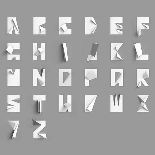
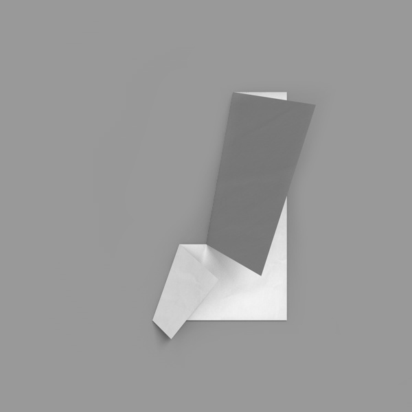
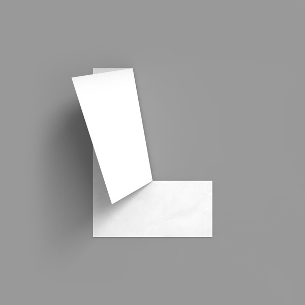
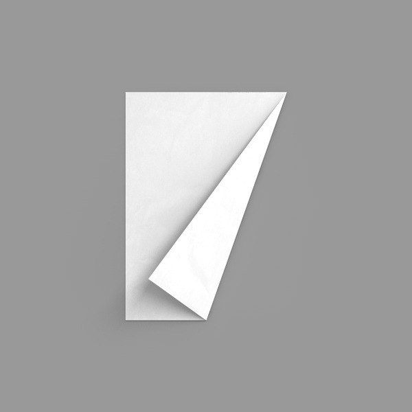
We are all about folding this week! Konstantin Datz is a 25 year old graphic design freelancer and industrial design student from Germany – and the creator of my currently favorite typographic piece, the Folded Paper Alphabet. I love simple, brilliant designs like this. It makes me want to get out my scissors and try it for myself.
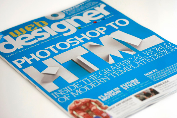
Konstantin Datz’s Folded Paper Alphabet was originally created as a private piece of art, but later showcased on the cover design of Web Developer magazine in 2010 (see the last photo). Since then the images have spread across the world wide web, to the likes of me, who fell in love with the simple idea. What makes the typographic piece irresistible to me, is the idea of using a single piece of white paper as the starting point for each letter. For any paper lover and typography enthusiasts, this is the culmination of simplicity and style.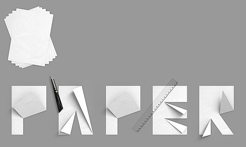
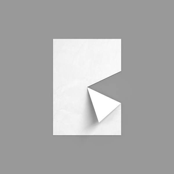
With some carefully and precisely placed cuts and folds, Datz creates the most straightforward and effortless looking letter designs I’ve seen in a while. The clean, crisp-cut style seems timeless, and makes you wonder why it hasn’t been done before. 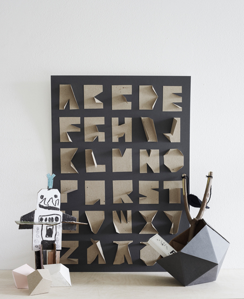
Cardboard inspired version by Riikka Kantinkoski
When looking at the design, it doesn’t take long before you find yourself wondering how exactly is each letter folded? And this is what many other designers and DIY lovers across the world seem to wonder as well, as when it comes to the high number of different versions and DIYs inspired by the original piece, you know it’s the simplicity that fascinates people. Along many others, the Finnish designer and blogger Riikka Kantinkoski made her own lovely version out of cardboard, so cool! What do you think?
Who knows, maybe I’ll have to do my own version one day..


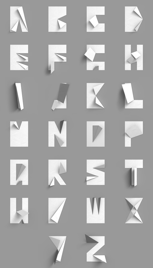
 Photos © Konstantin Datz