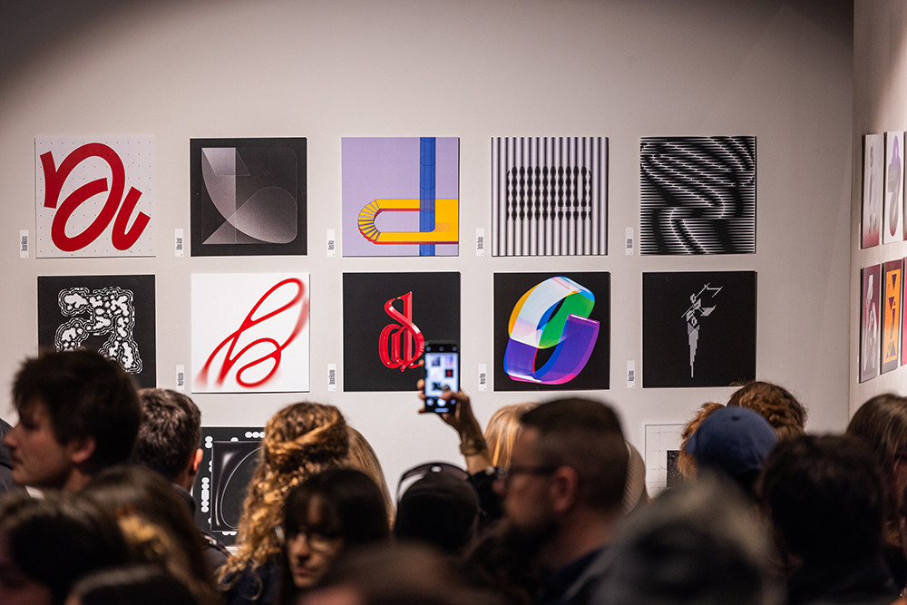
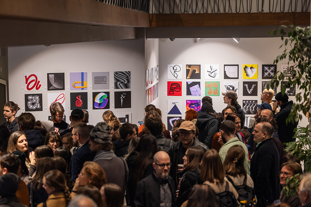
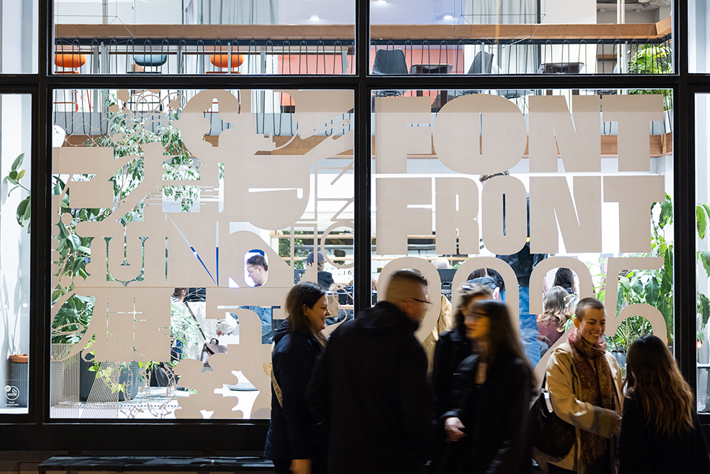
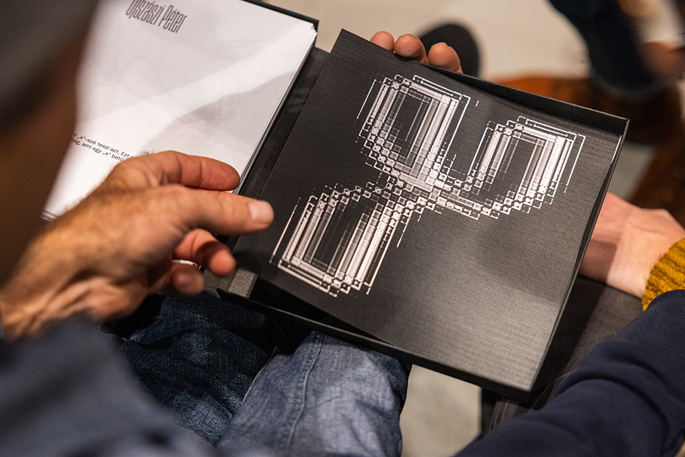
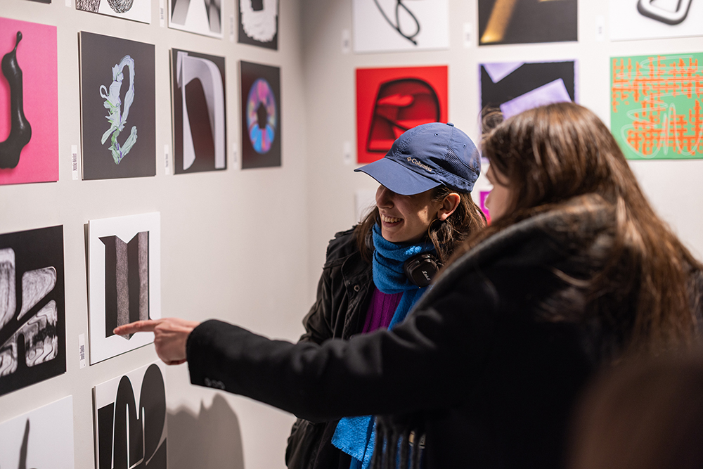
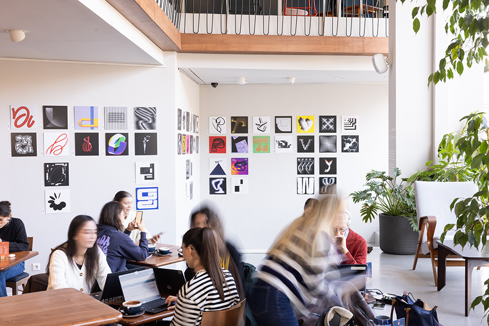
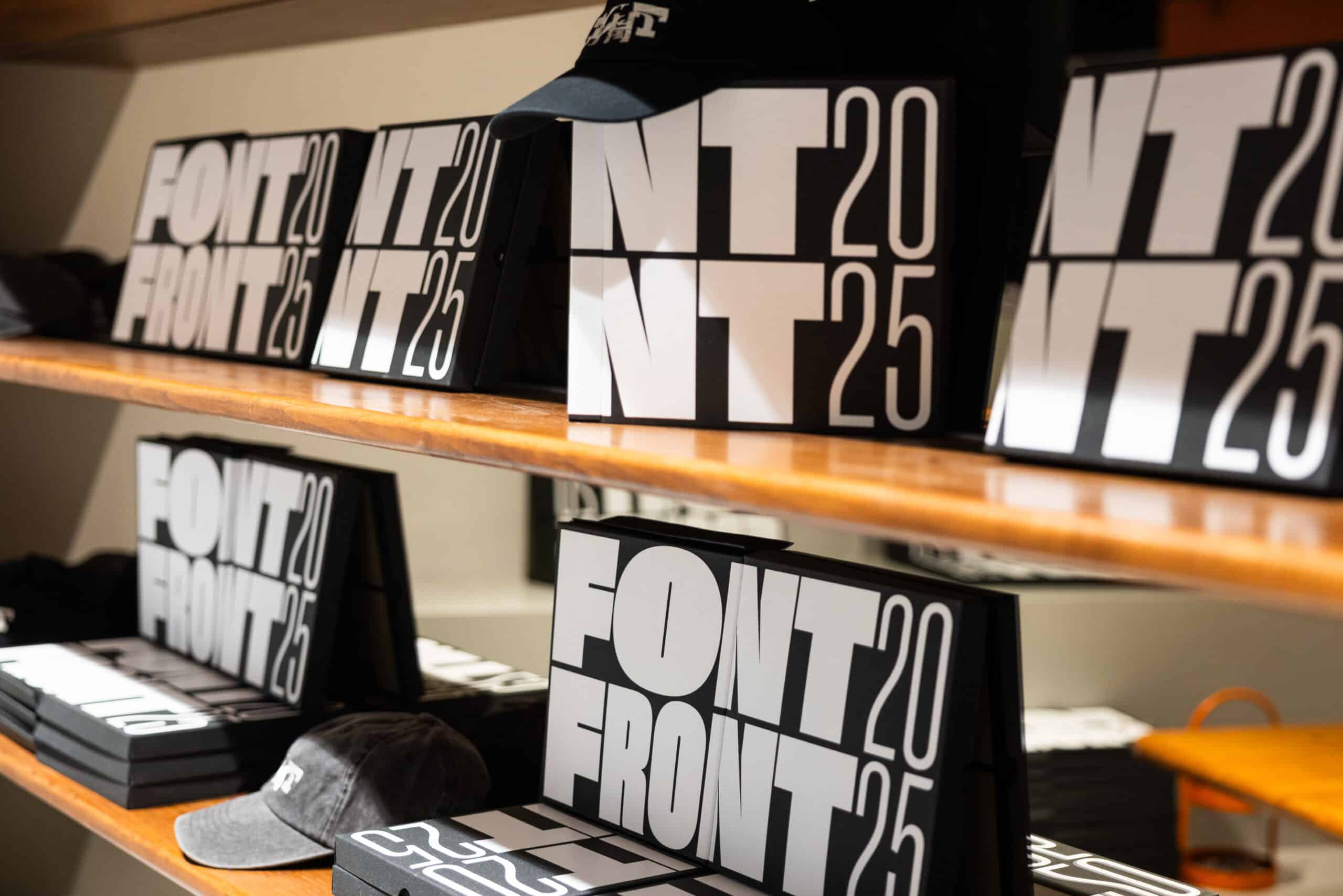
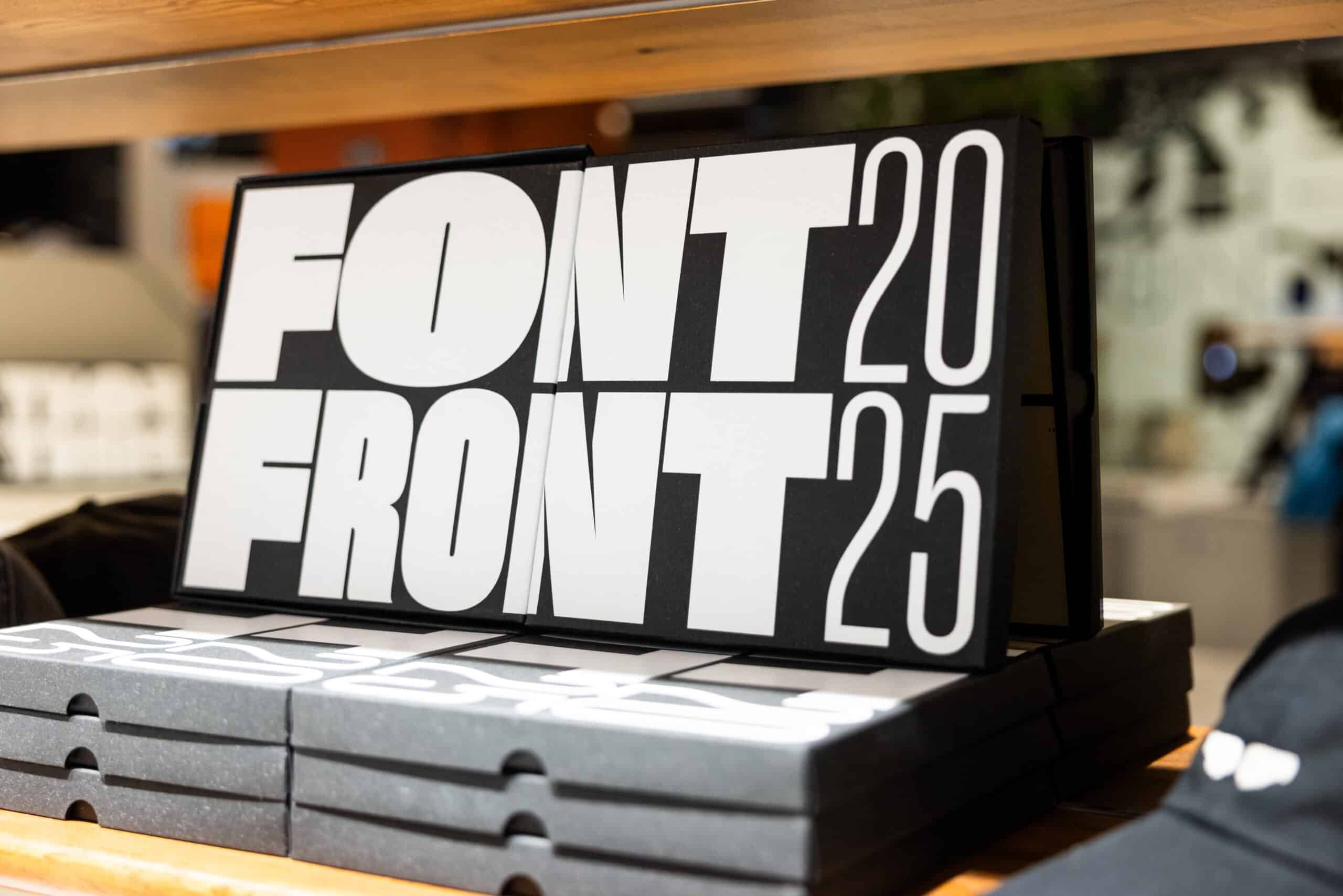
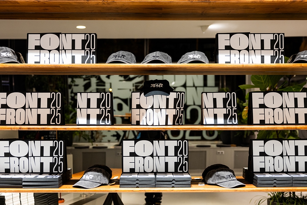
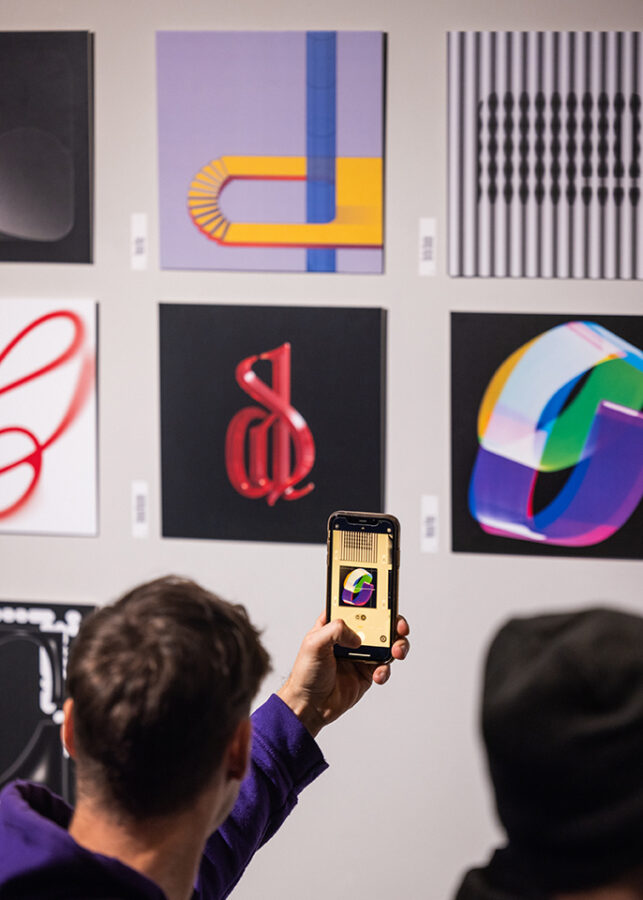
The Budapest creative scene has once again welcomed the return of FONTFRONT — a typographic competition turned community event that breathes new life into Hungary’s graphic design culture. Originally active from 2012 to 2014, FONTFRONT was resurrected in 2023, and since then, it has grown rapidly, becoming one of the most anticipated typographic showcases of the year. The competition invites designers to reinterpret letters of the Latin alphabet in creative, contemporary ways. Selected works are exhibited and voted on, both online and in physical space, bringing together past and emerging talent in a shared celebration of type design.
We spoke with the organisers behind FONTFRONT to dig into how the event has evolved — what drives it now, how the community responds, and what the future might hold.
Q: How was the energy at this year’s event? What would you say has changed over the years, if anything?
A: The energy was absolutely through the roof again. We’re so pleased that FONTFRONT has grown into a real professional and social gathering within Budapest’s graphic design scene. What started as a friendly typographic competition that lived only online for a few years — and then lay dormant for more than a decade — has now become something fresh, contemporary, and community-building.
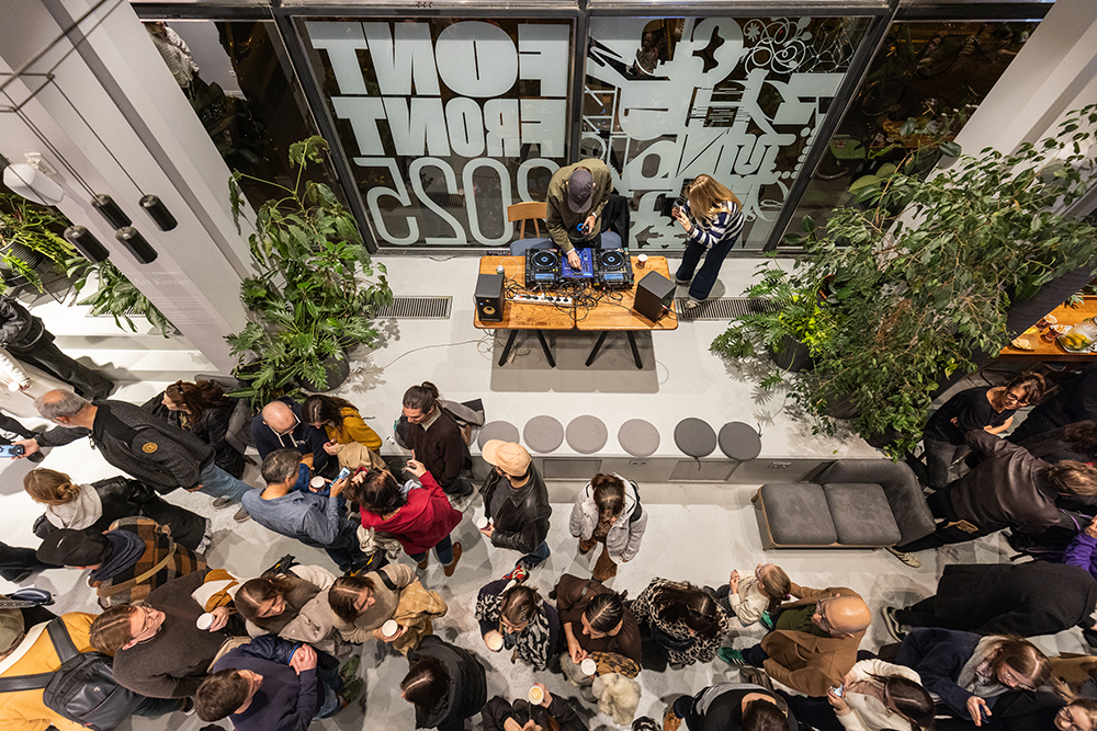
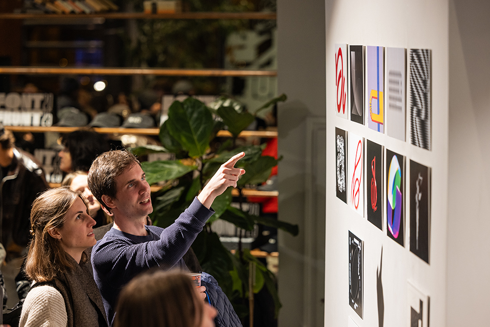
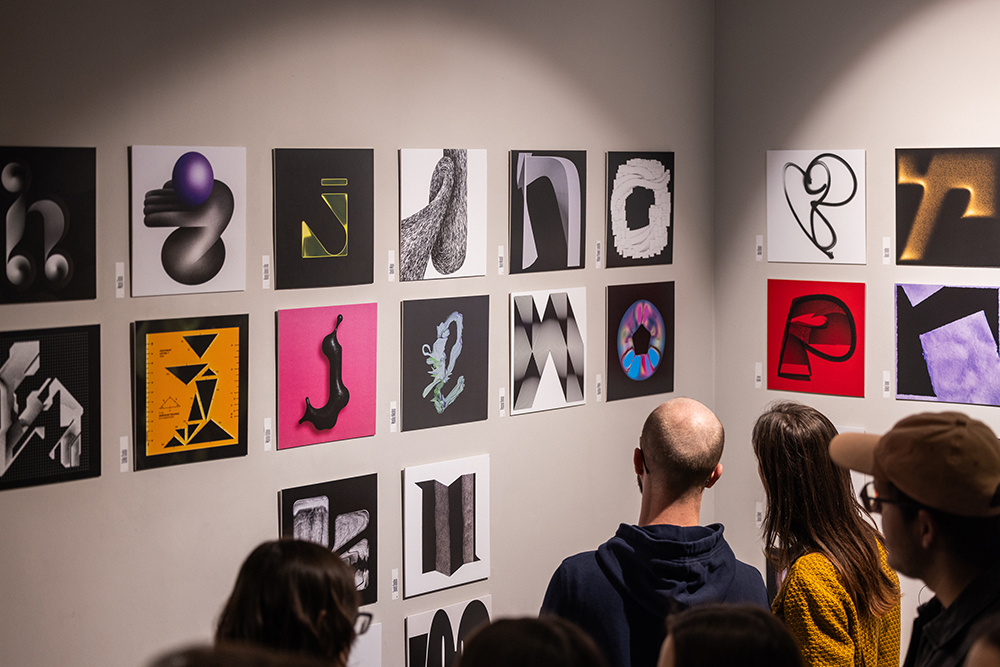
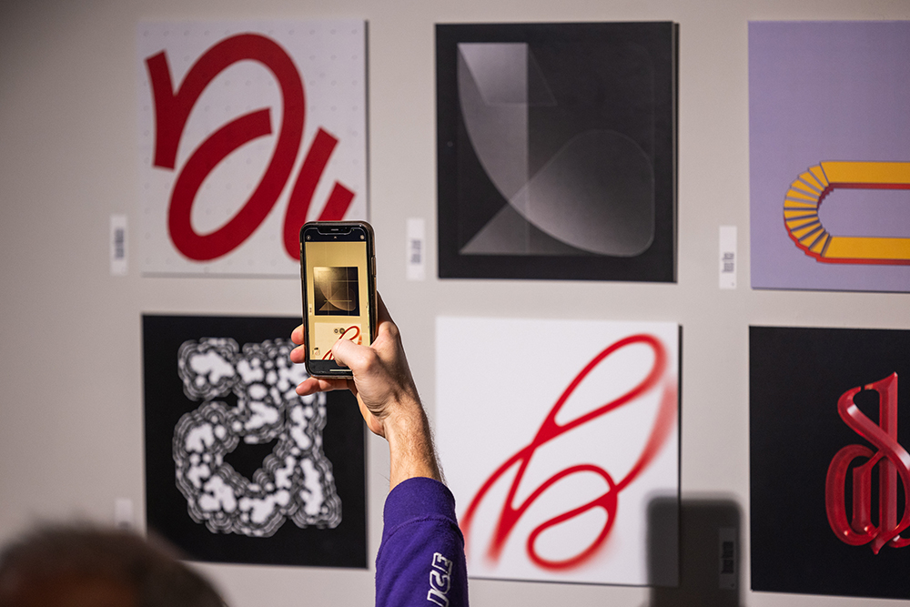
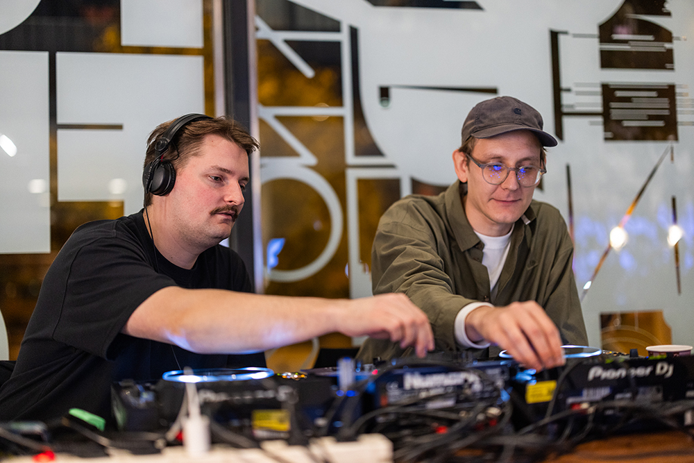
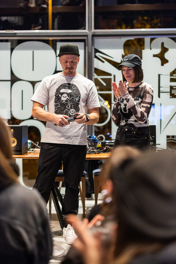
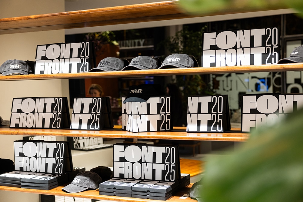
And the momentum is clearly growing: each year we see increasing interest in the project. In 2023, we received around 500 submissions, in 2024, this number nearly doubled to 1000, and this year we reached almost 1,200 entries, of which only 52 make it into the exhibition each year. The opening event always gets completely packed, so we can safely say the hype is real. 🙂
Q: Does it always take place during Budapest Design Week?
A: No, only the first edition of FONTFRONT — back in 2023 — was held during Budapest Design Week. In 2023, we (Korinna Tanczos art manager, curator and Gergo Cuba graphic designer) decided to create a graphic-design-focused exhibition for BDW. Once BDW announced that the year’s theme would be celebrating the major design moments of the past 20 years, the idea of reviving FontFront (which used to be an iconic, friendly typography competition in 2011) came to us immediately.
At first, we only wanted to put together an exhibition that evoked the spirit of the original FontFront — but we got carried away. Very quickly, we reached the point where we thought: why not resurrect the iconic game itself, but reimagine it in a fresh, contemporary form? So we began organizing it in our free time, completely on a non-profit basis.
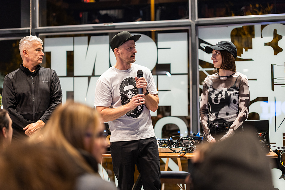
Since then, we’ve aimed to stay connected to BDW each year through some kind of side event. For example, this year we hosted a roundtable discussion on the fluid boundaries of typography, featuring renowned graphic designers and visual artists.
Q: Who is the team behind the organization? Could you please share all the names, profession & involvement in the event?
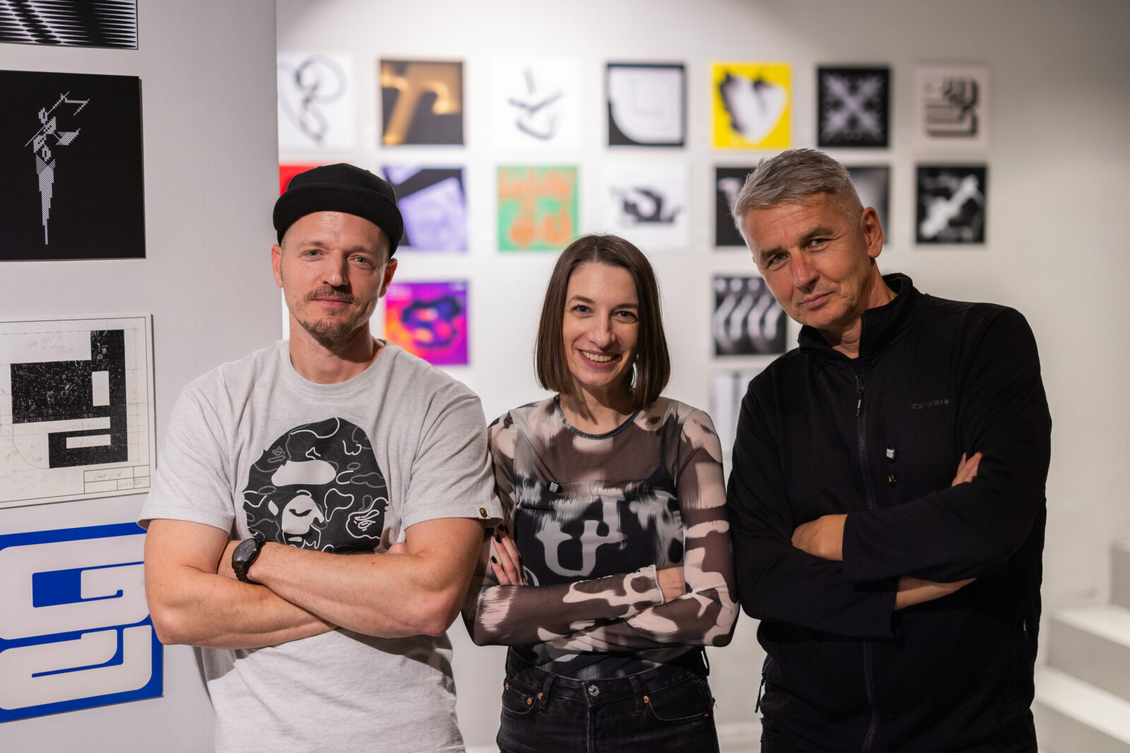
A: Gergő Cuba — Red Dot–winning graphic designer and lecturer at the Metropolitan University Budapest. Gergő is one of the main organizers of the event and the designer behind the entire project. He dedicates nearly all of his free time to FONTFRONT: planning, designing, organizing, coordinating production, shaping the visual identity, and assembling the jury each year. Practically every creative and structural element of the project passes through his hands.
Korinna Tánczos — art manager and curator. Korinna forms the other half of the main organizing team. She is responsible for management, funding processes, writing, communication, coordination, and social media. She supports Gergő throughout every phase and ensures that the project runs smoothly on the organizational and administrative side.
Zoltán Halasi — graphic designer, Ferenczy Noémi Award recipient, and lecturer at Design Campus Győr. Zoltán is the honorary member of the team. He was the creator of the original FontFront project, which ran from 2011 to 2014. He also taught Gergő back in the day, so having him involved now as the revived project continues is a meaningful full-circle moment — a kind of passing of the torch from mentor to the next generation.
Q: What brought you together to organize this event?
A: Gergő’s connection to FontFront goes back to its very beginnings. He contributed to the conceptual development of the project and was an active member and participant, fully immersed in the online community.
Korinna, meanwhile, explored 21st-century community formations in Hungarian graphic design for her master’s thesis, and FontFront was one of the projects she examined closely. Having already collaborated on several projects, it felt natural for us to work together again when the opportunity arose in 2023 to contribute to Budapest Design Week’s 20th anniversary program. FontFront immediately came to our mind. We both felt there was a need in the local professional scene for a free-spirited, enjoyable, and creatively open design game — one that could revive the somewhat dormant community and bring people together through playful, professional engagement.
Q: Anything else you would like to share with our readers?
A: After the first year of FONTFRONT, we conducted a community survey to understand how we could improve the project — what people enjoyed, what they wanted more of, and how we could grow. We’d love to share a few pieces of feedback we received. We’re incredibly proud of these responses; they’re what keep us motivated and moving forward:
I find it a very exciting and great project — it brings the Hungarian design community a bit closer together. It’s so good to see multigenerational initiatives happening in the local design scene. Thanks! The whole thing is just cool as it is. Thank you for the fantastic organization — and for the catalogue as well. 🙂 Thanks for all the energy you put into this — it’s great that you revived this initiative. It was one of the positive highlights of last year.
These messages mean a great deal to us, as we dedicate so much time and energy to this project entirely pro bono, and because FONTFRONT has always been about community, connection, and celebrating the joy of typography together. At FONTFRONT, we celebrate type, ideas, and community — and the excitement from the scene reminds us why we do it every year.
Why FONTFRONT matters?
What makes FONTFRONT truly special is not just the letters, but the spirit behind them. It’s more than a competition. It’s a community ritual, a design playground that bridges generations and backgrounds. By reviving the beloved typography game from the early 2010s and reimagining it for today, the team at FONTFRONT has created a space where both ambition and camaraderie thrive.
Exhibited as part of Budapest Design Week, FONTFRONT aligns beautifully with the wider goals of the design festival. To foster dialogue, stimulate innovation, and spotlight the richness of graphic design in Hungary. For design lovers — FONTFRONT offers an insider’s peek into the creative process behind typography: from initial sketches to final prints. From solitary design work to collective exhibition. From online votes to real-world shows.