

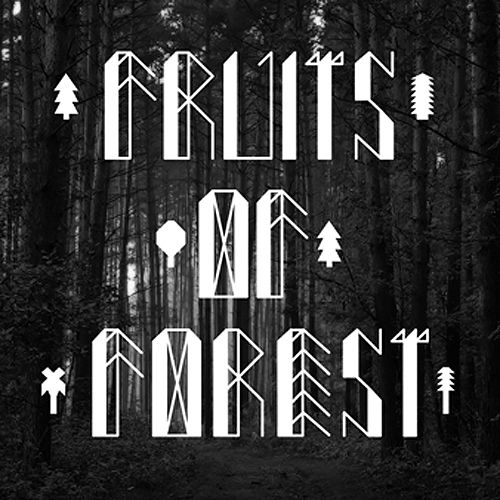
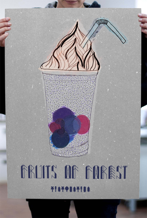
Polish art director and graphic designer Nina Gregier is a woman of many talents. Among her many projects, she enjoys drawing letters and designing typefaces, Fruits of Forest being one of them. The geometric and angular font reminds me of Stone Age cave drawings and ethnic symbols, which play with lines and angles. Like spears and arrows flying through the air!
Nina Gragier is a well-known name in the Polish graphic scene, Kraków based, she runs her one-woman creative studio Proste Kreski. Her clients include such local institutions as Polska Fundacja Sztuki i Mody, Craców Fashion Week, TUBA magazine and Craców School of Art and Fashion Design. She is internationally published and even curates and runs the Garaż art space/gallery with a fellow artist Piotr Wojtaszek. She is incredibly productive and involved with the local design scene, on top of doing all her professional design work and personal projects.
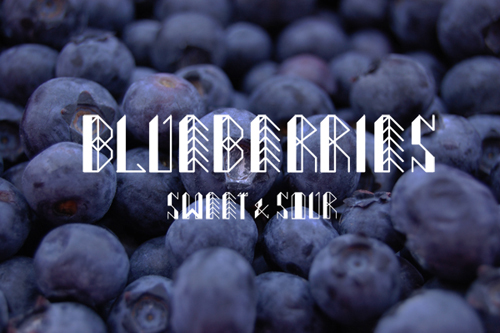
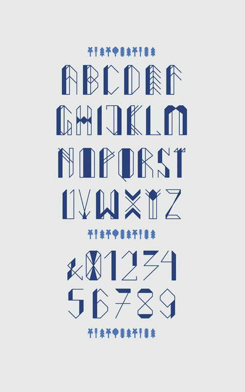
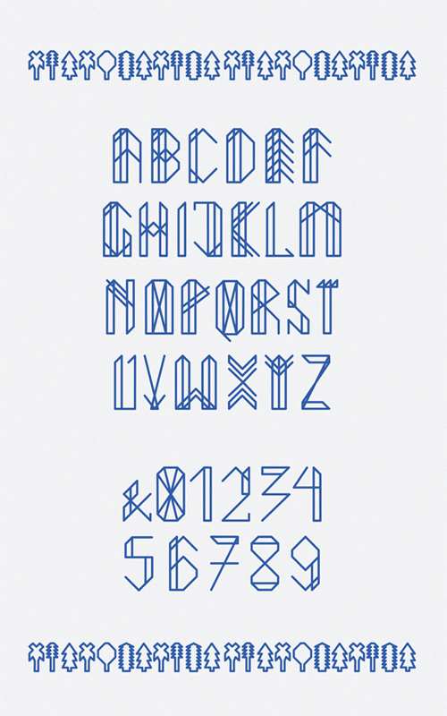
One of these personal projects is the Fruits of Forest typeface published in 2013. Even though the name suggests a nature-inspired font, the design is very geometrical, based on lines and shard angles. The letters are build up in a linear pattern and can be modified, and somewhat personalized with color blocking some areas of each letter. The design takes me back to the Stone Age cave drawings and hieroglyphs of the agent Egyptians but is still quite modern and new age. The font could perfectly be transferred into a knitting pattern, or to a simple stitch work, where we guess Gregier got her inspiration from judging from her style and previous designs, which you can see here.


 Photos © Nina Gregier