Ukrainian graphic design studio Glad Head creates emotion-driven design for local and international clients. Focusing on corporate branding, website development, and multipage publication design, they push themselves to find the utmost expressive and effective solution on each task given, which has earned the studio numerous awards over its five-year history – most recently the coveted Red Dot Award.
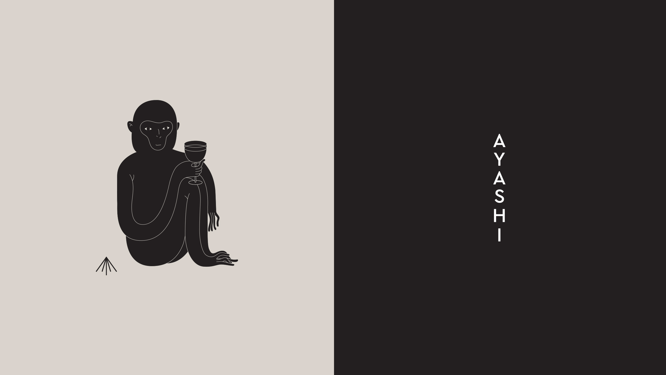
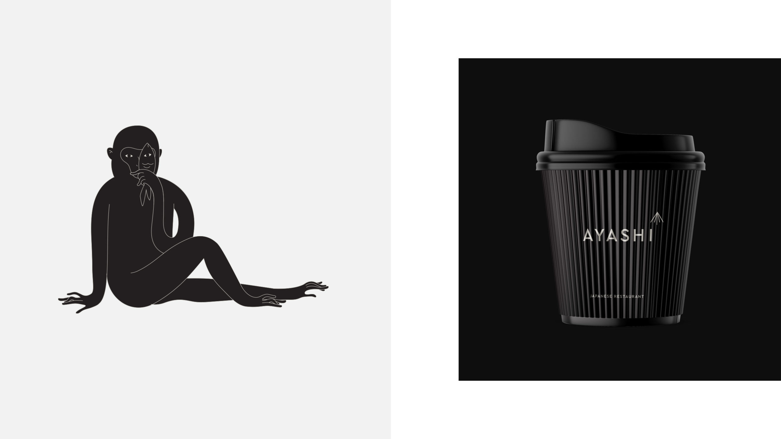
Inspired by the minimalist aspects of Japanese culture, and a unique idea of incorporating a character into the concept – Ayashi visual identity feels exclusive yet inviting
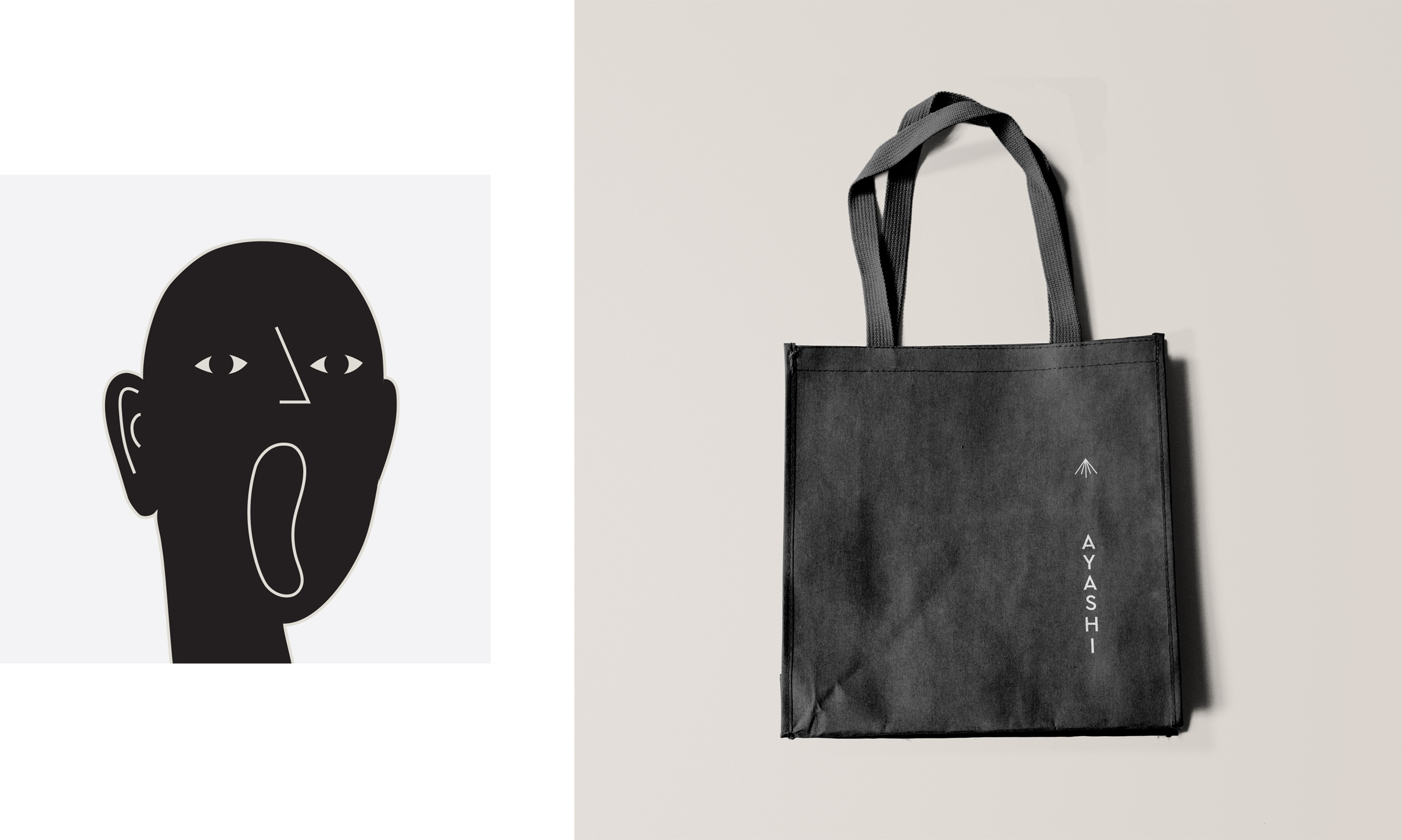
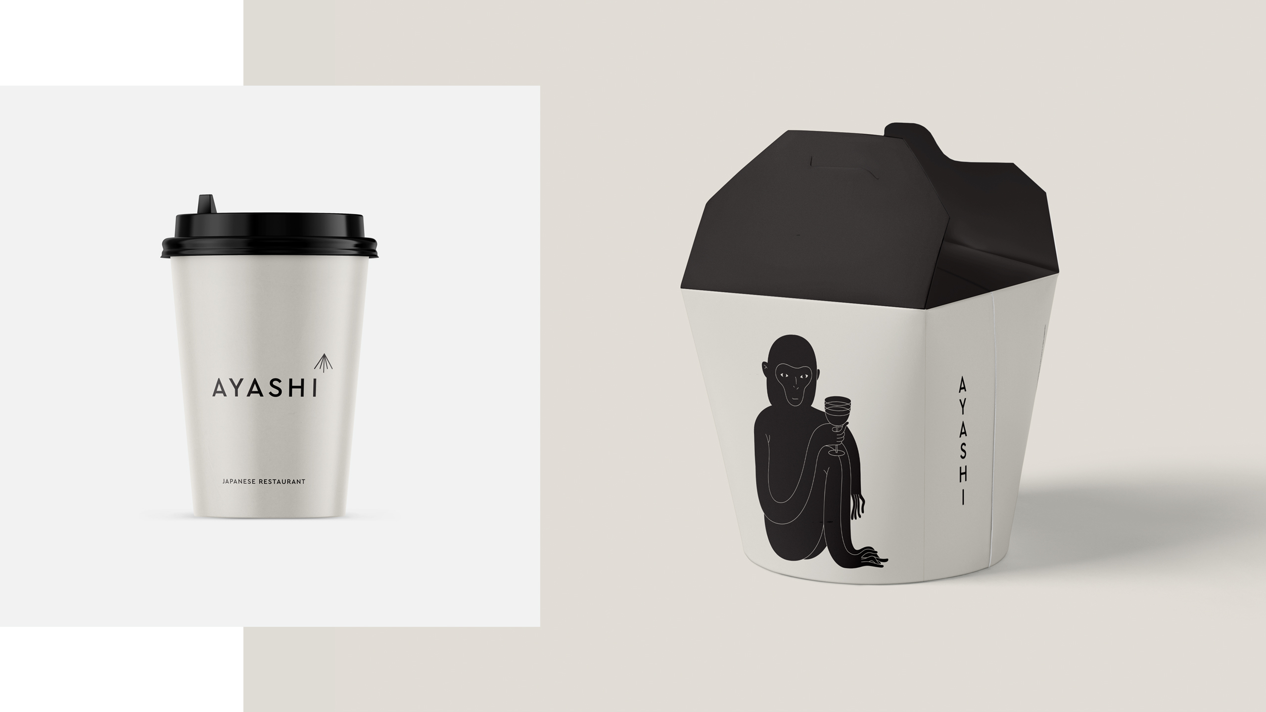
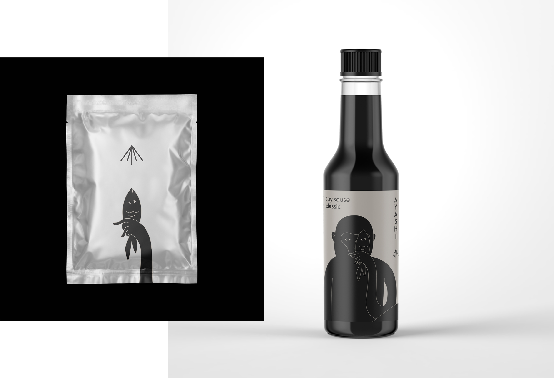
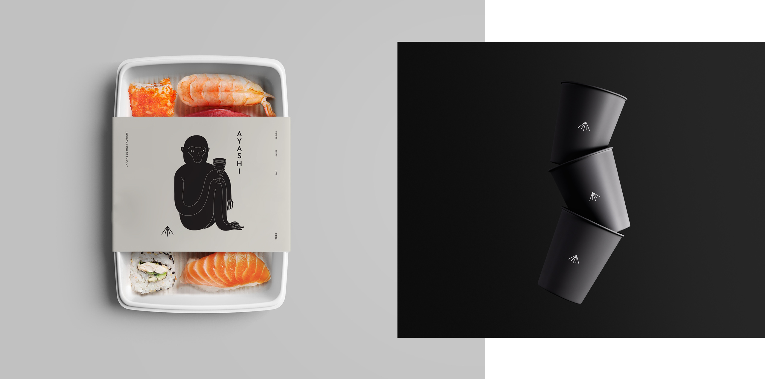
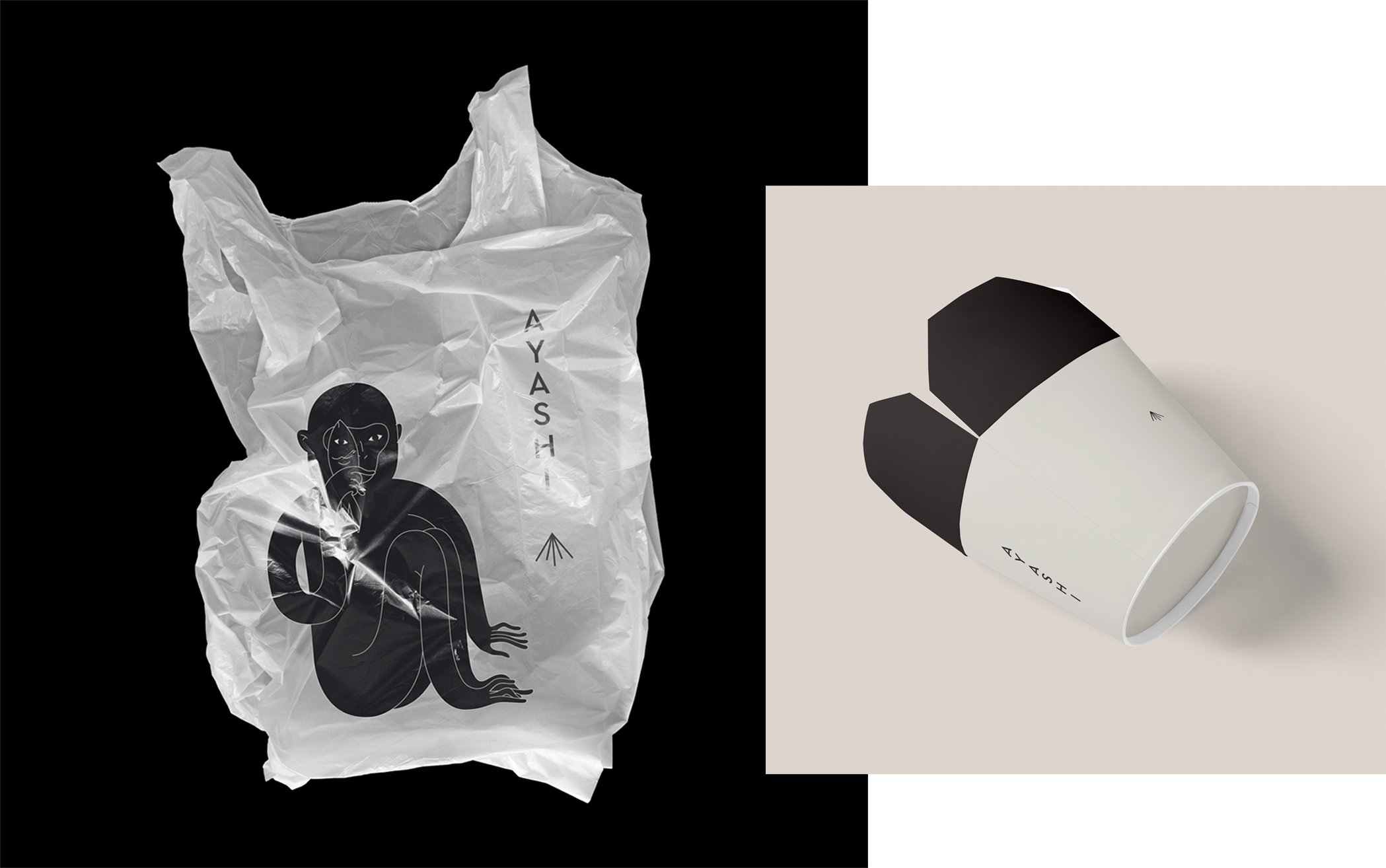
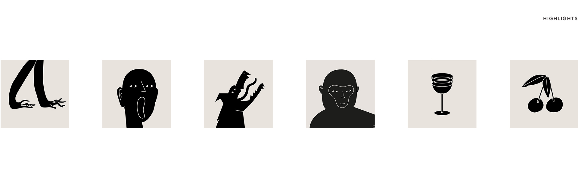
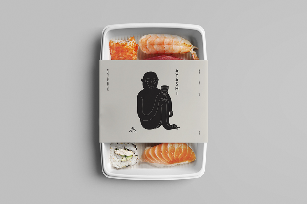
Glad Head’s recent work for a restaurant serving contemporary Japanese cuisine is a testament to the studio’s skillset – and made us fall in love with its simplicity, and harmony of contrasts and ideas, as well as the charming monkey character.
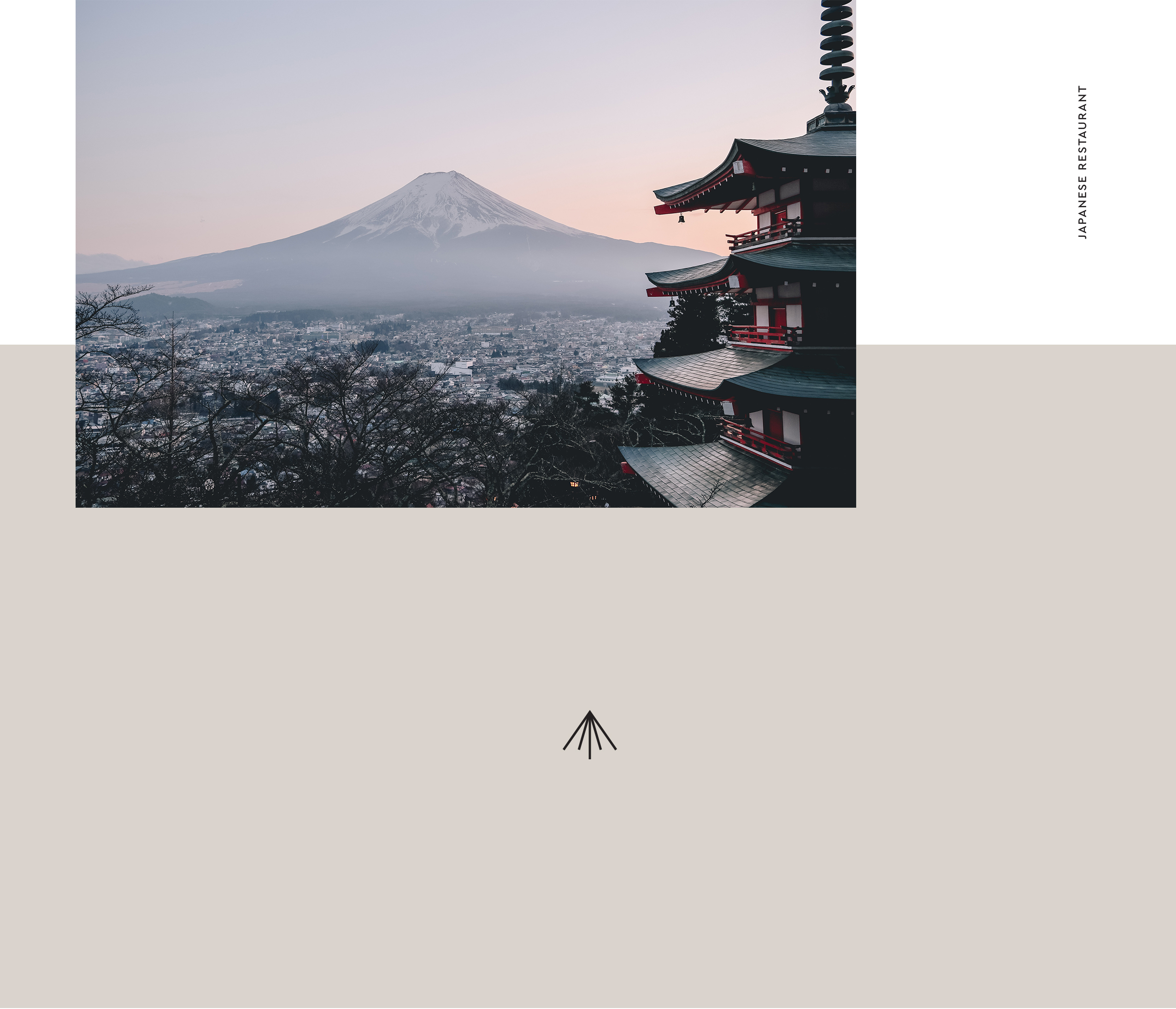
“Japan is a country of contrasts, both visual and emotional: the small stands next to the large, the monochromatic is replaced by color chaos, and black hair lies on light skin”, Glad Head writes.
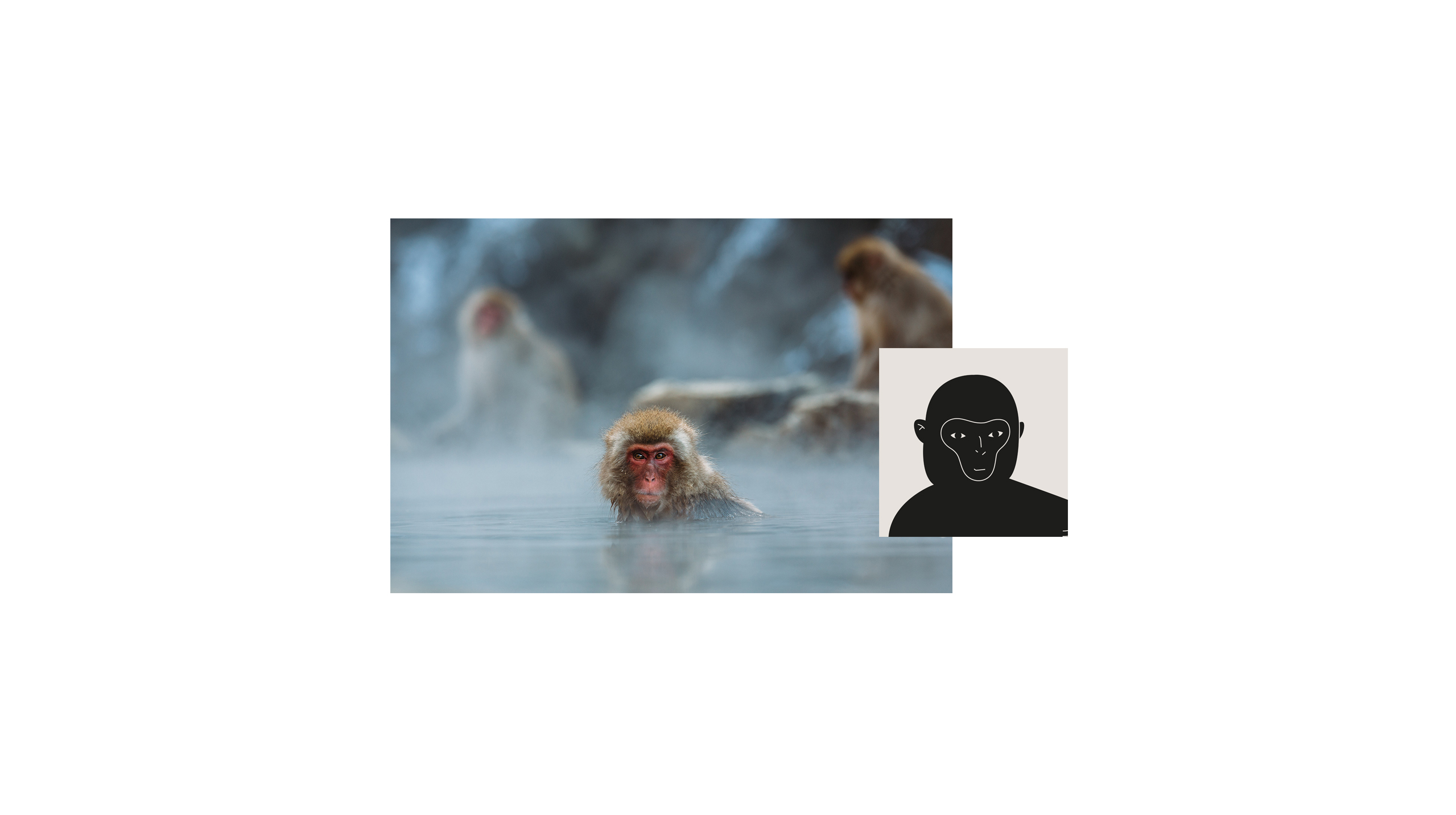
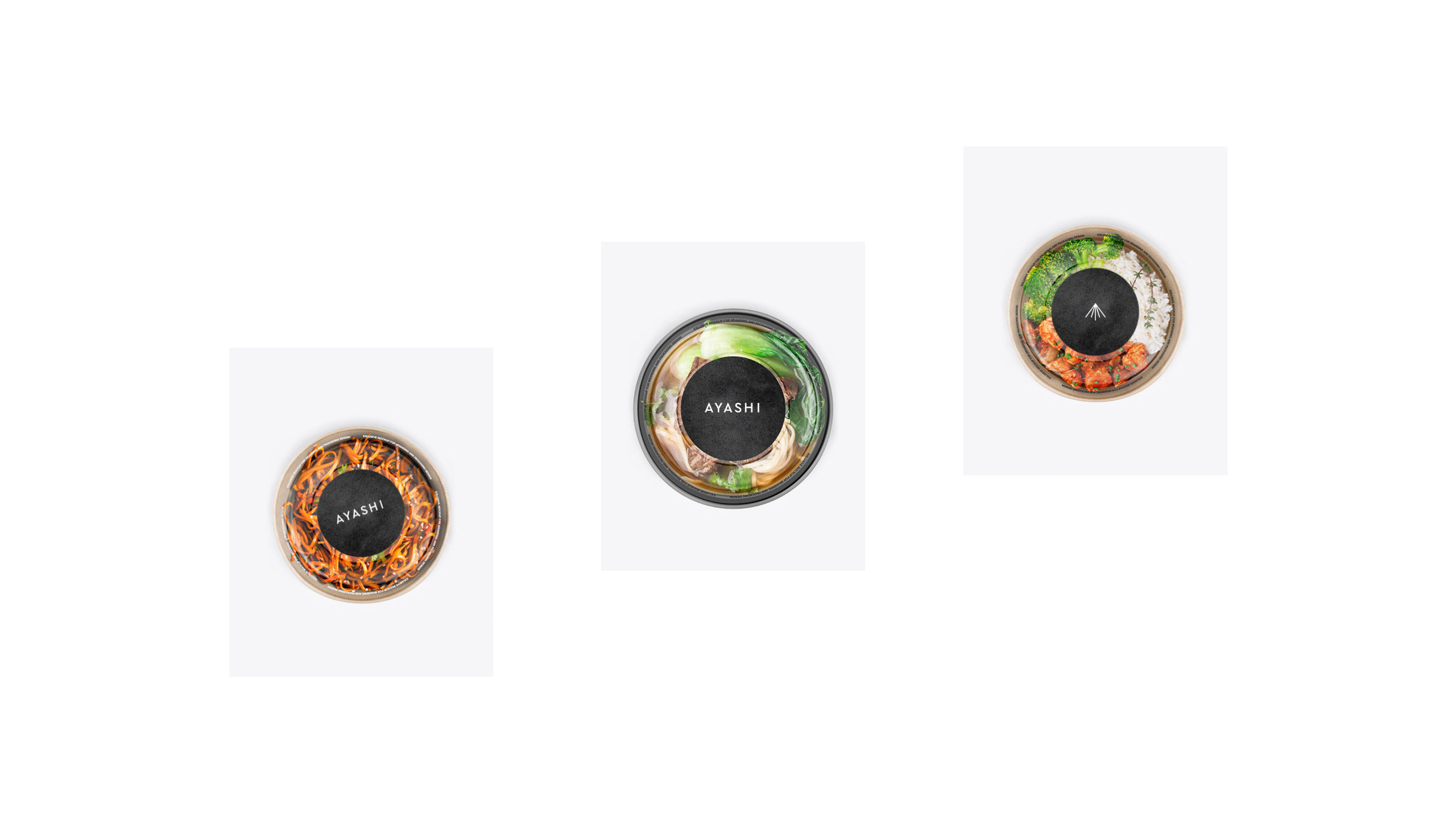
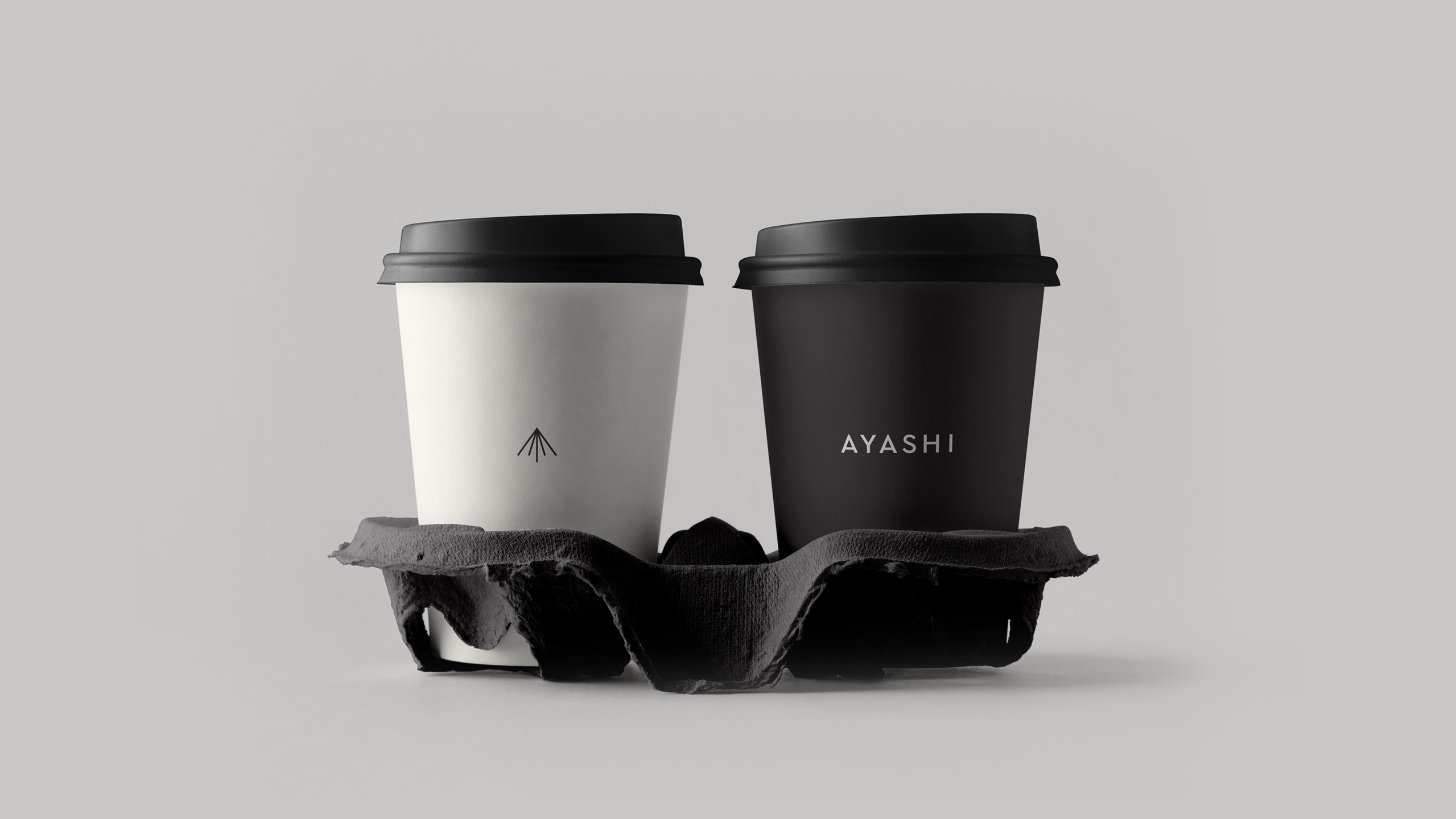
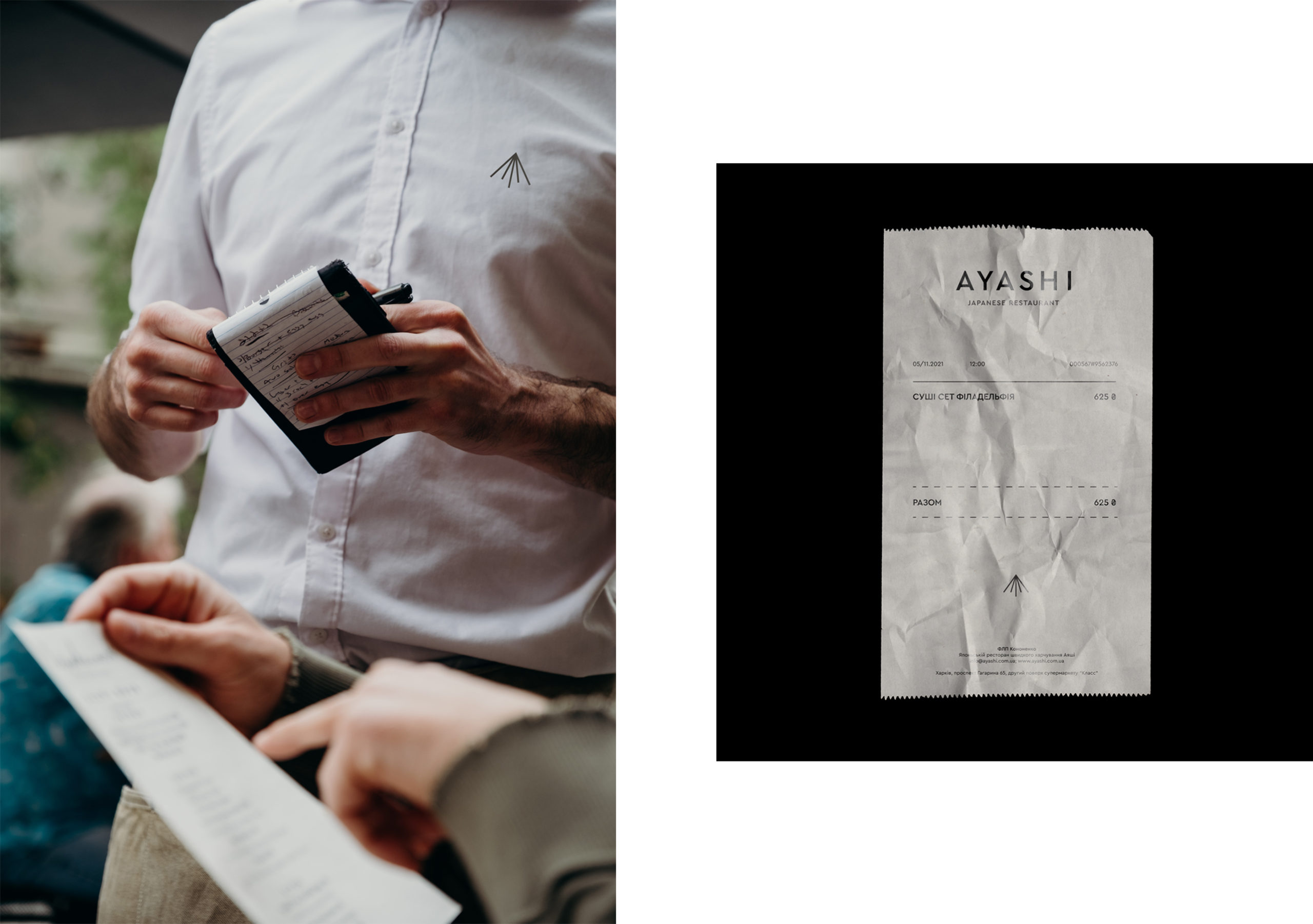
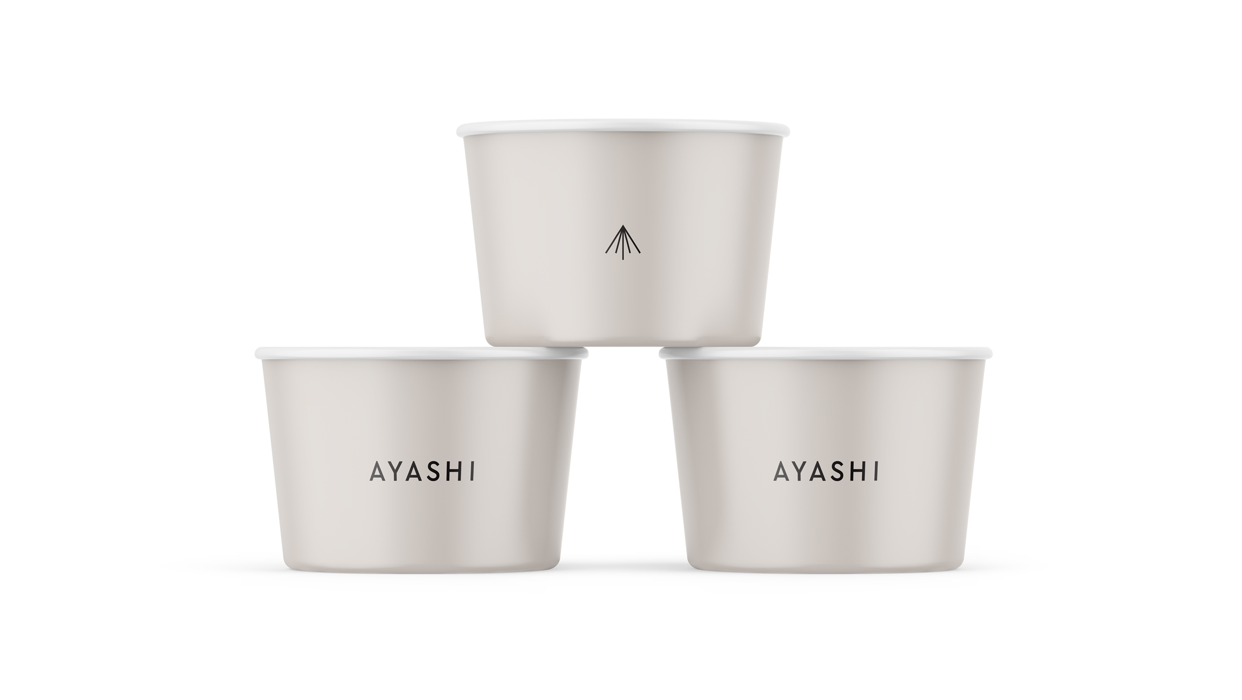
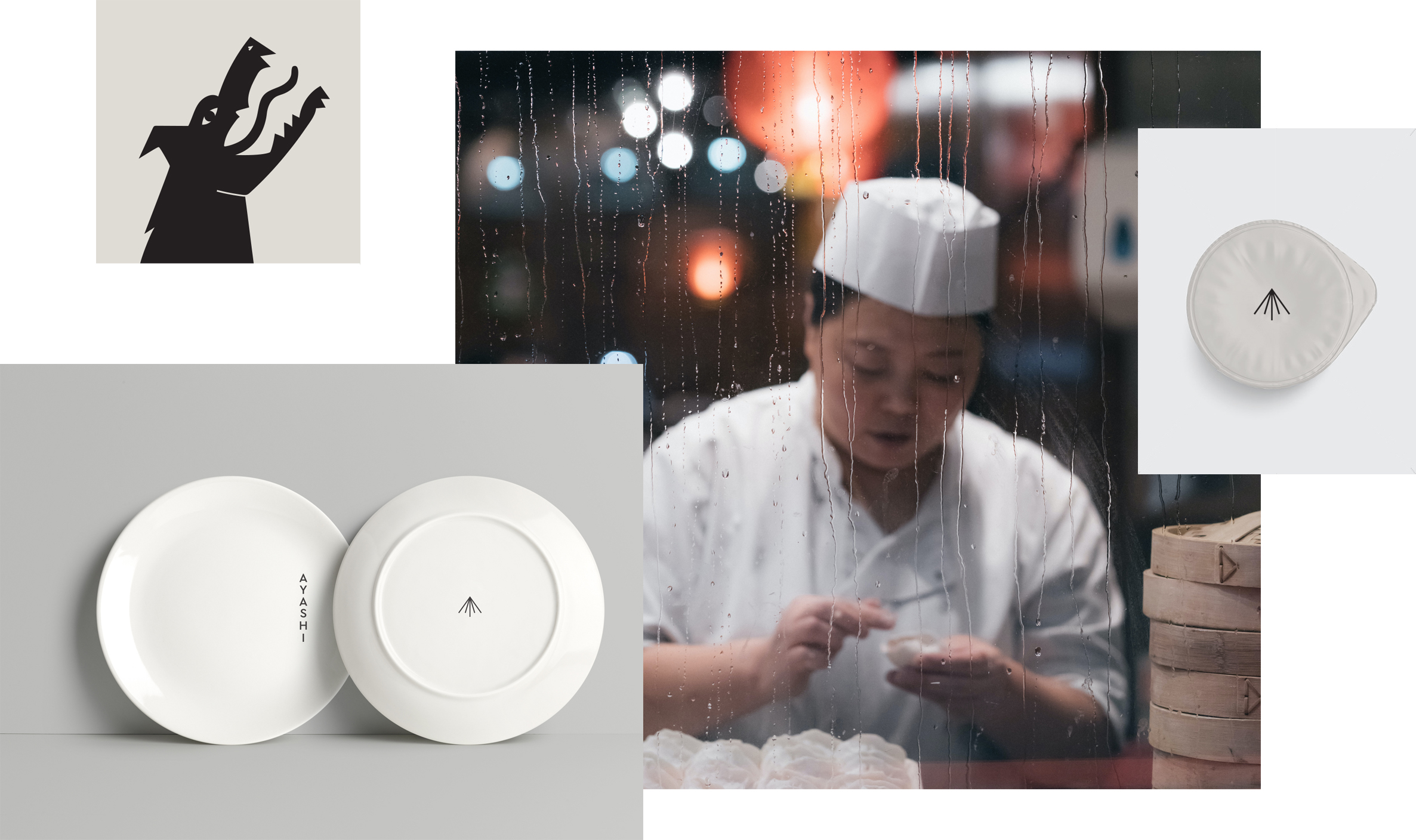
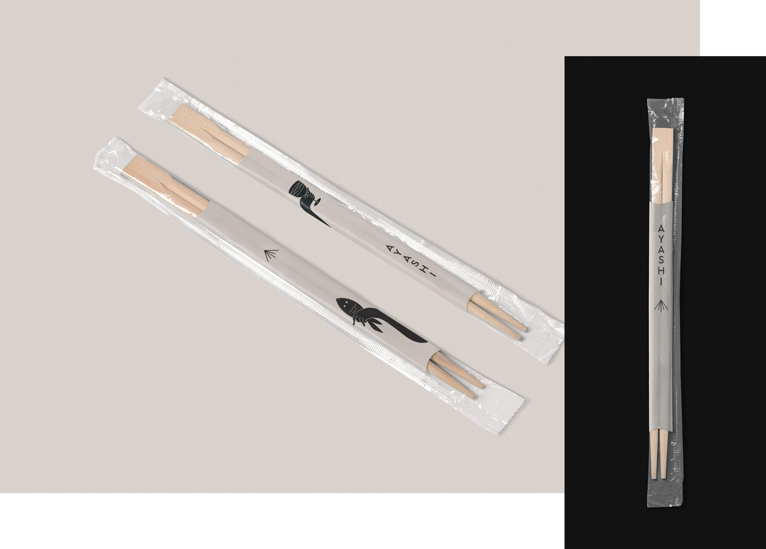
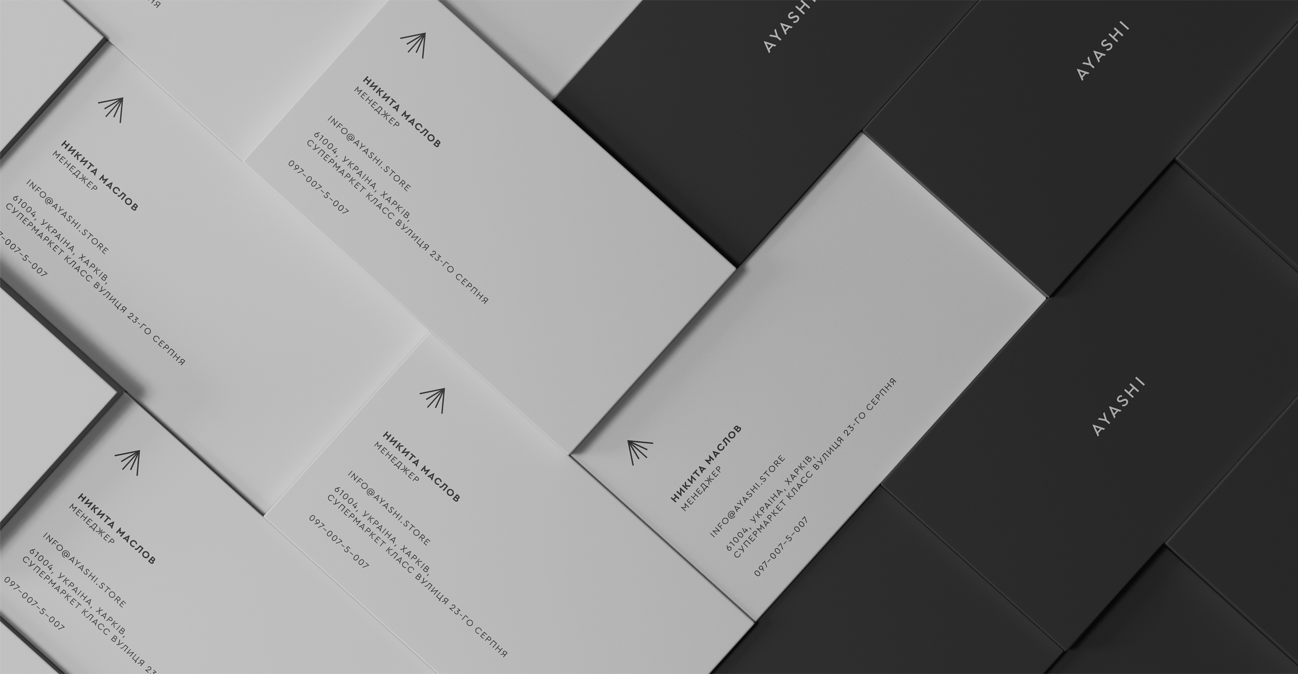
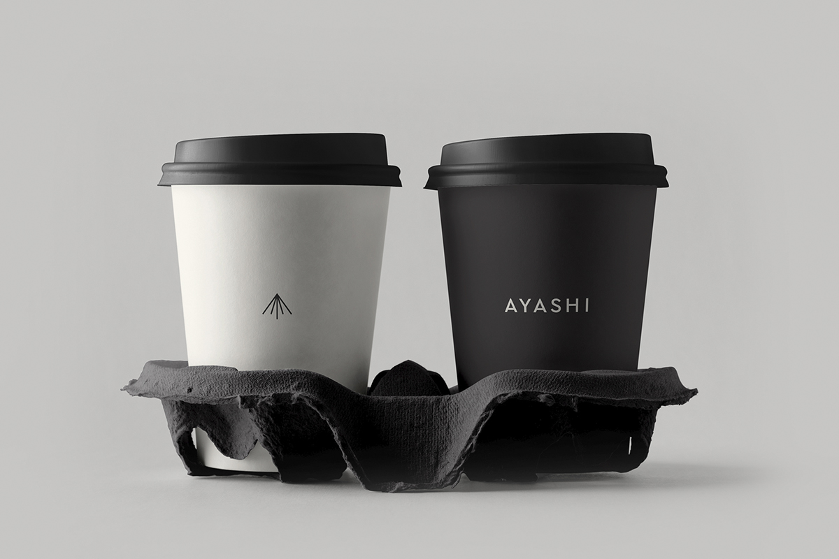
While creating the corporate identity for the restaurant Ayashi, the studio wanted to find a character that would scream in a whisper. Wanting to do something simple and completely unique at the same time. This is how an identity, that looks at the world with the eyes of a Japanese monkey, became to be. “It is thick and viscous, it is empty in one place, but in another, there is already too much of it.” The character is accompanied by a light sans serif typography and minimalist iconography. As a fully monochromatic concept, the visual identity leaves room for the product to shine.
You can find more inspiring work by the Glad Head studio on their Instagram.