Veronika Levitskaya, an independent designer, art director, and one of the founders of the awarded Moscow-based MADE studio (previously here), specializes in brand identity and logo design, package design, web design, and more. Levitskaya finds inspiration in styles based on geometry, form, and colors, such as the Memphis Group, Bauhaus, and Constructivism. The influence can be seen in her work, especially in her recent visual identity for Polyglot Family language school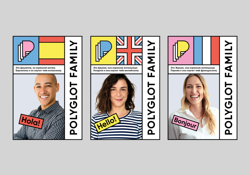
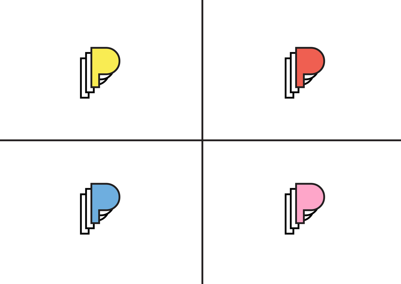
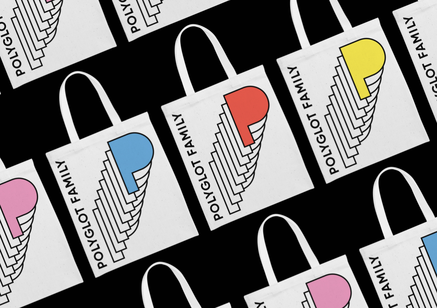
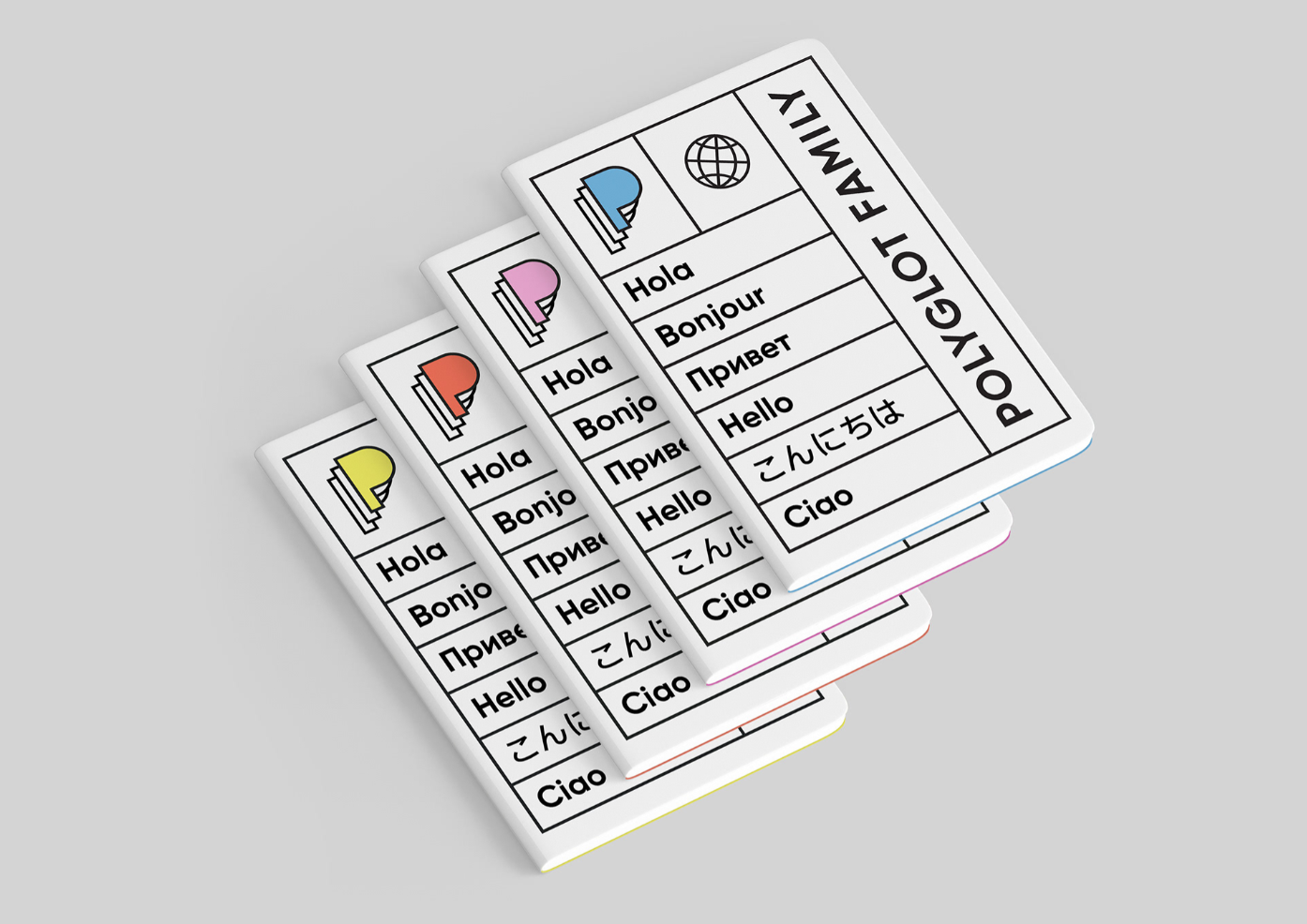
Polyglot Family visual identity design reflects on their sense of multiplicity and abundance
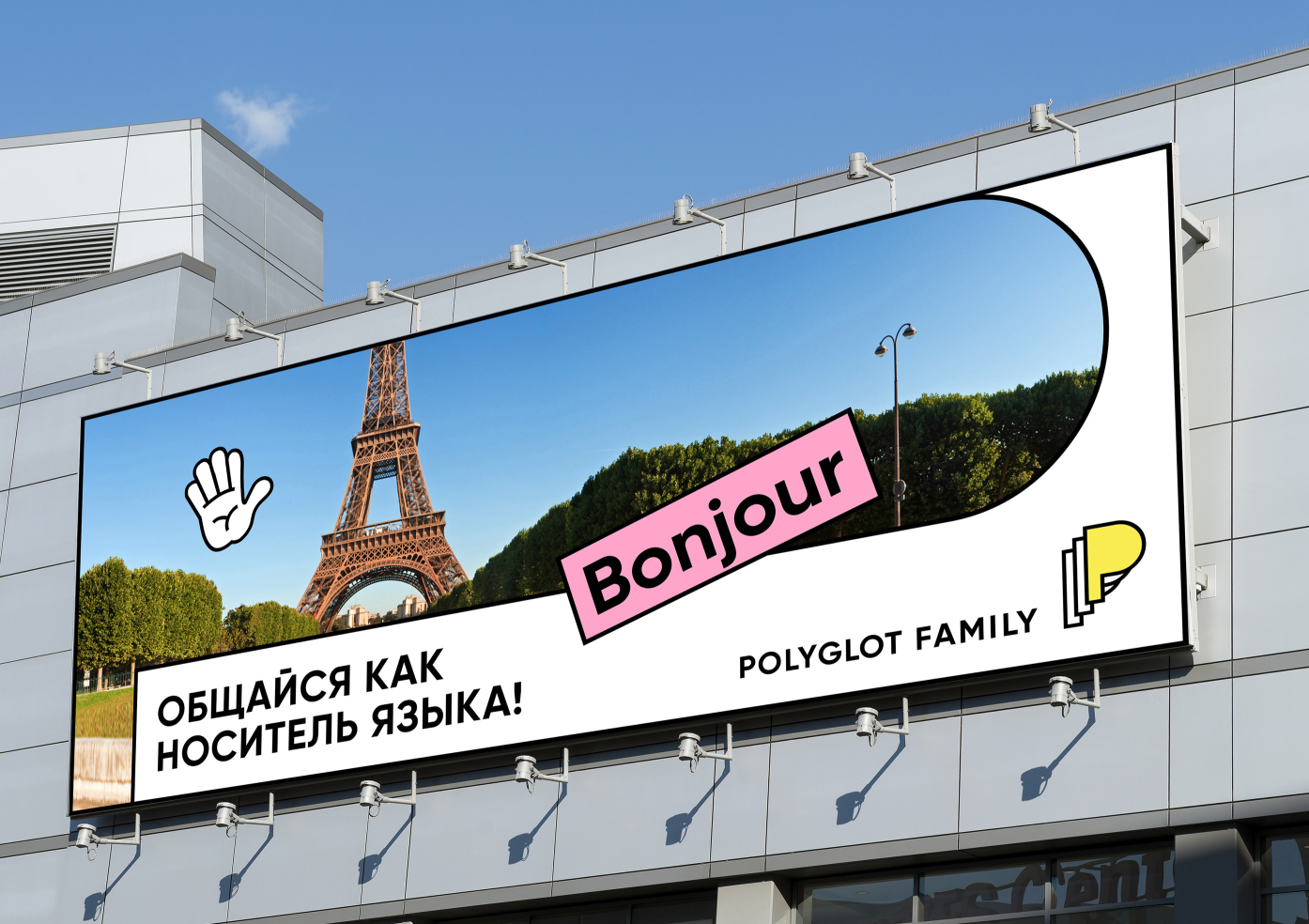
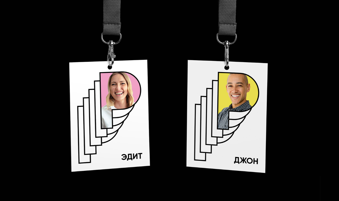
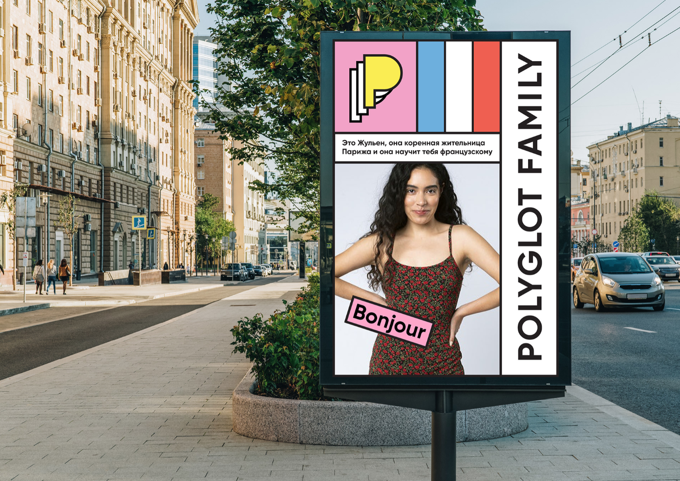
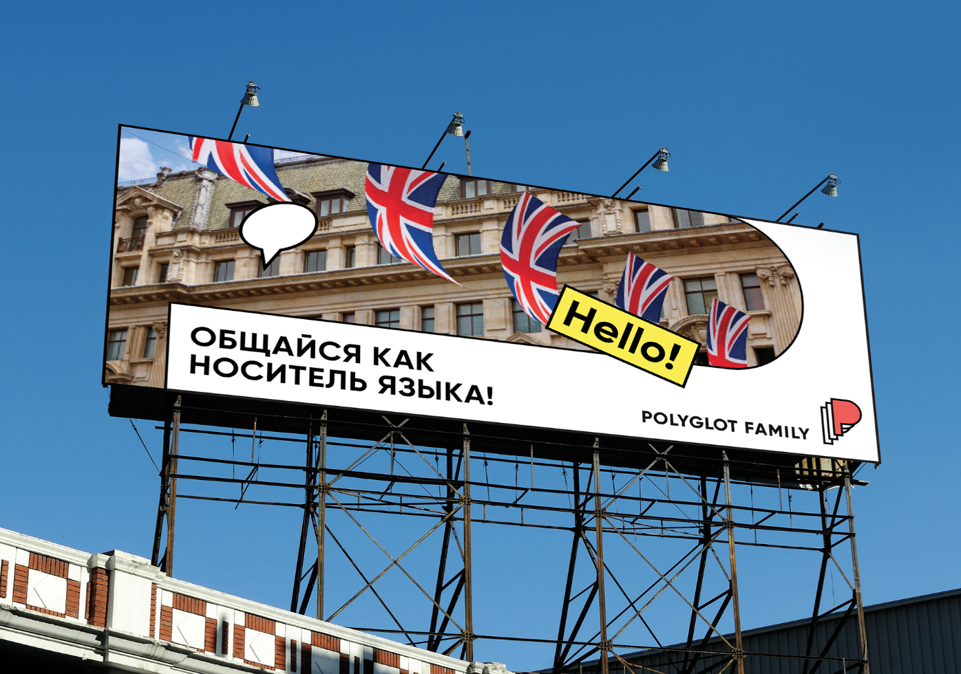
Always aiming to find a unique and individual approach to any client project, Levitskaya creates concepts that not only push the designer’s own imagination but often include collaborations with other experts, such as illustrators, copywriters, programmers, etc, to achieve a wanted result. The visual identity for Polyglot Family, a language school where everyone can learn foreign languages from native speakers, brings together Levitskaya love for bold, geometric patterns, and clean, crisp sans serif typography.
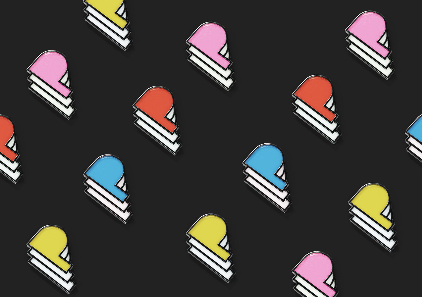
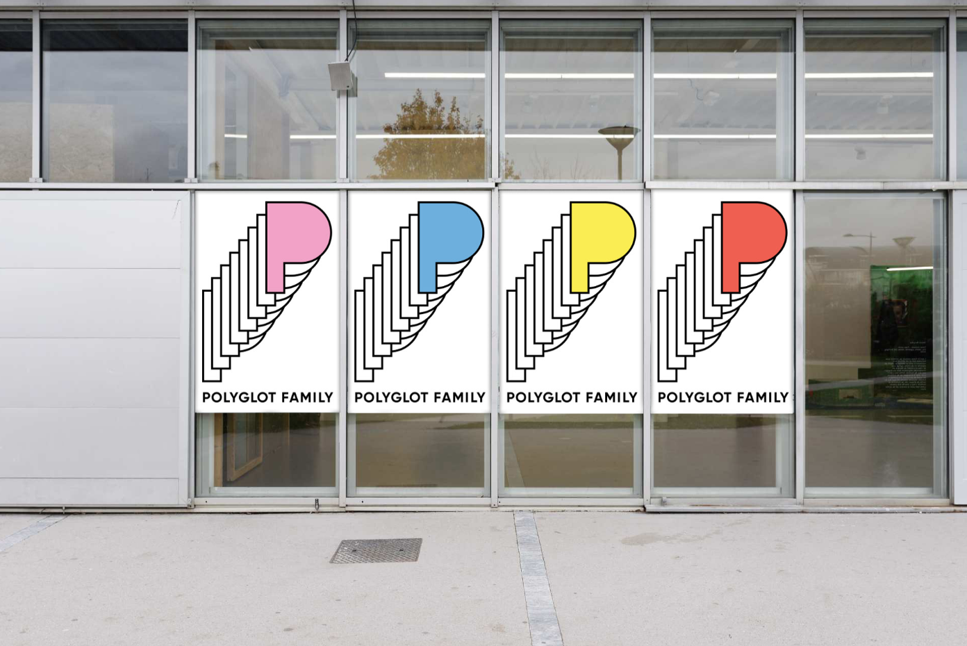
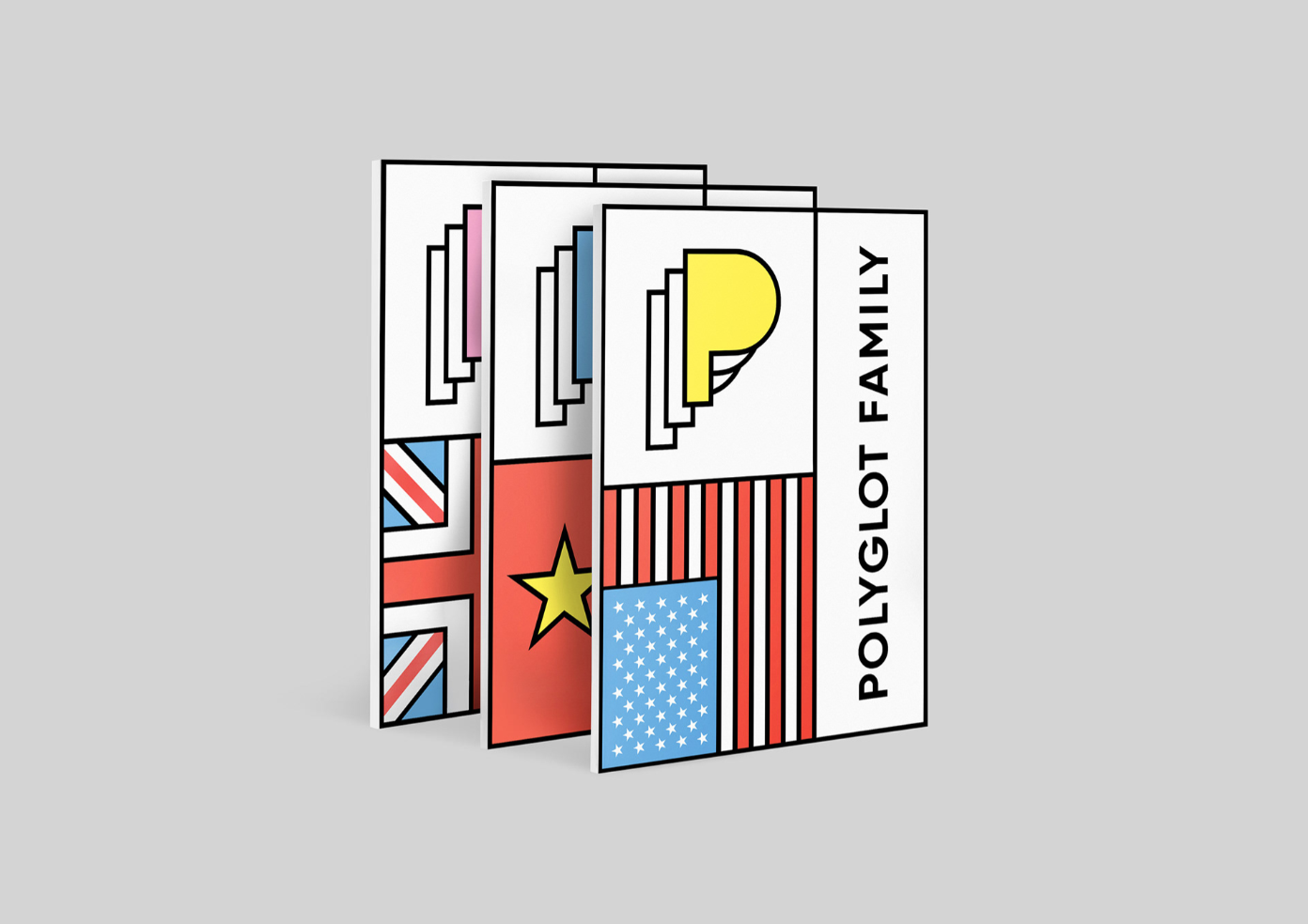
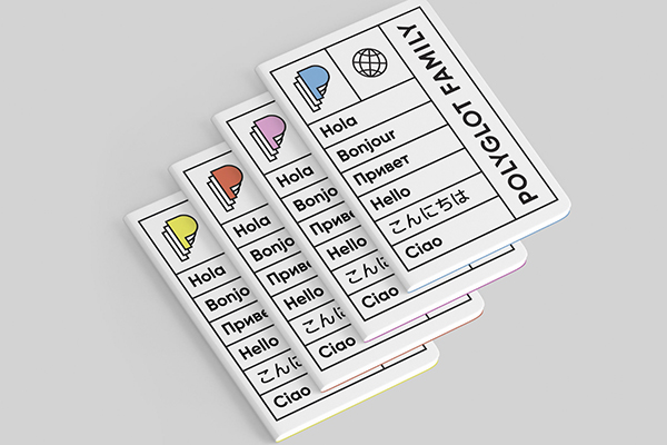
The main idea for the concept was to emphasize the essence of Polyglot Family’s name and the word “polyglotism”, reflecting on the sense of multiplicity and abundance, while the “multilayered” letter “P” in the logo showcases the wide catalog of foreign languages offered at the language school. The overall style feels fresh and playful while offering variable modifications as the repertoire of the company grows.