Cintia Bertaccini Continues To Be Fascinated By Paper And Its Infinite Usages

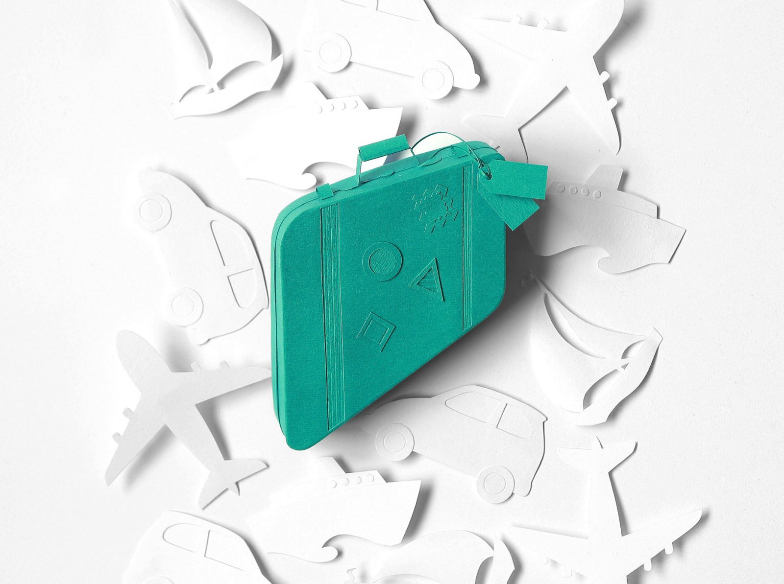
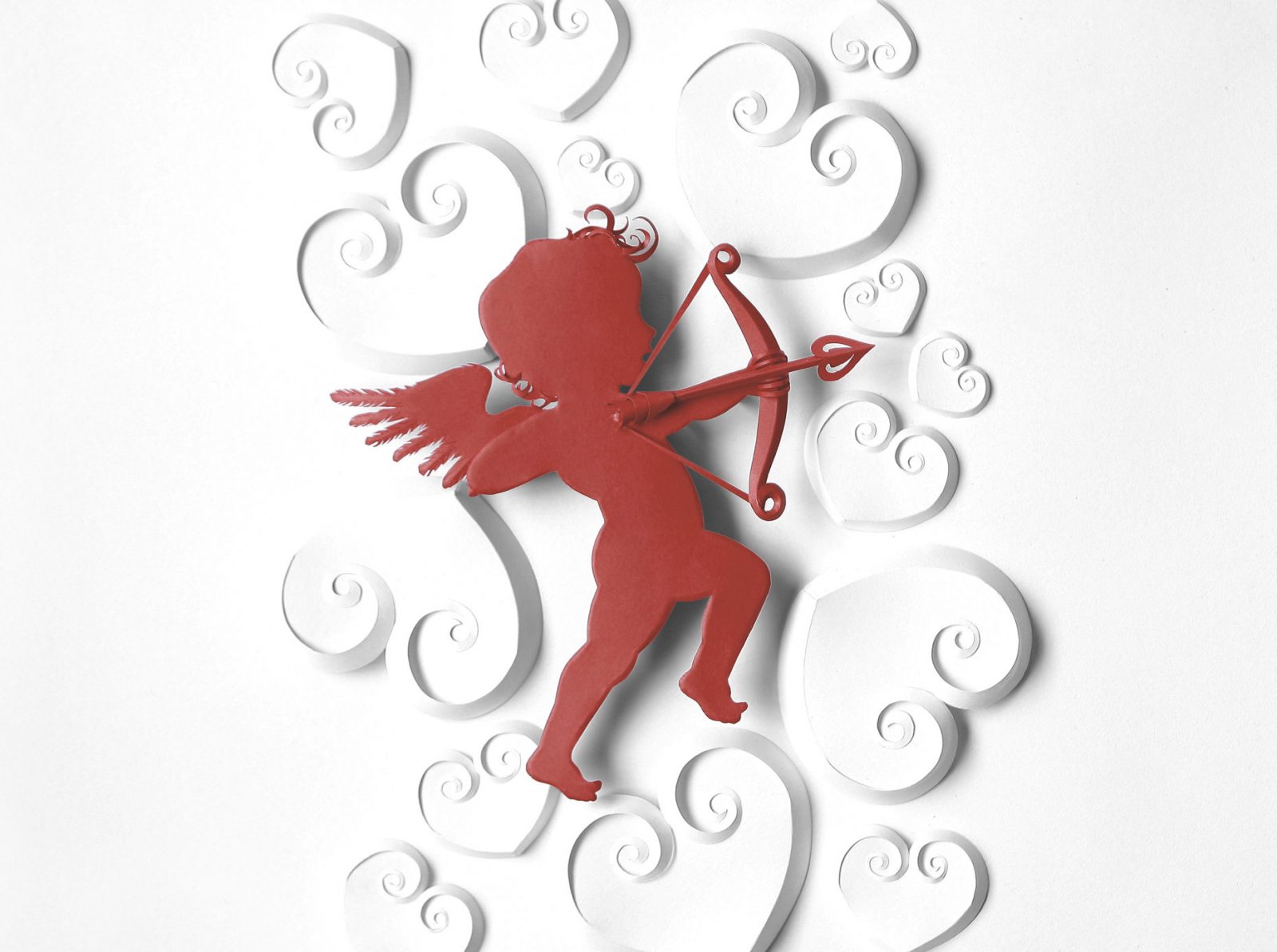
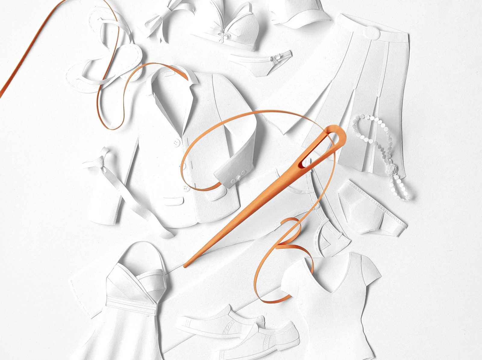
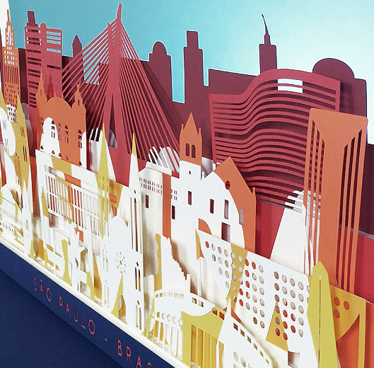
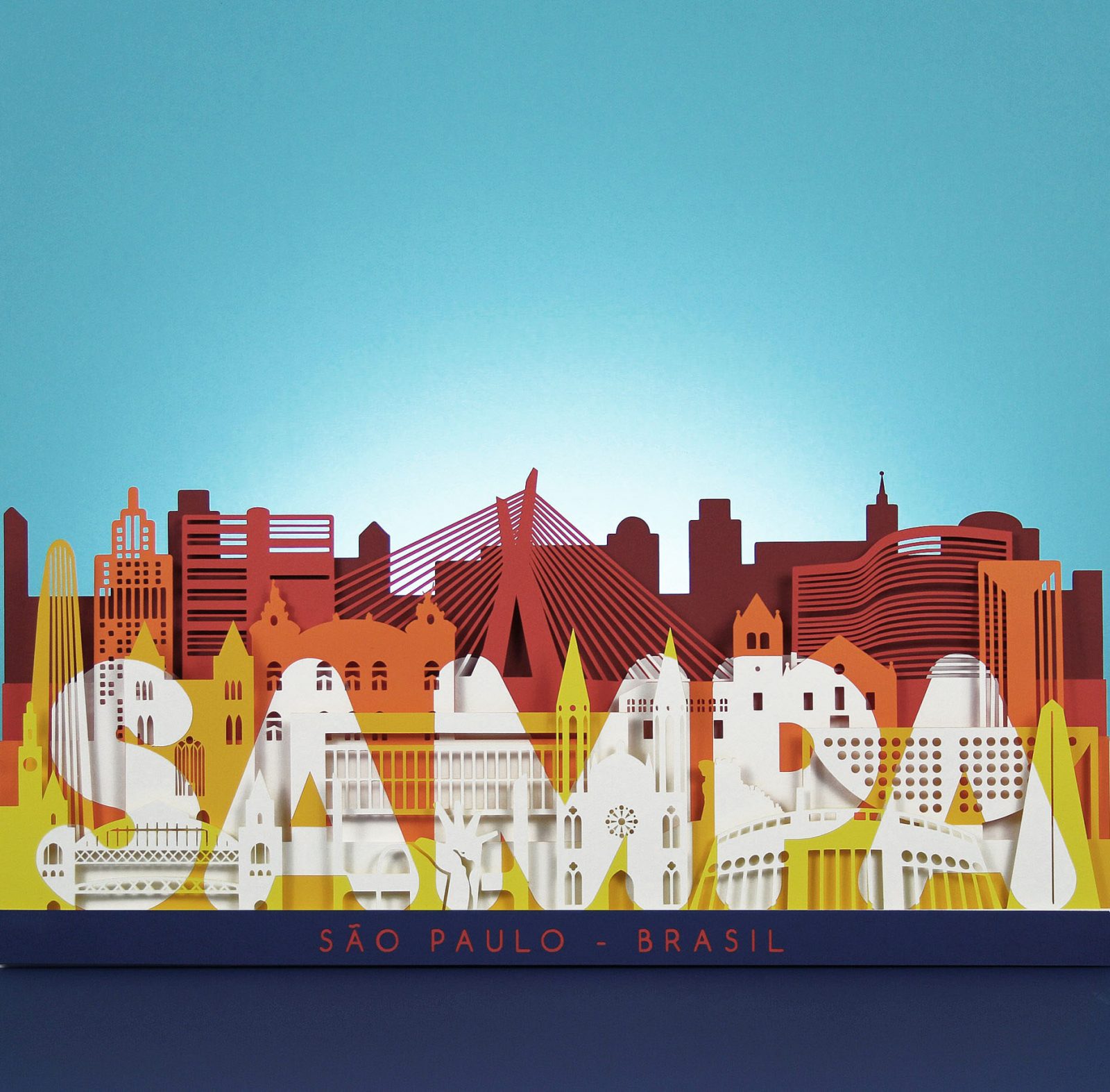
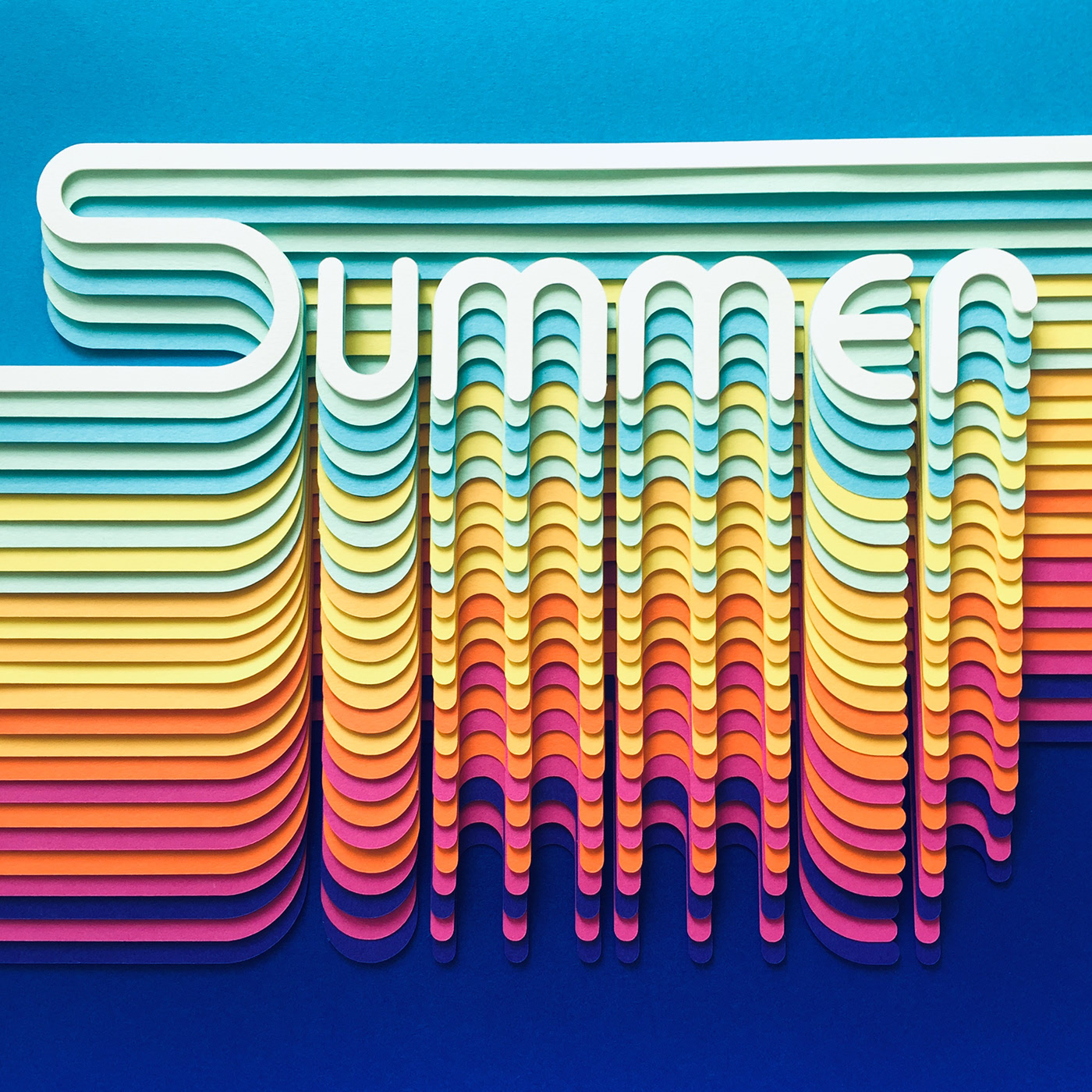
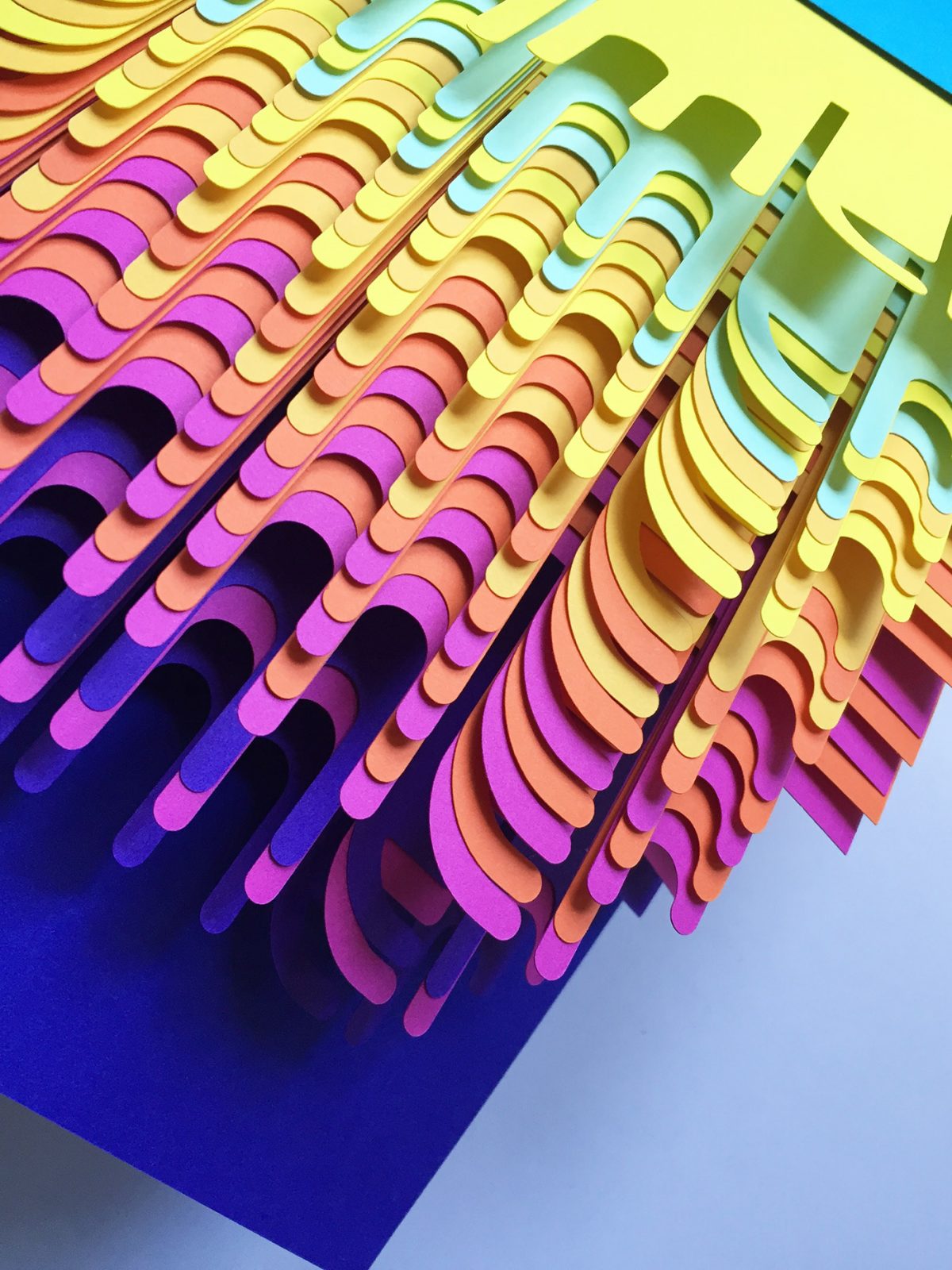
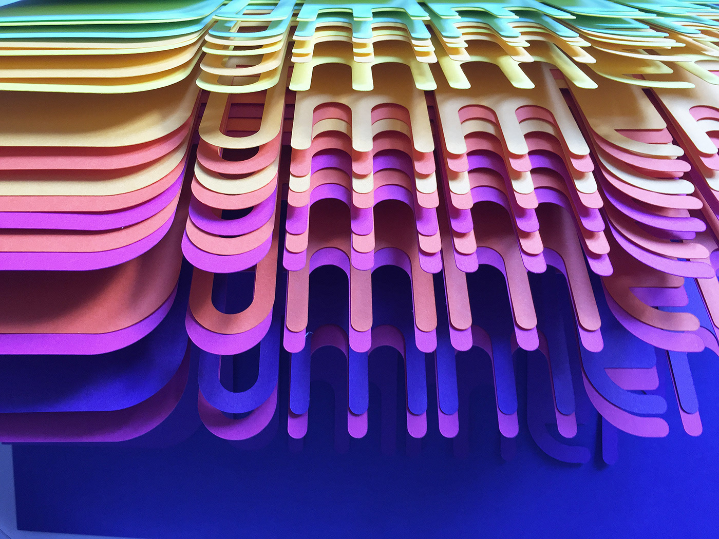
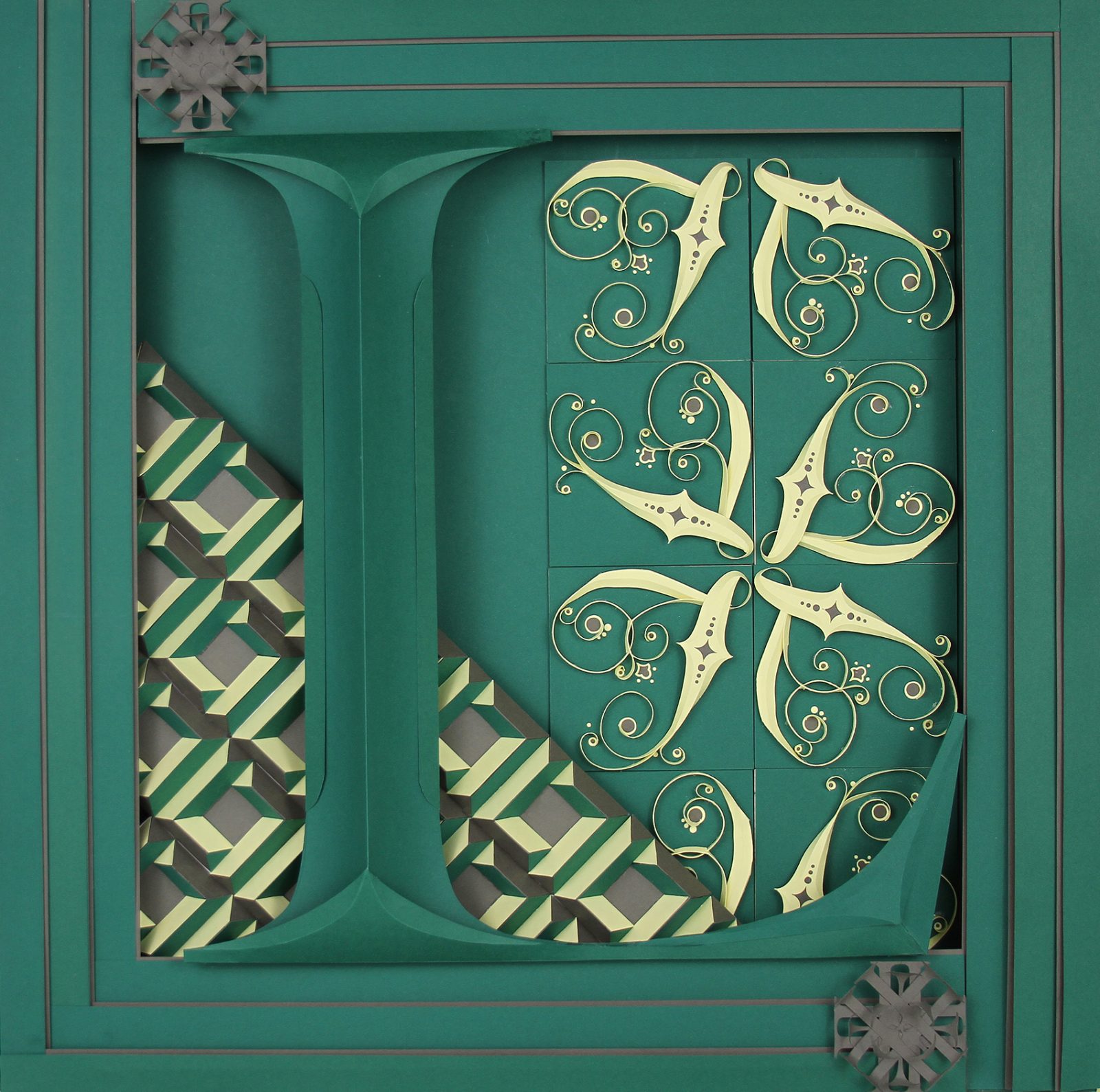
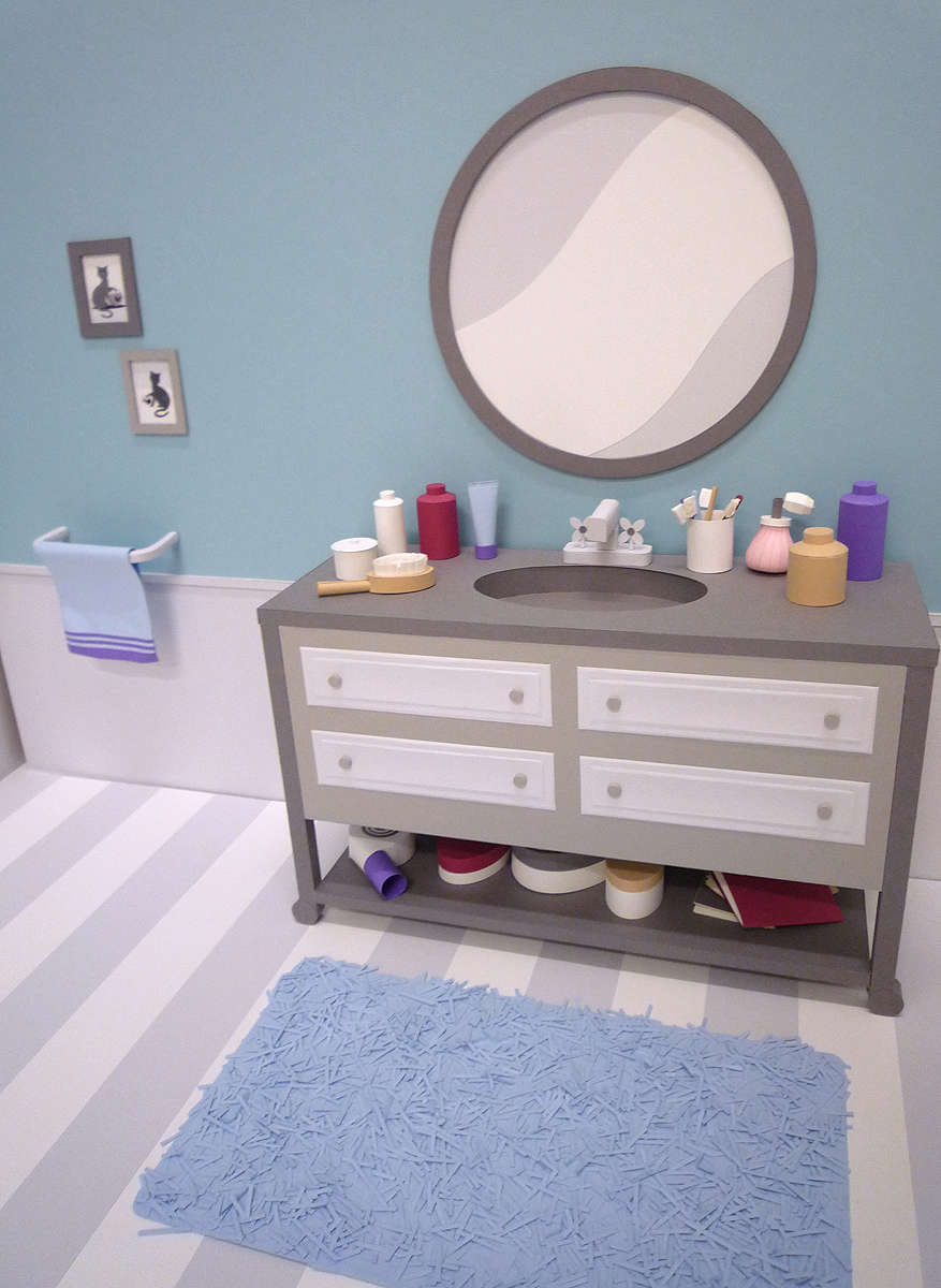
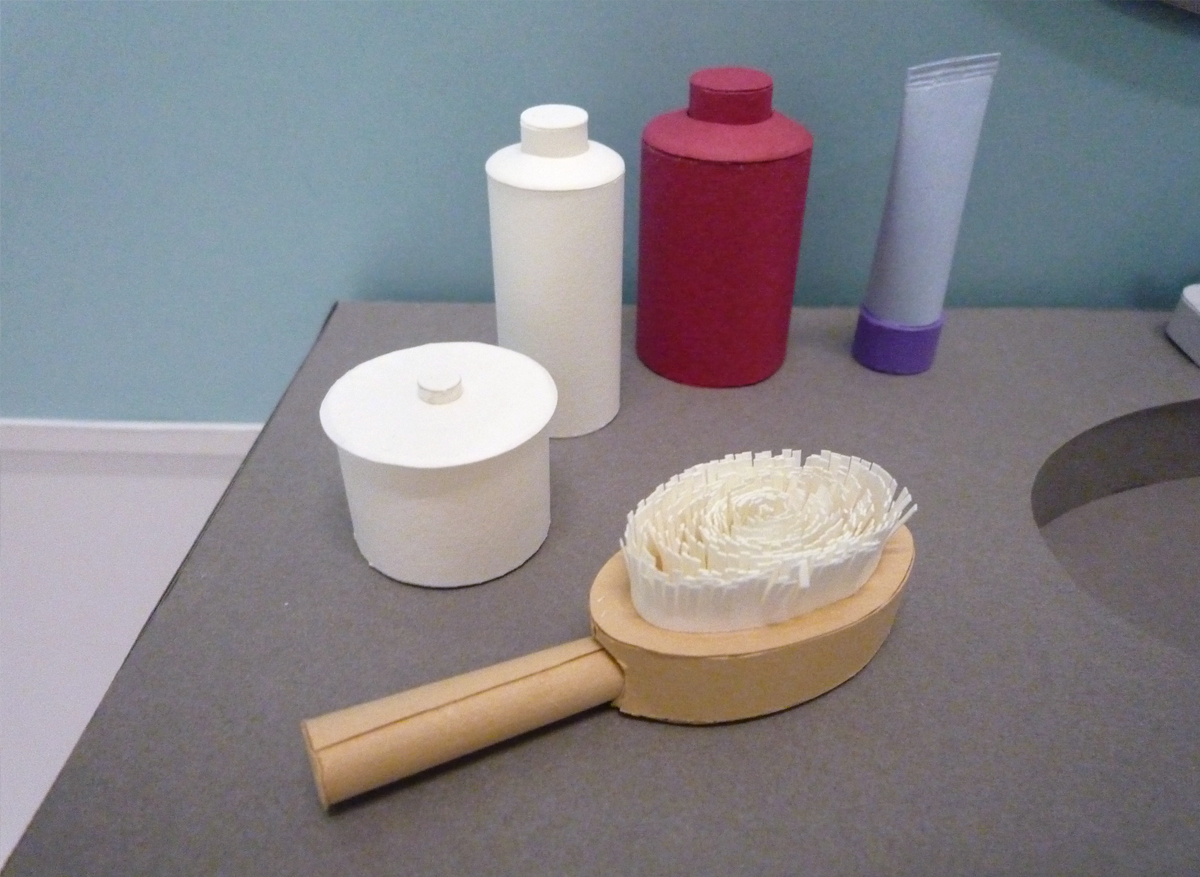
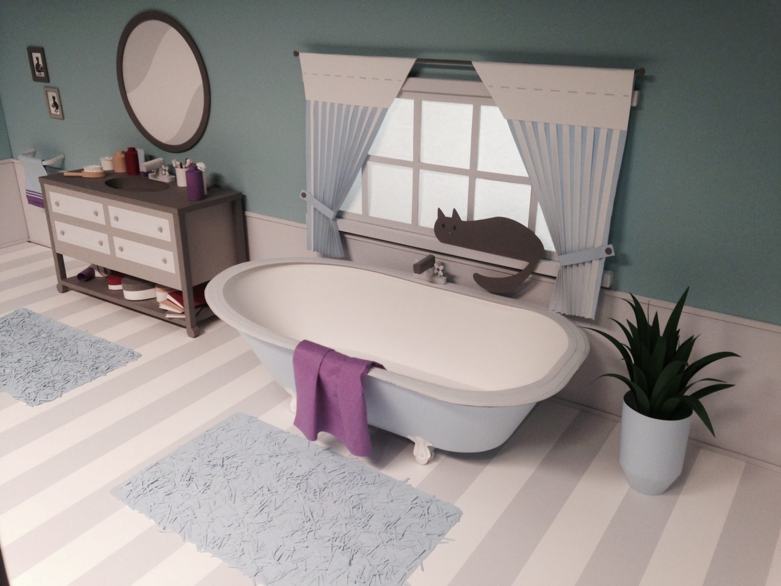
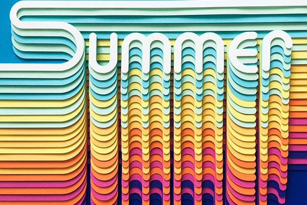
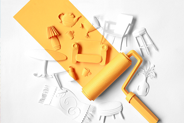
London, UK-based paper artist, and graphic designer Cintia Bertaccini discovered the magic of transforming a simple piece of paper into an object at a young age, and since then she’s been fascinated by paper and its infinite usages. Creating colorful, handmade, and layered works for both commercial clients as well as personal projects, it was Bertaccini’s 80’s inspired typeface “Summer” piece that was designed to wish everyone a happy, sunny, and colorful summer season.

With an impressive educational history and work experience, Bertaccini creates colorful paper works for a selected clientele

Bertaccini has worked as a graphic designer in advertising and editorial markets for over 15 years and has gathered an impressive educational experience studying social communication at the Escola Superior de Propaganda e Marketing, fine arts at Fundação Armando Alvares Penteado (FAAP), as well as children’s book illustration at the infamous Central Saint Martins College of Arts and Design. She’s currently working as a freelancer, developing graphic designs, illustrations, and paper engineering work for a selected clientele. She’s also been a member of the Paper Artist Collective since 2016.

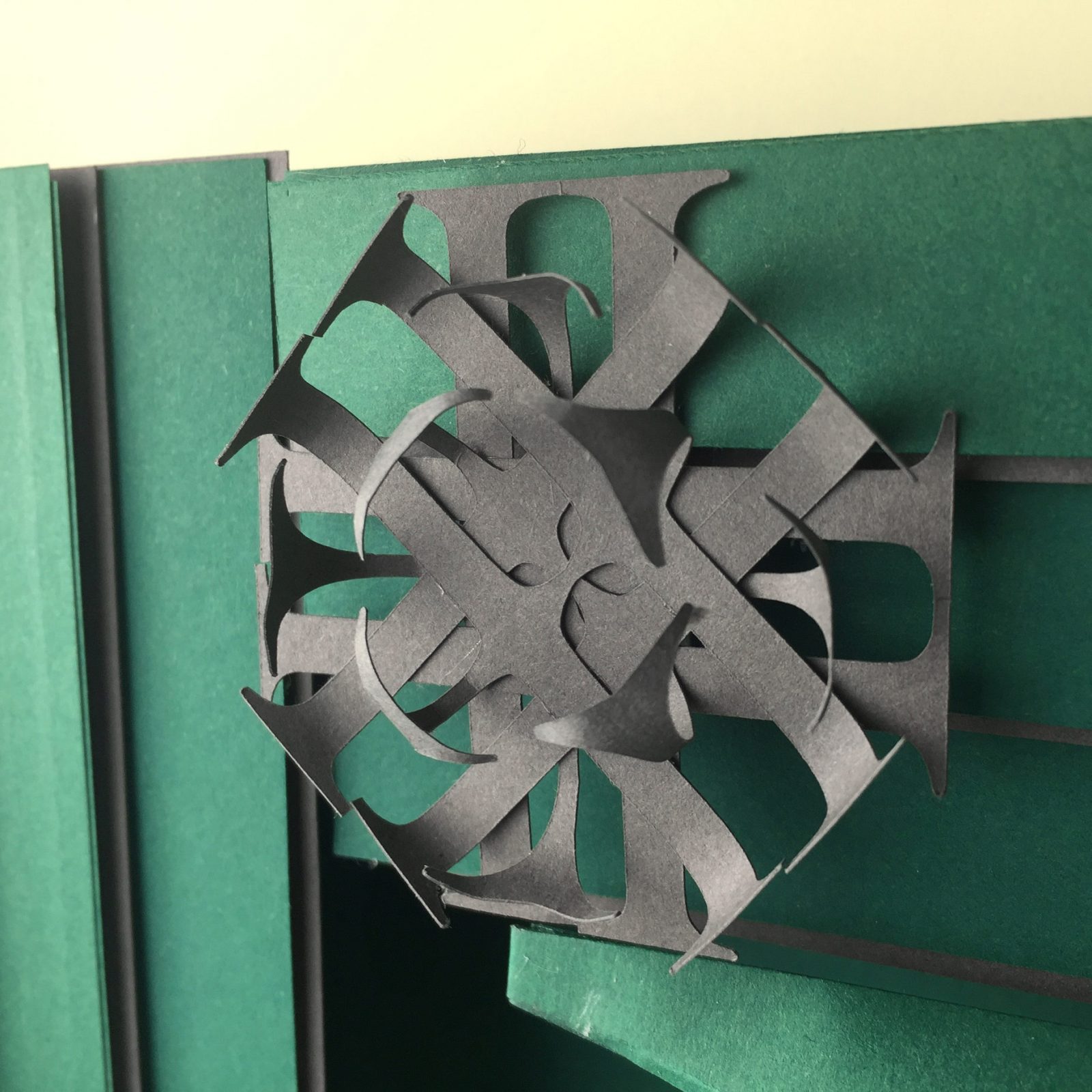
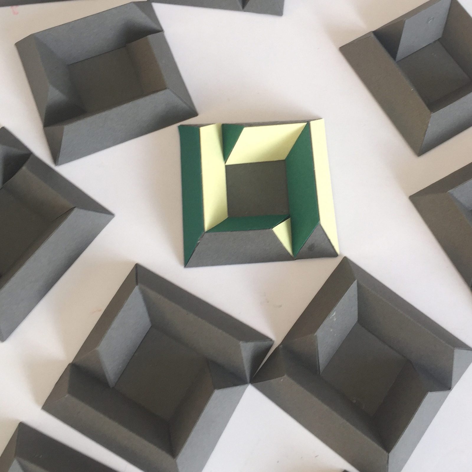
For more inspiration follow Bertaccini on Instagram where she shows more making-off material so you can learn how these elaborate paper works have come to life. 

© Cintia Bertaccini

Paper sculptures illustrations for Veja São Paulo Magazine’s Special Editions.

© Cintia Bertaccini

The Paper Artist Collective was approached by US brand Excel Blades to try out its range of scalpel handles and blades. The project, named #PACGlobal, had two rounds and collaborations of 34 artists from many different countries.

© Cintia Bertaccini

Handmade paper typeface inspired by the colorful 80’s the designer created to wish you a happy, sunny and colorful season!

© Cintia Bertaccini

The Paper Artists Collective challenged 26 of its members to create a letter of the alphabet by sending them 3 surprise colors and an allocated letter from the English alphabet. The letter given to Bertaccini was “L”, whose shape is graphically versatile, both in geometric and cursive styles. Bertaccini explored these possibilities using different patterns and designs, and also was influenced by the Portuguese tiles. Every element in the piece is shaped in L letters.

© Cintia Bertaccini

Film Club production with Nearly Normal Studio.

Direction: Saulo Jamariquelli
Crafts: Jess Deacon and Cintia Bertaccini
Animation: Anthony Farquhar-Smith
Post Production: Saulo Jamariquelli
Art assistants: Polly Lindsay and Sabine Füreder

Vimeo

By loading the video, you agree to Vimeo's privacy policy.
Learn more

Load video

Subscribe
Get the latest articles and news delivered straight to the comfort of your own inbox!
Subscribe
X
Subscribe
Get the latest articles and news delivered straight to the comfort of your own inbox!
Subscribe