Danke is a Brazilian bean-to-bar chocolate brand born in 2019 with more than a hundred years of tradition. Through hundred years of tradition, the brand produces high-quality chocolate with even higher values, as it works closely with small farmers who respect the long processes in the making of bean-to-bar chocolate. The Danke chocolate products are produced with high technology, compromised with fair trade, and family agriculture, and are of course child labor free. With numerous products under their brand, it comes as no surprise they have their own take on the most popular chocolate-related holiday of the year: Easter.
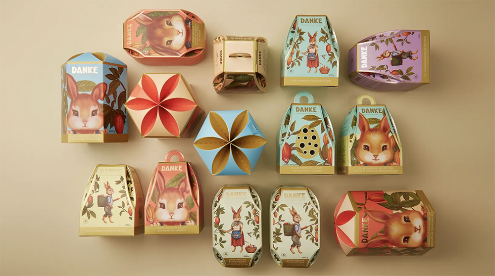
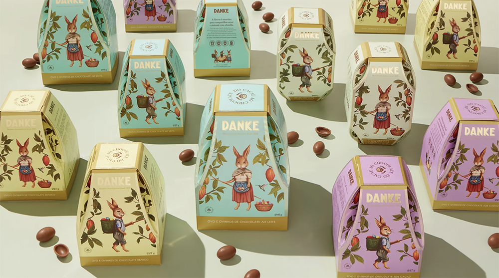
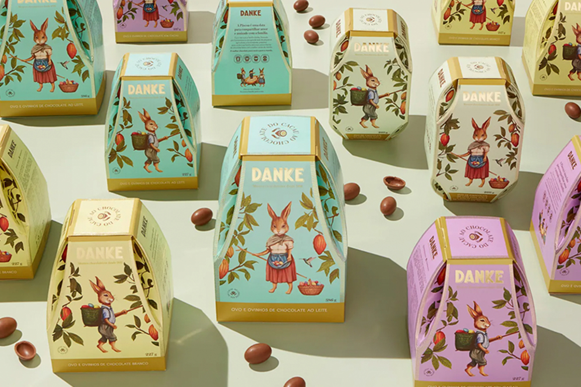
The vintage-inspired illustrations with gold details and pastel colors help the Danke brand stand out on the shelf during the most competitive season for chocolates
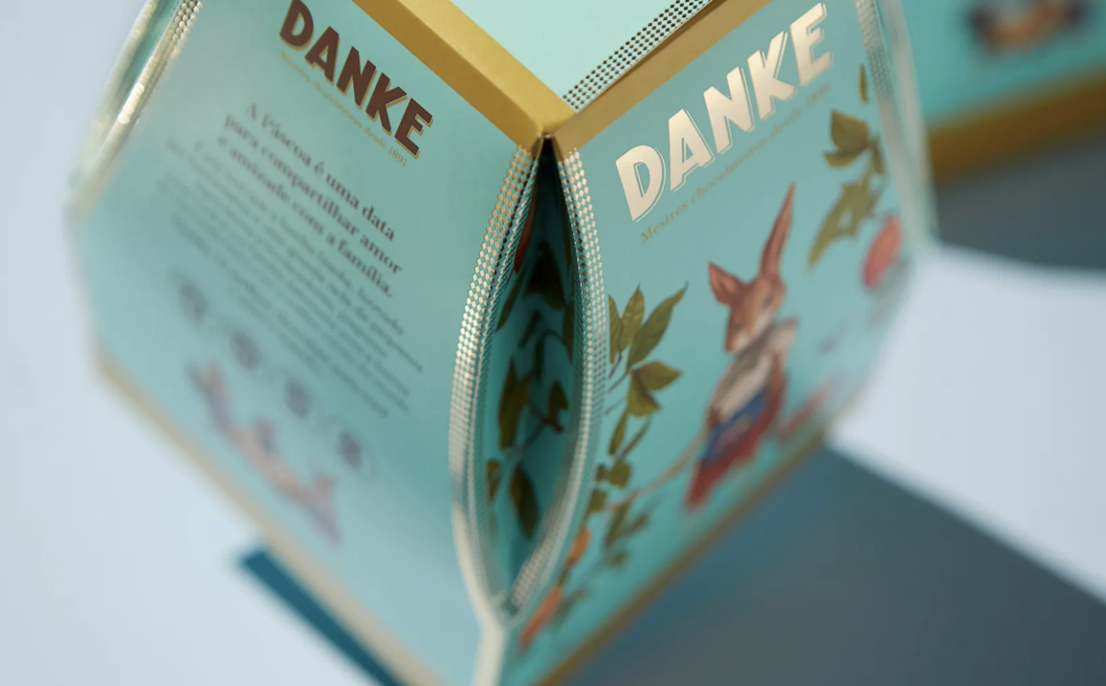
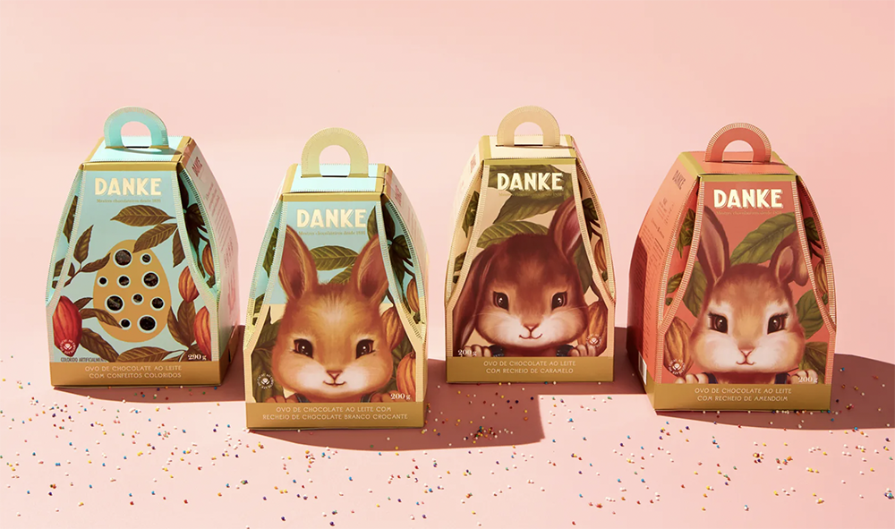
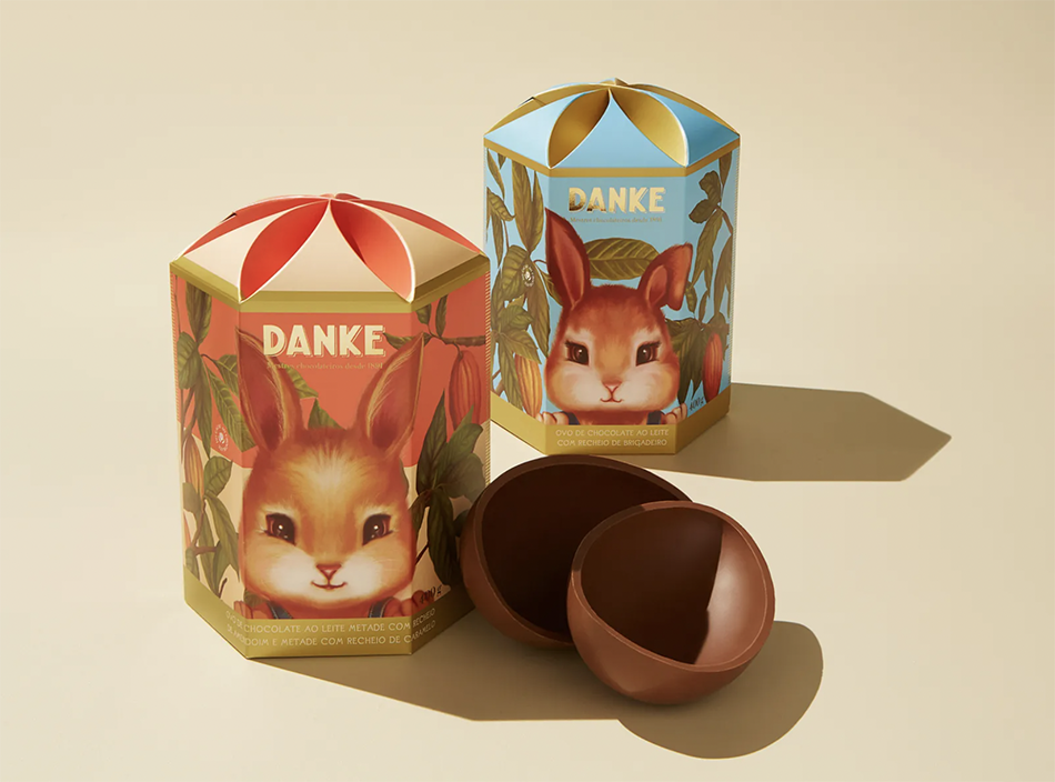
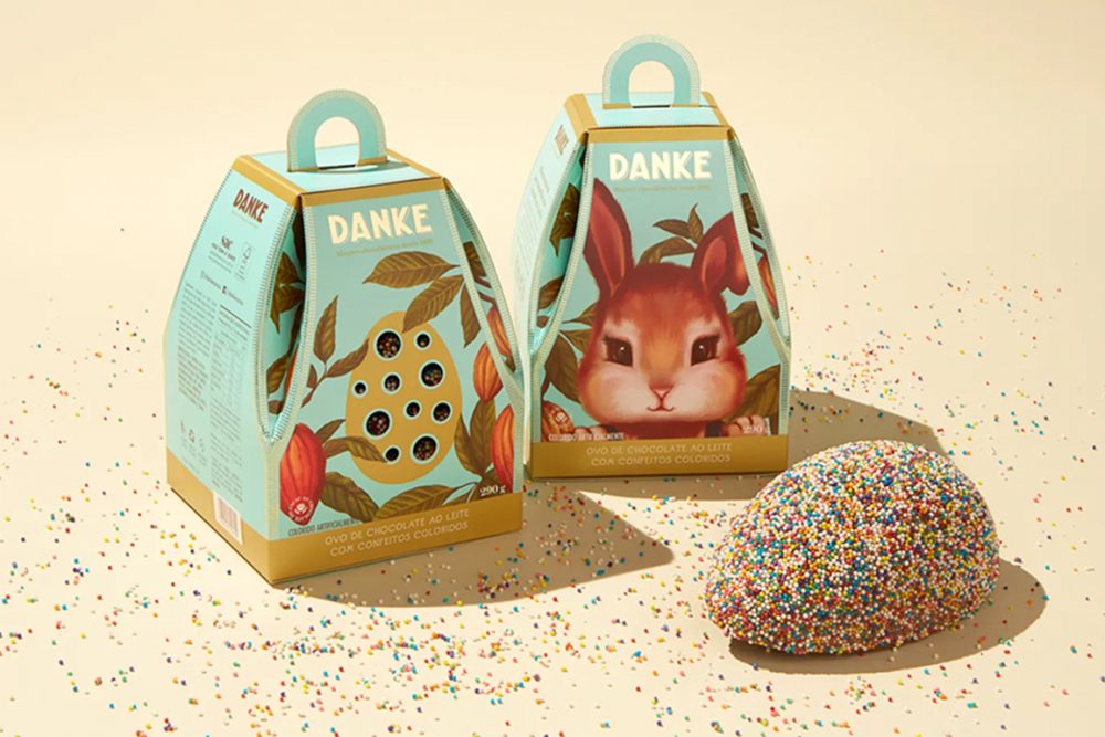
Danke’s Easter chocolate eggs are a treat to the eyes as well, as the adorable packaging is definitely something to flaunt. Designed by Nata Design, a graphic design studio based in São Paulo, Brazil specializing in brand strategy and packaging for food and lifestyle brands, the challenge was to make Danke’s Easter eggs the perfect gift in both kids’ and adults’ flavors and to help the brand stand out on the shelf during the most competitive season for chocolates.
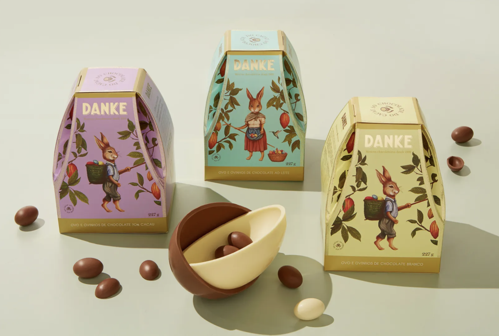
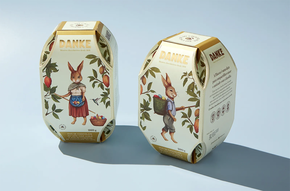
“Since the brand doesn’t invest much in media, the packaging was responsible for telling the whole brand’s story. We worked around the concept “From our family to yours”. For the adult flavors, we developed custom vintage-style illustrations inspired by Easter postcards from the end of the 19th century”, Nata Design writes.
The inspiration behind the illustration was the brand’s bean farmer’s families’ partners by representing them like rabbits on cacao farms and putting them on center stage. “For the kid’s flavors, we searched for great impact on shelves with custom-illustrated close-ups of cute rabbits. We looked for a playful and simple image that talked directly to consumers meters away from the shelves”. The vintage-inspired illustrations combined with gold foil print details, and the pastel Danke brand colors create an elegant yet easily-approachable image for the high-quality chocolate brand. “It’s a premium experience that incorporates the brand’s story”.