VOLTA STUDIO is an independent design studio focused on branding, packaging, and graphic design, who wants the brands they create and work with, to be relevant, attractive, honest, and unique. Be that for big established clients or small exciting new companies. With a flexible approach and high standards, VOLTA STUDIO approaches each and every project with the same dedication and aim for success. “It starts with ideas that transform into words, images, and stories. We want our concepts and thoughts to be clear, transparent, and sincere. That’s why we write, analyze, dissect, develop, enhance, and explain. We are rational in order to be creative. We search for — and create — meaning: we believe you can’t miss with this formula”, VOLTA writes.
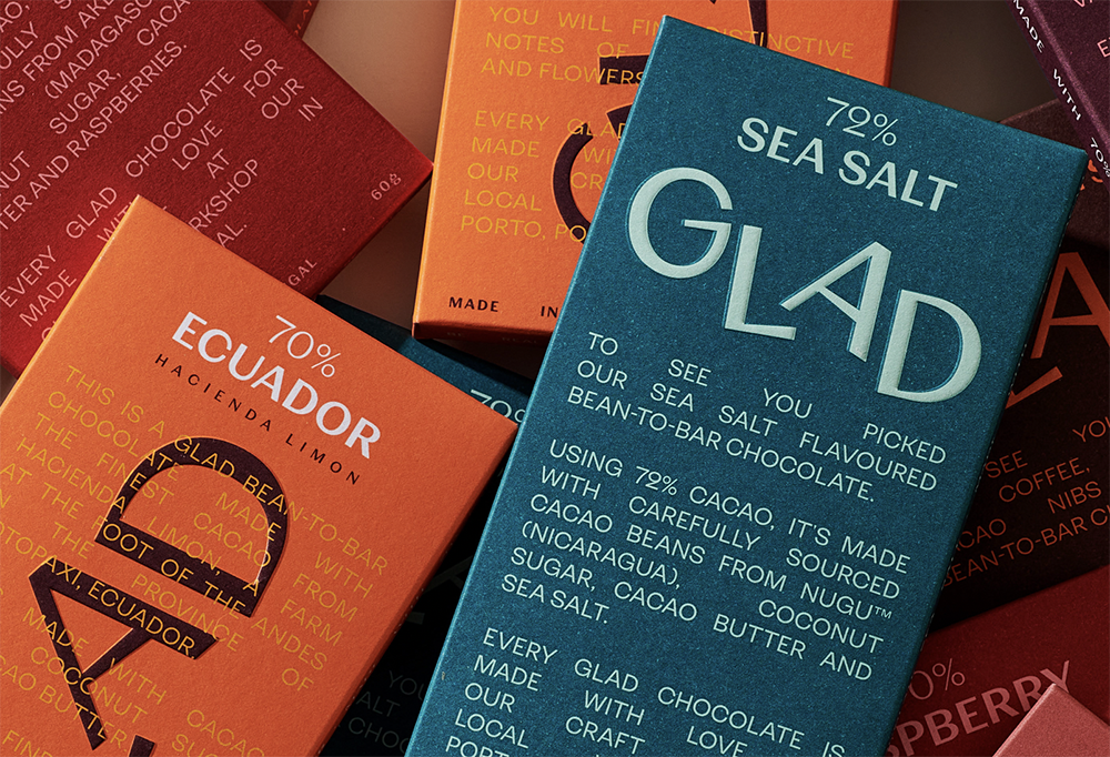
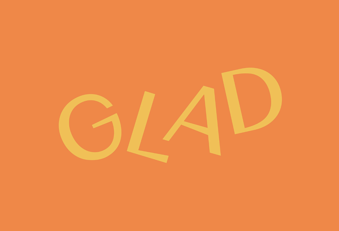
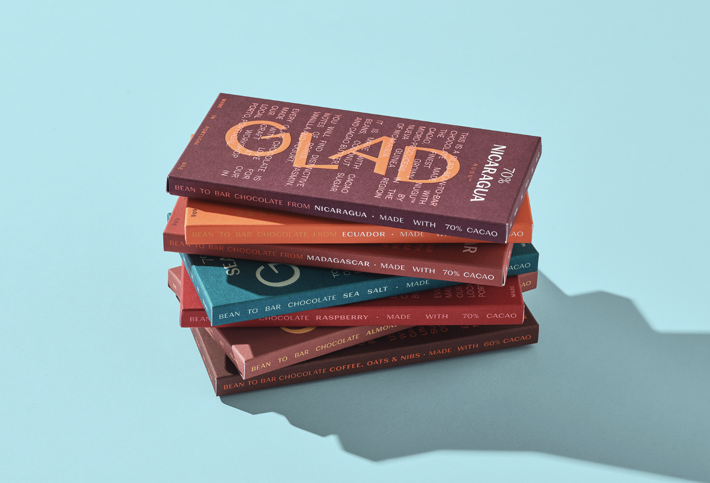
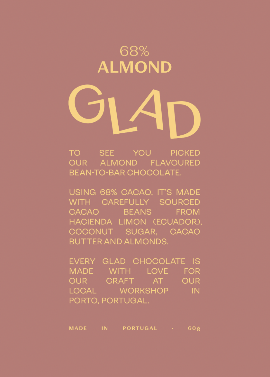
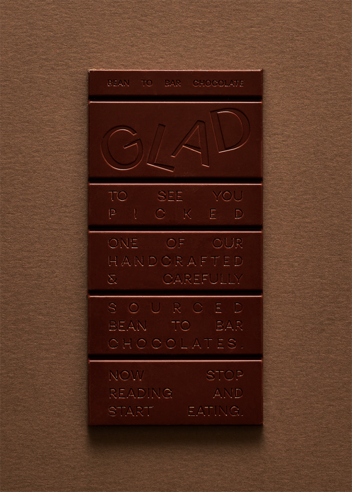
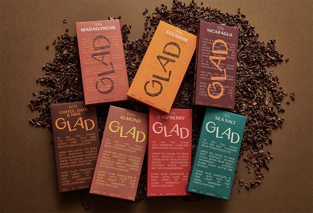
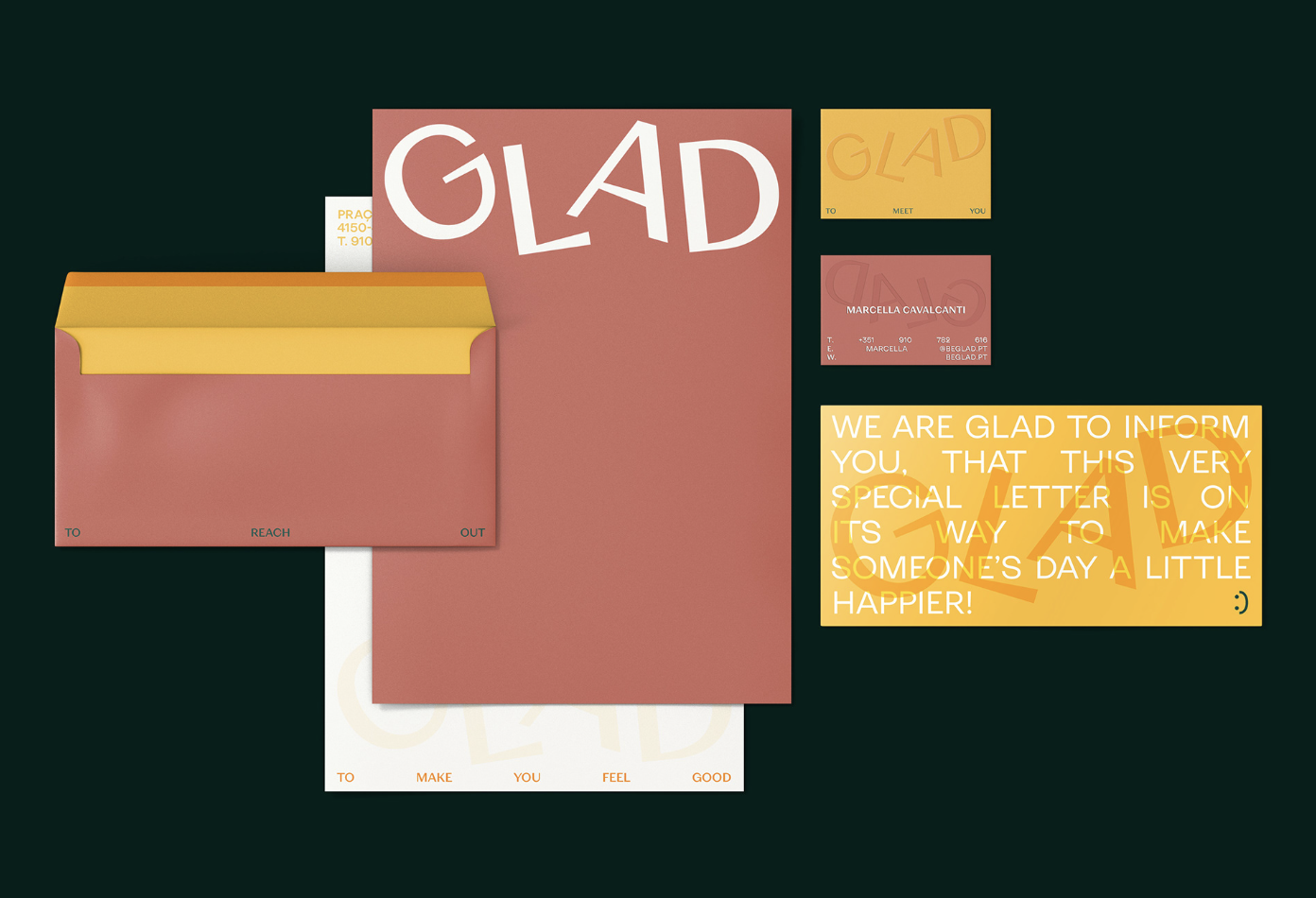
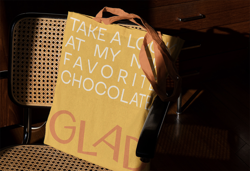
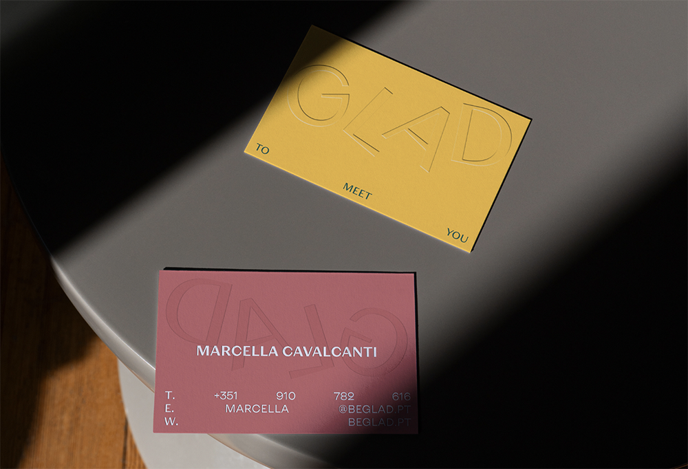
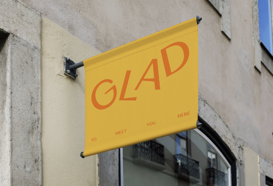
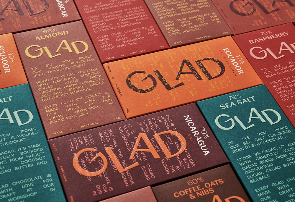
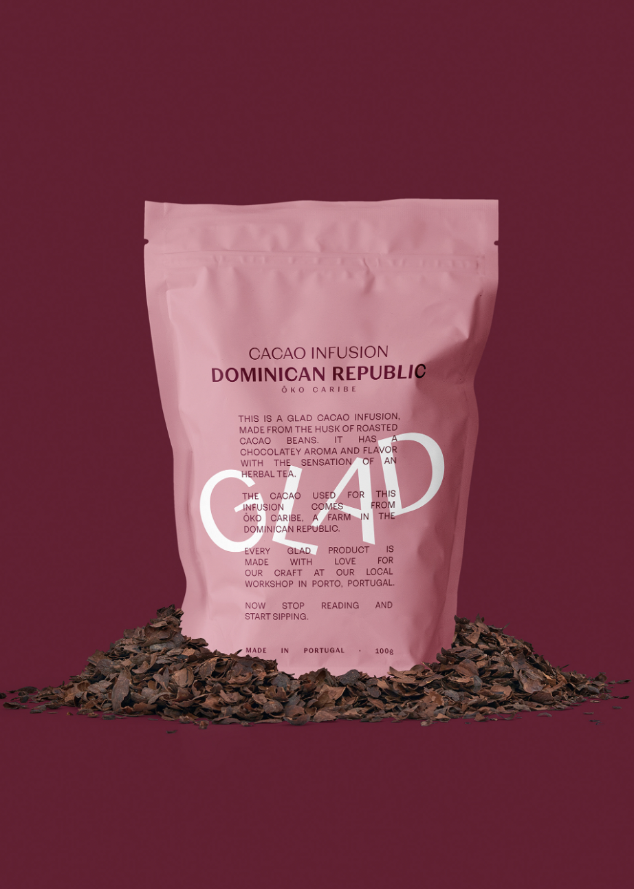
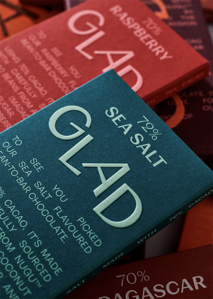 GLAD bean-to-bar chocolate’s cheerfully jumping logo by VOLTA STUDIO acts as a visual metaphor for one’s cheerfulness and spontaneity when happy
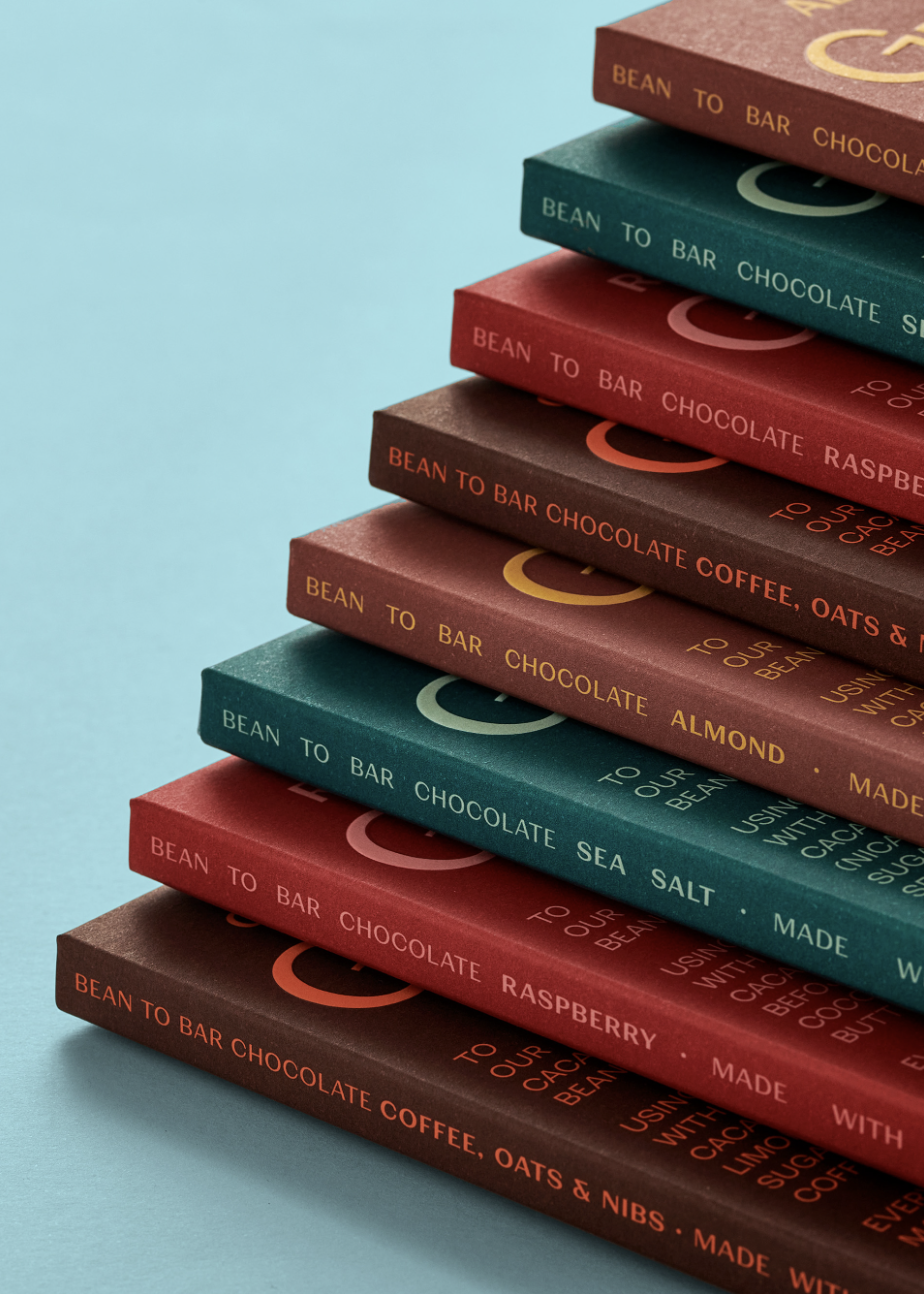
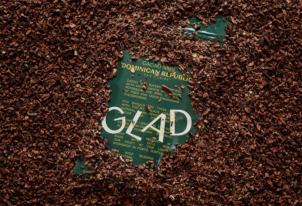
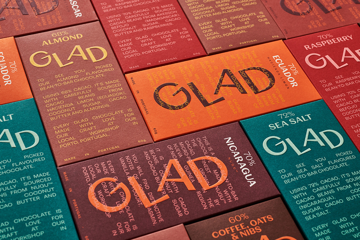
VOLTA STUDIO was commissioned to create a new, fresh visual identity and packaging for GLAD, a carefully sourced bean-to-bar chocolate that focuses on transparency to reach its main objective: making us feel good and happy. For GLAD, gladness comes from being true and real, so every ingredient, origin, and detail matters to create the finest bean-to-bar chocolate.