Polish graphic designer and art director Martyna Wędzicka-Obuchowicz from Gdansk Poland, whose work we’ve featured a few times prior (read her interview here), creates bold, graphic work that draws attention with its unapologetic style. Not one to opt for understated or demure, Wędzicka-Obuchowicz seems to think less is definitely NOT more, but more is more.
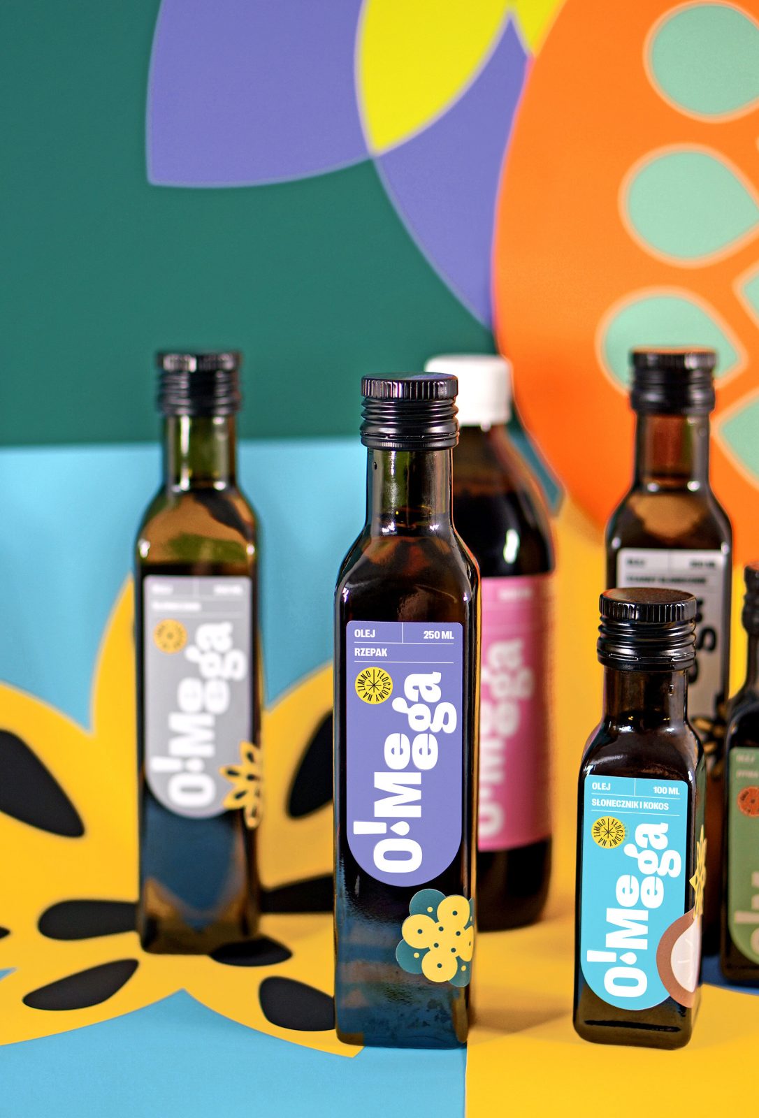
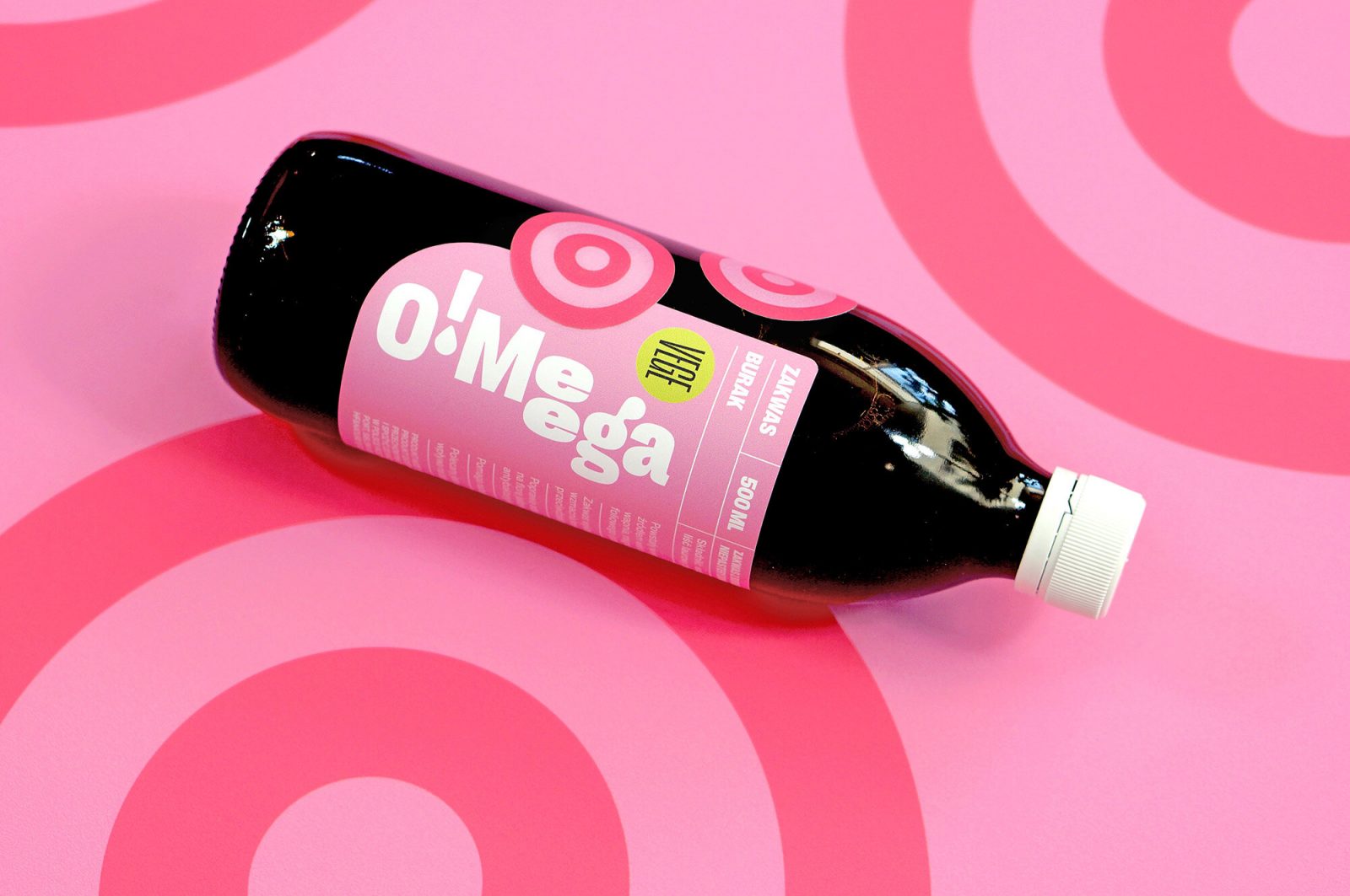
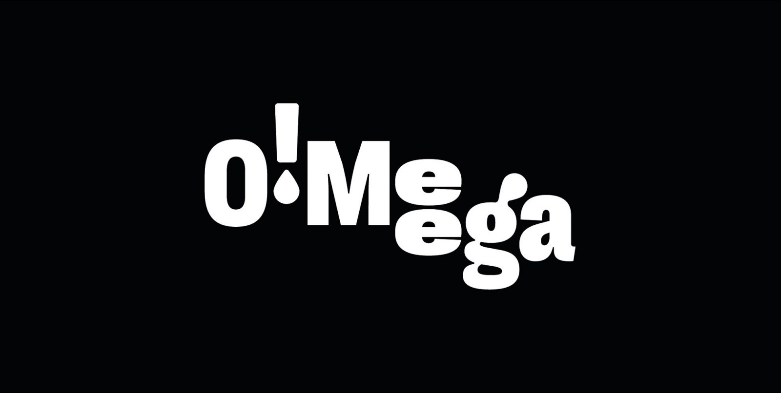
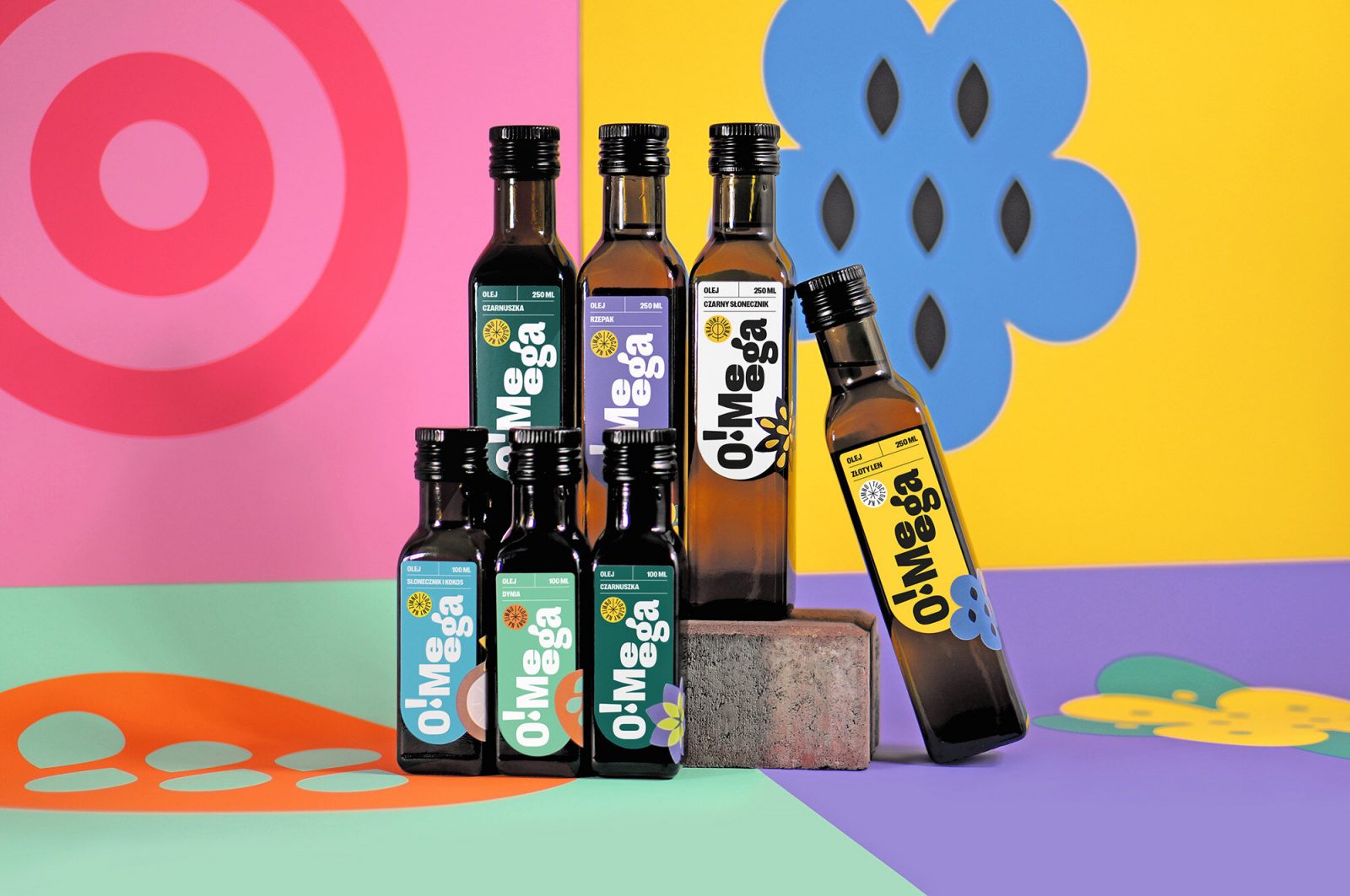
Playfully fresh O!Meega branding is a blast of colors, with a retro-reminiscent vibe
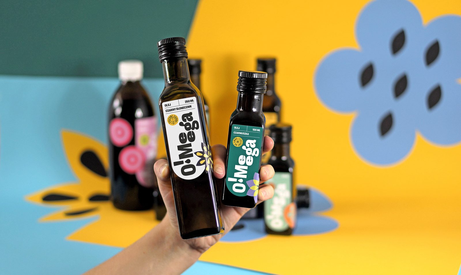
With a fun and playful, tongue-in-cheek attitude, the designer creates visuals for branding projects, editorials, posters, packaging, book covers, and more. One of her latest projects, fresh visual identity for the O!Meega brand, is a prime example of Wędzicka-Obuchowicz’s style.
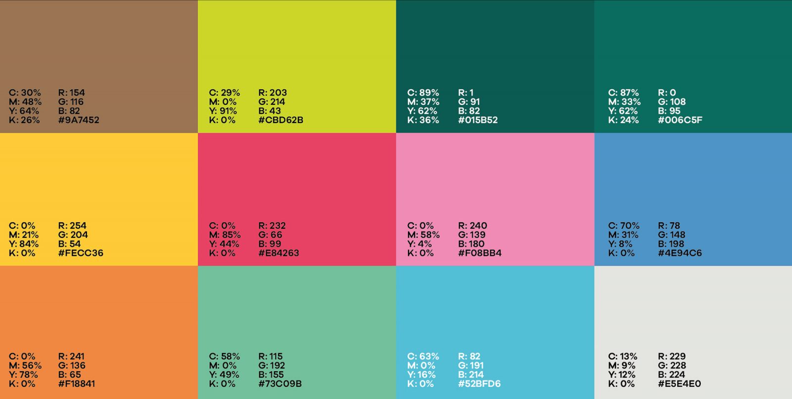
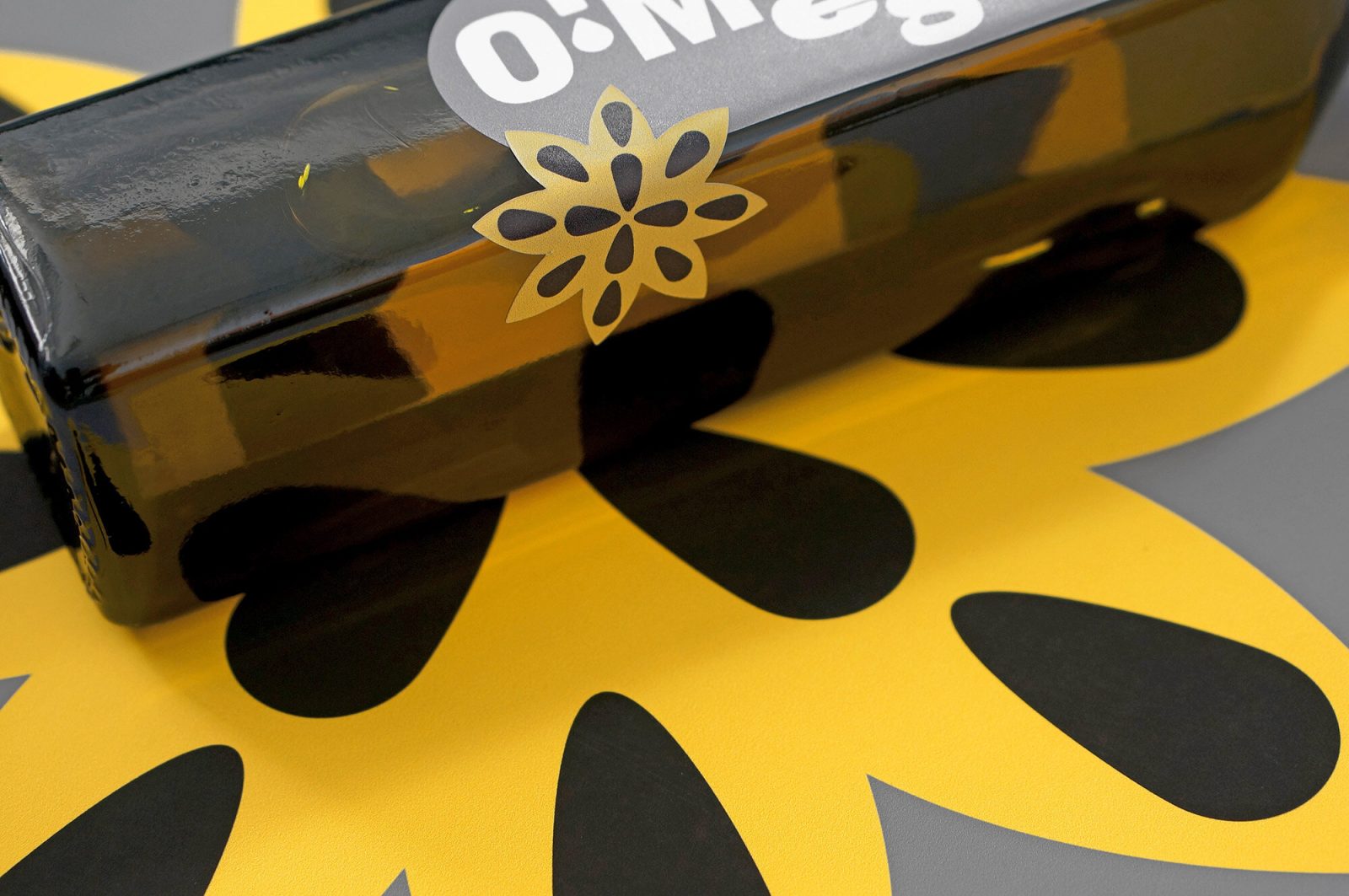
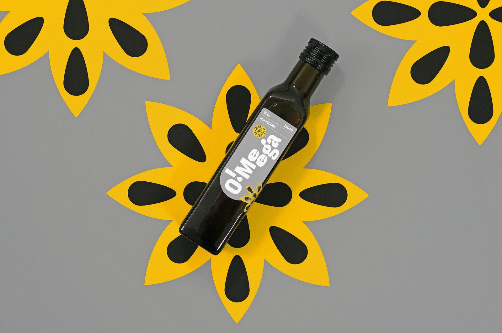
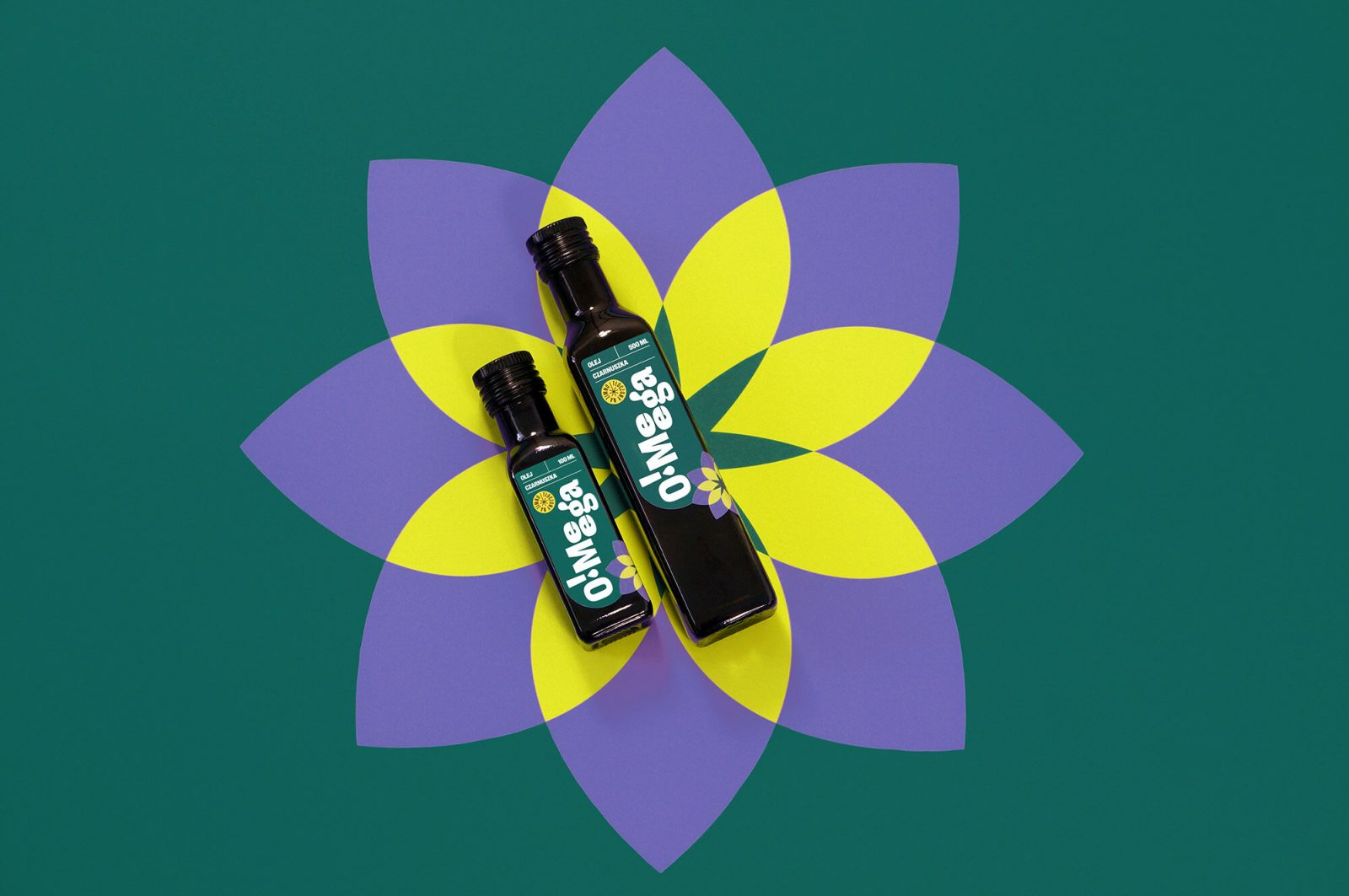
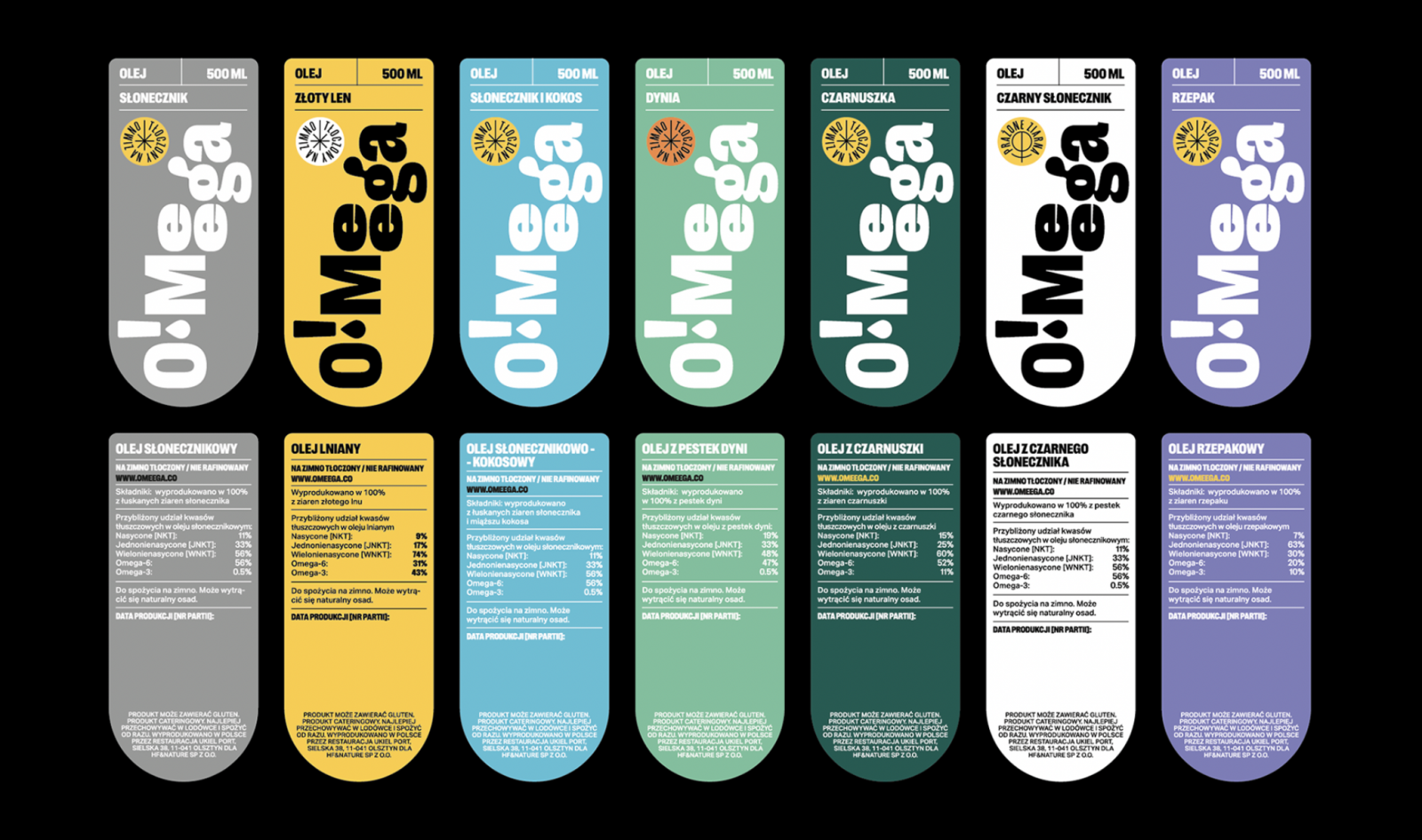
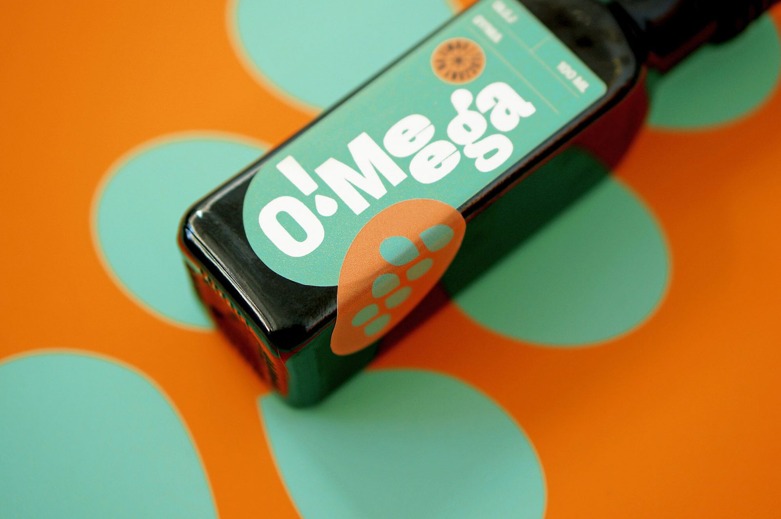
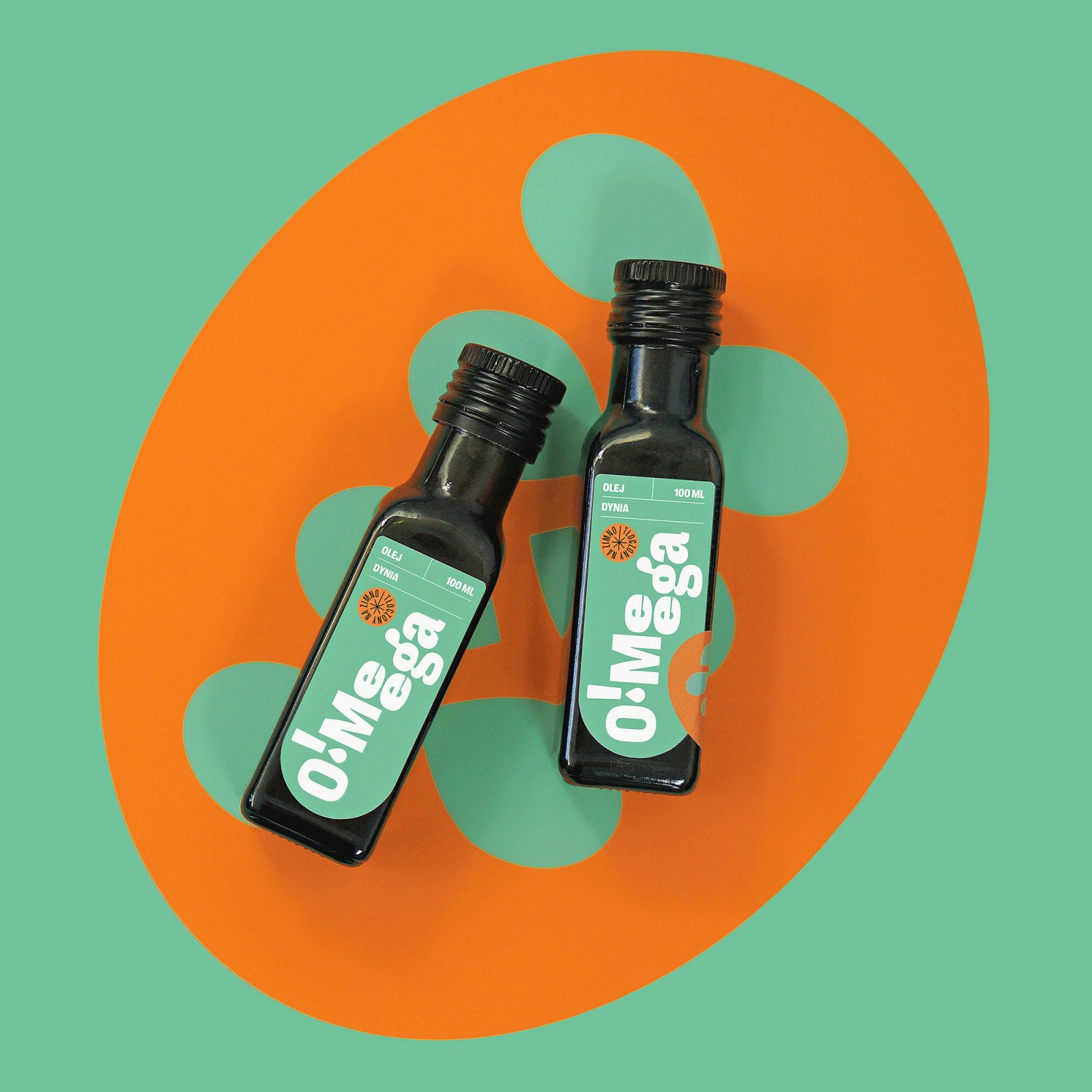
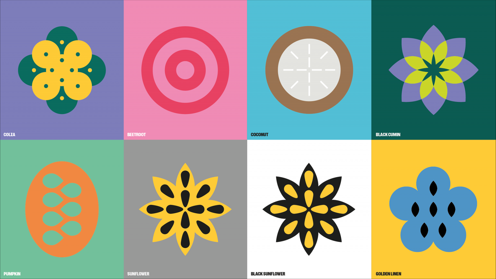
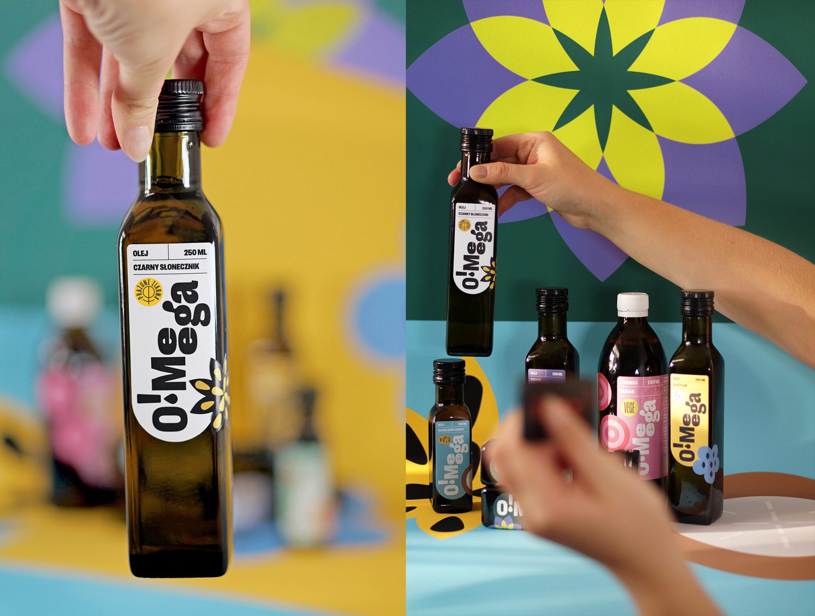
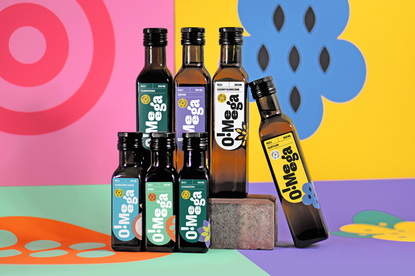
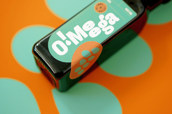
The colorful project includes signs, colors, illustrations, label design, merch design, stationery, and social media assets, oozing with flower power. The wide color palette supports the accompanying illustrations, while the bold logotype is on center stage. The first O!Meega products are an alternative to olive oil – oils from seeds and vegetables available locally in Poland. More products will be added to the brand family soon.
For a dose of flower power, color therapy, and just good old design inspiration, follow Martyna Wędzicka-Obuchowicz on Instagram.