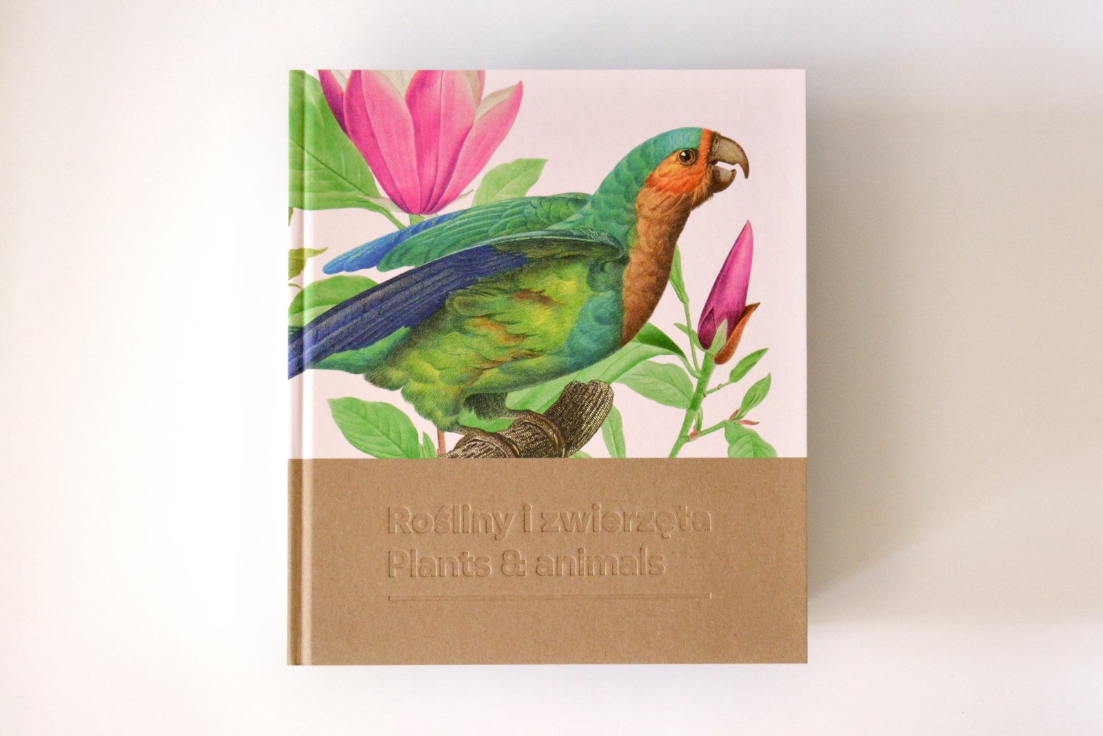
Plants and Animals. Atlases of Natural History in the age of Linnaeus – exhibition was one of the highlights of 2020 at the International Cultural Centre in Kraków Poland. The popular exhibition proved to fascinate visitors with its rich collection of atlases of flora and fauna, images of fish, and original large-sized boards of birds and plants, as well as previously unseen prints by famous botanists Maria Sybilla Merian, Georges Cuvier, Eleazar Albin, François Le vaillant, and Ulisses Aldrovandi.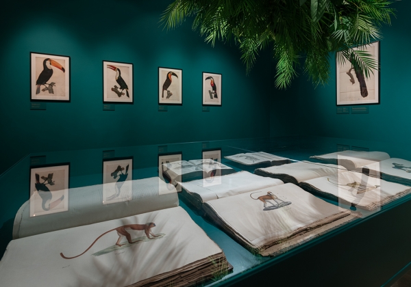
The exhibition showcases how the vast and varied world of nature was documented before the era of photography and television, for not only the sake of education but for its beauty and aesthetic pleasure. The intricate, hand-drawn and painted illustrations, which date as far back as the 17th century, offer an opportunity to marvel at the talent and craft of their creators while reminding the viewer of nature’s fragility and mortality, and the vital need of protection of that which still remains today.
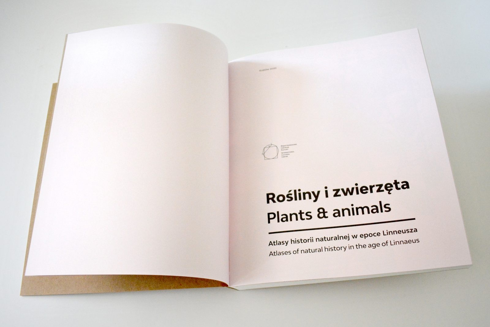
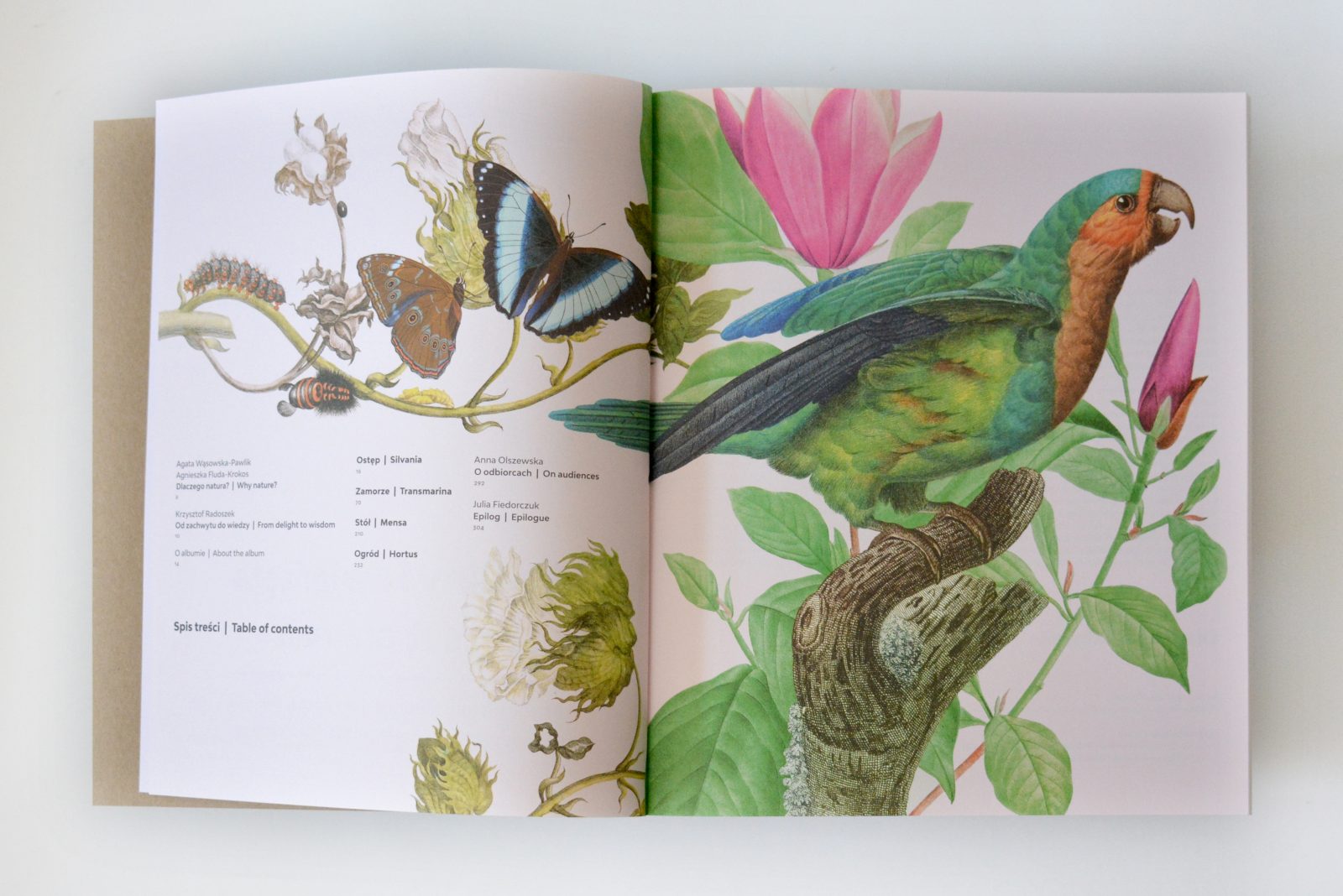
The artworks and prints displayed at the Plants and Animals exhibition and exhibition catalog came from the collection of the Print Room in the Scientific Library of the Polish Academy of Arts and Sciences, the Polish Academy of Sciences in Kraków, as well as the Library of the Institute of Systematics and Evolutions of Animals of the Polish Academy of Sciences. The exhibition was curated by Krzysztof Radoszek, a well-accomplished Polish designer who specializes in artistic designs of album publications and original image campaigns of important cultural institutions and events in Poland and abroad. Radoszek also designed the Plants and Animals. Atlases of Natural History in the age of Linnaeus exhibition catalog that beautifully immortalize the unique collection of natural history documentation between two covers, for the future enjoyment of us all.
Careful replication of the plant and animal illustrations and minimal design details, respect the value of the 200-year old engravings
Radoszek, a self-proclaimed natural science enthusiast and amateur naturalist, oversaw the exhibition catalog project from the concept to the production planning and detailed supervision over the printing process, which was done at the Skleniarz printing house in Kraków. With nearly 70 significant publication projects under his belt, Radoszek understood that the most important issue with regard to the design of the Plants and Animals exhibition catalog was to preserve the quality and fidelity of the 200-and 300-year old color engravings chosen from the most outstanding and famous European natural history atlases.
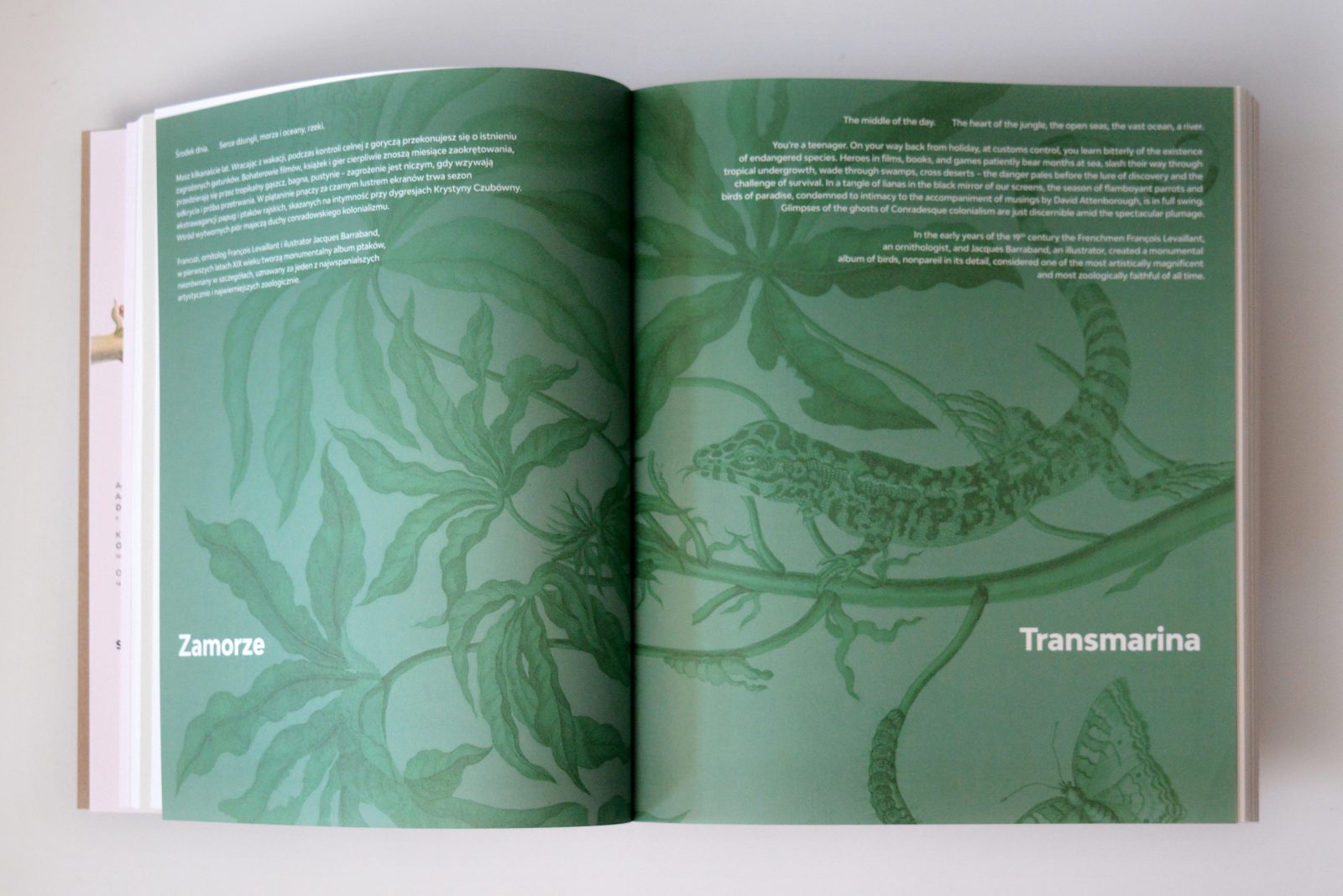
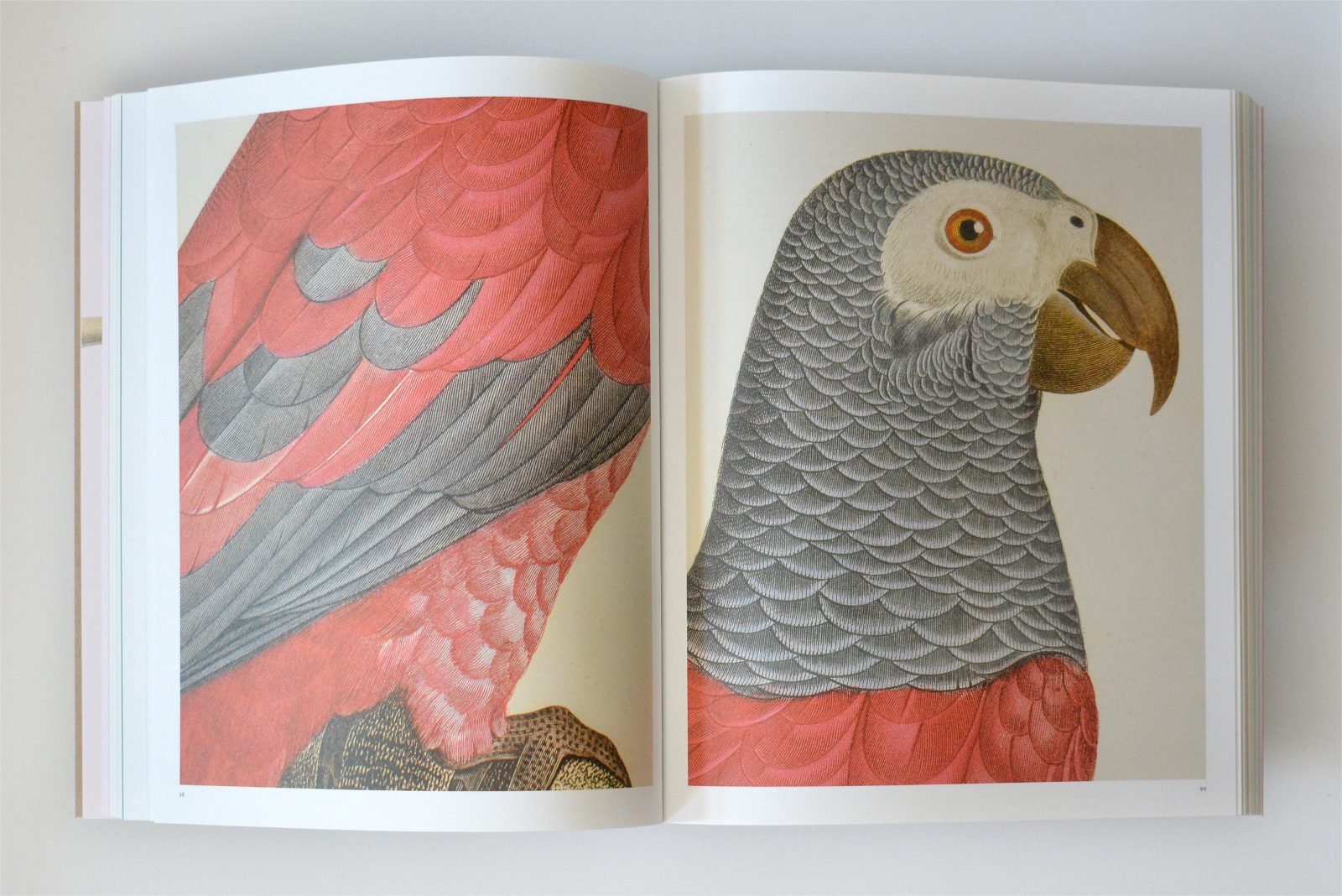
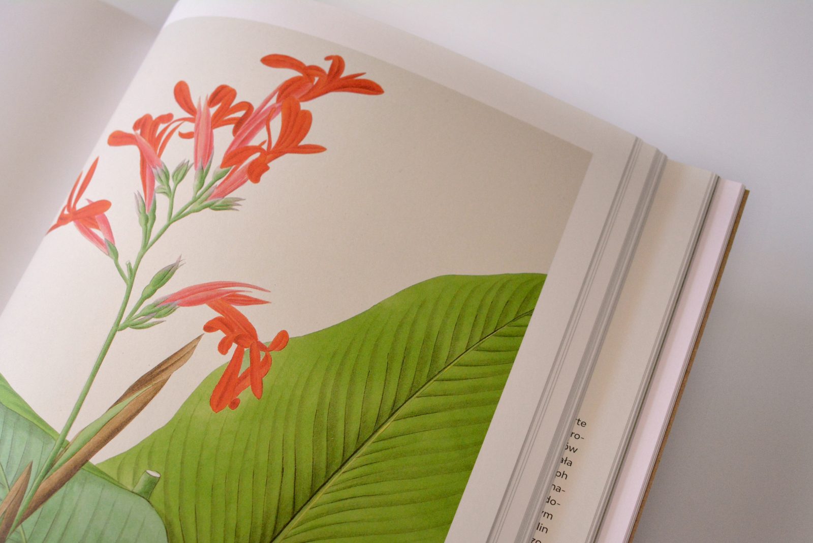
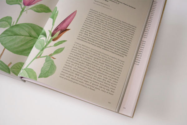
In order to not distract too much attention from the original artwork, an elegant and sober layout and simple typography were chosen for the catalog. Which with its timeless character evokes associations with the unpretentious simplicity of nature albums published in the 70s and 80s. Several variations of the Modelica typeface – a contemporary, soft, and delicately geometrized variation on the traditional grotesque – were used in the book. The over 240 pages of color illustrations include 1:1 reproductions and large-scale enlargements of microscopic details. Minimal retouching of discoloration and blemishes were necessary in the reproductions in order to reflect the original values of the works.

Special papers were required to replicate the nuances and subtle colors of the detailed nature of the original engravings
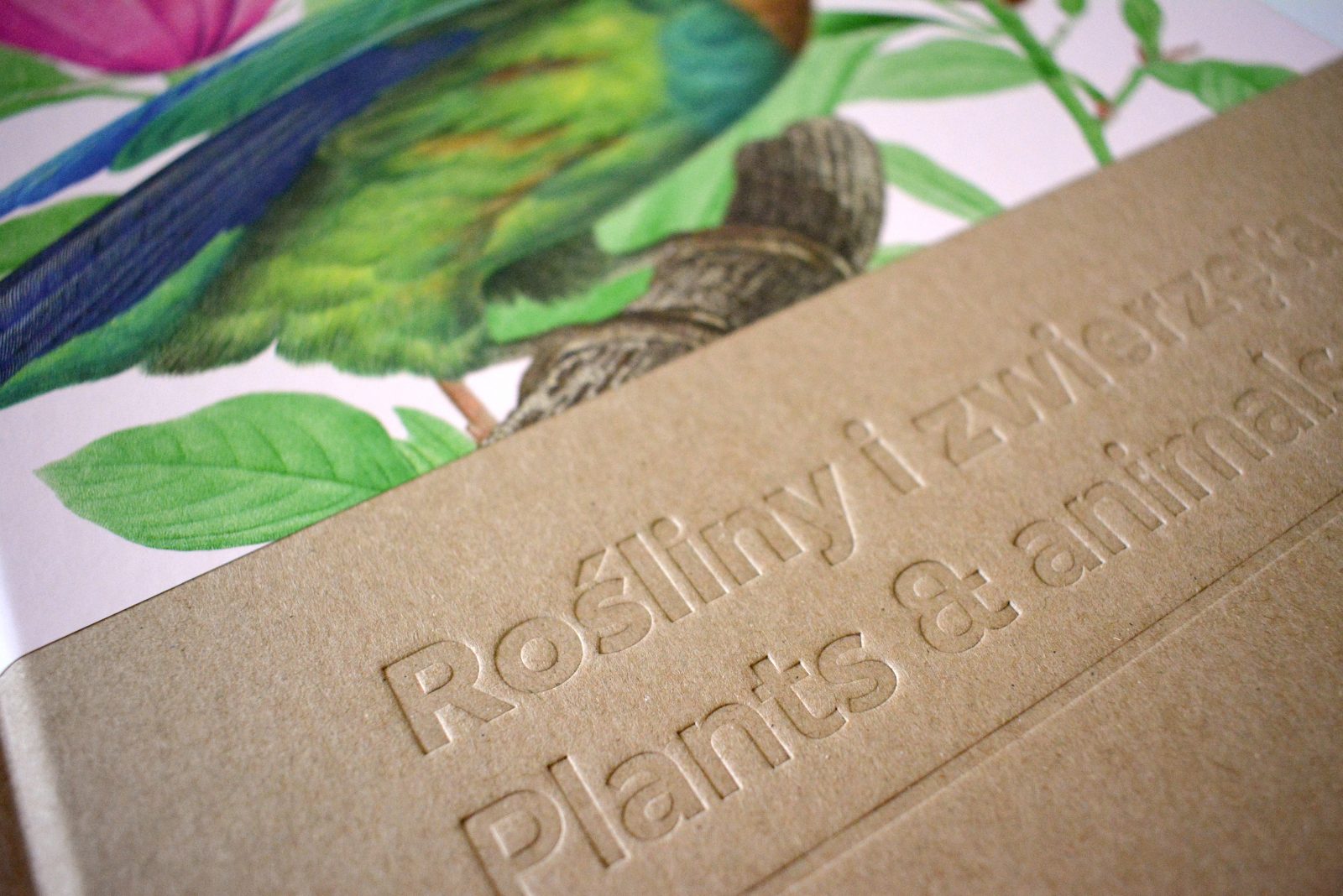
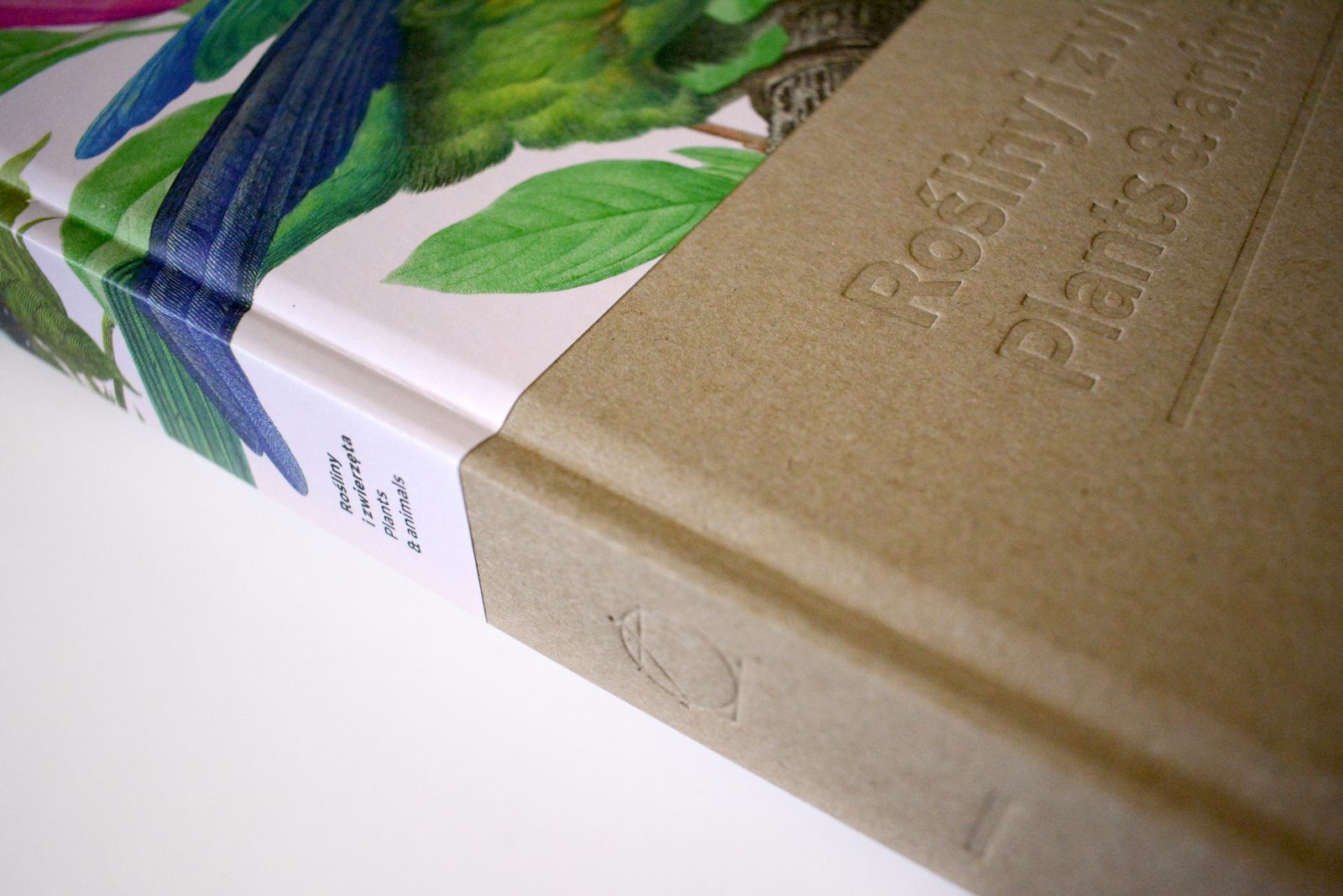
The graphic “horizon” of the layout, determined by the titles and chapters, was reproduced in an unusual, semi-covered hardbound. The catalog combines the simplicity of ecological cardboard and an embossed title, with intense, multi-colored graphics of contemporary collage, representing the content. The cover of the catalog was cut to size, which further highlights its modern, slightly austere character. SH Recycling paper was used as the first layer of veneer and endpaper, enabling the effect of solid thick cardboard with an interesting and rough surface in a nice shade of brown – covering the typical grey of the bookbinding material. The minimalistic title made by embossing looks very compelling on this surface.
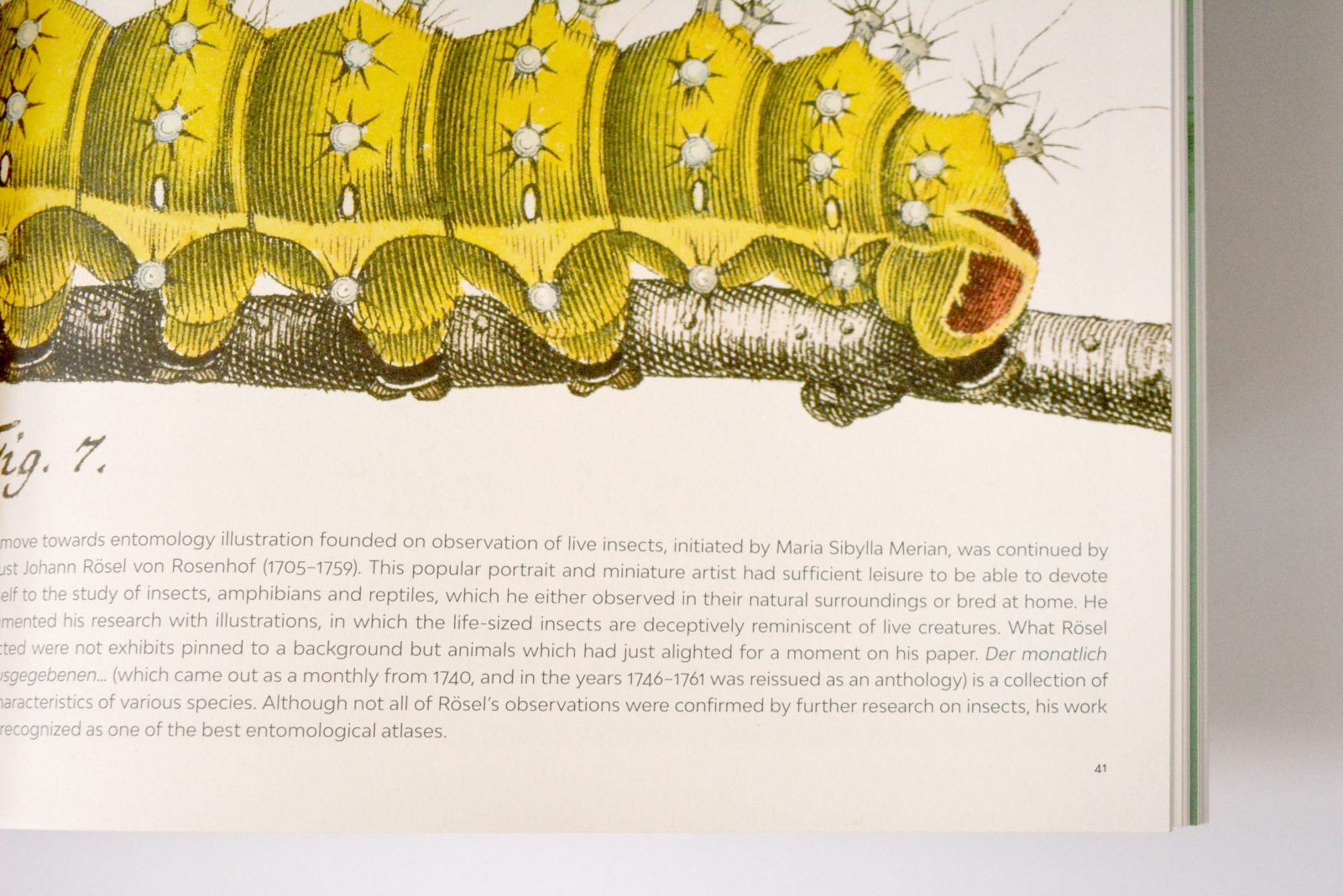
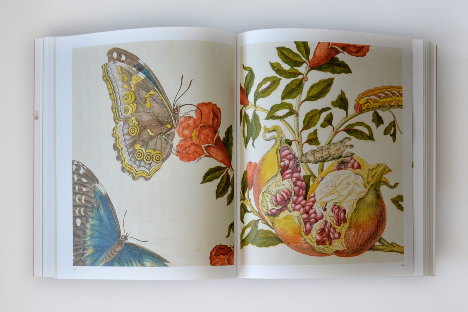
Sophisticated graphic techniques were used to create the original works. Precise copperplate engraving and etching were predominant, often used with stipple technique – enabling microscopic details of the structure of plants and animals, including small insects and fish. Most of the historical illustrations were hand-painted with watercolors and gouache, except in the atlas of parrots and toucans, where the meticulously designed feathers were printed in color from the plate using the toilsome “à la poupée” technique.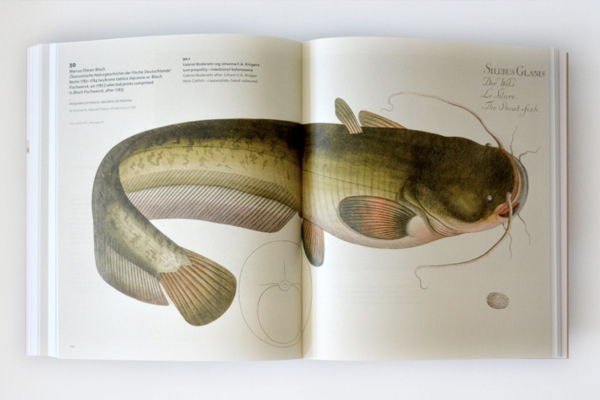
In order to reflect the above-mentioned nuances, and at the same time to reproduce the mattness and subtle colors of the originals, an uncoated paper was chosen. Due to the incredible attention to detail in the engravings, it was necessary to find a paper with an exceptionally compact and smooth surface, with limited water absorption, on which the raster point would not increase too much. Pergraphica Classic Smooth with a shade of natural white, and therefore not conflicting with the warm shades of the aged base of the prints, proved to be perfect in this regard. This paper, especially in combination with offset printing with UV inks and with special processing of graphics, allowed for intense color reproduction, ensuring viewing comfort thanks to a perfectly smooth, but non-glossy surface.
Both papers, SH Recycling 140 gsm in brown/grey and Pergraphica Classic Smooth 120 gsm, are exclusively available at Europapier Group.