

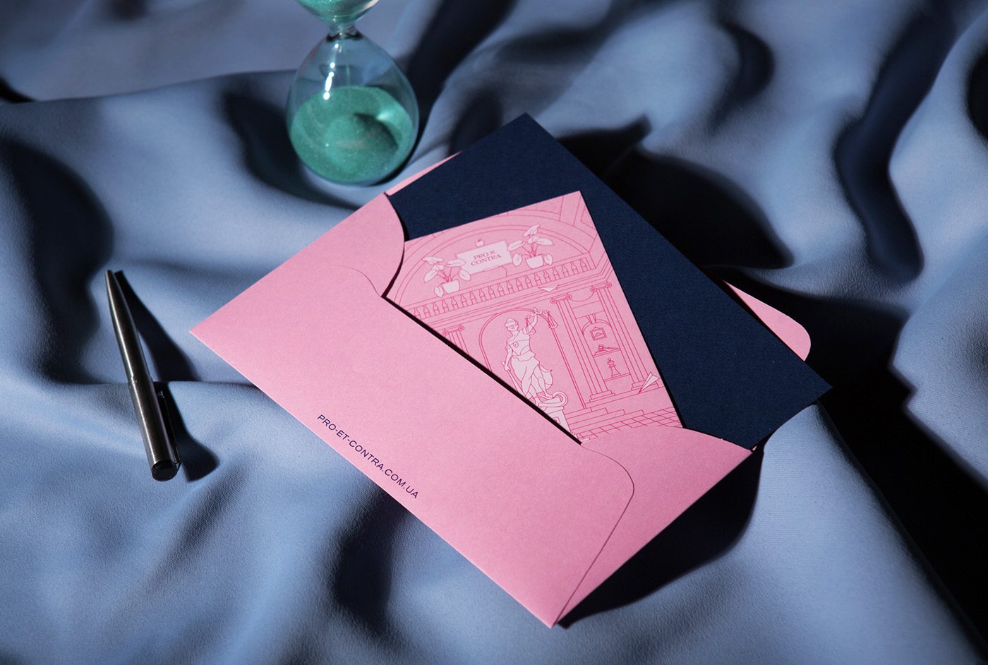
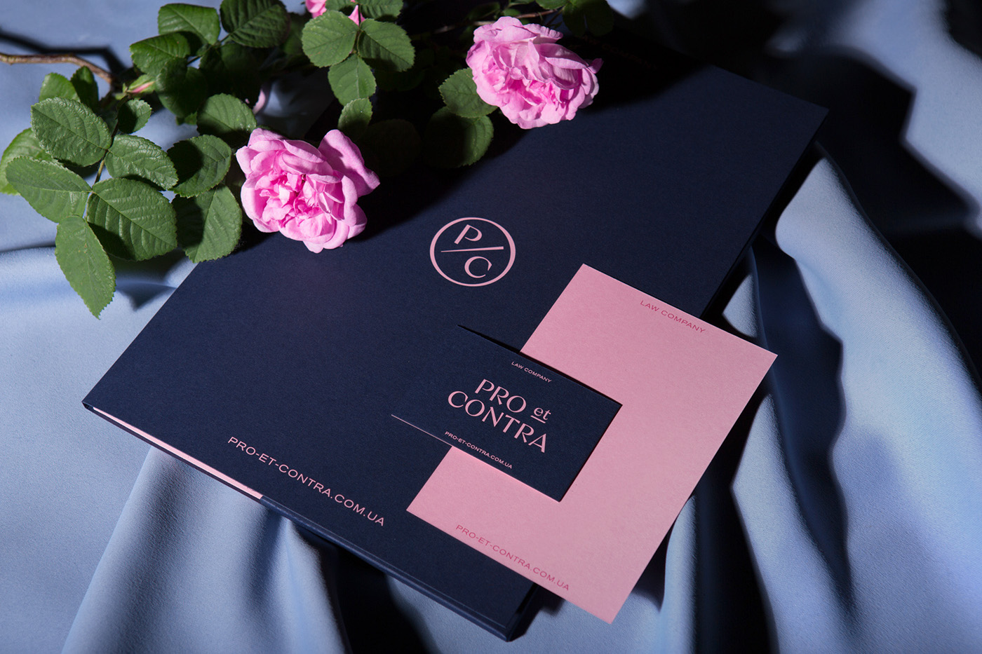
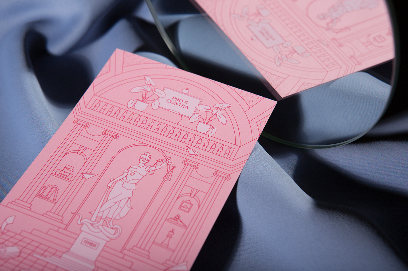
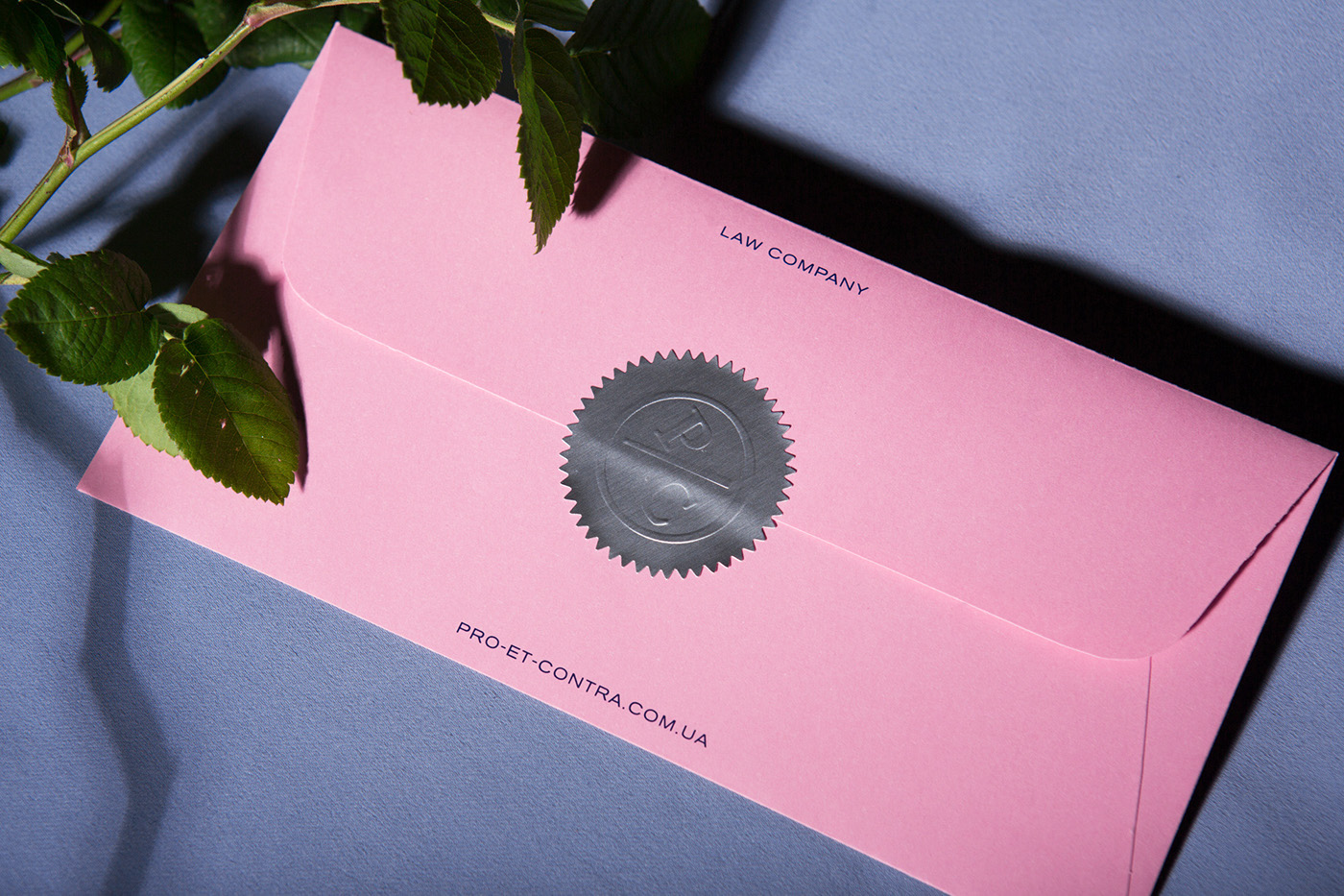
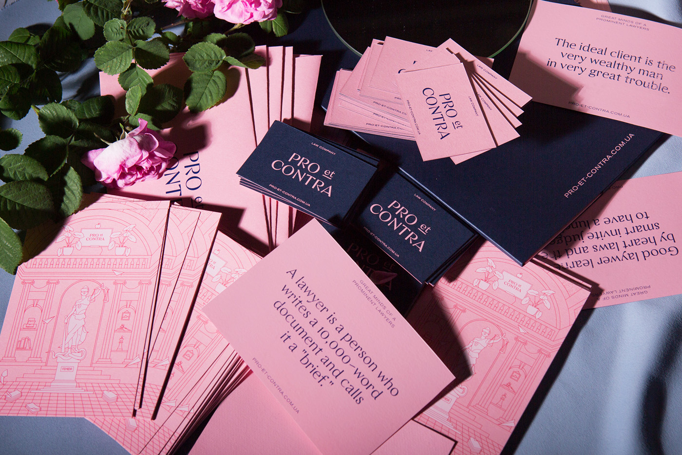
It’s not often you sew law firm branding done in pink, or with a tongue-in-cheek attitude. Not to mention with a humorous tagline; Pro et Contra – lawyers with a sense of taste and humor. But the Ukrainian Pro et Contra identity just might be the exception to the rule as their cool, contemporary design by local Other Land Studio incorporates all, as well as red linear illustrations.
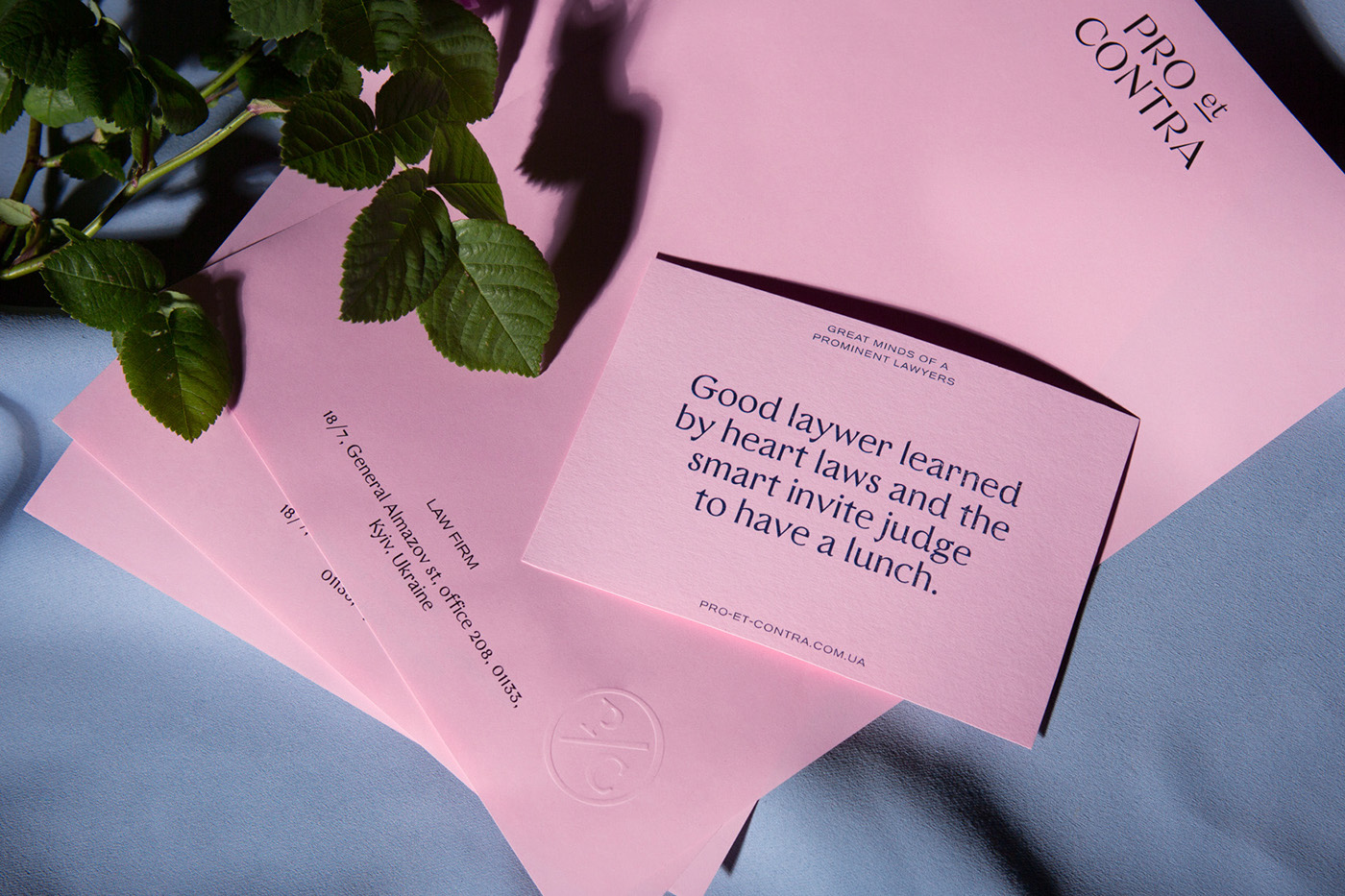
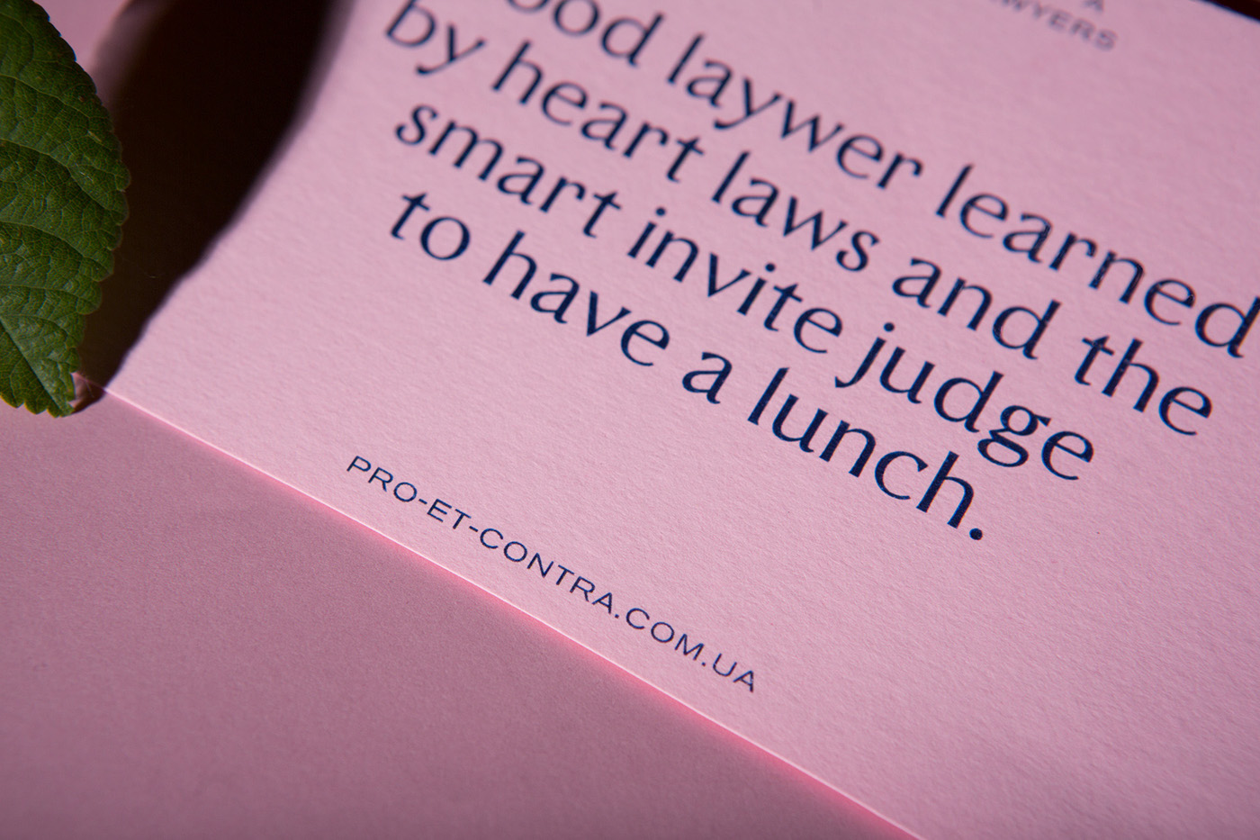
People have the opinion that lawyers are serious, cold and pragmatic personalities, who need to charge for each word they say…this design is set out with the aim of creating the image of benevolent, open, easy-going, and yet, elegant lawyers. – designer Lera Shap explains.
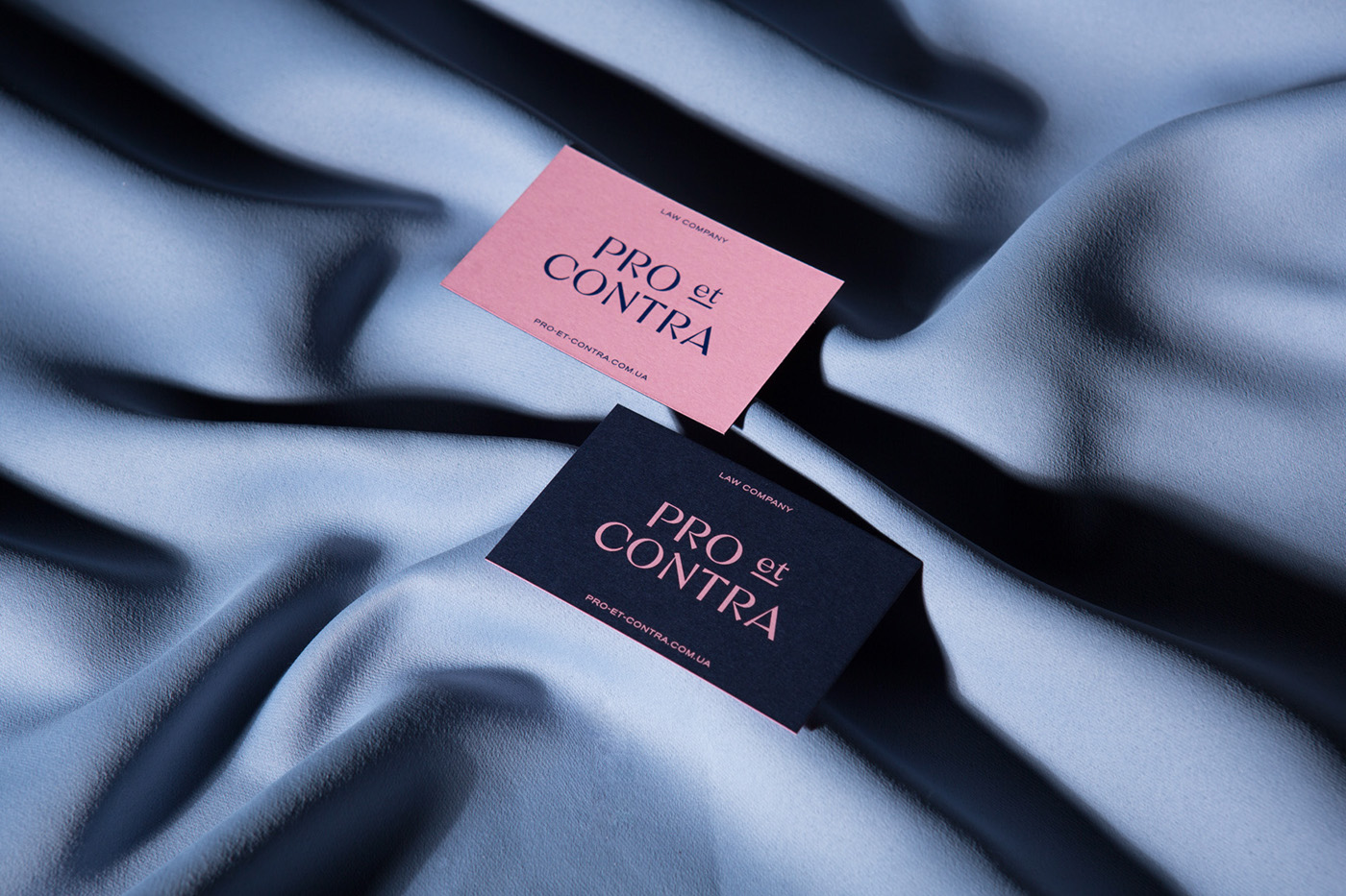
The name, an infamous Latin quote, translates as “For and Against”. Simply saying a good lawyer should weigh all sides of the case and choose only one correct decision. To emphasize the semantic meaning of the name, two contrasting colors were used: royal blue and the lately re-titled millennial pink – further highlighting the fun, young approach. For a traditionally conservative and conventional trade, as the law business is, the branding of Pro et Contra is cohesively stylish and high in quality, breaking the norm of the industry is all the right ways.

Images © Other Land Studio