

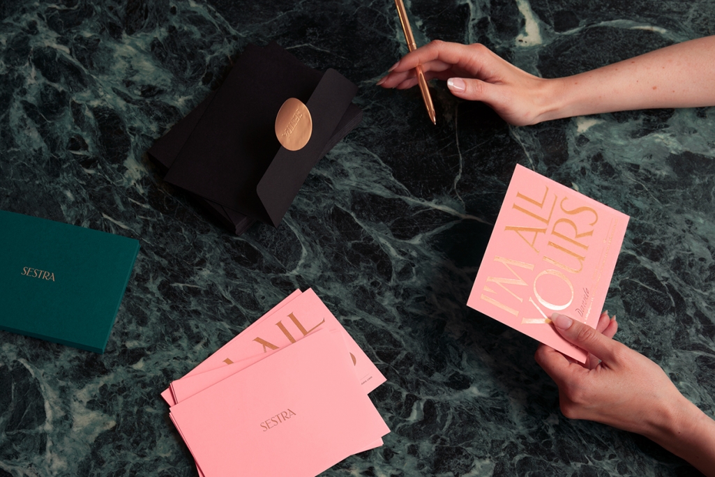
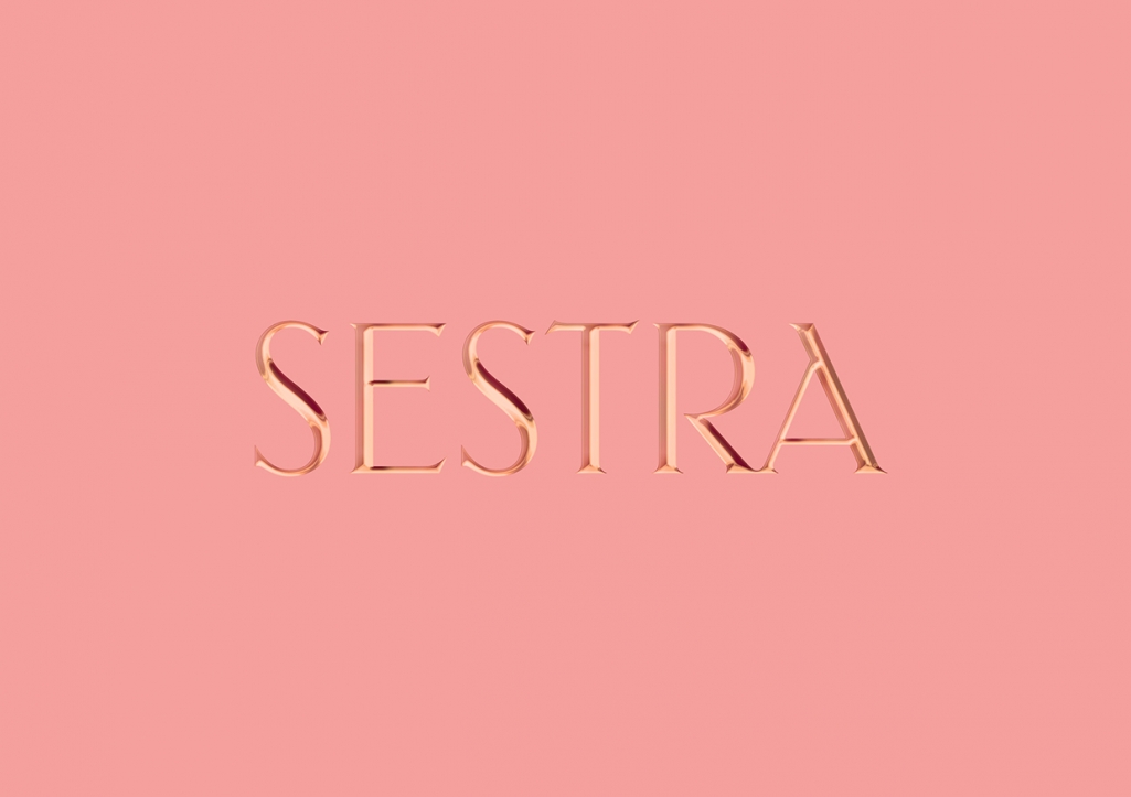
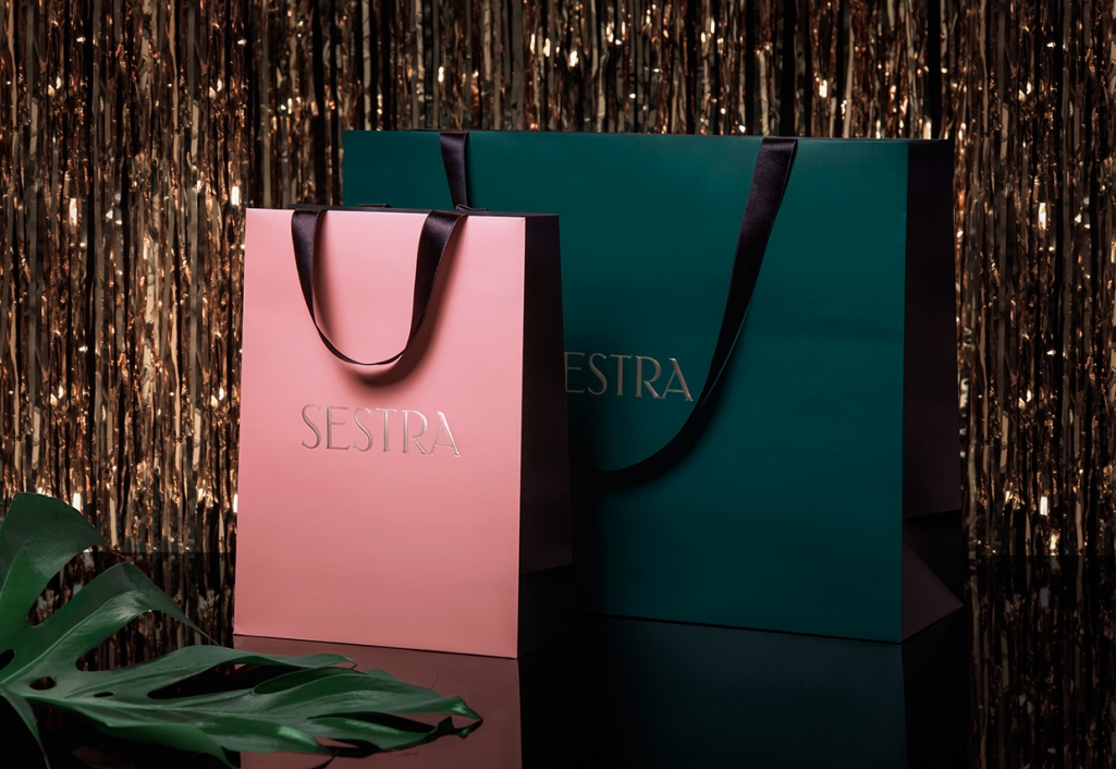
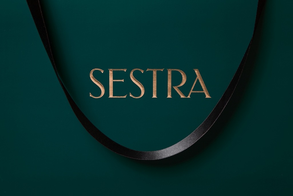
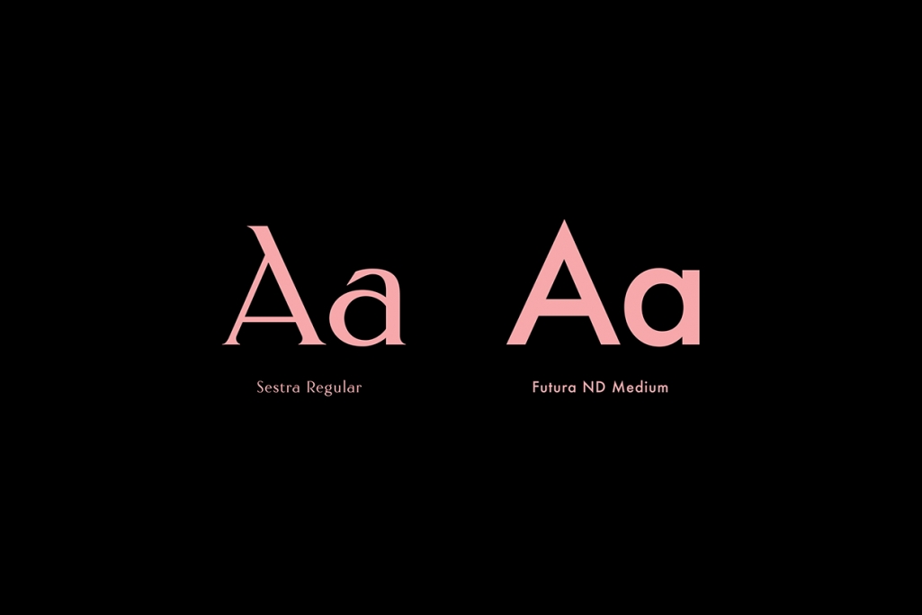
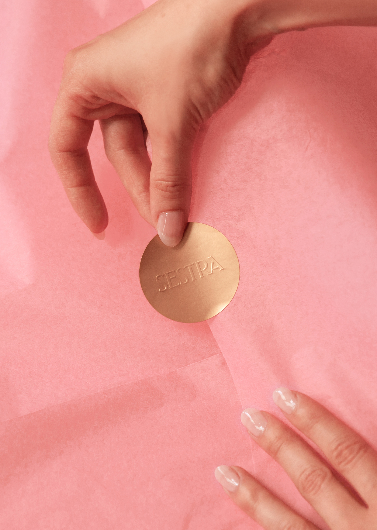
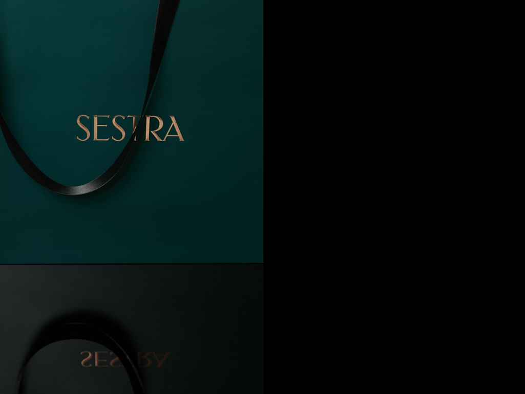

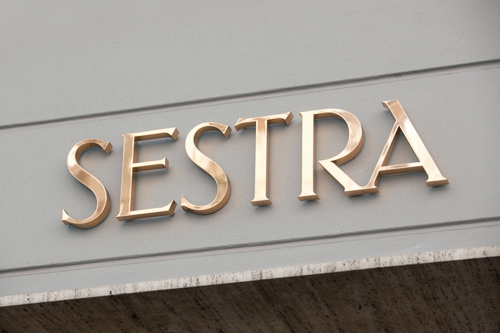
Two young, talented creatives Kristina Bartosova and Thomas Pokorn, together designed the branding for Sestra, a concept store in Graz, Austria. Owned by two sisters, the selection at Sestra focuses on young European labels, as well as hand-picked vintage pieces. The main element of the branding is the delicate custom typography, based on the logo lettering. It’s presented in two strong tones of pink and green, symbolising the two sisters. The entire feel is classy, high fashion and yet still give a nod to the trashy chic of the 80’s.
From the striking color palette to the glossy, vintagy logo, Sestra oozes of the highlife of the past decades, while keeping it cool and contemporary. Combining emerald green with doomy pink and shining gold, the vintage touch feels everything but stuffy, hitting the right notes on feel and contrast. The beautiful Sestra typoface, uniquely created for the brand by Kristina Bartosova is delicate and elegant yet fun and playful – representing the brand to a tee. And who better to make this beautiful design into reality than our favourite Graz letterpress printing house – the Infinitive Factory themselves.
Client: Sestra
Art direction & graphic desgin: Kristina Bartosova
Creative direction, naming & copy: Thomas Pokorn
Photography: Theresa Lipp & Michael Zahnschirm
Images © Kristina Bartosova & Thomas Pokorn