
Vienna is one of the hottest tourist destinations of Central Europe, filled with hotels catering to different needs. One of these hotels caught our eye: The Guest House Vienna strikes a perfect chord with its spot-on combination of design interior, welcoming atmosphere and luxuriously retro-inspired branding by Studio Q. It’s a home away from home, especially for all design lovers!
The hotel itself is located right in the center of the first district, next to one of the most famous museums in the city, the Albertina. With grandiose views over the old city with its narrow streets, boutique shops, and horse carriages, you truly feel like part of it all. The modern design of The Guest House Vienna originates from the creativeness of British designer Sir Terence Conran + Conran & Partners. A balanced combination of trend awareness, comfort and functionality are carried throughout the interior, blending into its surroundings. Opened only 6 months ago, the hotel has quickly become one of the most praised amongst few. Above all, the incredible attention to detail and original visual identity design swept us off our feet.
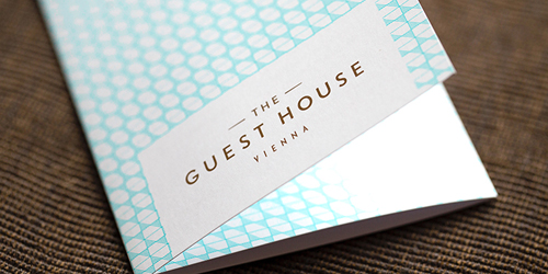
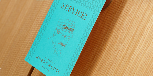
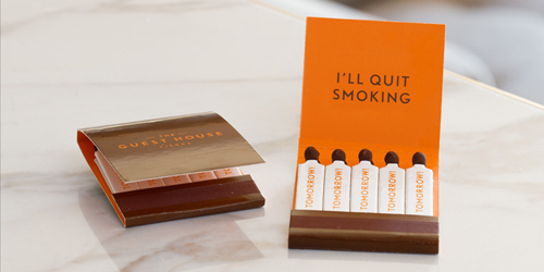
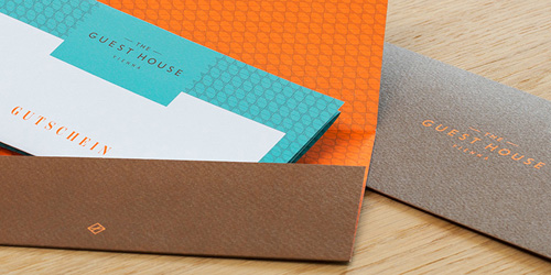
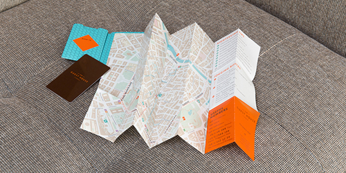
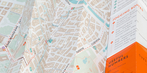
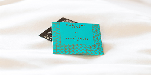
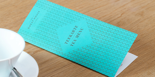
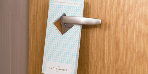
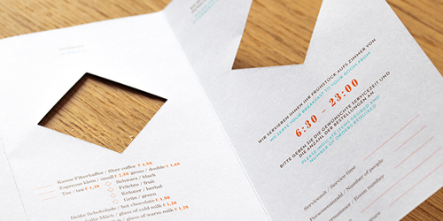
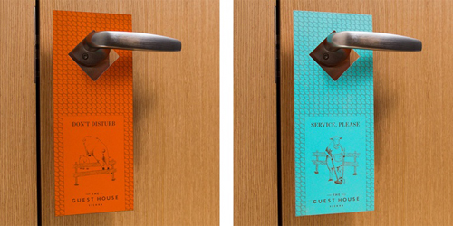
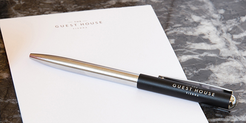
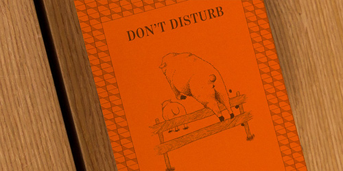
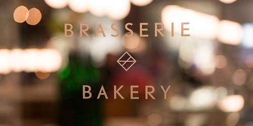
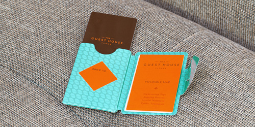
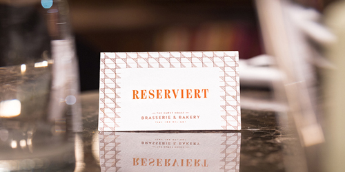
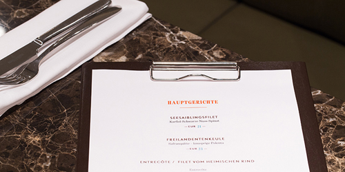
The personal style is continuously seen in everything from the logo to a book of matches (definitely my favorite), from service cards to the menu at the hotel’s own Brasserie&Bakery. A very classic approach that is spiced with some vintage feeling colors, patterns, and illustrations – a very fitting concept for a modern design hotel. The entire range of furniture was custom-made for The Guest House and so was the branding by the Viennese Studio Q, which is part of the Quartier21 of the Museum Quartier.
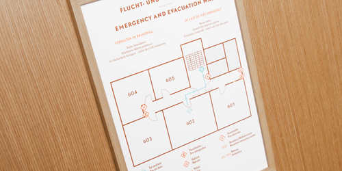
Studio Q is well known for their high quality and classic designs, and they’ve done a great job once again. Being responsible for all visual communication elements, such as web design, signage, creation and production of the hotel’s own magazine and well over 30 different print elements from door hangers to packaging, the task must have felt taunting. The result is a perfect visual match to the hotel’s surroundings, feel and attitude, most importantly. Classic yet cheerful, luxurious yet retro, modern yet colorful, the look is very original.
What I found personally interesting was the use of patterns and hand-made illustrations which are a rare thing in corporate branding. But the careful balance between classic and original is exactly what makes The Guest House Vienna so special.
Photos © Studio Q