Alejandro Gavancho from Leeds UK runs his own award-winning branding and design studio Design by Mango. With a strategic and collaborative approach, the studio creates powerful brand experiences with character, innovation, and passion – and the new bold Onça Chocolate visual identity is a prime example of this. The powerful design concept is sure to stand out among the competition, especially when you hear where it got its unique inspiration from.
 Led by curiosity and professional know-how, the artisanal chocolate brand Onça aims to offer a divine and luxurious experience using the vast flavors of cocoa from the best local and international ingredients, to celebrate the diversity of its fruits.
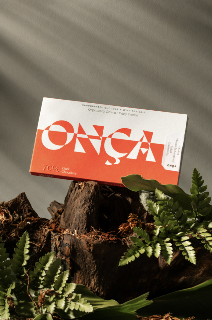
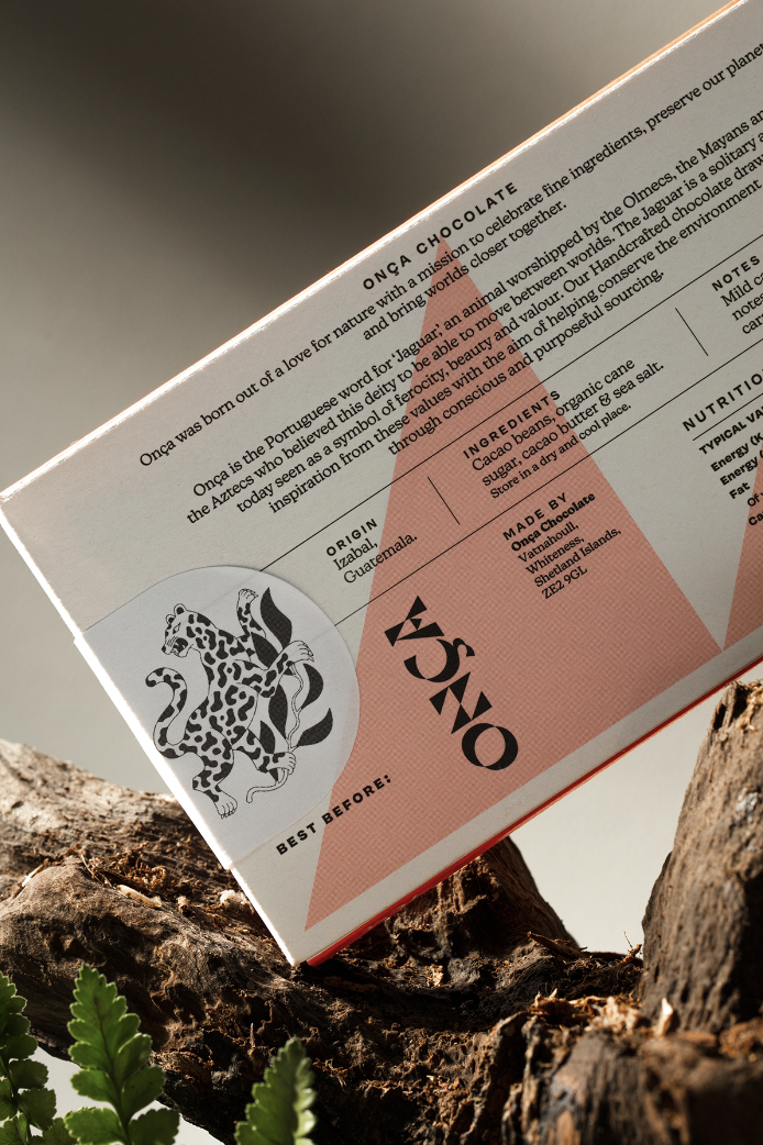
The origin of the brand is in 2021 when its founder Michael began his adventure to discover new chocolate flavors – and sharing his knowledge and the practices of the chocolate sector led him to embark on a personal adventure bringing Onça to life. Onça is a brand of artisanal chocolate born and produced in the Shetland islands in Scotland. The name is of Portuguese origin and means jaguar. The brand was born with the aim of creating a more divine and luxurious experience using the vast flavors that cocoa from around the world can have, selecting the best local and international ingredients, to celebrate the diversity of its fruits.
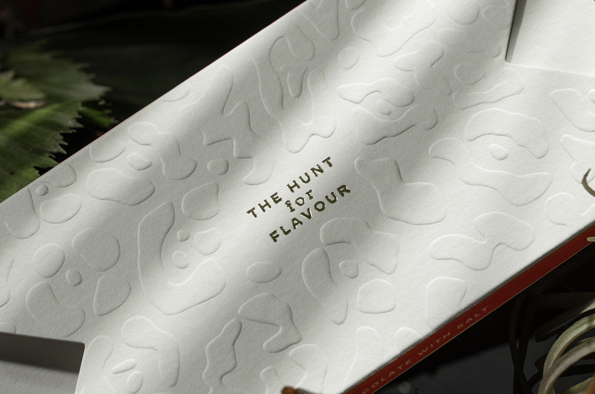
Onça Chocolate — The hunt for flavor
Michale and Onça Chocolate approached Gavancho and his design studio with the challenge of developing the brand identity and packaging system for the Onça brand’s first product, with the premise that there should be a clear representation of the strength and ferocity of the Jaguar.
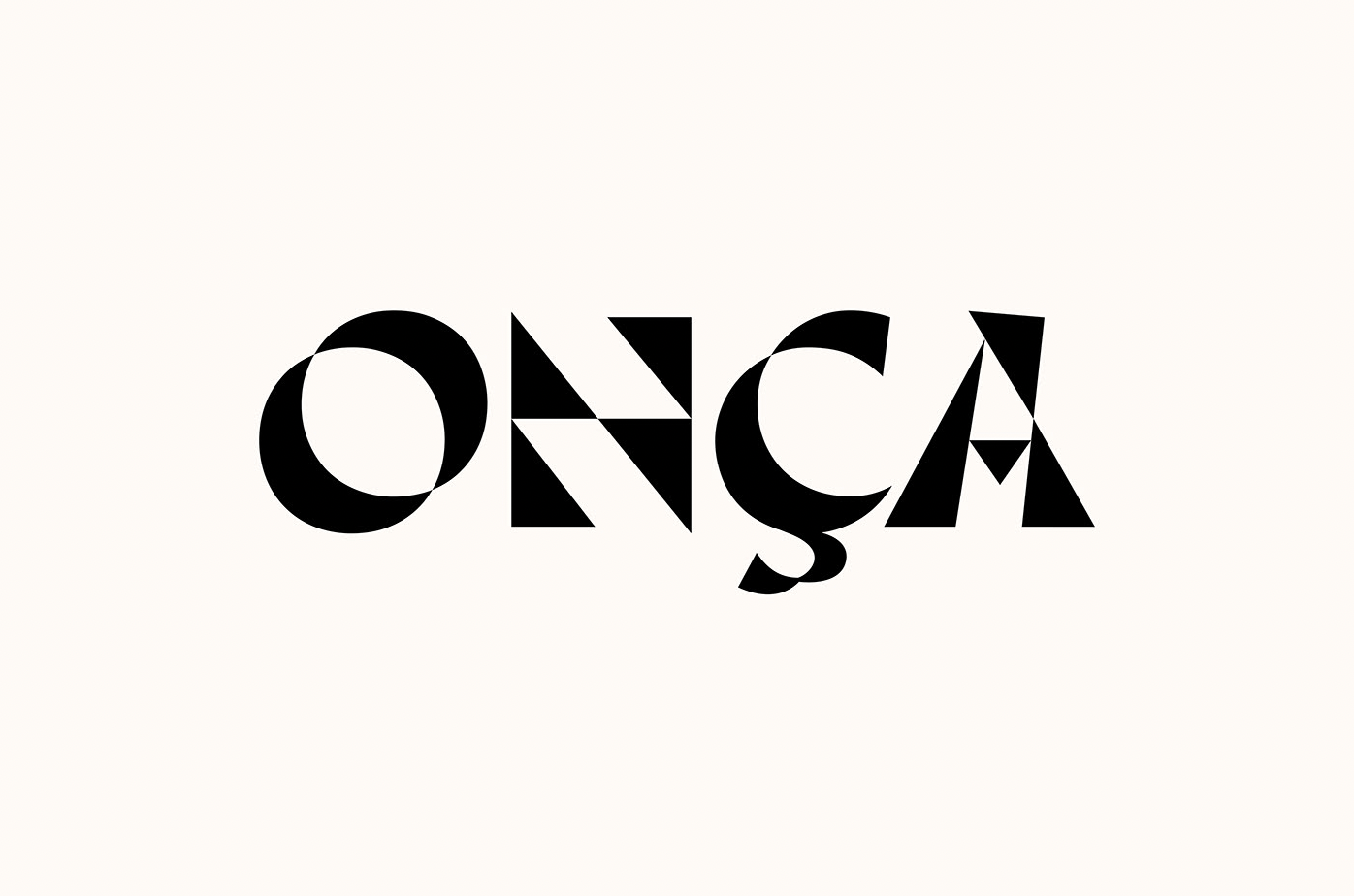
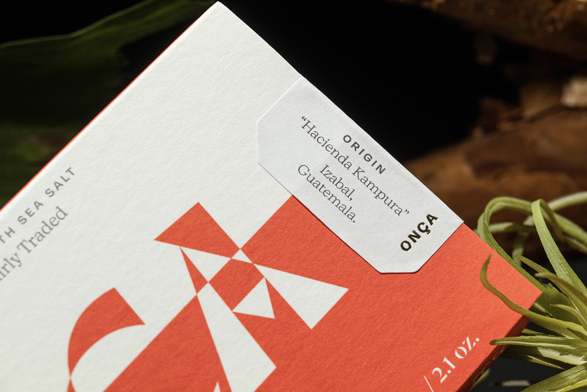
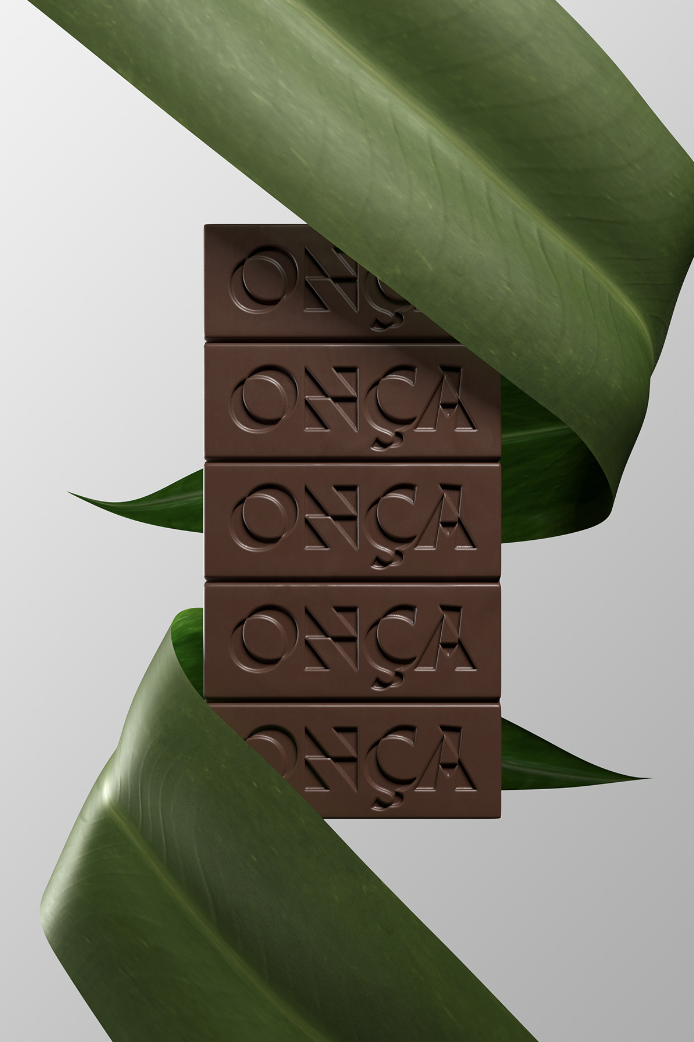
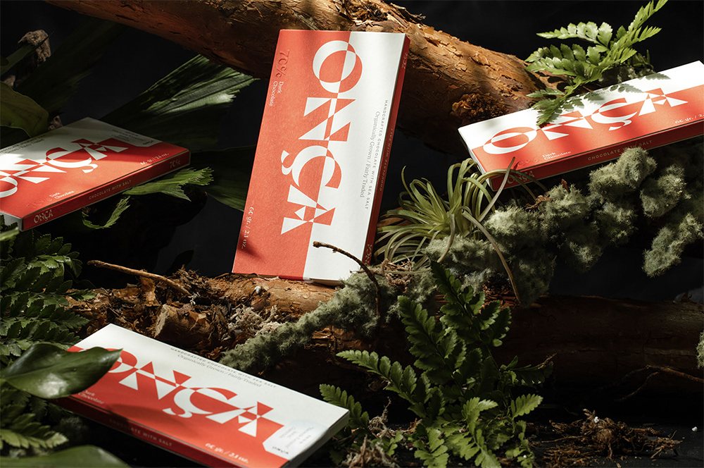
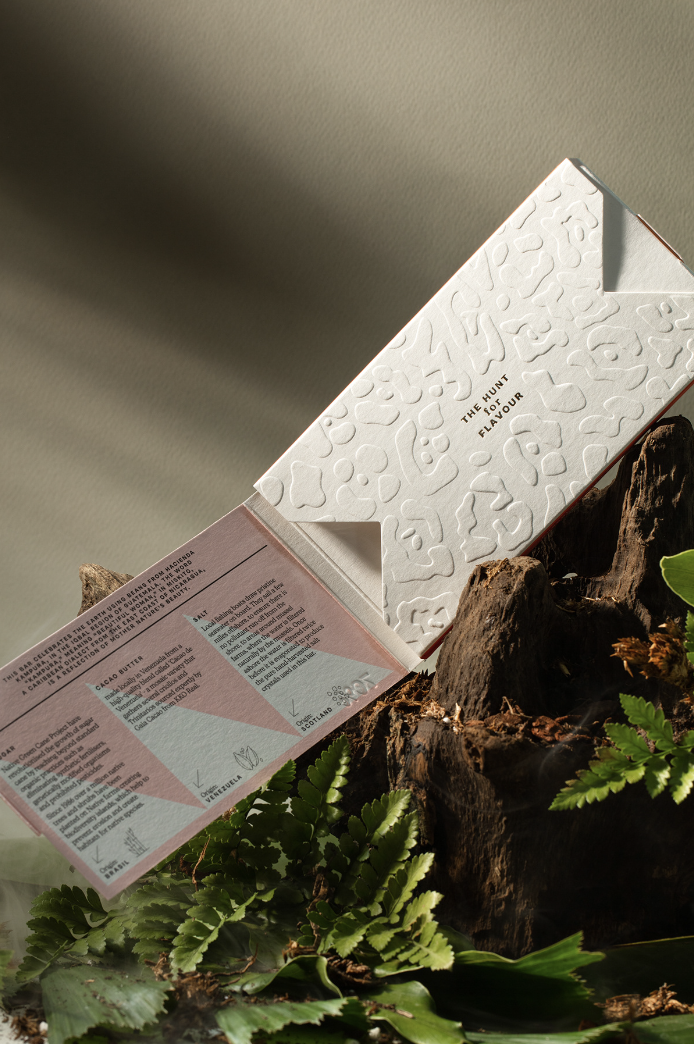
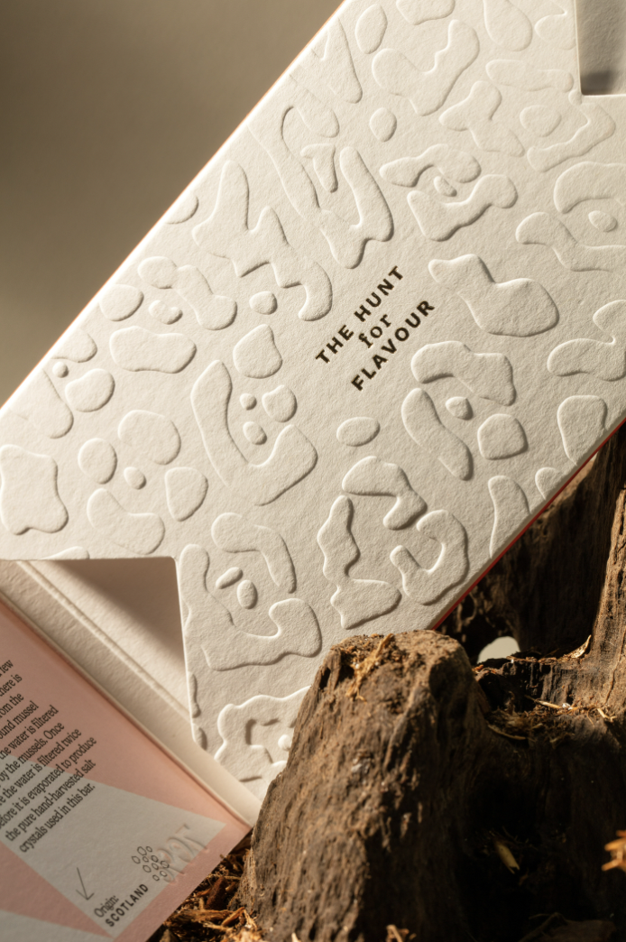
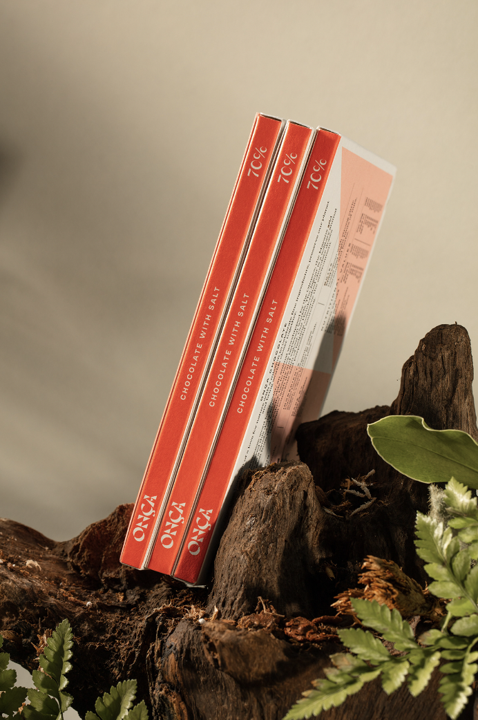
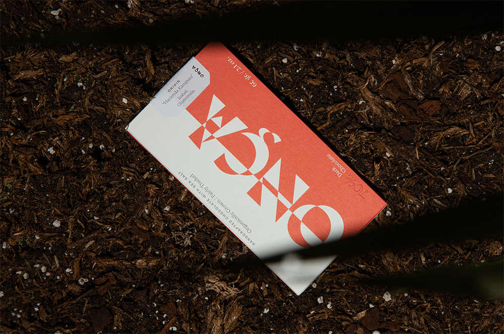
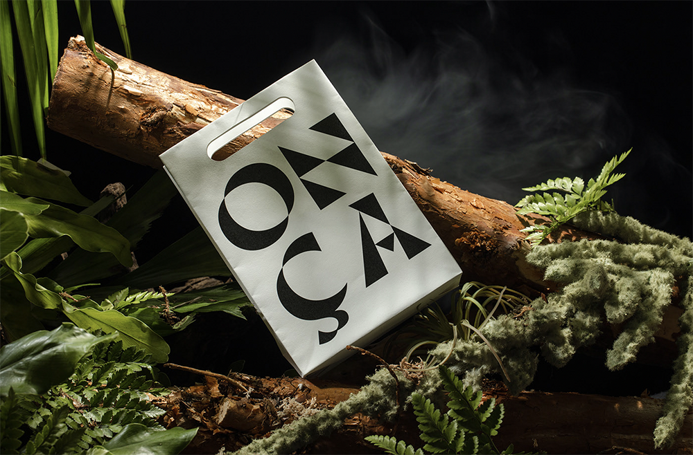
“Chocolate is a source of joy for many people, it is bought as a gift, as a gesture of love, and as a symbol of indulgence. We incorporated these ‘seductive’ traits in the brand and product while conveying the strength and fearlessness of the Jaguar”, Design by Mango writes. The studio created a captivating brand identity, including packaging that represents the jaguar in its natural habitat. The visual route begins with a strikingly vibrant burned red color representing the biodiversity – and ends with the interior of the packaging representing the heart and interior of the jaguar and its habitat, with both the aroma of intense chocolate notes and the feel of the embossed rosette motifs. The beautiful packaging is striking in its design and all its details, while the quality of the product is echoed in everything from the special printing choices to the stylish typographic details.