
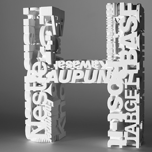
Extensive research led the London based design studio Johnson Banks create the special alphabet named Arkitypo. Commissioned by Ravensbourne to test and showcase their in-house 3D prototyping technology, they designed this mind-boggling, and actually very educational, typographic project.
The Arkitypo project came about when one of Johnson Banks clients, Ravensbourne, asked if they were interested in developing a research project to test and showcase the in-house 3d prototyping skills and technology. The idea was born to do something typographic, as just the briefest period of research revealed that very few examples of prototyping was ever done with the graphic design. They set themselves a task to create the alphabet of all alphabets. Where each letterform is different, each, in turn, interprets its own alphabet.
For each letter, they carried out extensive research, made drawings, build maquettes and did a simple 3D visual before handing the idea over to Ravensbourne’s team. After “virtual proofing”, when all participants were happy with the idea and design, they began the 3D printing. For some letters it took up to 8 hours for the machine to produce, with all their incredible details. Johnson Banks states that “some ideas worked straight away, some needed refining. Some fell apart, some were perfect, but after about six months of solid work the alphabet was done “- photos of the result you can see below.
What sets the Arkitype apart from other 3D typography projects is the simple fact they are not just digital renderings but actual objects which you can hold in you hand, turn around and see from every angle. Just the simple thought of this in mind-blowing. See and read more about the letters below, and visit Johnson Banks website to see the whole alphabet.
 Akzidenz Grotesk
Originally designed in 1896, and forerunner to Helvetica, Akzidenz was part of a family of early sans-serifs called grotesques. It comes in a range of weights and styles: for this design a condensed weight is fractalized, turning a grotesque into a thing of beauty.
 Zig Zag
This is an inline, Art Deco style typeface that, in 3D, becomes an interlocking, zig-zagging puzzle. 
Univers
This typeface family was famous for its broad appeal and was one of the first attempts to create a classification across its many weights, widths and styles. Since its introduction in 1957 it has become one of the world’s most ubiquitous typefaces. 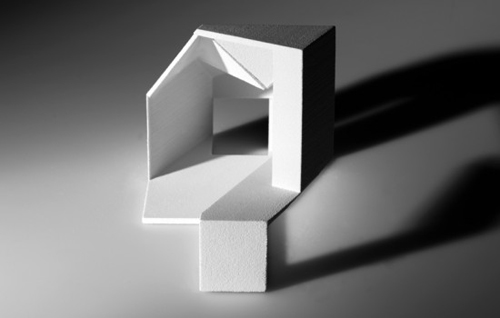
Quadrate
Many of the characters within this grid-based typeface from 2002 have the impression of having 3D form whilst only 2D. So this adaptation imagines what its 3D shape ‘could’ have been. 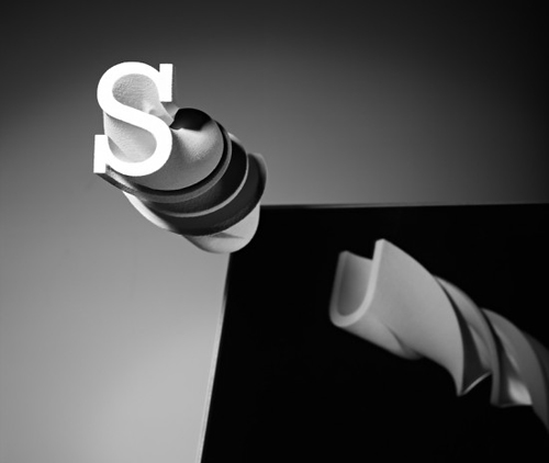
Serifa
Adrian Frutiger designed Serifa in 1966. Technically a ‘slab-serif’ design, Frutiger based his first designs on his well known sans-serif font, Univers, and simply added the serifs. 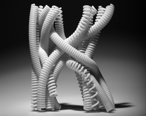
Kabel
Released in 1927, Kabel was a geometric sans-serif typeface that was named in honour of the then newly completed transatlantic telephone cable. 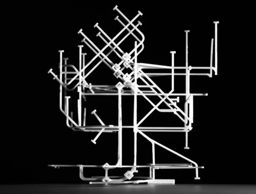
Johnston
This face is one of the earliest 20th century sans-serif typefaces, designed for London Transport by Edward Johnston in 1916. Originally called ‘Underground’, we now know it as Johnston, and it remains in use a century later. It was a key influence on Gill Sans and has several unique features, including its diagonal square dots. 
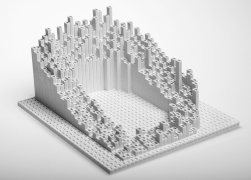
Machine
This infamous ITC typeface of the seventies took its inspiration from the American Midwest a century before. Now a classically brutal font perfect for all things industrial, it is interpreted here with a system of interlocking cogs. 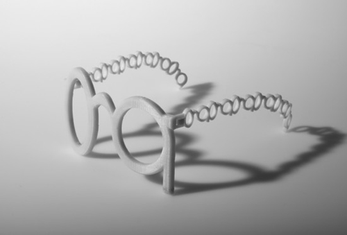
Gill Sans
This is the famous lowercase ‘g’ from Eric Gill’s 1933 typeface, Gill Sans. He is quoted as saying, “A pair of spectacles is rather like a ‘g’; I will make a ‘g’ rather like a pair of spectacles.”
 Engravers
This was typical of a style of font originally designed for engraving into metals, especially gold and silver.
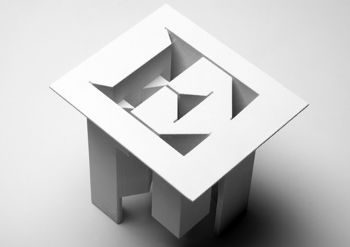
 IN
IN
DIN is the acronym of Deutsches Institut für Normung. Type design DIN 1451 was selected in 1936 as the standard German typeface across areas such as engineering, technology and traffic signs. As its popularity grows internationally, it has become one of the key symbols of cities and technology across the world. 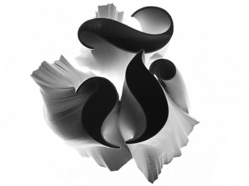
Fraktur
This classic ‘blackletter’ style of fonts is umbilically linked to Germany’s history, being the predominant style for centuries in pre-war Germany. For most of the 20th century it proved controversial, eventually being banned by the Nazis in 1941. Post-war adoption of sans-serif typefaces effectively killed it off as the nation’s style of script.
 Courier
Courier was originally commissioned for 1950s IBM typewriters, but soon became the standard font throughout the then-emerging industry. As a nod to the torturous days of jammed machinery, this ‘C’ is built from a small forest of typewriter keys. 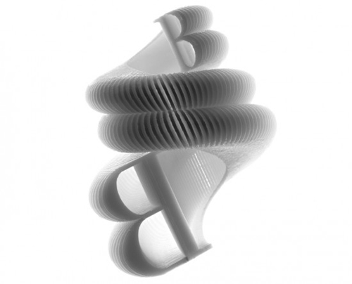
Bodoni
Baskerville and Bodoni are usually judged as two separate typefaces, but Giambattista Bodoni modelled his famous font on John Baskerville’s, at first. The key difference is that the thicks and thins are in turn thicker, and thinner. 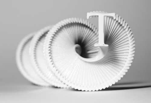 Trajan
This was a 1989 adaptation of the famous Roman capitals inscribed on the base of Trajan’s Column in Rome. These letterforms have been influential for centuries, but this was the first design to directly emulate the carvings. The column itself can be climbed via an internal spiral staircase.
You are currently viewing a placeholder content from Vimeo. To access the actual content, click the button below. Please note that doing so will share data with third-party providers.
Photos © Johnson Banks