
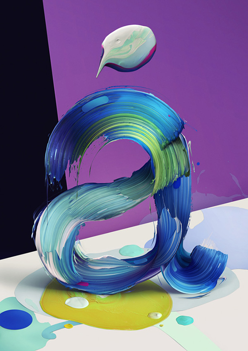
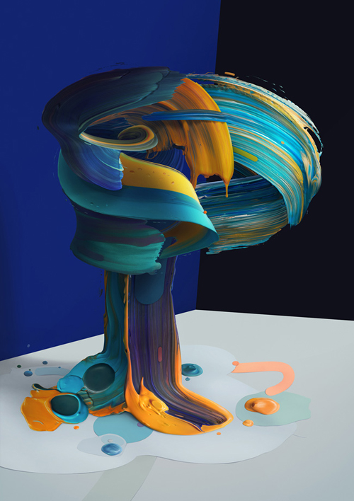
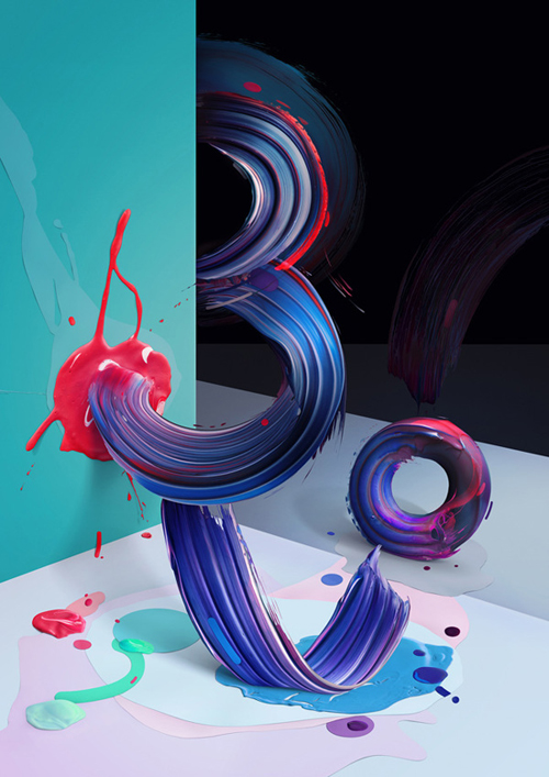
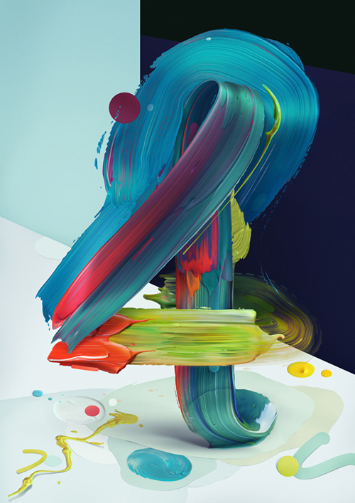
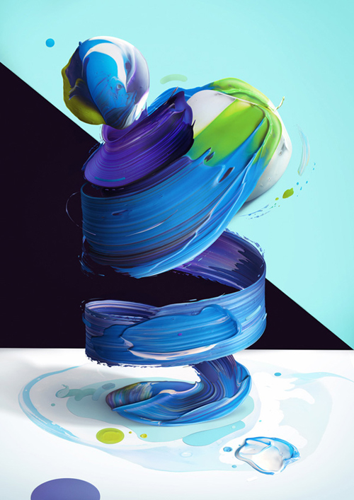
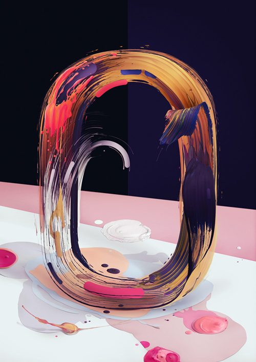
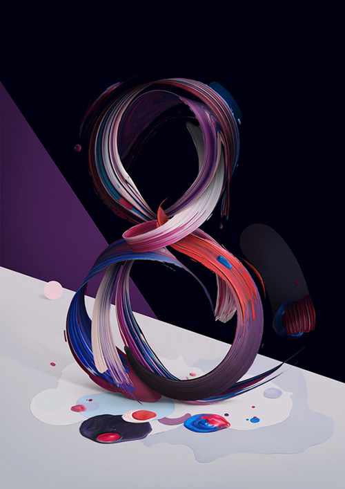
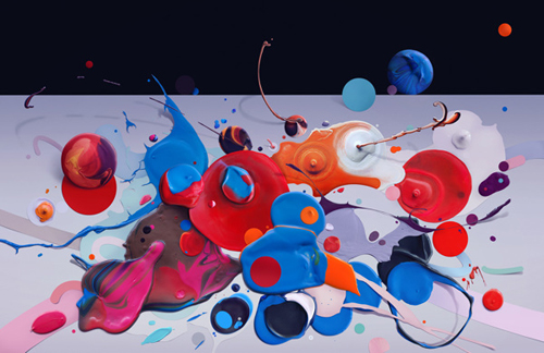
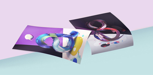
Atypical is an incredibly vivid series of posters exploring the form and rhythm of letters or pseudo-letters presented as half-realistic, half-illustrative figurative sculptures. Designed by Polish illustrator and graphic designer Pawel Nolbert, the artworks were built from elaborate artistic painterly gestures into expressive arrangements – extending the aesthetic characteristics of typography.
Pawel Nolbert has an amazing talent creating strong, memorable visual images. With a client list as long as his, including giants like Google, Nike, Disney and many more his talent has not gone unnoticed. Atypical is one of Nolberts’ more recent projects and there is not much I can say about it, as it leaves you simply speechless and breathless! The Atypical letters and numbers are constructed of thick, animated brushstrokes and saturated with deep colors, creating a typeface like no other. The half-realistic, half-illustrative figurative forms take a sculpture-like life, which you wish you could reach out for and touch. 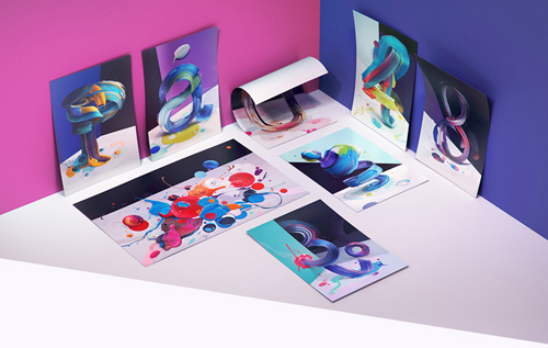 You can buy the posters here!
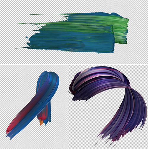
And how exactly did Nolbert create these stunning images? If you want to leave it as a mystery, don’t scroll all the way down this post. But for you curious souls you can see it in the “making of” photos. In all it’s simplicity: he photographers paint splatters, and edited and enhanced them through digital manipulation. But what became of it, is as far as from simple as it gets. The typeface gives new life and feel of movement and flesh to an age-old letter forms. Captivating!
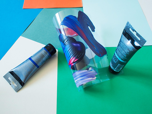
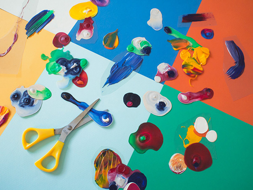
Photos © Pawel Nolbert