
Fontarte – a typographic, graphic design studio and independent publishing house was established by Magdalena Frankowska and Artur Frankowski in Warsaw back in 2004. With extensive knowledge and passion towards typography, their work is distinguished by its original letterforms and unique typographic style. They’ve become the go-to agency when looking for high-quality custom typefaces. From an incredible list of clients and projects, I’ve selected works for you to enjoy.
Fontarte consists of Artur Frankowski – graphic designer, typographer, type designer and lecturer with a Ph.D. on the legibility of type and Magdalena Frankowska – graphic designer and type designer with a MA in Art History and post-graduate degree in public relations. The two creatives are authors on several typography-related books and publishings and have together curated numerous exhibitions locally and internationally.
Both designers being very active and prominent characters in the design scene in Poland, it’s been longoverduee to shine some light on their wide array of projects, including art direction, editorial design and custom typography, for clients in the artistic and cultural fields in Poland and abroad as Museum of Modern Art in Warsaw, Moderna Museet Malmö, Gallery BWA Design Wrocław, Zachęta National Gallery of Art and Polish Institutes.
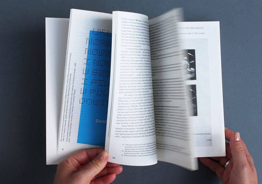
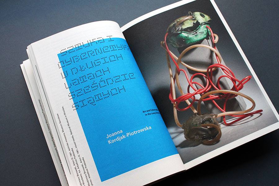
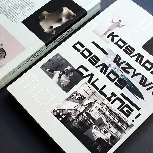
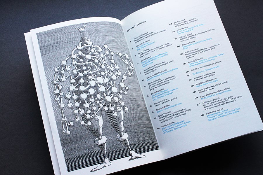 Kosmos wzywa! Cosmos Calling! (main photo)
Accompanying the exhibition “Cosmos Calling! Art and Science in the Long Sixties”, the book features 12 essays devoted to the visual arts, music, film, design, architecture/urban planning and fashion, viewed in the context of their relationships with science and technology, especially astronautics and cybernetics.
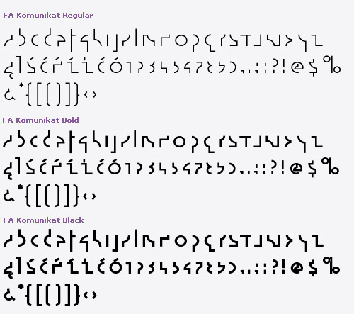
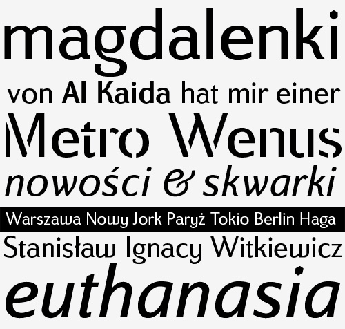
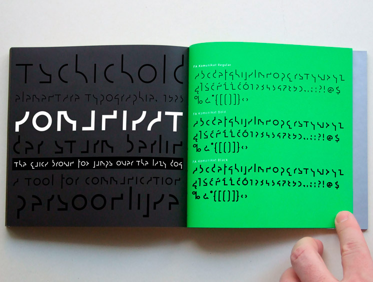 FA Komunikat
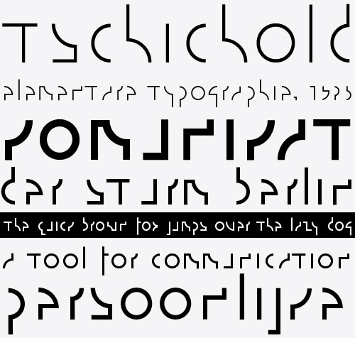
FA Komunikat typeface is based on the sketch of unique lettering from 1932 made by Władysław Strzemiński, Polish abstract painter, an artist and a typographer. Strzemiński claimed that modern economic letter forms should be standardized and based on lines and arches. He wrote that readability is a matter of habit and after a practice the new letter forms would be very well readable for everyone. Fontarte revived original design creating set of characters, widen up with numerals, punctuation marks and diactrics. FA Komunikat is an experimental and geometrical typeface based on simple elements: a circle, it’s parts and straight lines. The typeface communicate the spirit of future, dynamism and modernity.
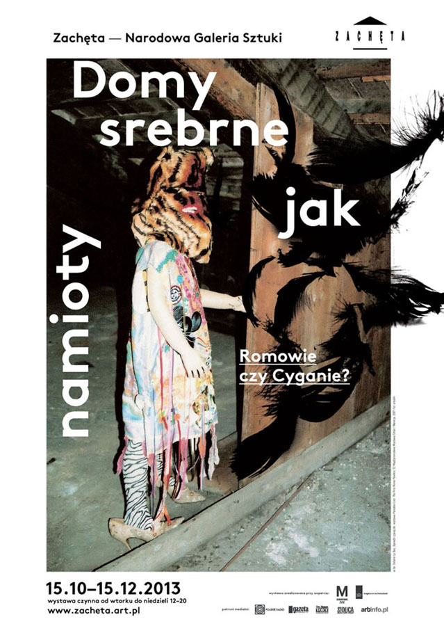
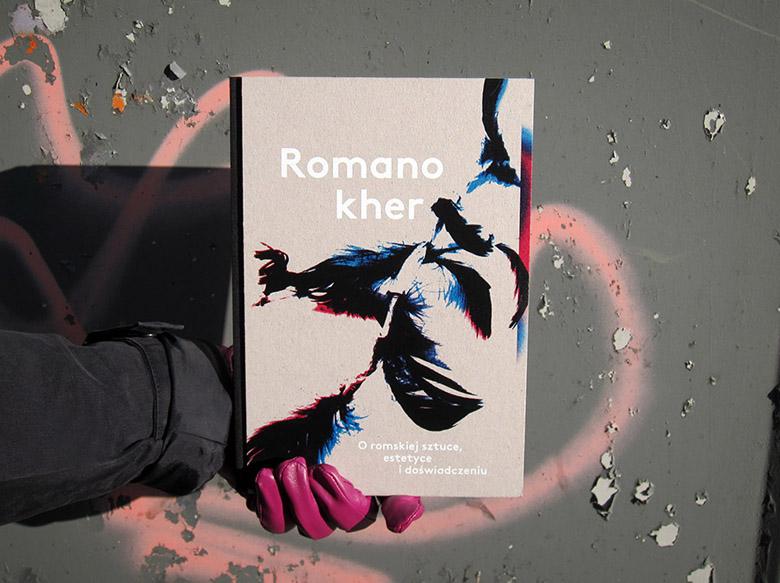
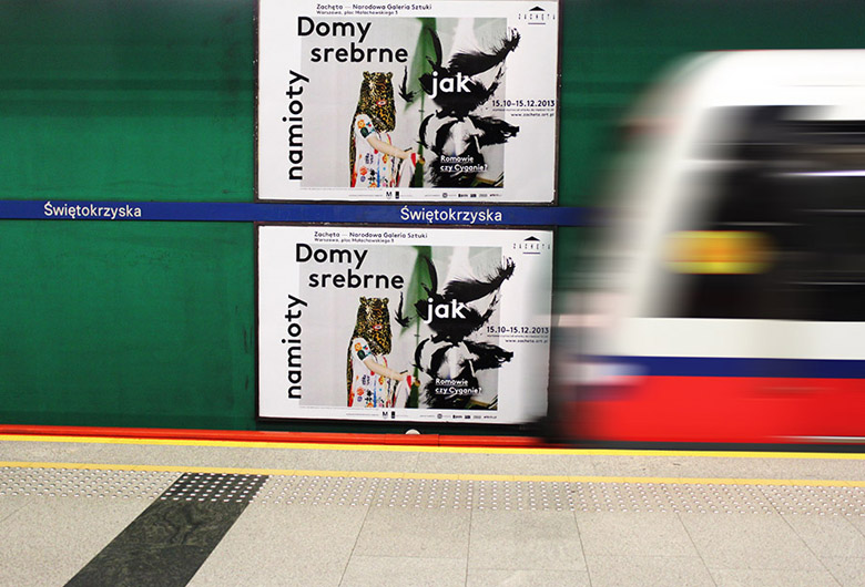 Houses as Silver as Tents
An identity of the exhibition “Houses as Silver as Tents” (Domy srebrne jak namioty). Problems that the exhibition touches upon include: hidden integration vs. forced assimilation, nomadism as a possible social alternative, the notion of “Gypsiness” and the voice of the Roma community in the discussion on extermination. Works of contemporary artists from different countries provide possibilities to go beyond stereotypes.
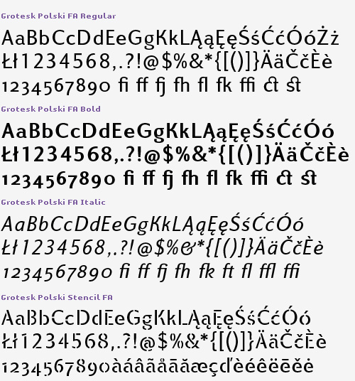
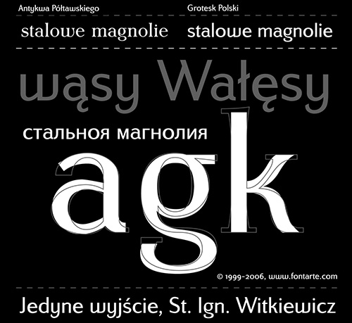 Grotesk Polski FA
Grotesk Polski was inspired by the Polish pre-WWII text typeface – Antykwa Półtawskiego. Adam Półtawski designing his antiqua had took into consideration the special qualities of Polish language. He designed unique letters: k, w, y, z and R, K, Y. Another unique element of his typeface was polygonal dot. Grotesk Polski keeps all that shapes and goes further. It is a contemporary sans serif in four cuts: Regular, Italic, Bold and Stencil. The proportions of the typeface were rebalanced to give it a neo-grotesque with a Polish twist. It comes complete with a full upper & lowecase latin and cyrillic character set in Open Type format. Try it here.
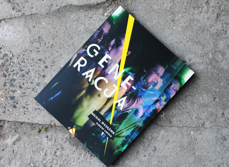
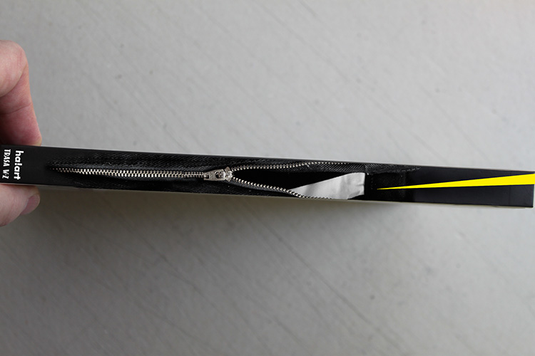
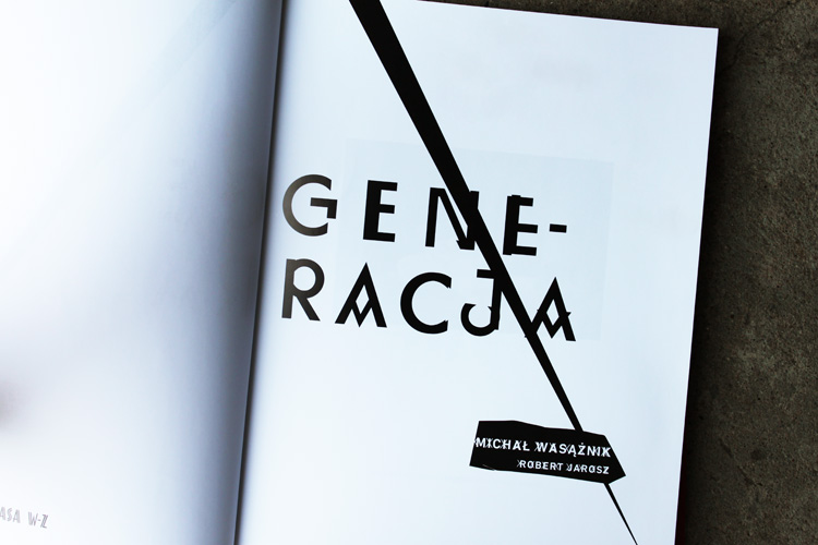 “Generacja” (Generation)
A book cover and a title page design of a publication by Michał Wasążnik and Robert Jarosz. “Generation” is a visual documentation of the Warsaw punk and reggae scenes of the first half of the eighties.
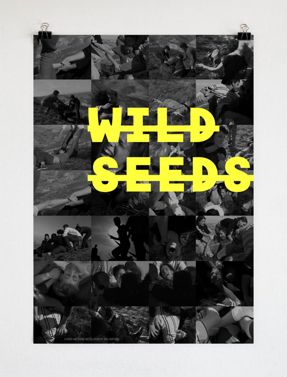
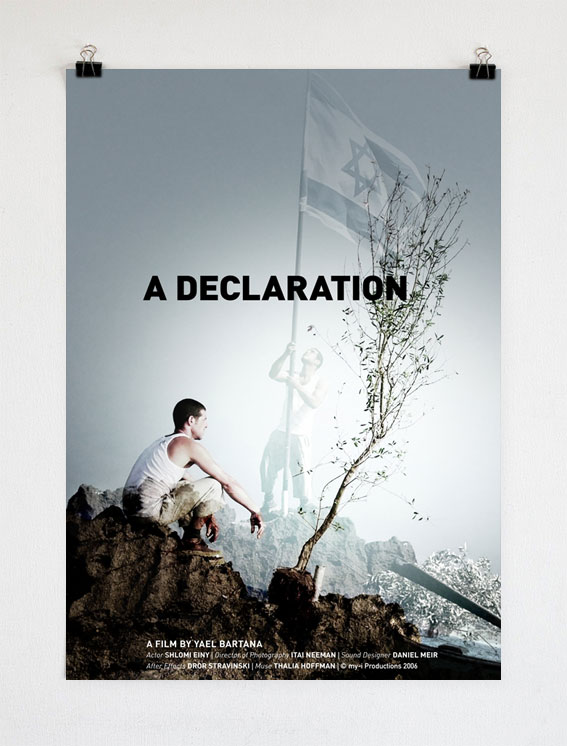
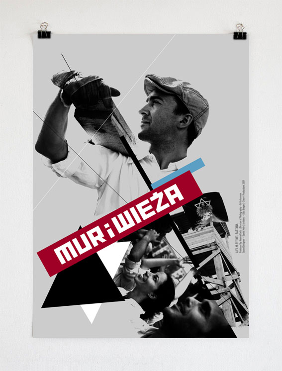 Posters for Yael Bartana’s films
A set of posters for Yael Bartana exhibition and Europe will be stunned at the Moderna Museum Malmö in Sweden. Yael Bartana, a film artist and a winner of a prestigious Artes Mundi prize, asked Fontarte to design posters for her films: “Wild seeds” (2005), “A declaration” (2006) and “Mur i wieża” (2009).
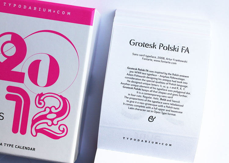
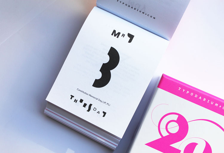
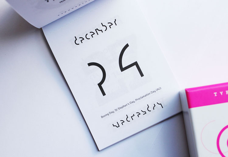 6 Fontarte fonts
Six Fontarte fonts in Typodarium calendar 2012. Tear-off calendar to hang or stand unveils a new font everyday. With bank holidays of 32 countries and a box to collect the sheets. See this years Typodarium here.
Photos © Fontarte