Full-service Belgrade based branding agency Metaklinika (previously here) is an industry leader with a multitude of successful and awarded design projects under their belt. With a holistic approach to their work, Metaklinika’s team tackles any task given to them from the initial concept right down to its realization. With a global client base, the agency’s talent lies in clear, contemporary, and thoughtful design, realized with care and understanding of the market.
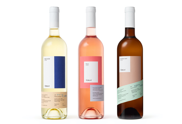
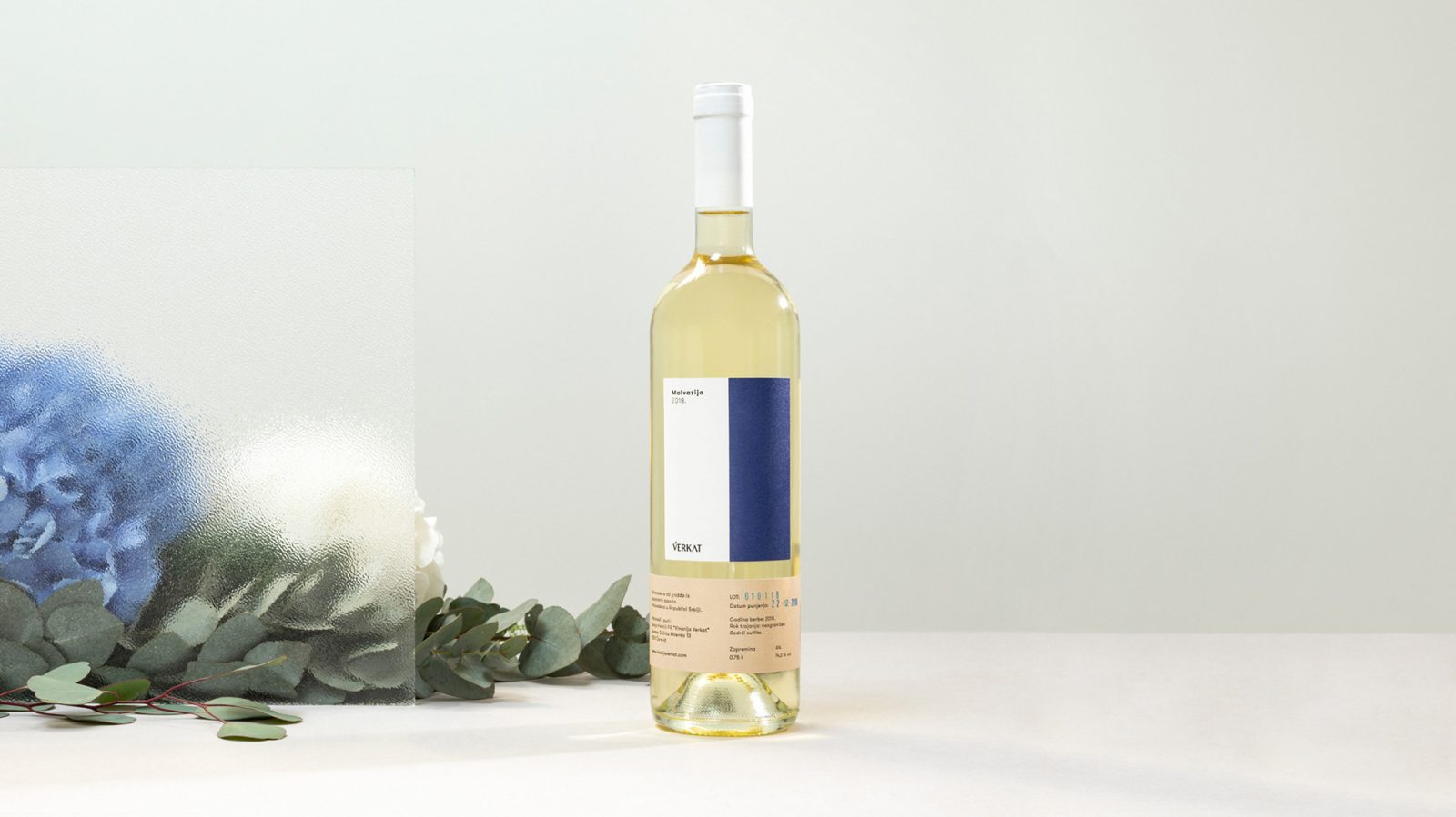
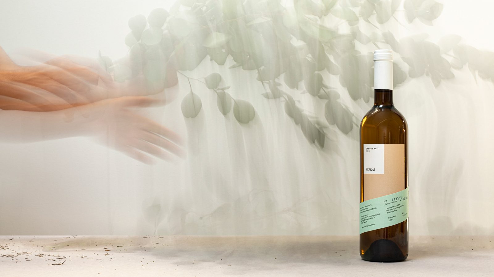
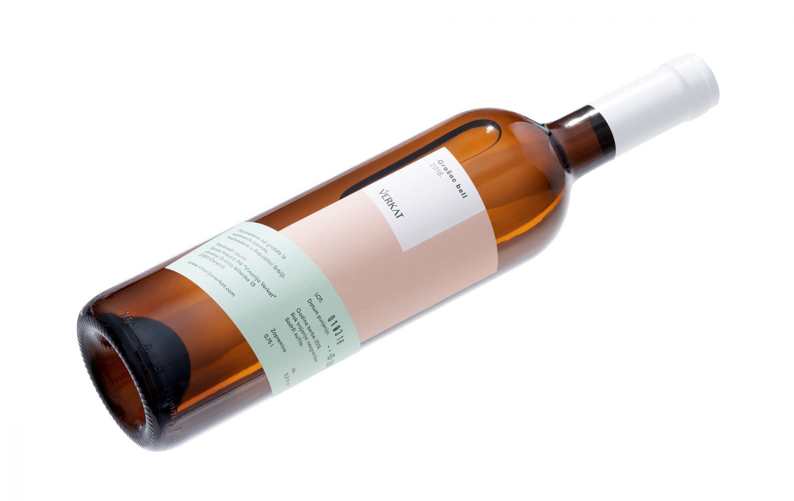
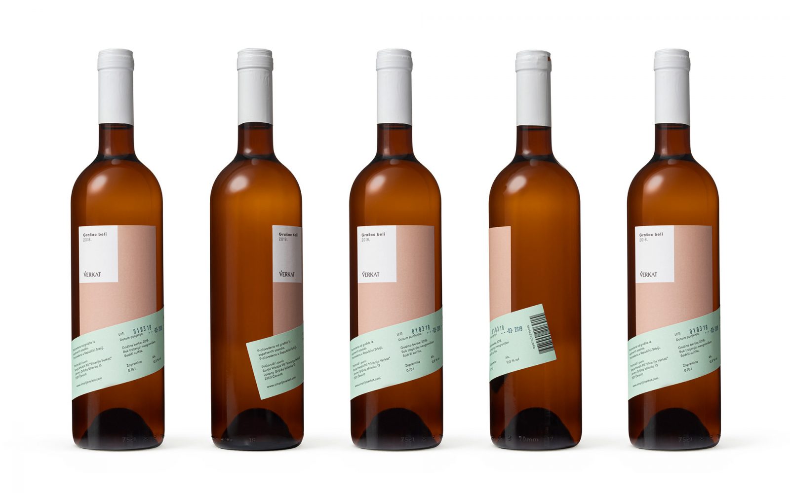
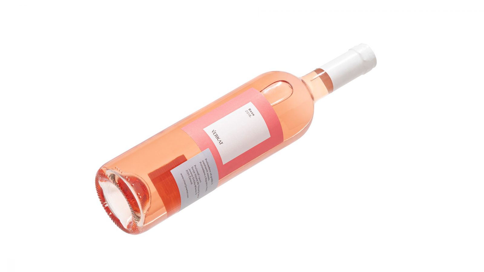
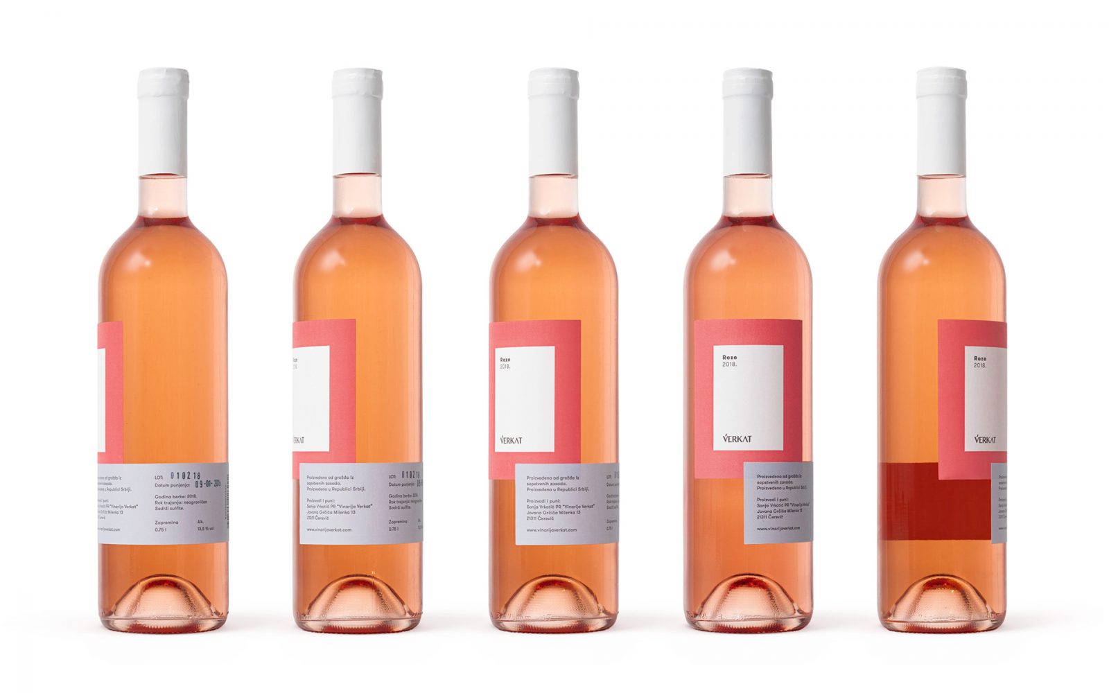
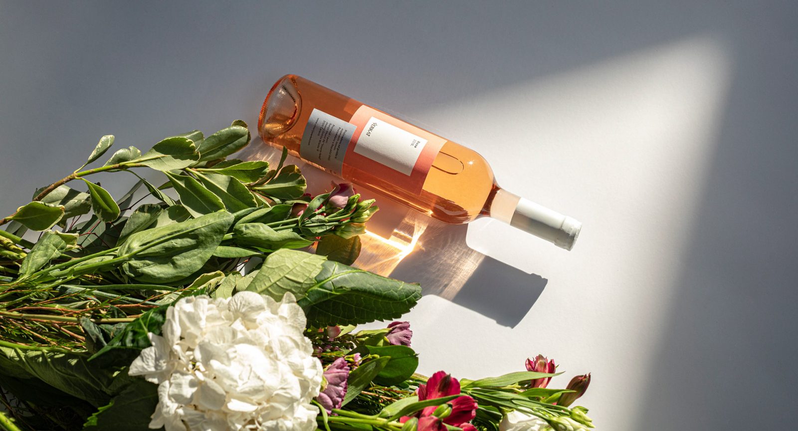
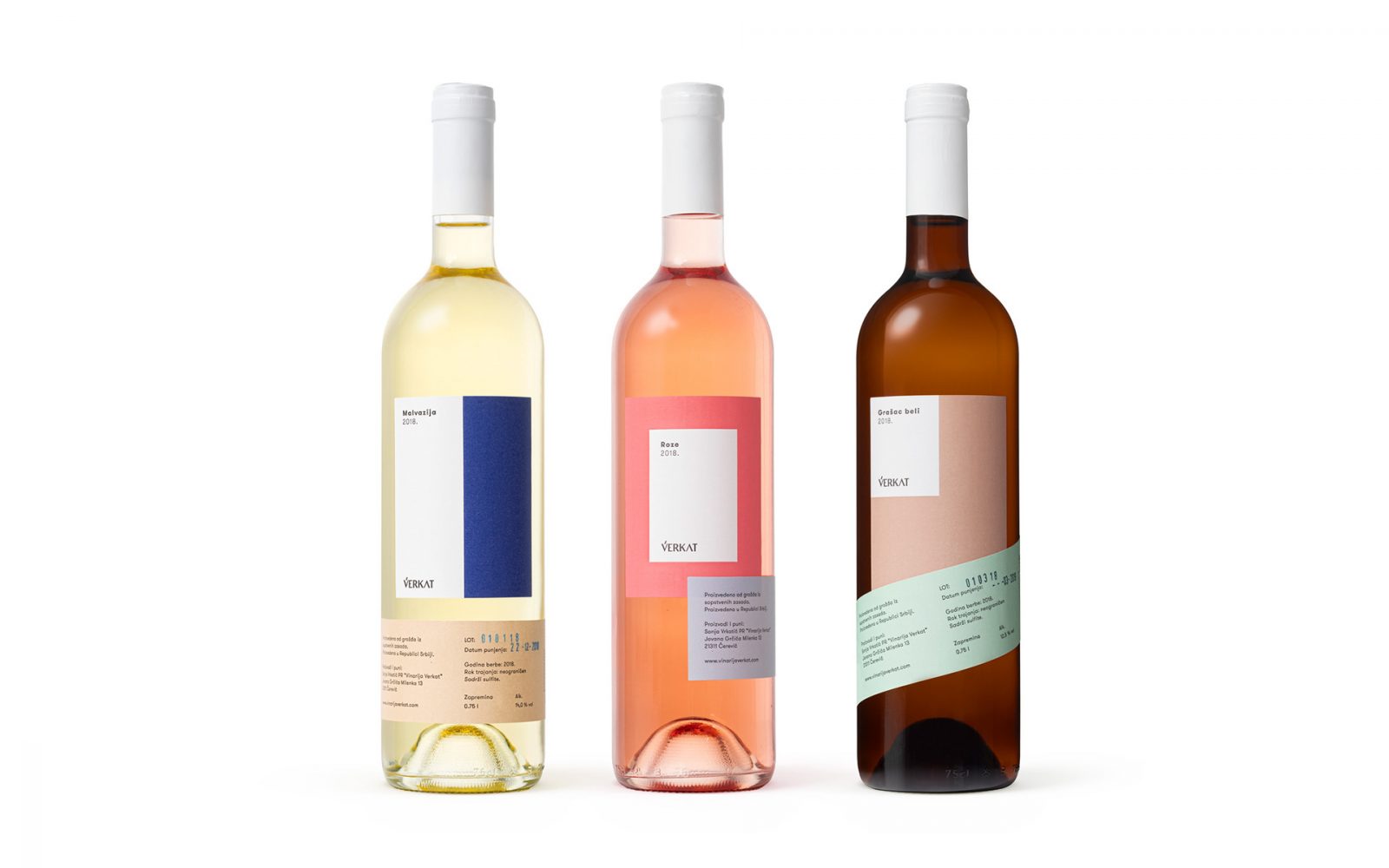
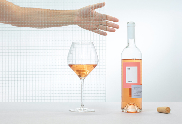
Metaklinika’s latest client, Vérkat, is a small Serbian family winery, whose wine originates from a privately-owned vineyard. Metaklinika designed sophisticated branding and wine packaging for their Vérkat’s Malvasia, White Grashac, and Rose – perfectly representing the light, fruity and floral notes of the wines.
Inspired by modernist forms and shapes
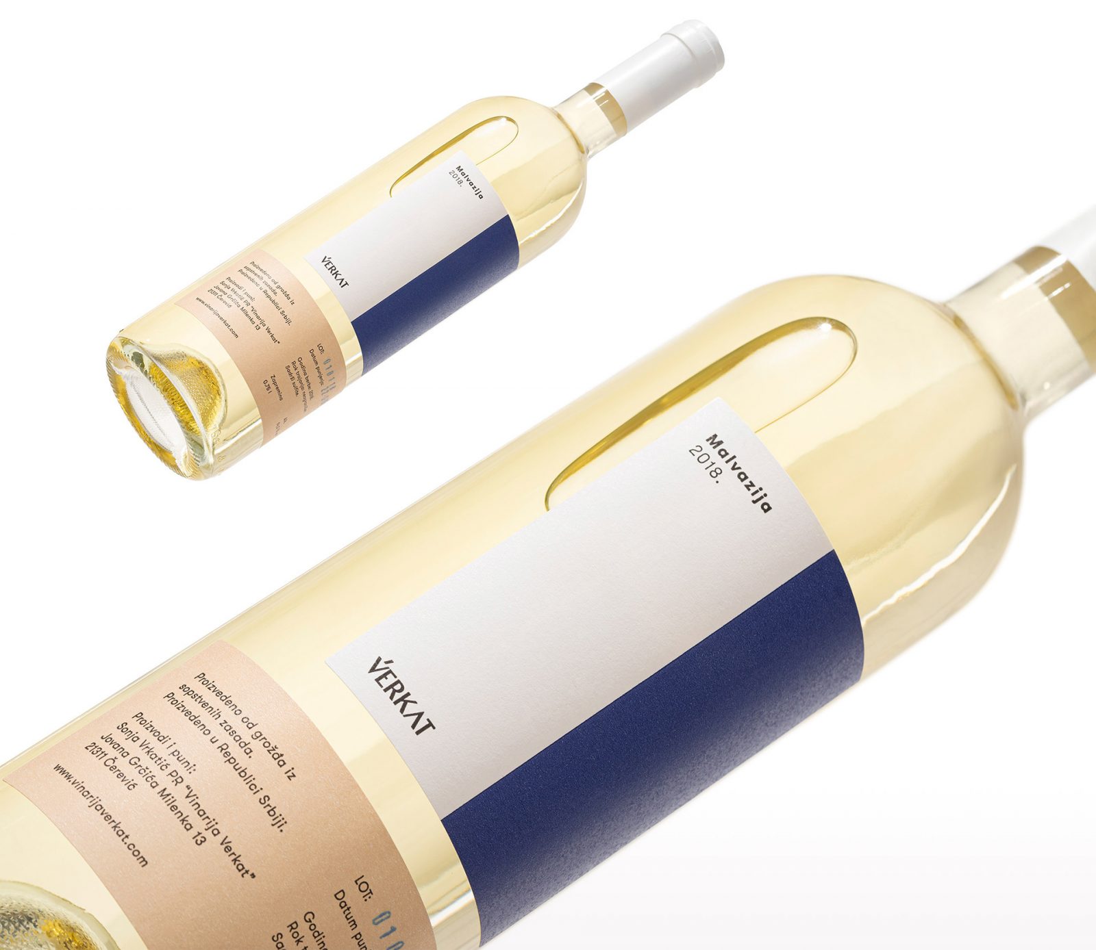
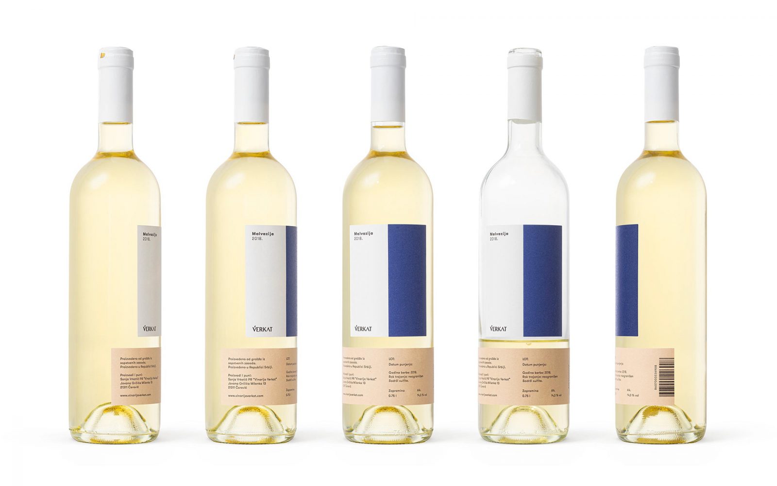
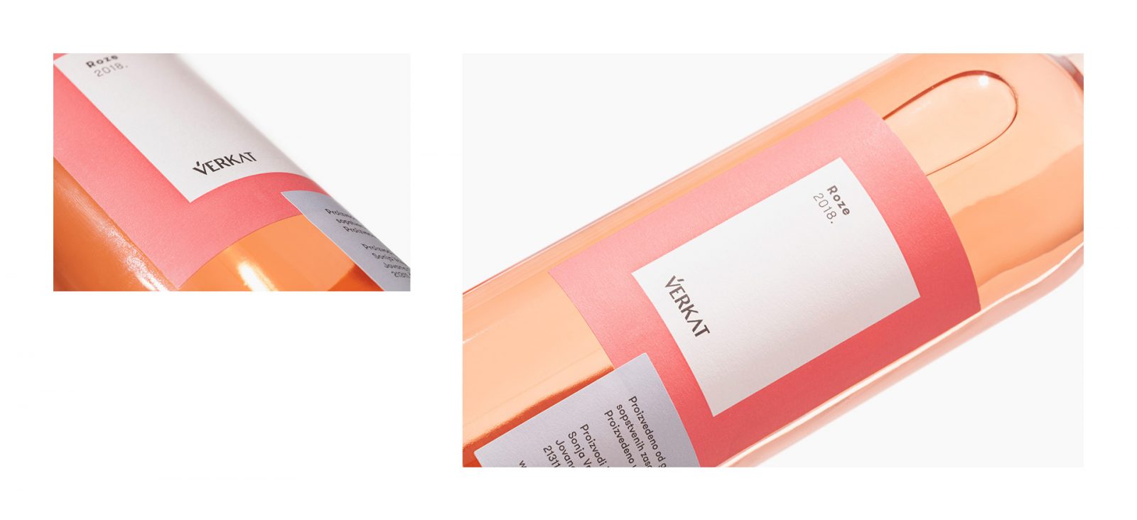
The concept for the design was inspired by modernist forms and shapes, while the very packaging represents a sort of a play of these forms. The bottles contain two labels, one which is always in its designated central place, while the other changes positions. The playful take creates a contrast to the otherwise minimalist design.
The design intends to represent the subtle and layered aroma of the Vérkat wines. The color palette used is derived from the colors of the grapes and wine itself, with thoughtful color combinations separating each variety, royal blue and peachy beige for the Malvasia, pink and baby blue for the Rose, and muted nude with minty green for the White Grashac.
The concept for the design was inspired by modernist forms and shapes, while the very packaging represents a sort of a play of these forms. The bottles contain two labels, one of which is always in its designated central place, while the other changes positions.
The logo is designed typographically and is intended to demonstrate the simplicity of taste and balance of different shades. The logo captures the complex bouquet, where every low-key detail to emphasize some other striking aspect. The typographic simplicity embodies the wines of full, fresh and sophisticated taste. – Metaklinika explains.