
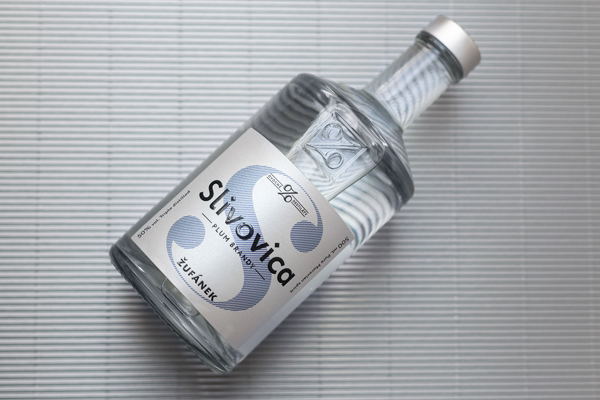
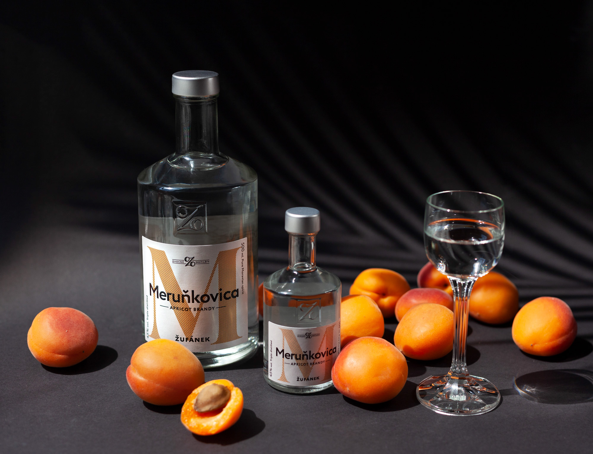
Andreea Bora, originally from Bucharest, Romania, now based in Prague, is a multi-disciplinary designer focusing on branding and packaging. Experienced in creating meaningful, comprehensive branding concept, she redesigned the labels of Žufánek, a well known and beloved brand of spirits in the Czech Republic.
The visual identity and packaging of the fruit brandies and liqueurs had not changed since Žufánek’s founding in 2002, which included an abstract illustration of the fruit, the name of the product in a handmade “woodcut” font and the name of the brand – a style which has since become a standard in the industry. But as the leading brand in the country for its category, Žufánek believed it was time for a change, and asked Bora help it lead the way again with a complete redesign of its brandies and liqueurs range.
The new labels are a more modern, more premium version of the same idea of abstraction. But taken even further, the signifier for each flavor becomes the initial of the products name instead of the illustration of the fruit, therefore creating a new alphabet of alcohol. The new labels have a system of information that gives the consumer more details about the product, including a category denominator on the top, production process on the left and English translations of the product names.
The redesign included the development of labels for new, 100ml bottles, as well as the re-imagining of the differentiation between the basic fruit brandy and the more premium, oak barrel aged fruit brandy. The resulting design is a stylish, contemporary take of a traditional product, sure to win over the hearts of new consumer groups.


Images © Andreea Bora