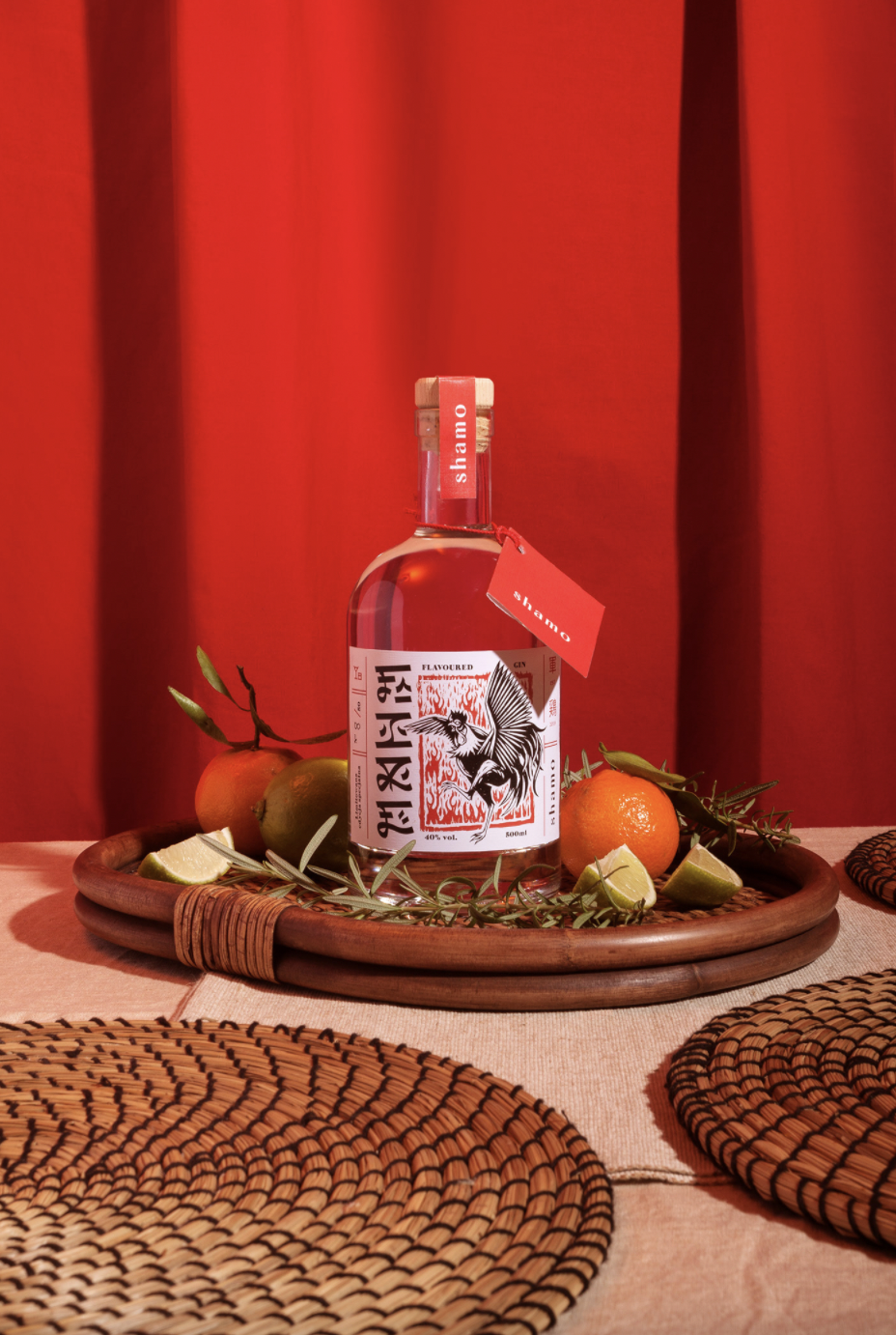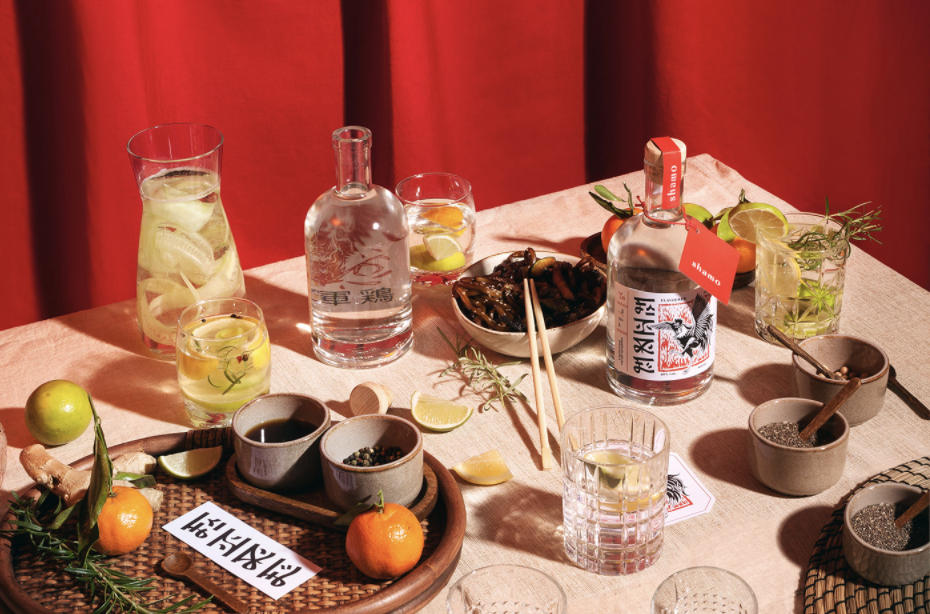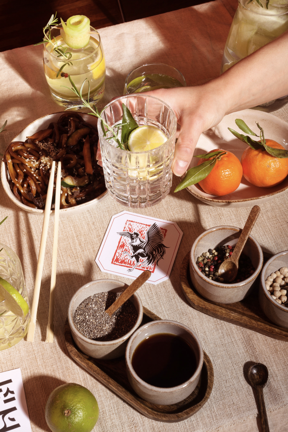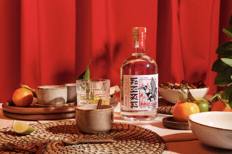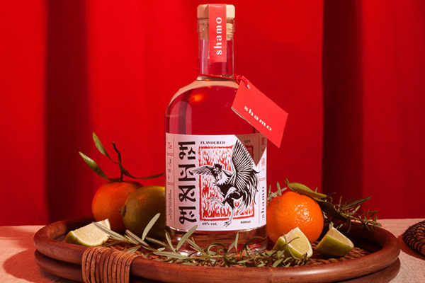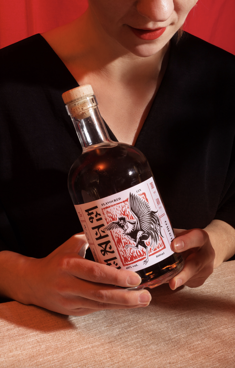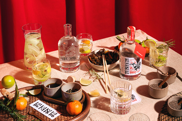
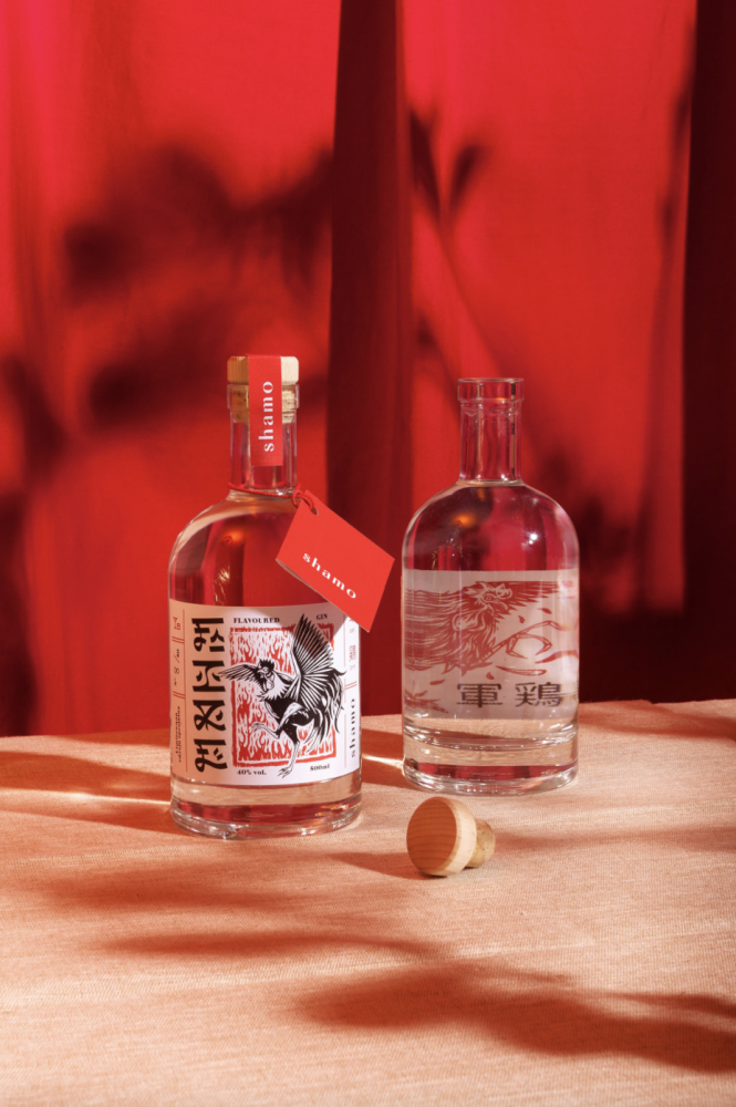
A limited edition of 50 bottles of fire-flavored gin was gifted to the restaurant’s most solid partners
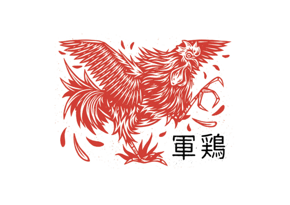
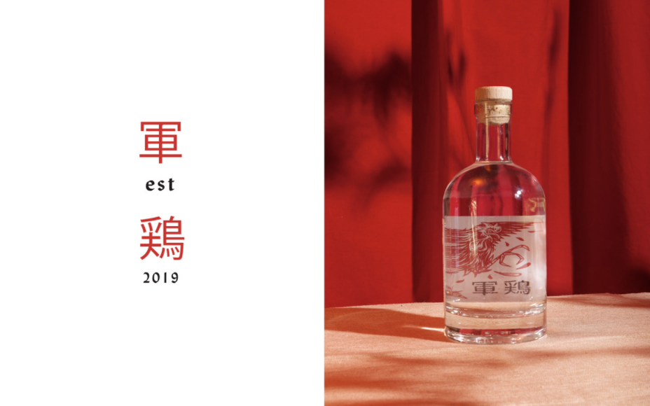
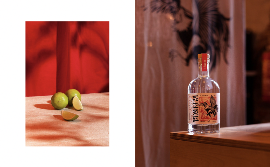
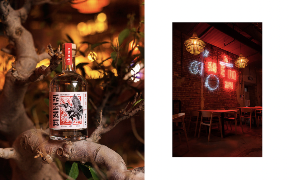
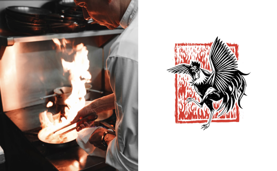
The name of the restaurant – Shamo – in Japanese means combat hen. An icon that was an obvious choice for the main element in the identity and label for the bottle. If not during these hard times, when, would a fighting spirit be more needed?
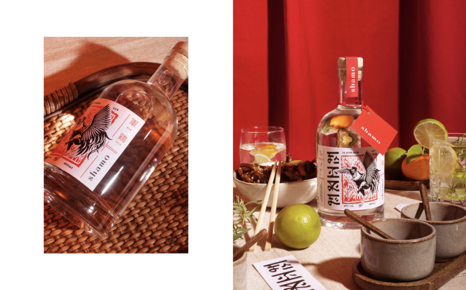
The hen illustrations on the bottle label were made by Maciek Polak, a talented designer and illustrator (previously featured here) who has experience in various design projects, and was recently awarded the 2021 Award of Excellence in Communication Arts, Illustration Annual. Polak’s work for the Shamo gin fits perfectly with the restaurant’s visual identity and style and atmosphere.
The limited-edition gin was named Fire, inspired by the very hot and fiery situation of the moment. “A nice word describing a bad situation in the restaurant sector”, the design team says.
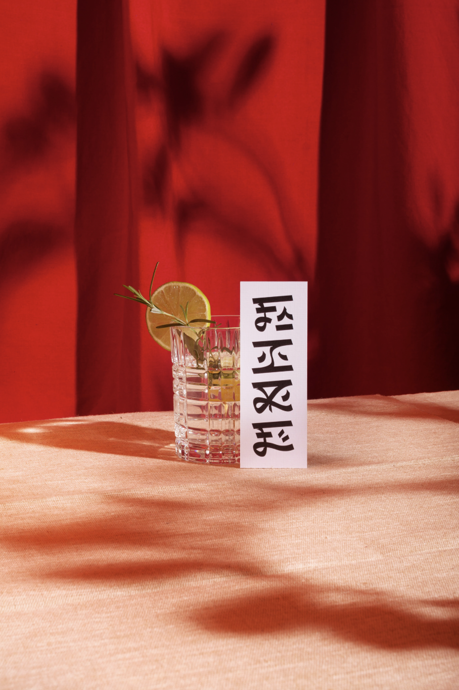
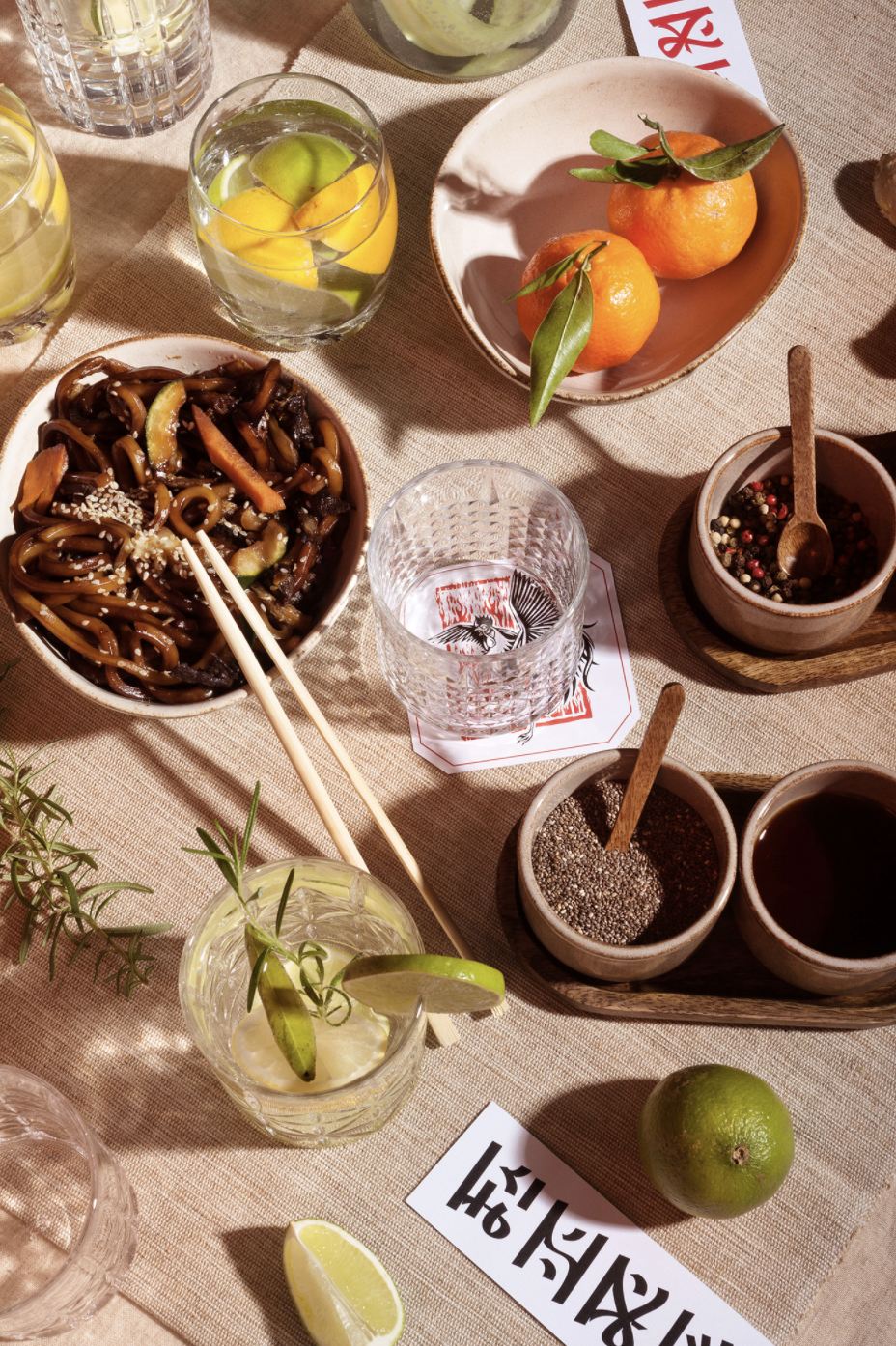
The limited-edition gin was named Fire, inspired by the very hot and fiery situation of the moment. “A nice word describing a bad situation in the restaurant sector”, the design team says. “From the first line to the last we created a custom font to reflect the brand’s personality. Maintaining harmony in the typography with a modern and simple look. We took a lot of inspiration from the Japanese language and alphabet to create our own style but at the same time communicate our own unique character. That was our mission”, the Unifikat design teams explain.