
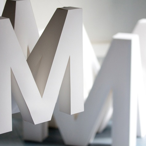
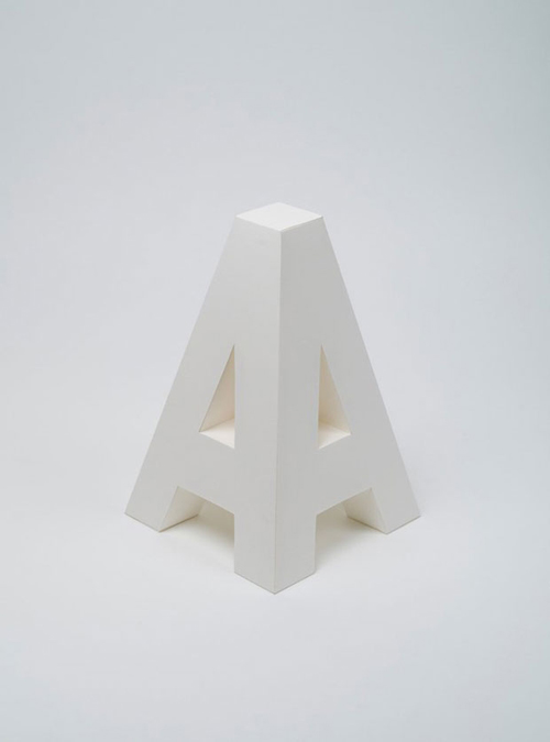
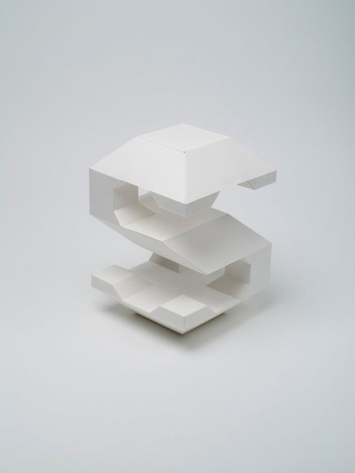
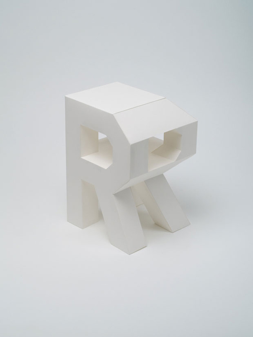
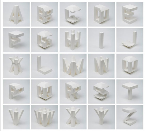
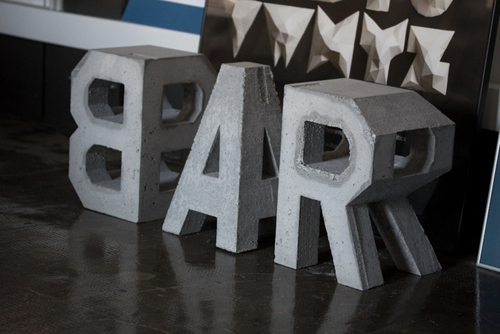
Barcelona based graphic design company Losiento has created a set of sculptural letters that can be read from all sides. The studio had been working on several projects relating to architecture when they decided to try out “four-dimensional” typography. A very original and unique project, bringing pure excitement into the smiles of typography enthusiasts like us.
Let me start off by saying, yes, I know these aren’t exactly four-dimensional letters in their purest form and laws of physics, as that would entail more than just the same visual image from four sides. But as these are pretty much the closest thing ever even tried towards it, more of conceptual sculptures, I say it’s pretty damn impressive. And the fact that they were crafted out of our favorite medium paper, makes them that much more amazing.
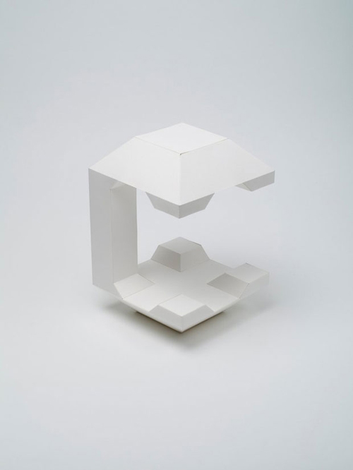
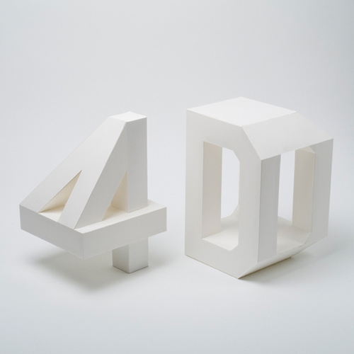
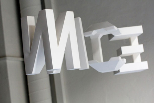
The designers of Losiento constructed the letters from pieces of white carton. First figuring out the structure with the help of a computer modeling program, then printing out the intricate pattern and finally cutting, folding and gluing the letters together. Check out the video in the end that shows exactly how one of the letters was constructed from start to finish, and you see it’s way more complicated than thought. It really takes a creative mind to do this. And it’s cool how when the letters are strung up, the reader can walk around and see the words and read them from any direction. Thus making them “four-dimensional”.
The original inspiration for the design was architecture. How an observer searching to enjoy a particular architecture is forced to move around and through it. The change in perspective generates new spaces in which light acts in different ways. In this case, it is the typography that makes the effort of abandoning its two dimensions to approach the architectural sense. It does not resign with a third dimension; a fourth one is necessary to complete the reading possibilities. By hanging the typography, the reader is allowed to surround the characters in order to understand all their shapes.
– Losiento
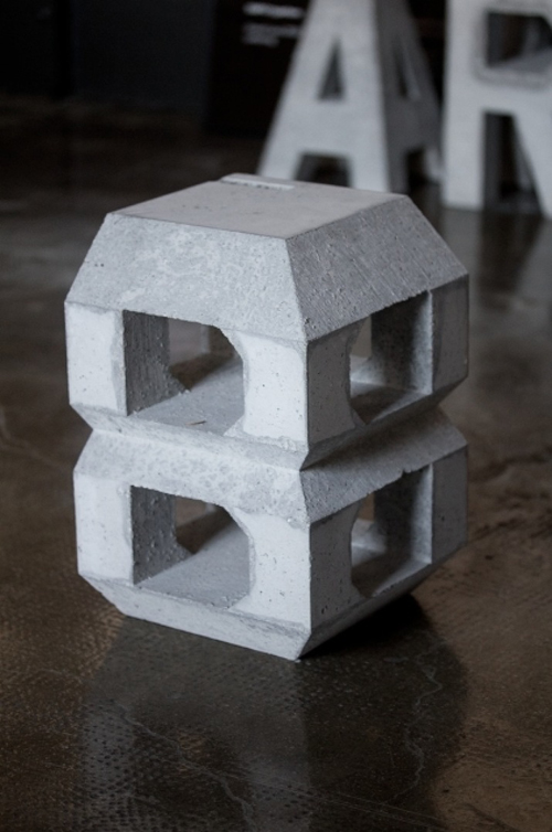
The project originally started back in 2012, but got a sequel last year when Lo Siento produced a second series of 4D typography out of concrete. How the original paper versions work more of conceptual art pieces, the concrete versions can be utilized as stools, part of the interior. We love both versions, and truly believe these to be some of the most creative and inspirational typography designs we’ve seen in a while.
You are currently viewing a placeholder content from Vimeo. To access the actual content, click the button below. Please note that doing so will share data with third-party providers.
The movie is by Marcel Battle and Lander Larrañaga.
Photos © Losiento