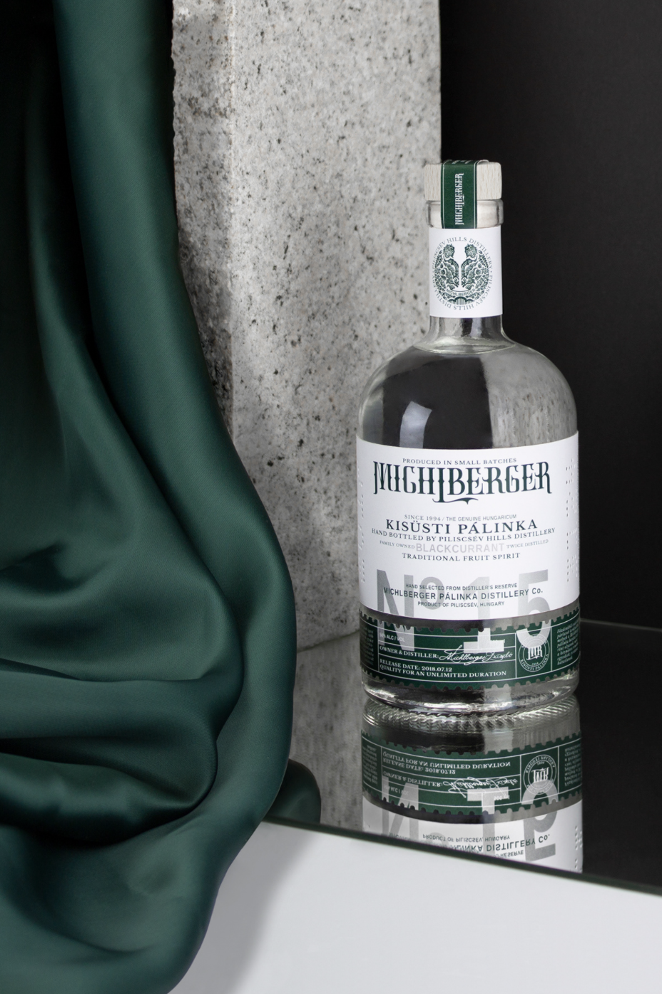
Pálinka, a traditional type of distilled fruit spirit, might be one of the most famous Hungarian specialties. Invented in the Middle Ages, pálinka is now protected as a geographical indication by the European Union and is even regulated under local Hungarian “pálinka law”. The strong beverage that has a deep historical and cultural significance crossing centuries, is gaining popularity among specialty alcohol hobbyists and connoisseurs, as a younger generation is taking interest in the unique drink. One manufacturer helping in continuing the story of pálinka to the 21st century is Michlberger Distillery and their newly rebranded blackcurrant flavored Kisüsti Pálinka.
Reviving and uplifting a traditional pálinka brand with a unique, interesting, and elegant rebranding
The Michlberger manufacture in the Piliscsév region in Hungary is a family venture, where multiple generations work together to distill the fruits of the Pilis valley into bottles. Michlberger distillery commissioned Budapest based graphic designer Kristof Balla to redesign the visual identity of their flagship product, and help revive the Kisüsti Pálinka brand.
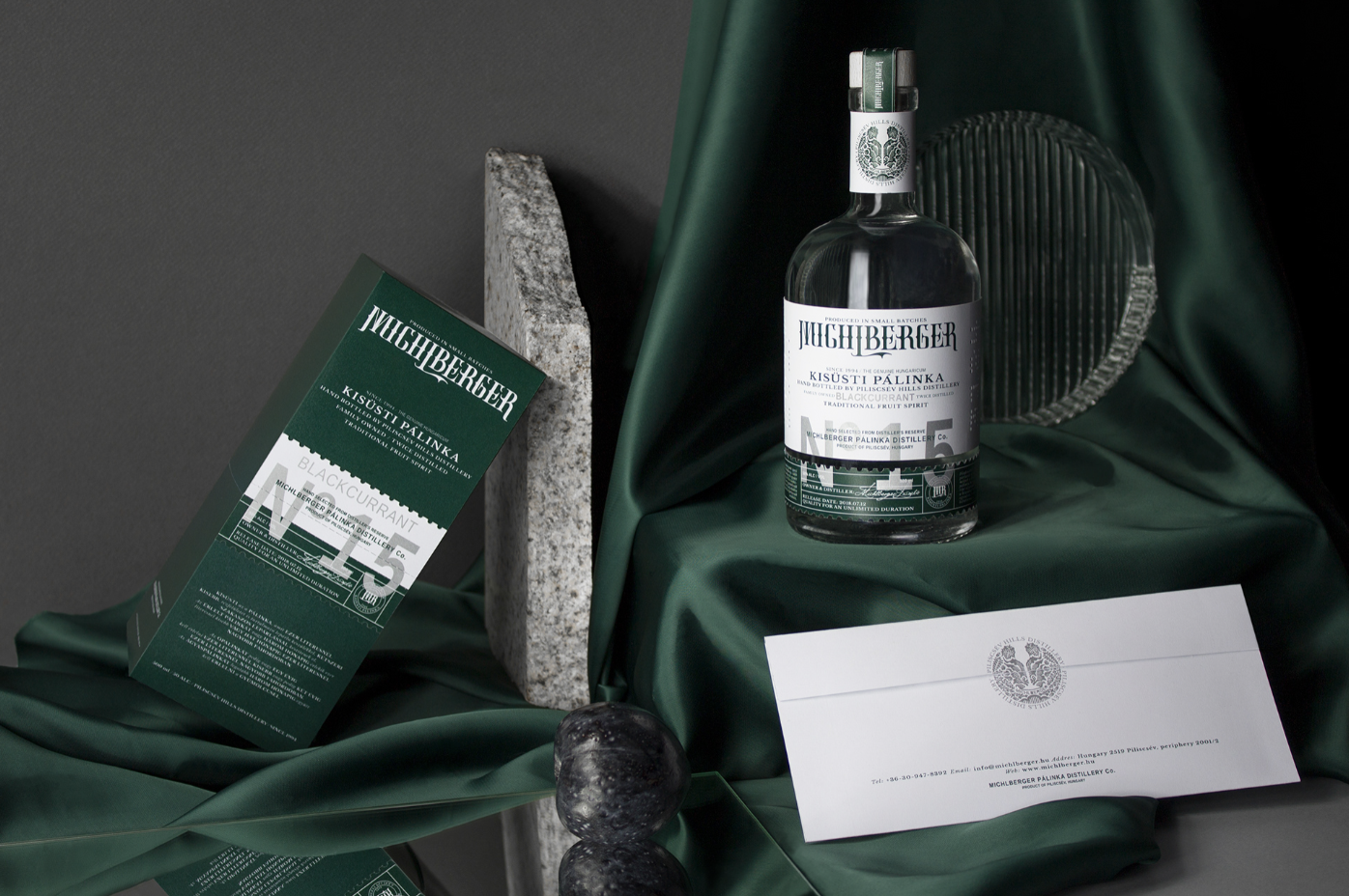
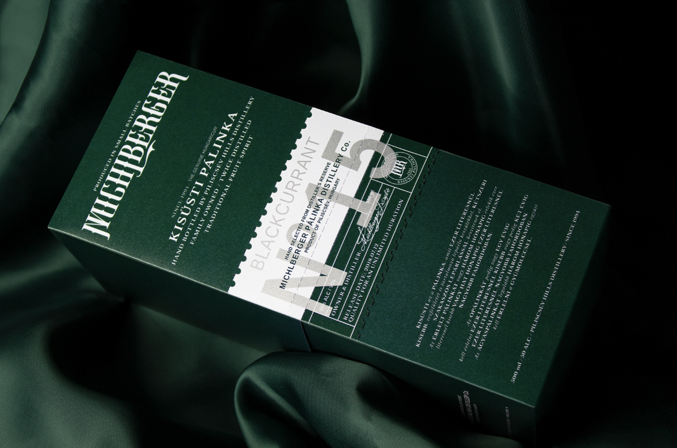
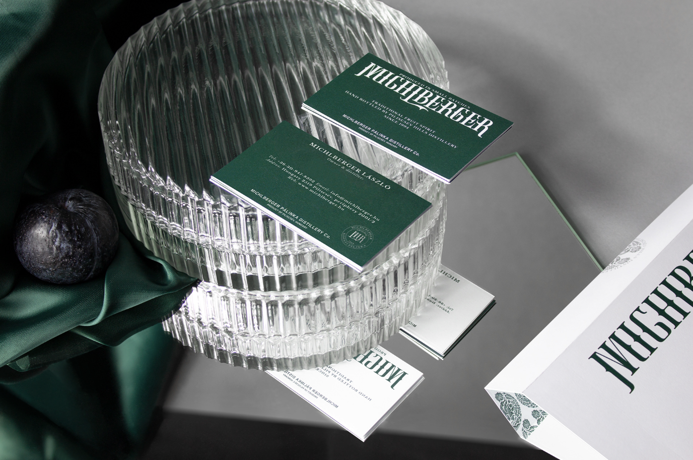
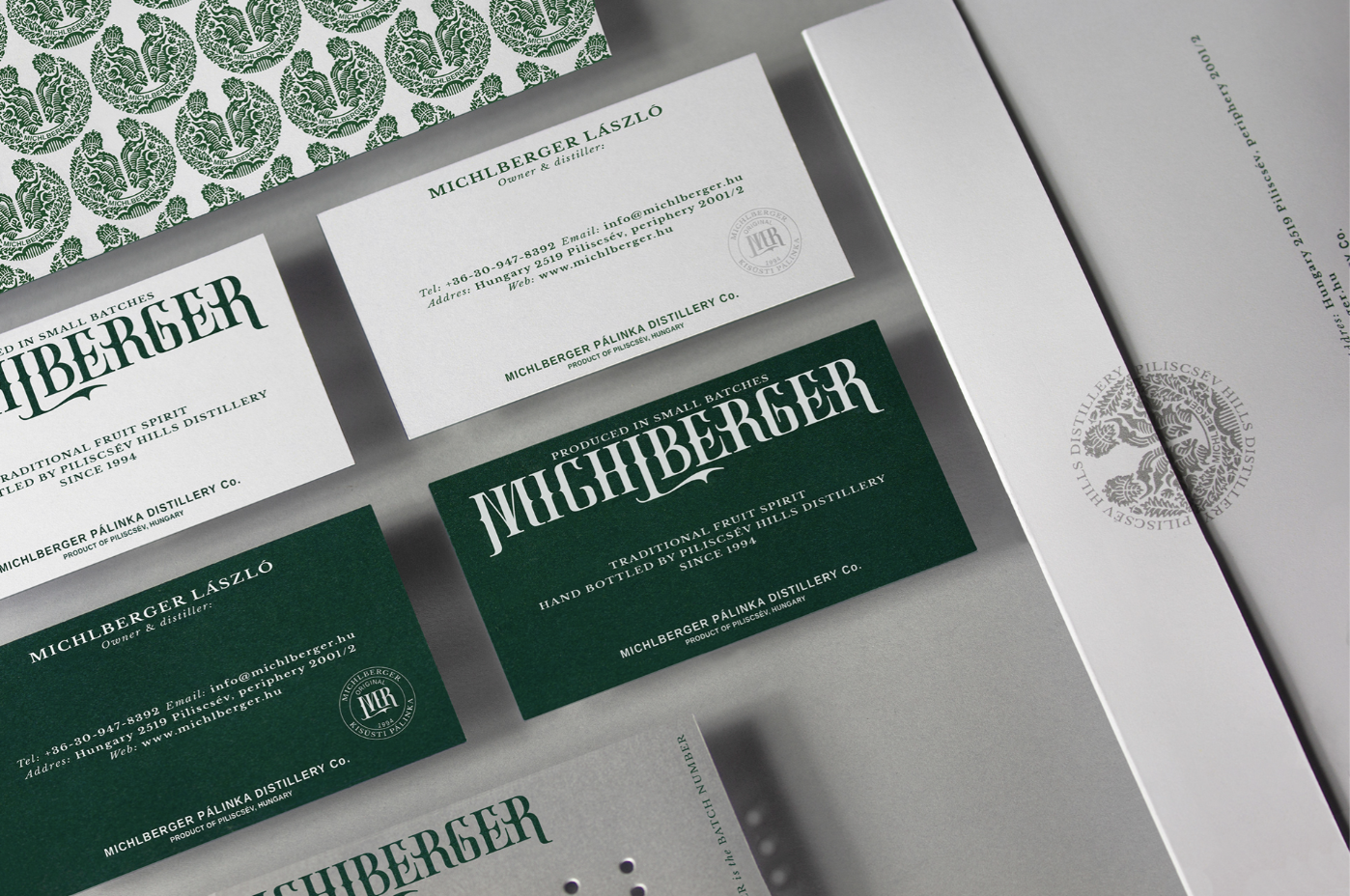
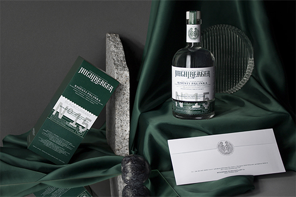
The Michlberger distillery only produces small batches, from 100% Hungarian fruit, making their product unique and original. This quality is now further supported by the graphic design elements of its identity. The redesign is supporting not only the revival of the brand and the reflection of the product’s quality but also lifting the brand to a premium, yet affordable level for the consumers. Balla’s concept for branding and packaging is unique, interesting, and elegant. The Michlberger brand’s core is a functional system, which is easy to recognize, and also possible to develop and expand further in the future.
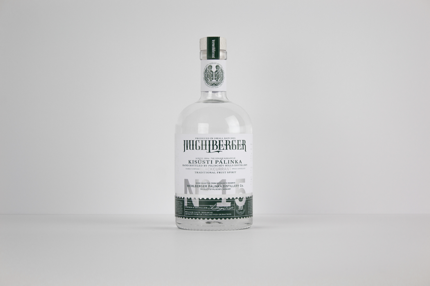
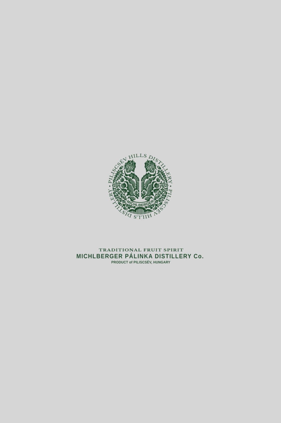
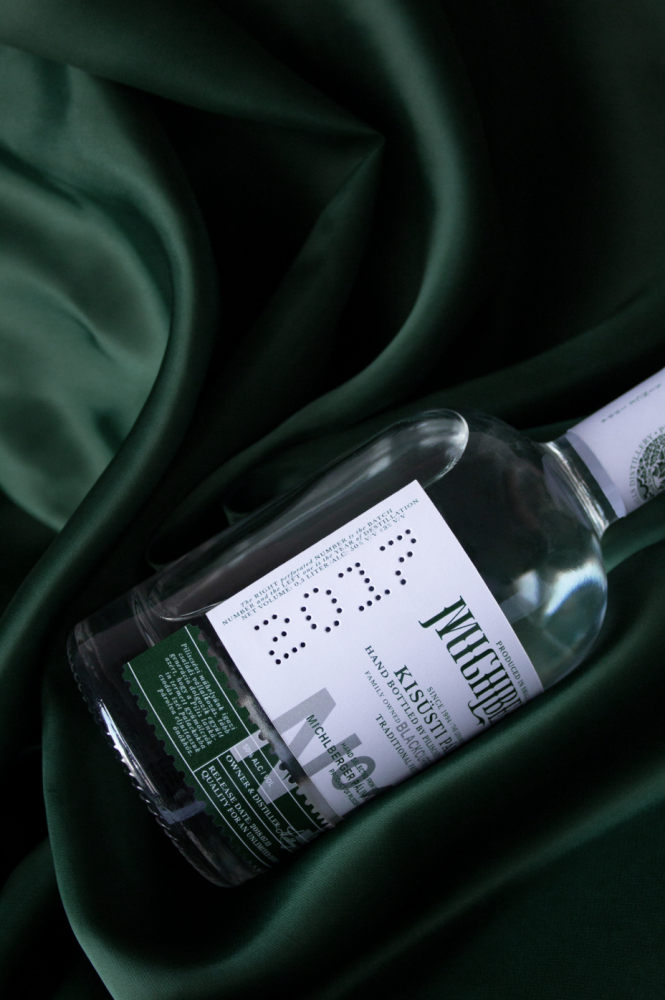
The specialty designed emblem reflects the traditional Hungarian folk motives, including the form of the tulip-shaped glass used to enjoy pálinka
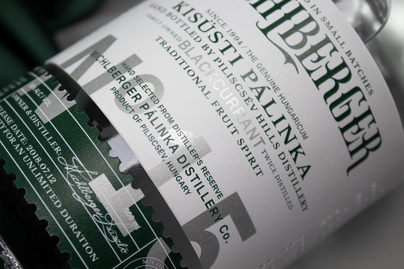
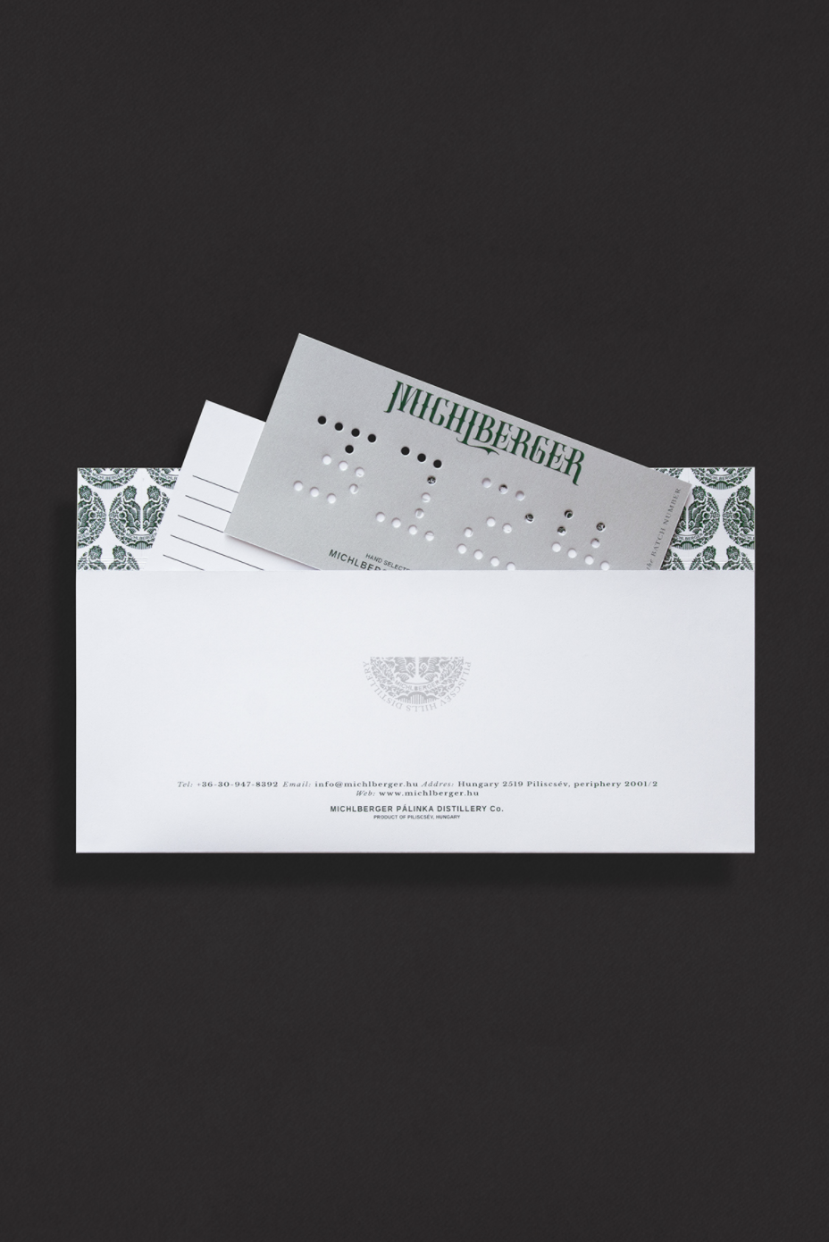
The Michlberger brand’s uniquely designed logotype reflects the rhythm of organic shapes and features rules of classic typography. The stamp-like emblem brings together the crest of Piliscsév with traditional Hungarian folk motives. The negative space shows the traditional tulip-shaped palinka glass. Another unique element in the graphic is the punched production date and serial number, which suggests a hand-made and limited edition product. The label follows a classic structure, bringing the consumer’s attention to the most relevant product information, using clean typographic elements. The colors of the materials complement each other, bringing both a clean and elegant appearance and a connection to nature.
For more inspiration, follow Kristof Balla on Instagram and read the 31 Beer & Wine & Spirit Label and Packaging Designs Full of Character article.