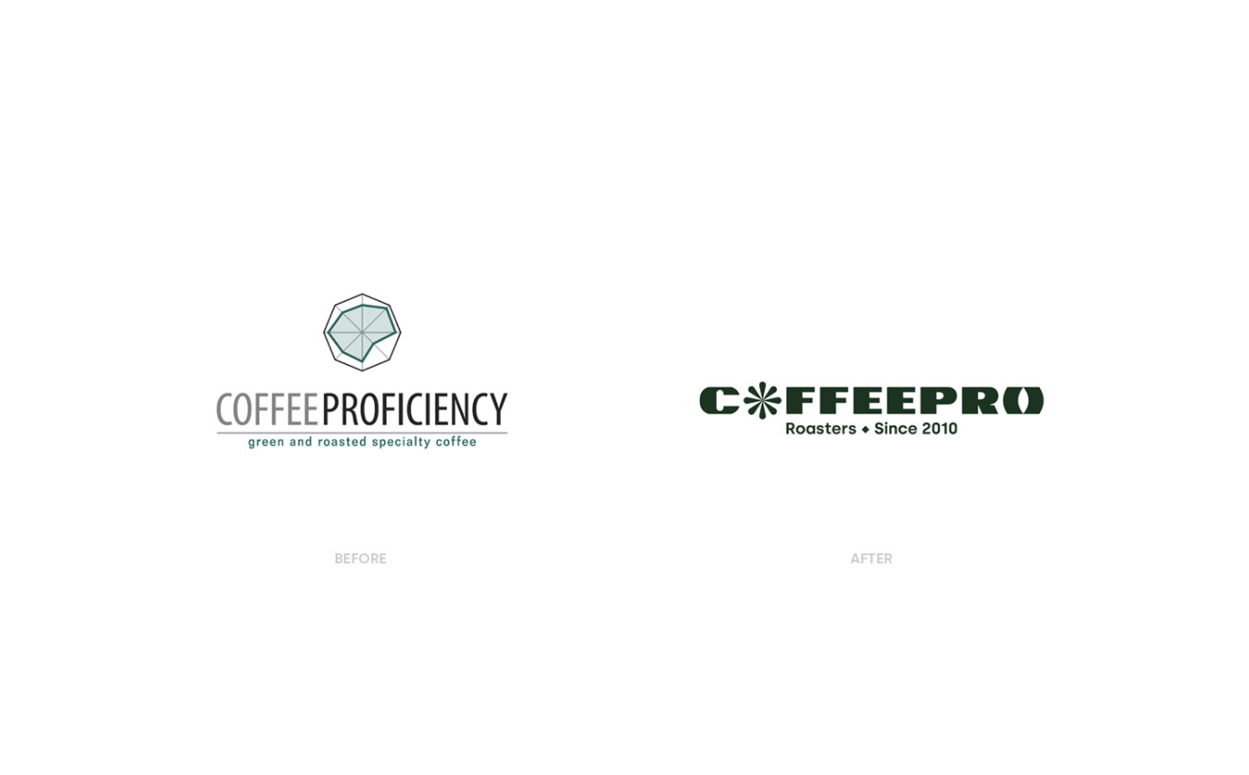
In late 2020, Polish graphic designer Bartek Bojarczuk, aka Illcat (previously featured here), partnered with Coffee Proficiency to work on creating a new, refreshed visual identity for the brand. As one of the oldest roasteries in the Polish market, Coffee Proficiency needed a fresh, new look – “one that would emphasize innovation and uniqueness that was always in the core of the brand but had gotten a bit dusty”, as the designer put it.
Along with a new name, a bold, fresh new visual identity based on the Polish design tradition was created
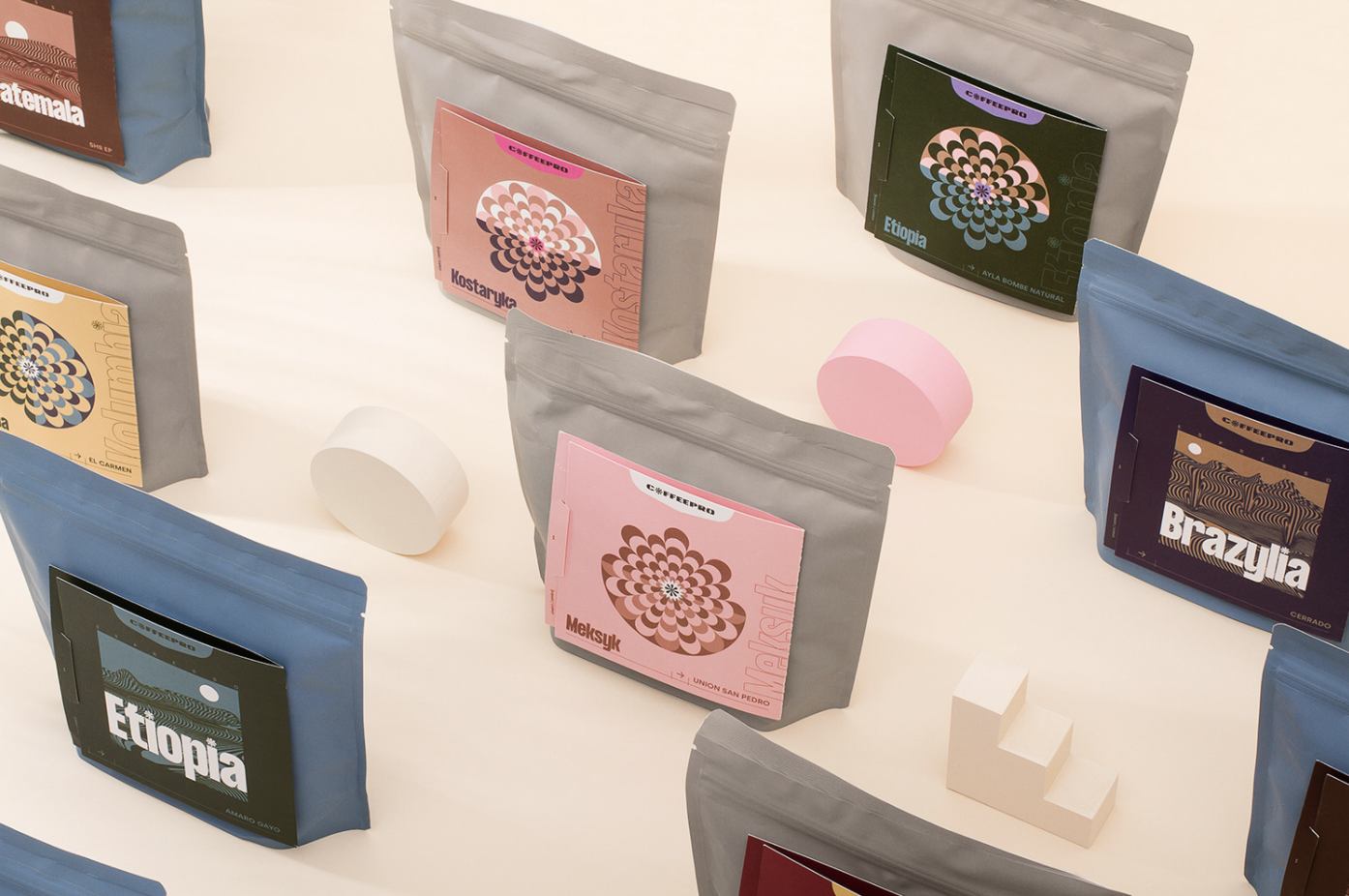
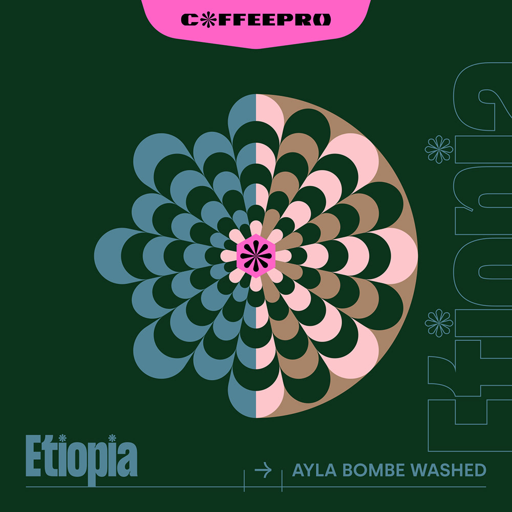
“We created a completely new, colorful, and bold visual language based on the Polish design tradition with references to coffee origins and sharing knowledge of the craft”, Bojarczuk says. The first task to tackle was renaming and logo development. The obsolete typography and logomark had to go, making place for a more modern concept that will hopefully serve for years to come. Coffee Proficiency changed its name to COFFEEPRO.
We created a completely new, colorful, and bold visual language based on the Polish design tradition with references to coffee origins and sharing knowledge of the craft.
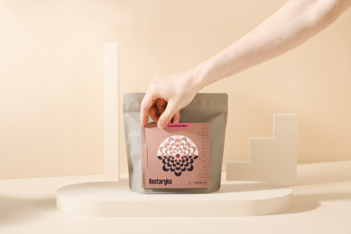
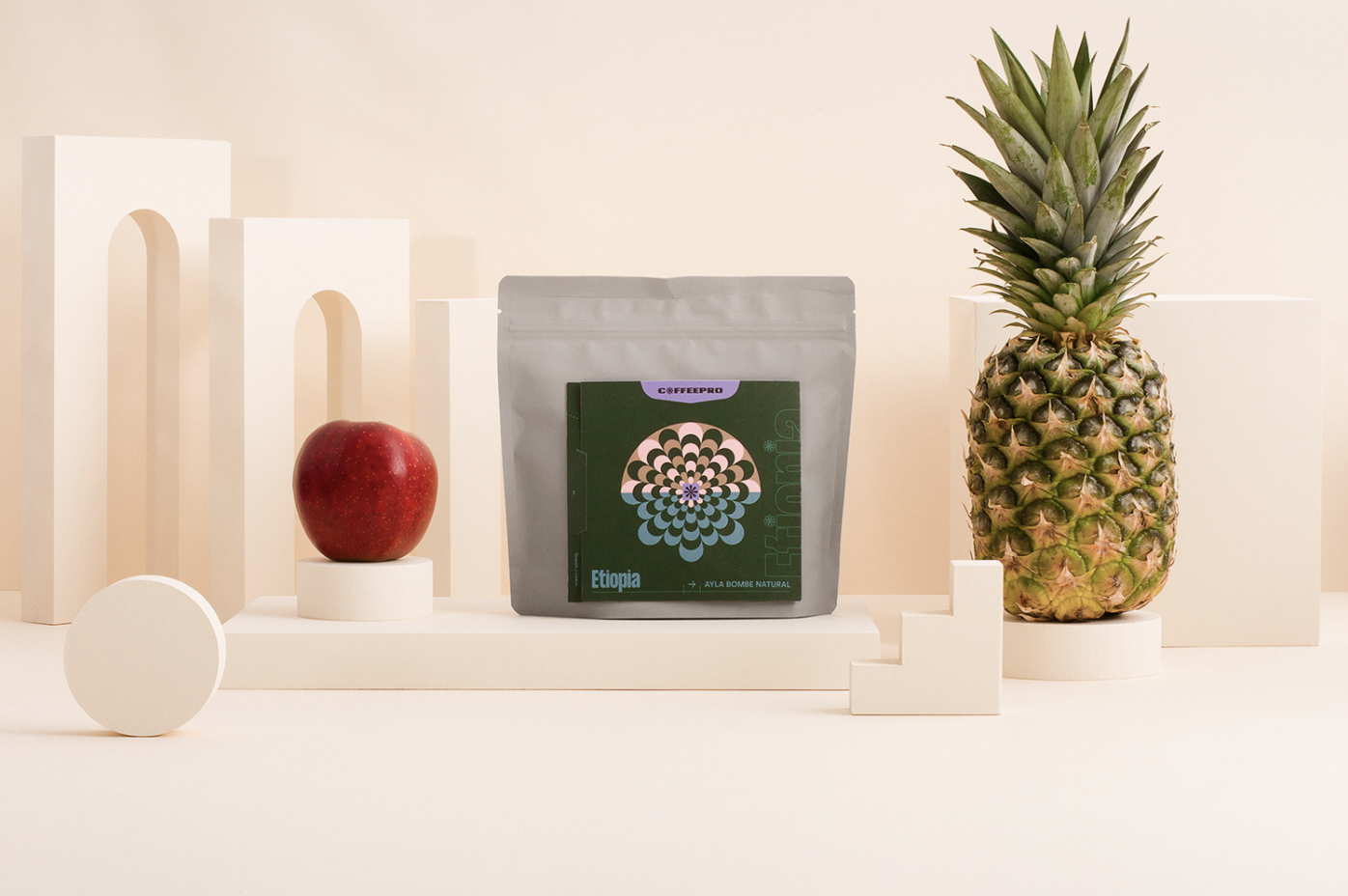
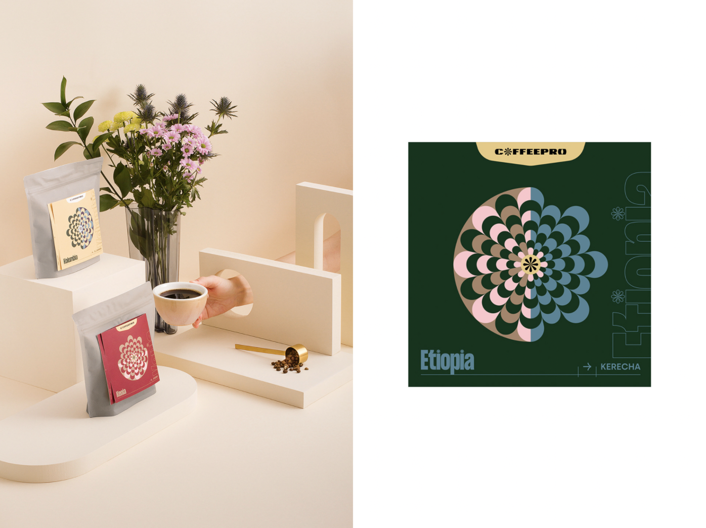
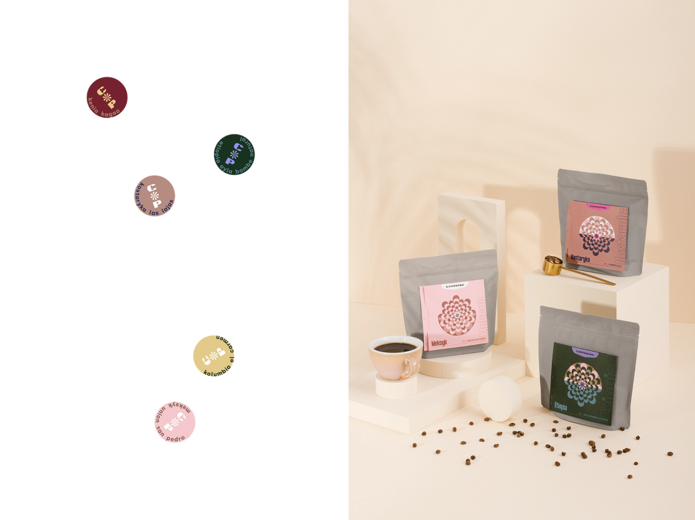
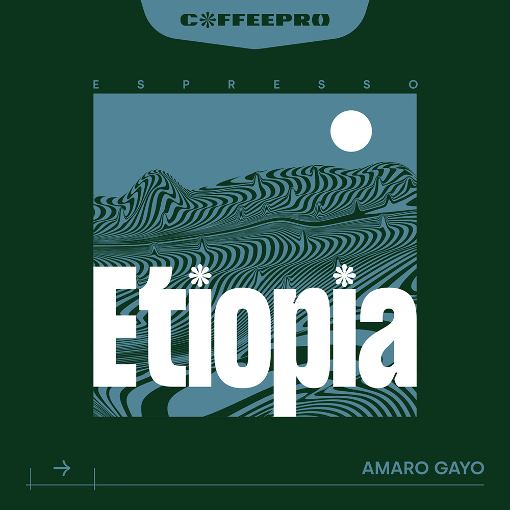
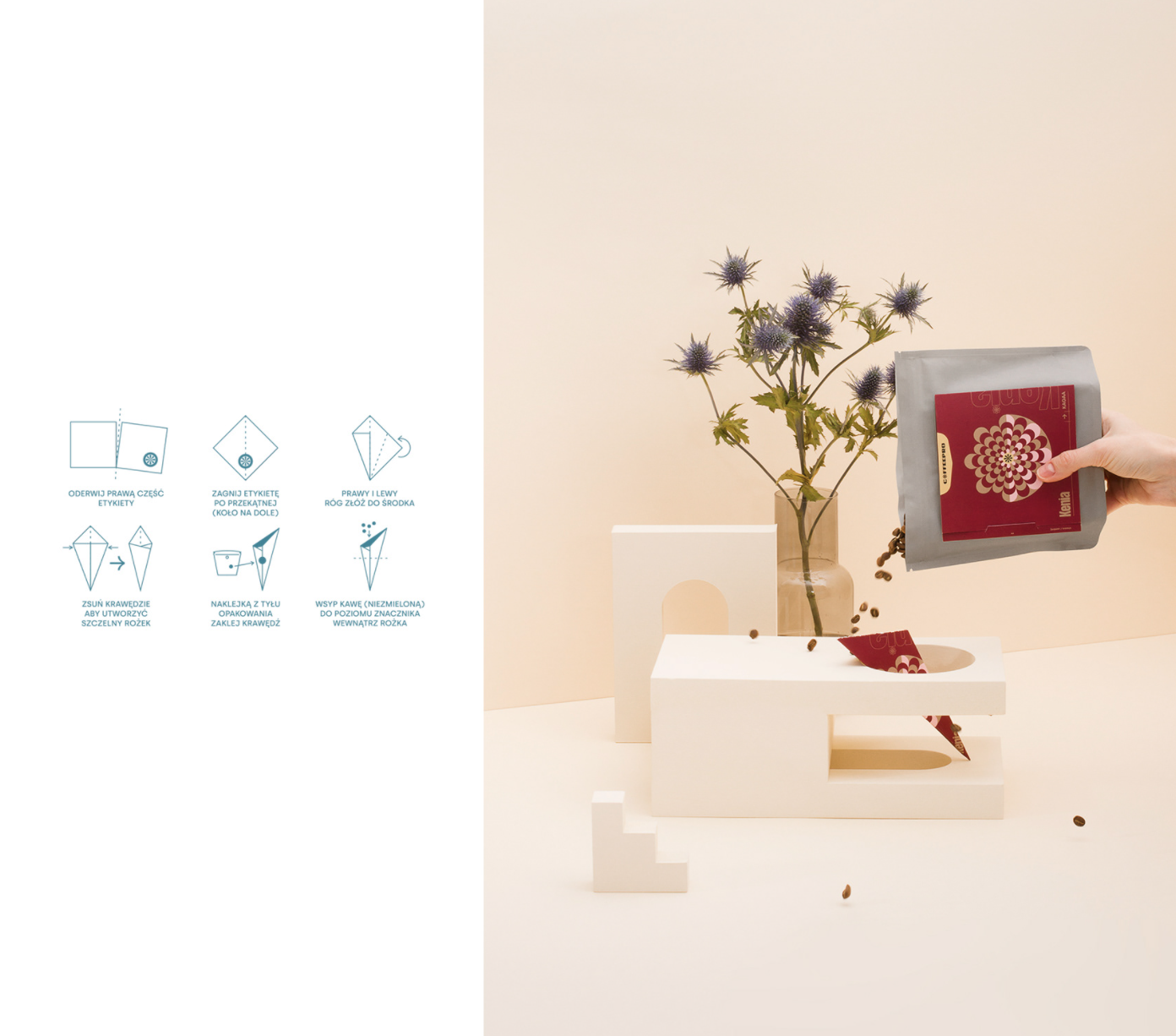
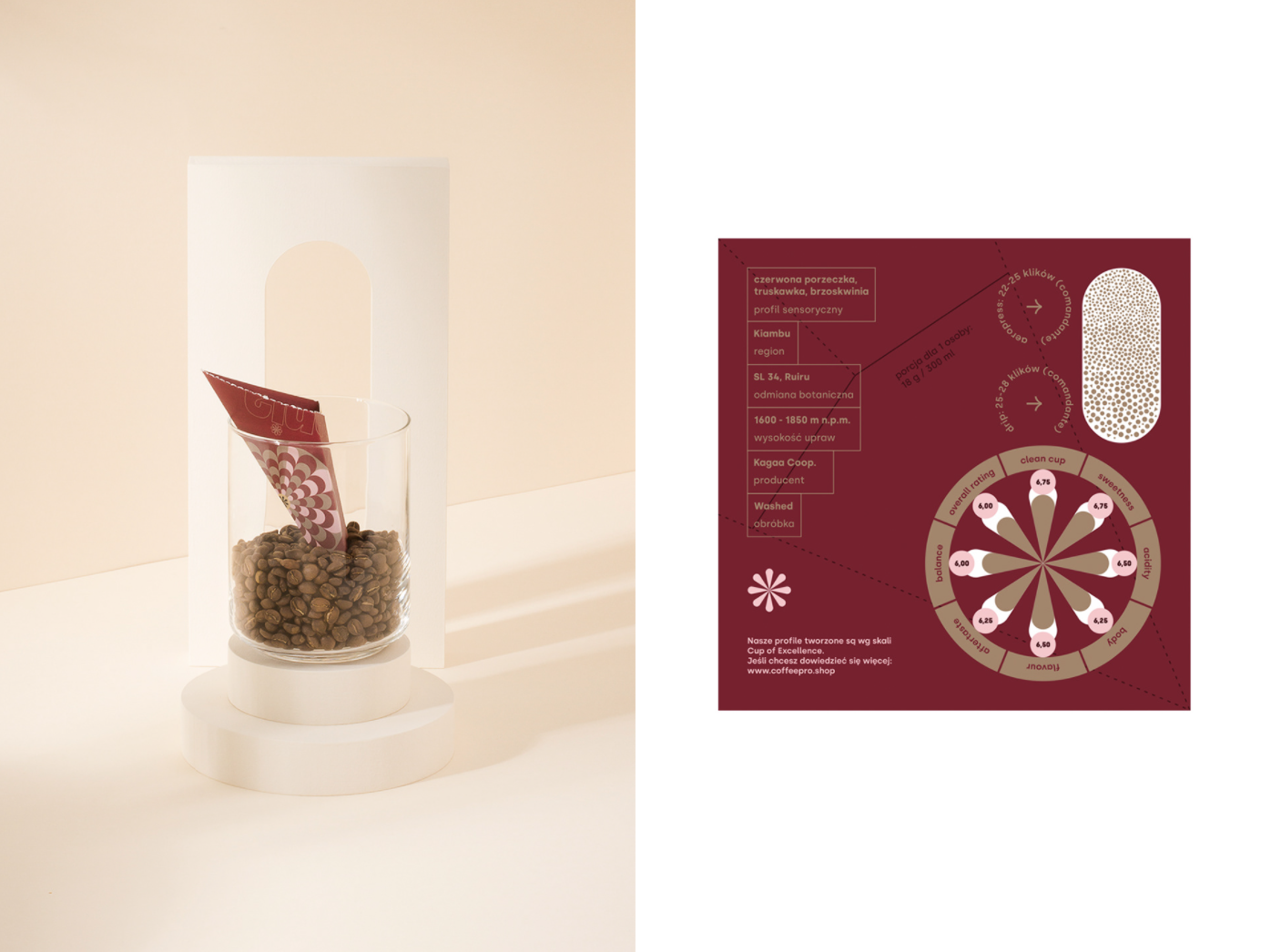
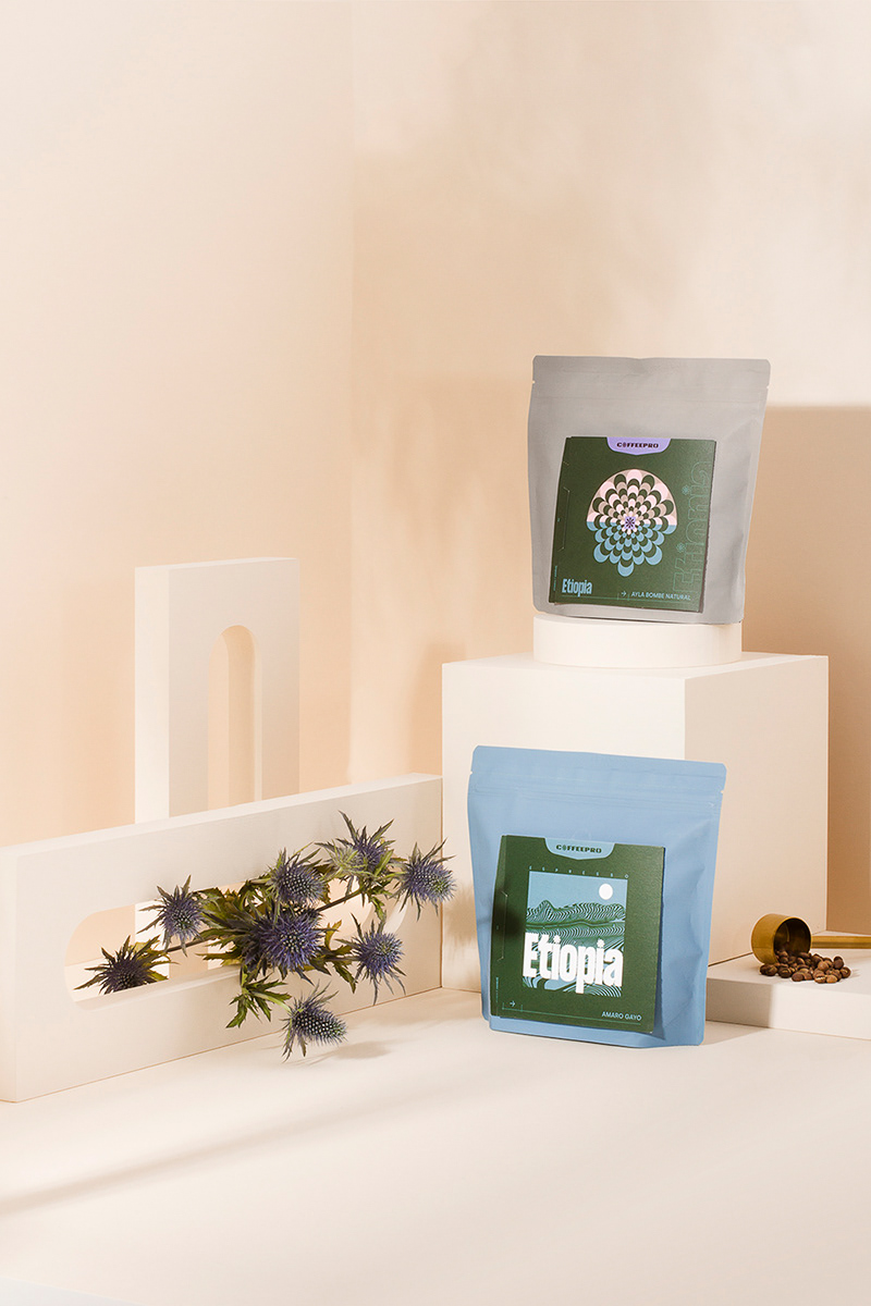
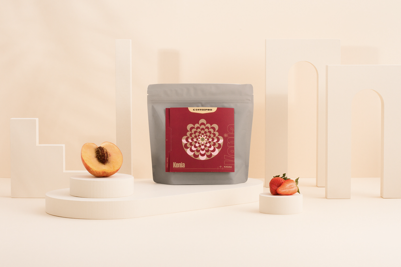
The logomark was inspired by the coffee plant, the sun, and the asterisk symbol that stands for passing knowledge. The characteristic graph was strongly identified with Coffee Proficiency before. It appears on judging cards during the cupping process and helps define the best coffee among all others. “We wanted to keep it, but on our own terms”. The mark was also the foundation for the filter coffee label design.
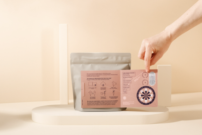
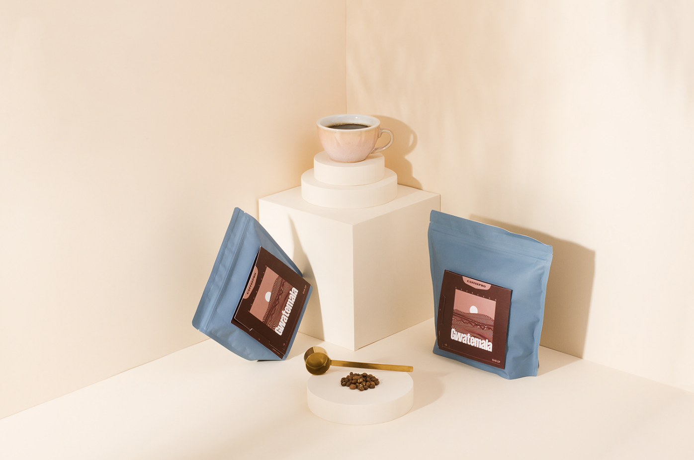
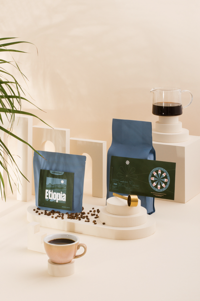
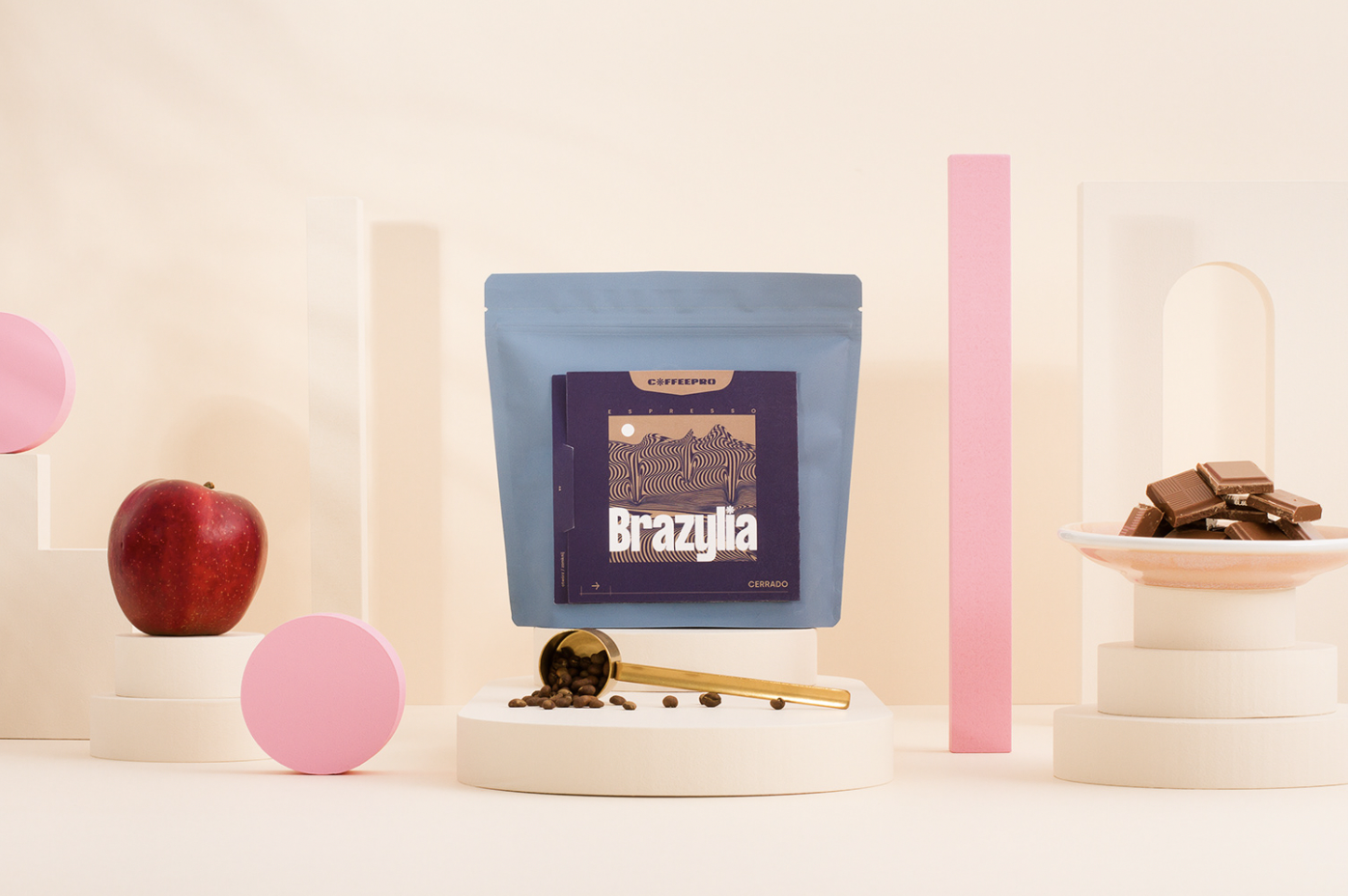
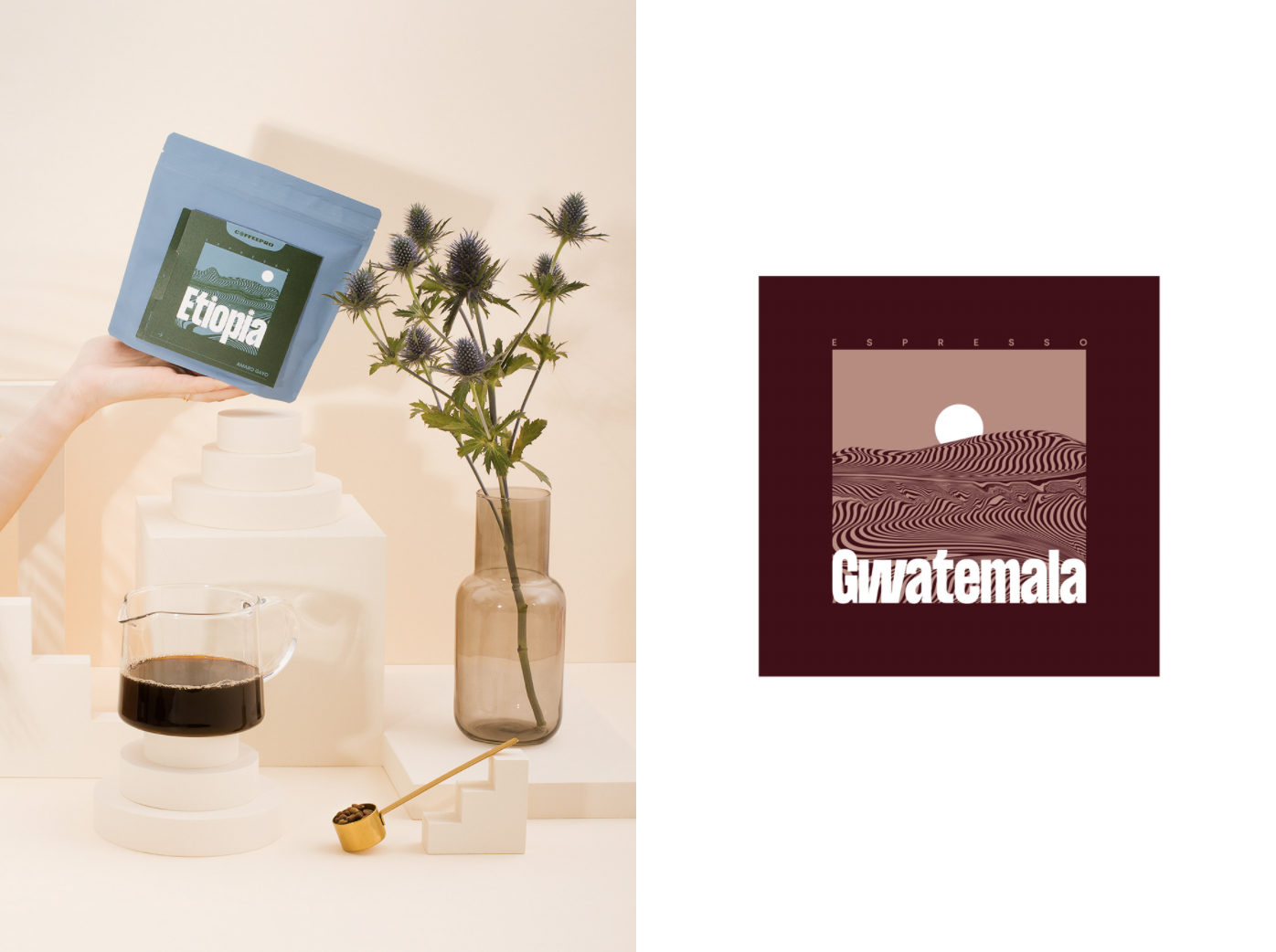
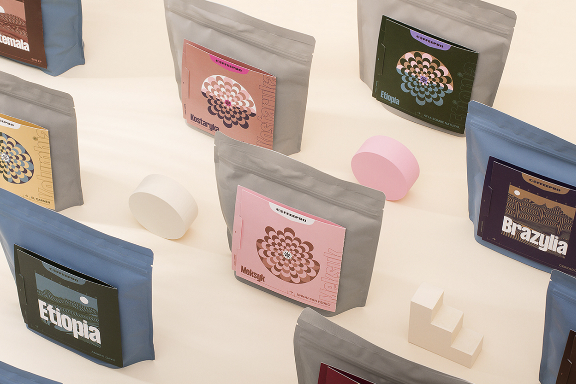
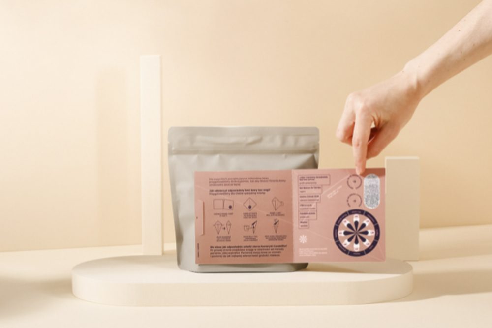
Minimalistic plantation landscape illustrations and blue packaging distinguish the espresso labels from the filter variety. As a brand, Coffeepro aims to create less waste, listing eco-friendliness as one of its top priorities. This led the brand to use zero-emission packaging and special paper with potato starch in their materials, including re-imagining the packaging labels by creating an alternative use for it. The paper label on the coffee packaging can be re-purposed as a tool to measure exactly the right amount of coffee, or as a guide to creating the perfect grind.