Serbian artist and designer Anja Savic, the founder of the design studio The Letterist, loves to create and talk about text, letters, and typography. Creating beautiful work for clients around the globe, her talent lays in contemporary, yet timeless design, while always keeping a keen eye for detail and harmonious color schemes. We asked Savic about her work, and latest wedding stationery project, which encapsulates all the current and upcoming trends in a magnificent way.
Could you introduce yourself, tell everyone who and what the Letterist is? And where can one find your work?
The Letterist is a boutique design studio specializing in hand-lettering and typography-focused graphic design; unique logo design and brand identity development for small creative and lifestyle businesses, and custom wedding, event and personal stationery.
…hand-lettering and typography-focused graphic design; unique logo design and brand identity development for small creative and lifestyle businesses, and custom wedding, event and personal stationery.
I am currently based in Belgrade but work with clients all over the world and aim to offer a unique, sophisticated and personalized approach to all my projects. I partner with trusted global paper and print suppliers to offer a wide range of paper stocks, envelopes and finishing details, and deliver printed stationery of the highest quality, including specialized techniques such as letterpress, embossing, foil stamping, and more.
This coming October will mark 5 years since I founded The Letterist and to celebrate the occasion, I have decided to refresh my own branding, website, product offerings and printed collateral…much of which will again be printed on and inspired by Europapier’s beautiful stocks. Stay tuned!
Your latest wedding stationery project is absolutely stunning, can you tell us more about it?
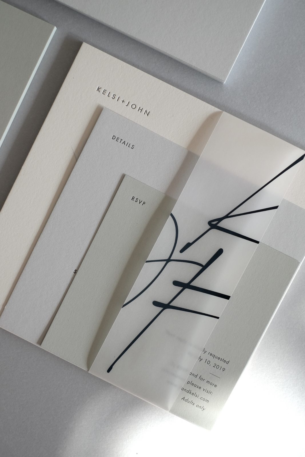
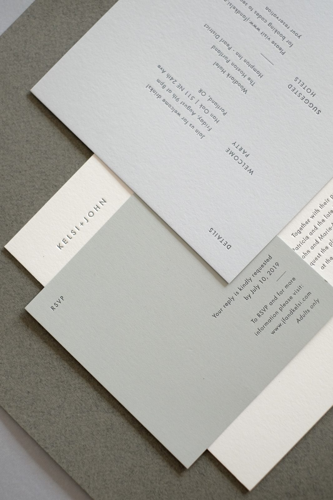
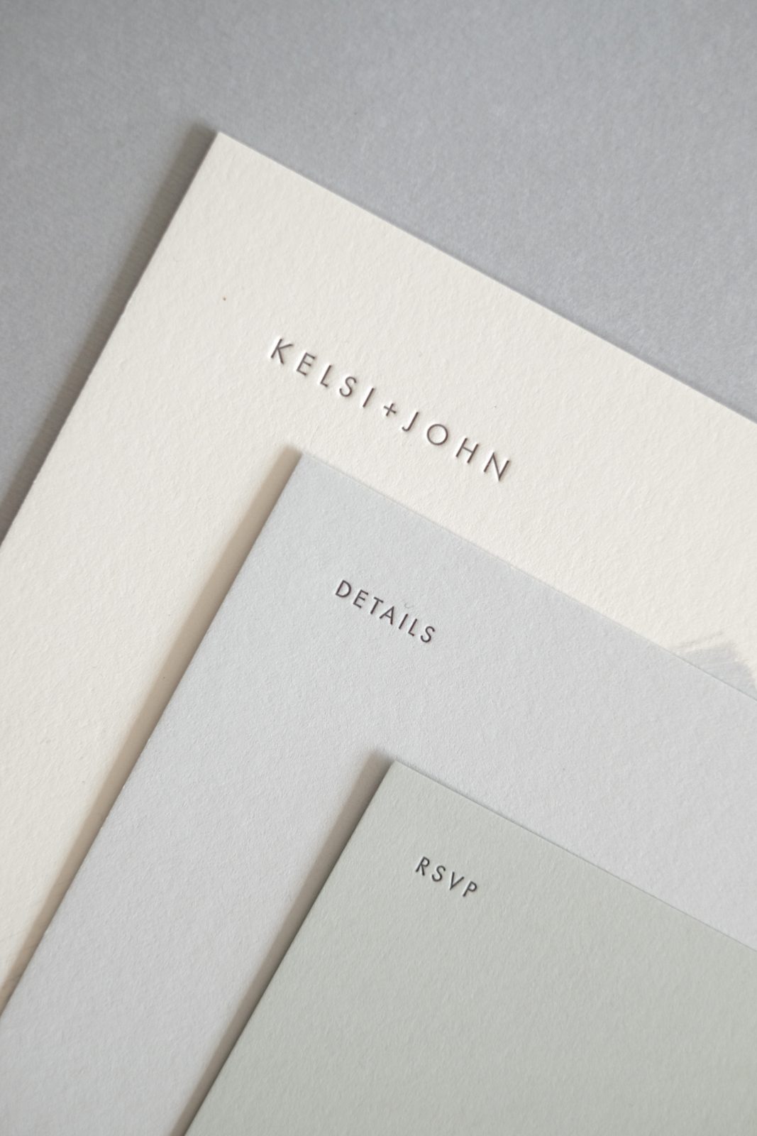
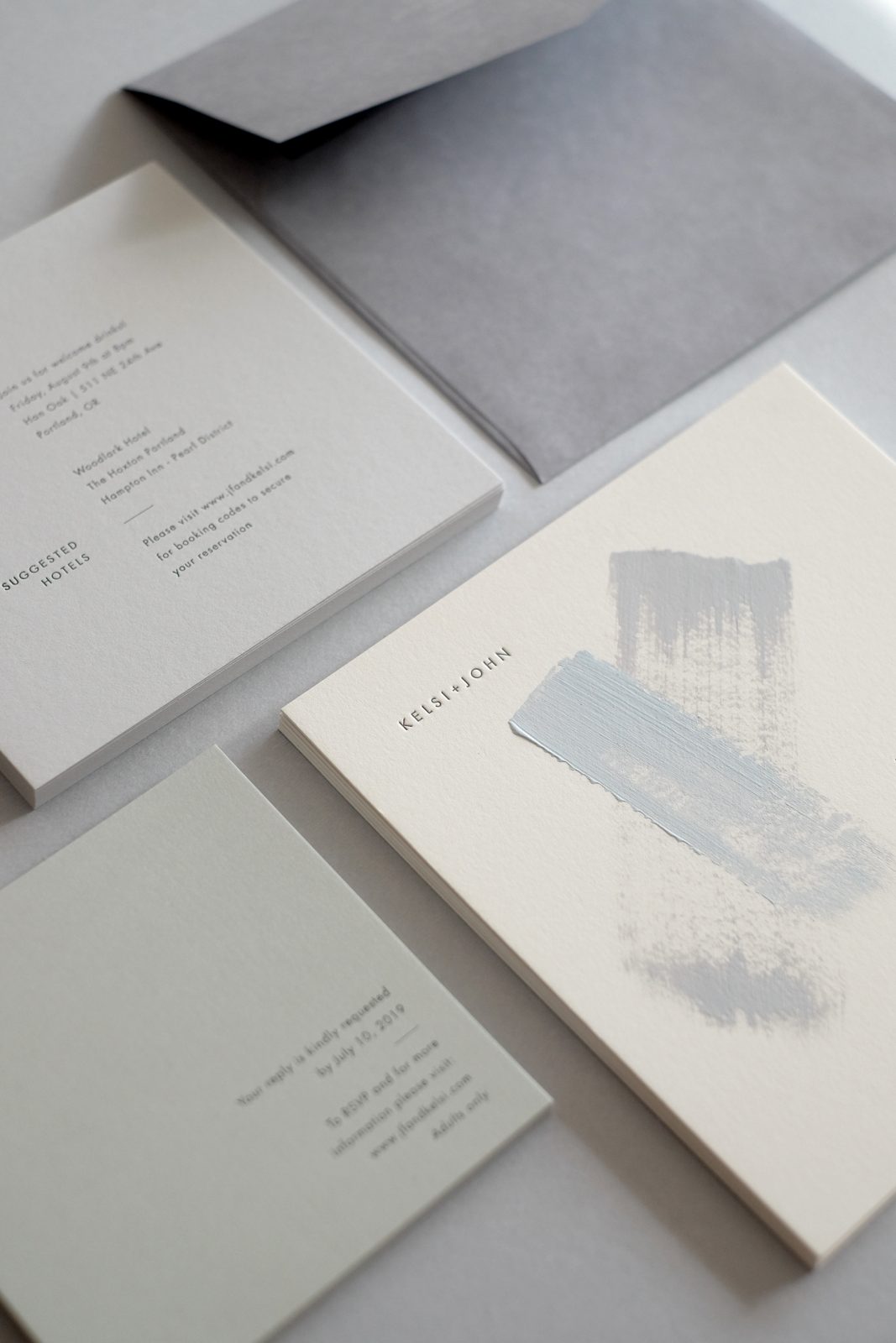
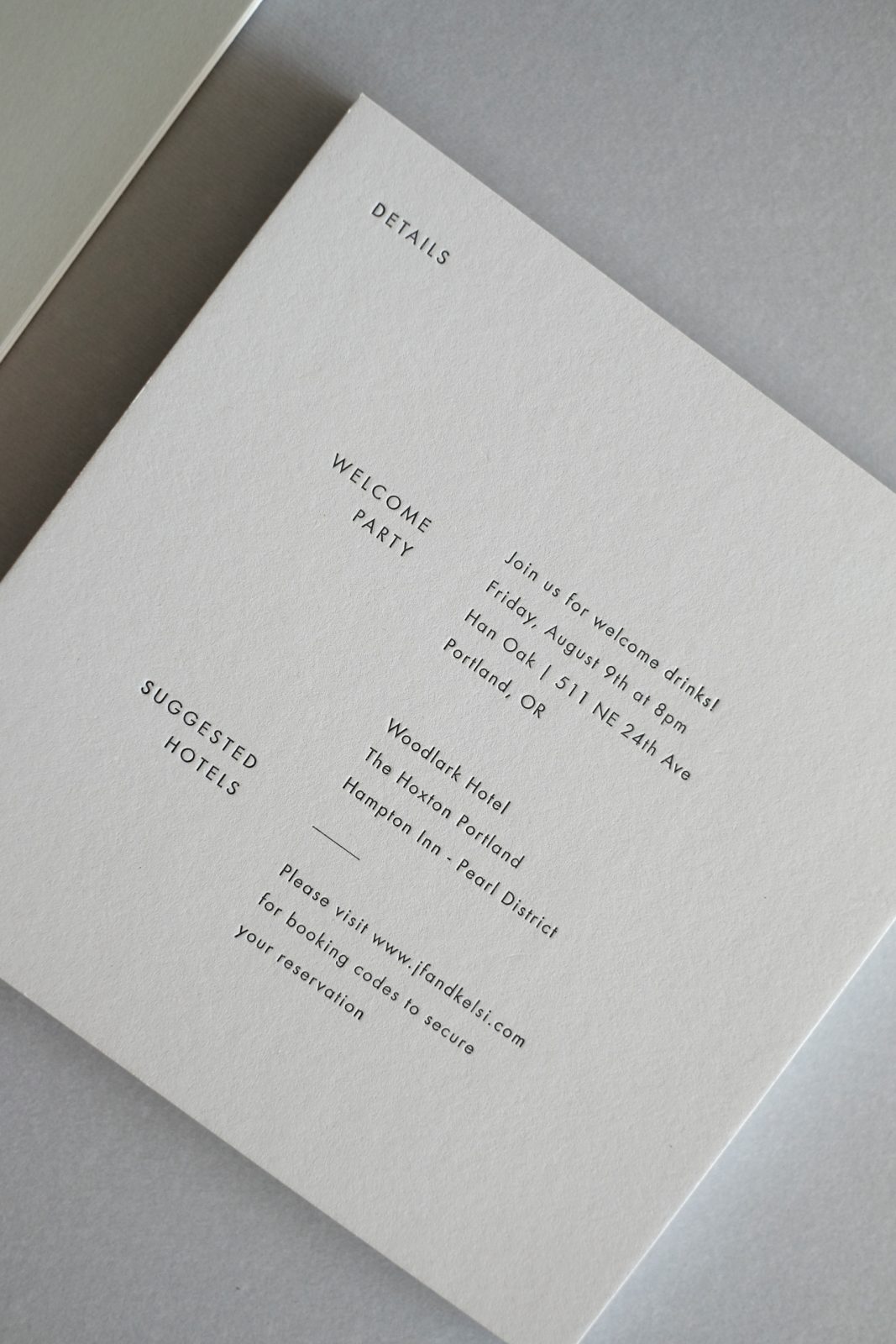
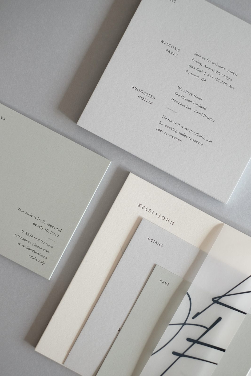
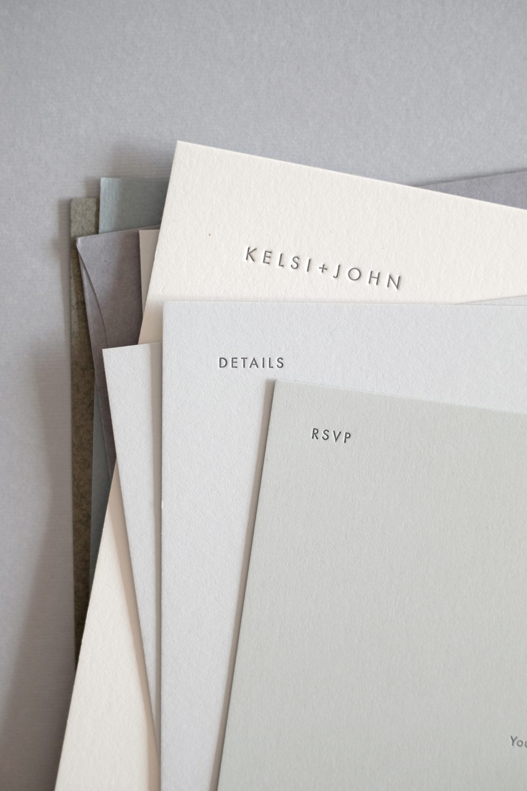
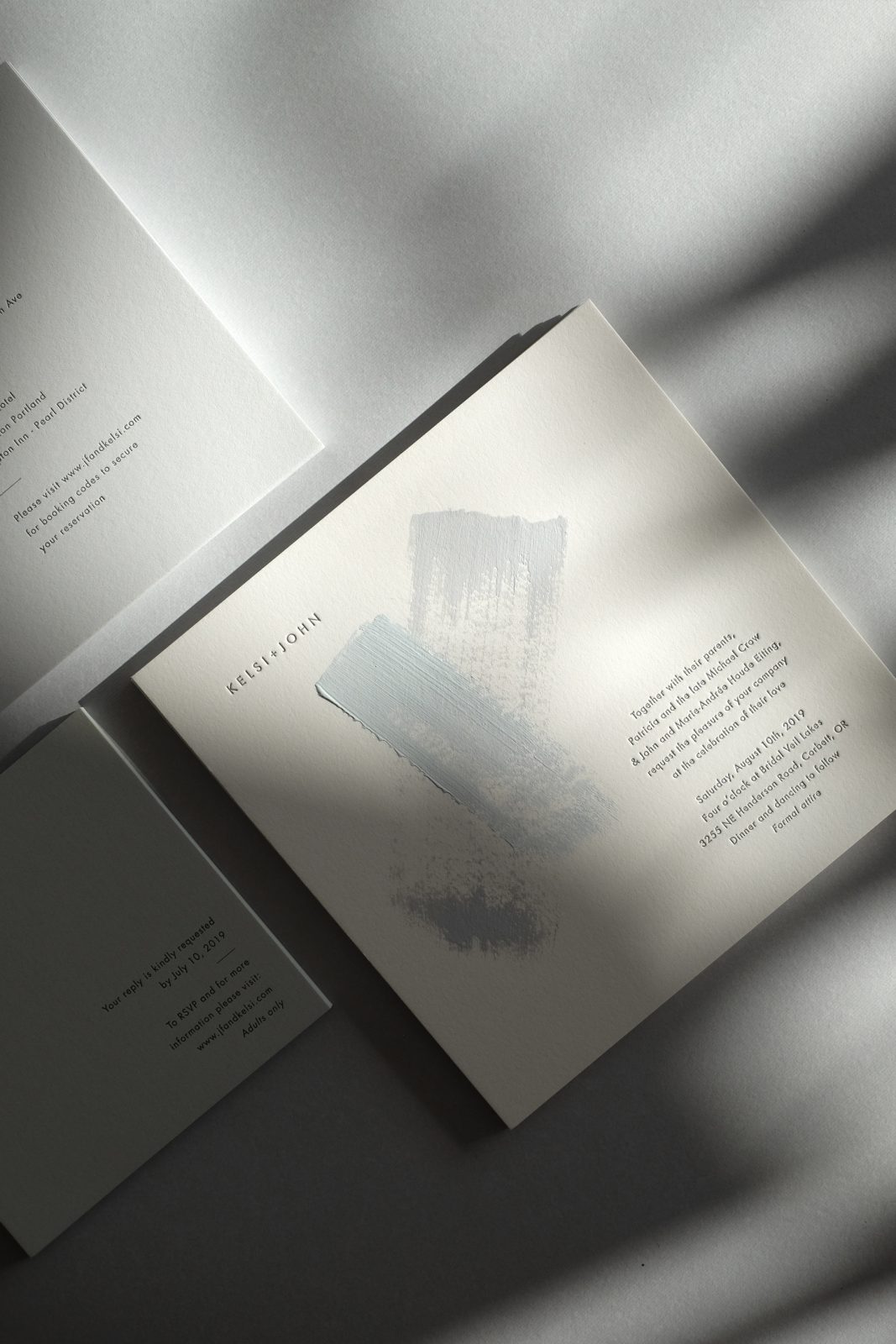
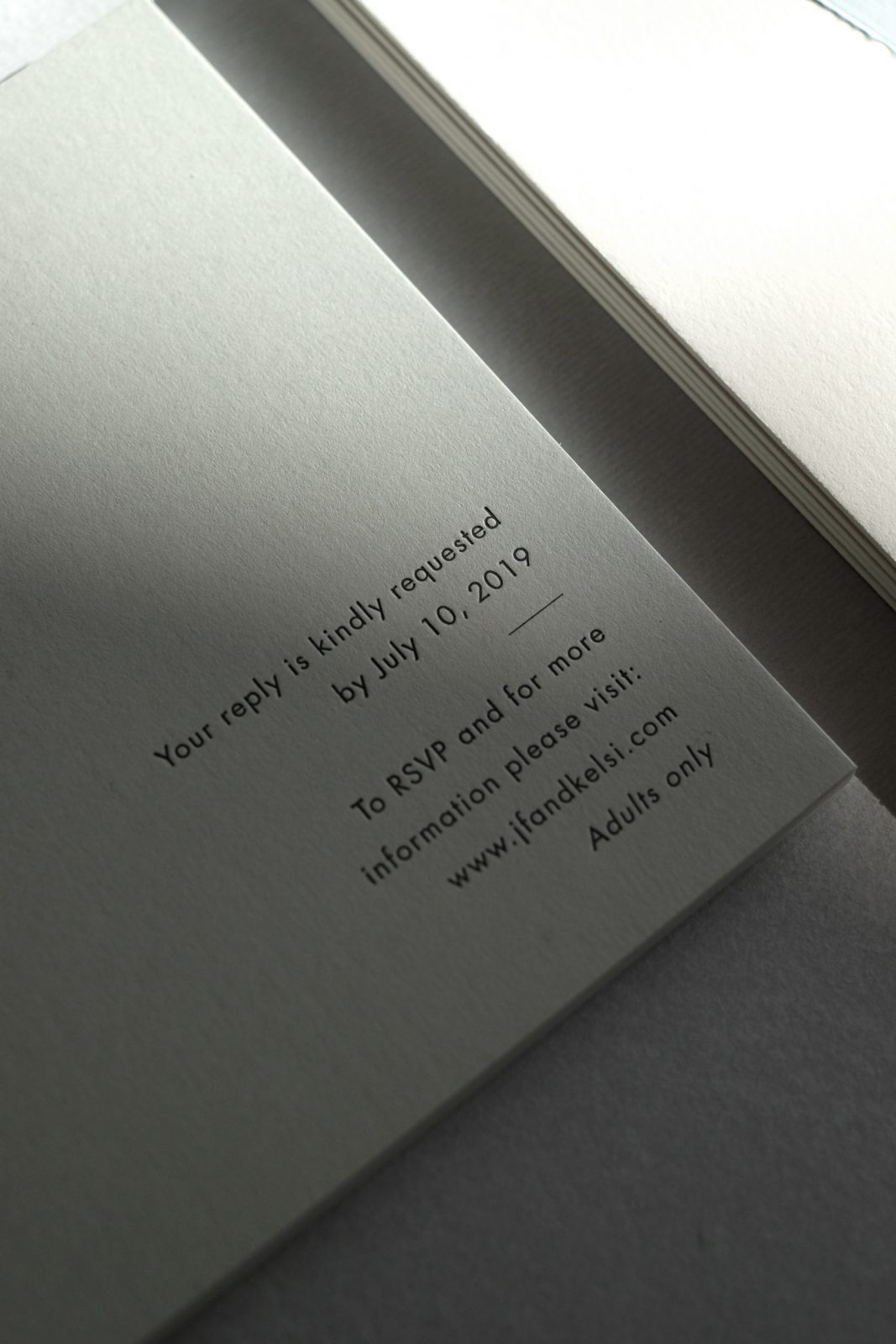
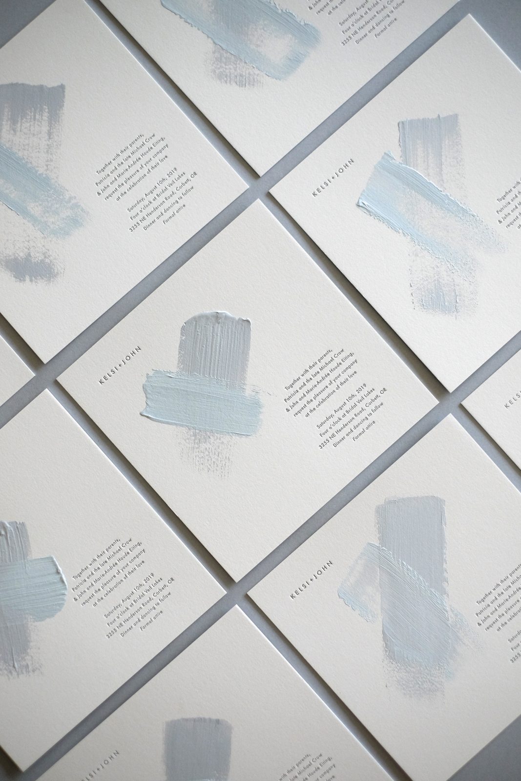
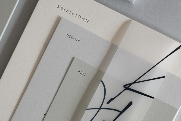
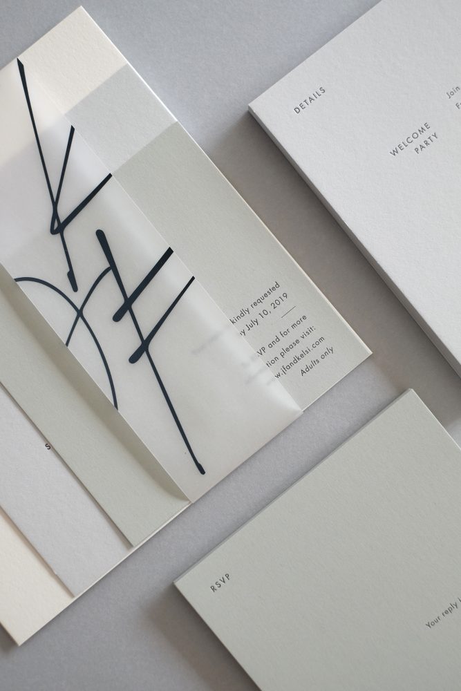
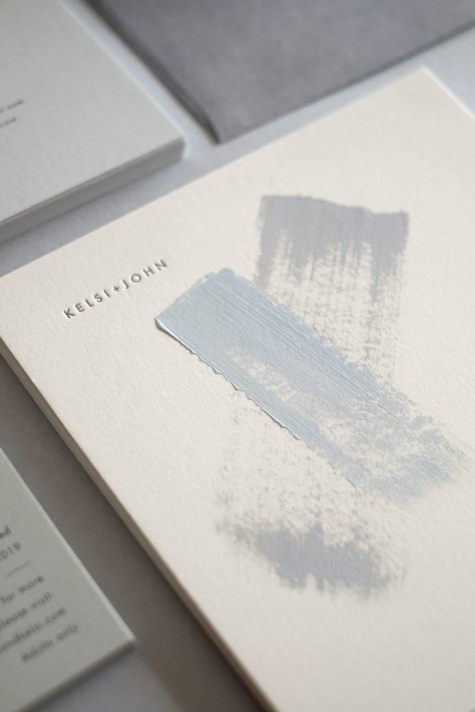
This project is a wedding invitation suite for my clients Kelsi & John who are based in Chicago but got married in Portland, Oregon on the 10th of August 2019. The suite consisted of three cards (the wedding invitation, a details insert, and an RSVP insert), held together by a vellum band and inserted in a custom-made outer envelope.
They wanted a very modern and minimal wedding invitation suite, so we avoided more usually seen wedding design elements such as patterns, illustrations, and script or traditional calligraphy, and decided instead to let the paper do the talking and be the star of the show.
…carefully selected combination of papers – five different colors, textures, weights, and feels that all came together beautifully to tell a unique and simple, but striking story.
We stuck to square formats, simple typography, and unassuming text layouts so that what really stood out was the carefully selected combination of papers – five different colors, textures, weights, and feels that all came together beautifully to tell a unique and simple, but striking story. To tie it all together and add a touch of warmth and personality, each of the ceremony invites was then hand-painted with acrylic paint in shades to match the paper.
We have to ask, what papers did you use in the project?
The invitations were printed on Pur Coton Absinthe 710 g/m2, details insert Pur Coton Smoke 350 g/m2, the RSVP insert IQ Color Oyster Grey OG52, monogram band (Vellum) Glama Basic 110 g/m2, and envelopes Esprit de Nature Ombre, 110 g/m2.
The clients originally wanted the suite to be completely white, with a very pale shade of dusty blue – all to match the overall theme of the wedding, venue, and styling. As we began working however, and the design became more and more simplified, I convinced them (with the help of their fantastic wedding planner Kayla Hoppins) to switch from bright white to a more natural/oyster shade, and also introduce light and dark nuances of grey, on different weights and textures…so that we ended up with a palette that had a little more complexity and contrast.
…designing wedding invitations means translating love onto paper…and this was a love that was light, serene, complementary, understanding, timeless, beautiful, intriguing, profound.
To me, designing wedding invitations means translating love onto paper…and this was a love that was light, serene, complementary, understanding, timeless, beautiful, intriguing, profound. I was genuinely sad when I shipped them off because, for the four days that I painted and watched them dry, they brought all of that into my studio.
You used various printing methods on the stationery, can you specify what and why?
All three cards were letterpressed, the vellum bands and envelopes were screen-printed, the brush strokes were hand-painted, and all guest addresses handwritten.
We were initially going to print everything digitally, but when I discovered the papers in the swatch samples and put them all together, I made an executive decision that we needed to go letterpress. These papers deserved letterpress. And I’ll say this time and time again, love deserves letterpress.