–
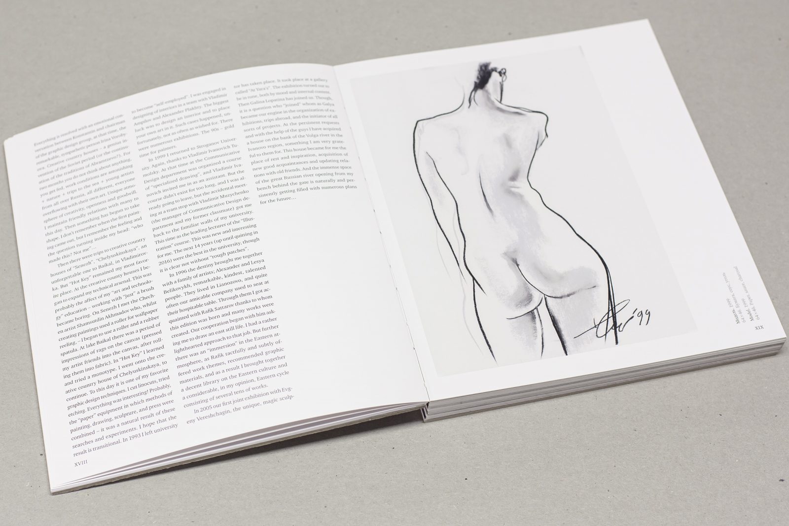
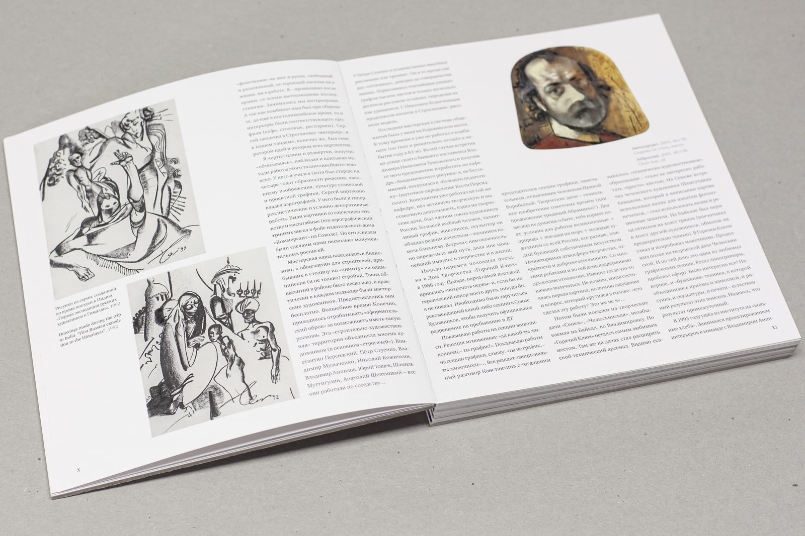
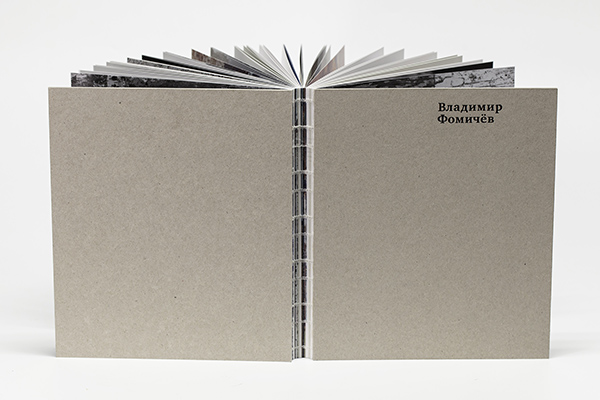
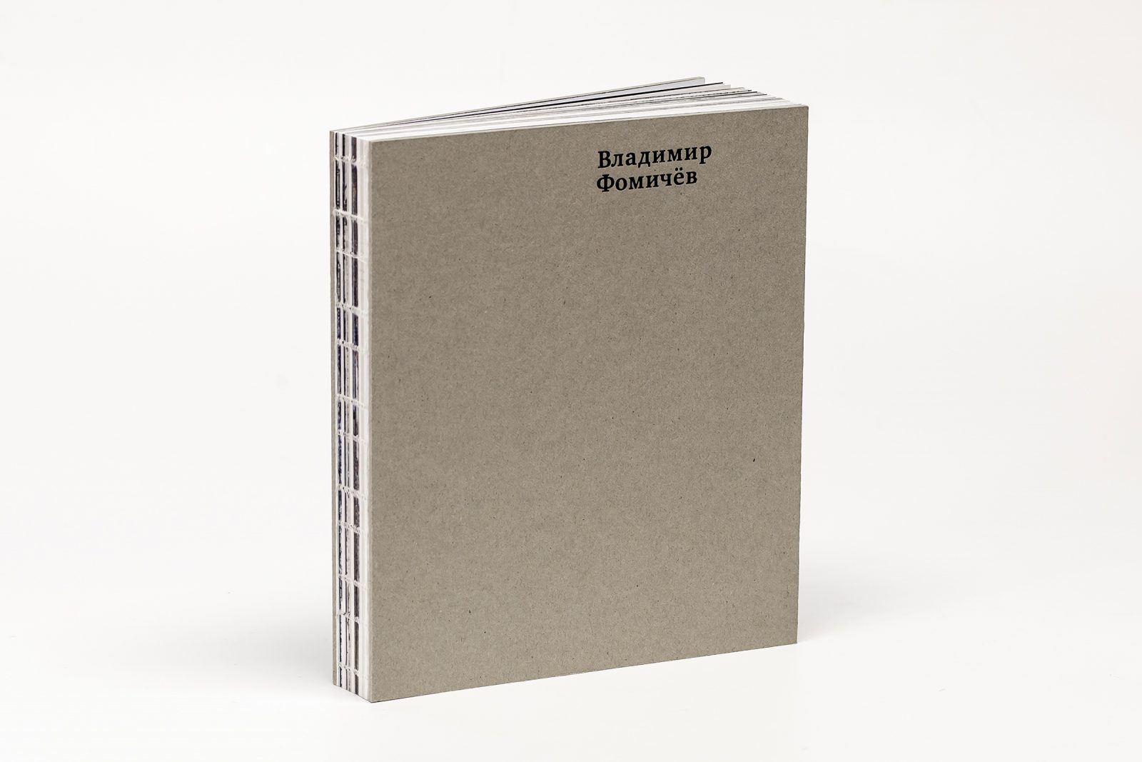
Creating a beautiful book is often the labor of many, a collaboration of professionals, each aiming for the same target: to create and produce a high-quality title that represents the theme and concept and its makers to the fullest. This is the story of one nook: Vladimir Fomichev. An artist book, written and designed by Viktor Kuplevatsky and published by FINEARTPRTINT focuses on the work of Russian artist Vladimir Fomichev, a member of the Union of Artist of Russia and an honorary member of the Russian Academy of Arts.
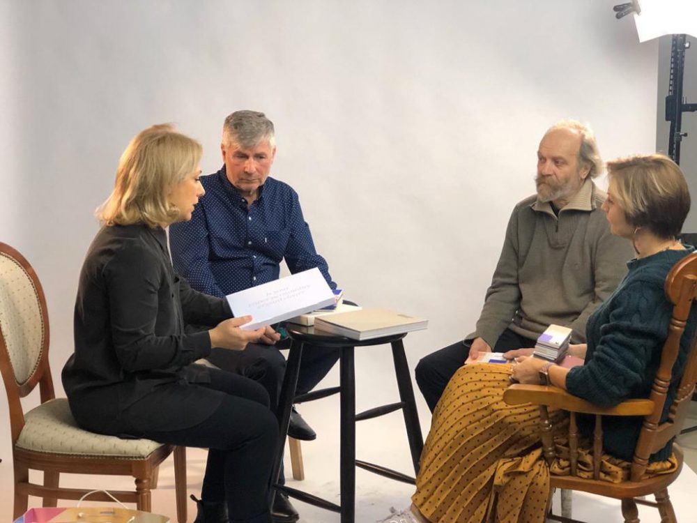
A discussion between with the designer, printer, and focus of the book
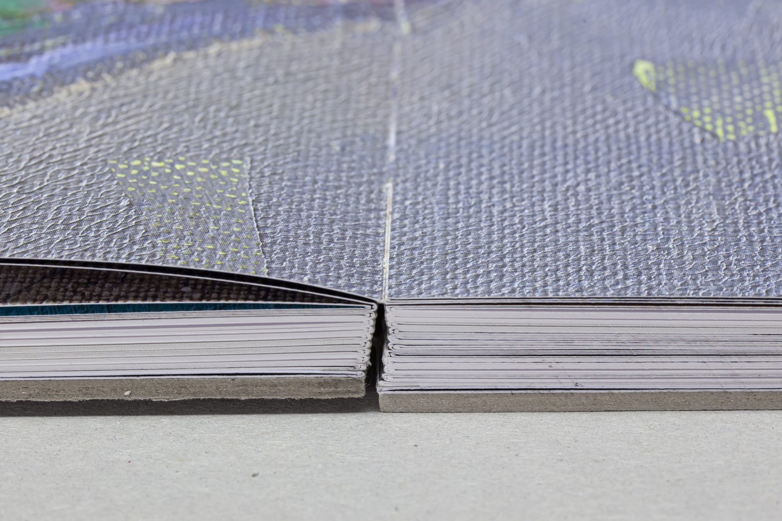
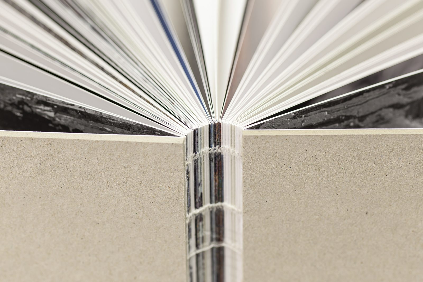
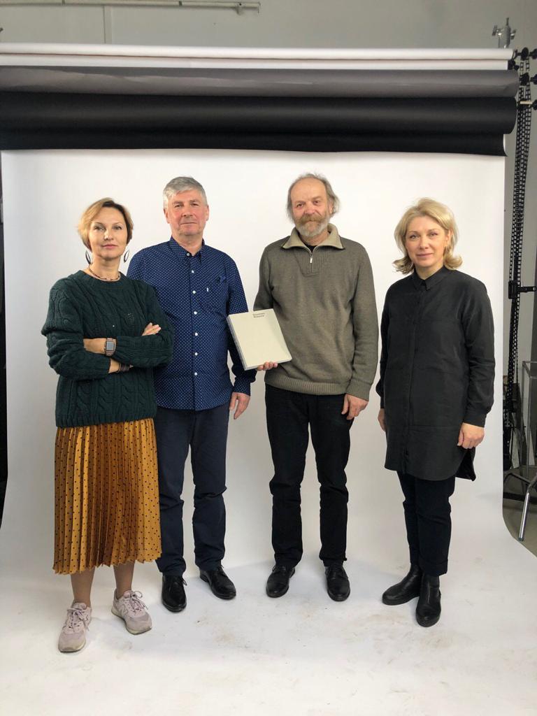
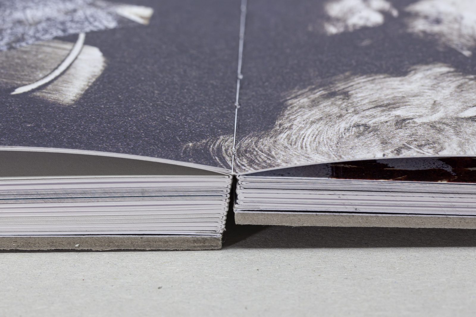
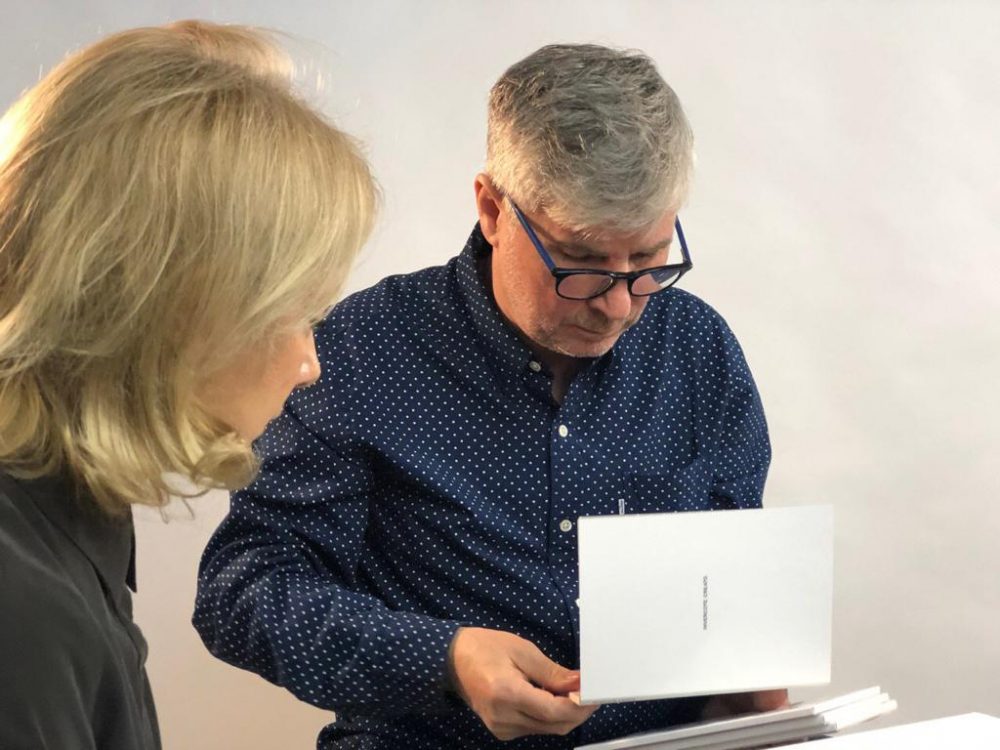
In a rare, limited edition of 50, the book is printed on Arctic Volume White – exclusively available at Europapier – with HP Indigo technology and has an open sewn binding. Olga Kurlykina, the development manager of Europapier Russia sat down and discussed the book and decisions and options that went into making it, with graphic designer Viktor Kuplevatsky, art director of FINEARTPRINT Natalia Stepanova, and the artist himself, Vladimir Fomichev.
–
Tell us, please, how the idea to create this book came to you?
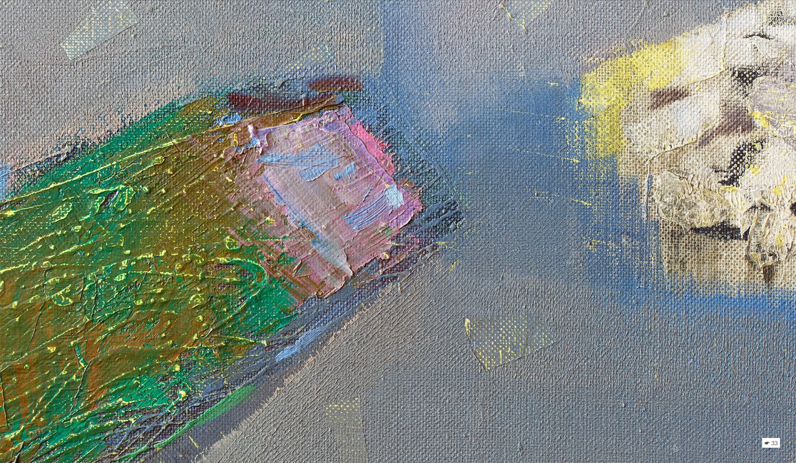
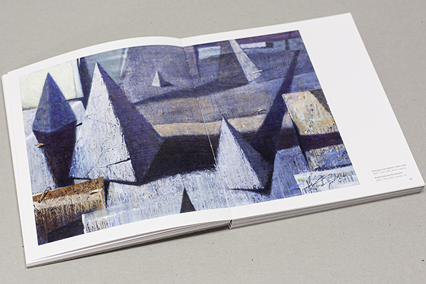
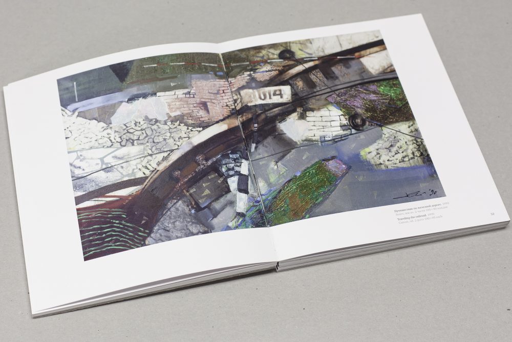
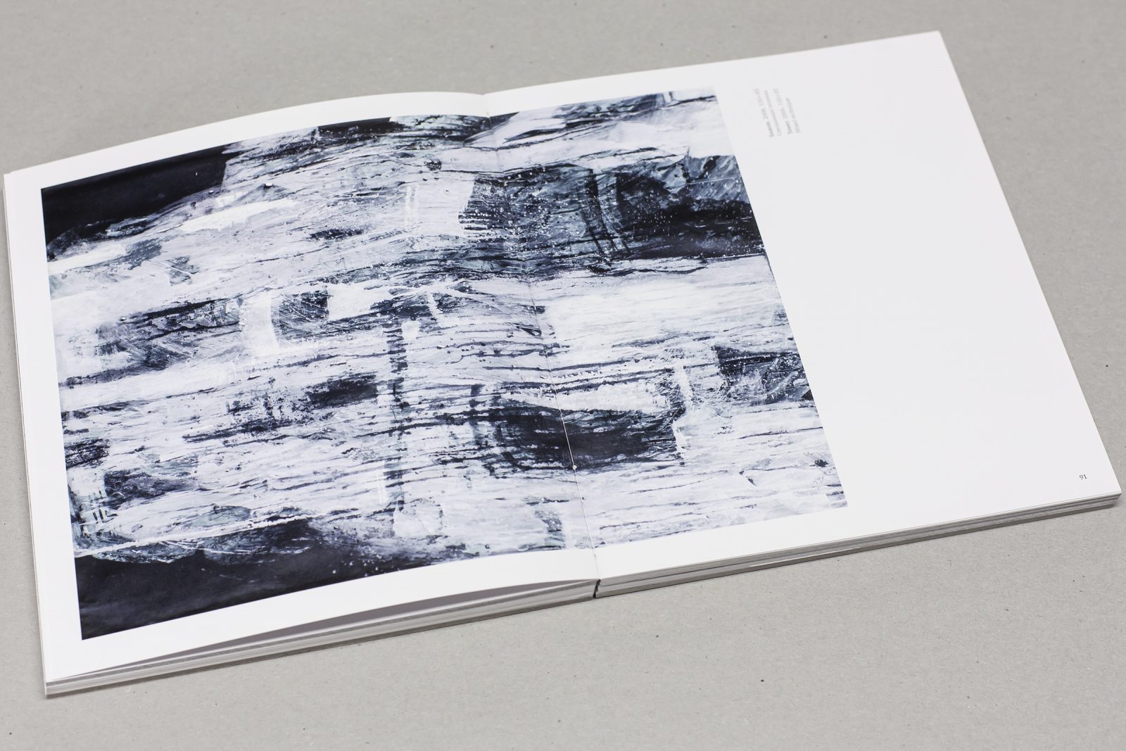
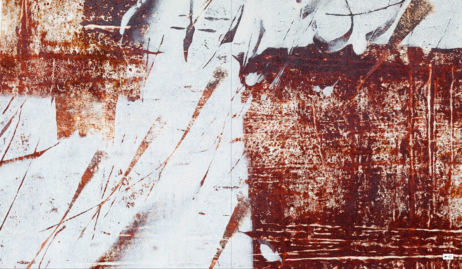
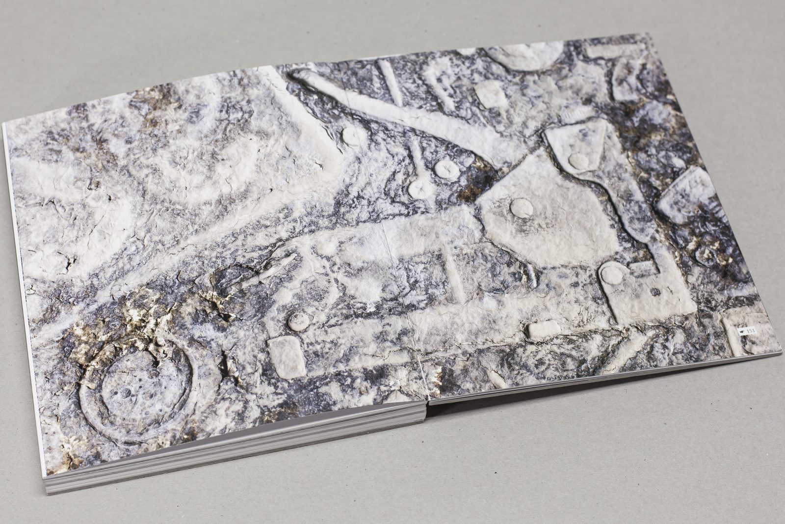
Viktor Kuplevatsky: it was a birthday present to Vladimir from his friends. Vladimir and I are old friends and over the years I have developed a large photo archive with his works. We’ve created a catalog for Vladimir’s exhibition at first. This is how the basis for the book that we printed in the FINEARTPRINT came up. Many thanks to Nikita Stepanov, who recommended the wonderful Arctic Volume paper for the publication: if you open and look at the paintings, you can see that the colors are identical to the original.
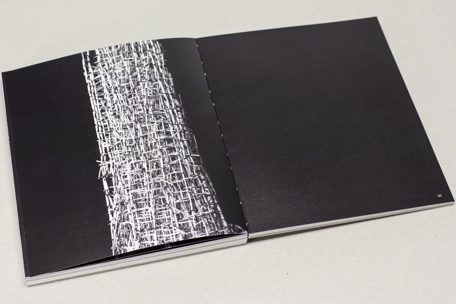
Natalya Stepanova: it was not by chance, that we chose this particular paper During the testing, we selected various materials, and Arctic Volume – matte bulky coated paper – had shown the best results for conveying a coloristic solution to the artist’s works. After several print samples, we found that Arctic Volume is suitable for many genres: painting, graphics, architectural installation, and photographs. The fact, that this paper is completely matte and has a pleasant tactile effect. In general, it creates the feeling of an expensive product.
Vladimir, are you satisfied with the result? It is known that artists are very sensitive to color rendering.
Vladimir Fomichev: yes, I am very pleased. The gift was exceptional, I am delighted! a completely different feeling when you hold a book in your hands, rather than looking at the picture on a computer monitor.
Viktor, did the artist see the future layout, did he coordinate the signal instance?
Viktor Kuplevatsky: Vladimir saw the intermediate version of the project, but did not see the final version. this was a surprise.
What is the role of materials in the implementation of an idea?
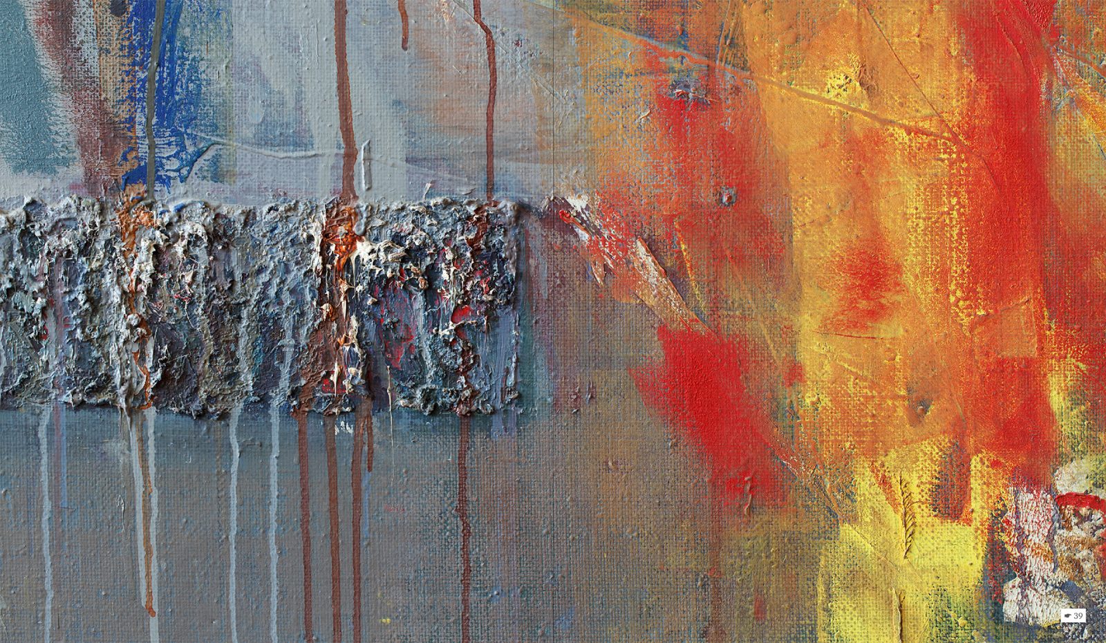
Vladimir Kuplevatsky: of course, materials are very important in the project. Initially, for this project, I was looking for a paper that would convey the color scheme as accurately as possible. In addition, I liked that the paper is completely matte but, when printing, all the images in the publication turned out to be saturated and deep. All colors “dies”; rolled out smoothly, without gradients, black 2dies” are dense, juicy. During testing and material selection, the idea arose to print graphics on titted paper, however, these lines and halftones on Arctic Volume paper worked equally well, so the project was fully implemented on this paper.
Vladimir, what materials do you use in your work?
Vladimir Fomichev: I work mainly with waste paper. I use newspapers, advertising – I make paper pulp from this, and then form a layer that dries up and appears as a basis for future work. For 12 years I have been working in this technique. Almost all of the works are in my workshop. The largest canvas is 2.6 meters. There is a combined picture “River of Time” – about 6 meters.
An artist, who is following his own path, is a seeker, and innovator. And if you look at the students today, what knowledge do they get now?
Vladimir Fomichev: three years ago I finished my teaching career at the Stroganov Academy. My discipline was illustration. I myself started once at the Stroganov Academy. Many students now are working on popular graphics techniques. And I noticed that young people have a desire to be here and now, to be in the “stream”. A professional graphics artist must know the “base”: whatever he will do in the future, he should know all the techniques and, using this arsenal, the result can be any. the danger is that under the influence of fashion, an artist without a “base” creates “beautiful now” pictures, but fashion is changing rapidly. In general, working with a young artist is not easy – a negative assessment or overestimation can give a completely different development vector.
And what trends you observe in book design today?
Viktor Kuplevatsky: for me, each book is individual. For example, a book with the works of Vladimir Fomichev was created in minimalism exclusively for the concept of the artist’s works. In other projects, different tasks can be solved with another style – gloss, gold stamping, metalized materials, etc. Creating a project concept, I act according to the product, customer desire, and consumer expectations. Unlike the artist, the designer remains with the framework of the correspondence of the idea and its implementation. In its pure form, design for me can be only in private projects.
Natalya, when the book came to you, have you made any corrections or was everything ready for implementation?
Natalya Stepanova: Almost everything in the book was announced by Viktor, he had predicted the result in advance. For our part, we always pay attention to the details of the project, for the successful implementation of which it is important to find materials appropriate to the style. It is important for us to know the composition of the project and how to express it through paper, binding materials, and decor. Some time ago, we worked closely on the topic of studying the materials market, as a result, we created the “We love designer paper” catalog: we selected authors images, various designer papers, prepared special image processing, added color, for example, whitened it for specific works. And thereby gained a lot of experience: combining materials and the nature of the images, printing technology on various materials. Now, this is the printing bible for our employees in FINEARTRINT, as well as in the COUTURE BOOK. Therefore, using our experience, we understand what paper to offer for each project so that it can be professionally implemented.
–
Natalya, what makes a photo book unique?
Natalya Stepanova: it is a difficult question. If we are talking about a private project, then, first of all, content. No matter how beautiful materials and designs we offer, the idea and content of the book are of paramount importance. So far, the culture to print photo books has not completely developed. Unfortunately, more often photos settle on your hard drive or phone.
Vladimir, how as a creative person, an artist can express himself nowadays?
Vladimir Fomichev: you should do what you want to do, regardless of the estimates from the outside. The artist wants to be appreciated, noticed, to monetize the fruits of his creativity – this is so, but it is a difficult topic – commerce and creativity. if creativity is exciting, you have to dive, and the road will lead somewhere. This is not an easy way. I am sure, that art must remain honest and heartfelt.
Thank you, Vladimir, Natalya, and Viktor for taking the time to talk to us.
