
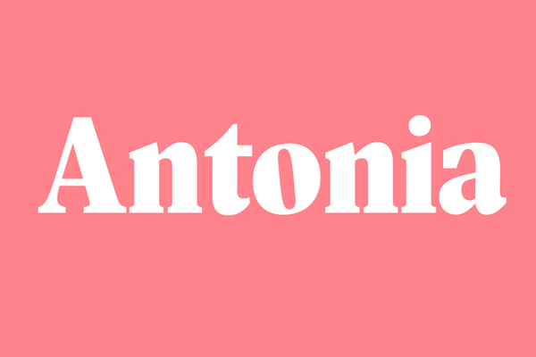
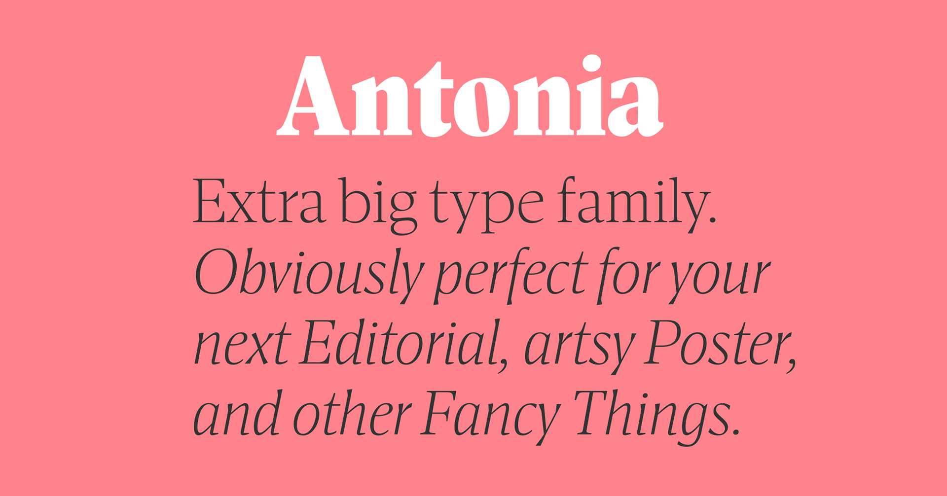
Antonia is the latest addition to the font library of the multiply-awarded and beloved Viennese type foundry Typojockeys. The Antonia type family consists of 46 fonts in 7 weights, and 4 optical sizes, fulfilling any designers or creative directors wishes. The super versatile font adapts to all needs and situations demanding a beautiful, strong serif font.
Modern serif with ornate details give Antonia character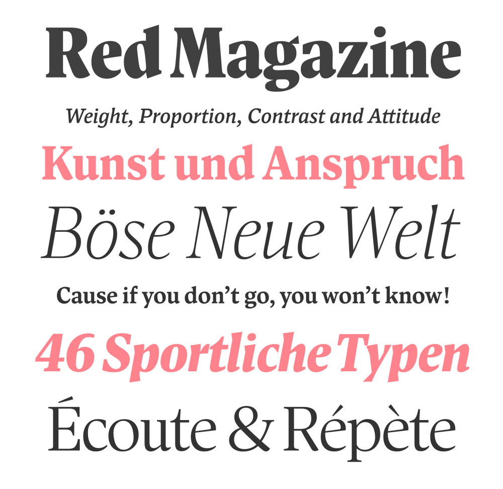
Designed in the middle of the Alps by Franziska Weitgruber and Michael Hochleitner, the founders of Typejockeys, Antonia is as modern as it is down to earth. The font feels orderly while having a sense of unique ornate detail. The slightly slanted counter-space in the letter O is a delightful, yet important detail.
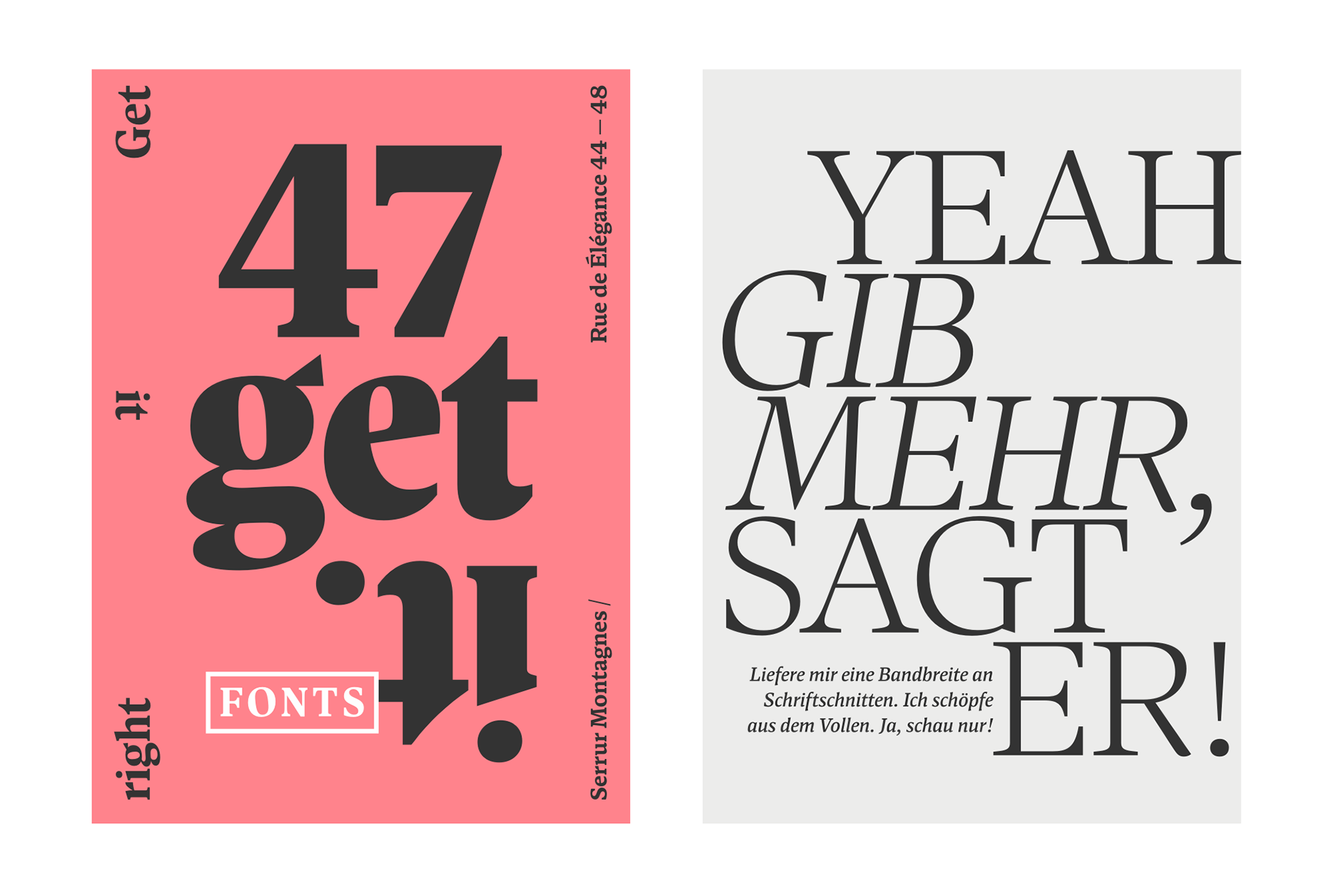
Antonia is perfect for brands focused on a stylish appearance that’s also easy on the eyes. It can be used sparingly in headlines and titles for a strong impact, as well as in body text, because of its legible and bold appearance. The font family combines all the necessities of a modern serif font; text, display, and italic styles, looking crisp and perfect in all sizes and applications.
From traditional to trendy
Serif font has been making a comeback for a while now, slowly shaking away the old beliefs of it being the old-fashioned and traditional choice next to its more modern sans serif counterpart. The common misbelief is that the fine, delicate details of a serif font won’t adjust well on displays, but with high-resolution screens becoming more common now and with the help of fonts like Antonia, this issue is in the past now.
You can buy the full font family, or your chosen set here.


Images © Typejockeys