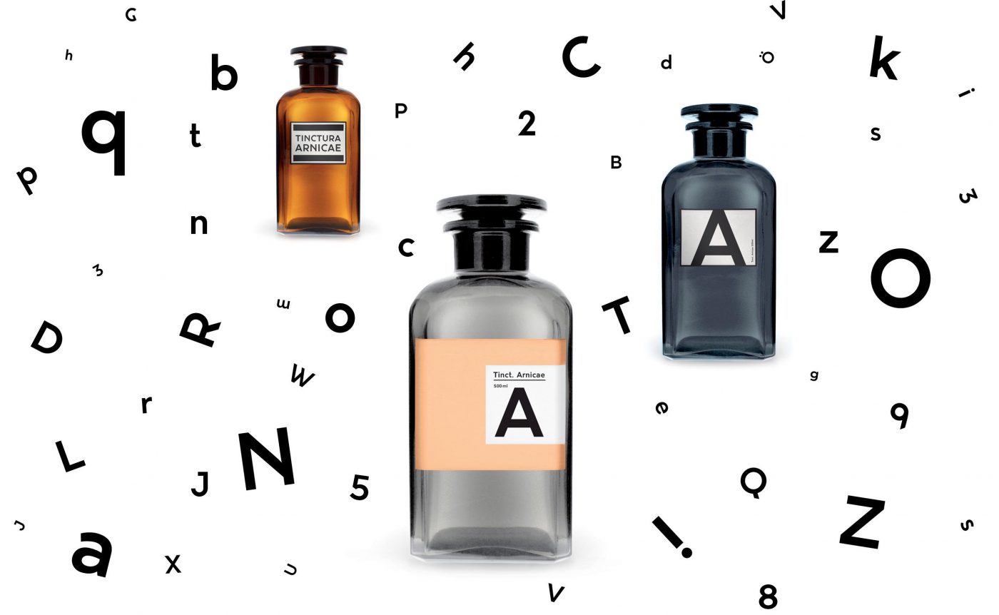
Vienna based graphic designer Michael Leithner was inspired by the writings on labels of old apothecary bottles and letterings of facades of councils in Vienna when creating a new typeface: Arnicae. The contemporary typeface is a prime example of Leithners design motto – good design is evolved by focusing on the tension between good conception and optimized visual solutions.
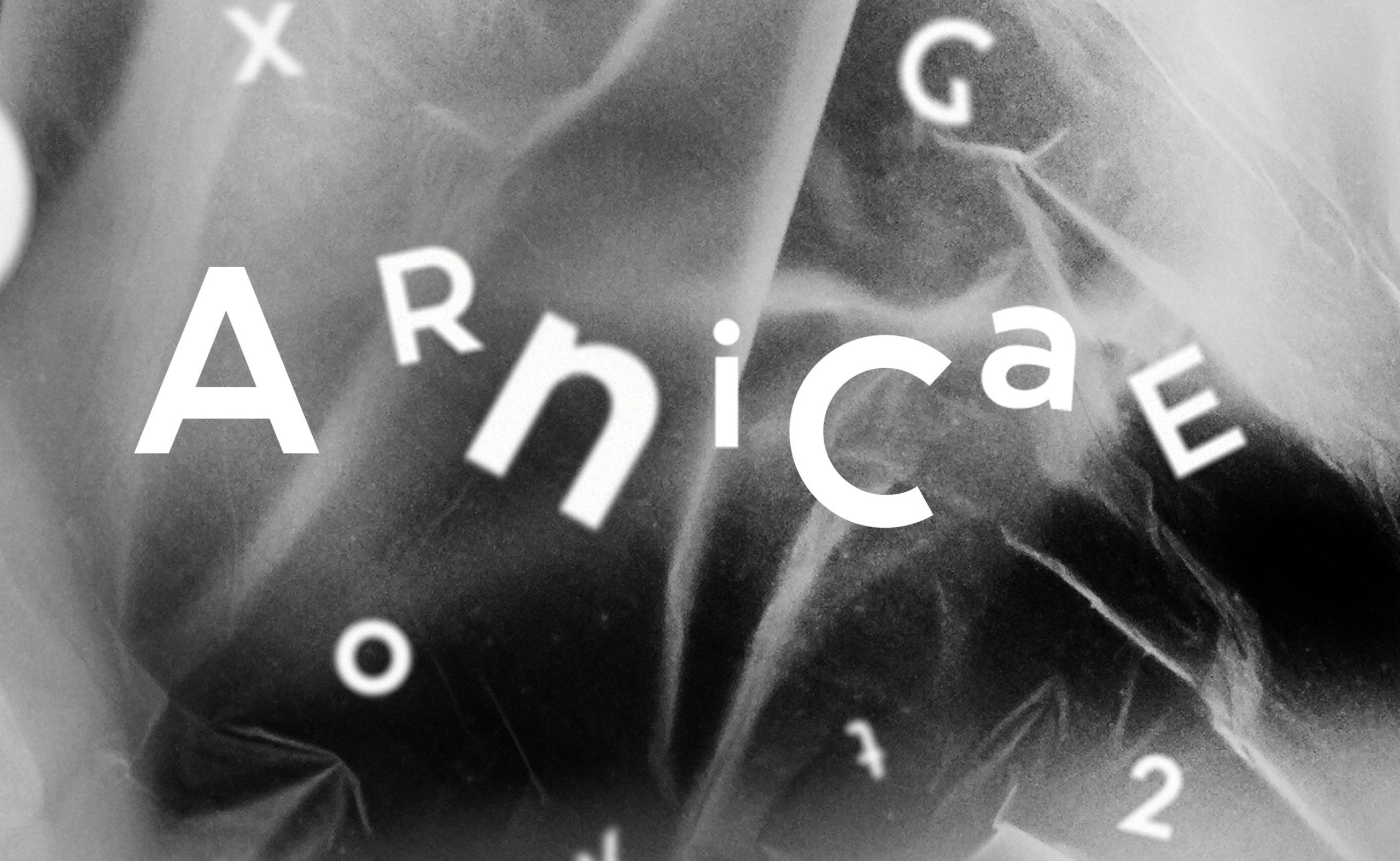
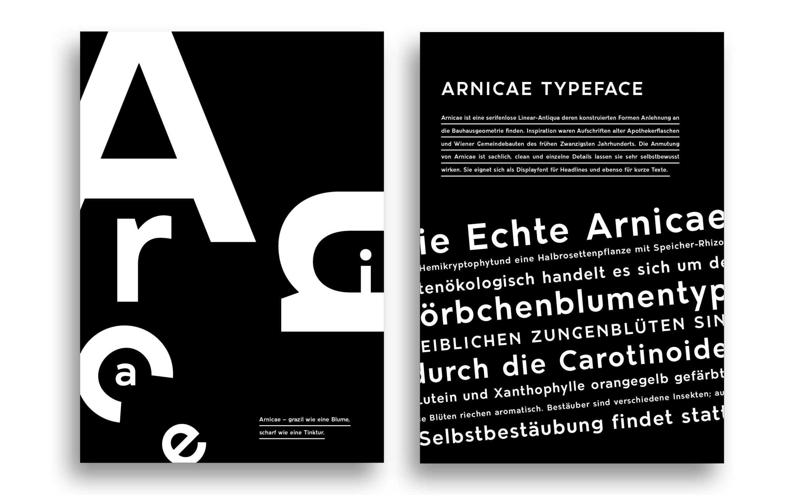
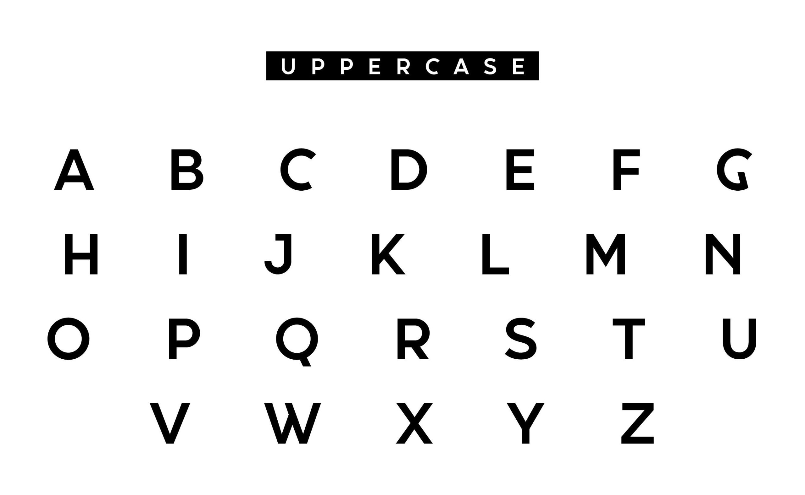
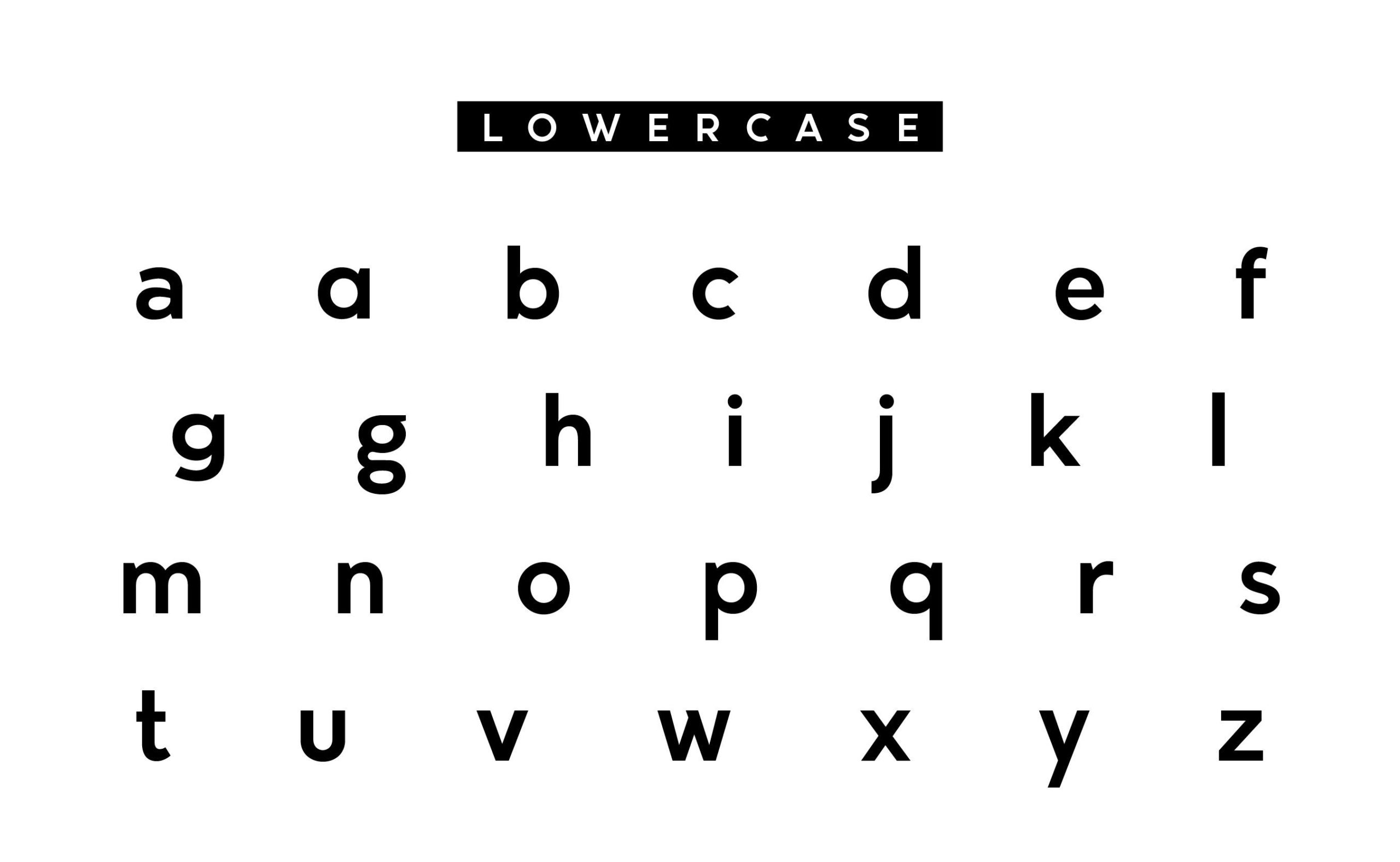
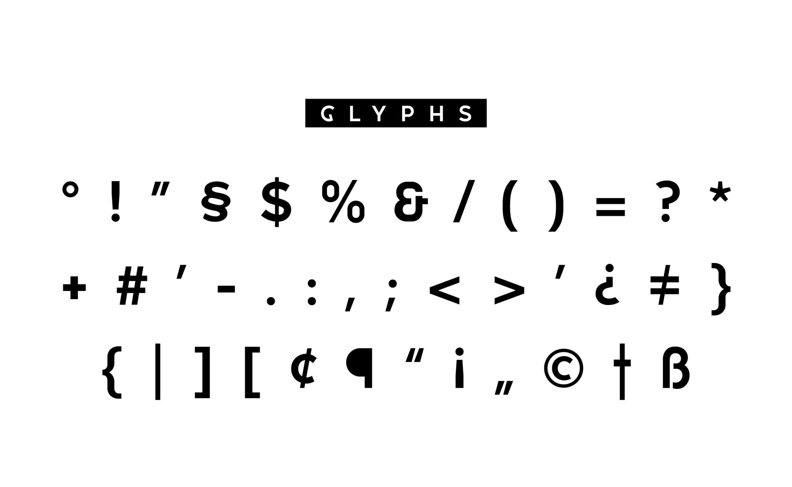
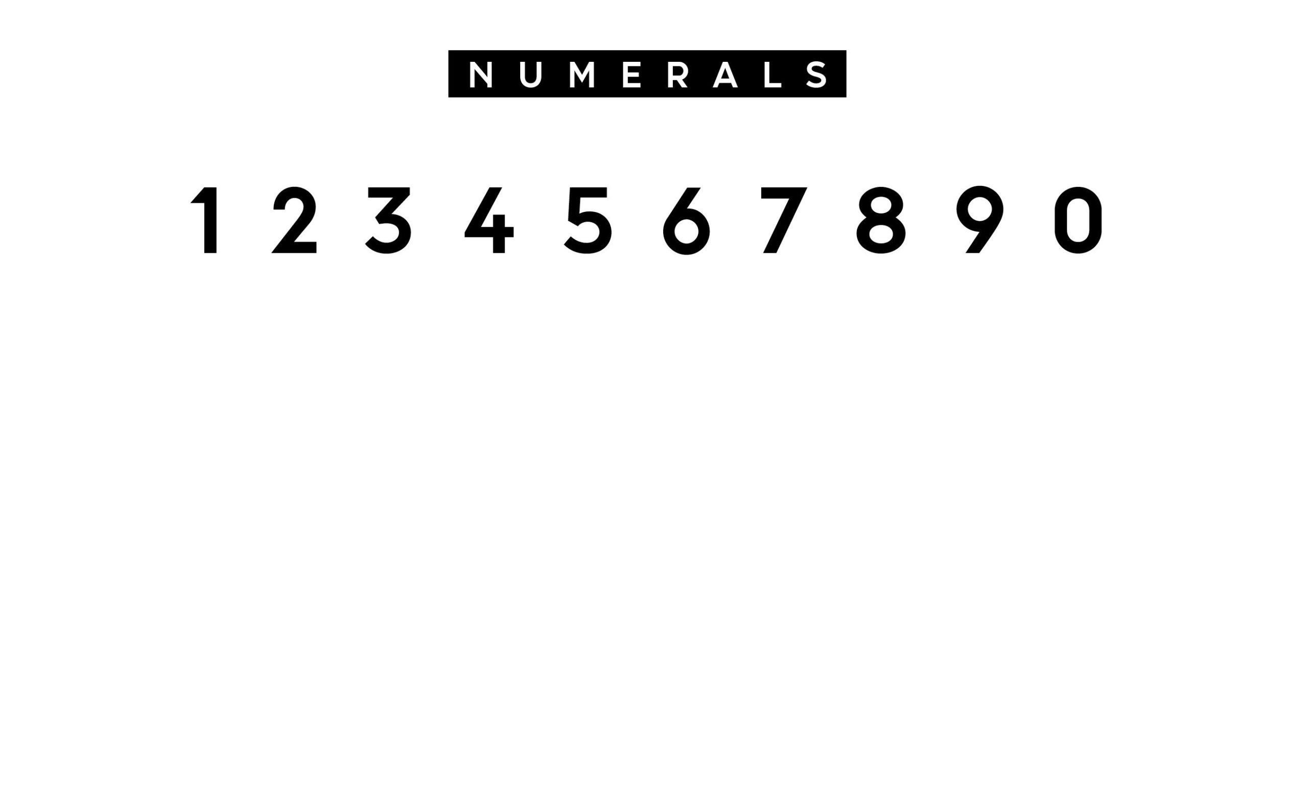
Both the bottles and the councils letterings are from the 1920s and have diverse characteristics and details that Leithner incorporated in the forms of Arnicae typeface. Arnicae is a sans linear antiqua whose costructed forms found dependence in the Bauhaus geometry. Its appearance is neuter, clean and the individual details mediate self awareness. It can be used as a display font as well as for headlines and for short texts.
The name comes from the Tictura Arnicae, an inflammation inhibitory medicine which is made out of Arnica (Marguerite). Arnica is available at www.ultratypes.com.
Images © Michael Leithner

