
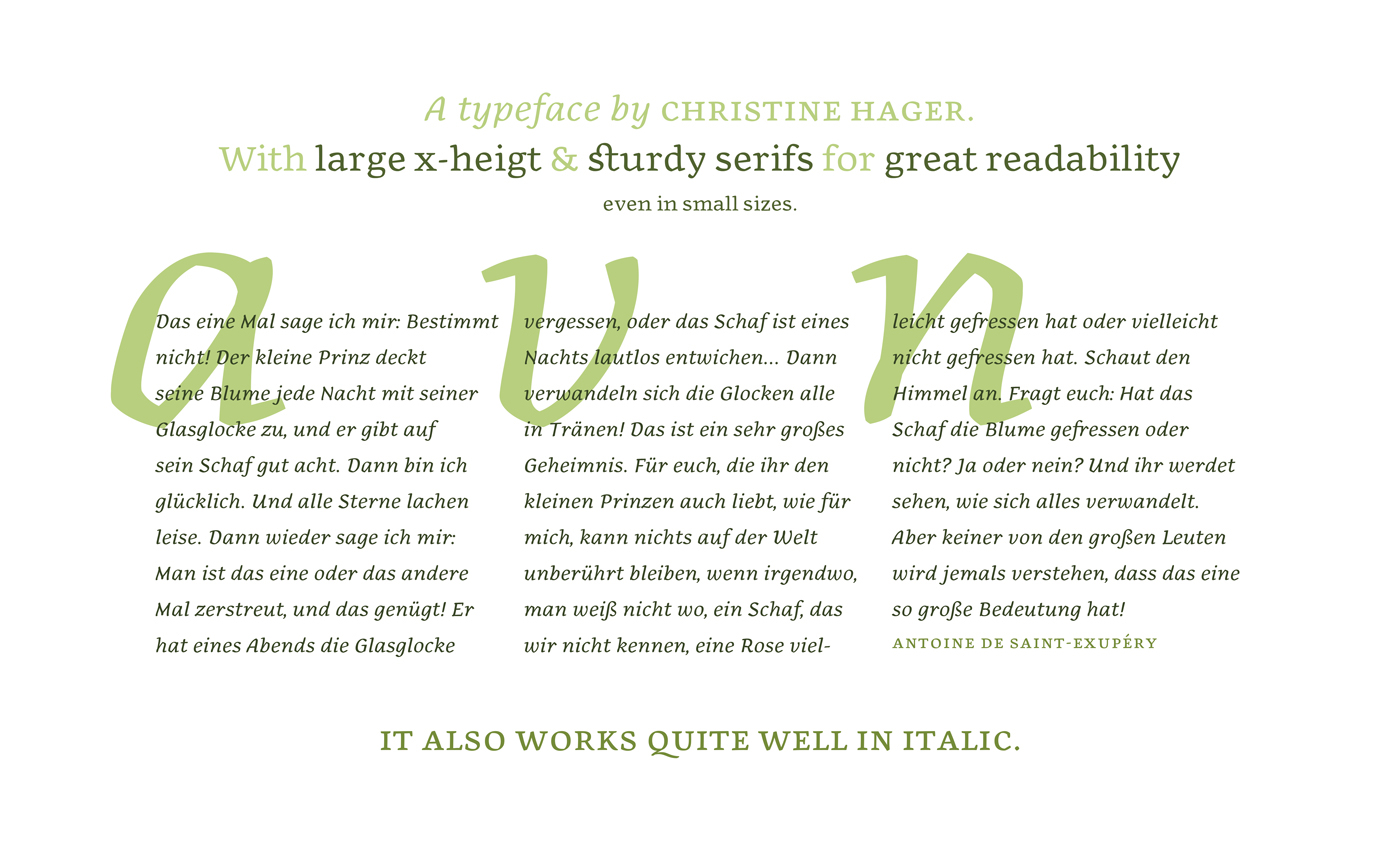
Austrian designer Christine Hager‘s Lotti typeface is as beautiful as it is meaningful. Created specifically for the young creatives graduation project – a book about her late grandmother Lotti. The book is superb in its own editorial design, but the unique typeface elevates it to another level. The amount of detail, also considering the personal take in the project, gives it all the more meaning.
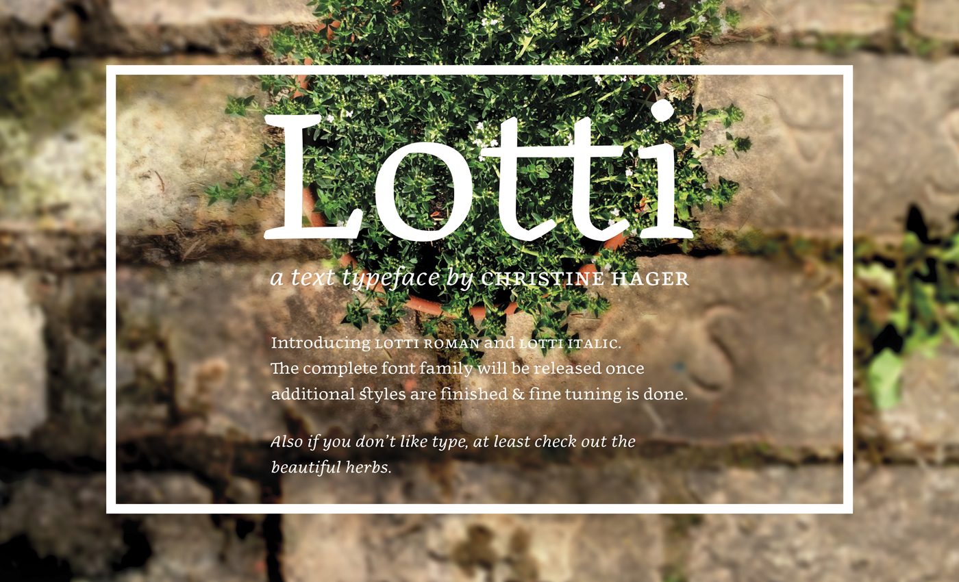
Hi, have you met the sisters Lotti Roman and Lotti Italic?
Well, here they are.
Aren’t they pretty?
Yeah, I think so as well…
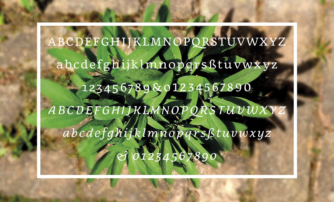
Soon you’ll meet the whole family!
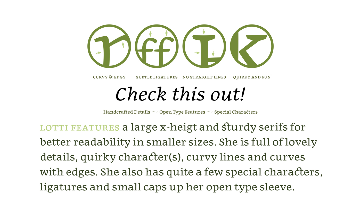
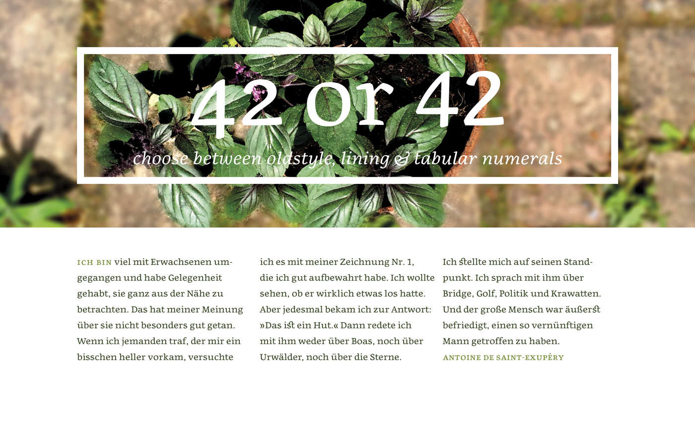
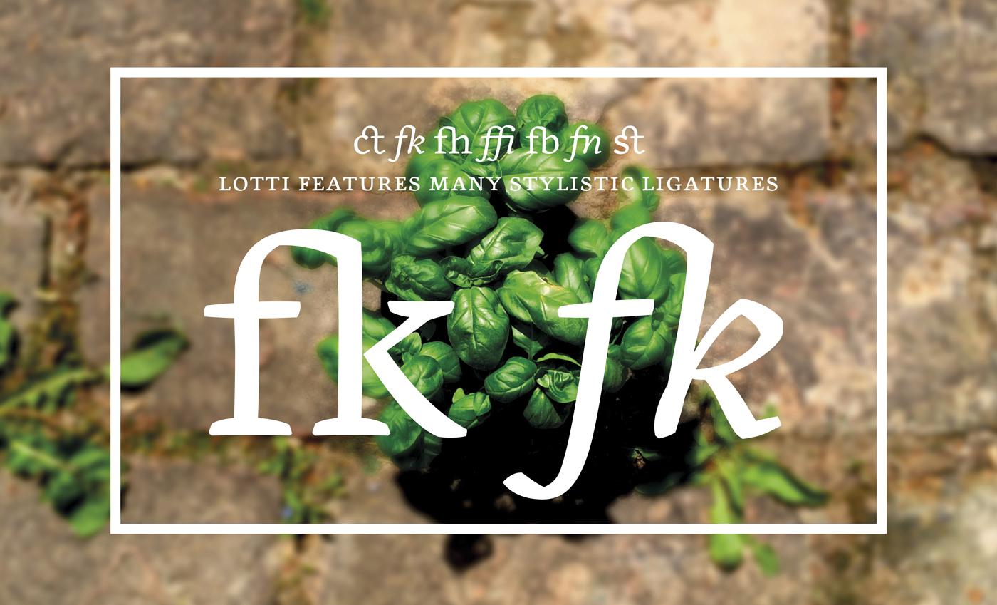
Created with the idea of a typeface that works well in small sizes and long passages of text. With quirkiness and lots of details, Lotti combines her old school roots with a modern feel. Lotti is currently being polished and will be released once additional styles and fine-tuning are finished. See the typeface in action here ( a beautiful book by the designer about the life and romance of her later grandmother), and follow the birth of the whole Lotti typeface family at Hager’s Behance profile.
 Images © Christine Hager